Week 5 – Reading Reflection

The moment I started reading the article I immediately recognized Myron Krueger’s Videoplace from my first week in Understanding IM; I remember it because Professor Shiloh explained that Kreuger was actually manually adjusting the project in the background but making it appear to audiences like an automatic feedback loop. At the time, only computer specialists and engineers had access to complex computer vision technologies; this story is a reminder to me that the development tools that we now take for granted have only become accessible to the majority of the population in the past decade.

How does computer vision differ from human vision?
In the simplest sense, I believe computer vision lacks perspective and has an innate lack of context. Where humans lack in high processing speeds, they make up for in their innate flexible perception of reality of what is in front of them. They ask questions or make comparisons to what may not necessarily be the objectively closest comparison.

When it comes to perspective in AI– artificial intelligence didn’t grow up with an innate curiosity about the world no matter how many “Hello, World!”s it says. A human can look at a boy and a girl who always hang out together and assume romantic context but an AI wouldn’t know that innately; that’s probably why the trope of AI learning human emotions from watching their movies and media is such a common one in our fiction pieces.

Techniques to help the computer see / track what we’re interested in?
I believe the article mentions using bright lighting or at least high contrast backgrounds. However, I’m sure that image training is also very important in today’s computer vision.

Effect of tracking & surveillance in interactive art
I remember when I got my Xbox 360 as a kid and got the Kinect system bundled alongside it. It was such a revolutionary technology back then and now we can recreate the same thing on the software side with just a webcam on p5js! That is incredibly impressive to me.

I never even considered computer vision in surveillance until I read the piece on Suicide Box, which recorded real tragedies of people taking their lives at the Golden Gate bridge. What surprised me is how port authorities counted thirteen in the initial hundred days of deployment whereas the suicide box with its computer vision recorded seventeen. That’s four human lives that were tragically lost and possibly forgotten.



Assignment 4 – Data Visualization

Concept:

For this assignment, I wanted to create a data visualization that conveys information through motion and color. Initially, I tried using real-world GDP data I downloaded from Kaggle, but I ran into errors because some columns were missing values, and I wasn’t sure how to handle those gaps. So, I decided to create my own fictional CSV file with made-up GDP numbers for a larger set of countries. Each country is represented as a bouncing circle whose size reflects its GDP and whose color adds a visual layer of distinction. The animation gives the data energy and makes patterns easier to notice. I also utilized arrays and a custom class to organize the circles, dynamically managing their movement, size, and color.

Code Highlight:

One part of my code I’m proud of is how the circles move and react to the edges of the canvas. Each circle has its own speed and direction, creating a sense of individuality while still forming a cohesive scene. I also added a feature that displays the country’s name when you hover over a circle, allowing you to read the data without cluttering the visualization.

if (dist(mouseX, mouseY, this.x, this.y) < this.size / 2) {
    fill(255);
    textAlign(CENTER, CENTER);
    textSize(18);
    text(this.name, this.x, this.y - this.size / 2 - 10);
}

Embedded Sketch:

Reflections & Future Improvements:

This project taught me how to combine datasets with visual techniques to make information more intuitive. I realized that adding motion and color can turn raw numbers into an engaging experience. Hover interactions enhanced the usability, making the visualization informative without overwhelming the viewer.

For future improvements, I would like to make the visualization more interactive, perhaps allowing users to filter by region or toggle between GDP and population. I also want to experiment with color gradients or circle trails that respond to velocity, so the data becomes even more expressive. Overall, this project helped me understand how programming, animation, and data can intersect to communicate ideas creatively.


Week 5 – Midterm Progress (VERY) rough draft

(VERY ROUGH) draft of my game

For my midterm project I am designing an interactive memory game called Garden of Sequence. The idea is inspired by the concept of a magical garden where flowers “light up” in a sequence, and the player must repeat the pattern. Each round, the sequence grows longer and playback gets faster, which challenges the player’s short-term memory and focus. The interaction is simple but engaging: the player begins at a menu and presses Enter to start the game. During the playback phase, the game shows a sequence of flowers highlighted one by one with a circle (which i will later change to a glow or shine). Once playback ends, the player’s turn begins, and they must click the flowers in the same order. If they are correct, the game advances to the next round with a longer sequence. If they are incorrect, the game ends and a restart option appears. At any time, pressing “R” resets the game to the menu so a new session can begin.

Right now, I’m starting off with the bare bones of the game and keeping things simple. I’m not too focused on visuals or polish yet because I want to make sure the core concept, gameplay mechanics, and basic UI are working first. The prototype is built with a very clear structure: the flow of the game is controlled by four states, MENU, PLAYBACK, INPUT, and GAMEOVER. Each state decides what gets drawn on the screen and how the player can interact at that moment. I also created a Flower class to represent each clickable flower, which stores its position, size, color, and index. The class has a draw() method to show the flower and a contains() method to check if the player clicked inside it. The flowers  are just circles for now just as placeholders. Other functions like startGame(), restartGame(), and prepareNextRound() handle moving from one round to the next, while makeSequenceForRound() creates a random sequence with the correct length for each round. The updatePlayback() function is what plays the sequence back to the player, it shows which flower is active by drawing a simple white outline circle around it (which will later replace with a glow or other visual effect). Interaction is kept basic: the Enter key starts the game, the R key restarts it, and clicking on the flowers lets the player try to repeat the sequence.

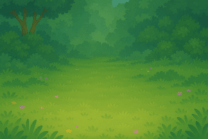
NOT YET IN PROTOTYPE BUT PLANNED FOR THE ACTUAL GAME: When designing the visual elements for Garden of Sequence, I wanted to blend AI-generated assets using chat gpt with my own creative touch. I used AI tools to quickly generate base images such as the background, which gave me a solid starting point and saved time on initial drafts. From there, I created a logo and customized it in Procreate, adding hand-drawn details, adjusting colors, and layering text with the flowers so they felt more personal and unique to the game. For the flowers I used images from google that I liked and removed their backgrounds to make them a png, and tweaked minor details in them to make sure they looked like what I want for my actual game. This mix of AI efficiency and manual drawing allowed me to create visuals that are polished but still carry my own artistic style. Its important to note that these elements are not yet in the prototype but will be added to the actual game later on.

Background:

Flowers: Game Logo for cover page:

The most intimidating part of this project was figuring out how to handle the playback of the sequence and the checking of user input without overlap. The challenge was not only to generate a random sequence but also to display it one flower at a time, with pauses in between, and then smoothly transition to the input phase. If playback and input overlapped, the game would feel broken. To minimize this risk, I stripped the game down to its simplest form. Instead of complex glowing graphics, I used a basic white circle to indicate the active flower. I tested different sequence speeds and lengths until the loop felt reliable. By reducing the visuals and focusing on the sequence logic, I was able to confirm that the core mechanic works before moving on to more complex features such as the sound and design. I’m excited to mess around with the sounds, I feel like it will add a lot of depth to my game especially when users click and get the sequence right I can add a positive noise and an error noise if they get it wrong.

This prototype demonstrates the essential gameplay loop and shows that the memory challenge mechanic actually works in p5.js. With the hardest logic already tested, I now feel confident adding more polished elements such as custom flower drawings, glow animations, sparkles, and ambient sound. The prototype also sets up room for future features like score tracking, or maybe even weather events that could make gameplay more dynamic. Starting small and addressing the most uncertain part first gave me a working structure to build on, along with a clear plan for how to transform this into a polished final project.

Week 5 Reading Response

Prompt:

What are some of the ways that computer vision differs from human vision? What are some techniques we can use to help the computer see / track what we’re interested in? How do you think computer vision’s capacity for tracking and surveillance affects its use in interactive art?

Response:

From my understanding plus the reading’s interpretation regarding computer vision, computer vision differs from human vision as human’s ability is sort of built-in inside our brain and takes way less energy and time to train our ability to recognize certain objects. For CV, however, they not only need numerous examples to learn certain facts, but also they consume huge amount of energy. Also, during the process of learning the ability to recognize, computer algorithms would often “cut” pictures into small pieces and train based on that while human learn to recognize as a whole.

Techniques that assist computer to see and track include frame differencing, background subtraction, brightness threshold, and simple tracking. I believe computer’s ability to track and surveillance could assist interactive art to be more interactive. For example, if I want to design a background music/scenes for a dancer, and if i want to change the background according to the dancer’s movements, I need CV as a technique to help me calculate parameters that could be applied into algorithms which later on could turn into shapes/sounds/etc..


Week 5 Midterm Progress

Concept:

For this project, I decide to create a design includes interactivity with sound. When I looked at how musicians create their music, they always apply something called as “soundtrack” that could be dragged around to edit their produced songs. So, for this midterm project, I decide to build on this concept.

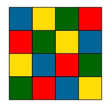
However, it would be too technical if I just recreate a soundtrack control system and it wouldn’t be very artistic. To add certain aesthetics to the design and to simplify the system. I decided to create a visual system that is similar to this picture.

With different color representing different sound, user could drag the gridlines to increase/decrease the length of certain sound. With colored blocks designated to certain sound, I decrease the difficulty to choose which sounds are available to the sound track. Also, I want to design a system in which the user could click on the grid inside and change the color(grid) of the sound. There should also be a play button which plays the sound block once the user finish design the block.

Complex parts:

I always insist on making my design graphically dominant. Ideally, there’s no word included in the system. However, I want to achieve the effect of asking users to discover they could drag the grid lines so that they could alter the duration of a certain sound. Also, the operation of changing the color of the grid should also be very intuitive.

Design:

There should be a class for blocks as user could alter the color of the grid and the width of the grid.

First Stage work:(press f to enter full screen)

As displayed above, this version is extremely crude.

There are several Improvements I could make in the coming week

  1.  the entire interface should be more user friendly, right now it’s just ugly.
  2. it should be a 5*5 grid instead of a 1*5 grid
  3. the grid line alter function should be designed more beautifully
  4. there should be no word instruction

However, this version works right now, and I can play with the sound to make some simple music.


Week 4: Generative Text

Fullscreen sketch

Main Concept:

My main concept is the first home screen you see when you buy a new phone. There are so many “hello” messages in different languages popping up, and that makes me shiver and feel like I’m really getting a new phone. For this assignment, I wanted to replicate that feeling of “I’m getting a new thing.” I also thought generating “hello” in different languages would symbolize that even though we are divided by languages, we are all connected with each other, and it is important to understand and embrace one another.


The part of the code I’m proud of:

The part of the code I am most proud of is the update function. In order to calculate the time that has passed after the word was generated, I had to learn a new function called millis(), which basically gives you the number of milliseconds that have passed since the program started. I used multiple if-else statements to make the word gradually appear and disappear based on time intervals. For instance, the transparency of the word gradually increases from 0 to 255 within 1 second so that it does not pop up immediately. This was meant to imitate the iPhone’s way of generating “hello,” which gradually fades in. I also used the map() function, which we learned in class, to map 0 to 1 second to 0 to 255 in transparency. I am happy about the fact that I was able to fully utilize the concepts we learned in class in this update function inside the Hello class. 

update(){
    let passed = millis() - this.beginTime; 
    
    if (passed < 1000){
      //gradually fade in in 1 sec 
      this.alpha = map(passed, 0, 1000, 0, 255);  
    } else if (passed < 3000){
      //full transparancy after 3 secs
      this.alpha = 255;
    } else if (passed < 5000){
      //gradually fade out in 2 secs
      this.alpha = map(passed, 3000, 5000, 255, 0); 
    } else{
      //word faded out
      this.over = true;
    }
  }

Sketch:


Reflections & Future Improvements:

For future improvements, I would like to change the color of the word each time it pops up to make it more colorful and enjoyable for viewers. Furthermore, I want to avoid generating the same word two times in a row. I think I will be able to do this by using an if-else statement to control the conditions. Overall, I am happy with the outcome, as I was able to replicate a simpler version of the iPhone’s starting screen.

Reading Reflection – Week 4

Reading Norman’s chapter on how to design everyday things brought back memories of my experience with poorly designed washing machines. The majority of newer machines have vague buttons, knobs, and symbols that make even a single load of laundry complicated. Some controls are counterintuitive, with icons that are unidentifiable as any standardized symbol. Others have poorly laid-out buttons or poorly readable colors, which make discoverability nearly impossible.

These design errors are just the kind of problems Norman discusses in terms of discoverability and understanding. A washing machine should express its use naturally so that users would know what can be done, where to do it, and what the controls accomplish without regard to instructions. Norman’s principles of affordances and conceptual models are applicable here. The signifiers should refer to the possible actions on the machine, and affordances should tell us where and how to do them naturally. Poorly designed washers fail in all of these ways, keeping their users uninformed and frequently erring that would not have been done with better design.

Norman indicates that machines should be planned for human error, and I agree that anticipating mistakes is crucial in terms of usability. A properly thought-out machine should anticipate human error and guide the user instinctively through the procedure, without requiring perfect knowledge or precision. I think there is a fine line, however, between assisting users and overcompensating for every mistake. If a design strives to support as many potential errors as it can, it will end up being overcomplicated or even enable sloppy use, rather than teach or lead users to the correct way of using it. Brilliant design, in my opinion, should discourage the most common errors without shutting doors entirely on the freedom to learn from experience and make decisions, rather than trying to predict all potential errors. This equilibrium provides usability without sacrificing structure or clarity.

Reflecting on Norman’s principles, I realize how important it is to design for clear feedback in interactive media, especially in my p5.js projects. For example, if I create a sketch where clicking on shapes triggers animations or changes their color, I can’t assume that a first-time user will immediately understand what to do. To address this, I might add visual cues like hover effects, tooltips, or a brief on-screen instruction to indicate which elements are interactive and what actions will happen. Norman’s arguments remind me that good design means guiding users through interactions intuitively, so they can enjoy the experience without confusion, frustration, or guesswork. By applying this principle, I can make my projects more accessible, engaging, and user-friendly.

Week 5 – Reading Response (Computer Vision for Artists and Designers)

Reading Computer Vision for Artists and Designers made me realize how differently machines interpret the visual world compared to humans. Where my eyes and brain can immediately recognize faces, objects, and contexts, a computer sees only streams of pixel data without inherent meaning. That difference kinda amazes me: what feels intuitive for me (like noticing the mood on a friend’s face) must be translated into measurable rules for the computer, such as brightness thresholds or background subtraction. This gap forces me to think about vision not as a natural act but as a series of constructed processes, something that both reveals the limits of human assumptions and opens new artistic possibilities.

The text also showed me that helping computers “see” isn’t only about coding better algorithms but also about designing the physical environment to be legible to the machine. Techniques like backlighting, infrared illumination, or retroreflective markers are surprisingly simple but effective. I found this point significant because it shifts responsibility back onto the artist or designer: we’re not just programming systems but curating conditions where vision becomes possible.

What I can’t ignore, though, is how these same techniques can easily blur into surveillance. Works like Lozano-Hemmer’s Standards and Double Standards or Jeremijenko’s Suicide Box made me uncomfortable precisely because they expose how tracking technologies, even when playful or artistic, carry power dynamics. If a belt can silently follow me or a camera can count unacknowledged tragedies, then computer vision isn’t neutral, it’s political. This makes me question: when I use vision algorithms in interactive art, am I creating a playful experience, or am I rehearsing systems of control?

For me, the text ultimately sharpened a tension: computer vision is at once liberating, because it expands interaction beyond a keyboard and mouse, and troubling, because it normalizes being watched. As a student studying Interactive Media, I feel I must navigate this duality carefully. A question that stuck with me is how to design works that use computer vision responsibly, acknowledging its history in surveillance, while still exploring its potential for creativity and embodiment.

Week 4 Visualizing Data

My Concept

For this project, I wanted to create a data-driven timelapse showing airports across Europe. Each airport is represented as a circle, and its size corresponds to the number of passengers in a given week. The idea is to make busier airports stand out visually while showing the flow of air traffic over time. I got the idea as I was looking for datasets on Kaggle. The first dataset I found had the Daily flight information on hundreds of European airports from 2016-2022. The problem was that it didn’t contain the coordinates of the airports for me to plot them in p5 as I envisioned. Thankfully, I found a second dataset that contains the coordinates of airports from around the world. I decided to remove all the non-European airports from the second dataset, then cross filter the two datasets by airport code to make a third csv file with all the information I need before using p5.

Code Highlight

Since I wanted to create a third dataset. I needed to clean out any irrelevant, redundant, or incomplete columns, then merge the two csv files. To remove the non European airports from the coordinates file, I used the below C++ program which reduced the number of rows from the original 83,000 to a couple hundred.

while (getline(inputFile, line)) {
        stringstream ss(line);
        string ident, lat, lon, continent;
        getline(ss, ident, ',');
        getline(ss, lat, ',');
        getline(ss, lon, ',');
        getline(ss, continent, ',');
        continent = trim(continent);
        cout << continent << endl;
        
        if (continent == "EU") {
            cout << "Found an EU row" << endl;
            outputFile << line << "\n";
        }
        
    }

I then wrote this code to only take the airports that appear in both flights.csv and airports.csv, and write then to a third file, which I uploaded to p5

while (std::getline(flightsFile, line)) {
         std::stringstream ss(line);
         std::vector<std::string> cols;
         std::string cell;

         while (std::getline(ss, cell, ',')) {
             cols.push_back(trim(cell));
         }

         if (cols.size() < 6) continue; // skip malformed rows

         std::string icao = cols[3];

         // Skip row if airport not found in airportMap
         auto it = airportMap.find(icao);
         if (it == airportMap.end()) continue;

         // Write row with coordinates
         outFile << cols[0] << "," << cols[1] << "," << cols[2] << ","
                 << cols[3] << "," << cols[4] << "," << cols[5] << ","
                 << it->second.lat << "," << it->second.lon << "\n";
     }

     airportsFile.close();
     flightsFile.close();
     outFile.close();

     std::cout << "Merged CSV with coordinates created successfully.\n";
     return 0;

Finally, in p5, I looped through all the airport data and positioned them based on their coordinates mapped to the canvas size. Then I made the sizes of the airports correspond to their traffic using Power of Log Scaling to make the less busy airports extra small and the busy airports extra big so the contrast is clearer.

// Map coordinates and size
 for (let i = 0; i < airports.length; i++) {
   airports[i].x = map(airports[i].lng, minLng, maxLng, 50, width - 50);
   airports[i].y = map(airports[i].lat, minLat, maxLat, height - 50, 50); // Inverted Y because p5 coordinates are top to bottom

   // Power of log scaling for exaggerated size
   airports[i].size = map(
     pow(log(airports[i].passengers + 1), 2),
     0,
     pow(log(maxPassengers + 1), 2),
     2,
     60
   ); 
 }

Sketch

Reflection

I was impressed by how even large datasets can be visualized effectively with only a few lines of code once the mapping is set up. Using loops and data structures allows complexity to emerge naturally. This project reinforced how math and data can drive visual design, and how small adjustments, like using a logarithmic scale instead of linear mapping, can completely change how readable a visualization is.

For future improvements, I would like to make the timelapse smoother, add color coding by country or region, and include tooltips or labels when hovering over airports so users can see exact values. I could also allow filtering by week or year to explore trends more interactively. These enhancements would make the visualization more engaging and informative.

Week4 Reading Response

I totally agree with the author’s essential idea that it’s all about balancing competing priorities including usability, attractiveness, cost, reliability, manufacturability, marketability, and so on. I realized through reading that nowadays people care more about aesthetics rather than functionality, which undermines the usability of the product. Although aesthetics are quite important to attract a larger audience, I truly think that preserving usability is a must and should never be compromised. Otherwise, it would be bad if we, as producers, confuse users about how to use the product. As someone who likes minimalistic design, in my future projects in interactive media, I would like to keep the design simple and modern, while still being attractive to users. Muji is a great example. Its product designs are super simple, yet their usability is pretty good. Thus, I would like to balance usability and attractiveness like Muji does. 


I also realized that what’s being discussed in this reading is quite similar to the software development life cycle I learned in my software engineering class. Back in the old days, communication between clients and producers was not prioritized. However, in modern days, we use the agile method, where communication among users, developers, and business people is the most important factor in increasing usability and satisfying users’ expectations. I drew a connection here with the reading in the sense that we put more emphasis on facilitating communication to better understand and design the product itself. 


Something that drives me crazy is a washlet. As a Japanese person, I’m proud that so many foreigners are fond of it. But I don’t know how to use it even to this day. It has too many buttons, and sometimes there are buttons called “massage,” which I’m scared to press because I cannot imagine how a toilet would massage me while sitting. Also, there are multiple buttons to spray water, so I don’t know from which part of the toilet the water will spray. I’m just scared of getting wet and confused. I wish it could reduce the number of buttons for usability and add some simple text to explain what will happen when I press a certain button.