Inspiration
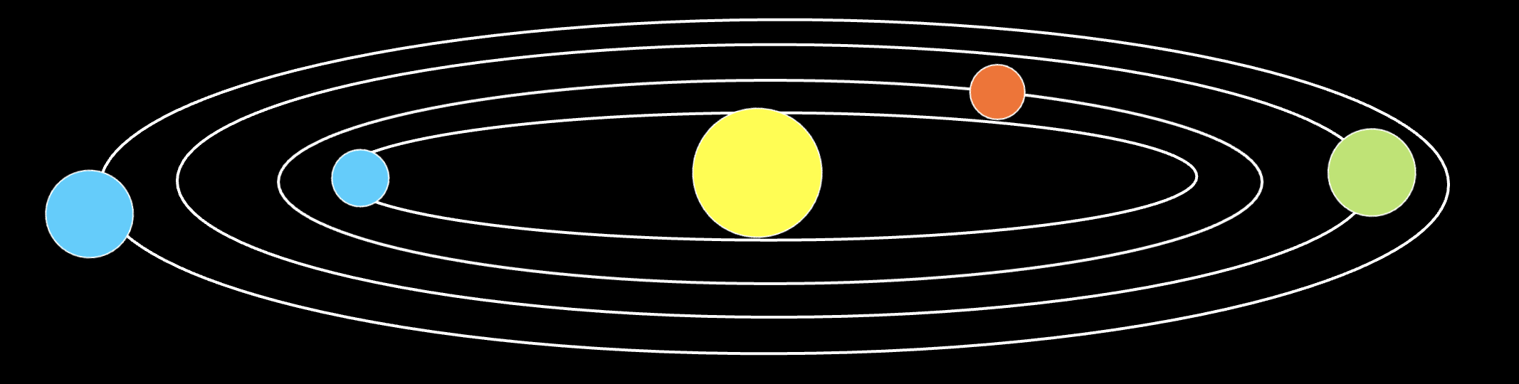
So I absolutely love space, I just think the science, visuals, and grandness of it is so crazy and something we will never be able to interpret properly. From music to visuals, I have always wanted to create some art related to space and so I decided to create some sort of simulation of our solar system in the 2D space of p5. However, I didn’t want circular rings, I wanted more elliptical rings to give it that 3d effect. 
Design
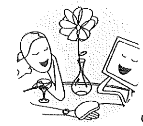
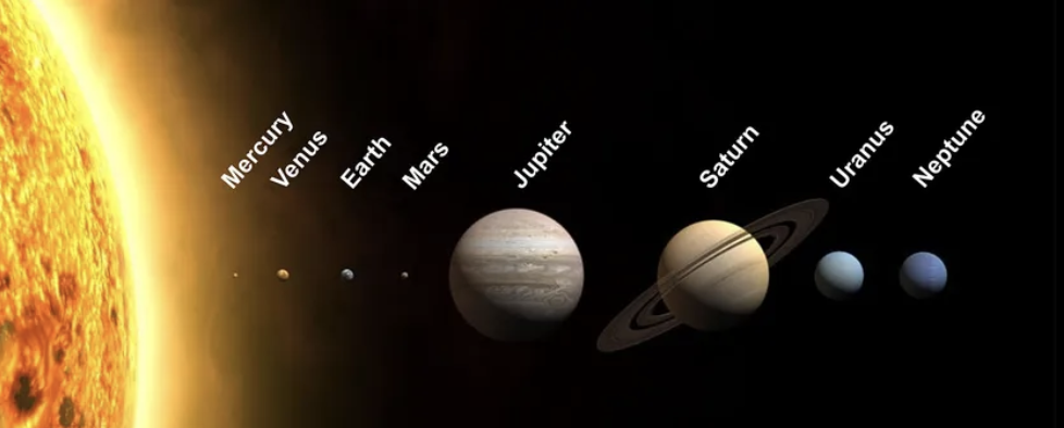
 This is just a quick mockup of what I would want the sketch to look like, I will also have moons for some of the planets like Earth, Saturn, and Jupiter.
I need classes for the planets, moons, stars of the background.
For all 3 of these ‘Objects’ I will make a parent class called SpaceBody which will host some basic attributes, such as position (x,y) and size.
I will also host all these objects in a SolarSystem class for encapsulation.
Background
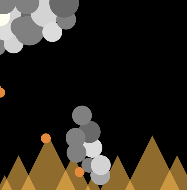
I wanted a deep-purple background with stars that grow a little then get smaller again, to give that illusion of glowing stars. I can do that by having the stars randomly drawn on the canvas and changing the alpha value change its ‘brightness’.
My ‘stars’ will have 4 attributes: x,y, size, twinkle. These will be js objects with x,y being random and the size being random between 1-3. Twinkle will be our variable that alters the alpha value. (quality of image isn’t the best, apologies)
SpaceBody
This will be my parent class and will host the basic attributes mentioned previously. I will also have a draw function here that will simply display circles. (Only Saturn will be a circle PLUS the ring).
class SpaceBody {
    constructor(x, y, size, color) {
        this.pos = createVector(x, y);
        this.size = size;
        this.color = color;
    }

    // display method - simple circle
    display() {
        push();
        translate(this.pos.x, this.pos.y);
        fill(this.color);
        noStroke();
        circle(0, 0, this.size);
        pop();
    }
}
Sun
Here I will have the Sun at the very centre. For my interactive element of this project, I will have the mouse position be the Sun’s location and the centre of the solar system essentially. I wanted the Sun to stand out compared to the other planets so I will have a few less opaque circles around it to give that ‘glow’ effect.
update() {
        // follow mouse - interactivity
        if (mouseX > 0 && mouseX < width && mouseY > 0 && mouseY < height) {
            this.pos.set(mouseX, mouseY);
        }
    }

    display() {
        push();
        translate(this.pos.x, this.pos.y);

        // the soft glow around the sun
        for (let r = this.size * 1.5; r > this.size; r -= 5) {
            let alpha = map(r, this.size, this.size * 1.5, 100, 0);
            fill(255, 200, 50, alpha);
            noStroke();
            circle(0, 0, r);
        }

        // main body of the sun
        fill(this.color);
        noStroke();
        circle(0, 0, this.size);

        pop();
    }
I overrode the display function here as I wanted to add the glow of the sun.
I also wanted the rings of the planets to be drawn here.
//  elliptical orbit rings around the sun
    drawOrbitRings() {
        push();
        translate(this.pos.x, this.pos.y);

        let orbitData = [
            {radius: 80, factor: 0.2},   // Mercury
            {radius: 110, factor: 0.25}, // Venus
            {radius: 140, factor: 0.3},  // Earth
            {radius: 180, factor: 0.35}, // Mars
            {radius: 250, factor: 0.4},  // Jupiter
            {radius: 320, factor: 0.45}, // Saturn
            {radius: 380, factor: 0.5},  // Uranus
            {radius: 420, factor: 0.55}  // Neptune
        ];

        // each orbit draw with faint blue
        for (let orbit of orbitData) {
            stroke(100, 100, 150, 80);
            strokeWeight(1);
            noFill();
            ellipse(0, 0, orbit.radius * 2, orbit.radius * 2 * orbit.factor);
        }
        pop();
    }
Moon
When having my original code drafted, I was using the SpaceBody class as the base for both Moon and Planet. I then realised, I could use Moon as a child class of SpaceBody AND THEN use Planet as a child of Moon.
I did this because both Moon and Planet do some sort of orbiting, whether it be the Sun they orbit, or a planet. I would say this realisation / code was the part I was most impressed with.
class Moon extends SpaceBody {
    constructor(x, y, size, color, orbitRadius, orbitSpeed, parentBody) {
        super(x, y, size, color);
        this.orbitRadius = orbitRadius;
        this.orbitSpeed = orbitSpeed;
        this.angle = random(TWO_PI); // random starting position
        this.parentBody = parentBody; // the body this orbits around
        this.ellipticalFactor = 0.3; // 3D effect - stronger ellipses
    }

    update() {
        // elliptical orbit around the parent body for 3D effect
        this.angle += this.orbitSpeed;

        // elliptical orbit (wider than tall for 3D effect)
        let x = this.parentBody.pos.x + cos(this.angle) * this.orbitRadius;
        let y = this.parentBody.pos.y + sin(this.angle) * this.orbitRadius * this.ellipticalFactor;
        this.pos.set(x, y);
    }
}
Planet
For the planet class, I added some extra attributes to the Moon class such as hasRings ( Boolean for Saturn) and moons[] for planets with moons. Because Planet inherits the Moon class, there were fewer lines of code which was nice to have.
SolarSystem
This class was to hold all the objects (Sun, Moons, Planets).
I used AI to help me with the creation of the planet objects by adjusting the size and moon knowledge. Example, Jupiter is the biggest planet so having that planet with the largest size.
let planetData = [
    [8, color(169, 169, 169), 80, 0.04, 0.2, false, []], // Mercury
    [12, color(255, 198, 73), 110, 0.03, 0.25, false, []], // Venus
    [14, color(100, 149, 237), 140, 0.025, 0.3, false, [[4, 25, 0.1, color(220, 220, 220)]]], // Earth
    [10, color(205, 92, 92), 180, 0.02, 0.35, false, []], // Mars
    [28, color(255, 140, 0), 250, 0.015, 0.4, false, [[6, 40, 0.08, color(255, 255, 224)], [4, 55, 0.06, color(139, 69, 19)], [5, 70, 0.04, color(176, 196, 222)]]], // Jupiter
    [24, color(255, 215, 0), 320, 0.012, 0.45, true, [[5, 45, 0.07, color(255, 255, 240)]]], // Saturn
    [18, color(64, 224, 208), 380, 0.008, 0.5, false, []], // Uranus
    [17, color(30, 144, 255), 420, 0.006, 0.55, false, []] // Neptune
];
Challenges
Honestly, as I was coding this, I kept on seeing more way to use OOP such as having Planet and Moon extend this new class I made. Originally I had them as children of SpaceBody and then the update function was a global helper function then it was part of my new class. There was a lot of restructuring so I wish I spent more time focusing on the structure of the classes.
Next Time
I added the mouse position as a part of the interactivity but I want to come up with something more creative next time. Maybe having the whole system be on an angle?
Final Product