Week #4 – Production Assignment ( Data Visualization)

Introduction:

I have always found bar graphs to be quite fascinating. The ability to stack and compare data visually allows it to be easily perceived. In my case, I wanted to make sure, that I can log my study hours, as an extrinsic motivation. Something which will give me visual overview of my efforts in the form of time put into studying.

Concept:

In theory, I wanted the data visualization and bar graph to be based on weekly basis. A snapshot of just one week as opposed to a complete log since the dawn of time.  Each day in the week will have a bar , extending from top to bottom axis, and will vary in height, to signify which day was the most productive (I know this isn’t exactly considered productivity, but we might just pretend). Each bar will have designated study hours listed on top of it, and will give a quantitive and qualitative visual of study pattern.

The user will be greeted by start page, then taken to a page to log in study hours, and then again upon a button click, will see the graphs appear.

Code Highlight:

function setup() {

}

function startProgram() {

  }
 
}

function submitData() {
  // check and store if 
  for (let i = 0; i < studyInputs.length; i++) {
    //cycle through the inputs to verify the nature of data.
    let val = parseFloat(studyInputs[i].value());
    // parseFloat is a javascript function, which parses
    // a value as string and then converts it to number
    studyHours.push(isNaN(val) ? 0 : val);
    /*
    isNaN is 'Not a number' function which returns true if the value is     passed is not a number. in our case if the value passed is a 
    number, then its true, and pushes 'val' into study hours. and for
    the one where if there is no number entered for instance a letter /
    character instead, this will push the value '0' for the hours.
    */
    studyInputs[i].hide(); // hide the input field after submission
  }
  submitButton.hide();
  state = "graph";  // change state so that draw() will call drawGraph()
}

function drawGraph() {
  
}

//atlas draw function which keeps on cycling, and only draws graph when the state has been changed to draw graph.
function draw() {
  // if state is "graph" continuously draw the graph. 
  if (state === "graph") {
    drawGraph(); // custom function
  }
}

The code in submit data is what I am proud of. At first, I encountered the possibility where the user might not enter a numerical value, but rather a string or character. Hence I made use of ‘parseFloat’ and ‘isNaN’ javascript functions paired with a inline if-else logic statement to check for the nature of input. If the input happened to be other than a number, then push a ‘zero’ value into the ‘studyHours’ array.


Things I struggled with:

I struggled the most with the placement and sizing of the bar graphs. There coordinates were inconsistent, and the spacing was off. Hence, I decided to use mathematical formulation to calculate the division of space on the spot , and keep its coordinates and their margin  consistent.

let margin = 60;
 let gap = 20; //gap between days
 let availableWidth = width - 2 * margin;
 let barWidth = (availableWidth - (days.length - 1) * gap) / days.length; 
 let maxHours = max(studyHours); // maxiumum value in the array
 if (maxHours === 0) {
   maxHours = 1;  // to avoid division by zeor
 }
 let graphHeight = height - 100;
 stroke(0);
 //horizontal bar
 line(margin, height - 50, width - margin, height - 50);
 
 // For each day, draw the corresponding bar and label its study hours and name
 for (let i = 0; i < days.length; i++) {
   let x = margin + i * (barWidth + gap);
   let barHeight = map(studyHours[i], 0, maxHours, 0, graphHeight);
   
   // Draw a blue bar representing the study hours
   fill(50, 150, 200);
   rect(x, height - 50 - barHeight, barWidth, barHeight);


Instruction on How to Use:

Click on ‘start’ to proceed to data logging stage.

Then, enter numerical values for the hours studied each day.


Once pressed on ‘submit’, the user will see visualized pattern of data entered.

Since ‘ali’ is not a numerical value, it shows zero, and for the rest, it visualizes the trend and numbers entered.

Embedded Sketch:


Future Improvements:

In the future, I want to make it even more dynamic. For instance 7 is not far away from hitting the title. Even though the current program is able to resize depending on the maximum and the minimum relative to other bars, and the graph, yet still, better margins and specific coloration to each bar can make it more sybmolic. For instance hot red can refer to the most hours studied, and simple greenish can refer to the least.

Complete code:

The complete code is extremely lengthy, not really but can be accessed via clicking on the sketch.


Week #4 – Reading Response

Overview of the reading:

I thoroughly enjoyed this reading. I had no idea the famous ‘Norman Door’ was literally named after a personality named Norman! The reading touches upon various concepts and examples such as doors and teapot for masochists. By using the example of his friend and his struggle with an aesthetically pleasing array of doors, the author made and argument that ‘discoverability’ and ‘understanding’  are two of the most critical elements of design, which are often neglected. Discoverability means the how easy it is for users to discover possible actions and understanding refers to what extent user can understand the meaning of those actions.


What’s something (not mentioned in the reading) that drives you crazy and how could it be improved?

If there is one thing, that I happened to have been struggling with recently are the plastic latches. To be more precise, the battery latches on cameras.

Turns out, I am not the only one, many folks over the internet have been struggling with these latches. The latch mechanism works by pulling a small protruded lever. Instead, those unfamiliar, end up pooling the whole latch backwards, which ends up damaging , loosening, or even breaking it. No wonder,  why they have so many spare plastic latches lined up on amazon:

In order to improve, I think a release mechanism can be designed, based on a simple push mechanism, rather than a pull mechanism. A simple button, which releases the hatchet rather than you having to pry it with your nails, making it extremely difficult and scratching the plastic in the process. Most importantly, memory card has to be removed every time to transfer images, and with latch being this annoying, it is bound to be damaged and broken in the long run. Therefore, a push to open mechanism would be more important than a push / pry to open mechanism.

Note: I am not referring to the movement of the latch (wouldn’t make any different to door), but rather the release mechanism that works in latches and sometimes say’s push to open or ‘pull’ but reality results in user confused which axis to apply force in.

Solution: A press to open and press to release mechanism, similar to kitchen drawers.


How can you apply some of the author’s principles of design to interactive media?

Feedback mechanism is one of the main visual or multi-sensory cue (signifier) that can be implemented to interactive media projects. Upon user input, the designed system should either inform the user after an adequate amount of time wether his/her action has been negated or accepted. I personally like the idea of sound or haptics. For instance on Macintosh mousepad, when user is performing a drag or drop action with the mouse which is beyond the graphical constraints of that program, the springs in the mousepad harden and vibrate. This gives the simulation of difficulty when dragging . Similarly that annoying sound from windows 7, when prompt window not dealt with are some of the examples.

Secondly affordances such as designs which allow for ‘easy’ discoverability is something that I would like to work upon.  Easy to understand designs, which prompts user in the right direction, such as drawing borders in the game selectively to direct the player in the right direction.

Assignment 4: Fortune Cookies

This is my text-based art piece, which I have taken inspiration from during a recent trip to a Chinese restaurant. My friends and I enjoyed opening our cookies and reading each other’s fortunes. I wanted to give others this experience too so created this piece to do exactly that.


📋Assignment Brief

  • Create an interactive piece of artwork by loading data or displaying text

💭Conceptualisation

The idea for this project emerged from a delightful dining experience at a Chinese restaurant. As my friends and I cracked open our fortune cookies and shared our fortunes with laughter and anticipation, I was struck by the simple joy this tradition brought to our meal. I wanted to capture and recreate this experience, allowing others to enjoy the whimsical pleasure of fortune cookies from anywhere. The idea evolved to combine the visual aesthetics of a Chinese restaurant with the interactive element of opening a fortune cookie. I envisioned a scene where users could click to “open” a virtual fortune cookie, revealing one of many possible fortunes. This concept aimed to blend cultural elements, visual art, and interactivity into a single, engaging piece. By digitizing this experience, I hoped to make it accessible to a wider audience, allowing people to enjoy the surprise and wisdom of fortune cookies without the need for a physical restaurant visit.

💻Process

The coding process for this project began with creating the foundational elements of the Chinese restaurant scene using p5.js. I started by establishing the basic structure, including the background, tables, wall decorations, and lanterns, to set the ambiance. The next crucial step was designing the fortune cookie itself. I used bezier curves to craft a realistic cookie shape, complete with a subtle shadow and a visible fold line. To add depth to the experience, I implemented two states for the cookie: closed and open. This required creating separate functions for drawing each state.

The interactive element was introduced by implementing a mousePressed() function, allowing users to toggle between the closed and open states of the cookie. To bring the fortune-telling aspect to life, I created an array of ten different fortune messages. Each time the cookie is opened, a random fortune is selected from this array and displayed on the ‘paper’ inside the cookie.

function mousePressed() {
  isOpened = !isOpened;
  if (isOpened) {
    currentFortune = random(fortunes);
    drawOpenedFortuneCookie(openedFortuneCookie, currentFortune);
  }
}

One of the more challenging aspects was ensuring the fortune text was properly centered and legible within the opened cookie. This required careful adjustment of text positioning and size. Throughout the process, I continually refined the visual elements, adjusting colors, sizes, and positions to create a harmonious and visually appealing scene.

The final touch involved fine-tuning the user experience, ensuring smooth transitions between states and readable fortune messages. This iterative process of coding, testing, and refining resulted in an interactive digital representation of the classic fortune cookie experience, nestled within a charming Chinese restaurant setting.

🚩Challenges

One of the main challenges I faced while writing this code was achieving a realistic representation of a fortune cookie while keeping the code simple and efficient. Creating the curved shape of the cookie using bezier curves required careful adjustment of control points to achieve a natural-looking form.

Another significant challenge was implementing the random fortune selection mechanism. While the concept seems straightforward, ensuring that the fortunes were truly random and didn’t repeat too frequently required careful consideration. I had to strike a balance between maintaining a diverse selection of fortunes and avoiding predictability in the user experience.

📶Potential Improvements

While the current version successfully creates an interactive fortune cookie experience within a Chinese restaurant setting, there are several areas for potential improvement and expansion:

  • Animation Enhancements: Adding subtle animations, such as a smooth opening animation for the fortune cookie or a gentle floating effect for the lanterns, could make the scene feel more engaging

  • Sound Integration: Incorporating audio elements, like a soft cracking sound when opening the cookie or ambient Chinese restaurant background noise, could enhance the immersive experience

  • Multiple Cookie Types: Introducing different types of fortune cookies with varying shapes, colors, or even flavors could add variety and replay value to the interaction


Week 3 Project

Inspired by my floor’s theme I am making batman. I used object-based coding to make the rain appear to fall. Adding music also gave it the batman like mood I was looking for. I think the way that half of the rain falls in front of him and half falls behind him was something that took me a while to conceptualize. Therefore this was a part of the code I was proud of.

  // draw raindrops that go behind batman
  for (let drop of drops) {
    if (drop.z <= 1.5) {
      drop.fall();
      drop.show();
    }
  }
  //draw batman
  fill(0)
  noStroke()
  ellipse(200, 250, 100, 100)
  quad(400-250, 248, 250, 248, 400-120, 400, 120, 400)
  triangle(152,240,160,170,182,240)
  triangle(400-152,240,400-160,170,400-182,240)
  fill(255)
  quad(163,250,183,250, 190, 260, 170, 260)
   quad(400-163,250,400-183,250, 400-190, 260, 400-170, 260)
  
  
  // then draw the raindrops in front of batman
  for (let drop of drops) {
    if (drop.z > 1.5) {
      drop.fall()
      drop.show();
    }
  }
}
  //making the raindrops fall
class RainDrop {
  constructor() {
    this.x = random(width);
    this.y = random(-height, 0);
    //perspective
    this.z = random(1, 3);
    // this makes the background slower than the foreground
    this.speed = map(this.z, 0.5, 2, 2, 6);

In terms of improvements I definitely could have made batman less minimalistic, and I think doing some other things to the rain to make it even more real (vary thickness of raindrops to account for perspective and stuff like that) which would add to the artwork. Lastly, adding some sort of more interactive element would have also made it better.

Reading Reflection – Week#4

  • What’s something (not mentioned in the reading) that drives you crazy and how could it be improved?

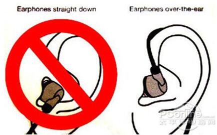
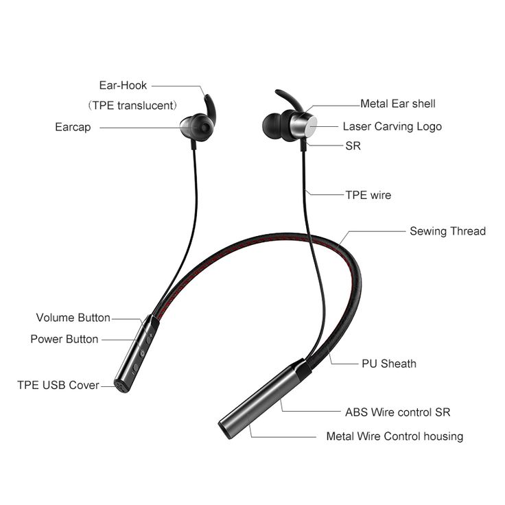
Personally, something that might frustrate me is an object for which multiple people hold varying mental conceptual models of it. Imagine the complication if these varying mental conceptual models conflict.  Earphones might not necessarily drive me crazy, but it is initially designed to be worn wrapped around the ear and countless people simply plug it into their ear. I realize the problem is that usually a lack of signifier indicating a round wrapping action around their ear, and that users tend to place huger focus on the earbud, which is to be plugged in the earhole, leading to users simply plugging the earphone into their ear without wrapping it around their ear. I did ponder over how it could be designed to let people know clearly how earphones should be worn, but a better design that I can think of involves a long round rubber earhook placed before the earbud that indicates to the user it should be placed in the long around the antihelix, for which it can only be placed that way if the earphone cable was wrapped around ear.

Right way to wear earphones. Cited from https://www.aizerd.com/news/the-right-way-to-wear-headphones.html
Parts of the earphone (see the top-left for ear-hook). Cited from https://www.pinterest.com/pin/663084745114270948/.

Taking careful steps in designing an object is necessary, and it is crucial to consider the conceptual model that might be constructed, for these provide value for understanding, in predicting how things will behave, and in figuring out what to do when things do not go as planned.

  • How can you apply some of the author’s principles of design to interactive media?

I learned to consider affordances, the possible interactions between people and the environment, as well as incorporate signifiers to signal things, in particular what actions are possible and how they should be done. Signifiers must be perceivable, else they fail to function. I also learned that in design, signifiers are more important than affordances, for they communicate how to use the design. A signifier can be words, a graphical illustration, or just a device whose perceived affordances are unambiguous.

I have a real-life experience of the need for design improvement on my last data visualization project using the author’s principles of design to interactive media. The project involves viewing stellar objects in 3D space, allowing users to zoom in, zoom out and move across the space using mouse controls. Excitedly, I asked my friend to see it. She was keen to try out my project, but she didn’t seem delighted with her experience. Problems? There were not just one, but several:

  1. I didn’t want users to lose view of the stellar objects in their exploration, so when mouse is released, I automatically resetted the view to the initial view of the stellar objects. But it’s not the way someone else might want it to be. Probably, my friend found this sudden reset quite unnatural, and she may have thought my animation wasn’t functional. She suggested having reset as an option using a button instead. I learned that it’s preferred that after releasing the mouse in some exploration, the view stays at the result of that exploration – the user can then pick up from where the user left off to continue the exploration. This increases the affordance (possible interaction between people and the environment).
  2. Due to lack of time, I was also not able to put on a signifier that the view would reset. This caused confusion for the user.
  3. Feedback was quite slow, so this might have played a factor in dettering my friend from continuing to try the animation, going off to do other activities. The delay seemed too long. According to the reading, “Feedback must be immediate: even a delay of a tenth of a second can be disconcerting.” On the contrary, imagine quick feedback in a space simulation: smooth zooming, tilting through space – how inviting to continue exploration.

I hope to incorporate these design considerations and principles in my upcoming assignments and future projects. I would love to help users enjoy a wonderful experience!

Week 4 – reading response

Reading Response: The Psychopathology of Everyday Things

Something That Drives Me Crazy: Confusing Shower Knobs

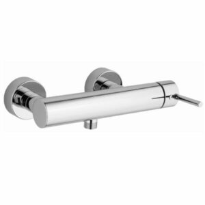
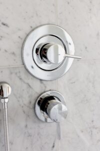
One of the most frustrating design flaws in everyday life is the lack of a standardized, intuitive shower knob system across different countries. If you’ve ever traveled internationally, you’ve likely encountered showers that seem to require a degree in engineering to operate.

In the United States, many showers have a single-knob system where you turn left for hot water and right for cold. However, some models require you to pull or push the knob, which isn’t always obvious. In the United Kingdom, separate hot and cold taps are still common, making us mix water manually. In Norway, for example, some showers have buttons that must be pressed in a particular sequence before water flows. The inconsistency means that travellers like me often accidentally scald themselves, turn on the water at full blast, or get an unexpected cold shock.

The biggest issue is discoverability. There’s often no clear indication of how the system works. Some showers even have extra knobs that control water pressure or temperature separately, adding to more confusion. Without obvious instructions, we are left to experiment, sometimes getting drenched unexpectedly in freezing or boiling water.

Applying Norman’s Principles to Improve Shower Design

Don Norman’s principles of discoverability, affordances, and signifiers could help improve shower designs:

  1. Clear affordances. The shape and placement of knobs should signify their function. A lever-style handle naturally implies to us that it has to be turned, while a button clearly calls for you to press it.
  2. Icons or labels could tell us about temperature directions, with simple red/blue colors universally suggesting hot and cold temp.
  3. Natural mapping. This could be a horizontal sliding control that moves left for hot and right for cold. It would be more intuitive than rotating knobs in random directions.

Another potential hi-tech solution is a digital shower interface with a display which could get rid of confusion entirely.

Week 4 – generative text output

Inspiration for This Project

I wanted to create an interactive and visually engaging experience that merges astrology with generative art. The idea was to provide users with a simple yet immersive way to receive a zodiac-based “psychic reading,” followed by animations and visuals. Astrology is often associated with mysticism and magic, so I aimed to reflect that via changing background colours and adding floating particles. For the visual part, I took my inspiration from this website: https://www.horoscope.com/us/index.aspx

Code Highlight I Am Proud Of

One part of the code I’m particularly proud of is the getZodiacColor function, which assigns a unique background color to each zodiac sign:

function getZodiacColor(sign) {
  let colors = {
    "Aries": color(255, 99, 71), "Taurus": color(107, 142, 35), "Gemini": color(255, 215, 0), "Cancer": color(70, 130, 180),
    "Leo": color(255, 165, 0), "Virgo": color(46, 139, 87), "Libra": color(123, 104, 238), "Scorpio": color(148, 0, 211),
    "Sagittarius": color(255, 140, 0), "Capricorn": color(139, 69, 19), "Aquarius": color(0, 191, 255), "Pisces": color(72, 61, 139)
  };
  return colors[sign] || color(240);
}

This function is simple, but it instantly transforms the visual feel of the project based on the user’s selection, creating some sense of personalization.

Reflection

For future projects, I’d love to explore more complex generative animations, such as constellations that change based on the zodiac sign. Things like integrating sound effects or subtle ambient music could enhance the mystical atmosphere. Another direction could be adding more interactive elements, like having particles respond to mouse movement, making the experience feel even more magical and immersive.

Here is the full code:

let signs = [
  "Aries", "Taurus", "Gemini", "Cancer", "Leo", "Virgo",
  "Libra", "Scorpio", "Sagittarius", "Capricorn", "Aquarius", "Pisces"
];

// Zodiac readings for each sign
let readings = {
  "Aries": ["Today is a day for bold moves.", "A new adventure awaits you.", "Your energy will attract opportunities."],
  "Taurus": ["Stay grounded, but take a leap of faith.", "Patience will bring unexpected rewards.", "A financial opportunity is coming your way."],
  "Gemini": ["A conversation will spark inspiration.", "Your curiosity leads to a surprising discovery.", "Adaptability is your greatest strength today."],
  "Cancer": ["Your emotions will guide you well.", "A nostalgic moment will bring clarity.", "Trust your intuition—it knows the way."],
  "Leo": ["Your confidence will open doors.", "A bold move will lead to admiration.", "Shine your light and others will follow."],
  "Virgo": ["Your keen eye will catch an important detail.", "Organization will bring unexpected rewards.", "A small habit change will lead to a breakthrough."],
  "Libra": ["Balance is key today.", "A relationship will deepen in an unexpected way.", "Harmony will find you when you least expect it."],
  "Scorpio": ["Mystery surrounds you—embrace it.", "Transformation is closer than you think.", "Your passion will lead you to new heights."],
  "Sagittarius": ["An exciting journey is on the horizon.", "Your optimism will inspire someone today.", "The universe is conspiring in your favor."],
  "Capricorn": ["Hard work pays off—stay focused.", "A disciplined approach will yield results.", "Your perseverance will be rewarded soon."],
  "Aquarius": ["Innovation is your ally today.", "A sudden insight will change your path.", "Your unique perspective is your greatest strength."],
  "Pisces": ["Your dreams hold important messages.", "Creativity will flow effortlessly.", "A moment of solitude will bring deep understanding."]
};

let dropdown, button, output;
let bgColor;
let particles = [];

function setup() {
  createCanvas(400, 300);
  textSize(16);
  textAlign(CENTER, CENTER);
  
  // Create dropdown menu for zodiac signs
  dropdown = createSelect();
  dropdown.position(100, 100);
  
  for (let sign of signs) {
    dropdown.option(sign);
  }
  
  // Create button to generate reading
  button = createButton("Get Your Reading");
  button.position(100, 140);
  button.mousePressed(generateReading);
  
  output = "Select your sign and receive your reading";
  bgColor = color(240);
  
  // Create floating particles for magical effect
  for (let i = 0; i < 50; i++) {
    particles.push(new Particle());
  }
}

function draw() {
  background(bgColor);
  fill(50);
  text("Psychic Zodiac Reading", width / 2, 50);
  text(output, width / 2, 80);
  
  // Update and show floating particles
  for (let p of particles) {
    p.update();
    p.show();
  }
}

// Generate random reading based on selected zodiac sign
function generateReading() {
  let selectedSign = dropdown.value();
  let possibleReadings = readings[selectedSign];
  output = possibleReadings[int(random(possibleReadings.length))];
  bgColor = getZodiacColor(selectedSign);
}

// Assign unique background color for each zodiac sign
function getZodiacColor(sign) {
  let colors = {
    "Aries": color(255, 99, 71), "Taurus": color(107, 142, 35), "Gemini": color(255, 215, 0), "Cancer": color(70, 130, 180),
    "Leo": color(255, 165, 0), "Virgo": color(46, 139, 87), "Libra": color(123, 104, 238), "Scorpio": color(148, 0, 211),
    "Sagittarius": color(255, 140, 0), "Capricorn": color(139, 69, 19), "Aquarius": color(0, 191, 255), "Pisces": color(72, 61, 139)
  };
  return colors[sign] || color(240);
}

// Particle class for floating magic effect
class Particle {
  constructor() {
    this.x = random(width);
    this.y = random(height);
    this.vx = random(-1, 1);
    this.vy = random(-1, 1);
    this.alpha = random(100, 255);
  }

  // Update particle movement
  update() {
    this.x += this.vx;
    this.y += this.vy;
    if (this.x > width || this.x < 0) this.vx *= -1;
    if (this.y > height || this.y < 0) this.vy *= -1;
  }

  // Display particle as a glowing dot
  show() {
    noStroke();
    fill(255, this.alpha);
    ellipse(this.x, this.y, 5, 5);
  }
}


Startup Funding Visualization

Concept

This project visualizes startup funding data by representing different startups as interactive elements on the screen. Users can hover over a startup to see its funding amount and valuation, and click on a startup to view more detailed information. The goal is to create an intuitive and engaging way to explore startup funding rounds.

Code Highlight

One of the key sections of the code is how the information is displayed when a startup is hovered over. The following snippet effectively creates a tooltip-like interaction:

text(`${this.emoji} ${this.name}`, this.x, this.y - 15);

if (hovered) {
  fill(255, 200);
  rect(mouseX, mouseY, 160, 50, 10);
  fill(0);
  textSize(12);
  text(`💰 $${this.amountRaised}M`, mouseX + 80, mouseY + 20);
  text(`📈 $${this.valuation}M`, mouseX + 80, mouseY + 40);
}


This block dynamically positions the tooltip near the cursor and provides a quick summary of key financial metrics.

Embedded Sketch


Reflection and Future Work

While the current implementation effectively visualizes funding data, there are several areas for improvement:

  • Scalability: The current approach might become inefficient with a large dataset. Optimizing how data is rendered could enhance performance.
  • More Interactivity: Adding filtering options for different funding rounds (Seed, Series A, B, etc.) could improve user experience.
  • Enhanced Visualization: Implementing different shapes or colors to represent different funding rounds would make distinctions clearer.
  • Data Integration: Connecting to a live API to fetch real-time funding data would make this visualization more dynamic and useful.

Overall, this project provides an engaging way to explore startup funding data, and with future iterations, it can be expanded into a more powerful analytical tool.

week 4- reading response

One I thing I find frustrating is the lack of customization in close-source systems. My iphone that uses IOS for example, I like it, I think its great, but it lacks a lot of customizable features that other systems like android, which lets you customize almost everything in your phone, from keyboard appearance to even system functionalities.

When it comes to designing interactive media, applying key design principles can make all the difference in usability. First, affordances and signifiers should be clear—buttons and links need to look like what they are, so users don’t waste time guessing. Feedback is just as crucial; when a user taps a button, they should see or hear an immediate response that confirms their action. And then there’s mapping—controls should align naturally with their effects, like familiar gestures and intuitive layouts that make navigation feel seamless.