Week 4 – Generative Text

Concept

For the fourth assignment, I will present a sentence generator that provides new drawing ideas. When you hit the “Enter” key, the sentence displayed will be changed to a new randomly generated idea. The interface has a beige color to resemble a warm, inviting workspace. On the left, the text “Possible Drawing Ideas” is centered, and a small, cute pencil image is positioned just below it. On the right side, a large white rectangle looks like lined composition paper, with blue horizontal lines and a red border to make it look like a notebook page. The sentence generator uses three arrays—subjects, verbs, and objects—to construct new and random sentences whenever the “Enter” key is pressed. This is inspired by word generators online, more specifically the drawing generator below:

https://randomwordgenerator.com/drawing-ideas.php

I always wanted to know what to draw after a while of not doing so, so I hoped this generator could help me generate ideas on what to draw during my freetime.

Code Highlight

A a snippet i am proud of is this one:

function generateNewSentence() {
  let s = random(subjects);
  let v = random(verbs);
  let o = random(objects);
  currentSentence = `${s} ${v} ${o}.`;
}

This is because when I first started creating this, I struggled to get the sentence structured properly. At first, I couldn’t figure out how to manipulate the arrays and get the randomly selected items to fit properly into the structure of the sentence. I kept getting errors like missing spaces or syntax errors because I didn’t understand how important it was to use template literals for dynamically building strings. Upon discovering that, I was still struggling with randomization, e.g., getting an undefined result due to the arrays being accessed improperly. Eventually, after practicing with W3Schools and learning about template literals using this as reference:

https://www.w3schools.com/js/js_string_templates.asp  

I realized I needed to structure the string with it in a more precise way to avoid errors with spacing.

Embedded Sketch

(You can go to p5.js to see it clearly)

Reflection

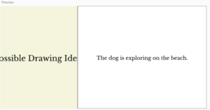
Overall, this was a really fun project to play with texts and random words to generate one sentence. I really enjoyed testing my project by hitting “Enter” to transform the sentence to another random one. However, what had frustrated me sometimes is finding out the fonts for separate texts. I once tried to add another font but it ended up changing the size of the title “Possible Drawing Ideas” and caused some parts of the sentence to be chopped off (See below).

I can see myself using this feature in p5.js more and I can add extra details to make it seem a bit more realistic (shading, and details on the small pencil).

Assignment 4: Generative Text

In this assignment, I created an interactive visualization featuring animated letters that swirl, drift, and change colors as they fall across the screen. The letters are selected randomly from a character set of uppercase English letters and numbers. Each letter moves independently with unique properties such as speed, rotation, color cycling, and sinusoidal horizontal drift. The use of transparency in the background creates a subtle trailing effect, enhancing the sense of motion and fluidity. The goal of this project was to create an aesthetically engaging and dynamic animation with a mix of structured randomness and organic movement.

One part of the code that I am particularly proud of is the display() method inside the SwirlingLetter class. This function not only ensures smooth rendering of each letter but also cycles through colors using sinusoidal variations. This approach creates a mesmerizing shifting color effect without requiring predefined color schemes. Another aspect I appreciate is the reset mechanism in update(), which seamlessly resets letters when they fall below the canvas, ensuring a continuous flow of animation. Looking ahead, possible improvements include adding user interactivity, such as allowing the mouse to influence letter movement or introducing gravity variations for more dynamic behavior. Another potential enhancement could involve applying Perlin noise for smoother, more naturalistic drifting patterns, making the animation feel even more organic.

display() {
  // Calculate color based on colorPhase (sin/cos wave)
  let r = 127 + 127 * sin(this.colorPhase);
  let g = 127 + 127 * sin(this.colorPhase + TWO_PI / 3);
  let b = 127 + 127 * sin(this.colorPhase + (2 * TWO_PI) / 3);
  
  push();
    translate(this.x, this.y);
    rotate(this.angle);
    textSize(this.fontSize);
    fill(r, g, b);
    text(this.char, 0, 0);
  pop();
}

Week 4: Reading Response

The reading was an insightful exploration of design principles, especially in how seemingly simple objects can cause unnecessary confusion due to poor design. Norman’s discussion of unintuitive doors resonated with me because I often find myself second-guessing whether to push, pull, or slide a door. It reminded me of how many everyday frustrations are not due to user error but rather poor design choices. This reading reinforced the idea that effective design should be invisible—when done well, users don’t notice the effort behind it, but when done poorly, it becomes a major source of frustration. The comparison to unnoticed yet essential elements in other fields, such as sound design in film, really stood out to me. Just like poor audio mixing can pull you out of a film, bad design disrupts an otherwise seamless interaction with a product. The reading also made me appreciate the balance required in good design—ensuring clarity without overwhelming users with excessive instructions, and making products both functional and aesthetically pleasing.

Applying these design principles to interactive media requires a careful balance of affordances, feedback, and signifiers to ensure an intuitive experience. In previous projects, I’ve experimented with interactive elements like hover effects and keyboard controls, but I’ve realized that just because an interaction is possible doesn’t mean users will know it exists. Without clear signifiers, like visual prompts or subtle animations, the interactivity might go unnoticed, reducing engagement. I’ve also seen cases where too much feedback—like unnecessary pop-ups or redundant instructions—ends up being more annoying than helpful. A major takeaway from Norman’s work is that design should guide users naturally rather than force them to read detailed instructions. For interactive media, this could mean designing with affordances that align with user expectations, like making buttons look clickable or using motion cues to hint at interactivity. Balancing clarity with aesthetics is key to making interactive experiences engaging without being intrusive.

Assignment 4: Generative Text

For this project, I was inspired by the windows at the Louvre Abu Dhabi that have quotes on them. I’ve always thought that poetry is incredibly beautiful powerful, and something that could have a section in a museum to inspire those that want to read it. Therefore, for my project, I decided to create what I call the “The Museum of Poems”. The concept involves a museum scene with a frame in the very center that displays a random quote about love or life for the person to see. My hope is that whatever they read, although short, inspires them or motivates them in some way. I gathered 2-line poems from various reddit posts, online blogs, quora posts, and even ChatGPT, and put them all into a giant list for the program to pick and display at random. My museum ended up looking like this:

The hardest part of this project was that after I initially finished, I accidentally clicked refresh and lost the entire project. I thought I had saved it, but turns out I hadn’t, and there was no way to recover it. Luckily, there was a point where I asked ChatGPT to help me solve a problem I was running into and gave it all my code, so I could copy that back. However, this was still in the earlier stage of my project, and I had to redo a lot of it from scratch including importing all my fonts and images again, putting in all the poems in the list, the gradient background, the wood flooring, etc. Speaking of the gradient background, that part along with the wood flooring is the part of the code I am most proud of. I had to learn how to use the lerpColor function, mapping properly, as well as using an image in repetition to create a pattern. The result can be seen here:

//Creates the entire background and floor of the museum
function drawMuseum() {

  //Draws the gradient background
  for (let i = 0; i <= height - 100; i++) {
    let inter = map(i, 0, height - 100, 0, 1);
    let wallColor = lerpColor(color('#ECC2EC'), color('#DCB5A5'), inter);
    stroke(wallColor);
    line(0, i, width, i); 
  }
  
 // Creates the wood texture on the floor
  for (let i = 0; i < width + 50; i += 100) {
    // Draw the first set of wood planks
    image(wood, i, height - 100, 100, 50); 
    image(wood, i - 50, height - 50, 100, 50);
    
  // Adds borders around each plank
    stroke('#BC7C64');
    noFill();
    rect(i, height - 100, 100, 50);
    rect(i - 50, height - 50, 100, 50);
  }
}

Overall, I am really proud of how the “The Museum of Poems” turned out. I wish though, that I could make it somehow look more realistic. I feel like the wall and the flooring has a pretty big contrast in terms of aesthetic which is something to consider for the future.


Week 4: Data Visualization

Concept

I was going through Kaggle, looking at interesting datasets that I could use to visualize some data. I stumbled upon a dataset about “IMDB Top 250 Movies Dataset” and decided to give it a look. After looking through the dataset I became interested to how the budget the movie had initially gotten corelates to the Box-office revenue it received so I decided to make a graph using that data and present it using p5js.

The project might have a simple look, but I believe the data that it shows and the results are quite interesting.

Process

For the process I first looked at the dataset on my computer, trying to find interesting data that I could present visually. After finding the budget and the box office values I then loaded them into the p5js and first printed a few values just to see if the dataset works. Then came the process of actually pulling all the data and plotting it on the preview. This process was a bit tricky as I had to play around with the map function to understand it completely and make the graph look how it should. I am proud of the way I found mins and maxes and the way I mapped them.

// Getting the minimums and maximums, by pulling only the budget or only the boxOffice data
let minBudget = min(movieData.map((m) => m.budget));
let maxBudget = max(movieData.map((m) => m.budget));
let minBoxOffice = min(movieData.map((m) => m.boxOffice));
let maxBoxOffice = max(movieData.map((m) => m.boxOffice));

//Maping and placing the data
for (let movie of movieData) {
  let x = map(movie.budget, minBudget, maxBudget, 50, width - 50);
  let y = map(movie.boxOffice, minBoxOffice, maxBoxOffice, height - 50, 50);
  fill(0, 255, 0);
  ellipse(x, y, 5, 5);
}
Reflection and Future improvements

For the future improvements I would maybe want to find a bigger dataset and try to plot more movies into the existing one and see what the difference it makes. Maybe I could also incorporate allowing user to tweak what other “filters” are present to see what maybe affects the budget to box office revenue difference in movies. Overall I found this project very interesting and challenging, but at the same time tons of fun!

Week 2 Project

This week’s prompt made me think of pickup sticks, which are scattered on the ground in a cluster. This made it so that I could be random about how the sticks were distributed. But at the same time, considering the idea of controlled randomness, I realized I wanted it to not just be completely random, but in some ways simulating they were being tossed.

for (let i = 0; i < 40; i++) {
   let x = random(((width)/2)+50);
   let y = random((height/2)+50);

This part of code was very simple, but a highlight to me because I had to acutally think about how if they were tossed out in real life, the sticks would not  be completely random but would sort of cluster in an area. This allowed me to implement a bit of control into the randomness by dividing the width and height by 2.

One way that I see myself impoving upon this design is to have the sticks interact with each other like they do in the game. This would not only make the piece more interactive by also make it feel more real.

Week 4: Reading Response

One thing that drives me absolutely insane is paper straws. Nothing disappoints me more than getting my coffee or any other drink really and seeing a paper straw. And no, of course I’m not against saving the environment or the turtles, but those flimsy things are horrible for mixing drinks and get all soggy so fast. Any milkshake or even whipped cream and  the straw will give up and disintegrate before my eyes, refusing to let me finish my drink without crumpling up into a useless, unpleasant, undrinkable, thing in my cup. Sometimes I even have to get my hands dirty while trying to get a firmer grip on the straw just to mix it. With sustainability being a key issue for many, there are many other biodegradable alternatives up and coming on the market like wood straws or even sugarcane straws that have much better, 24 hour durability compared to like 30 seconds with a paper straw. While places in the UAE are slowly starting to implement these, it will take time before I never have to see a paper straw again.

This highlights why, as Norman explains, human-centered design is so important. While paper straws match the societal push for sustainability and look great for companies, they don’t account for the humans actually using them that suffer through the sogginess and disintegration of paper straws themselves. One of the other things Norman talks about is signifiers and affordances. Since perceived affordance can take the form of many things, it is important to have signifiers to make clear what the instructions are. I think this is especially important in interactive media because we often assume people will know to click, move their mouse around, press the arrow keys, etc in order to make something happen on the screen. However, as a designer, things that seem self-intuitive to us may not always be self-intuitive to others and can have many affordances. Therefore, having signifiers is important to make sure our projects are understandable and usable to a broader audience.

Reading Response 3 – Design of Everyday Things or Why I Hate Smart Watches (Week 4)

In “Design of Everyday Things”, Don Norman brings his perspective on the challenges of design of the daily tech. stuff. While I was reading the chapter, the example of a watch with four buttons really resonated with me. 

Don discusses how the excessive design features of the mentioned watch makes the overall user experience less enjoyable as a watch that has 4 different buttons brings extra functionality to something that was supposed to show time and time only. Even though the idea of a device with multiple buttons and functionality is quite progressive and optimistic, such a redundant feature bomb confuses the users of such a watch. It distracts the user from the initial purpose of a watch: time display.

I resonate with Don’s frustration with this product as I have experienced this firsthand when I got my hands on my first Apple watch. At the beginning, it was really fun to use: switching music tracks on the go, replying to messages and even using Siri to essentially Google anything was amazing, as if I had a mini companion on my hand. However, as time went on, I started to realize that I do not really use my Apple watch for checking time. Now it was another distraction that kept my feeble brain from work and kept me from focusing on the task in front of me. The constant notifications, messages and other features became hateful to me. At times, I didn’t even charge my own watch to work in silence.

Ever since I got my Apple Watch, I feel even more attached to my phone. The small screen, limited performance, and awkward interaction with tiny buttons make it frustrating to use. Plus, it’s packed with features I’ll likely never need, echoing the usability challenges Norman described. Having to charge it daily only adds another layer of inconvenience.

So, I believe watches shouldn’t try to be multifunctional gadgets but rather remain focused on a single purpose with a sleek, intuitive design. That’s what truly defines a watch. When overloaded with features, they lose their essence and become just another mini-smartphone—one that’s harder to use and more of a hassle to maintain. A watch should enhance convenience, not add to the digital clutter we already navigate daily.

Assignment 4: In The Shadow

This week’s assignment tasked us with creating a generative text piece. I decided to take a slightly different, more artwork centered piece. I used one of my favorite books, “Before The Coffee Gets Cold” by Toshikazu Kawaguchi as an inspiration behind my piece. The book details may different relationships, and I used that as an inspiration for my piece. The code will generate a random paragraph from some predetermined sentences, and display it in the background, establishing a situation. The viewer can then click through the possible relationships it applies to, and try to see how the nature of the relationship may alter the meaning of the generated paragraph.

A section I am particularly proud of is the generation of said sentences, as they are constructed using the random() function, and as such provides different situations each time the page is refreshed.

//generating the text
function generateText() {
  let openings = [
    "'Oh gosh, is that the time? Sorry, I have to go,' the man mumbled evasively.",
    "'I didn't expect this conversation to go this way,' she admitted hesitantly.",
    "'Are you really leaving?' he asked, his voice barely above a whisper."
  ];
  
  let middles = [
    "She looked at him with uncertainty. The clocks in the café all showed different times, adding to the confusion.",
    "His fingers absentmindedly traced the rim of his coffee cup, avoiding her stare.",
    "The sepia-toned café seemed frozen in time, yet everything was changing for them."
  ];
  
  let endings = [
    "'Don’t I deserve an explanation?' she finally asked, breaking the silence.",
    "He sighed, glancing at his watch, knowing there was no easy answer.",
    "Without another word, he stood up and walked toward the exit, leaving her behind."
  ];
  
  // Construct generative text
  generatedText = random(openings) + "\n\n" + random(middles) + "\n\n" + random(endings);
}

The most frustrating part of this assignment definitely was creating each silhouette for the relationships. I wanted to make them seem organic and not blocky-looking, so I had to hardcode each shape into position, which was not difficult, but was definitely tedious. I want to research into whether there is a way to directly import unique shapes into p5.js  so that I can save myself any future struggle similar to this. While the end result is good, this part by far took the longest and most concentration to complete.

Week 4: Reading Response

One thing that drives me crazy is the poor design of public bathroom sinks. Many of them have automatic sensors for water flow, but the sensors are inconsistent. Sometimes, you have to wave your hands around for the water to turn on, or it shuts off too soon, forcing you to repeat the process. It’s frustrating, especially when you’re in a hurry. This could be improved by using better sensors that recognize motion more accurately or by designing a simple manual option as a backup.

Norman’s principles of design, such as discoverability and feedback, can be applied to interactive media in many ways. For example, in app design, buttons and navigation menus should be clearly visible and intuitive. A good interface should guide the user naturally, without confusion. Norman also talks about signifiers, which are essential in digital design. Websites and apps should have clear indicators—like highlighted buttons or hover effects—to show what actions are possible.

Another principle that applies to interactive media is mapping, ensuring that controls relate logically to their effects. For example, when adjusting volume on a screen, a vertical slider is often more intuitive than a horizontal one, because we associate “up” with “increase” and “down” with “decrease.” Norman’s ideas remind me that good design is not just about looks but about usability. A well-designed interface should be easy to understand and not require a user manual to figure out.