Assignment 2: Loops (Want a slice?)

Concept

The inspiration started with the for loop lesson where we made a pattern in grid format, and in class I made a repeating pattern of an orange laid out in rows and columns. As opposed to the black and white designs from computer art magazines provided for reference, I wanted to do something more colorful and fun. Brainstorming from the ‘orange’ idea, I thought of a picnic setting! So I went onto Pinterest and looked it up for inspiration. Then I found this:

In my head, it was possible to recreate the iconic red pattern look of the picnic blanket using the for loop we learnt in class, so that’s exactly what I did. Red blocks displayed in a grid format using for loops, with lighter red blocks on the right and bottom of the red blocks to give the effect of overlapping strips of red fabric.

Highlight

For the cake, I’ve always wanted to learn how to rotate shapes on p5js so I challenged myself into making the cake with strawberry toppings which are repeated ellipses in a for loop that increase in angle of rotation each iteration. And I also got to use the translate function in the process!

I learnt how to rotate from here!

 // strawberry toppings

angleMode(DEGREES);
translate(200, 200);
noStroke();
fill("rgb(238,96,67)");
for (angle = 0; angle <= 360; angle += 45) {
rotate(angle);
ellipse(0, 40, 20, 25);
}
Sketch

Psst! Try hovering over the bottom right of the cake 😉

Link to the “Want a Slice?” p5js code.

Reflection

I really enjoyed making this piece because I learnt so many new functions, like the translate and the angleMode function, as well as applying what we learnt in class (for loops, if statements, movement of shapes).

In the future, I would love to learn how to make it less glitchy (like the strawberry here looks as if it isn’t moving in sync with the slice of cake in the back), and also maybe challenge myself into making my own version of the designs from the old computer art magazines instead of sticking to manually building images using colorful shapes!

Reading Reflection – Week 2: Casey Reas

The video opened my eyes to the possibility of making art with the random function. I’ve used the random function before in my code for my computer science class in high school, like to generate a random number for a user to guess; but I never thought of it to be used in code to make art. After watching Casey Reas’ video, I was reminded of a TikTok video of someone using code to make an image from a single branch and over time branches off into a tree. I didn’t think much of it at the time, but now that I know what ‘randomness’ can do, I think a random function was used in the making of that tree. If I could find that video again, I’ll definitely take a closer look and see how randomness was used in the making of that art piece.

What interested me the most is how you can combined technology and non-technological ideas to make art. In the example from the video, it’s biological ideas. From an interpretation of nervous systems to computing art; this pipeline is one that I have not seen before and definitely not one I’ve thought of. So it’s something I want to explore myself. Maybe not with nervous systems, but what came to mind is how massive objects have a higher gravitational force compared to less massive objects (think sun vs planets) and it would be interesting to make code and make art using this idea.

Assignment 2: Eye-versity

Context:

Rather than creating my own version of an inspiration piece, I decided to spend this time exploring the functions of p5.js and to mess around with one variable at a time to really understand what it does. I knew I wanted to create something colorful and interactive, so I kept adjusting the variables until I got an idea of something I liked. Ironically, the newly learned “for” looping function was the one thing that stayed consistent throughout my trial and error process. I played around with many mouseX and mouseY functions to see the way it affected my piece. The journey to my final piece was a little long and complicated, but I eventually managed to conclude at “Eye-versity.”

Concept:

This piece consists of a grid of lines all connected to one eye. When you move your cursor around, the lines stretch to follow the eye and the eye changes shape and color. The different variations of how the eye shape can look depends on how you move your cursor on the x or y-axis, therefore the name “Eye-versity” to represent diversity in eyes. As someone who comes from a culture where I lack the big round eyes that are the beauty standard, this piece resonates a lot with me and my experience of learning how diverse eye shapes can be amongst all ethnicities and my journey with learning to feel secure about my eyes.

The Piece:

Highlight:

 for(let x=0;x<400;x+=35){
    for(let y=0;y<400;y+=35){
      fill(mouseX,mouseY,mouseX,mouseY,x,y)
      ellipse(mouseX,mouseY,mouseX/2,mouseY/4,x)
}
}

I’m proud of this code because it contains everything I wanted to come out of this project: using the looping function, making it colorful, and making it interactive. I’m also proud of it because I managed to fix an issue I had with my old code that eventually resulted in this code to fix that problem.

Reflections & Future Ideas/Improvements:

“Eye-versity” wasn’t the initial project idea that I wanted to create. The piece to the right is what I wanted to keep working on, but I couldn’t manage to get the cursor to follow the main target of the artwork, so I added a small black dot that was aligned with the cursor, and created a piece called “Pesky Fly.” I wasn’t exactly a fan of how it looked despite how cool I found the layered base to be. I tweaked the code a bit to find something that would be centered and the “fly” was still there, so I thought I could turn it into an eye for fun and then came “Eye-versity.”

For improvements, I wish I had more time to try to fix my code and create the ideal centered piece I wanted to achieve with the first idea without having to add a “fly.” I really liked how its colors looked and the way it moved, but it was really unfortunate that the cursor wasn’t centered because it bothered me a lot. In the future, I would like to work with more interactivity to make a work that’s more complex and has more movement to it. I also had an idea to create a loop of multiple paparazzi cameras flashing and clicking, so it would be nice if I could create something more aligned with my personal interests and hobbies (I like being a photographer not paparazzi.)

Reading Reflection 1

Casey Reas’ Eyeo talk on chance operations:

After watching Casey Reas’s assessment of randomness in art, I’m convinced of its valuable role, especially in the STEM field, where it allows researchers to predict and analyze randomness in their subjects. His explanation reminded me of a study where Japanese researchers used algae to optimize their rail transport system. The algae grew in random, unpredictable ways, yet always found the most efficient pathway to form a network based on the pattern or map of the space in which it was cultured. (In 2010, a team of researchers from Japan and the U.K. fed a slime mold with nutrients arranged to imitate the nodes of the Tokyo subway system. The resulting network closely resembled the actual subway network, leading to the development of biologically inspired adaptive network design.) This study highlights the potential of introducing randomness to the template designs of objects, something Casey Reas often emphasizes in his work.

When it comes to incorporating randomness in my own projects, I find it most effective in creating animations. For example, using a random number generator and initializing it to a variable, then applying that variable as an argument for certain shapes in my self-portrait sketch, allowed me to simulate the movement of the ‘mouth’ shape, giving the illusion of the sketch talking. To me, randomness is most enjoyable and useful when applied in animations.

In the balance between total randomness and complete control, I prefer maintaining more control over an object while leaving some variables to function randomly. This approach not only makes the model more reliable but also allows me to observe and understand the specific randomization patterns more clearly. Much like in research, where we use a “control” scenario to keep experiments fair, having a balance between control and randomness helps detect how certain variables influence the behavior of others.

Week 2 reading reflection

What Casey Reas was trying to show through his talk was the usage of “controlled chaos” through an artistic manner. He gives many examples of art pieces that he took part in where through his code, he determines how much of the piece he was to leave up to chance.  Within my own work I aim to start incorporating randomness within my work through noise and random numbers to determine different aspects of my work like colors or placement. Through watching the talk, I believe the optimum balance depends on the specific works, but it really comes down to utilizing randomness in a way that is still cohesive to the work as a whole. For example, in a music piece, if incorporating randomness, you may not want the timing and the notes to be completely random, sounding like a complete mess, instead, you may want to incorporate randomness and chaos in a way where the piece still works nicely together.

One example piece that he showed during the count that stood out to me the most was the one line algorithm in the commodore 64. Even though it was simply just an algorithm that does a simulation of a coin flip, where one results prints a character and the second result prints a different character. This randomness creates a very unique piece of art that, to the human eye, may look like order. Although this piece was very simple, I found it to be the perfect balance of order and randomness.

Reading Reflection 1

Casey Reas ideology of art made me reevaluate my thought that art is something that should be consciously shaped by an artist. His concept makes me embrace the capabilities of letting the unknown unfold and curating it to become what one wants it to be and this is enough to be considered as creativity. I bared the thought that randomness in art is an accident but on viewing his catalogue of artwork I came to understand that randomness is an active and thoughtful way to come up with new possibilities in art. This has changed my view of artists ownership where an artists role is not reduced but rather redefined as someone who curates chance and thus expanding what is considered  art.

Ultimately, Reas discussion on randomness in art has impacted how I approach my creativity in art. The idea of using chance not as an afterthought but as a way of discovery creates more freedom in art. This has inspired me to take chance as an opportunity rather than a risk as in this way I become a collaborator with the unknown, guiding it to become something surprising yet deeply personal. This has consequently enlightened me that art is not just the outcome but rather everything from the imagination, process and implementation and it is not only what is planned but what comes out naturally through the process.

Assignment 2 – Looping in the Dunes

Concept

When thinking about what kind of loops and patterns I would like to code for my assignment, I had my ideas brainstormed from floral patterns to portraits created using loops. But, I decided to choose a loop concept stylistically resembling the Dune movie. Since, the movie and its style is very diverse and highly aesthetic, I thought it would present a great room for experimentation (and also I am just a fan of the Dune sequel).

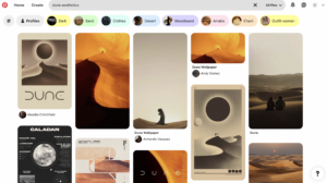
Looking through a Pinterest board, I’ve identified main elements that I would implement in my project, which was the sun and the desert. It was also important for me to work on the colors of the design.

Since, the coded image of the Dune universe was not as realistic as in the movie, I decided to add a pop art element of kind of vintage picture of the scene. So, I additionally added loop of the points.

What I’m Proud of
//desert imitation & animation
 fill ('#ea941b')
 stroke('#dd691e');
 strokeWeight (1);
   
 for(let x=25;x<=550; x += 100){
   for (let y=190;y<=510; y += 15){
     if(mouseIsPressed){
       fill(238,159,28);
       arc(x,y,50,15,PI,0)
   }
     else {
       arc(x,y,50,15,0,PI);
     }
   }
 }
   
 for(let x=75;x<=550; x += 100){
   for (let y=190;y<=510; y += 15){
     if(mouseIsPressed){
       fill(216,99,29);
   arc(x,y,50,15,0,PI);
      } else {
       arc(x,y,50,15,PI,0)
     }
   }
 }

I’ve been struggling a lot with how to visualize the dunes in the code. After experimenting with the arcs, I switched from noFill arcs to filled ones, cause they looked more on point in the visuals. Moreover, I wanted to animate the arcs, so I used conditionals to create some difference in the forms and image of moving dunes in the desert. I feel like I could accomplish my vision, even though it took a lot of trials.

Sketch

Reflection

In the future development of this project, I would like to work more on the image of the dunes, to make them more realistic and appealing (so it would be easier to recognize theme of the Dune). I think this could be accomplished through Bezier curves or experimenting with another forms of arcs. Moreover, I would work on interactivity of the project, since even though it is now interactive in some way, I would like to focus specifically on resemblance of the desert environment, such as wind moving the sand or just the sunrise and the sunset. In addition, I think color scheme could be improved, by adding more gradients.


Assignment 2 – Interactive Mandala

Inspiration

For this assignment, the task was to make a simple work of art using loops. My first thought was that  I wanted to make something that resulted in a visually appealing pattern of some sort (with an element of interactivity as well). As I was brainstorming ideas, I scrolled through my Pinterest boards and came across various dot mandala designs. The intricate patterns and vibrant colours of these mandalas instantly caught my eye, inspiring me to create a digital version that would capture the same sense of symmetry and beauty. I wanted to explore this concept – an effect where symmetrical shapes radiate out from a center point, creating an interesting pattern.

Concept

The core concept behind my project is to also incorporate a kaleidoscope-like pattern that keeps rotating, creating a mesmerizing visual effect. I aimed to use symmetrical shapes (circles) and a gradient of colors to mimic the aesthetic of traditional mandala designs. To add an interactive element, I decided to map the number of segments to the horizontal position of the mouse, allowing viewers to alter the complexity of the pattern by simply moving their cursor. This interaction not only makes the art more engaging but also gives viewers control over the visual complexity, making each interaction unique.

Implementation

Here’s the final product!

I started by setting up a square canvas with a black background to make the colours stand out. The origin was moved to the center of the canvas to simplify the rotation and placement of symmetrical shapes. I used two nested loop to create the series of symmetrical shapes (circles in this case) radiating from the center. Each shape is rotated by an equal angle to maintain symmetry. The number of these symmetrical segments is dynamically adjusted based on the mouseX variable, adding interactivity.

Something I explored on my own was how to use the rotate function and incorporated it for two purposes in the artwork:

  • To rotate the entire canvas continuously over time, creating the overall animation effect of the whole mandala rotating.
background(0); // black background
  translate(width/2, height/2);  // moving origin to the center of the canvas (instead of top left corner)

  // Rotating the entire canvas to animate the mandala
  rotate(frameCount * 0.6);  // rotating by frameCount * 0.6 to make the animation and control speed (since frameCount increases with every iteration of the draw() function)
  • To manage the placement of individual symmetrical segments of the mandala.
// Mapping the mouseX position to the number of symmetrical segments (between 6 and 30)
  numShapes = int(map(mouseX, 0, width, 6, 30));
  // print(numShapes);

  let maxRadius = 250;  // max radius (distance from center of canvas till edge) for shapes

  // Loop to create symmetrical patterns
  for (let i = 0; i < numShapes; i++) {
    push(); // saving current drawing style settings and transformations
    rotate((360 / numShapes) * i);  // rotating each shape by equal angles

While working on this project, I also learned to use the map() function, which became necessary for adding dynamic and interactive elements. Initially, I found it challenging to map values between different ranges, but experimenting with map() helped me control aspects like the number of segments, shape sizes and color gradients. By mapping the mouse position to the number of segments, I could easily adjust the pattern’s complexity, and mapping distance to hue allowed for smooth color transitions.

Another thing I did differently was use the HSB (Hue, Saturation, Brightness) colour mode instead of traditional RGB values or HEX codes. This was mainly done to create the smooth gradient that changes as you go outwards in the mandala. By mapping the shapes’ distance from the center to the hue value, I achieved a transition in colour that adds to the overall visual appeal.

Reflections and Further Improvements

Working on this project taught me a great deal about the creative potential of code. It also deepened my understanding of how symmetry and rotation can turn simple elements into complex, visually appealing patterns. Beyond the technical skills, I discovered the importance of experimentation and iteration in the creative process, allowing me to refine my ideas to achieve the outcome I was looking for. For this project, I used circles to keep the design simple, but to achieve a more authentic mandala feel, I might want to incorporate other shapes of varying sizes in the future. This would add complexity and better mimic the intricate details often seen in traditional mandala designs. Overall, this project was a rewarding experience that broadened my perspective on combining art and coding.

Assignment 2: Fuzzy Brain

Concept:

In this project, I draw inspiration from the geometric artworks discussed in: COMPUTER_GRAPHICS_AND_ART_Aug1977.  My goal with this project was to explore the potential of ‘for’ loops to generate grids of symmetrical, curved lines, creating a structured, rhythmic design. However, I hoped to disrupt this symmetry by introducing heavy distortion, with the intention of simulating the visual effect of mind fog. The resulting artwork presents a uniform arrangement of curves that distort and displace when the cursor hovers over it, evoking a sense of disorientation and randomness—mirroring the feeling of brain fog.

Highlight:

I’m particularly proud of the distortion animation I added to this sketch. By utilizing the dist() function, I created interactive conditions that are activated when the mouse hovers over the Bézier curves. Using an if statement, I introduced random increments within a range of negative to positive values to the variables used as arguments for the original Bézier curves. This approach helped change the positions of the curve lines at random, adding distortion and creating the brain fog effect that I intended. Additionally, reducing the frame rate helped give the animation a 90’s cartoon effect aesthetic.

// mouse hover animation
    if (dist(mouseX, mouseY, x, y) < 300) {
      // displace lines randomly
      x1 += random(-20, 10);
      y1 += random(-30, 10);
      x2 += random(-40, 10);
      y2 += random(-50, 10);
      x3 += random(-60, 10);
      y3 += random(-70, 10);
      x4 += random(-80, 10);
      y4 += random(-90, 10);
    }
    
    bezier(x1, y1, x2, y2, x3, y3, x4, y4);

Reflections:

While working on this project, I experimented with creating symmetrical grids and distorting the curves to simulate mind fog. Initially, I focused on generating the grids using for loops, but as I introduced interaction through mouse hover effects, I realized how much potential this had to enhance the dynamic nature of the piece. The use of dist() and if() functions to trigger random distortions worked well in creating a more immersive experience.

Looking back, I think there’s room for improvement in making the distortions more fluid and gradual. Currently, the randomness of the distortions can feel abrupt, so in future iterations, I would explore using easing functions to smooth the transitions.

Reading Reflection – Week 2

I found myself enjoying Reas’s lecture quite a lot more than I thought, and a big part of that was the endless visual examples of works of art that he showed rather than told. It was interesting to see such diverse forms of art, and some pieces even made me question what art actually is. Some of the pieces honestly just looked like close up clumps of hair (3:08) or balls of lint (10:19). Maybe it was a bit too random for my personal liking. Overall, it was still really cool to see just how much randomness there was, which made me think of how different randomness would be when it comes to humans vs computers. Needing random numbers in our code would be easy work for a computer–(and it would actually be random), meanwhile if I was told to choose a bunch of random numbers, I would choose them based on numbers I like and numbers that are special to me. Since I would be more focused on the significance of the number rather than its randomness, it would end up not being very random.

Going back to computer randomness, I feel like I learned a lot more about the structured potential computers have at creating arts of randomness. Take for instance the black and white squares that changed color depending on heads or tails. It looked pretty alright being that random, but just by adding symmetry, it completely transformed the look of the art, and I enjoyed that a lot more than how it was before. It made me realize that just because it’s random doesn’t mean it has to be messy.

The overall concept of randomness and chance when it comes to creating art is still a new concept to me, but I find it to be interesting, and I’m intrigued to see just how much you can do with randomness and loops combined. I would like to incorporate random color and random movement into my work because 1) I think it would be really cool to see what unexpected and/or expected results come from it and 2) all of my projects would look related if I didn’t let randomness take over. I think the right balance between total randomness and complete control is over how serious things are. In the context of Intro to IM projects, I think the freedom to allow randomness to dominate is fine for the creative visuals, while control is more necessary for coding and the order of the code. In terms of using randomness to create everything, I question just how much it would be considered art if everything stemmed from a computer’s algorithm and you having no control over it. It reminds me of the debate over whether AI art is considered art.