Weekly Reflection _ #8

While reading Emotion and Attractive by Donald A. Norman, a lot of ideas and thoughts were going through my head. Most of what he spoke about made me question the importance of design, practicality, efficiency, and how current feelings affect the decisions we make and actions we take on the spot. One of the first things he mentions is how colorful screens were not necessarily helpful in terms of effectiveness but it gives him a sense of pleasure and hence, he does not want to remove them. He later highlighted that we have evidence that pleasing things work better and produce a more harmonious result. Although I’m not a hundred percent sure what determines a harmonious result in Norman’s context, I interpreted his statement based on the following: Design and adding pleasurable aspects to a product does not necessarily affect how the product itself works, but it affects our interaction with that product that leads to better results. The more attractive a thing is, the more emotionally we connect with something, and the more improvements we can witness in the results. For example, let’s assume I have two different screens with the same efficiency and speed level. If I’m using a small screen to code a game or whatever the project is, the results would be different if I’m using a bigger one. There are many ways to explain the reason for this but the reasons that are not very much discussed in Norman’s text is our feelings towards the product that lead to different results. Based on my interpretation, a bigger screen would be easier for me to program a project, hence, I would feel more motivated to work on it, knowing that I wouldn’t be struggling much with the visibility and display.

Another point Norman highlights in his text is how nervousness and negative affect might change the overall results. I thought of discussing this point because I was able to relate to it on different levels. There is a reason why we need breaks between studying and coding or whatever tasks that require a great amount of focus and mental capacity. In my experience, when I perform such tasks, I see myself drowning back to the same idea or solution I can see. It feels like my brain can not detach from the initial solution, hence, that could create anxiety and overthinking, which ultimately leads me to poor results because I did not have the mental capacity to think out of the box or think differently. When we take breaks, release some tension, and come back with a more positive effect, we think more creatively and possibly see a different way to implement something, leading to better results.

Week 8 – Let’s Blink

Concept

This project is inspired by the moustache switch example. In the example, the creator used conductive materials to mimic moustache and made them into a switch. Then, I think of the very first Arduino program everybody learns: Blink of the LED. A idea comes into my mind: why don’t we actually blink when the LED blinks? Therefore, I decide to follow the same manner of the moustache switch to make a blink switch.

video_blink

Highlight

I think the highlight of this little project is the attachment of the wires to the conductive materials and to the eye muscles. It is critical to decide which part of the eyes to attach the conductive pieces to so that they are sensitive enough to close the circuit when blinking.

Whenever the user blinks, the movements of the muscles will make the to conductors touch each other, making it a closed circuit. 

Reflections and Improvements

I think generally the project is interesting and can be expanded if more coding is added and more complicated sensors are used. It explores the possibilities of other parts of the body and movements as switches other than just hands. The project can be further improved by using better conductive materials that can be attached better to the skins with more compatible sizes to make the interaction more smooth and create better user experience.

Week 8 | Create an unusual switch: “Light up your step” Assignment

Light up your step:

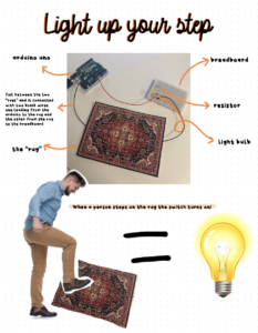
The “Light Up Your Step” assignment involves creating a foil-based light switch integrated into a rug that activates when someone steps on it. When pressure is applied to the mat, the foil switch makes contact, turning on the lights connected to the breadboard. This concept aims to create a welcoming and surprising element for guests entering your living room, as the lights switch on when they step on the rug (if made into a real rug).

This assignment took some time to conceive, but during a visit to my home over the weekend, I found inspiration. Upon arriving in my living room, I was inspired to create something based on rugs. I thought that integrating this into my project would be a fantastic idea, and it turned out to be quite appealing.

IMG_5050 = demostration video of the rug being stepped on

Structure

The structure of the project involves printing two images of a rug and sandwiching a strip of foil between them. I attached one wire from the Arduino to the foil, and the other black wire to the foil, connecting them to the breadboard. The wires are secure with tape.


Reflection

As this is my first time working with electrical components like Arduino, I’m feeling excited and enthusiastic about diving into this new experience. Despite my initial lack of knowledge, I took the time to revisit the required readings and carefully studied Professor Michael’s notes to reassemble the light switch correctly. I’m genuinely proud of how I interpreted the assignment and came up with a unique and enjoyable concept. I’m looking forward to the journey ahead!

week 8 – reading response

I think it’s especially interesting how wide the breadth of psychology, which is profoundly underpinned by Norman’s “Emotion and Design: Attractive Things Work Better”, really is. Norman’s emphasis on emotions highlights the significance of aesthetics in enhancing user functionality, and this is all the more important to note is since such a concept really challenges the conventional belief that aesthetics should take a backseat to functionality in design. Her specific delineation regarding affect, aesthetics and functionality makes sense and the reason why it was illuminating was because this wasn’t something I consciously and actively thought about when handling a product. It’s completely natural for positive affect to increase tolerance for minor flaws in user functionality because we are in a more forgiving headspace for such a situation. However, negative affects eliminate this state of mind, hence it makes more sense to prioritise user functionality over aesthetics in products that warrant negative affects.
This same concept can be applied to Margaret Hamilton’s groundbreaking work as exemplified in the second reading whereby it highlights the clear intersection between psychology and user functionality in high-stake situations. Her meticulous software development for the Apollo mission integrated rigorous testing and fault tolerance to ensure usability under extreme conditions i.e., conditions that are prone to evoking negative affects. This ultimately aligns with the psychological principles discussed in Norman’s text, illustrating that the design of critical systems must consider users’ emotional states and its subsequent impact on usability.

Assignment 8 – “Don’t steal my Arduino UNO”

Concept

For this assignment, I tried to come up with a functional switch that could be potentially used in real life. As it was my first time working with electronics, I found it very interesting to explore different tools and materials that could be used in the project.

After some consideration, I decided to create a theft detection switch that is triggered when an object is taken out of the place. One of the complications I had to solve was to make a switch more convenient by not connecting the wire directly to the object that was being tracked.

Technical structure

For this switch, I used conductive fabric, which was put on the back of the object. I secured two wires on the table, one of which was connected to an Arduino Uno, while another was connected to a solderless breadboard. When an object is lying on the wires, the circuit completes and the LED lights up. The moment you take the object from its place, the LED goes out.

Demonstration

Link to the video: Switch_demostration

Reflection

I really enjoyed working with electronics, and I see how many things can be done using them. I’m glad I managed to find a practically usable switch that could be potentially used in future work. I’m looking forward to learning more about Arduino and creating more and more sophisticated projects.

week8.reading – Attractive Things Work Better & Her Code Got Humans on the Moon

Attractive Things Work Better – Donald A. Norman

In this preview of Don Norman’s forthcoming book, Norman writes about the implications of pleasurable and attractive design on human interaction and functionality with certain elements. His first example of the three types of teapots concisely demonstrates different balances of the two main aspects of an object’s design and functionality. Whilst some objects might have a ‘negative affect’, (negative visual response to an object being unattractive), they might still be completely functional. Nevertheless, Norman’s research suggests that these negative responses can “make simple tasks more difficult” and, conversely, with a positive ‘affect’ “difficult tasks more simple.”

By the end of the article, I have mostly agreed with Norman, however, I believe that there are a few considerations he did not mention. For the most part, I agree that if an object is ‘attractive’ and equally functional, it is far better and more understandable than one that is ‘unattractive’ yet equally functional; this idea can stem back to the previous reading of the Design of Everyday Things. Nevertheless, what Norman did not mention is that in certain circumstances, humans prefer a challenging design. For instance, physical puzzles can come in many shapes and forms but are usually confusing to humans at first sight, which could be considered ‘unattractive.’ Nevertheless, most people would prefer to attempt the challenge of solving the said puzzle and try to work through the solution. Of course, these things are designed to be difficult, but they might contain a simple solution. This would support the idea that a challenging design can complicate the tasks at hand, however, depending on the context, I believe that this could be beneficial and even pleasurable to us humans.

Her Code Got Humans on the Moon – Robert McMillan

In this WIRED article, McMillan writes about Margaret Hamilton, the woman who wrote code for the first-ever Apollo mission, which brought humans to the moon. In the article, numerous quotes from Hamilton are given, describing her experience in creating the highly sophisticated program and how she managed to do it.

I found it highly interesting learning that a young mother, working for MIT, was able to accomplish and build such a significant part of the world’s history, and it just goes to show that you can do anything you put your mind and heart to. Due to the widespread stereotypes about ‘men ruling the tech industry,’ it is refreshing and intriguing to learn that women played a much more significant role than most of us realize in the creation of the so-called “tech-run world” that we live in. The article also emphasizes the importance of error prevention, which was a significant issue on the Apollo 8 mission when all the navigation files were deleted due to the program P01 being launched. This instance reminded me of a video I recently saw which described why Japanese cars are considered more reliable than German cars. It is because Japanese engineers consider all cases and expect that the users won’t follow every instruction by law, where as German engineers construct cars that will work perfectly well if used as intended, but can quickly break if misused. Similarly, as a programmer and software engineer, I believe it is important for programmers to consider all cases, however as we know by the frequent bugs and crashes we experience, we all make mistakes.

Blink and You Miss it

Approach and Concept:

After spending a lot of time brainstorming ideas – I found one I was particularly proud of. The phrases “it happened in the blink of an eye “, “blink and you miss it” etc. are often used to talk about phenomena that happen really quickly. The literal meaning behind them is that it may as well happen that the phenomenon will start and end in the time it takes for you to finish a blink – leaving you with nothing to observe.

So how about we build a system that only does ‘something’ when you close your eyes? Thus now, every time you blink, or close your eyes – you miss ‘it’. You never actually have the experience but everyone around you does. I was personally satisfied with the concept but it was quite difficult to actually implement it given the very limited range of motion of our eyelids. Nonetheless, I ended up succeeding in doing so:

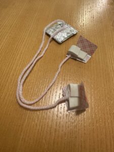
The mechanism that connects the switch to the eyelid movement. (double sided tape connects the thread to your eyelid. a piece of cardboard covered with aluminum foil and weighed down further using a coin serves as the conducting bridge.)

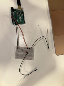
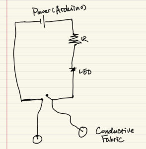
The simplified circuit

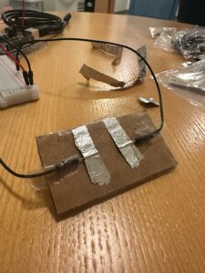
The switchboard. Two wires are taped to a piece of cardboard and aluminum foil is used to increase the surface area of conduction.

Demonstration:

Highlights:

The part I’m the most proud of in this project is devising the exact mechanism for the switch to work. Unlike the p5.js coding assignments, arduino and physical hardware is something I have no experience in – so this was my first time actually working with these elements and I had a lot of fun finding solutions to problems as they came up.

For example, just taping the wires to the cardboard and using the aluminum foil as the switch worked – but it wasn’t as reliable due to the uncertain points of contact between the wire ends and the foil. I managed to remedy this by putting a layer of aluminum foil on the wire ends.

Next, the switch mechanism itself didn’t have enough weight so it wouldn’t rest properly on the wire ends. I changed this by putting a small coin as to add some weight to the mechanism – and this ended up working spectacularly.

Reflections and Future Work:

I’m proud of several decisions I made in the design of this switch as I stressed earlier. However, there are quite a few things I would do differently if I had to redo the project:

First, I would find a more effective way to connect my eyelids to the switch. The current method using double-sided tape works but is very inefficient. I am still unsure as to how I would do this though.

Second, the switch itself is fairly robust to perturbations – but I believe it can be improved further aesthetically and functionally. I can use a more stable base and find better configurations to place the aluminum foil such that it covers the best area possible.

Lastly, since all my time was spent focusing on the switch, my actual design for the lights can definitely improve by a lot. I would like to add more LEDs to make my design prettier.


Week 8 Reading Response

On Norman and the Importance of Attractive Design:

In this follow-up reading we had to Norman’s previous work – Norman feels the need to clarify that when he didn’t mention aesthetics in his previous writing “The Design of Everyday Things” he didn’t put functionality above aesthetics, but rather on the same level. I never got the impression this was the case, but nonetheless, it’s a welcome clarification.

Throughout the reading, Norman stresses the synergy of affect and cognition – not only are emotions driven by cognition,  cognition is also influenced by affect. I particularly love the rigorous way in which Norman points out how aesthetics can make things more ‘functional’ by themselves. Moreover, going into this reading, I did not expect to read an analysis of how mental/emotional states affect our mental processing – Norman’s discussion of depth first processing etc. – a pleasant surprise as this is a topic I have read about before!

On a more practical level, working to make your designs pleasant and relaxing for the user (or in general being conscious of the emotional state we want the user to be in when experiencing our work) seems extremely important. I have personally experienced this when even though my website designs were often technically better than my peers, I would myself prefer theirs because they looked pretty. Moreover, (though not recommended) even implementation flaws can be hidden by an aesthetic design – but are glaring when your designs are not aesthetic. From the perspective of psychology, perceptual sets, and first impressions of an aesthetic design deciding the overall experience more than the technical details seems obvious too!

I want to end this reflection with this beautiful quote by Norman: “True beauty in a product has to be more than skin deep, more than a facade. To be truly beautiful, wondrous, and pleasurable, the product has to fulfill a useful function, work well, and be usable and understandable”


On Hamilton’s Contributions to the Space Mission:

Margaret Hamilton’s narrative with the Apollo program is not just a testament to her pioneering efforts but a remarkable moment in the history of software. On a personal level, it echoes some sentiments I’ve personally experienced in my coding journey.  For example, the evolution of software from an afterthought to a critical component during the Apollo moon landings parallels many projects I’ve encountered, where the true importance of effective software design only shows up later.

Moving on, this deep-dive into Hamilton’s contributions also reveals an essential trait in software design: predictive error handling. I can recall several instances in my own projects where I had neglected potential edge cases. When a user unexpectedly entered data in a manner I hadn’t anticipated, causing the software to crash. While this is an important concept drilled into students who learn coding today – I imagine the roots of how it came to be thought of as a fundamental concept can be traced back to Hamilton. Additionally Hamilton’s championing of asynchronous processing in the Apollo computer also sounds way ahead of the time they were operating in and is incredibly impressive.

In sum, Margaret Hamilton’s journey with the Apollo program, filled with foresight, innovation, and resilience, is not just historical but a beacon for every coder. Her story doesn’t just echo the challenges and triumphs in the software domain but resonates with the intricacies of my personal coding experiences. It’s a reminder that in the realm of coding, challenges are but stepping stones to innovation.


Week 8: Lighting Up A Cigarette

A video of my switch is uploaded here.

I complete the circuit and a red light switches on by pressing two cigarettes together and open the circuit and turn off the light by pulling them apart. I taped the connecting wires to the cigarettes. A picture of the circuit is below:

The circuit itself is simple but I like the concept behind it. In smoking circles, if somebody doesn’t have a lighter, a friend will offer to light their cigarette by putting their cigarettes together. It’s surprisingly intimate because the two people have to put their faces quite close to each other for the trick to work. You pause in the moment, and then your cigarette flares bright red, and you pull back. I really liked making this circuit because it resembles that smoking experience pretty closely. There’s something meaningful in it to me, in watching the little red light, which indicates the cigarette lighting, burn and disappear by putting the cigarettes together and pulling them apart. I think it’s a pretty cool switch.

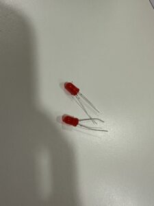
Unfortunately, I burned two red lights out before getting a friend to help me figure out that I needed a resistance wire with a higher resistance. Their remains are pictured below, RIP:

All in all, it’s simple. And it requires the use of my hands but I liked the concept too much to let it go. I want to upload this for now but I plan to ask Professor Riad to help me develop the switch a bit more for the purposes of this assignment.

(Also I am just recognizing how often cigarettes have played a role in my assignments this year. Hm.)

week8.assignment – Creative With Switches

Concept

Since this is the first time I get to work with electric components, specifically the Arduino Uno, I am excited to explore all the possibilities with physical computing and circuit design. For the first assignment using the Arduino, we were tasked to come up with a creative switch, a physical component that opens and closes the circuit, without the use of our hands. The concept that I came up with was to create a switch that completes the circuit when you bend your arm in and flex your bicep.

Process

Accomplishing this switch was slightly more challenging than anticipated, At first, I realized that the wires given in the starter kit were not long enough, to comfortably create connective pads. Additionally, I tried to use conductive fabric, however, the tape I had would not hold it in place properly. Finally, I decided that it was best to use two aluminum foil pads for creating the connection. A video of the working switch is attached below.

VIDEO FOR SWITCH

Reflection

Overall, with my limited knowledge of circuit design and lack of certain supplies, I believe that I could have created a better switch. Nevertheless, since this is my first time working with these concepts, I am proud of the switch I created, and I believe it is a fun way to connect a circuit. On a side note, even though the circuit was only 5V, it still gave me a weird sensation on my skin as the current was trying to pass through me. I look forward to working on more complex projects involving the Arduino.