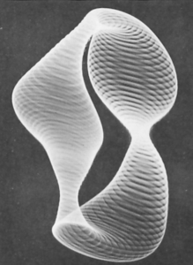
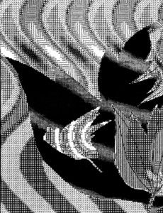
After looking at the images, the first image stuck out to me, specifically, the lack of order in the image. In my own, I added color to highlight the disorder as well as add disorder with the contrast between the colors.
For this week’s assignments, I had many different ideas on what I wanted to do, but instead of exploring the many ideas, I found myself playing with this one for a long time, making small changes to see what it would do to the image, changing the size of the rectangle, the color of the fill, background, and stroke. While working, I was listening to music, and it was so satisfying to watch the music somehow sync with the visual image, which I think could also make for an interesting future project.
While I previously used the push and pop function for a very simple result, understanding the function, was important as changing the angle component of the function could make a significant change to the final result. In the future, I would aim to make it more 3-D looking to get a result like or even add a shape in the background to give a layered look as seen in the first image: 

