Self Portrait using Processing

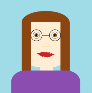
Originally, the wannabe artist in me wanted to make my self portrait look as organic and realistic as possible. But, when that failed, it was very helpful for me to break down every part of the portrait into certain shapes that would suit specific features. I used the quad function for the face shape for a more structured jaw, a combination of rect and ellipse for the hair and body, and so on.

Although challenging, I felt like this assignment helped me learn more about the different functions I could use in Processing, and hopefully next time I can figure out how to use beginShape.

Here’s the code:

float hairR;
float hairG;
float hairB;
PImage lips;

void setup(){
  size(500, 500);
  lips = loadImage("lips.png");
  hairR = 139;
  hairG = 69;
  hairB = 19;
  
} 
  
void draw(){
  
  println ( mouseX + "," + mouseY );
  //background(255, 200, 200);
  background(160,220,232);
  noStroke();
  
  //head
  fill(hairR, hairG, hairB);
  ellipse(250, 120, 258, 120); //head top
  fill(255, 238, 212);
  quad(121, 120, 379, 120, 379, 340, 121, 340);
  quad(121, 340, 360, 340, 300, 360, 200, 360 );
  noStroke();
  fill(hairR, hairG, hairB);
  rect(121,120, 50, 350); //121 + 35 
  rect(345-15 ,120, 50, 350);


  stroke(0);
  strokeWeight(2);
  
  pushMatrix();
  translate(250, 250);
  
  
  fill(250, 200, 200);
  stroke(0);
  strokeWeight(1);
  translate(0,20);
 
  //eyes
  fill(255);
  ellipse(-50,-80,35,35);
  ellipse(50,-80,35,35);
  fill(190, 102, 0);
  ellipse(-50,-80,20,20);
  ellipse(50,-80,20,20);
  fill(0);
  ellipse(-50,-80,10,10);
  ellipse(50,-80,10,10);
  fill(255);
  ellipse(-45,-80,5,5);
  ellipse(55,-80,5,5);
  
  //glasses
  noFill(); 
  stroke(0);
  strokeWeight(2);
  ellipse(-50,-80,60,60);
  ellipse(50,-80,60,60); 
  
 //lips
  image(lips,-50,-20, width/5, height/6);
  
    popMatrix();
 
 //glasses2
 strokeWeight(2);
 line(230,190, 270,190); 
 
 //nose
 stroke(250, 220, 180); 
 triangle(250, 230, 280, 250, 230, 250);

 //neck
 fill(255, 238, 212);
 rect(220,360,70,80);
 
 //body
 fill(140,77,176); 
 stroke(140,77,176);
 rect(65, 440, 75, 120);
 rect(150, 380, 200, 120);
 rect(360, 440, 75, 120);
 ellipse(140, 440, 150, 120);
 ellipse(360, 440, 150, 120);
 
}

void mousePressed(){
  hairR = random(255); 
  hairB = random(255);
  hairG = random(255);
}

And the masterpiece:

Her Code Got Humans On the Moon – And Invented Software and Attractive Things Work Better


Her Code Got Humans On the Moon – and Invented Software

This Article talked about Margaret Hamilton, aspects of her life and her struggle as a working mother in a predominantly male industry. The most interesting part of the article, to me, was when Hamilton found an issue which made the simulator crash when she was “toying” with it. This reminded me of something that our professor encourages us to do with our project and it was said more than two times (which is I remember it)- and it is to stress test our projects. To work them over and over again until we find an error and fix it. We shouldn’t just assume that things are never going to happen, because they will and they might, at the wrong time, just like it happened with Jim Lovell.

Attractive Things Work Better

This reading’s whole focus was around the three levels of processing: Visceral, Behavioral and Reflective and how they affect human emotions- specifically when it comes to the design of products. The reading started off with a very funny story which made it clear that emotions when it comes to design is a “human” thing and not specific to ethnicity or race. Then it went on to talk about how people who are happier generally have no problem with minor inconveniences and will ignore them and be as positive about the situation as they can be. This means a human being under stress will not be able to think clearly if one thing goes wrong and are bound to crack/ break down and lose rationality. The example of doors at the cinema is very scary, but an important one. It goes back to thinking about the precaution in the design of buildings and items like the fire extinguisher. Making them functional so people can use them when under stress and fear is very important, but also making them look nice so the aesthetics don’t get ruined.

Self Portrait

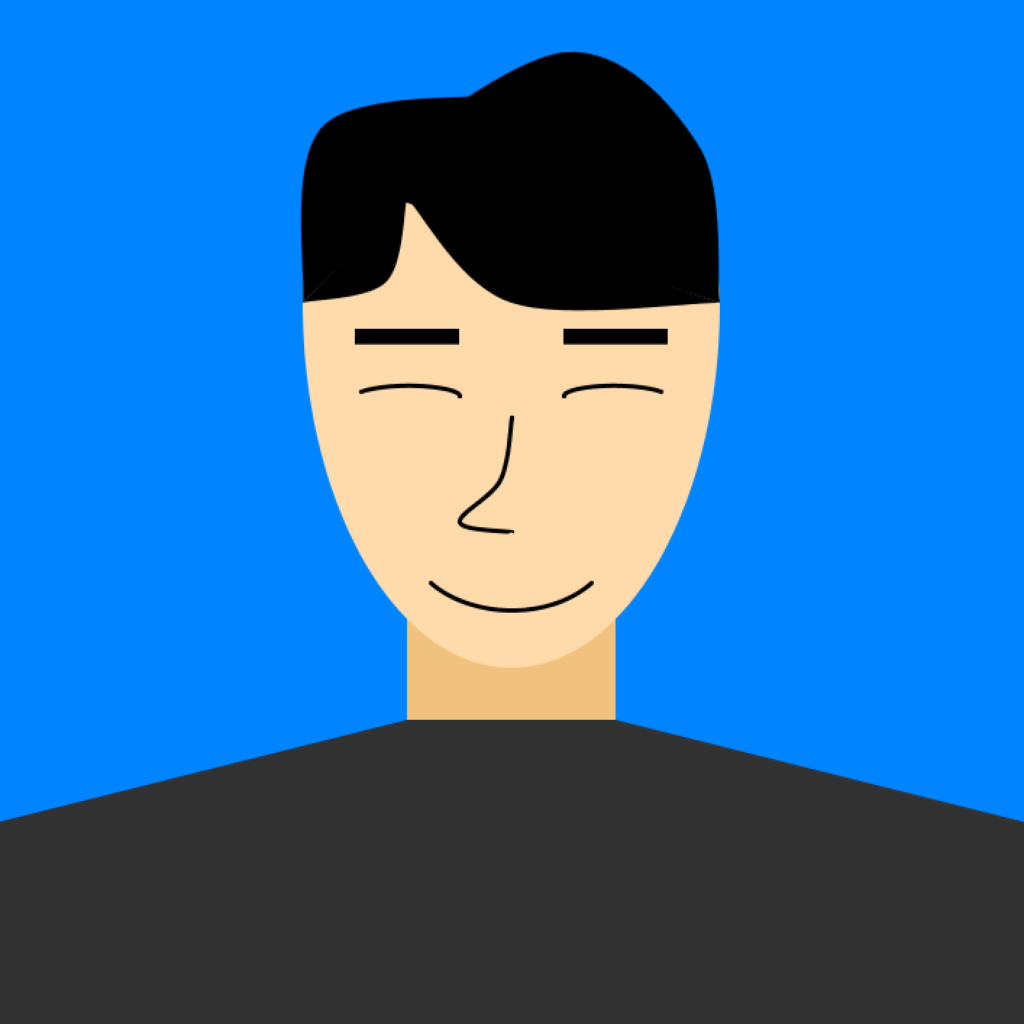
Since the self-portrait needs a lot of different shapes other than the given functions such as rect() or ellipse(), I have played around with the beginShape() and endShape(), utilizing vertex and curveVertex to formulate the curves. I have also tried to use the rotate() function, but since the rotate() function rotates the art board and not the configured shape, I was stuck on creating figures using the built-in vertex functions. The image below is the self-portrait I have created following with the source code on Processing.

color backgroundColor = color(0,132,255);
color black = color(0, 0, 0);

color skin = color(255, 219, 172);
color skinDark = color(241,194,125);

int unit = 72;

void setup() {
  size(720, 720);
}

void draw() {
  background(backgroundColor);
  noStroke();
  strokeWeight(1);
  
  // *NECK
  fill(skinDark);
  rect(unit*4, unit*6, unit*2, unit*1);
  
  // *FACE
  
  fill(skin);
  arc(unit*5, unit*3, unit*4, unit*7, 0, PI);
  
  // *UPPERHEAD
  fill(skin);
  arc(unit*5, unit*3, unit*4, unit*4, PI, TWO_PI);
  
  //*HAIR
  fill(0);
  beginShape();
  curveVertex(unit*4, unit*2);
  curveVertex(unit*4, unit*2);
  curveVertex(unit*3.8, unit*2.8);
  curveVertex(unit*3, unit*3);
  curveVertex(unit*3, unit*3);
  endShape();
  
  beginShape();
  curveVertex(unit*4, unit*2);
  curveVertex(unit*4, unit*2);
  curveVertex(unit*5, unit*3);
  curveVertex(unit*7, unit*3);
  curveVertex(unit*7, unit*3);
  endShape();
  
  beginShape();
  curveVertex(unit*3, unit*3);
  curveVertex(unit*3, unit*3);
  curveVertex(unit*3.2, unit*1.3);
  curveVertex(unit*5.05, unit*1);
  curveVertex(unit*5.05, unit*1);
  endShape();
    
  beginShape();
  curveVertex(unit*3.4, unit*1.85);
  curveVertex(unit*3.4, unit*1.85);
  curveVertex(unit*5.5, unit*0.6);
  curveVertex(unit*6.8, unit*1.5);
  curveVertex(unit*7, unit*3);
  curveVertex(unit*7, unit*3);
  endShape();
 
  // *EYEBROW_LEFT
  beginShape();
  vertex(unit*3.5, unit*3.25);
  vertex(unit*4.5, unit*3.25);
  vertex(unit*4.5, unit*3.4);
  vertex(unit*3.5, unit*3.4);
  endShape();
  
  // *EYEBROW_RIGHT
  beginShape();
  vertex(unit*5.5, unit*3.25);
  vertex(unit*6.5, unit*3.25);
  vertex(unit*6.5, unit*3.4);
  vertex(unit*5.5, unit*3.4);
  endShape();
  
  // *EYE_LEFT
  stroke(0);
  strokeWeight(3);
  fill(skin);
  arc(unit*4, unit*3.9, unit, unit*0.2, PI+0.5, TWO_PI);
  
  // *EYE_RIGHT
  arc(unit*6, unit*3.9, unit, unit*0.2, PI, TWO_PI-0.5);
  
  //*NOSE
  beginShape();
  curveVertex(unit*5, unit*4.1);
  curveVertex(unit*5, unit*4.1);
  curveVertex(unit*4.9, unit*4.7);
  curveVertex(unit*4.5, unit*5.1);
  curveVertex(unit*5, unit*5.2);
  curveVertex(unit*5, unit*5.2);
  endShape();
  
  // *MOUTH
  arc(unit*5, unit*5.2, unit*2, unit*1.5, 0.7, PI-0.7);
  
  // *BODY
  noStroke();
  fill(50);
  beginShape();
  vertex(0, unit*10);
  vertex(0, unit*8);
  vertex(unit*4, unit*7);
  vertex(unit*6, unit*7);
  vertex(unit*10, unit*8);
  vertex(unit*10, unit*10);
  endShape();
}


“Emotion & Design: Attractive things work better”

There are two ideas approached by this reading that I believed can really improve my strategies as a designer.

The first idea is that attractive things tend to perform better than an ugly thing. To support this claim, the author gives the example of an experiment done in Japan about pretty ATMs having a higher positive impact on people than uglier ATMs. After knowing this, now I realized the importance of the aesthetics of things and how I can use the tendency that human beings prefer pretty things in my favor.  There have been times in this class that even though I  have spent hours working in complicated coding projects and I just don’t feel proud of myself and sometimes I do easy coding things that perform well easily and It does not take a long time to do. Going back to these projects, I realized that the projects that I made that I feel proud of myself to tend to be the ones that have an aesthetic outcome and the ones that I didn’t feel proud were not good looking projects. This teach me that maybe If I ever want to sell a product the aesthetic is as important as the function of the product.


The second idea is that anxiety help to focusing but not creativity, This is a mistake that I tend to do to leave things to the end. Now, that I know this, I have decided to at least design my projects when I am in a good mood and happy because as it is mention in the reading this will help me to improve my brainstorms for the project.

My Self Portrait Created in Processing

Oh boy here it is!

Here is the code

int x, y;
float x2,y2,speedX, speedY;

void setup () {
  size (700, 850);
  x= width/2;
  y= height/2;
   x2 = 0;
 y2 = 0;
  speedX =2;
  speedY =5;
}

void draw() {
  background(255);
//  fill(255,150,0);
//quad(180,340,300,340,300,400,300,460);
//quad (180,640,300,300,300,400,600,460);
//fill (100, 205, 30);
//ellipse( 200, 500, 300, 200);
//ellipse(x, y, 100, 100);

//neck
fill(245,230,195);
  stroke(245,230,195);
  quad(230, 600, 500, 600, 470, 900, 180, 900);
  
  fill(220, 187, 153);
  stroke(237, 187, 153);
  quad(150, 700, 500, 700, 400, 800, 230,780);


//face
  fill(255,235,203);
  stroke(255,235,207);
  quad(150, 175, 600, 175,540, 680, 100, 680);
  quad(125, 225, 150, 175,175, 750, 100, 680);
  quad(125, 225, 175, 750,540, 680, 150, 680);
  quad(600, 175, 600, 300,540, 680, 400, 760);
  quad(150, 175, 600, 175,400, 760, 175, 750);


//eyes
  stroke(0);
  fill(255, 240, 240);
  arc(240, 350, 70, 70, PI, PI+PI);
  fill(255, 240, 240);
  
  arc(430, 340, 70, 70, 0, PI+QUARTER_PI, OPEN);
  arc(240, 560, 120, 0, PI+QUARTER_PI, PI);

//pupils
  fill(0);
  ellipse(430, 345, 15, 15);
  ellipse(240, 335, 15, 17);

//nose
  fill(255, 230, 211);
  stroke(255, 230, 211);
  quad(x-40, y, x-20, y- 130, x+10, y-120, y-60, y+60);
  //nose
  fill(245, 210, 200);
  stroke(245, 210, 200);
  quad(320, 475, x+50, 465, x+10, y-120, y-60, y+60);
  //nose
  fill(235, 200, 190);
  stroke(235, 190, 190);
  quad(320, 500, 320, y+40, 400, 460, 380, 500);
  //nose
  fill(255, 230, 211);
  stroke(255, 230, 211);
  quad(x-40, y+100, x-20, y- 130, x+10, y-120, y-60, y+60);

//left eyebrow
  fill(147,81,22);
  stroke(147,81,22);
  quad(190, 300, 280, 295, 300, 330, 210, 315);

//right eyebrow
  fill(147,81,22);
  stroke(147,81,22);
  quad(400, 310, 465, 300, 490, 330, 390, 325);

  stroke(0);
  line(x+10, y-120, y-60, y+60);
  line(y-60, y+60,x-40, y+100);

//top lip
  stroke(203, 67, 53);
  fill(203, 67, 53);
  quad(230, 580, 300, 570, 350, 600, 210, 600);

//top lip
  stroke(203, 67, 53);
  fill(203, 67, 53);
  quad(250, 600, 350, 565, 400, 590, 410, 600);

//bottom lip
  stroke(236, 112, 99);
  fill(236, 112, 99);
  quad(210, 600, 410, 600, 370, 630, 270, 640);

// left ear
  stroke(237, 187, 153);
  fill(237, 187, 153);
  quad(80, 390, 120, 360, 110, 480, 90, 460);
  
  
//right ear
  stroke(237, 187, 153);
  fill(237, 187, 153);
  quad(580, 370, 620, 390, 640, 460, 570, 470);
  
 //hair
 fill(244, 208, 63);
 stroke(244, 208, 63);
 quad(350, 50, 500, 70, 650, 170, 390, 140);
 fill(244, 220, 80);
 stroke(244, 220, 80);
 quad(315, 70, 560, 125, 670, 260, 270, 190);
 fill(250, 240, 80);
 stroke(250, 240, 80);
 quad(201, 60, 320, 80, 390, 200, 170, 220);
 fill(255, 245, 100);
 stroke(255, 245, 100);
 quad(120, 80, 230, 100, 260, 210, 100, 230);
 
 ////fly
 //fill(15, 50, 30);
 //ellipse(x2, y2, 40, 20);
 //x2 += speedX;
 //y2 += speedY;
  
}

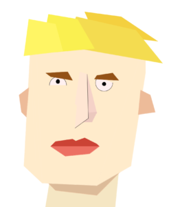
I used a lot of quad functions, because I thought it would most accurately represent the picasso-esque cubist ___ I desired.

I thought my portrait looked annoyed, so I was going to program a little fly to bounce around the screen, but ran out of time to make it as desired. I’m pretty happy with how it came out though.

Kyle reads “Physical Computing’s Greatest Hits (and misses)” by Tigoe

This blog post by Tom Igoe is basically a review of different physical computing or interactive media “themes.” These themes are different varieties of common physical computing projects. through the post he describes which ones have the most and least potential for artistic interpretation. As to not discourage the reader, Tigoe prefaces it by noting that despite the fact that  these themes exist and can be defined, it is still possible to find originality within the different interpretations of the themes.

What I think is helpful about his descriptions of the “themes” is that he not only explains how they work and how they are limited, but also provides examples of how to get past their basic functionality and make them original and interesting.

I think the thing that I enjoyed most about this post is that it got me excited about making my final interactive media project. I will definitely look back at this post if i need some inspiration for a place to start from. It might even be fun to combine multiple themes, like the author describes at the end of the post.

Self Portrait

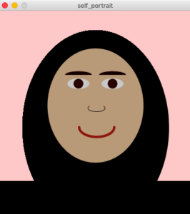
I can’t decide if I really enjoy processing or find it really frustrating (probably both). Although, I played around with with the beginShape() endShape() functions and also the vertex() function, I couldn’t make them nice enough to include in the final sketch. So instead, I decided to stick to a simple version of myself made with all sorts of shapes (this part was fun).

void setup () {

size(400, 430);
background(255, 200, 200);

}

void draw() {
  
smooth();

// hijab?
fill(0, 0, 0);
ellipse(200, 240, 300, 400);

// face
fill(184, 153, 120);
ellipse(200, 195, 197, 235);

//eye
fill(200, 200, 200); 
ellipse(165, 150, 45, 22);
 
//eye
fill(200, 200, 200); 
ellipse(235, 150, 45, 22);

//pupil
fill(40, 0, 0); 
ellipse(165, 150, 20, 20);

//pupil
fill(40, 0, 0); 
ellipse(235, 150, 20, 20);

//eyebrow
fill(20, 0, 0);
arc(235, 132, 55, 15, PI, TWO_PI);

//eyebrow
fill(20, 0, 0);
arc(165, 132, 55, 15, PI, TWO_PI);

//nose
stroke(0,0,0);
strokeWeight(1);
fill(184, 153, 120);
ellipse(202, 200, 35,15);

//nose
noStroke();
fill(184, 153, 120);
ellipse(202, 192, 35,15);
 
//mouth
stroke(140,20,10);
strokeWeight(5);
noFill();
arc(202, 239, 72, 40, 0, PI);

//shoulders
fill(0, 0, 0);
noStroke();
rect(0, 350, 800, 600);

}


2 Blog Post on Readings

Her Code Got Humans on the Moon

I’m surprised I’ve never heard of Margaret Hamilton and what she was able to accomplish. With all the hardware (punching holes in stacks, hardwired, and indestructible memory, etc) and barely established software, Margaret was able to create an entire industry with her colleagues. The point about how Margaret wanted to extra features that could handle error was interesting. The way it was explained in the article, it seems like the P01 button was unnecessary, so I didn’t really understand why it was there in the first place if all it did was erase data which preventing the astronauts from getting back home. All in all, the main focus of this article seems to focus on how a women engineer was able to revolutionize a whole new industry.

“Emotion & Design: Attractive things work better”

I’ve realized that attractive things work better, but I’ve never looked or realized how that might be. What Norman claims about how being in a better positive state can result in people thinking of better solutions to use a product makes a lot of sense to me. Whenever someone is anxious or mad, they seem to not think about other solutions and instead continue to do the same thing over and over again and expect something to be different. When a design is unattractive, it can possibly put someone in a bad mood, which results in them not figuring out how to use something.

I thought the idea of using sound to break focus was very interesting because I never realized that it actually works (calling “fire” to get someone to notice that something bad is happening, having buzzing noises once something bad happens). I think these are all great ideas to get someone out of the negative affect.

Overall, from this reading, I feel more confused about how to create better designs since there’s so many aspects that I have to keep in mind. All the emotions that one feels when using a new product can change depending on ones mode makes it difficult to design. Norman says the reflective aspect is the hardest to work with especially since it prolongs with time. The visceral and behavioral levels are about the present, but the reflective one stretches into the future.

Self Portrait

The task for this week was to create a self-portrait using processing.  To solve this task, First, using ellipses, rectangles, and other primitive shapes from processing, I attempted to draw a human being as similar to myself as possible. After this, I realized that if I have full beard a look really different compared to when I am clean shaved so that’s why I decided to add the option that if the mouse is in the bottom part of my face then I beard will show up.  This interaction was created with an If statement and delimiting the pixels of the bottom part of my face. Then, also a blink interaction was added. Using the method as the beard, the user has the option that if he clicks in the eye section the eye will blink once. Finally, colors were added to the draw.

The biggest challenge for this assignment was setting up the location for the objects, I am not used to using this type of coordinates and I struggle with finding the correct coordinate where I wanted to put the object. My takeaway from this assignment is that the more organized and clear you set up your variables the easier will be to find the proper coordinates for the object and to later delimit areas to create interactions.


Reading Response- A Brief Rant on the Future of Interaction Design and Responses

Bret Victor talks mainly about making things more graspable, to maximize human capabilities in satisfying their own needs. When reading the “rant”, I realized that most of what he was stating was true as my own “visions” of the future is more advanced versions of the “flat” surfaces we have now. As much as I love my phone, laptop, and Ipad, I have to admit that they do not indeed maximize the full potential of activity that our hands and bodies can do. I do know as someone who paints and draws that the hand, alongside the arm and the shoulder it’s attached to can do so much more and deserves more interactivity than just sliding a flat surface.