Week 8 : Reflection

Emotion and design

The book delves into the intricate balance between usability and aesthetics in design, drawing from examples like three different teapots that serve various purposes. It resonates with me as it highlights the versatility of design preferences based on different situations and moods. The author’s  exploration of how emotions influence problem-solving and task performance is particularly intriguing, emphasizing the significance of considering both positive and negative emotions in design. It’s a reminder that a good design should strike a balance between usability and visual appeal. Understanding the impact of emotions on the user’s experience seems crucial, reinforcing the need for designs that accommodate various emotional contexts for a better overall user experience.

Her Code Got Humans on the Moon—And Invented Software Itself


in the 1960s, Margaret Hamilton broke barriers and redefined the course of technological history. Working in a male dominated field, her unexpected journey into the Apollo space program played a pivotal role in the moon landing. As a young mother and programmer, she altered her career trajectory, which resulted  into the creation of software that shaped human capabilities and space exploration. Hamilton’s leadership in software development became instrumental in the success of the Apollo mission, expanding the realm of software engineering and setting a foundation for future technological advancements. I strongly agree that her pioneering work revolutionized the role of software across various industries, leaving an enduring legacy that continues today through her company, Hamilton Technologies, at the forefront of technological innovation. Her influence not only propelled humanity’s reach beyond Earth but also reshaped the landscape of computer science and technology which by itself is a ground breaking achievement.


Week #8 assignment: Unusual Switch

Concept:

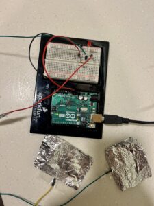
For this week’s assignment, I wanted to create something universal that could be adapted in various creative scenarios. To the Arduino board, I attached two wires with aluminum foil plates, a connection of which completes a circuit and lights up the LED light. I also wanted for it to be used between 2 people to increase the interactivity aspect and make it more fun (which it actually was a lot!). Here is the initial result:

And here is some more fooling around with it:

Implementation:

Implementing it was quite simple. It was a series circuit, enhanced with aluminum foil. Here is how the setup looked like:

Safety Switch

Concept:

For this assignment, I wanted to take the chance to get used to using Arduino, circuits, and everything we learned in class. At first, I was intimidated by the kit we had because I did not know what anything was or how it worked.

It was not easy to get an idea for this assignment mainly because I do not know yet the many things I can do with Arduino. For this assignment, I wanted to do something useful especially when it comes to kids.  As scissors can cause damage when kids touch them, I decided to create a switch that turns on when the scissors are opened or touched. It is a simple idea and the main concept behind it is to learn more about Arduino.

Highlight:

IMAssignment

I always start with research. I personally can start doing something if I am not sure if I fully understand its different components and how it really works.  As you can see in the file attached all the things I learned while doing this small project.

SwitchAssignment

I began by trying to put the project together and see if it would work. I initially used foil to put things together in a circuit. A problem was that I did not use the solderless board and it was not neat, but at least it worked. Then I decided to make it make more sense by using the solderless board and copper tape instead of foil. It was confusing at the beginning but once I understood it it made sense. The code is very simple too. It is a small conditional to indicate when the light will be on and when it will be off.

const int scissor = 3;   // Pin connected to the scissors
const int led = 2;       // Pin connected to the LED

void setup() {
  pinMode(scissor, INPUT);
  pinMode(led, OUTPUT);
}

void loop() {
  int scissorState = digitalRead(scissor);

  if (scissorState == HIGH) {
    digitalWrite(led, HIGH);  // Turn on the LED when scissor is opened
    delay(50);  
  } else {
    digitalWrite(led, LOW);   // Turn off the LED when scissor is closed
    delay(50);  
  }
}


Reflection and ideas for future work or improvements:

In these assignments, I learned a lot, and I broke the fear of using the kit we have. I know that the scissors are not the most creative thing so for future work I would try to make it a switch for a safe or a drawer where someone puts valuable things in.


Week 6- Midterm Process 2

Progress on Generative Gallery: A Digital Art Experience

In the recent updates to the p5.js Art Gallery, I’ve made significant strides in personalizing the overall experience. By creating detailed interior and exterior images entirely by myself through online platforms, I’ve successfully revamped the visual aspects of the gallery.

I’ve implemented interactive canvases within the gallery, allowing users to engage with and contribute to the artistic space. Visitors can now explore their creativity and interact with the digital canvases, fostering a more dynamic and engaging experience. I have also incorporated a user-friendly slider with arrows, enabling seamless navigation back and forth within the canvases, enriching the overall exploration process. To enhance the ambience and user experience, I’ve added a convenient light switch feature, allowing visitors to adjust the gallery’s lighting to their preference. An exit option has also been integrated, enabling users to smoothly return to the main page without any inconvenience.

Looking ahead, my next steps involve integrating a carefully curated sound element to complement the visual art, creating a more multisensory experience for visitors. Additionally, I plan to continue my work on advancing the generative art features, exploring new techniques and patterns to further enhance the overall artistic experience for our esteemed visitors.

These updates represent a significant step forward in creating a more personalized and interactive environment.

Whack-A-Mole-Land

One word “Finally”! This project was one of the worst ones I’ve worked on in a long time, I was met with error after error and pure confusion more than once.

But in the end and after millions of trial and error and hours in the lab this is my little baby and I couldn’t be happier and prouder of how it turned out:

Link to the full screen version (Zoom out to 60% or 75% for the best experience): https://editor.p5js.org/nourhane/full/vzSr13gm7

Whack-a-mole with a twist, I choose to focus a lot on the visuals of the game to make it reach the vision I had in mind but furthermore, I choose to add new features that the normal whack-a-mole didn’t have like bombs, and magic worms.

 Highlights:

The game begins at the main menu, inviting players to dive into the frenzied world of moles, bombs, and worms. Clicking on the screen transitions to an instruction page, which succinctly explains the game mechanics and objectives.

if (this.gameState === "mainMenu") {
    if (mouseY > height * 0.6) {
        this.gameState = "instructions";
    }
}

Moles sporadically appear from their designated holes, and the player must click on them to score points. However, there’s a twist! Occasionally, bombs disguised as moles pop up, and clicking them deducts lives. Additionally, friendly worms grace the screen, offering bonus points if clicked.

One of the features I’m particularly proud of is the random appearance logic of moles, bombs, and worms. It keeps players on their toes, ensuring every game session is unpredictable and challenging.

if (frameCount % 60 === 0 && game.gameState === "playing" && !game.paused) {
    let moleToShow = random(game.moles);
    moleToShow.visible = true;

    setTimeout(() => {
      if (!game.paused) {
        moleToShow.visible = false;
      }
    }, random(500, 1500));
  }

  if (frameCount % 80 === 0 && game.gameState === "playing" && !game.paused) {
    let showWorm = random() < 0.15; // 15% chance to show the worm
    if (showWorm) {
      game.worm.resetPosition();
      game.worm.visible = true;

      setTimeout(() => {
        if (!game.paused) {
          game.worm.visible = false;
        }
      }, random(500, 1500));
    }
  }
}

The game’s immersive experience is further enhanced with dynamic sound effects, creating an auditory feedback loop that’s satisfying and engaging.

Issues faced:

One of the main issues that took me hours to figure out was the score. It wasn’t increasing no matter how many times I clicked on the mole even though the mouse was telling me that it was clicked. I tired everything to fix it and used thousands and thousands of console.log statements to try and pin point the issue but nothing, looked on the internet, asked unix tutors, no one was able to figure it out, till it jumped to me “THE HAMMER, THAT’S THE ISSUE, IT’S NOT ALIGNED WITH THE MOUSE” at that moment I couldn’t feel happier but also dumber because it was such an easy fix yet i had to rake my mind and go crazy to find it.

Another main issue I had was with the sound, for some reason it kept giving me “undefined” and crashing my entire game and once again after hours of looking and console.loging, the issue was easy, I didn’t play the sound where it should. I was loading but not playing them in their respective spots (stupid right?)

Improvement:

In the end I’m so so so proud of it and couldn’t be happier with how it turned out. But no project or game is ever done, there always room for better and in this case they could be:

Game Dynamics: While the game offers a good mix of unpredictability with the random appearance of moles, bombs, and worms, adding more diverse game elements or increasing levels of difficulty could enhance the player’s experience. Introducing different types of moles with varying speeds, for instance, or adding power-ups and penalties, could make gameplay more dynamic and engaging.

User Interface and Graphics: The user interface, though functional, could benefit from a more refined design. Enhancing the graphics, smoothing out animations, and possibly introducing a thematic storyline could make the game more immersive. A more intuitive and interactive menu system could also be introduced, allowing players to adjust settings, view high scores, or access tutorials

Mobile Compatibility: Given the growing number of mobile gamers, optimizing the game for touch controls and ensuring it’s responsive to different screen sizes would be a significant improvement.

Conclusion:

However, considering my coding level and how far I got from the beginning and how much effort I put into it. Whack-a-mole Land is easily one of my favorite projects I worked on and I’m so proud of it and of myself as well.

Week 5 Response

I found the idea of using computer vision to judge how intensely a person is smiling to be very intriguing. There is an animated short film by the name of Shehr-e-Tabassum which imagines a dystopian future where anyone who doesn’t smile is considered to be outcast and is immediately captured by the government. I can only wonder how computer vision technology in the future will be used for deep public surveillance and for penalizing those who don’t comply.

I wonder if cameras are the only way we can implement computer vision. I think things like heat sensors and sonar technology also has a space in the computer vision landscape. I also wonder if computer vision will ever be as advanced as a human eye and by extension will AI ever be able to process as much information as humans can or will it always be limited by what computer vision can achieve and have to rely on other sensors for getting a complete picture of what is happening. There is also anti computer vision technology which will massively undercut the effectiveness of computer vision and security systems in general.

Overthinker-

As usual finding an idea for assignment 4 was a challenge of its own and as I was scrolling through instagram I saw a video about the overthinking brain and there it was, my generative text artwork. The mind is an amazing thing but the overthinking mind is an epitome as it lies to its owner and paralyses him in negativity.  So through my artwork I wanted to create a simulation of that but have the positive thoughts “win” and create a sense of peace and victory in the end.

This is what I came up with in the end:

First, I started off with a simple black background and positive and negative words just floating around and the negative words disappear when colliding with the positive to symbolize that we should not let the negative thoughts our head lies to us with win.

Highlight of code:

The mechanism of the colliding and disappearing is honestly what I’m most proud of because it took a lot of researching and trial and error but in the end it came out exactly how I envisioned it.

Initially, each word is represented as an object, complete with its position, velocity, and type. Using the dist() function, a foundational function in p5.js, the code assesses the distance between two word objects. If this distance is less than a specified threshold, it infers that the two words are overlapping or colliding. Given the creative intent, the code dictates that if either of the two colliding words is negative, it should be removed from the display. However, directly manipulating (like removing items from) an array while iterating over it can lead to skipped iterations or index out-of-bound errors. To circumvent this, the code first logs the indices of words slated for removal in a separate removalIndices array. Only after all overlap checks are completed does the code loop through removalIndices to remove the identified words from the main displayedWords array. This ensures a safe, error-free removal process. Such collision-detection methodologies are commonplace in game development and interactive visualizations.  Daniel Shiffman’s tutorials on The Coding Train on YouTube were extremely helpful in figuring all of this out, especially object collision pt1, object collision pt2, and  his video about adding and removing from arrays

// Update and display each word
for (let i = displayedWords.length - 1; i >= 0; i--) {
    displayedWords[i].display();
    displayedWords[i].move();

    // Count negative words
    if (displayedWords[i].wordType === "negative") negativeWordCount++;

    // Check for overlapping words
    for (let j = i - 1; j >= 0; j--) {
        if (dist(displayedWords[i].position.x, displayedWords[i].position.y, displayedWords[j].position.x, displayedWords[j].position.y) < 30) {
            if (displayedWords[i].wordType === "negative" || displayedWords[j].wordType === "negative") {
                if (displayedWords[i].wordType === "negative" && !removalIndices.includes(i)) {
                    removalIndices.push(i);
                }
                if (displayedWords[j].wordType === "negative" && !removalIndices.includes(j)) {
                    removalIndices.push(j);
                }
            }
        }
    }
}

// Remove words based on indices stored in removalIndices list
for (let index of removalIndices) {
    displayedWords.splice(index, 1);
}

However, I didn’t like how simple and plain it looked so I started thinking of what other things I could add and started building the mind of my dreams. First, the background was to plain so I made it into a gradient of black and added particles that symbolizes the other thoughts and memories that are present in the mind and that alone made it look better and more lively like a real mind. Then I moved on to the words themselves and decided I wanted to make them look more distinctive so I went ahead and changed their color palette making the positive words lighter and cheerful and the negative more dark and gloomy. After that I remembered the goal I wanted to have which was a sense of peace and victory that comes with letting the positive thoughts win and decided to represent that with a beautiful sun that appears (symbolizing the radiance and happiness one feels when we don’t believe the lies our mind tells us) once all the negative thoughts are whooshed away and is surrounded by a peaceful find filled with nothing but positive words floating around.

Reflection:

The journey was both challenging and rewarding. The task started simply: display positive and negative words on a canvas. But as the requirements grew more complex – making words move, detecting overlaps, and having words disappear based on specific conditions – the code had to evolve. There’s a beauty in the simplicity of the final visualization: negative words being “overpowered” and disappearing when they encounter other words, and the eventual appearance of the sun symbolizing the triumph of positivity. However, behind that simplicity was a series of problem-solving steps, from collision detection to safely modifying arrays during iteration. In the end i’m so happy with the end result and what I was able to come up with in the end and of course the message it conveys.

Ideas for Future Work and Improvements:
  1. Interactive Elements:
    • Allow users to add their own words to the positive and negative lists, personalizing the experience.
    • Let users click on words to manually remove them or promote them.
  2. Animations and Transitions:
    • Instead of immediately removing negative words, they could fade out or shrink, making the disappearance smoother.
  3. Sound Integration:
    • Add background music or sound effects, enhancing user engagement. For instance, a calming tune could play, with chimes or effects when words disappear or when the sun appears.
  4. Narrative or Storytelling:
    • The visualization could be part of a larger narrative or game where users have to actively combat negativity.
  5. Adaptive Challenges:
    • Introduce “boss words” that require more effort to remove.

Art, Interactivity, Design

Whenever someone asks me: “what projects do you do as an IM major?”, I reply by saying: “I mean.. a big part of the projects is about that interaction between humans and what we develop. We develop cool interactive stuff?” Now I don’t know how much this description is consistent, but I actually sensed this description in Crawford’s arguments about Interactivity.

Basically, the chapter emphasizes the importance of interactivity in modern technology and entertainment. Crawford argues that interactivity is not a mere add-on but a core element of design, making it distinct from other forms of media. He highlights the unique ability of interactive media to engage users actively and elicit responses.

An important concept Crawford introduces is the concept of the “reactive mind”. He explains that interactivity relies on users’ ability to perceive and respond to changes in the system. He also discusses the role of user actions and system responses in creating a dynamic interactive experience.

It might be because of my Physics background, but just like Crawford, I’m too technical and direct with my definitions, which is why I agree with the points he talked about. One may think he is biased because he didn’t think of the internal interaction that occurs inside your brain when you open a fridge, but please? It’s hardly convincing to say that a fridge is interactive unless it has interactive elements in it (does the fridge open with a tactile button? does it answer when you say I want milk?). Same for a book, a cupboard, a rug, a static artwork.. You do not interact with what I just listed and it’s okay, it does not change their value. They are just not interactive. I feel like there is a very thin line that can be easily blurred between Interactive and Immersive. The first one concerns the actual interaction and the effect it elicits in the user, and the second one only concerns the engaged reaction of the user to anything, which doesn’t require the object or the work to be interactive.


Week 5: Reading reflection


Reflection

After reading this article about computer vision methods and how they are used in interactive media, I am incredibly excited by the remarkable potential that this field holds. Beginning with the enormous difficulty of obtaining meaningful information from digital video, which by its very nature lacks semantic content, the article emphasizes the difficulty of so doing. Also, the article presents basic computer vision techniques that detect motion, presence, and other interactive features encoded in video streams. The techniques include frame differencing, background subtraction, and brightness thresholding. The explanation of these techniques fascinates me since it makes them seem unexpectedly approachable, especially to novice programmers. Without a doubt, this accessibility emphasizes how computer vision has democratized the fields of art and design.

The article also emphasizes the essentiality of matching physical parameters with vision algorithms to improve their dependability. It demonstrates how astute environmental planning can dramatically boost computer vision systems’ functionality. I am inspired by the accessibility of these technologies for artistic efforts as I learn about the numerous multimedia authoring tools and plugins accessible to designers and artists. The article concludes with an encouraging illustration of LimboTime, a straightforward yet entertaining interactive game that was developed by workshop participants in just one afternoon. Such an illustration depicts how computer vision may enable designers and artists to explore new realms of interactive art. The article demystifies the complexity of computer vision techniques and emphasizes their accessibility while revealing their revolutionary power. As such, it highlights their capacity to enable creators of all skill levels to create interactive experiences, enhancing the field of multimedia and beyond. As it turns out, I am in awe of the nexus of technology and creativity, where pixels become dynamic canvases, providing new horizons for creative expression.

Assignment 4 – Minimalist Water

Concept: In this assignment, I wanted to do minimalist artwork inspired by my visit to Louver Abu Dhabi. I looked into many ideas before I settled into my final one. I researched L-systems in the p5js examples where one can create automated drawings based on the growth of biological structures, but I did not know what data I could use to implement it. Eventually, I decided to look into the Water Security Dashboard because it is an important issue nowadays. I got some data from the World Bank that was published in 2021. My goal was to transform this data into a simplistic art piece, leading me to the realm of minimalist art.

This type of art says “the most with the least “ (Bob Newhart).

Highlight:

This is how the data is initially. looked like

 My journey began with the task of making the code functional, which needed a lot of time, focus, and dedication. I got a lot of errors at first and I had to deal with each one separately. First, the code was not reading the file properly because some names within the files had commas within them. I decided to remove the commas that were not necessary in the file. It is not the best solution though especially if the csv file is big. After that, I had to figure out how to get the minimum and maximum values of GPD and Water per Capita which took some time. Finally, I had to think of the aesthetics of it all. First, I added the results into a circle and mapped them into random positions within the circle constraints but that was not a good representation of the data because of the randomness. Consequently, I switched to a square format, mapping the data relative to the square’s dimensions while incorporating a central circle.

Random mapping

Throughout the experimentation process, I generated interesting results and different shapes and forms. Finally, I settled on the result below. Although I explored creative coding, gradients, and glitch shaders through video tutorials, these elements, while captivating, did not align with the minimalist vision I had in mind.

Reflection and Future Improvements:

For future improvements, I would want to think of other ways to use data in art without losing the representation of the data. I want to start working with 3D and maybe do something with the L-systems and Glitch Shader. I also want to start thinking of the interactivity of what I do and in which ways I want users to interact and feel when incorporating these interactive concepts.

 Resources: 

https://www.youtube.com/watch?v=r5YkU5Xu4_E

https://www.youtube.com/watch?v=rTqvf0BkTNE&list=PLyRZnpOSgMj3K8AV2I6UldnvTj6d_Zrf0

https://wbwaterdata.org/dataset/water-security-dashboard