
When I first read the statement ‘attractive things work better’, I tried to justify it in my head but it simply did not work. However, through reading the article this statement made more sense.
It shows that human perception and behavior are highly influenced by attractiveness, which often determines choices and preferences. Attractiveness holds a user’s attention to different things that it is being used on whether products or individuals, and even ideas; positive emotions are evoked while trust as well as credibility are built up. Furthermore, ‘attractive’ features, which in this context refers to sleek, clean, minimal design, make the product easy to use. With so many options around us and so many choices to make, a simple or attractive design can provide us the relief we need, meaning they work better.
When I think of this concept my mind goes to Blackberry vs iPhone. iPhones work better, no doubt. iPhones are more attractive. At a young age I was not extremely aware of the limits each design has or the technology yet I understood iPhones earned a higher rank. This is due to the simple design, blackberry has a mini screen which is sort of limiting, and a ton of buttons. On the other hand, the iPhone had a simple home button and a wide screen to increase convenience. Which in return, made me realize the iPhone is more attractive, more user friendly, works better.
The second text discusses the programming process of Margaret Hamilton. Due to her innovation, she is regarded to be one of those who have laid down a foundation for today’s digital world. She even was involved in Apollo missions, which shattered all stereotypes and moved humanity further towards space. This therefore means that she became a symbol of breaking the gender barrier created and sustained over time. Ada Lovelace’s story can be seen as a mirror of the present-day version of Margaret Hamilton’s innovations in computer programming that made her called “the first computer programmer in the world.” For instance, during the 19th century, Lovelace cooperated with Charles Babbage on his mechanical universal computer called Analytical Engine. although the societal norms were suggesting science was not a women’s area, through her ideas and logical skills, Lovelace created grounds for all modern computation processes we know nowadays. For example, still serving as an icon for female empowerment within STEM fields even today are aspects such as Lovelace’s long-standing impact on software engineering and related issues similar to Hamilton
Author: Rama Alwidian
Rama’s Midterm: Tetris
The Idea
For my Midterm I had my take on the Tetris game which I’ve been a fan of for years. I want to maintain the arcade/video game feel to it so I kept that in mind while creating my game. It consists of various components including shapes, grids, timers, and user input handling. The game aims to control the falling tetrominoes, rotating and moving them to form complete horizontal lines to clear rows. Once 5 rows have been cleared, the game levels up and the tetrominoes fall faster giving the player less time to find a good fit to clear the rows.
How It Works and Highlights
The project leverages object-oriented programming principles to organize code into manageable classes such as Tetris, Timer, and T-Grid. This modular approach enhances code readability and maintainability. The game mechanics are well-implemented, with smooth tetromino movement, collision detection, and row-clearing functionality. The user interface is intuitive, providing clear visual feedback through colorful shapes and text. The inclusion of background music and sound effects enhances the overall gaming experience. I created the background image and the first-page using elements on Canva.
displayGrid(pg, x, y, w, h, pallette) {
    var nx = this.tGrid.nx;
    var ny = this.tGrid.ny;
    var cw = w / nx;
    var ch = h / ny;

    // Render background
    for (var gy = 0; gy < ny; gy++) {
        for (var gx = 0; gx < nx; gx++) {
            var cx = x + gx * cw;
            var cy = y + gy * ch;
            pg.stroke(210);
            if ((gx & 1) == 1) {
                pg.fill(250);
            } else {
                pg.fill(240);
            }
            pg.rect(cx, cy, cw, ch);
        }
    }

    // Render foreground (tetrominoes)
    for (var gy = 0; gy < ny; gy++) {
        for (var gx = 0; gx < nx; gx++) {
            var cx = x + gx * cw;
            var cy = y + gy * ch;
            var valGrid = this.tGrid.getGridVal(gx, gy);
            if (valGrid > 0) {
                pg.stroke(0);
                var rgb = pallette[valGrid % pallette.length];
                pg.fill(rgb[0], rgb[1], rgb[2]);
                pg.rect(cx, cy, cw, ch);
            }
        }
    }

    // Render active tetromino shape
    var ks = this.tGrid.shapeSize;
    var kr = ceil(this.tGrid.shapeSize / 2.0);
    for (var ky = 0; ky < ks; ky++) {
        for (var kx = 0; kx < ks; kx++) {
            var gx = this.tGrid.sx + kx - kr;
            var gy = this.tGrid.sy + ky - kr;
            var cx = x + gx * cw;
            var cy = y + gy * ch;
            var valShape = this.tGrid.getShapeVal(kx, ky);
            if (valShape != 0) {
                pg.stroke(0);
                var rgb = pallette[valShape % pallette.length];
                pg.fill(rgb[0], rgb[1], rgb[2]);
                pg.rect(cx, cy, cw, ch);
            }
        }
    }
}
Areas for Improvement and Challenges
One area for improvement could be enhancing the visual appeal of the game by adding animations for tetromino movements and row clearing. Additionally, implementing more advanced gameplay features such as different game modes, power-ups, or multiplayer functionality could increase player engagement. Some challenges were adding a sound effect once every tetromino lands but I had several issues with it, also I was not able to get the tetromino count to stop once the game was over.
Design Inspiration
I took inspiration from EA’s Tetris mobile app game, here’s how it looks: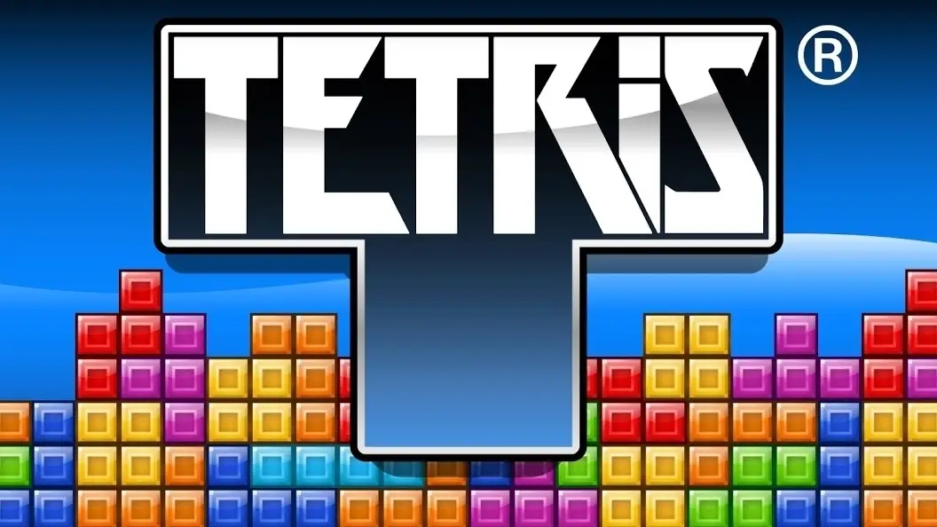
And here’s mine: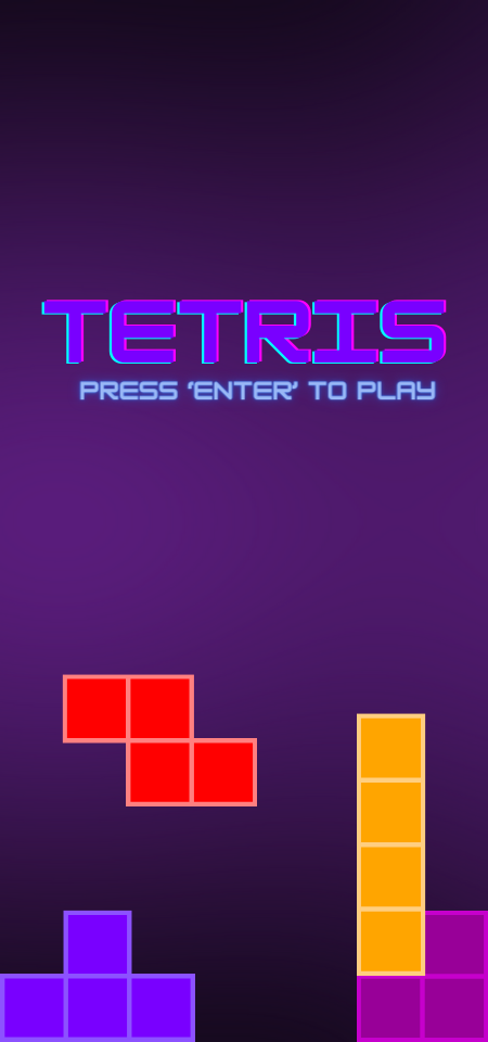
Credits
Sound Track: https://www.youtube.com/watch?v=NmCCQxVBfyM
Main Menu page: https://www.canva.com/
Code :https://www.youtube.com/@easywebsify
Additional Code Assistance: Chat GPT.
Final Sketch
Mid Term Process Update
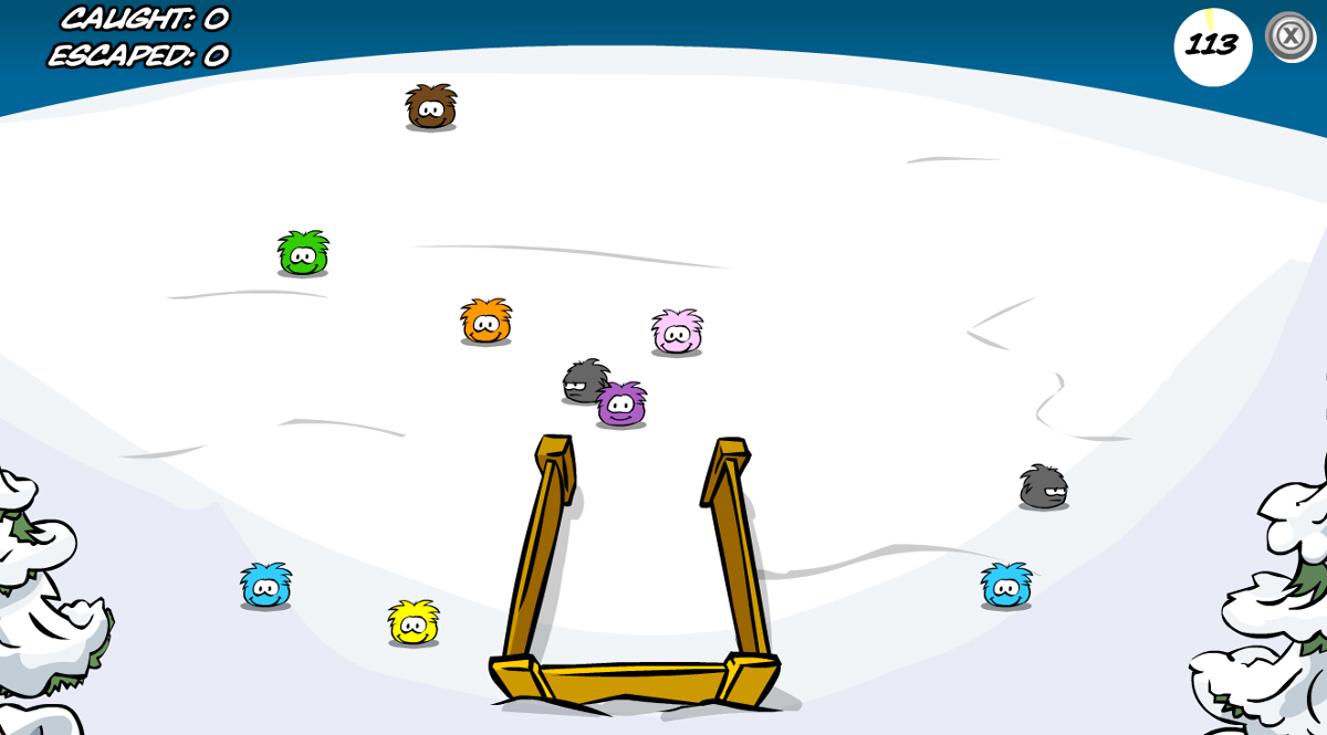 My game is inspired by the Club Penguin Puffle Park games, specifically the Puffle Roundup. The game aims to gather as many Puffles into a designated area (the cage) in under 120 seconds. The more you gather, the more points you earn. The twist is that if you’re not careful with the movement of the mouse you could push away the puffle, making them escape, meaning you lose points.
The most complex part of the project would be looking for images/assets to make the game, the mouse interactivity smoothness, and probably the timer and point count system. I did some research and found a tool that lets you pack your images together to use in the code “http://free-tex-packer.com/” which would be very useful for the clock timer in my game.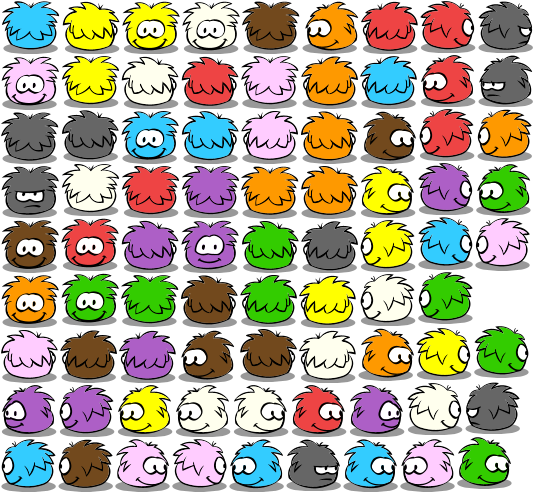
Assignment 4, Rama
For this assignment, I experimented with the concept of word clouds using p5.js, where the size and style of each word vary randomly. The word cloud relies on the frequency of words in the input text data. When the mouse is pressed on the screen, the word cloud is restarted, providing an interactive experience for the user.
Initially, I learned how to create the world cloud using a couple of YouTube videos, however, they did not go through the link between word frequency and size of the words in the sketch. So, I found this code (https://editor.p5js.org/dano/sketches/1_RLNdYnT) which uses a different method of text input and method of display than my initial sketch, however what’s cool is the word size is determined through word frequency. Here’s the code:
split(text) {
return text.split(/\W+/);
}
validate(token) {
return /\w{2,}/.test(token);
}
process(tokens) {
for (var i = 0; i < tokens.length; i++) {
if (! tokens[i]) continue;
var token = tokens[i].toLowerCase();
if (this.validate(token)) {
this.increment(token);
}
}
}
getKeys() {
return this.keys;
}getCount(word) {
return this.dict[word];
}
increment(word) {
if (!this.dict[word]) {
this.dict[word] = 1;
this.keys.push(word);
} else {
this.dict[word]++;
}
The code technically breaks down the words in the text and keeps count of their frequency. Then it validates these words (true/false), keeps track of their count/frequency in the passage or text. It’s like a simple tool for counting and analyzing the words in a piece of text.
One potential improvement I considered is the ability to load external text data so the user could make the word cloud generator more versatile and useful in different contexts.
Week 4 reading response
In the first chapter of “The Design of Everyday Things,” Don Norman talks about the concept of affordances and their importance in shaping how users interact with products and environments, overall leading to the product’s success or doom. He emphasizes the importance of intuitive design, where the objects function should be to the point. Norman uses the example of a well-designed door handle to illustrate. A good handle should make it obvious whether to push or pull through its shape and positioning. Norman summarizes it pretty well here, “The design of the door should indicate how to work it without any need for signs, certainly without any need for trial and error.”(2) On the other hand, poorly designed handles without clear affordances often frustrate users and lead to confusion. He argues that intuitive design creates a seamless relationship between users and products, reducing cognitive load. Overall, Norman’s approach enhances the experience while minimizing mistakes and accidents.
Furthermore, a well-designed smartphone interface intuitively guides users to access different functions and features. For instance, users understand that tapping an icon opens an app, swiping left or right navigates between screens, and pinching or spreading fingers zooms in or out. These intuitive interactions reduce the learning curve for users and enhance their overall experience with the device, to the point where even toddlers use tablets nowadays without any trouble. Yet interfaces with unclear design can confuse users and lead to frustration. Therefore, prioritizing intuitive design in smartphone interfaces is crucial for ensuring seamless interaction and user satisfaction.
Intuitive design should be the key priority to every product development process. By understanding users’ needs, we can create products that enchance not cause trouble in our daily lives. In today’s world of complex technology, prioritizing intuitive design isn’t just a design approach but a necessity for creating products that are truely successful.
Assignment 3, Rama
For this project I had two goals, adding interactivity, even if simple because it adds to the UI in addition to keeping it simple. So I decided to use was I learnt from the previous assignment about loops and incorprate class and arrays this time. I didn’t have much inspiration from outside sources, I chose cats because the shape is very interesting to make and the meowing sound is annoying yet cute. Here is my sketch:
This is my favourite part of the code:
function mouseClicked() {
if (cats.length < 5) {
cats.push(new Cat(colors[catIndex]));
catIndex++;
meowSound.play();
} else {
window.location.reload();
}
}
because I got to use sound for the first time in my sketch and incorprate it with the mouse clicked function. However I did want to include a different sound of “meow” for every colored cat do add variety but it was getting a bit tricky and overwhelming so I kept it as is.
Assignment 2, Loops
When I think of loops the first thing that comes to mind is the DVD screensaver that I used to see as a kid, a never-ending loop that managed to grab my attention until I saw the corner of the logo line up with the edge of a screen. If you still don’t know what I’m referring to, have a look at this iconic scene from the office:
I Tried to recreate the same loop using if statements, randomized the color change whenever the logo hit an edge, and redirected itself in the opposite direction by going into negatives.
I am particularly proud of this part of the code:
if (pos.x >= width – imgPos.width || pos.x < 0) {
speed.x *= -1;
getColorforImage();
}
I was intially overwhelmed by this task, however using the if statement really made it simpler, by making the image speed into the negatives to redirect and change color simultaneosly (repeated the same code for Y variable) I managed to recreate the OG dvd screensaver.
However, I did not use the for or while commands to create this loop so I started experimenting and managed to find a non traditional loop instead:
This was very surprisingly simple, although I wanted to involve more motion to the circles in the back initially, I felt content when I reached this final product. For the future, I would hope to have done something such as a color loop instead, blending or transforming colors into one another in hopes of making this loop more “traditional”, at least visually.
Creative Reading Response #1
Casey Reas’s talk on using code to make generative art with a grip on randomness caught my attention. The whole idea of finding this sweet spot between order and chance in art is super intriguing, especially when you can let randomness guide you a bit without it taking over the whole identity of the piece. This is something that I look forward to incorporating into my IM pieces throughout the semester.
Reas’s example of ‘The Tissue Work,’ inspired by neuroanatomist Valentino Braitenberg, and the controlled randomness they used to simulate conceptual vehicles and patterns over time was mind-blowing. It’s like a dance between structure and surprise. I love the notion of randomness being a “jumping off point” in art – a way to explore possibilities without losing control over the essence of the work.
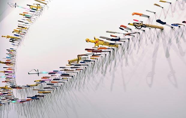
This example brought several artists to mind, one of them being Farhad Moshiri an Iranian artist known for his intricate yet playful pieces, and I believe his ability to dance on the thin line between intricacy and randomness is what makes his work admirable. Here is an example of one of his pieces:
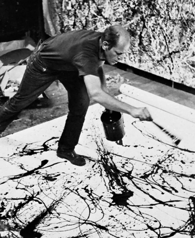
Another artist that instantly comes to mind is Jackson Pollock, known for his drip painting. As a child, I had a love-hate relationship with this category of artwork because I believed the artist did not deserve the credit for the piece, and that there was not much to it. However, after admiring his work and listening to people’s perspectives I fell in love with the idea of “letting loose” which is exactly what this piece consisted of, allowing gravity and change to create something, with minimal control and high spontaneity. This proposes the question, is the art the final piece or the process of creating it?
 So, I agree with Rea’s idea that embracing randomness in art feels like tapping into a world of creative possibilities. Artists from way back to today are showing us how to walk that fine line between order and chance, making the relationship between art and technology evolve in the most fascinating ways.
Assignment 1, Self Portrait
For this piece I was inspired by the work of previous students, I liked how they managed to use simple shapes and combine them to make the portrait more visually appealing. I used a combination of circles, ellipses, arcs, and rectangles to create my portrait. I also wanted to incorporate motion yet keep it simple since I’m new to coding, I used Chatgpt to learn how to create the circular loop by asking for the code.
For the background, I chose a baby pink color since it’s my favorite color, and I wanted that to be shown in my portrait. Moreover, I used my color palette to represent me, a black shirt because I tend to always wear black. I wish I would’ve done a couple of things differently, like adding more details such as lashes, hair pieces, cheeks, and a more thought-out mouth. However, I’m generally happy with the final product and excited to see what I can learn throughout this course!