Concept
My final project is an interactive maze-navigation game called Maze Race, where players use a custom Arduino controller to guide a character through a scrolling maze built in p5.js. The goal is to reach the finish as fast as possible while feeling real-time tactile feedback: when the player hits a wall in the game, the Arduino vibrates. This creates a loop of sensing and response between the physical controller and the digital world.
Project Interaction
The bi-directional communication I decided to go with is:
Custom controller reads accelerometer data to determine tilt, and sends velocity data (Arduino -> p5)
The game running on p5 sends haptic feedback to the custom controller (p5 -> Arduino)
Arduino Implementation
This is where the Arduino processes the accelerometer data and sends it to p5 by Serial.print
// Constrain readings to -1 to 1
  speedX = constrain(speedX, -1.0, 1.0);
  speedY = constrain(speedY, -1.0, 1.0);


  // If the tilt is very small (less than 10%), just treat it as 0.
  if (abs(speedX) < 0.15) speedX = 0;
  if (abs(speedY) < 0.15) speedY = 0;


  Serial.print(speedX);
  Serial.print(",");
  Serial.println(speedY);
This is where the Arduino listens for the character ‘V’ from p5, which tells it to activate the vibration motor to simulate a collision
// Read from p5 and record time
  if (Serial.available() > 0) {
    char incoming = Serial.read();
    if (incoming == 'V') {
      digitalWrite(motorPin, HIGH);
      vibrationStart = millis();
      isVibrating = true;
    }
  }

  // Turn off motor after 150ms
  if (isVibrating && millis() - vibrationStart > 150) {
    digitalWrite(motorPin, LOW);
    isVibrating = false;
  }

  delay(50);
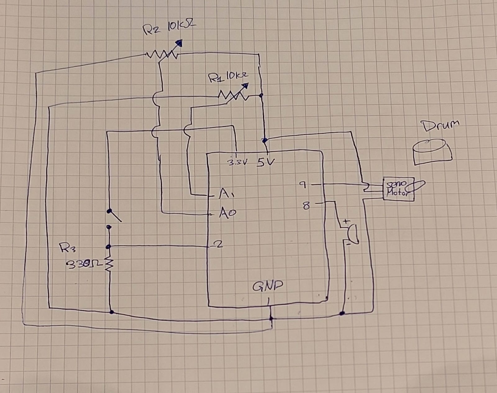
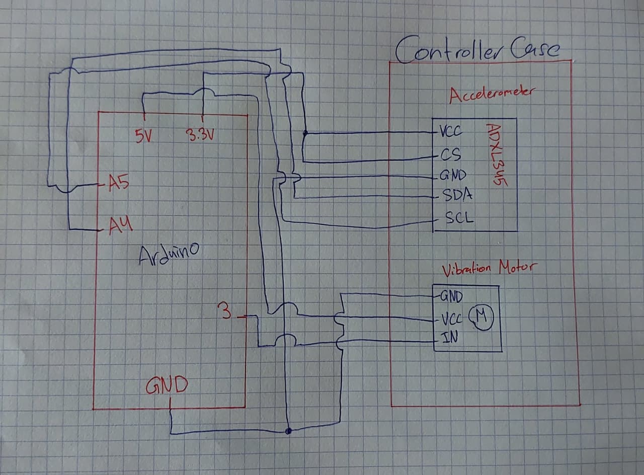
Schematic
P5 Implementation
This is how p5 reads the tilt data from Arduino
let str = port.readUntil("\n");
  if (str.length > 0) {
    let parts = split(trim(str), ",");
    if (parts.length >= 2) {
      joyX = float(parts[0]);
      joyY = float(parts[1]);
    }
  }
And this is p5 telling Arduino to active the vibration motor
function triggerVibration() {
  if (port.opened() && millis() - lastVibrateTime > 200) {
    port.write('V');
    lastVibrateTime = millis();
  }
}
Aspects I’m Particularly Proud of
I’m especially proud of the smoothness of the joystick controls and how natural the vibration feedback feels. The scrolling maze, collision accuracy, and the physical-digital connection all came together better than I expected, and the system genuinely feels like a small custom arcade game.
AI Usage
I used AI in this project to help me understand the unique wiring for the accelerometer needed to read tilt on the X and Y axis only, to reduce the amount of wires. I also used it throughout the project to help me understand and debug code issues I ran into.
Future Improvements
In the future, I’d like to add multiple difficulty modes, different maze themes, more games, and maybe even a second Arduino controller for two-player races. I’d also like to improve the enclosure of the joystick so it feels even more like a real arcade controller.