Week 5: Midterm Progress Report

Concept:

I have been playing “Survivor.io” as a leisure game whenever I have free time or in-between classes just to pass the time. This game is a small mobile based game with the objective of surviving waves of attacks from a swarm of enemies that approach you and inflict damage when they touch you. We are given with a basic weapon in the beginning which we upgrade as we kill the enemies and survive the wave. The objective of the game is to farm weapons and survive for the longest time possible. I thought of implementing this game in p5js as my midterm project.

Survivor.io - Apps on Google Play

I have made quite a progress with my game by implementing the following features:

  1. A starting screen which describes the objective of the game.
  2. A playing screen where the player can control a character and kill minions. For now, the players, minions and weapons are just blobs with color.
  3. A game over screen where the time the player endured the waves is shown with a “Play Again” button.

Most Terrifying Part:

The most frightening part of the code so far was the collision detection of the “weapon & minions” and “minions & player” and killing the minions or the player when enough collision is made. The confusion lied on how to detect collision for all the minions and all the weapons. The solution I came up with is as follows:

  1. Weapons & Minions: I would detect the collision in the Minions class. Then we consider all the Arrows for the current minion. We call this detectArrowHit in the Minions class for all the minions in the minions array.
  2. Minions & Player: The same concept was applied for this collision, except the collision algorithm is implemented in the Player class, where we consider all the Minions present in the minions array.

As for the effects of the collision, I am still working on it and fine-tuning the effects of the collision. For now, I delete the minion which are hit from the minions array.  In doing so, it brings the problem of indexing in the minions array which is used to identify a minion in the canvas.

Future Progress and Reflection:

So far, the project is going smooth with all the bugs that I encountered getting solved fairly quickly. Here are a few things I need to work on:

  1. Sound track for the entire game.
  2. Sound effects for weapon firing, minions and player dying.
  3. Power-up for the player when it gets very hard to survive.
  4. Mechanism to regain health when certain criteria is matched.
  5. Images for the player, minions and weapons

The code is getting longer and longer very quickly, so I will probably divide the code into more JS files, just to make everything readable and understandable.

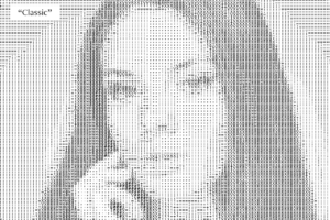
ASCII Art

Introduction:
For this assignment, I was inspired by the ASCII art in front of the IM lab, so I tried to create such generative art.

Coding and Process
For the process, I first started looking into different possible projects that could be done using data visualization and generative texts. I really found this project of drawing images through different ASCII characters. So at first, I had to learn what is a pixel array, understand how it works, and use it to give different colors to the letters at one pixel. Once I understood how it worked, then it was me just experimenting around and playing with texts.

Final Project

Reflection and future improvements
For future purposes, I can have something interactive and live and could engage with the audience.

Yerkebulan Imanbayev – Home Work 4

For this project, I was inspired by a video piece that was meant to spread awareness about dyslexia and how dyslexic people perceive written text.

Link to the video: https://drive.google.com/file/d/1A8b0rKX24hairV4tFCItGpdnE2iSorkR/view?usp=sharing

With this assignment, I tried to create a disorienting feeling initiated by written text that would allow the user to understand the condition of dyslexia. The words appear in different sizes and move, similar to the way the words move in the clip.

display(){
fill(this.textColor);
this.textColor = this.textColor+1;
textSize (this.Size);
textFont(newFont);
this.textX = this.textX + 1;//allows the words to move to the right
text(splitString,this.textX,this.textY);
if(this.textX>400) {
this.textX = -70;//allows the word to move back to its initial position
}
}

I used a class in order to make more words appear on the screen. In the piece of code included above, I made the text move so that once it’s out of the frame, it re-enters from the other side of the screen. Furthermore, I wanted the text to change and attain a different speed when the screen is clicked.

For the future, I want to be able to code it so that new words appear as the screen is clicked. Furthermore, I want the words to move in a more chaotic manner. Overall, I want to gain more knowledge on the tools that would allow me to convey a deeper sense of disorientation.

Assignment 4: Fish Histogram

Overview

Since I have past experience working with CSV files,  I decided to utilize them again for this assignment. After careful consideration, I chose to create a bar graph, or more specifically, a histogram, as it is an effective way to visualize and compare data. Despite the CSV file containing multiple variables, I found it more appropriate to focus solely on the weight of the fish (which serves as the y-axis variable for my bar chart) in order to ensure a clear and concise representation of the data, rather than presenting a cluttered array of variables. I loaded the lines in the CSV file into the array of strings as taught in class and then continued to make separate arrays for storing the names and weights of the fish from the specific rows in the CSV file.

The Data file I chose had a total of 161 fish data but I limited it to 10 fish being represented at a time which were randomly chosen and changed to another set of 10 randomly chosen fish from the data file with the help of a mouse click.

Final Output

Concluding Remarks

I am happy to incorporate more animation into this assignment compared to my previous ones. Additionally, I also added a water bubbling sound effect to enhance the interactivity of the project. However, I am aware that there is room for improvement in terms of the accuracy of the data representation. Specifically, I believe I could provide more detail regarding the weight unit and markings on the y-axis to create a more precise depiction of the data, rather than solely relying on the height of the bars.


Week 4 – Global Temperature Anomaly Visualization

Concept & Idea

This visualization shows the change in global temperature anomaly (the difference between the actual temperature and the long-term average temperature) over time, based on publicly available data. The visualization uses a line chart to represent the data, with the x-axis representing the years from 1753 to 2015 and the y-axis representing the temperature anomaly in degrees Celsius.


Implementation

The chart is generated using the p5.js library for drawing and the d3.js library for data manipulation. The code first loads the JSON data from a publicly available URL and extracts the necessary data. It then draws the x-axis and y-axis of the chart, with tick marks and labels indicating the years and temperature values. Finally, it draws the data points as small circles with color representing the temperature anomaly value, and connects them with lines to form the line chart.

let data; // variable to hold the JSON data
let minYear, maxYear, minTemp, maxTemp;

function preload() {
  // load the JSON data from a publicly available URL
  let url = 'https://raw.githubusercontent.com/freeCodeCamp/ProjectReferenceData/master/global-temperature.json';
  data = loadJSON(url);
}

function setup() {
  createCanvas(800, 400);
  textAlign(CENTER);
  textSize(16);
  noLoop();

  // extract the necessary data from the JSON
  let monthlyData = data.monthlyVariance;
  minYear = monthlyData[0].year;
  maxYear = monthlyData[monthlyData.length - 1].year;
  minTemp = data.baseTemperature + d3.min(monthlyData, d => d.variance);
  maxTemp = data.baseTemperature + d3.max(monthlyData, d => d.variance);
}

function draw() {
  background(255);

  // draw the x-axis
  stroke(0);
  line(50, height - 50, width - 50, height - 50);
  for (let year = minYear; year <= maxYear; year += 10) {
    let x = map(year, minYear, maxYear, 50, width - 50);
    textAlign(CENTER);
    text(year, x, height - 30);
    stroke(200);
    line(x, height - 50, x, 60);
    stroke(0);
  }

  // draw the y-axis
  line(50, height - 50, 50, 60);
  textAlign(CENTER);
  push();
  translate(30, height / 2);
  rotate(-HALF_PI);
  text("Temperature Anomaly (°C)", 0, -15);
  pop();
  for (let temp = Math.floor(minTemp); temp <= Math.ceil(maxTemp); temp += 1) {
    let y = map(temp, minTemp, maxTemp, height - 50, 60);
    textAlign(RIGHT);
    text(temp, 40, y + 5);
    stroke(200);
    line(50, y, width - 50, y);
    stroke(0);
  }

  // draw the data points and connecting lines
  noFill();
  beginShape();
  for (let i = 0; i < data.monthlyVariance.length; i++) {
    let x = map(data.monthlyVariance[i].year, minYear, maxYear, 50, width - 50);
    let y = map(data.baseTemperature + data.monthlyVariance[i].variance, minTemp, maxTemp, height - 50, 60);
    stroke(255 - map(data.monthlyVariance[i].variance, -7, 7, 0, 255), 0, map(data.monthlyVariance[i].variance, -7, 7, 0, 255));
    ellipse(x, y, 4, 4);
    vertex(x, y);
  }
  endShape();
  
  // add the title and data source
  textAlign(CENTER);
  text("Global Temperature Anomaly (°C) " + minYear + " - " + maxYear, width / 2, 30);
}

Reflection & Future Improvements

This visualization allows users to easily see the trend in global temperature anomaly over time, as well as the magnitude of the variation in temperature from year to year. The color-coded data points also highlight areas of particularly high or low temperature anomalies, drawing attention to potentially significant events or trends in global climate. There are several potential improvements that could be made to this visualization. For instance, the visualization could be made more interactive by allowing users to hover over data points to see the exact temperature anomaly value and the year, or to zoom in on specific areas of the chart to see more detail. Users could also be given the ability to adjust the time frame shown on the chart or to select specific temperature ranges to focus on.


Assignment 4 – FIFA World Cup Data Visualization

The Concept

This piece is to provide a data visualization of all the countries that have won the FIFA world cup since the start of the tournament in 1930. I used a pre existing map of the world in p5js, and added the data about the world cups from kaggle. By combining the two, I was able to have all the data I needed to create the visual representation.

The Sketch

Link for the full screen sketch: https://editor.p5js.org/mhh410/full/3e1QPs51S

<

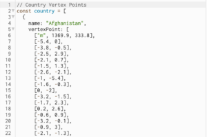
The design of the sketch itself is something I spent a lot of time on. I tried various combinations of world map lay outs, color combinations and even explored the Mappa library. At the end, the most practical thing to use was a preexisting p5js sketch [link: https://editor.p5js.org/Kumu-Paul/sketches/8awPJGZQ4] as the structure of my data visualization. The preexisting sketch gave me access to a complex array of vertices that layout the border of every single country in the world.

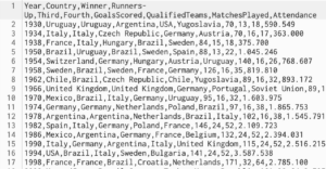
Now with the dataset for all the countries locations as vertices, I needed a dataset of all the Fifa World Cups that have taken place. I found a great resource of Kaggle, but it only went up to 2014, so I had to manually add the relevant data to make it up to date.

Then to combine everything, I first started by making the whole map black. I wanted to highlight the countries that won the world cup as gold, and the countries that were runner ups as silver, so adding any different color in the background didn’t seem to make sense aesthetically. I added a slider functionality to build on the interactivity of the sketch. The slider represents the date starting from 1930, when the first world cup was hosted, and the user can slide it all the way till 2022. As the world cup happens every 4 years, the slider has a step of 4.

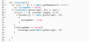
The next step was to extract data from the World Cup csv about the date, the winner and the runner up. To do this, I iterated over the csv table and saved the winners and the runner ups in separate arrays. There was one issue here, which was what happens if a country already won the cup and then were runner ups in later years. If a country had won the world cup, but then became runner ups later on, I wanted them to stay with the gold color. To do this I had to make sure I create the winners array first and then cross check the winners array before pushing to the runner ups array.

Finally, the last functionality I wanted to add is that if a country won the world cup several times, I wanted there to be some distinction when compared to the rest. Todo so, I added a variable which counted the number of wins, and then decreased the rgb value of the shade of gold by a factor of the number of wins. This allowed me to create a representation for the number of wins of each country, as the countries that had won more cups now were represented by a darker shade of gold


Improvements

I would have liked to change the color of the slider, but unfortunately I can’t do that on p5js

HW4: Generative Text

CONCEPT

I was inspired by the Stroop text I learned about from the intro to psychology class I am currently taking. The test requires its participants to name the colors of the words on the grid as fast as possible. The trick is that the words on the grid are actually the names of colors different from the ones they are colored in. This test allows for measuring a person’s selective attention capacity and executive processing skills. In my assignment submission, I am making this test into a written game.

Taking the Stroop Test | Musings of an Aspie

IMPLEMENTATION

The most challenging part of the idea implementation for me was to make the time counter work. I couldn’t figure out how to make it count the seconds since the beginning of the game as opposed to every frame since the beginning of the game. My mistake was that I didn’t divide it by 60, which sounds silly but took me lots of time to notice. Besides that, I didn’t have any other issues while figuring out the game design. Below is attached a snippet of my time counter:

//update and display time since the beggining of the game
function updateTime() {
  //check if 30sec passed
  if (timeLeft > 0) {
    //count seconds passed since start
    let alltime = floor((frameCount - startTime) / 60);
    //count time left
    timeLeft = 30 - alltime;
    //display time left
    textSize(14);
    text("time: " + timeLeft, width / 1.25, 270);
  }
  //if 30sec passed -> end game
  else {
    gameOver(false);
  }
}

ASPECTS TO WORK ON

I feel like my code could have been written more beautifully (neater and more concise). I have also tried assembling it as a class but I couldn’t figure out how to make it work, so I turned it back into a bunch of functions. Perhaps, I could have actually displayed the words in a grid as opposed to one word at a time to make it more challenging to focus for the user.


Week 4 Generative Text

The concept behind this project is to create a colorful, dynamic, and mesmerizing generative artwork that combines vibrant colors, fluid shapes, and intriguing phrases. To achieve this, we use a combination of randomization and user-defined variables to create unique color schemes, shapes, and phrases.


The program is structured around a group of arrays that describe the nouns, adjectives, and colors that make up the sentences. The random() method is then used to pick a color from the color array, an adjective from the adjective array, and a noun from the noun array, resulting in a sentence that vividly describes a scene using a wide variety of colors and adjectives.

My use of a gradient background is one of the code snippets I am most pleased with. To make a background that is both visually pleasing and easy on the eyes, I used the createLinearGradient() function to make a linear gradient.


Adding user controls to this project would be a great way to improve it and give people more interactivity in shaping the final product. Also, I would use other shapes and phrases, adding additional components to the artwork to increase its visual complexity and intrigue.


Generative Text with p5js

For this homework, I chose to work with generative text and produce a simple program that will output a poem of my choice in some chaotic fashion. The poem I chose ‘The night, the pharmacy, the street’ is one of quite famous poems in Russian by Alexander Blok, and it is one of very few I can fully recite in Russian. Personally, while this poem has a meaning, it always comes to my mind first when I think of something quite random in literature.

To select which words are going to be displayed in canvas, I use the following function. It first filters poem from double spaces and then randomly selects the first word to display as well as the last word.

function drawWords(x, y) {

  let corpus = poem.split(' ').filter(y => y!="");

  let first_word = floor(random(corpus.length));
  let last_word = first_word + random(2, 8);

  fill(255,233,0);
  text(corpus.slice(first_word, last_word).join(' ').trim(), x, y);

}

The sketch of my final program is shown below:

I chose yellow and black to better match with the scene described: the street in the night with the bright lamppost. For future improvement, I would like to add more complexity to implementation and to make it more random. It feels chaotic as of now, but with addition of randomness in the position and more controlled randomness in the selection of words it should be more accurate in my vision. Also, I wanted to work on graphics a bit and add a lamp with options to turn on and off to match the theme. Overall, this was a fun experience with generative text and I hope future projects are going to be fun as well =)


Link: https://editor.p5js.org/ds6058/sketches/GHtAW9-XW

References:

https://sites.google.com/site/poetryandtranslations/alexander-blok/-the-night-the-pharmacy-the-street-a-blok

https://p5js.org/examples/typography-words.html

Assignment 4 – Data Visualization

In this assignment, I represent the countries of the world and their population growth over the years on a world map.

To start off, I downloaded the dataset from https://data.worldbank.org/indicator/SP.POP.TOTL. The dataset shows the countries of the world, and the respective populations of each year from 1960 to 2021. As the dataset only contained the country names and not their latitudes and longitudes, I used the Google Sheets extension “Geocode by Awesome Table” to generate the lats and lons of each country. I cleaned up the data by removing all rows where the longitudes and latitudes could not be generated.

Once the data was ready, I read through the csv and generated points for each longitude and latitude. I then added a map of the earth in the background and adjusted the lans and lats to match the borders of the countries as accurately as possible. To ensure this was successful, I also printed the names of all the countries along with their points to give me a better idea about where to place the dots approximately. Initially, I mapped the population of 2021 for all countries only for making sure the program runs fine.

After this was implemented, I used the map() function to change the size of the ellipses and their colors based on the population of the country. This was done by initially finding the min and the max population from the entire dataset along with min and max latitudes and longitudes.

Once I had the basic functioning code for the year 2021, I edited the code to run for all years. As the code was too slow when the years were only incrementing by 1, I changed it to make the years increment by 10 each time.

Reflection

I found it quite challenging to update the canvas without removing the ellipses which represented the population for the previous year. If I updated the background image each time the draw function was run, all ellipses was erased. And, if I only updated it every time the year was incremented, all the previous ellipses were erased due to which it was difficult to estimate population growth over the years. To solve this problem, I went through P5 references to understand multiple functions which may help me to solve the problem such as erase() and clear() but none of them helped. Eventually, I settled on only initializing the background once in setup but adding a black rectangle behind the text so I can update it every time without the years being overwritten on top of each. One aspect in which I believe this piece could have been further improved is by showing the growth of all the circles more dynamically instead of one being drawn over another.