Week 4 – Data Visualization

Week 4: Data Visualization


Description:

This project consisted of creating a data visualization for some kind of data.

Idea:

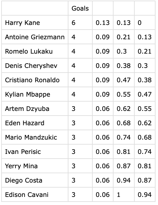
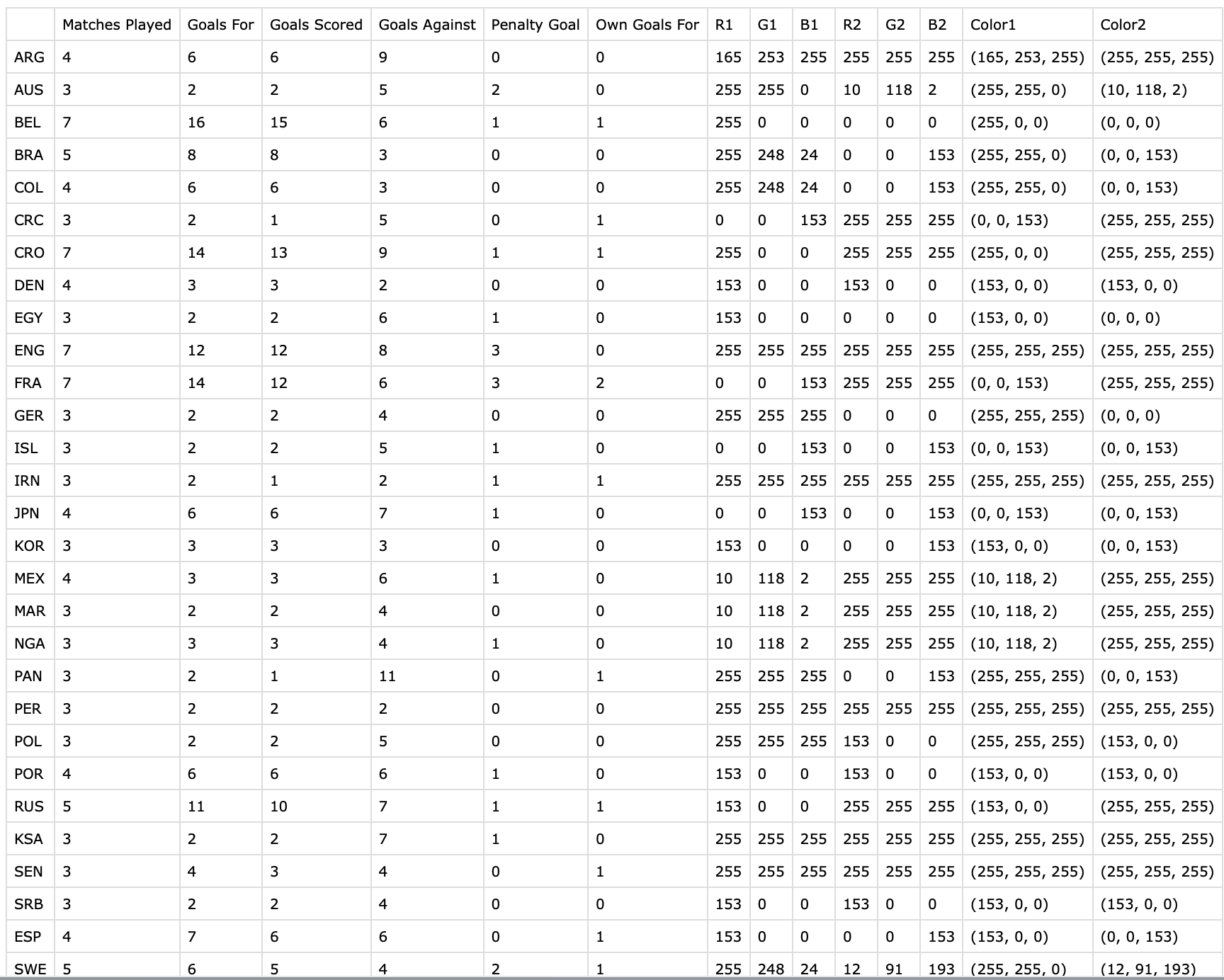
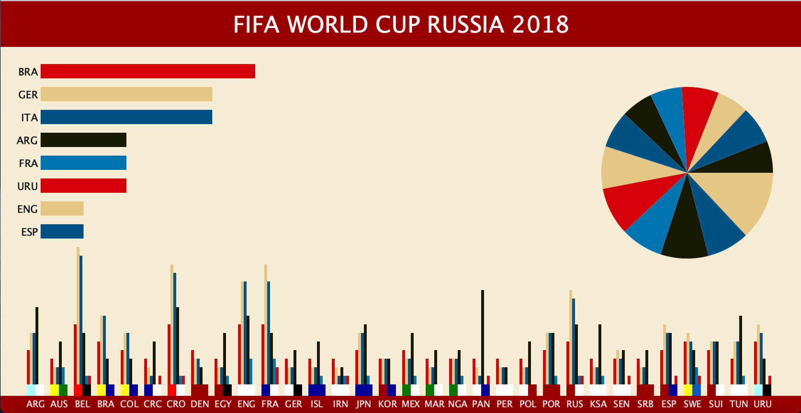
For this assignment, I wanted to create some kind of visualization involving soccer. I really enjoy watching soccer and one of my favorite tournaments is the World Cup. Therefore I decided to do some research on the latest World Cup in Russia 2018. I initially liked the data involving goals for each country so I decided to collect such data on the official FIFA webpage. 

Challenges:

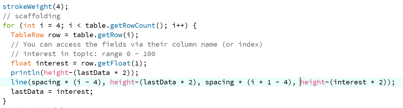
For this project, there was no major challenge for me. The only difficult process was collecting data and working with CSV files. One major example was when I was using colors. I had to manually put every single piece of data. Initially, I thought I could write the colors in RGB in one single cell. However, Processing failed to read the data as colors. Finally, I had to write every single RGB value in a separate cell. For the piechart, I tried to make it interactive by making it bigger once clicked and making it display the names of the players. Although I tried to use the rotate function and textAlign function, I failed to get the outcome I wanted.

Process: 

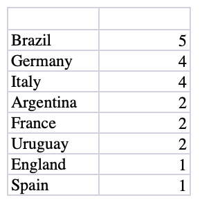
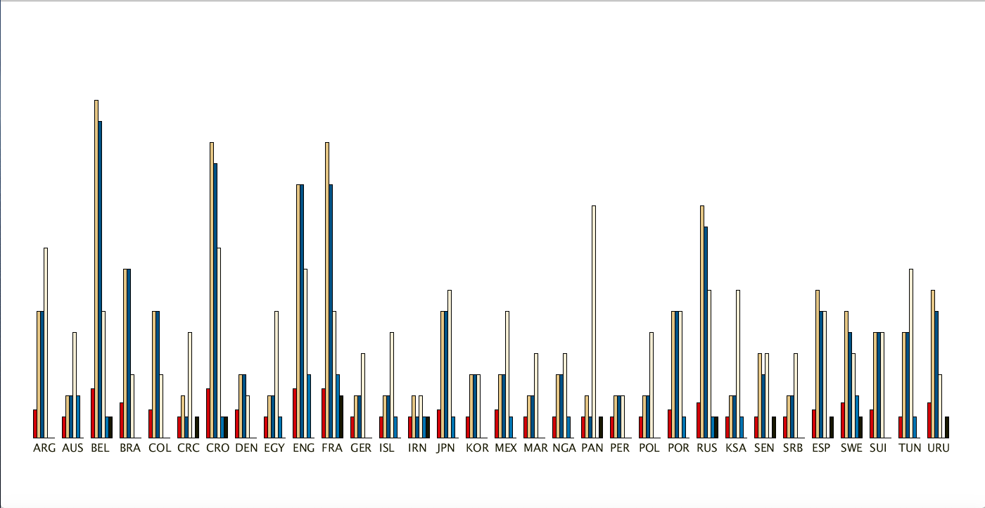
For this project, I first started collecting data. I used the official FIFA website to collect data such as matches played, goals scored, goals against, own goals, and penalty goals. After collecting such data I used Microsoft excel to write each country’s name and data. I tried different designs and positions until I liked the last one where I place all of the data at the bottom of the screen and show it in bar graphs. When I completed this, I decided to put some color. For the overall design, I used the official colors used in the Russia World Cup. Then I got the idea to represent each country’s uniform color along with the name. After being done with this, I realized that the screen looked somewhat empty. Later I decided to add two additional features. The first one was a pie chart involving the top thirteen goal scorers. The second one involved the number of World Cup wins by country. 


Conclusion:

Overall I had a lot of fun creating this project because it involved something I liked. Although it was tedious to work with a lot of data I think I got to practice a lot for this project. I used previous topics such as OOP and using text. Even though I failed to complete the part for the text, I was satisfied with the result. The project looks a little empty but I think I will keep working on it to fill it and make it more interactive. Although the project took me more time than expected, I feel I enjoyed investigating and creating this data visualization. Also compared to other projects, I think I have improved a lot in avoiding hardcoding.

Country[] countries;
PieChart[] players;
Winners[] winner;

PFont font;
Table table, table2, table3;
color red = color(211, 2, 8);
color gold = color(229, 198, 133);
color white = color(245, 238, 213);
color black = color(23,23,0);
color blue = color(1, 83, 134);
color blue2 = color(0, 116, 177);
int zoomindata = 0;

color[] colors= { red, gold, blue, black, blue2 };
String[] countryname = { "BRA", "GER", "ITA", "ARG", "FRA", "URU", "ENG", "ESP"};

void setup(){
 size(1400, 720); 
 loadData();
}

void draw(){
  font = createFont("Montserrat", 40);
  background(245, 238, 213);
  textSize(64);
  fill(153, 0, 0);
  rect(0,0,width, 80);
  rect(0,height-30,width, 30);
  fill(255);
  textAlign(CENTER);
  textFont(font);
  text("FIFA WORLD CUP RUSSIA 2018", width/2, 55);
  
  for(int i = 1; i < 33; i++){
    countries[i].drawData();
  }
  for(int i = 0; i < 14; i++){
    if(zoomindata == 0){
      players[i].drawData();
    }
    else if(zoomindata == 1){
      players[i].drawBigCircle();
    }
  }
   
  for(int i = 0; i < 8; i++){
    winner[i].drawData();
  }
}

 void loadData(){
    
    //array for bottom data
    table = loadTable("worldcup2018.csv");
    //array for piechart
    table2 = loadTable("piechart.csv");
    //array for winners
    table3 = loadTable("line_chart.csv");
    
    countries = new Country[table.getRowCount()];
    players = new PieChart[table2.getRowCount()];
    winner = new Winners[table3.getRowCount()];
    
    for (int i = 0;  i < table.getRowCount(); i++){
      TableRow row = table.getRow(i);
      String name = row.getString(0);
      float matchplay = row.getFloat(1);
      float goalfor = row.getFloat(2);
      float goalscore = row.getFloat(3);
      float goalagainst = row.getFloat(4);
      float pkgoal = row.getFloat(5);
      float owngoal = row.getFloat(6);
      int r1 = row.getInt(7);
      int g1 = row.getInt(8);
      int b1 = row.getInt(9);
      int r2 = row.getInt(10);
      int g2 = row.getInt(11);
      int b2 = row.getInt(12);
      color c1 = color(r1, g1, b1);
      color c2 = color(r2, g2, b2);
      countries[i] = new Country(41*i, name, matchplay, goalfor, goalscore, goalagainst, pkgoal, owngoal, c1, c2);
    }
    
    for (int i = 0; i < table2.getRowCount(); i++){
      TableRow row2 = table2.getRow(i);
      String player = row2.getString(0);
      float goal = row2.getFloat(1); 
      int colornum = i%5;
      float anglei = row2.getFloat(4);
      float anglef = row2.getFloat(3);
      players[i] = new PieChart(player, goal, colors[colornum], anglei*TWO_PI, anglef*TWO_PI);
    }
    
    for (int i = 0; i < table3.getRowCount(); i++){
      TableRow row3 = table3.getRow(i);
      //String country = row3.getString(0);
      float wins = row3.getFloat(1); 
      int colorbar = i%5;
      winner[i] = new Winners(i, countryname[i], wins, colors[colorbar]);
    }
    
 }

 void mousePressed(){
   if(mouseX > 1000 && mouseY < 500){
       zoomindata = 1;
   }
  }
  
 void mouseReleased(){
   zoomindata = 0;
   
 }
 
class Country{
  float posX, posY;
  String name;
  color color1, color2;
  float MP, GF, GS, GA, PG, OG;
  float spacebtwy, spacebtwx, widthbar, barheight;
  
  Country(float x, String n, float matches, float goalf, float goals, float goala, 
  float pkgoal, float owng, color c1, color c2){
    posX = x;
    posY = height - 50;
    spacebtwy = 5;
    spacebtwx = 5;
    name = n;
    MP = matches;
    GF = goalf;
    GS = goals;
    GA = goala;
    PG = pkgoal;
    OG = owng;
    widthbar = 5;
    color1 = c1;
    color2 = c2;
    barheight = 15;
  }
  
  void drawData(){
    textSize(16);
    noStroke();
    fill(255);
    text(name, posX+20, posY+40);
    fill(red);
    rect(posX+spacebtwx, posY-MP*barheight, widthbar, MP*barheight);
    fill(gold);
    rect(posX+2*spacebtwx, posY-GF*barheight, widthbar, GF*barheight);
    fill(blue);
    rect(posX+3*spacebtwx, posY-GS*barheight, widthbar, GS*barheight);
    fill(black);
    rect(posX+4*spacebtwx, posY-GA*barheight, widthbar, GA*barheight);
    fill(blue2);
    rect(posX+5*spacebtwx, posY-PG*barheight, widthbar, PG*barheight);
    fill(red);
    rect(posX+6*spacebtwx, posY-OG*barheight, widthbar, OG*barheight);
    fill(color1);
    rect(posX+5, posY, 15, 20);
    fill(color2);
    rect(posX+20, posY, 15, 20);
  }
  
}
class PieChart{
  float posX, posY;
  float percentage;
  float radius;
  float anglei, anglef;
  color colors;
  String name;
  
  
  PieChart(String player, float goal, color colorpie, float angle1, float angle2){
    posX = 1200;
    posY = 300;
    radius = 300;
    colors = colorpie;
    anglei = angle1;
    anglef = angle2;
    float num = goal;
    name = player;
    
  }
  
  void drawData(){
    fill(colors);
    arc(posX, posY, radius, radius, anglei, anglef);
  }
  
  void drawBigCircle(){
    fill(colors);
    arc(width/2, height/2, radius*2, radius*2, anglei, anglef);
    textSize(24);
    pushMatrix();
    translate(width/2, height/2);
    rotate((anglei+anglef)/2);
    fill(0);
    textAlign(RIGHT);
    text(name, 0, 0);
    popMatrix();
    
  }
  
}
class Winners{
  float posX, posY;
  float wins;
  color colors;
  String name;
  int barlength, barwidth;
  
  
  Winners(int position, String country, float number, color colorbar){
    posX = 70;
    posY = 40*position + 110;
    name = country;
    wins = number;
    colors = colorbar;
    barlength = 75;
    barwidth = 25;
    
  }
  
  void drawData(){
    fill(colors);
    rect(posX, posY, wins*barlength, barwidth);
    fill(0);
    textSize(18);
    textAlign(RIGHT);
    text(name, posX-5, posY+20);
  }
  
}


Weird Letters

This week we had to experiment with text and how we can manipulate them and I thought the best way to do so was to illustrate it in the form of a word game. And so I created this word game which involves both geomerative points as the backdrop of the text behind and the original text which can be manipulated by the use of a house causing the characters to move up and down. It was not what I had in mind as my first idea for the project but since I was late and couldn’t bring my first idea to fruition I thought of settling for this.


In this project, other than the regular Rfunctions we learned in class, I learned about RShape and how they can be used to identify letters in a text.


import geomerative.*;

RFont font;
RPoint[] points;
String phrase = "Word Game!";
float xOffset;
RShape shp;
float letter_x =0;
float letter_y = 0;
int random_letter = -1;
int speed = 10;

void setup()
{
  size(800, 800);
  RG.init(this);
  font = new RFont("Franklin Goth Ext Condensed.ttf", 160, RFont.CENTER);
  RCommand.setSegmentLength(int(random(10)));
  RCommand.setSegmentator(RCommand.UNIFORMLENGTH);
  RGroup grp;
  grp = font.toGroup(phrase);
  grp = grp.toPolygonGroup();
  points = grp.getPoints(); //for points
  shp = RG.getText(phrase, "Franklin Goth Ext Condensed.ttf", 150, RFont.CENTER);
  xOffset = width - grp.getBottomRight().x - grp.getBottomLeft().x;
  letter_x = xOffset/2;
  letter_y = height/2; //for letters
  
}


void draw()
{
  background(0);


  for (int i =0; i<points.length; i++) {
    float x = points[i].x + xOffset/2;
    float y = points[i].y + height/2;
    fill(random(255), random(255), random(255));
    rect(x, y, random(5), random(5)); //to create dotted background
  }

  
  for (int j =0; j<shp.children.length; j++)
  {
    if(j != random_letter){
      pushMatrix();
      translate(letter_x, letter_y);
      shp.children[j].draw();
      popMatrix(); //to create letters
    }
  } 

  if(mouseX > 0 && mouseX < width){
   random_letter = int(map(mouseX,0,width,0,shp.children.length));
    println(random_letter);
    translate(letter_x, random(2*letter_y));
    shp.children[random_letter].draw(); //to move them acc to cursor
  }
}


:) idk what to call this – week 5


IDEA:


I was thinking of a way to make a text look cool. The first thought in my mind was to let the user manipulate its position using the mouse. But that was not enough, so I thought I might make it look like it’s raining the characters of the sentence with other effects (different sizes and colors every time the program runs).


DIFFICULTIES:


I tried making colors be generated in for loop inside another for loop but for some odd reason it did not work. It either did not display anything or ran like crazy and did not look good. Then I realized I did not need a for loop for it.


CODE:

PFont f;
String s;
float g;


void setup(){
size (640, 480);


f = createFont("Georgia", 35);
s = "Shaikha is amazing";


}

void draw(){
 
  
  background(0);
  g = random(200, 255);
  textFont(f);
  textSize(35);
  fill(255);
  text(s, mouseX, mouseY);

  if (mousePressed == true){

      for (int i = 0; i< s.length(); i++){
                 
          fill (245, g, 66);
          textSize(random(9,100));
          text(s.charAt(i), random(width), random(height));
    
      }
      

  }


}


Week 5: Data Viz!

Perhaps it was the fact that we spent last class doing translate and rotate to place objects in a circle or perhaps because I love radar charts, I gravitated towards doing a visualization resembling lines in a circle.

Using data from Google Calendar and my memory, I first logged how I spent my last week in terms of the number of hours spent in class and meetings, working, socializing, and practicing self-care.

Next, I started with the layout of the piece, drawing some dummy rectangles to organize the sketch.

sketch of rectangles drawn with for loop across sketchFrom there, I began experimenting with drawing the strokes in a circle.Second step in process of sketch; blurry text

It was rather unclear how long the lines actually were which was important since the length was supposed to convey the number of hours I spent engaged in a particular activity. I also was not vibing with the font.

I ended up drawing smaller circles for each day to have gridlines to show the number. I also learned how to load a font into Processing and used one of my favorite typefaces: Avenir!

process 3 of sketch; changed font to Avenir and made less blurry

One thing I needed to pay particular attention to was the order of drawing all the elements. Originally, I had my circles in the inner for loop which meant they kept getting drawn on top of so they were thicker than intended, they got drawn on top of the chart lines, and the obvious harm to performance.

Here is my final sketch!

final sketch!

And the code!

//class, meetings, social, work, self-care
float[][] data ={{1.25, 6.5, 1.0, 3.0, 2.25}, {4.25, 2.0, 4.0, 5.0, 1.0}, {3.75, 0.0, 4.0, 3.0, 1.0}, {2.5, 1.25, 3.0, 2.0, 3.0}, 
{1.25, 2.5, 3.0, 6.0, 3.0}, {0.0, 0.5, 6.0, 6.0, 3.0}, {0.0, 1.0, 3.0, 8.0, 2.0}};

PFont av;

String[] days = {"Sunday Feb 7", "Monday Feb 8", "Tuesday Feb 9", 
"Wednesday Feb 10", "Thursday Feb 11", "Friday Feb 12", "Saturday Feb 13"};

color[] palette = {#28464B, #855A5C, #8A8E91, #B8D4E3, #FED766};

String[] legend = {"class", "meetings", "social", "work", "self-care"};

int scale = 20;

void setup(){
  av = loadFont("Avenir-Book-48.vlw");
  hint(ENABLE_STROKE_PURE);
  size(1300, 500);
  background(255);
   fill(#6D7174);
  textAlign(CENTER);
  textFont(av, 36);
  text("How I Spend My Week (and too much time in meetings)", width/2, 50);
  drawKey();
  drawLines();
  textAlign(CENTER);
  textFont(av, 10);
  fill(#6D7174);
  textAlign(LEFT);
  text("Notes: The length of line corresponds to the number of hours spent that day engaging in that activity. The color corresponds to the activity.", 15, height-15);
}

//draws lines at top showing the colors and activities
void drawKey(){
  int x = 800/data[0].length;
  for (int a = 0; a < data[0].length; a++){
    stroke(palette[a]);
    strokeWeight(3);
    line(width/6 * a + x, 100, width/6 *a +x + 50, 100);
    textFont(av, 12);
    textAlign(LEFT);
    text(legend[a], width/6 *a +x + 65, 102);
  }
}

void drawLines() {
  textAlign(CENTER);
  int x = width / days.length;
  float angle = 360/data[0].length;
  for (int i = 0; i < data.length; i++) {
    //draws guiding circle gridlines
    textFont(av, 12);
 noFill();
      strokeWeight(0.5);
      stroke(#D4D8D8);
      circle(x * i + 100, height/2, 2*scale);
      fill(#D4D8D8);
      text("2", x * i + 100 + scale, height/2);
      noFill();
      circle(x * i + 100, height/2, 4*scale);
      fill(#D4D8D8);
      text("4", x * i + 100 + 2* scale, height/2);
      noFill();
      circle(x * i + 100, height/2, 6*scale);
      fill(#D4D8D8);
      text("6", x * i + 100 + 3* scale, height/2);
    fill(#6D7174);
    //draw day labels
    text(days[i], x * i + 100,height- 100);
    for (int j = 0; j < data[i].length; j++){
      //draws the chart lines
      translate(x * i + 100, height/2);
      rotate(angle * j);
      strokeWeight(3);
      stroke(palette[j]);
      line(0,0,0,data[i][j] * scale);
      fill(255);
      strokeWeight(1);
      ellipse(0, data[i][j] * scale, 7, 7);
      rotate(-angle * j);
      translate(-(x * i + 100), -height/2);
    }
  }
}


Week 4: Shivering Letters

//a string of text
String s = "Shivering in Abu Dhabi";
// Create an array the same size as the length of the String
Letter[] letters = new Letter[s.length()];
//Check the font list
//println(PFont.list());
PFont f;

void setup() {
  size(600, 600);
  f = createFont("Courier New", 30);
  textFont(f);

  // The initial position
  int x = 100;
  for (int i = 0; i < s.length (); i++) {
    letters[i] = new Letter(x, height/2, s.charAt(i)); 
    x += textWidth(s.charAt(i));
  }
}

void draw() { 
  background(255,255,0);

  // loop through the letters array and display letters
  for (int i = 0; i < letters.length; i++) {
    letters[i].display();

    // If the mouse is pressed the letters shiver; otherwise, they return to their original location or station
    if (mousePressed) {
      letters[i].shiver();
    } else {
      letters[i].station();
    }
  }
}

class Letter {
  float x,y;
  float X,Y;
  float fluctuation;
  char letter;

  Letter (float _x, float _y, char _c) {
    X = x = _x;
    Y = y = _y;
    x = random(width);
    y = random(height);
    fluctuation = random(TWO_PI);
    letter = _c; 
  }


  void display() {
    //Choose random color for each letter
    fill(random(255));
    //strokeWeight(2);
    textAlign(CENTER);
    textSize(30);
    pushMatrix();
    translate(x,y);
    rotate(fluctuation);
    text(letter,0,0);
    popMatrix();
  }

  // Fluctuate the letters
  void shiver() {
    x += random(-5,5);
    y += random(-5,5);
    fluctuation += random(-1,1);
  }

  // Return the letter to the initial positions using lerp function
  void station() {
    x = lerp(x,X,0.05);
    y = lerp(y,Y,0.05);
    fluctuation = lerp(fluctuation,0,0.05);
  }
}

Motivation

I want to display letters in a shaky form representing how tremendously the temperature fluctuates between daytime and night time in Abu Dhabi. I can wear sweaters at night or early morning and shorts at noon.

Process

I want to make the letter blink in different shades of one color (I should have chosen red!) to represent the temperature change. When the mouse is pressed, individual letters moved freely around the initial position and they come back to the station and stand still when the mouse is released. Also, I based the code for my class Letter on  our class file circleLetterSketch and took reference from The Coding Train Youtube channel. In the coding and googling process, I discovered the println(PFont.list()) funtion to know all the fonts available in Processing after some failed trials with different random fonts I searched the names on the internet. Also, the lerp function is also used to fluctuate letters within a limited range to create a shaking effect as if the letters were shivering because of the cold night or foggy morning here these days.


Week 4: data visualization

Inspiration:

I think that it is useful to know how to visualize data and generate text in Processing. That’s why this week I explored them both, not focusing only on one of them. To be honest, before this version I had many other attempts to make something creative (lyric video, for example). However, I gave up for now and decided to represent and compare the interest overtime for a few of my favorite TV-shows, Game of Thrones, Sherlock, and Grey’s Anatomy.

Process:

I took the data from Google Trends Explore and had 3 CSV files, which graphs you can see below. I also added text at the top of my work using the geomerative library. I played with sizes, figures, colors, and actually understood what the functions of this library mean using this resource.

I displayed 3 graphs under each other and added titles to them. I also had the timeline that shows which years are displayed. All titles are typewritten (kinda), so they appear letter by letter.

Problems:

This assignment was not as easy as I thought, so I spend hours understanding how things work here. The order of functions is extremely important because few times elements didn’t display only because I messed up the order.

Result:

Code:

import geomerative.*;
RFont font;
RPoint[] pnts;
String phrase = "TV-shows";
String word1 = "Game of Thrones";
String word2 = "Grey's Anatomy ";
String word3 = "Sherlock       ";
float xOffset = 0;
Table table1, table2, table3;
float spacing;
PFont f; 
int counter;
  
float[] intervals = new float[11];

void setup() {
  size(600, 720);
  loadData();
  stroke(255, 0, 0, 75);
  smooth();
  frameRate(5);
  
  f = createFont("Courier New", 10);
  textFont(f);
  
  RG.init(this);
  font = new RFont("Franklin Goth Ext Condensed.ttf", 85, RFont.LEFT);
  
  RCommand.setSegmentLength(2);
  RCommand.setSegmentator(RCommand.UNIFORMLENGTH);
  RGroup grp;
  grp = font.toGroup(phrase);
  grp = grp.toPolygonGroup();
  pnts = grp.getPoints();
  xOffset = width - grp.getBottomRight().x - grp.getBottomLeft().x;
  xOffset = xOffset/2;
  
  for (int i=0; i<10; i++) {
    intervals[i]=width/10*i;
  }

  noFill();
  stroke(255, 255, 255, 85);
}

void loadData() {
  
  // Load CSV file into a Table object
  // "header" option indicates the file has a header row
  table1 = loadTable("GameOfThrones.csv", "csv");
  spacing = float(width)/(table1.getRowCount()-3);
  println(table1.getRowCount()+" "+spacing);
  
  table2 = loadTable("GreysAnatomy.csv", "csv");
  spacing = float(width)/(table2.getRowCount()-3);
  println(table2.getRowCount()+" "+spacing);
  
  table3 = loadTable("Sherlock.csv", "csv");
  spacing = float(width)/(table3.getRowCount()-3);
  println(table3.getRowCount()+" "+spacing);
}

void draw() {
  background(10, 10, 20, 80);

  line(0, height/4, width, height/4);

  
  for (int i=0; i<10; i++) {
    line(intervals[i], height/4+10, intervals[i], height/4-10);
    fill(0, 102, 153, 204);
    textAlign(CENTER);
    textFont(f);
    fill(255);
    text("201"+i, intervals[i], height/4+20);
  }
  
  textAlign(LEFT);
  textSize(20);
  fill(255);
  typewriteText(word1,  width/10, height/4+50);
  
  typewriteText(word2, width/10, height/2+50);
  
  typewriteText(word3, width/10, height/4*3+50);
  
  text("some of my favorite", width/10, 30);
  text("through the years", width-width/2, height/4-55);
  
  noFill();
   
  beginShape();
  for (int i = 3; i < table1.getRowCount(); i++) {
    TableRow row0 = table1.getRow(i);
    float interest = row0.getFloat(1);
    float x = (i-3)*spacing ;
    float y = map(interest, 0, 100, height/2, height/4+50);
    curveVertex(x, y);
  }
  endShape();
  
   beginShape();
  for (int i = 3; i < table2.getRowCount(); i++) {
    TableRow row0 = table2.getRow(i);
    float interest = row0.getFloat(1);
    float x = (i-3)*spacing ;
    float y = map(interest, 0, 100, height*3/4, height/2+50);
    curveVertex(x, y);
  }
  endShape();
  
   beginShape();
  for (int i = 3; i < table3.getRowCount(); i++) {
    TableRow row0 = table3.getRow(i);
    float interest = row0.getFloat(1);
    float x = (i-3)*spacing ;
    float y = map(interest, 0, 100, height, height*3/4+50);
    curveVertex(x, y);
  }
  endShape();
  
  for (int i=0; i< pnts.length; i++) {
    float x = pnts[i].x + xOffset;
    float y = pnts[i].y + height/4-80;

    float diam = 7;
    ellipse(x, y, diam, diam);
  }
}

void typewriteText(String word, float start, float finish){
  
  if (counter < word.length())
    counter++;
  text(word.substring(0, counter), start, finish, width, height);
}

Text || Emotional Circle

Emotional Circle

This week from the perspective of the class was dedicated to text modification and data visualization, however from my  personal perspective it was about mental health. This week i’ve learned a bit about feelings, emotions and mental health. I bumped into different articles and interesting posts. My personal experience + new information gave birth to the visualization of Emotional Circle

First my code looked like this. The color and atmosphere are dark and gloomy, so I decided to be positive and added some motivation  to the code

Code:

To make the circle text move I used geomerative library and some piece of code which found in references.  To output all the text statements easier I put them in the array.

import geomerative.*;
PFont sourceLight;
RShape   grp;
RShape   circle;
String [] names = {"fear", "sadness", "anxiety", "confusion", "calmness", "exitment", "pain", "horror", "interest", "nostalgia", "disgust", "hatred", "acceptance"} ;
int i = 0;
boolean ignoringStyles = false;
PFont  HelveticaNeue;

void setup(){
   
  size(900, 700);
  smooth();
  textSize(30);
  HelveticaNeue = createFont("HelveticaNeue-Light",10);
  textAlign(CENTER);
  
  RG.init(this);
  
  grp = RG.getText("Choose not to blame yourself", "FreeSans.ttf", 72, RG.CENTER);

  RG.setPolygonizer(RG.ADAPTATIVE);
  RG.setPolygonizerAngle(0.065);
  grp = RG.polygonize(grp);
    
  circle = RG.getEllipse(0, 0, 20);
  circle = RG.centerIn(circle, g, 220);  
}

void draw(){
  translate(width/2, height/2);
  background (0);
  fill(0);
  stroke(254, 184, 198);
  float t = map(mouseX, 0, width, 0.01, 0.99);
  RShape circleSeg = RG.split(circle, t)[0];
  
  RG.setAdaptor(RG.BYELEMENTPOSITION);
  RShape adaptedGrp = RG.adapt(grp, circleSeg);
  
  RG.shape( adaptedGrp );
  
  noFill();
  stroke(255, 200);
    
  RG.shape( circleSeg );
  frameRate(2);
}

void keyPressed(){

 if (key == 's')
  fill(253);
  textFont(HelveticaNeue);
  textSize(random(30, 60));
  textAlign(CENTER);
  text(names[i], 0, 0);
  i++;
}

void mousePressed(){
  ignoringStyles = !ignoringStyles;
  RG.ignoreStyles(ignoringStyles);
}


This video shows the last result of my coding, but not the last way of thinking


Femicide

*Trigger warning: as you can see by the title, I walk about deaths of women in my home country and describe the femicide that inspired me to work on this project under the Inspiration section*

Description:

This is a project that showcases the number of femicides committed in the country of Honduras since January 2021. It displays the number of cases by department (Honduran word for state) and the user can place the mouse on top of the bubbles containing the numbers to look at the name of the department. Meanwhile, the map of Honduras can be seen forming in the background, with the bubbles placed on their respective location in the map.

Inspiration:

To be honest, my original idea was to make something using generative text, however, I felt like I understood generative text better than I did data visualization, so I decided to make the project based on data visualization to practice more. The idea of displaying the number of femicides committed in Honduras, my country since the start of 2020 came from I post I saw last week about a girl who was detained by the police at night and was discovered dead in her cell (most likely because she resisted an attempt to sexual assault by the policemen who imprisoned her). The police took her to the hospital already dead, but filed in the report that she was taken alive and died while the doctors treated her and they refused to perform an autopsy, dismissing the case as a suicide attempt. The hospital, however, released their report in which they explained that she was strangled (most likely by men). Because of how boldly the police died, many people in the town where this happened started to make a campaign that grew into a social media under the hashtag JusticeForKeyla (the name of the girl). Nevertheless, though the police has acknowledged that Keyla didn’t commit suicide, they refused to investigate. The policemen who incarcerated Keyla have been re-assign and their whereabouts are not known.

I was outraged by this case, not only because it was the police, the people charged with the safety of citizens, the ones who killed her but also by the fact that they lied to openly about it. Femicide, unfortunately, is not something uncommon in my country and cases like Keyla’s are some of the few that are actually been investigated, if not by the police, by the Honduran people. It is very dangerous to be a women in Honduras and in honor of the 90% of the victims that will not receive justice for their murder, I decided to make this visualization.

Process:

I had no idea how to start the project. I knew what I wanted it to look like and I had the data of the femicides this year from one of the NGO’s back home that advocates for women’s rights., but I didn’t know how to come up with the logic to actually write the code. I decided to make a sketch of how I wanted the visualization to look like to get my ideas in order.

This is what I came up with:


After doing the sketch, I decided to first get the locations of the coordinates in which to place the circles. I did this mainly using trial and error and the mouseX, mouseY . I also tried experimenting with other shapes. The rectangle was a good contender, but I preferred the overall look of the circles.

This is what they looked like:

Once I had the locations, I added them to the data set containing the # of deaths.

Afterwards, I decided to stop hardcoding and get to work with the Table object. This took quite some time as I didn’t really understand how to read the rows of the table that well. Thus, I went to Baba Daniel Shiffman for help and watch a lot of his videos on Tabular Data in Processing.It was a great resource and after following along his examples, I manage to grasp a fair amount of the knowledge needed to proceed. (He also gave me the idea of using a hover so the user could see the number of deaths and the department, which I tried with the original ‘hardcoded’ version).

The difficult part came when doing the objects. I found it very difficult to make the bubbles look like I wanted them to, since there were departments that had 74 to 50 deaths in January, contrasting  with other departments that had only 1 or 2 deaths (which are mainly the inhabited territories ), thus I couldn’t use the same scale for make all the circles since one would look too big while the others too small. I opted for having different scaling values for the radius of the bubbles depending on the magnitude of the number of deaths .

Afterwards, I remember look at my visualization thinking that it looked pretty good regardless of the fact that every 30 minutes I edited something I completely crashed the program. But alas, the main product was finalized. I still wanted to do something more with the background because I wanted more circles in the sketch. I read through some of my class notes and remembered that I have never used ArrayList<>; . I then Googled ideas to practice using ArrayList<>; and someone in a forum mentioned making a background out of digital circles using. I then binged watch for two days how to use ArrayList<>; and did some pretty lame attempts at it, but once I manage to understand what I was doing, I decided to make a background since the map I was using was a transparent png . It look fine, but a little overwhelming because of all the color.

When that was done, I decided to experiment a little with the things we learned last lecture about pixels  and took the color values of the pixels in the image I had for the map of Honduras to determine the color of the circles that would comprise the more dynamic map. That created some very interesting results (and also a lot of bugs).

This is what one of my final sketched looked like. 
Then, I recalled that I had forgotten to add the hover function for this ‘final’ version of the sketch, but since I had resized the bubbles, some of the smaller ones where not hovering correctly. Figuring out why my logic was wrong took a lot of time, but at the end it was a silly mistake of not including the scale variable in the radius to calculate the distance between the mouse and the center of the bubble.

Finally, I began to toy around with the colors of the background because I was creating circles for all of the canvas, so the circles outside the map would be white and thus wouldn’t show on the screen. I wanted to see if I could use this circles to make the sketch nicer and a black background provided a very nice contrast. I also decided to add more space between the circles because I thought that the visualization looked better with the spaces. The most interesting thing is that since the circles are created randomly, when I run the program it looks different (even if it is very slightly) every time.

This is the final result

Difficulties:

I already mentioned some in the project description, but my main difficulties were:

  1. Making sure that the Table set loaded correctly and under its respective variable.
  2. Finding the x and y locations where the bubbles needed to be. It wasn’t necessarily hard, but it was very time consuming and such a pain.
  3. Figuring out the logic to create objects using the Table (this took a lot of Google and many tutorials).
  4. Trying not to get confused about what I was editing in the main function since it is quite long. (I gave up and decided to make functions for each step and then call those functions in the setup() and the draw() ).
  5. Making the bubbles look good.
  6. Learning how to use ArrayList. I don’t know why but this was very hard for me to grasp, specially how to compare values of different elements within the array list (the whole for(class object: objectList) thing).
  7. The circles for the map where very hard. It took a lot of my time just to figure out how to detect if they touched another circle or not.
  8. I named a variable expand() and it wasn’t working correctly because Processing has an inbuilt function called expand() that I wasn’t aware of.
  9. I had to add a variable called attempts to control the main loop that loads the map because I read in a forum that if you don’t do it, then you will have an infinite loop and that is bad.
  10. Figuring out what was wrong with the hover because it wasn’t working after resizing the bubbles.
  11. SO. MUCH. DEBUGGING (I’m gonna become an exterminator)

Conclusion:

A good chunk of my time for this project was watching and reading tutorials about how to do things. I think it was beneficial in the sense that, I didn’t feel completely lost about what alternatives to try, but it also frustrated me a lot when I thought I was doing everything right but then I made a very small and silly mistake that kept me up at night.

Overall, I liked this project. It was very personal and I think that helped me keep on working regardless of how often stuff didn’t work.

This is the link to my GitHub because the coded is somewhat long and I already took a lot of space with my explanation.

distorted typography [week 4]

THE INSPIRATION:

I’m terrified of Instagram’s algorithm to show me exactly what I’ve been looking for. That’s how I found this guy whose artworks are all in one fashion, blue, white, and kinetic words on top of distorted pictures. This technique has been implemented a lot for ads, campaigns thus it’s certainly a stylish way to represent any message to an audience.


THE IDEA:

Bostandyq means freedom in the Kazakh language. For my assignment, I was very much inspired by Tim and decided to use this chance to convey a message about how political prisoners rarely get their fair share of justice, although justice was what they fought for. In the artwork, it’s metaphorical how this word gets distorted whenever you try to cursor on it, it gets separated, spread out, and almost invisible at some parts, which also represent how freedom became a property of those above in government and now plays a catch-me-if-you-can game with accused of political opinions.

THE EXECUTION:

I’ve used the copy function to translate a region of pixels from one to another area of the window and it copies a region of pixels from a source image into the destination.  While the copy image does translate part of the image to the other, iterating it with sin function makes it move, well at least imitate the movement of a horizontal wave.

DIFFICULTIES:

Since the graphics were of the same dimension and had the same function, three texts were overlapping on top of each other. Before that, I only had a code where it says “copy(pg, sx, sy, sw, sh, dx, dy, dw, dh); copy(pg1, sx, sy, sw, sh, dx, dy, dw, dh);copy(pg2, sx, sy, sw, sh, dx, dy, dw, dh);”  one after the other and as a result, the last one would only show since processing reads it from top to bottom and the last one was closing the view of two previous graphics. I resolved this issue by putting it all under for loop, where each graphics gets its time to shine under if condition with the implementation of random for the condition.

THE CODE:

PGraphics pg;
PGraphics pg1;
PGraphics pg2;
PFont font;

void setup() {
  font = createFont("Courier", 600);
  size(1600, 800, P2D); //renderer should be defined
  pg = createGraphics(1600, 800, P2D);
  pg1 = createGraphics(1600, 800, P2D);
  pg2 = createGraphics(1600, 800, P2D);
}

void draw() {
  background(0);
  
  pg.beginDraw();
  pg.background(#2103a8);
  pg.fill(255);
  pg2.fill(#F9F9F9);
  pg.textSize(300);
  pg.pushMatrix();
  pg.translate(width/2, height/2-300);
  pg.textAlign(CENTER, CENTER);
  pg.text("bos", 0, 0);
  // text 1
  
  pg.popMatrix();
  pg.endDraw();
  
  pg1.beginDraw();
  pg.background(#2103a8);
  pg2.fill(#F9F9F9);
  pg.textFont(font);
  pg1.textSize(300);
  pg1.pushMatrix();
  pg1.translate(width/2, height/2-100);
  pg1.textAlign(CENTER, CENTER);
  pg1.text("tan", 0, 0);
  //text 2
  
  pg1.popMatrix();
  pg1.endDraw();
  
  pg2.beginDraw();
  pg.background(#2103a8);
  pg2.fill(#F9F9F9);
  pg.textFont(font);
  pg2.textSize(300);
  pg2.pushMatrix();
  pg2.translate(width/2, height/2+150);
  pg2.textAlign(CENTER, CENTER);
  pg2.text("dyq", 0, 0);
  pg2.popMatrix();
  pg2.endDraw();
  //text3


  int tilesX = 12;
  int tilesY = 12;

  int tileW = int(width/tilesX);
  int tileH = int(height/tilesY);

  for (int y = 0; y < tilesY; y++) {
    for (int x = 0; x < tilesX; x++) {
      //creating a table

      // WAVE
      int wave = int(sin((frameCount + ( x*y )) * 0.05) * 200);

      // SOURCE
      int sx = x*tileW + wave;
      int sy = y*tileH;
      int sw = mouseX;
      int sh = mouseY;


      // DESTINATION
      int dx = x*tileW;
      int dy = y*tileH;
      int dw = tileW;
      int dh = tileH;
      
      
      for (int i=0; i<random(0,4); i++){
        if (i==0){
          copy(pg, sx, sy, sw, sh, dx, dy, dw, dh);
        }
        if (i==1){
          copy(pg1, sx, sy, sw, sh, dx, dy, dw, dh);
        }
        if (i==2){
          copy(pg2, sx, sy, sw, sh, dx, dy, dw, dh);
        }
        //to show three different text one after the other using random
      }
    }
  }
}


Google Trends – Data Visualization

Inspiration and Initial Implementation

This week’s project was data Visualization. My work today was built upon the class example of plotting a line graph and inspired by Google Trends data representation of a line graph to make it more advanced and also interactive!

In the class example, we downloaded a .csv file of the number of cupcakes sold worldwide from January 2004 to February 2021. This is what we worked on when just learning how to read files and manipulate data on the screen :

There was a plotting problem in this code because we used the line() function to draw the line between 2 data points (see below). We had to keep track of the previous point in this case which gave an error in the beginning for the initial point and did not plot the last point. I managed to fix this by shifting the indices but the method was not very efficient. Using the vertex() function inside beginShape() and endShape() function proved to be more logical.

After I got the plotting correct, I positioned my line graph properly in the center of the page (a little off-centered from the top to leave space for the heading) and drew the axes and border.

This was crucial for what I was going to do next – The most challenging part of this Data Visualization.

THE TASK!

Inspired by how Google represents its line graphs, I wanted to make my line graph interactive – display the value of y-axis whenever the user hovers over a data point.

Now, there were several things to keep in mind here:

  • Since the line graph only plots the data points and joins them together, it is crucial that we display only the data available to us represented by the points and not the intermediate values. For this, I had to first locate find peaks and locate which peaks are closest to the mouse pointer (because I should not display a random intermediate value if a mouse pointer is in between two consecutive data points). I did integer division for this and then compared if the previous or the latter peak was greater.
  • Once the closest peak was determined, I need a vertical line through it and I have to display the corresponding x and y values for this data point. To get the data values for a certain peak, I actually had to reverse the code for how I got peak values to create the vertical line. This took quite a bit of time to figure out and understand how to implement.
  • Where to display the text? I decided to display the year and month on the top right corner as it looked neat and compact. But faced more dilemma as to where to display the number of cupcakes. It should be close to the peak value but not close to other points (to avoid confusion). Displaying this text with respect to MouseX and MouseY proved to be a great idea! The vertical line passing through the point clearly indicates which point corresponded to the data and also gives the user flexibility as to where they want it to be displayed – giving them a sense of control (and it’s honestly fun too to see it move that way!).

Now one major problem I faced here was a mismatch of the line graph, the vertical line, and the text that was being displayed. None of them were matching. After a lot of trial and errors and printing ample println() statements, I was able to make all 3 coincide.

Yet, another problem awaited me. Since I was retrieving the data from the .csv file based on where the mouse pointer was, I often ran outside the bounds of the rows in the table which kept on giving the error.

Even when I restricted the value to be shown only when the mouse was in the range, there was a sight range in which I still got an error. In an attempt to fix this, I discovered something new about the curveVertex() function (which I used before vertex() to draw my line graph). curveVertex does not draw the first and last point. So, when my mouse pointer was with the first 2 and last 2 points, I was still getting an error. I managed to fix this by switching to vertex() function which draws all points.

Once I finally managed to get the line graph as desired, I labeled the axes, made grid lines, etc. to make it look more professional. I also added color to break the monotony. The process looks like below:

What more can my data say?

Once I was satisfied with my line graph, I wanted to add some additional information about the data by using another representation method. I decided to show the number of cupcakes sold as a percentage of the maximum number of cupcakes sold in the entire data collected. This would tell me how the cupcakes in a particular month performed as compared to the others. A pie chart seemed just the right fit for this! I used the arc() function in which I made the arc as complete as the percentage of cupcakes sold.

Lastly, I added the heading, gave a background color and I was done! This is what my final outcome looks like:

CODE

Table table;
float spacing;
float marginT, marginB, marginL, marginR; // of the rectandle
float h, w; // height and width of the display
float innerBorderX, innerBorderY; // for the line graph
int peakX; // to display value of cupcakes
int maxVal = 100; //found the max num of cupcakes sold in any month by using max() function in excel
int arcW; 
float arcX, arcY; // for pie chart
String s1 = "Number of Cupcakes Sold Worldwide", s2 = "From January 2004 to February 2021"; //for my heading

//defining colors
color blue1 = color(42, 157, 244);
color blue2 = color(10, 57, 200);
color greyblue = color(208, 239, 255);
color grey1 = color(146, 167, 179);
color grey2 = color(231, 230, 225);

void setup() {
  fullScreen();
  //size(1280, 720);
  loadData();
  marginT = 0.2*height;
  marginB = height - 0.05*height;
  marginL = 0.1*width;
  marginR = width - 0.1*width;
  h = marginB - marginT;
  w = marginR - marginL;
  innerBorderX = 0.05*w;
  innerBorderY = 0.05*h;
  arcW = 120;
  arcX = marginR-arcW/2;
  arcY = marginT/2;
  println(w);
  loadData();
}

void loadData() {
  // Load CSV file into a Table object
  table = loadTable("multiTimeline.csv", "csv");
  // spacing is rowcount - 4 since the first three rows and the last row are superfluous
  spacing = (w-2*innerBorderX)/(table.getRowCount()-3);
}

void draw() {
  background(grey2);

  //draw display rectangle
  pushStyle();
  stroke(grey1);
  rect(marginL, marginT, w, h);
  popStyle();

  //to display x and y axis
  pushStyle();
  strokeWeight(2);
  line(marginL+innerBorderX, marginT+innerBorderY, marginL+innerBorderX, marginB-innerBorderY);
  line(marginL+innerBorderX, marginB-innerBorderY, marginR-innerBorderX, marginB-innerBorderY);
  //label the axes
  textSize(16);
  textAlign(CENTER);
  fill(grey1);
  text("Cupcakes", marginL+innerBorderX, marginT + innerBorderY - 7);
  text("Month", marginR-innerBorderX, marginB - innerBorderY + 17);
  popStyle();

  //grid lines
  pushStyle();
  stroke(grey2);
  fill(grey1);
  textSize(16);
  textAlign(RIGHT);
  //line1
  float yline = map(25, 0, 100, marginB-innerBorderY, marginT+2*innerBorderY);
  line(marginL+innerBorderX, yline, marginR-innerBorderX, yline);
  text("25", marginL+innerBorderX-5, yline);
  //line 2
  yline = map(50, 0, 100, marginB-innerBorderY, marginT+2*innerBorderY);
  line(marginL+innerBorderX, yline, marginR-innerBorderX, yline);
  text("50", marginL+innerBorderX-5, yline);
  //line 3
  yline = map(75, 0, 100, marginB-innerBorderY, marginT+2*innerBorderY);
  line(marginL+innerBorderX, yline, marginR-innerBorderX, yline);
  text("75", marginL+innerBorderX-5, yline);
  //line 4
  yline = map(100, 0, 100, marginB-innerBorderY, marginT+2*innerBorderY);
  line(marginL+innerBorderX, yline, marginR-innerBorderX, yline);
  text("100", marginL+innerBorderX-5, yline);
  popStyle();

  //draw the line graph first
  pushStyle();
  strokeWeight(3);
  stroke(blue1);
  noFill();
  beginShape();
  // start at row 3 since the first few rows are filler
  for (int i = 3; i < table.getRowCount(); i++) {
    TableRow row0 = table.getRow(i);
    float interest = row0.getFloat(1);
    float x = (i-3)*spacing ;
    float y = map(interest, 0, 100, marginB-innerBorderY, marginT+2*innerBorderY); //map the data values to my display area
    vertex(marginL+innerBorderX+x, y);
  }
  endShape();
  popStyle();

  //Draw line and circle on line with mouseX
  //Choose closest peak

  //if mouse is inside the inner box
  if (mouseX<marginR-innerBorderX && mouseX>marginL+innerBorderX && mouseY<marginB-innerBorderY && mouseY>marginT+innerBorderY)
  {
    //See if it is closer to prior peak
    if ((mouseX % spacing) < spacing/2 ) {
      peakX = int(mouseX / spacing);
      //println("condition1");
      //println(mouseX);
      //println("spacing = " + spacing);
      //println("mouseX % spacing = " + mouseX % spacing);
      //println("peakX = " + peakX);
    } else {
      //otherwise closer to next peak
      peakX = int(mouseX / spacing) + 1;
    }

    //Print text at mouse of the peak value
    pushStyle();
    fill(0);
    textSize(20);
    if (int(peakX-int((marginL+innerBorderX)/spacing))+3 < 209) //to avoid out of bounds error
    {
      //draw the vertical line
      line(peakX * spacing, marginT, peakX * spacing, marginB);

      //write value of peak
      String val = nf(table.getRow(int(peakX-int((marginL+innerBorderX)/spacing))+3).getFloat(1), 0, 0);
      text(val, mouseX, mouseY);

      //display month
      pushStyle();
      textAlign(RIGHT);
      String mon = table.getRow(int(peakX-int((marginL+innerBorderX)/spacing))+3).getString(0);
      textSize(16);
      text("Year-Month: " + mon, marginR - 25, marginT + innerBorderY);
      popStyle();

      //draw circle at peakX at height using map function
      TableRow r0 = table.getRow(int(peakX-int((marginL+innerBorderX)/spacing)+3));
      float value = r0.getFloat(1);
      float cirY = map(value, 0, 100, marginB-innerBorderY, marginT+2*innerBorderY);
      pushStyle();
      fill(blue2);
      stroke(blue2);
      circle(peakX*spacing, cirY, 7);
      popStyle();

      //draw piechart for number of cupcakes sold as a percentage of max value
      pushStyle();
      fill(greyblue);
      stroke(grey1);
      arc(arcX-20, 0+arcY, arcW, arcW, 3*PI/2, 3*PI/2+value/maxVal*TWO_PI, PIE);
      textAlign(CENTER, CENTER);
      textSize(16);
      fill(0);
      text(nf(value/maxVal*100, 0, 1) + "%", arcX-20, arcY);
      popStyle();
    }
    popStyle();
  }

  //heading
  pushStyle();
  fill(blue2);
  textSize(40);
  textAlign(LEFT, TOP);
  text(s1, marginL+20, 0+40);
  textSize(20);
  fill(blue1);
  text(s2, marginL+20, 0+90);
  popStyle();
}