Description
For this assignment, I created a “Simon Says” style memory game. The goal of the game is to memorize a sequence of colors displayed on the main RGB LED and repeat the pattern back using four push buttons.
To fulfill the assignment requirements, I incorporated both digital and analog controls to affect the game’s behavior:
-
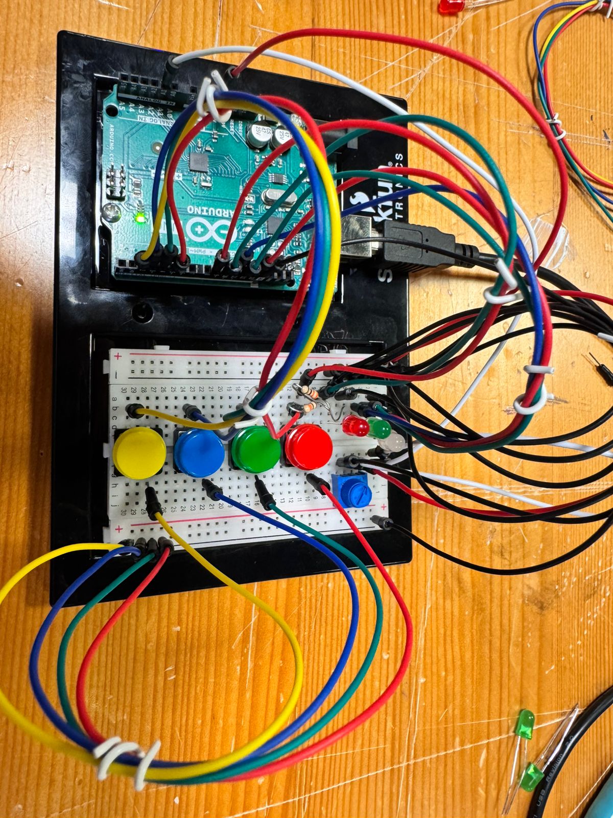
Digital Inputs (Switches): Four push buttons act as the game controller. These are used to start the game and input the color sequence.
-
Analog Input (Sensor): A Potentiometer is used as a difficulty selector. Before the game starts, reading the analog value of the potentiometer determines the speed of the flashes and the length of the sequence.
-
Outputs:
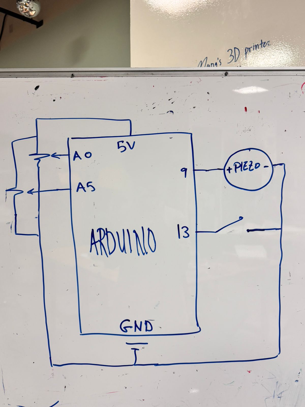
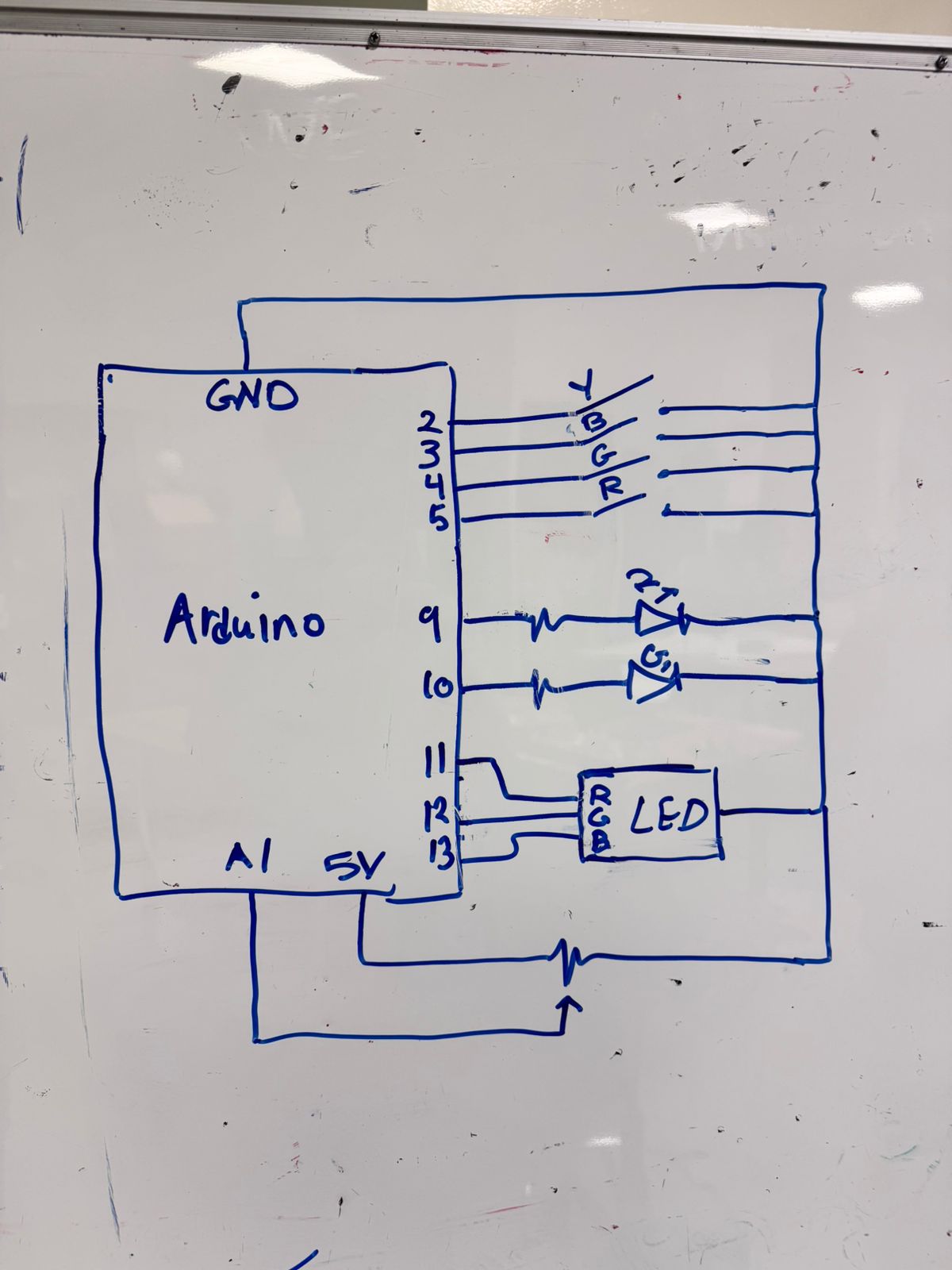
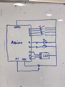
Schematic
Here is the hand-drawn wiring diagram for the circuit. It details the connections for the RGB LED (Pins 11-13), the Feedback LEDs (Pins 9-10), the Buttons (Pins 2-5), and the Potentiometer (Pin A1).
Logic & Interaction
The system waits for the Yellow button to be pressed to start. Once triggered, the Arduino reads the Potentiometer.
-
If the potentiometer is turned one way, the game is “Easy” (slower flashes, shorter sequence).
-
If turned the other way, the game becomes “Hard” (rapid flashes, longer sequence).
The Arduino then generates a random pattern displayed on the RGB LED. The player must press the buttons in the correct order. If successful, the distinct Green feedback LED flashes; if incorrect, the Red feedback LED flashes.
Gameplay Video
Code
Below is the Arduino code used for this project.
// RGB LED Pins
const int RGB_RED_PIN = 13;
const int RGB_GREEN_PIN = 12;
const int RGB_BLUE_PIN = 11;

// Feedback LED Pins
const int FEEDBACK_RED_PIN = 9;
const int FEEDBACK_GREEN_PIN = 10;

// Button Pins
const int BUTTON_YELLOW_PIN = 2;
const int BUTTON_BLUE_PIN = 3;
const int BUTTON_GREEN_PIN = 4;
const int BUTTON_RED_PIN = 5;

// Potentiometer Pin
const int POT_PIN = A1;

// Game Settings
const int BASE_SEQUENCE_LENGTH = 3;
const int MAX_SEQUENCE_LENGTH = 12;
const int BASE_LIGHT_DISPLAY_TIME = 1000;
const int FAST_LIGHT_DISPLAY_TIME = 100;
const int PAUSE_BETWEEN_LIGHTS = 50;
const int FEEDBACK_BLINK_TIME = 200;
const int FEEDBACK_BLINK_COUNT = 3;

// Game State
int gameSequence[MAX_SEQUENCE_LENGTH];
int currentSequenceLength = BASE_SEQUENCE_LENGTH;
int currentDisplayTime = BASE_LIGHT_DISPLAY_TIME;

void setup() {
  // Initialize serial communication
  Serial.begin(9600);
  Serial.println("Simon Game Started!");

  // Configure LED pins
  pinMode(RGB_RED_PIN, OUTPUT);
  pinMode(RGB_GREEN_PIN, OUTPUT);
  pinMode(RGB_BLUE_PIN, OUTPUT);
  pinMode(FEEDBACK_RED_PIN, OUTPUT);
  pinMode(FEEDBACK_GREEN_PIN, OUTPUT);

  // Configure button pins
  pinMode(BUTTON_YELLOW_PIN, INPUT_PULLUP);
  pinMode(BUTTON_BLUE_PIN, INPUT_PULLUP);
  pinMode(BUTTON_GREEN_PIN, INPUT_PULLUP);
  pinMode(BUTTON_RED_PIN, INPUT_PULLUP);

  // Reset LEDs
  turnAllRGBOff();
  digitalWrite(FEEDBACK_RED_PIN, LOW);
  digitalWrite(FEEDBACK_GREEN_PIN, LOW);

  // Seed random generator
  randomSeed(analogRead(A0));

  Serial.println("Waiting for start...");
}

void loop() {
  // Wait for start button
  while (digitalRead(BUTTON_YELLOW_PIN) == HIGH) {
    digitalWrite(FEEDBACK_RED_PIN, HIGH);
    digitalWrite(FEEDBACK_GREEN_PIN, LOW);
    delay(150);
    digitalWrite(FEEDBACK_RED_PIN, LOW);
    digitalWrite(FEEDBACK_GREEN_PIN, HIGH);
    delay(150);
    digitalWrite(FEEDBACK_GREEN_PIN, LOW);
    delay(100);
  }

  digitalWrite(FEEDBACK_RED_PIN, LOW);
  digitalWrite(FEEDBACK_GREEN_PIN, LOW);

  Serial.println("Game Starting...");
  delay(200);

  // Update difficulty based on potentiometer
  updateGamePace();

  // Generate and display sequence
  generateSequence();
  printSequence();
  displaySequence();

  // Process player input
  bool correct = getUserInput();

  // Provide result feedback
  if (correct) {
    Serial.println("Correct!");
    feedbackBlink(FEEDBACK_GREEN_PIN, FEEDBACK_BLINK_COUNT, FEEDBACK_BLINK_TIME);
  } else {
    Serial.println("Incorrect!");
    feedbackBlink(FEEDBACK_RED_PIN, FEEDBACK_BLINK_COUNT, FEEDBACK_BLINK_TIME);
  }
}

// Adjust sequence length and speed based on potentiometer value
void updateGamePace() {
  int potValue = analogRead(POT_PIN);

  currentSequenceLength = map(potValue, 0, 1023, BASE_SEQUENCE_LENGTH, MAX_SEQUENCE_LENGTH);
  currentSequenceLength = constrain(currentSequenceLength, BASE_SEQUENCE_LENGTH, MAX_SEQUENCE_LENGTH);

  currentDisplayTime = map(potValue, 0, 1023, BASE_LIGHT_DISPLAY_TIME, FAST_LIGHT_DISPLAY_TIME);
  currentDisplayTime = constrain(currentDisplayTime, FAST_LIGHT_DISPLAY_TIME, BASE_LIGHT_DISPLAY_TIME);
}

// Fill sequence array with random colors
void generateSequence() {
  for (int i = 0; i < currentSequenceLength; i++) {
    gameSequence[i] = random(4);
  }
}

// Output current sequence to serial monitor for debugging
void printSequence() {
  Serial.print("Sequence: [");
  for (int i = 0; i < currentSequenceLength; i++) {
    Serial.print(gameSequence[i]);
    if (i < currentSequenceLength - 1) Serial.print(", ");
  }
  Serial.println("]");
}

// Play back the sequence on the RGB LED
void displaySequence() {
  for (int i = 0; i < currentSequenceLength; i++) {
    switch (gameSequence[i]) {
      case 0: turnOnRGBRed(); break;
      case 1: turnOnRGBGreen(); break;
      case 2: turnOnRGBBlue(); break;
      case 3: turnOnRGBYellow(); break;
    }
    delay(currentDisplayTime);
    turnAllRGBOff();
    delay(PAUSE_BETWEEN_LIGHTS);
  }
}

// Capture player input and verify against sequence
bool getUserInput() {
  int inputCount = 0;

  while (inputCount < currentSequenceLength) {
    int pressedButton = readButtons();

    if (pressedButton != -1) {
      // Visual feedback for button press
      switch (pressedButton) {
        case 0: turnOnRGBRed(); break;
        case 1: turnOnRGBGreen(); break;
        case 2: turnOnRGBBlue(); break;
        case 3: turnOnRGBYellow(); break;
      }
      delay(100);
      turnAllRGBOff();
      delay(50);

      // Check against expected sequence
      if (pressedButton != gameSequence[inputCount]) {
        return false;
      }

      inputCount++;

      // Wait for button release
      while(digitalRead(BUTTON_RED_PIN) == LOW || digitalRead(BUTTON_GREEN_PIN) == LOW ||
            digitalRead(BUTTON_BLUE_PIN) == LOW || digitalRead(BUTTON_YELLOW_PIN) == LOW);
    }
  }
  return true;
}

// Return index of pressed button or -1 if none
int readButtons() {
  if (digitalRead(BUTTON_RED_PIN) == LOW) return 0;
  if (digitalRead(BUTTON_GREEN_PIN) == LOW) return 1;
  if (digitalRead(BUTTON_BLUE_PIN) == LOW) return 2;
  if (digitalRead(BUTTON_YELLOW_PIN) == LOW) return 3;
  return -1;
}

// Blink specified LED for feedback
void feedbackBlink(int pin, int count, int blinkTime) {
  for (int i = 0; i < count; i++) {
    digitalWrite(pin, HIGH);
    delay(blinkTime);
    digitalWrite(pin, LOW);
    delay(blinkTime);
  }
}

// --- RGB Control Helpers ---

void turnAllRGBOff() {
  digitalWrite(RGB_RED_PIN, LOW);
  digitalWrite(RGB_GREEN_PIN, LOW);
  digitalWrite(RGB_BLUE_PIN, LOW);
}

void turnOnRGBRed() {
  turnAllRGBOff();
  digitalWrite(RGB_RED_PIN, HIGH);
}

void turnOnRGBGreen() {
  turnAllRGBOff();
  digitalWrite(RGB_GREEN_PIN, HIGH);
}

void turnOnRGBBlue() {
  turnAllRGBOff();
  digitalWrite(RGB_BLUE_PIN, HIGH);
}

void turnOnRGBYellow() {
  turnAllRGBOff();
  digitalWrite(RGB_RED_PIN, HIGH);
  digitalWrite(RGB_GREEN_PIN, HIGH);
}