Pride Dragon Generator 🏮🐲🌈
Link to fullscreen: https://editor.p5js.org/eggangie/full/RdxIGV1n8
Concept:
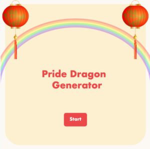
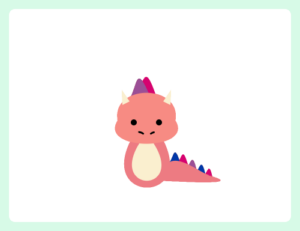
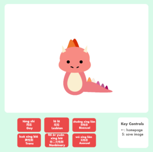
“Pride Dragon Generator” is essentially a very simplified version of a Picrew avatar maker, in which users can select a LGBTQ+ identity and receive a dragon with spike colors of the corresponding pride flag. They can then press “s” to save the image to their device.
Image of “Bi” dragon saved to device
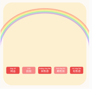
This project was inspired by my identity as a queer Chinese-American who has been immersed in queer culture for years, but did not know the terms in Chinese until very recently. These terms are not taught in language classes, and the queerness is oftentimes not spoken about in Chinese or Chinese diasporic families. Additionally, queer narratives in popular culture are overwhelmingly western-centric. Thus, I wanted to combine Chinese imagery (the color red, the lantern images, guqin music, dragons) with queer imagery to represent this intersection of identities. I hope this program makes the process of learning queer Chinese terms a little more cute and memorable than by just typing them into Google Translate.
Parts I’m Proud Of:
The thing I am most proud of in creating this project is not necessarily any single bit of code, since the code is quite basic (to those well versed in p5js —aka not me), but rather stringing it all together to form a functional work of art. In each week’s assignment, I gained individual skills such as drawing with shapes, making classes, and using the mouseClicked and keyPressed functions. The challenge was combining all of these into one project, and at first it kind of felt like starting off on a marathon when you had just learned how to walk. What helped was breaking the project down into chunks, and first establishing the “structure” of the code before actually drawing the details. Here are the steps I followed, roughly in order:
- Figuring out how to toggle between two screens with true/false & if statements
- Programming the “S” key and back arrow to save image & return to homepage
- Creating a Button class and adding functionality (hover and click) to it
- Drawing the unchanging elements of the homepage and the dragon page
- Creating a Dragon class
- Figuring out how to make the scales change color depending on which button was pressed (if I were to do this project again, I would perhaps move step 6 to the beginning and try to figure out the 6 buttons + 6 color schemes while my code was still minimal).
As for the design of the project, I like its minimalistic, cute feel, which I tried to emanate with round rectangle corners, bold Futura font, and pastel colors. I also believe it was a good decision to have the “back” and “save image” functions be keyboard commands, because it decluttered the area under the canvas and foregrounded the LGBTQ+ identity terms that I wanted to highlight.
I also think it was a good idea to have the toggling between scenes controlled by a boolean variable + functions to draw each scene, as it made it very clear which scene was being drawn currently. I had to restructure my program in the middle of my working process, as I realized that it made much more sense to have a dragon class and then call different dragons within one scene than to have different scenes with one dragon each, and call the scenes. Also, originally, the buttons were all on the homepage with only the Chinese terms, which was a bit confusing for the user.
Old version of sketch with buttons on homepage and 5 different scenes: https://editor.p5js.org/eggangie/sketches/Idyuc-bto
After revising, there was a start button on the homescreen and a “canvas” on the second screen, which brings to mind the universal design of familiar drawing programs, creating a more intuitive experience. I also added English to the buttons, because although my original intent was to omit English and have the user learn the terms by associating them with the pride flag colors, I realized this was not explicit enough and also many people may not know or remember which pride flag colors correspond with which identities.
Problems:
I encountered four main bugs in this code, two are resolved and two are still remaining.
The first bug was with the “press ‘s’ to save image” functionality. The bug was that every key being pressed was triggering the program to save the image, not just the “s” key. The issue was that I had written keyCode === "s" instead of keyCode === 83, as keyCode is only intended to work in natural language with special keys such as LEFT_ARROW, whereas for letter keys you need to find its numerical code. Below is the working code:
function keyPressed() {
  // To find keyCode of letter keys:
  // console.log(keyCode);
  if (keyCode === LEFT_ARROW && homePageVisible === false) {
    homePageVisible = true;
    scene1Visible = false;
  }

  if (keyCode === 83 && homePageVisible === false) {
    savedImg = myCanvas.get(0, 0, width, height - 115);
    savedImg.save("my-pride-dragon", "png");
  }
}
The second bug was that the buttons were triggering different scale colors to show up when the user was merely hovering over them, but not clicking them. This was because I was writing code for clicking specific buttons inside the class, which I later learned is unideal because classes are not supposed to know the specifics of each button, they should be as general as possible. Here is the code before, with this section repeated for each button 1-6:
  click(clickX, clickY) {
    if (
      clickX > button1.x - button1.buttonWidth / 2 &&
      clickX < button1.x + button1.buttonWidth / 2 && clickY > button1.y - button1.buttonHeight / 2 &&
      clickY < button1.y + button1.buttonHeight / 2
    ) {
      dragon1Scales();
    } else {
      mainDragonDisplay();
    }
And after I corrected the issue within the Button class:
click(clickX, clickY) {
    if (
      clickX > this.x - this.buttonWidth / 2 &&
      clickX < this.x + this.buttonWidth / 2 &&
      clickY > this.y - this.buttonHeight / 2 &&
      clickY < this.y + this.buttonHeight / 2
    ) {
      return true;
    } else {
      return false;
    }
In office hours, I learned that the click within the Button class can be used to make a boolean variable either true or false, and then that true or false can be used in the mouseClicked function to actually detect clicks on different buttons and call each button’s associated actions.
//code for detecting click on buttons to trigger
  //different scale colors
  if (scene1Visible) {
    if (button1.click(mouseX, mouseY)) {
      dragon1Visible = true;
      dragon2Visible = false;
      dragon3Visible = false;
      dragon4Visible = false;
      dragon5Visible = false;
      dragon6Visible = false;
      mainDragonVisible = false;
    }
The third bug, which I have not resolved yet, is one in which the “bi” dragon (dragon3) sometimes shows up as the “default”, what the user sees when entering sceneOne before clicking on any buttons. By putting print statements in every function where dragon3 is called, I was able to see that that something is happening between the moment the user goes back to the homepage and the moment they returns to sceneOne to call dragon3. All the code for the bi dragon is the same as for the other dragons, so I have not been able to figure out what is causing it, in particular, to be called.
Finally, the background audio does not play when the sketch is embedded into this blog post or in fullscreen mode, but it plays fine when the sketch is run in p5js. I am not sure why this is, but perhaps it could be solved by adding a command for playing the audio on the user’s first mouse click. However, the desired effect is that the audio plays before the user clicks, just as ambient background music.
Areas for Improvement:
There are many areas of improvement, both in terms of efficiency of the code and functions and aesthetics I wish the program had. In terms of efficiency, it would be sleeker to have a “dragon selector” variable that would assign a number to each dragon, so instead of writing all of the code below to ensure that only one dragon is true at a time, I could just call the number of each dragon.
if (scene1Visible) {
    if (button1.click(mouseX, mouseY)) {
      dragon1Visible = true;
      dragon2Visible = false;
      dragon3Visible = false;
      dragon4Visible = false;
      dragon5Visible = false;
      dragon6Visible = false;
      mainDragonVisible = false;
    }

    if (button2.click(mouseX, mouseY)) {
      dragon1Visible = false;
      dragon2Visible = true;
      dragon3Visible = false;
      dragon4Visible = false;
      dragon5Visible = false;
      dragon6Visible = false;
      mainDragonVisible = false;
    }

    if (button3.click(mouseX, mouseY)) {
      dragon1Visible = false;
      dragon2Visible = false;
      dragon3Visible = true;
      dragon4Visible = false;
      dragon5Visible = false;
      dragon6Visible = false;
      mainDragonVisible = false;

      //**bug: sometimes dragon does not set back to
      //the default dragon but instead
      //shows dragon 3 as the default
      //when returning to the drawing page
    }

    if (button4.click(mouseX, mouseY)) {
      dragon1Visible = false;
      dragon2Visible = false;
      dragon3Visible = false;
      dragon4Visible = true;
      dragon5Visible = false;
      dragon6Visible = false;
      mainDragonVisible = false;
    }

    if (button5.click(mouseX, mouseY)) {
      dragon1Visible = false;
      dragon2Visible = false;
      dragon3Visible = false;
      dragon4Visible = false;
      dragon5Visible = true;
      dragon6Visible = false;
      mainDragonVisible = false;
    }

    if (button6.click(mouseX, mouseY)) {
      dragon1Visible = false;
      dragon2Visible = false;
      dragon3Visible = false;
      dragon4Visible = false;
      dragon5Visible = false;
      dragon6Visible = true;
      mainDragonVisible = false;
    }
  }
}

function keyPressed() {
  // code to find keyCode of letter keys:
  // console.log(keyCode);

  //return to homepage when left arrow is pressed
  //reset dragon to default dragon (sometimes does not work because bug)
  if (keyCode === LEFT_ARROW && homePageVisible === false) {
    homePageVisible = true;
    scene1Visible = false;

    mainDragonVisible = true;
    dragon1Visible = false;
    dragon2Visible = false;
    dragon3Visible = false;
    dragon4Visible = false;
    dragon5Visible = false;
    dragon6Visible = false;
  }
Additionally, since each of my buttons are performing the same hover and click functions, they could perhaps be stored in a button array, instead of being called individually every time:
button1.showButton();
  button2.showButton();
  button3.showButton();
  button4.showButton();
  button5.showButton();
  button6.showButton();

  button1.hover(mouseX, mouseY);
  button2.hover(mouseX, mouseY);
  button3.hover(mouseX, mouseY);
  button4.hover(mouseX, mouseY);
  button5.hover(mouseX, mouseY);
  button6.hover(mouseX, mouseY);

  button1.click(mouseX, mouseY);
  button2.click(mouseX, mouseY);
  button3.click(mouseX, mouseY);
  button4.click(mouseX, mouseY);
  button5.click(mouseX, mouseY);
  button6.click(mouseX, mouseY);
However, I am glad I did things “the long way” for this project, because it was much easier for me to know what each part of my program was doing when I could see every button I was creating, instead of everything being “hidden” in a for loop. I think making the code more efficient would have come at the cost of me understanding my program as I worked on it.
As for features, I wish I had time to add a key command to change background color, as well as a little “wardrobe” for the dragon (another scene that users could enter to select items, such as sunglasses or a shirt, that they could put on their dragon).
Resources:
- Inspiration: @dinosaurcouch, @catalina_cheng
- p5 Examples: Saving canvas, Saving part of a canvas, Buttons with interaction
- BezierVertex visualization
- Pride flag color codes
- Music:
- Coding Train Tutorials:
- & many thanks to Professor Shiloh and Zion for their help

