Week 8 – Reading Response

I think the first and the second reading is both contradictory and complementary to each other in talking about the relationship between functionality and aesthetics.

The first reading centers around the question “Do attractive objects work better”. The author argues that it is okay for things to be aesthetically appealing even when the appearance is not necessarily related to its functionality. But he also points out that for objects people use when they are under stress and need a series of actions, the functionality outweighs aesthetics. I think his argument is true and important to keep in mind when designing everyday objects, such as the teapot example in the article. With things like teapots, even if they are not functional at all, people can just enjoy it looking at it and have a bit of fun. And in many real life cases, such as phones and furnitures, appealing things actually work better with us; people more tend to buy and use objects that look better than just function well.

However, the second reading points out the case where the argument of the first author does not hold. In the case of Apollo and related softwares, full attention to functions and details is what matters. Aesthetics is not important at all, as any error in functionality could result in irreparable harm. In this case, what works well is more significant than what looks good.

Taken together, both readings shed light on a central principle in HCD, which is the balance between aesthetics and functionality. And I think what’s more important here is the balance should be based on the essential purpose of the design, which should be the driving force of all kinds of designs.

Week 8 – Response – Emotion & Attractive , Margret Hamiltion story

Norman’s reading made sense to me. I totally agree that emotions play a role in what tools or elements we use daily, and it could be as simple as a pot. We design things with purpose in mind, but making them appealing is as important. I really liked the part about the transformation from black and white screens to colors, and his argument that the inspiration of colors does not have a scientific effect but rather have an emotional one. It made me think of colors a painter would use to emphasize certain moods. For example, if an artist wants to emphasize loneliness or sad emotions they would use blues, and if they are emphasizing hope and love they would use worm colors like yellow and orange. I believe appealing design is as important as affordance, and having a balance between functionality and appearance is what good design is about.

Margret Hamiltion was an inspiring read. Her work did not only transform technology and software but opened possibilities for the developments we see today. It is a success story that proves a quote I read once: when there is a well, there is a way. We design what we want to be, but we can always re-design anything that does not fit into our plan. Similar to Hamilton who did not limit herself, we push our borders higher and higher every time we reach something. In a way, we push our lives the same way designers re-design objects and ideas. What made her different is that she had a vision that best suited her passion and inspiration. It is good to be inspired; nevertheless, everyone is inspired to aspire.

Reading Reflection – Week 8

Emotion & Design: Attractive things work better

I quite agree with this first reading, as I am a person who is greatly affected by the aesthetics of my surroundings. Norman wrote that there doesn’t have to be a scientific, cognitive explanation in place for us to like something better (as with the example of the color computer displays — there is no information advantage, yet we cannot go back to black & white displays). This brought two pieces of supporting evidence to mind. The first is YouTuber Molly Burke, who is blind and also very into fashion and makeup. I have watched her videos for a long time, and something that she often says is that, just because she can’t see the makeup or the colors of her cute outfit doesn’t mean she can’t enjoy it. This is a twist on what Norman wrote about the teapots: just because he can’t use them every day for brewing tea efficiently, doesn’t mean that they don’t give “satisfaction in their appearance”. While I agree with most of this text, I do think the author is biased, as a designer, when he says that “to be truly beautiful, wondrous, and pleasurable, the product has to fulfill a useful function, work well, and be usable and understandable”. I think true beauty can exist without usability, and might sometimes even exist because of the lack of usability.

Her Code Got Humans on the Moon—And Invented Software Itself

This reading was a fascinating glance into the beginnings of software, and I was both surprised and not surprised at how the tech industry hasn’t changed in terms of gender inequality. In fact, it may have even been less discriminatory back then, because it was the “Wild West” and nobody knew what they were doing. It is notable how Hamilton’s role as a mother and Lauren’s playing with the keyboard led to saving the Apollo 11 mission, because it shows how diverse life experiences in the workplace enhance overall outcomes.

Additionally, I think the inherently exclusionary “inside club” feel of programming persists to this day, because of the learning curve needed to understand and participate in discussions in the community. It’s comparable to jazz music, in the sense that there is a certain level of “work” you need to do to be a part of the culture.

I think this article shows that everything that we take for granted today was conceived and invented by people for the first time, some time ago. For example, I, with no previous knowledge about physical computing, am now able to use breadboards to create circuits that take digital input, but back in Hamilton’s time, a whole team of expert seamstresses was required to wire the 0s and 1s. This raises the question of how current technologies that are inaccessible to laypeople may, in the very near future, be simplified and commercialized enough for anyone to manipulate.

Week 8: Reading Response

I found the article “Her Code Got Humans on the Moon—And Invented Software Itself” to be very inspiring and thought-provoking. I am always amazed whenever I read about people who defy the norms of their times to do something extraordinary. Margaret Hamilton’s story is a shining example of resilience, determination, and innovation in the face of societal expectations.

In an era when women were not commonly encouraged to pursue careers in high-powered technical fields, Hamilton not only ventured into the world of software engineering but also became a trailblazer in the field. What struck me most is how Hamilton balanced her roles as a working mother and a programmer. The fact that she brought her daughter to the lab speaks to her unwavering commitment to her work.

In a world where gender inequality within the tech field still remains a challenge, I think Hamilton’s story provides a very promising avenue for doing the extraordinary.

The second reading “Emotion and Attractive” offers intriguing insights into the interplay of aesthetics, usability, and emotional response in design. I liked how the author used his teapot collection to illustrate the idea that design isn’t a one-size-fits-all concept; it depends a lot on the context, mood, and personal preference. The analogy of transitioning from black and white to color screens in the early days of personal computing is particularly fascinating. The author’s initial skepticism about the value of color screens, despite their popularity, speaks to the subjective nature of design preferences. While the cognitive perspective may suggest that color doesn’t add significant value to productivity, the emotional response to color cannot be discounted.

The concept of “affect” and its role in design has left me with some intriguing food for thought. It’s fascinating to consider how our emotional responses to design can have such a profound impact on our decision-making and behavior. Affect, in this context, acts as a sort of silent influencer, guiding our judgments, shaping our perceptions, and even affecting our reactions.

What’s particularly striking is how affect doesn’t just serve as an emotional compass but also as a practical tool. It can alert us to potential dangers, which is incredibly valuable, but it can also steer our creative problem-solving processes. This dual role of affect makes me ponder the delicate balance between emotional response and practicality in design.

Week 8 | Creative Reading Reflection: Her Code Got Humans on the Moon—And Invented Software Itself, Norman “Emotion & Design: Attractive things work better”

Creative Reading Reflection – Her Code Got Humans on the Moon -And Invented Software Itself:

The article talks about how back in the 1960s, when most tech jobs were filled by men, a woman named Margaret Hamilton made history. She was only 24 and worked at MIT as a programmer. Even though people didn’t expect much from women in tech back then, Margaret proved them wrong in a big way.  As a young programmer at MIT, she embarked on a journey that would mark her as one of the important figures behind the successful Apollo space missions.

She became a key person in the Apollo space program because she wrote a lot of the software that made the Apollo missions successful. There was a tense moment during the famous Apollo 11 mission when the computer started showing some unexpected errors. But, thanks to her hard work and her team, the mission was a success, and the astronauts landed safely. She thought ahead during the Apollo program, identifying issues and pushing for software changes that later became vital for the success and safety of future missions.

Margaret Hamilton made significant contributions to both software engineering and space exploration. Her dedication and leadership are remarkable. When we think about major space achievements, it’s essential to see Hamilton as an influential figure who greatly impacted technology and space missions. Her work shows how one person can change history.

Norman “Emotion & Design: Attractive things work better”

Don Norman’s essay, “Emotion and Attractive,” highlights a fundamental aspect of design that often goes unnoticed. He emphasizes that the aesthetics of a product go beyond its outer appearance. It includes usability, understandability, and ease of use, in addition to beauty. He explains that sometimes, in stressful situations, like emergencies, things should focus more on usability. They need to be easy to use so people can stay safe. But in everyday life, when things are less stressful, it’s nice to have things that look beautiful and make us happy.

Don Norman also introduces the idea of “affect,” which is how we feel when we use something. Affect can change the way we think and solve problems. When something looks nice and makes us feel good (positive affect), it can even help us be more creative and patient. When something is visually appealing, we tend to invest more mental effort in understanding its use. However, this preference for aesthetics can be influenced by our mood and circumstances.

Norman provides a concrete example with teapots. If you have the time and inclination, you might choose the most aesthetically pleasing teapot, even if it’s not the most user-friendly. But when you’re in a hurry, practicality takes precedence over aesthetics.

So, the key is to find a balance between usability and beauty in design. It’s not about choosing one over the other but making things that work well and make us happy. That way, our everyday things can be both useful and beautiful.


Concept

Instead of developing a game for my midterm project I decided to create a space for an emotional experience. I believe that midterms often bring about stress, and it’s essential for individuals to be able to relax and prioritize their overall well-being. Consequently, I designed a meditation program that would help unwind people’s minds and partake in self-care activities.

Approach and Code highlight

For the development of this project, I planned to have three different exercises breathing, mantras, and journaling. I have shown the code for the breathing exercises in my midterm progress blog post, where I designed a program of a bouncing ball that would be helpful for people to find a certain rhythm in their breathing. For the mantras, I was planning to show participants different affirmative quotes that would allow participants of the meditation program to focus on their selves. I planned to use the method of a .substring(). I found a sketch that would help to display a portion of the string, based on the mouse position, here. For the journaling exercise, I decided to give some space for the participant where they can think about some questions and have a space to write down their responses. I used a csv. file to store all of the prompts for the journaling exercises. I created an array of strings to hold the entire file and preloaded the text from the file into an array. because I only had one row for all of the prompts, I did not need to loop through each row in the file. I created an index of the random prompt in the prompt array, a variable for a random prompt, and the code that would choose 1 of the prompts from an array. I created an input window and a button that when pressed would erase the input and leave a thankful note to the participant. As the basis for building this little program, I found a code for creating an input on the reference page, here.

Here is the code and sketch for this program, which I am very proud of.

let input, submitButton, prompt;
let strings = [];

function preload() {
  strings = loadStrings("quotes.csv");
}

function setup() {
  if (strings == null) {
    print("failed to load the file, stopping here");
  }
  print("strings array contains this many lines: " + strings.length);

  // create canvas
  createCanvas(710, 400);

  input = createInput();
  input.position(20, 100);
  input.size(400);

  submitButton = createButton("submit");
  submitButton.position(input.x + input.width, 100);
  submitButton.mousePressed(prompting);

  // all the prompts in an array

  let allThePrompts = split(strings[1], ",");

  print(allThePrompts); //it has 5 prompts and they are all split. nice!!!

  // X is the index of the random prompt in the promt array
  let X = int(random(allThePrompts.length));
  print(X);

  // variable for a random prompt
  let randomPrompt = allThePrompts[int(random(5))];

  print(randomPrompt);
  //choosing 1 of the prompts from an array
  prompt = createElement("h2", foo);

  prompt.position(20, 5);

  textAlign(CENTER);
  textSize(50);
}

function prompting() {
  input.hide();
  // ? not working: how to hide the button: button.hide();
  prompt.html(
    "Thank you for your response ! Hopefully it made your day a little better ^^ "
  );
  input.value("");
}


Another part of the program, which I am very proud of and which ended up working perfectly is the three buttons in the choosing menu. I was able to program buttons myself using an image and not using built-in buttons. For this, I used object-orientated programming. I created a class, where I specified how buttons should be displayed and function when a mouse is over and the mouse is clicked on these buttons. Then, in setup, I created the three similar buttons that are in the array, which would use the commands specified in the class. Here is a code highlight of the class:

class ChoosingButtons {
  constructor(inX, inY, inImg, inScenery) {
    // what does this mean?
    this.x = inX;
    this.y = inY;
    this.img = inImg;
    this.scenery = inScenery; // where to go if this button is clicked
  }

  display() {
    stroke(0);

    print("in button display; scenery = " + this.scenery);

    // tint the image on mouse hover
    if (this.mouseOverImage()) {
      print("mouse over image");
      tint(254, 220, 220, 255);

      // furthermore, if the mouse is clicked,
      // set the scene
      if (this.mouseClickedOnImage()) {
        print("mouse is clicked" + this.scenery);
        scene = this.scenery;
      }
    } else {
      noTint();
    }

    image(this.img, this.x, this.y);

    noTint();

    print(this.img.width, this.img.height);
  }

  // over automatically matches the width & height of the image read from the file
  // see this.img.width and this.img.height below
  mouseOverImage() {
    if (
      mouseX > this.x &&
      mouseX < this.x + this.img.width &&
      mouseY > this.y &&
      mouseY < this.y + this.img.height
    ) {
      return true;
    } else {
      return false;
    }
  }

  // over automatically matches the width & height of the image read from the file
  // see this.img.width and this.img.height below
  mouseClickedOnImage() {
    if (
      mouseIsPressed &&
      mouseX > this.x &&
      mouseX < this.x + this.img.width &&
      mouseY > this.y &&
      mouseY < this.y + this.img.height
    ) {
      return true;
    } else {
      return false;
    }
  }
}

The code for the three buttons:

// make the three choosing buttons
  buttonsChoosing.push(new ChoosingButtons(20, 150, choosingImage, BREATHING));
  buttonsChoosing.push(new ChoosingButtons(235, 150, choosingImage, MANTRAS));
  buttonsChoosing.push(new ChoosingButtons(450, 150, choosingImage, JOURNALING));

Future Thoughts and Reflection

I haven’t finished this project in three parameters: the switching back and forth between the pages, and the implementation of the sound and shape. I would have added the sound and the shape (btw, I know how to do it) if I finished the switch code. However, because I am very new to coding and have never designed such a complex program of switching between multiple cases, I did not fully realize my project. I decided to take the risk of creating multiple cases in the switch statement, however, the back buttons did not work perfectly well and I spent a lot of time trying to debug it and make it work. Even though it works in the sense that it changes cases, it didn’t change the case to the one I intended. Moreover, as I designed the code for journaling exercises in another shorter program, I was having issues implementing it in my main code. I tried multiple ways of breaking it down, however, it still didn’t work.

Nevertheless, I learned a lot during this project. I now know how to program a switch statement and create my own buttons from images. I learned how to create an input box and display text correctly. I recapped how to use a csv. file to load the information and I learned how to randomly present information from this file. I also learned patience and that it is best to debug a long program by diving it into smaller programs even though it may not work when you are trying to paste it back into the main program. I also was able to practice object-oriented programming on a new level by creating buttons with it. So, even though I didn’t get all of my program to work as was planned, I am nevertheless very happy with the experience and knowledge I gained in the process of creating it.
 

Midterm – Flappy Pokemon


For the midterm project, I decided to combine the common game flappy bird with my own obsession with Pokemon using one of my favorites as the main character.

Problems:

One of the main problems I ran into was figuring out how to restart the game without actually restarting the sketch. It took a lot of work to finally figure out how to do it because one of the arrays I was using wasn’t being reset with my resetSketch() function. So, after a lot of debugging, I figured out how to reset that array every time I reset the game.

This game is still very wonky and there are a lot of improvements that could be done for it to be an overall better experience. I am quite proud of my use of the flying animation and the continuous scrolling background.


Game:

Mid-Term Project

Concept 

For the Midterm Project, I initially started with a museum-like idea but as I focused more on the aesthetics and the picture I had in mind, it started looking like an old library room. I went with a friendly user interactivity experience, where a person experiences a calm and peaceful experience in a tiny underground library, where they could explore some books and have a few reads. I decided to encompass mostly positive quotes from historical figures from different backgrounds as well as Quranic verses. I also decided to include Greek temples and lanterns that hopefully align with parts of European culture and Arab Muslim culture as well.


Code Highlight 

The most part I struggled with is representing the quotes randomly as the user clicks on the bookshelf. I first placed an array inside the code itself but I kept getting multiple errors and unpleasant results, hence I decided to move the quotes in a CSV file and split the quotes at a semicolon, similar to how data visualization is implemented. I’m still facing one issue, the quote is being displayed twice, for the time being, I just left it there as a reflection but hopefully would figure out the mistake I made.

function room1_quotes() {
  fill(currentColor[0], currentColor[1], currentColor[2]);
  stroke(currentColor[0], currentColor[1], currentColor[2]);
  strokeWeight(10);
  rect(260, 260, 320, 220, 20);

  // Inside the book
  noStroke();
  fill(193, 154, 107);
  rect(270, 270, 300, 210);

  fill(0); // Set text color to black
  textSize(15); // Adjust text size as per your requirement
  textAlign(LEFT); // Change the text alignment to LEFT

  let textX = 270 + 10; // X-coordinate of the text
  let textY = 270 + 10; // Y-coordinate of the text
  let textWidth = 300 - 20; // Adjust the width to leave some margin
  let textHeight = 210 - 20; // Adjust the height to leave some margin

  // Loop through the quotes and display them as paragraphs

  for (let i = 0; i < selectedquotes.length; i++) {
    text(selectedquotes[i], textX, textY, textWidth, textHeight);
    textY += textHeight + 10;
  }
}
Reflection 

This assignment was definitely time consuming in my experience. It took me a while to figure out a lot of things, especially that I’m not very used to working with classes. I looked at random examples online that did not necessarily do anything I implemented but gave the solution to some of the problems I faced like presenting quotes randomly, and having images change but not rapidly. However, I learned a lot from coding this project, it compelled me to spend a good amount of time trying to understand how each code snippet affects the other and what might be causing glitches or any lags. It certainly made me more confident about my ability to implement something I envisioned, even though its not everything I wanted, but I’m pleased with what I have.

References


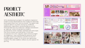
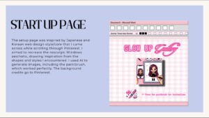
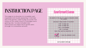
Weel 6 | Final Midterm: Glow Up Gallery: A Interactive Artwork Collage

Concept:

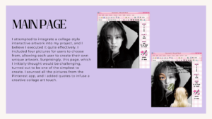
My project centers around the art of collaging. I have always loved collaging and scrapbooking ever since I first learned it in preschool. There’s something inherently captivating about the act of layering pictures over each other, creating a tapestry of memories and ideas. While some might perceive it as chaotic or haphazard, I see it as a unique form of art that allows for boundless creativity. In the past, I used to create physical collages on paper, but as technology evolved, I found myself drawn to the world of digital collage occasionally.

This got me thinking about a concept: What if there was a experience where people from could come together to explore their creative side through collaging? A place where individuals could take disparate images and meld them into stunning compositions. Collaging to me feels like painting with images with a way to convey emotions, tell stories and explore the depths of imagination.

The central idea behind my project is to provide an experience  for individuals to express themselves through collaging. It encourages users to dive into their artistic side, experiment freely with various images and styles, and chose their unique choices visually. It challenges users to push the boundaries of what’s possible with collaging, fostering innovation and unexpected compositions.

How it Started: Untitled Notebook (3)

How it ended up:

Coding:

As a beginner, creating my first interactive artwork/semi-game was an incredibly enjoyable and enlightening experience, particularly since I’m an avid gamer and I found it exciting. It was a journey marked by trial and error, as I grappled with new concepts and tools that felt foreign to me even though they weren’t. The initial stages were challenging; I found myself feeling stuck and uncertain about how to bring my project to life. To overcome these hurdles, I resorted to rewatching tutorials and revisiting the basics of using certain functions and processing tools, such as online resources like YouTube videos to gain insight and clarity. Seeking help from friends was also valuable, but what pleasantly surprised me the most was discovering that my aunt, an architectural engineer, was well-versed in P5. Her assistance was a game-changer. This project taught me that perseverance, a willingness to learn, and seeking help when needed and  challenges can turn into rewarding achievements as I am proud of myself

Highlight:

I dont have a particular code that I did struggle the most with, some might have been simpe while others did require alot of thinking. But if i could choose one it would be the checkPaintbrushHover. I would say I struggled the most with part as a whole, as I was very confused on how ‘dist’ work and had to watch videos to know how to amply it, but my implications were error but I achieved it at the end

function checkPaintbrushHover() {
 
  isHovering = false;  //  assume the mouse is not hovering over paintbrush
  if (currentPage === "startup") { // if the current page is 'startup'
    // calculate the distance between the mouse and the paintbrush 
    let d = dist(mouseX, mouseY, 120 + 50, 510 + 50);
    if (d < 50) { // if the distance is less than 50 pixels
      isHovering = true; // the mouse is hovering over the paintbrush
      return; // exit function 
    }
  } else if (currentPage === "boredImage") { // if the current page is 'boredImage'
    // calculate the distance between the mouse and the paintbrush 
    let d = dist(mouseX, mouseY, 120 + 50, 450 + 50);
    if (d < 50) { // if the distance is less than 50 pixels
      isHovering = true; // the mouse is hovering over the paintbrush
      return; // exit function 
    }
  } else if (currentPage === "main") { // if the current page is 'main'
    // calculate the distance between the mouse and the paintbrush 
    let d = dist(mouseX, mouseY, 490 + 45, 425 + 45); 
    if (d < 45) { // if the distance is less than 45 pixels
      isHovering = true;
      return; // exit function 
    }
  }
}


Reflection:

The projects concept is interesting and fun to me, as ive never gotten the chance to do something like this before. I do agree that I couldve done something even bigger and more creative but I do enjoy and proud of what I did and I find it creative and matches the theme of interactivity in an artwork. The mistakes I encountered throughout this project will be proved to be invaluable learning experiences for me,  to make me more confident in my ability I will be revisiting  as I continue to learn and grow.


Final work:


References:

Fonts

Images:

Sound:

Videos:

  • https://www.youtube.com/watch?v=mVq7Ms01RjA
  • https://www.youtube.com/watch?v=1Osb_iGDdjk
  • https://www.youtube.com/watch?v=UvSjtiW-RH8
  • https://www.youtube.com/watch?v=asvnmtVjeEk         
  • https://www.youtube.com/watch?v=7A5tKW9HGoM
  • https://www.youtube.com/watch?v=bhAUIeVe0s4


Midterm project – Merhba, Alf Merhba

CONCEPT:

This midterm project was honed to be a simplistic learning experience, where users get to learn new words related to household, in the Moroccan dialect through sound and interactivity. It is a project that holds to my heart because it represents a part of my culture and my dialect. I can’t be happier to share it, now that it’s done!

The idea turned out exactly how it was imagined and planned which makes me very proud of the way I’ve come from the first assignments which were purely trial and error. After this assignment, I feel like I grasp more what should be done, how and when. From brainstorming to design to implementation, it went smoothly.

I present to you the outcome of my midterm: Merhba, Alf Merhba (Welcome a Thousand Welcome!):

Link to the full screen sketch : https://editor.p5js.org/aa8915/full/75GdtC-n2

HOW DOES IT WORK?

-Home Screen:  Click on audio graphic for the pronunciation of the title (this sentence is used to welcome people to your space). Click on PLAY to start the experience. -Instructions: You’ll be presented with a screen containing the idea of the experience, as well as how to proceed. Click on left arrow to go back to the home screen, or right arrow to proceed.

-Inside the house: Now you have six spaces to choose from (room 1, room 2, bathroom, kitchen, dining room and lounge). Click on any space to discover the pronunciation of Moroccan words for objects related to that space.

-In any space x: Click on any object and discover how it sounds in this dialect! Use the arrow (on top or in the bottom), to go back to the house.

PROCESS & DIFFICULTIES FACED:

  1. Brainstorming: I didn’t spend a lot of time in this step because as soon as I read “midterm … experience”, I knew I wanted to do something related to something I identify with, but at the same time fun and useful for users to spend few minutes of their time interacting with. It took a few days to choose this concept among three other interesting concepts.
  2. Design: I was slowed down a bit by this step because I had many ideas for my concept that I was struggling to imagine in a visual format. I knew from the beginning that I wanted the setting to be a house, but didn’t know if I should have a single space hand drawn with interactive elements or something else. Many thanks to my friend Nourhane for helping me decide on a vector based image with multiple spaces, to be made interactive. Then, I designed the home screen and instructions screen by myself to align with the color palette of the house.
  3. Sound Recordings: My favorite part! I had so much fun recording the pronunciation of the words. I had to re-do many of the recordings multiple times because they either sounded weird, mispronounced or noisy. This part took about half a day.
  4. Implementation: Implementing all the fun ideas was always my least fun part! Luckily enough this time, I enjoyed this part where I got to try different ways to make the project work. I was first confused with layering because I had 9 layers to include, but later on managed it by creating a SceneManager class.

The hardest part in the implementation of this project was the clickable object. Since my objects were a part of the image itself, I could not figure out any other way but using conditional statements for each and every object (about 60 objects). I measured the position of each object in order to make it clickable and add sound to it. The process to do this was not complicated, but very monotonous, but I’m glad it works. The only downside about this method is that only a specific part of each object is clickable. As a result, if a part of the sofa is hidden by a table, only the clear part is clickable. Depends on where the user decides to click, some parts may not work if clicked. Now that I think about it, I think it would have been a better idea to have vectors of the objects as separate images as well as a separate empty space. This way I could have created a Clicked Object class, have instances for each object image and make them clickable by using a conditional whenever  X object is selected.

HIGHLIGHT


There isn’t a part I’m specifically proud of this time, because I’m proud that the whole code worked without errors. I would say I appreciate all the efforts and time I put into measuring the position of each and every object.

if (sceneManager.onRoom2){
     //to go back to house
     if(mouseX>=0 && mouseX<=107){
       if (mouseY>=0 && mouseY<=49){
         clear();
    sceneManager.onWScreen = false;
    sceneManager.onHouse = true;
    sceneManager.onRoom = false;
    sceneManager.onRoom2 = false;
    sceneManager.onKitchen = false;
    sceneManager.onBathroom = false;
    sceneManager.onDiningRoom = false;
    sceneManager.onInstructions = false;
    sceneManager.onLounge = false;
    return;   
       }
     }
     //mirror object
     if (mouseX>=0 && mouseX<=206){
       if(mouseY>=61 && mouseY <= 274){
         mraya.play();
       }
     }
     //picture object
     if (mouseX>=259 && mouseX<= 368){
       if (mouseY>=128 && mouseY<=217){
         tswera.play();
       }
     }
     //painting object
     if (mouseX>=421 && mouseX<= 757){
     if (mouseY >= 87 && mouseY<= 251)
       {
         tablo.play();
       }
     }
     //bed object
     if(mouseX>=390 && mouseX<=795){
       if(mouseY>=341 && mouseY <= 500){
         namousiya.play();
       }
     }
     //desk object
     if(mouseX>=0 && mouseX<=205){
       if(mouseY>=390 && mouseY<=600){
         comoda.play();
       }
     }
     //lamp object
     if(mouseX>=273 && mouseX<=324){
       if(mouseY>=347 && mouseY<=465){
         bola.play();
       }
     }
     //lamp 2 object
     if(mouseX>=872 && mouseX<=921){
       if(mouseY>=345 && mouseY<=467){
         bola.play();
       }
     }
     //table object
     if(mouseX>=223 && mouseX<=377){
       if (mouseY >= 472 && mouseY <= 600){
         tabla.play();
       }
     }
     //table 2 object
     if(mouseX>=810 && mouseX<=945){
       if(mouseY>=493 && mouseY<=600){
         tabla.play();
       }
     }
     //plant object
     if (mouseX>=0 && mouseX<=86){
       if(mouseY>=287 && mouseY<=383){
         nebta.play();
       }
     }
     //vase object
     if(mouseX>=815 && mouseX<=861){
       if(mouseY>=336 && mouseY<=465){
         vase.play();
       }
     }
     //clock object
     if(mouseX>=833 && mouseX<=938){
       if(mouseY>=124 && mouseY<=224){
         magana.play();
       }
     }
   
   }
REFLECTION:

One element of the project that is missing is text. I could not figure out how to make the text for each object pop in an aesthetic way without creating a mess, so I decided to give up on it. However, I still want to improve the project even after turning it in, so I will work on finding an efficient and visually pleasing text to incorporate text.

Overall, I’m happy of the result of this project, I hope the users will also have a fun (and bug-free) experience with it!