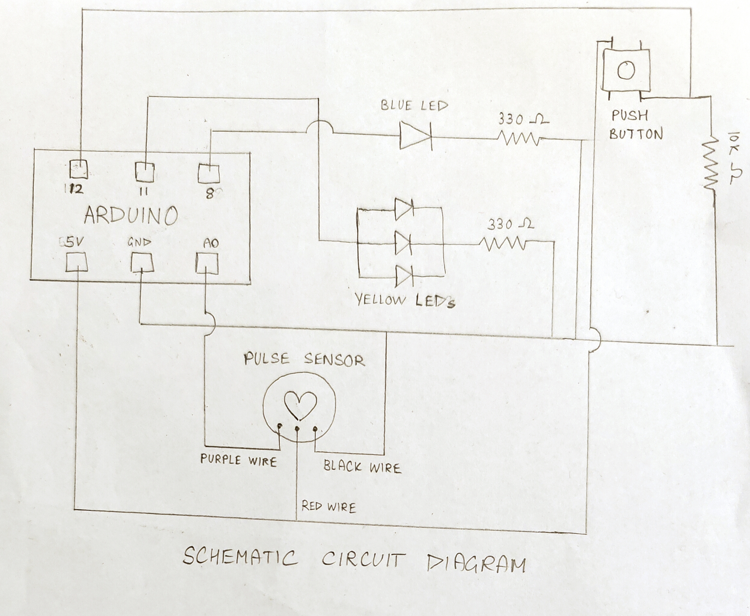
p5.js Sketch | GitHub URL | Schematic Diagram
Inspiration
For all my assignments so far, I’ve tried to do something that’s personal and meaningful to me in some way, and this project is no different. My favorite hobby, without a doubt, is reading—it’s something I’ve loved for as long as I can remember. So, when I started brainstorming for this project, I decided I wanted to create something that revolves around the joy of books and the experience of reading as a whole.
Now, of course I’ve always thought there was something magical about getting lost in a story and exploring new worlds through words. But as much as I love reading, it can sometimes feel like a solitary experience, especially when I come across a thought or idea I want to share but no one’s around to talk to. That’s what inspired me to create a book buddy robot—something that could bring a sense of companionship to reading, making it feel a little less lonely while still keeping the focus on the stories I love so much.
Concept
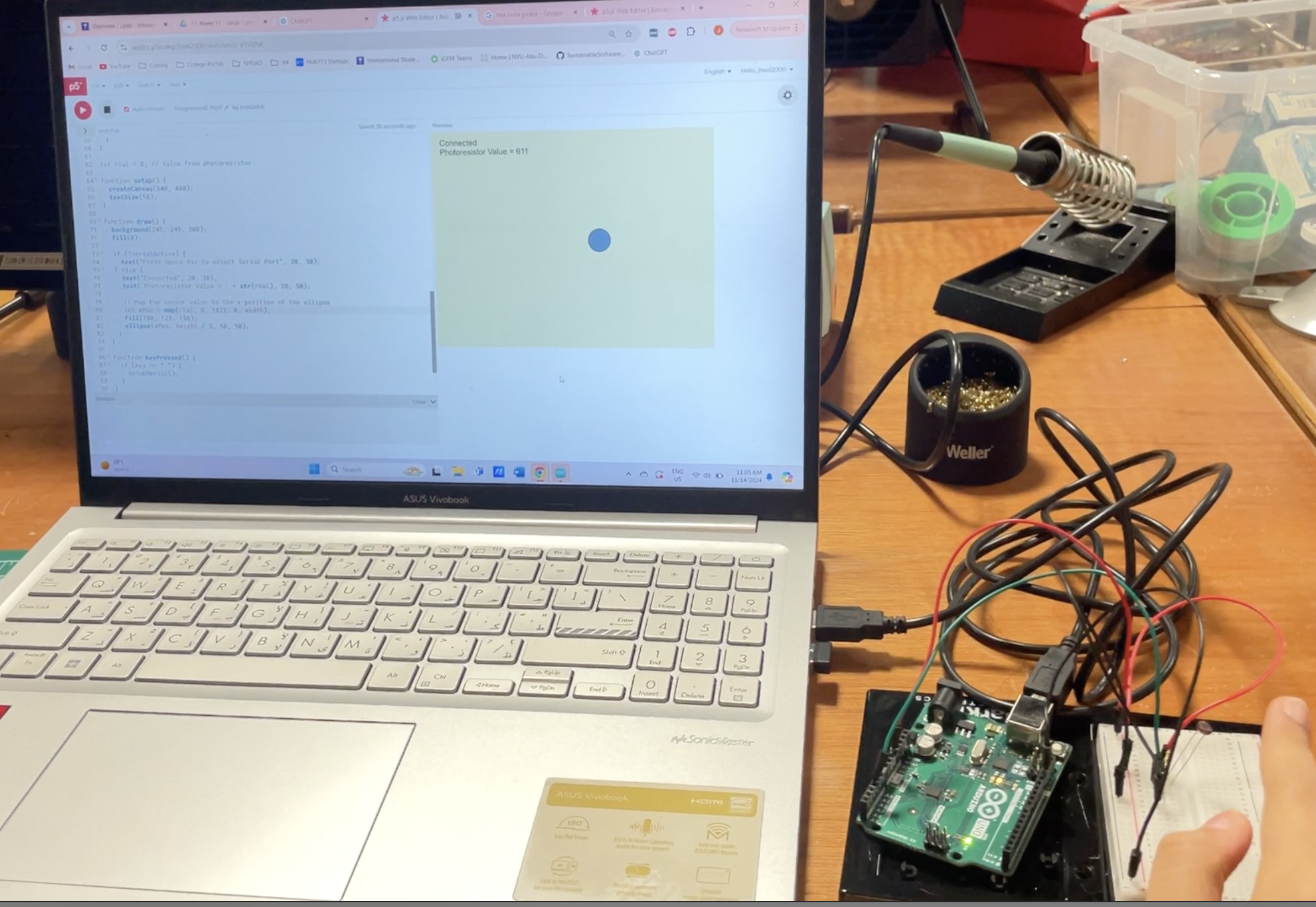
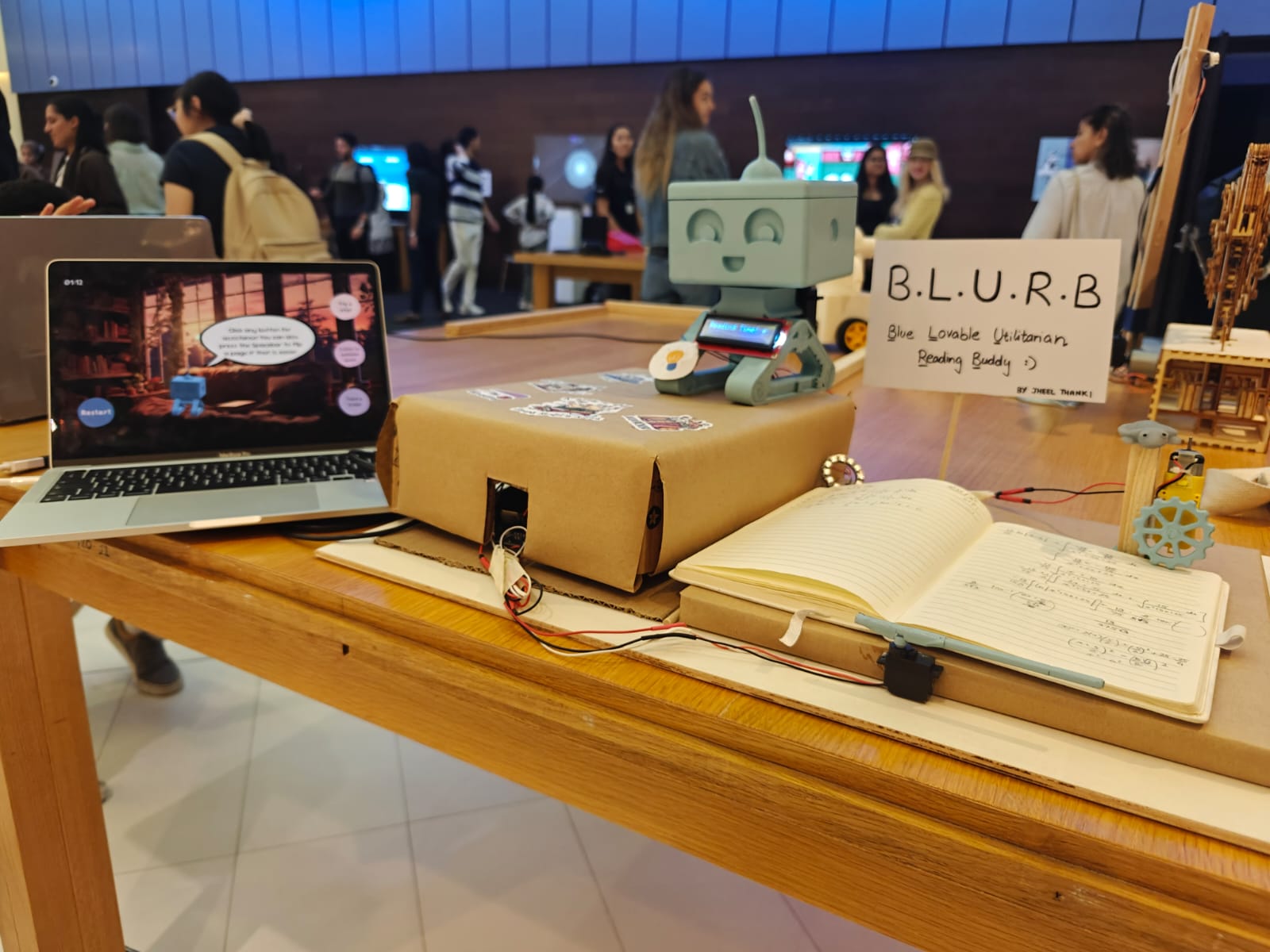
The concept behind my book buddy robot, B.L.U.R.B. i s to create a small, interactive companion that enhances your reading experience. Made using p5.js and Arduino, B.L.U.R.B. is designed to be there with you as you dive into a good book, offering a few fun features along the way.
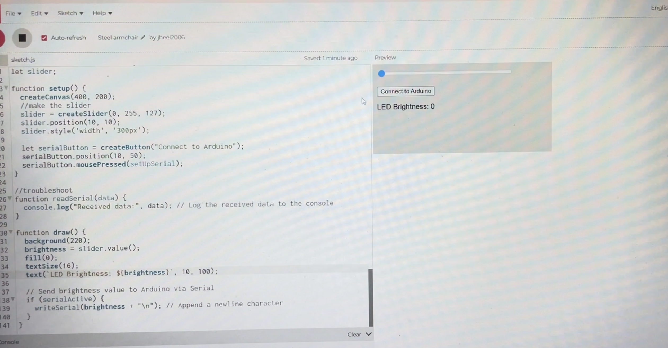
- Flip Pages (Arduino): Using Arduino, B.L.U.R.B. has the ability to automatically flip the pages of your book. This page-flipping function helps keep the flow going without having to pause and turn the page yourself. It gives the feeling of having a personal assistant to handle the mundane task, allowing you to stay immersed in your story.
- Play Ambient Music (p5.js): B.L.U.R.B. uses p5.js to play soft, ambient music tailored to enhance your reading experience. Whether it’s a gentle instrumental tune or nature sounds, the music helps set the atmosphere, making it easier to focus and get lost in your book. You can choose different genres or moods depending on the type of book you’re reading, helping you stay engaged and relaxed.
- Track Reading Time (p5.js): With p5.js, B.L.U.R.B. can track how much time you’ve spent reading, giving you a sense of accomplishment as you progress through your book. It can display a timer on the screen, helping you set reading goals or simply monitor how long you’ve been immersed in the story. It’s a subtle way to keep track of time without taking away from the reading experience.
- Give Break Suggestions (p5.js): Sometimes, reading for too long can leave you feeling drained. When you take a break, B.L.U.R.B. suggests helpful activities that could refresh your mind. These suggestions might include stretching, taking a short walk, drinking water, or even doodling on a piece of paper. It’s a fun way to make sure you’re taking care of yourself while you dive into your books.
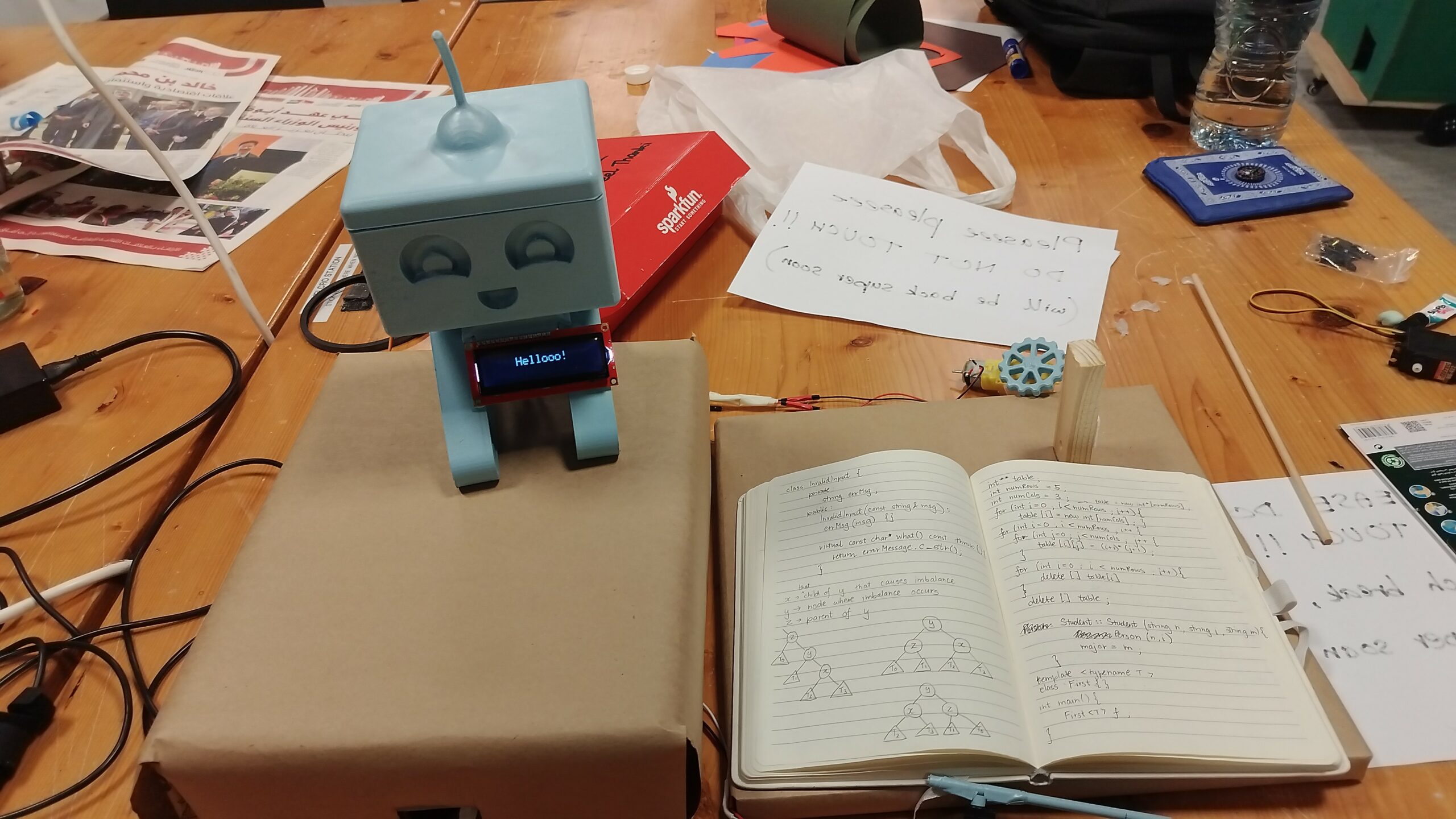
- Display Messages (Arduino): B.L.U.R.B. features an Arduino powered LCD screen that displays small, personalized messages. These messages could tell you when B.L.U.R.B. says “Hello” and also display whether you’re currently reading or on break. The idea is to add a little more interaction to the reading process, keeping you engaged and providing a sense of companionship while reading.
- Move Head (Arduino): B.L.U.R.B.’s head movement is controlled by Arduino, reacting to your actions. Whenever you switch between reading and break modes, B.L.U.R.B. moves his head from side to side. It’s a fun way to make him feel more like a real companion that’s in tune with your reading habits.
- Light Up Reading Lamp (Arduino): B.L.U.R.B. has a small reading lamp that can be activated by tapping its foot. This feature adds a practical element to your reading experience. When the lights are dim or you need a little extra light, a simple tap on B.L.U.R.B.’s foot will turn on the lamp, giving you the perfect amount of illumination to read comfortably.
Implementation
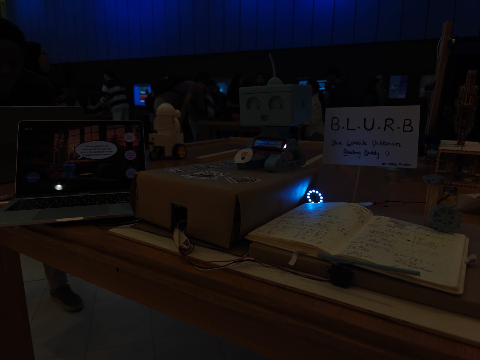
B.L.U.R.B’s Design
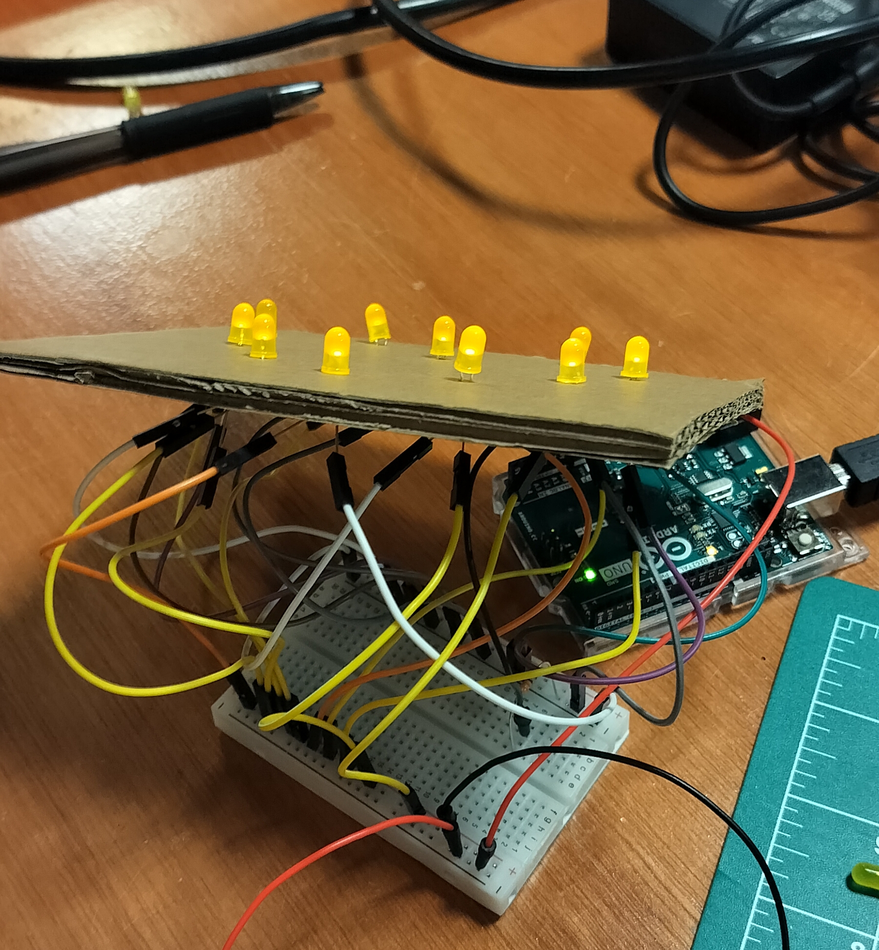
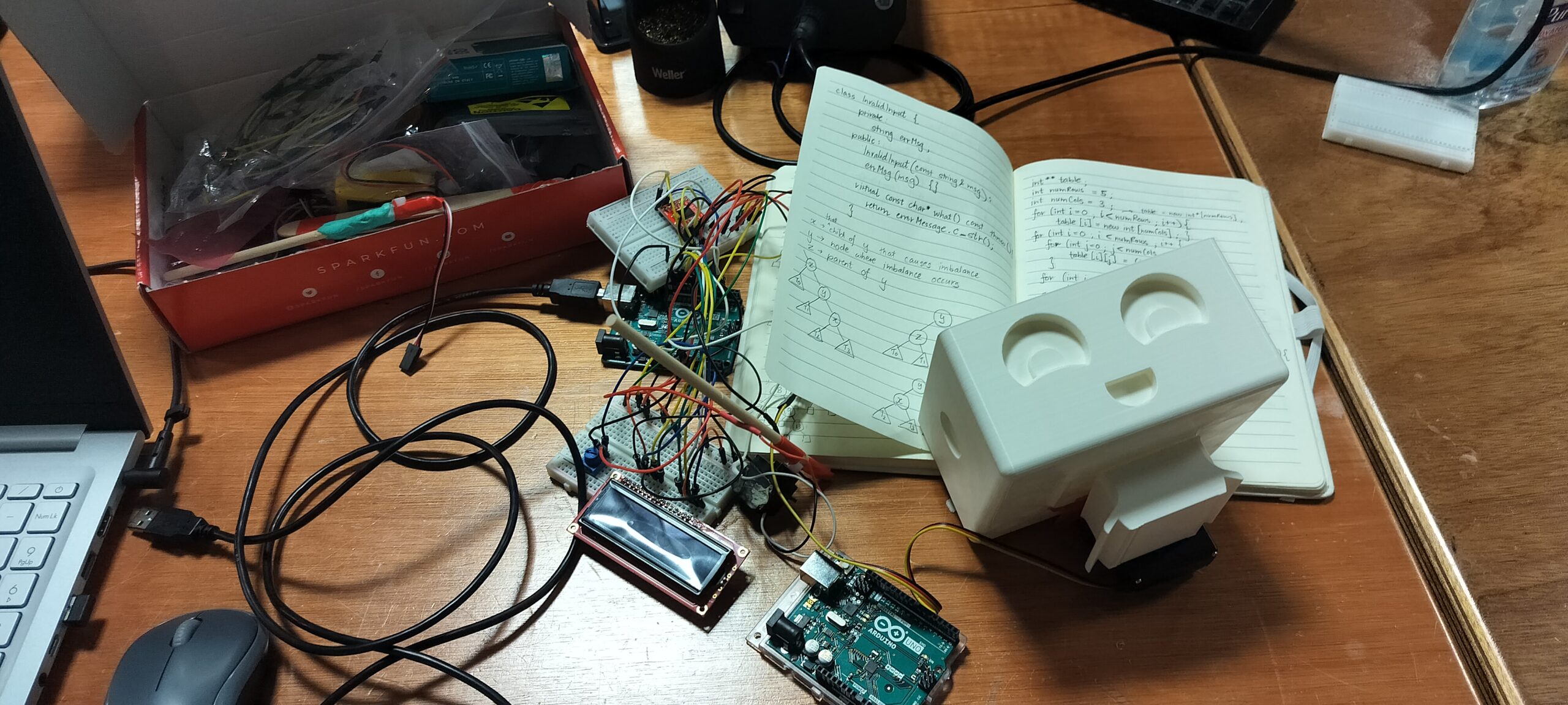
B.L.U.R.B.’s design started with a cute 3D model found on Thingiverse. However, 3D printing issues led to the need to split the model into multiple parts, which were then glued together later. After printing and assembling the pieces, I spray-painted all the components in a soft pastel blue, matching B.L.U.R.B.’s calming design.
This is a video I took after the initial 3d printing stages, while trying to work on making his head move from side to side:
On the p5 side, B.L.U.R.B. is seen sitting on a cozy sofa in a softly lit library room. The setting is designed to create a comfortable atmosphere, enhancing the user’s reading experience. B.L.U.R.B. interacts with the user through animated speech bubbles, where the text appears in a typewriter effect, adding a dynamic element to the conversation. This combination of design and animation gives B.L.U.R.B. a friendly, approachable personality while keeping the focus on a relaxing, cozy environment.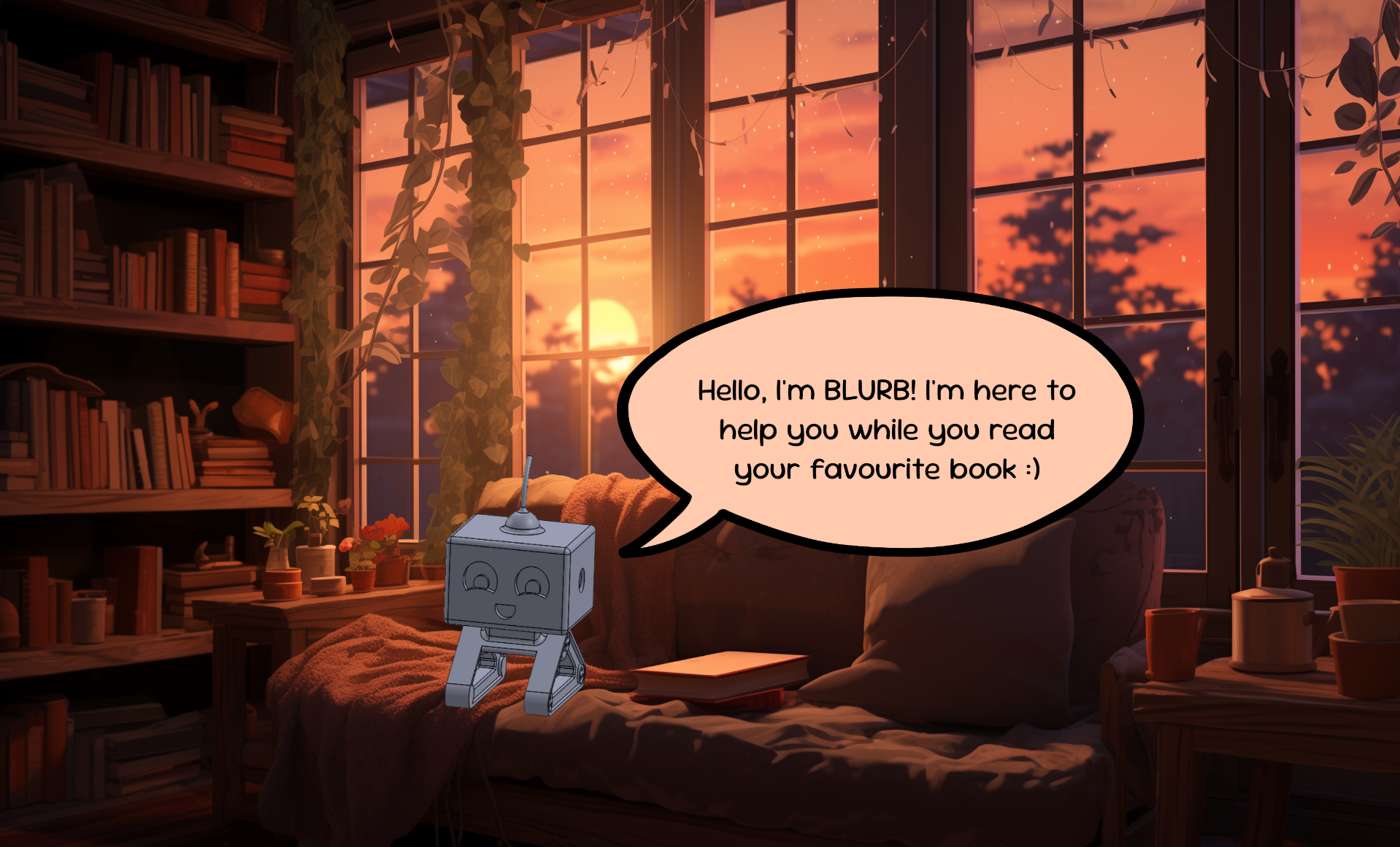
Flipping Pages
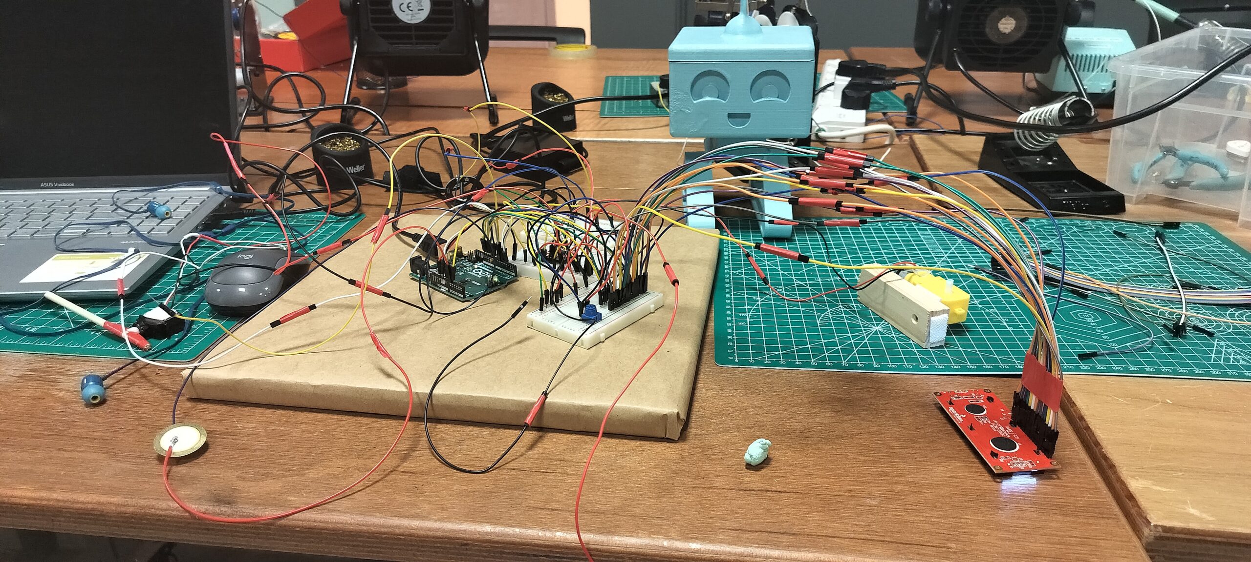
To figure out how to flip pages mechanically, I watched a few videos online for inspiration. My initial idea was to use two servo motors and a temporary adhesive, like Blu Tack, that doesn’t dry out too easily. I built several prototypes and tested different adhesives, but none worked perfectly. Strong adhesives stuck too firmly to the paper and couldn’t unstick, while weaker ones didn’t have enough grip to flip a page.
The adheseive would be stuck on the lower end of the shorter stick of the prototype below:
Eventually, I decided to try a different approach. This involved using a combination of a wheel and a stick attached to a servo motor. The wheel made contact with the page to be flipped, rotating clockwise for some time to lift the page. Then, the stick would get into the gap that was created by this page lift and swing 180 degrees to complete the flip, before returning to its original position. To ensure the next page lay flat, the wheel briefly rotated counterclockwise to smooth it down.
The wheels available in the lab didn’t work well for this setup, so I had a custom wheel 3D printed. This improved the mechanism somewhat, but it still wasn’t perfect. The main issue was that the wheel would sometimes lift multiple pages at once, causing the system to lack the power to flip them all successfully. This happened because the wheel’s motion often lifted more than one page during its run.
It took a lot of iterations to figure this out but the mechanism worked much better at the end with a small change: in the initial few seconds of the wheel running (when it is likely to have slightly lifted the first page), the stick moves slightly inward to fill this gap. The wheel then runs a little more and the servo motion happens as it did before. This ensures that the stick (more likely than not) gets into the right spot (under just one page) and the servo motion causes the page above it to flip.
Playing Ambient Music

Potential Improvements
There are a few areas where I could improve the project to make it even more engaging. One idea is to increase interaction with B.L.U.R.B. by having him move his head randomly to keep the user engaged. Additionally, if the screen in p5 is left idle for a while, I could make everything except the timer disappear, creating a more minimalistic and focused reading environment. Lastly, positioning the reading lamp above the book would provide better coverage of light across the pages, improving the overall reading experience. These changes would enhance both the functionality and the user experience, making the project even more dynamic and enjoyable :))
Reflections
I’m really proud and happy with how this project turned out! When I first decided on the idea, I had no clue whether it would be possible to bring everything together and make it all work. But I was determined to give it my best and worked on it every day, tackling one challenge at a time. The most difficult part, of course, was the page-flipping mechanism—I spent several days experimenting and testing different approaches before I finally got it to work.
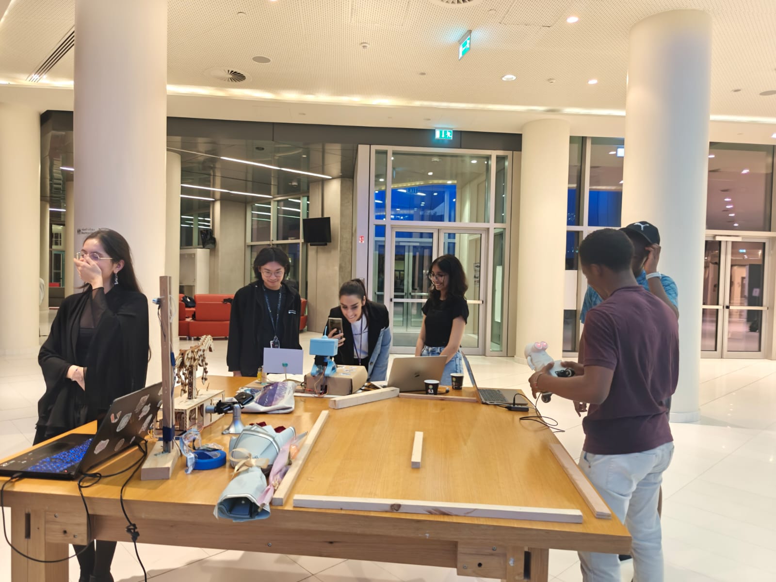
In the end, seeing all the different components come together felt incredibly rewarding. Presenting it at the showcase was a really proud moment for me. Watching people interact with B.L.U.R.B. and enjoy the experience I had created made all the effort worth it. I’m happy with how the project reflects my passion for reading and combines functionality with a cute, thoughtful design. It’s been a journey full of challenges, but the result really does feel like an accomplishment :))