Final Midterm Project

Midterm Project Link: https://editor.p5js.org/jiho.choi/full/Iz4oCo4Lf

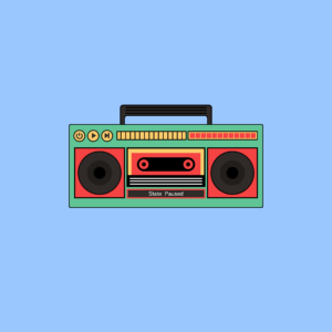
I wanted to make my Midterm project personal and the first thing that naturally popped into my mind was music. Music is such a big part of my life and I can confidently say that I probably will never be seen anywhere without my earphones. The original plan was to incorporate illustrations to use as music backgrounds, but I was experiencing an art block after my comlab webcomic assignment. I physically couldn’t get myself to draw again so instead I decided to code and make use of my knowledge thus far. Essentially, different songs would show different illustrated backgrounds that corresponded to my most profoundly remaining memory of that music. Whilst the backgrounds came off a bit cliche, it was still an honest memory so I was somewhat fine with it. Because my past assignments lacked a clear focus on aesthetic appearance I tried my best to achieve that particular quality. I thought a vintage radio graphic would look more visually pleasing and doable to code so that was the path I stuck with.

The way it works:
1) press play ==> music plays.
2) pause music ==> background changes to default.
3) skip button + play button ==> plays next song.

This process wasn’t at all a fond memory but instead was incredibly taxing, stressful and frustrating. Up until coding the vintage radio, things were going very smoothly and I was having so much fun… but once it got to coding the backgrounds, there was rapidly building friction. I was unfortunate enough to experience first-hand the importance of manually saving your code every 10secs. I had spent 6 hours coding my bg#1 and I thought it was autosaving as I went. Clearly I was wrong and the webpage malfunctioned and gave me the: “something went wrong” page…
But overall I’m proud that I was able to pull off what I would consider in my books a complex piece. Again, I used assignment#3 as a a guiding reference to creating my own version of this piece.

Parts I am most proud of:

function mouseClicked() { 
  let x = 337; // x-coordinate of the second ellipse
  let x2 = 387; // x-coordinate of the third ellipse

  if (mouseX >= x - 20 && mouseX <= x + 20 && mouseY >= 471 && mouseY <= 511) {
    if (song.isPlaying()) {
      song.pause();
    } else {
      song.play();
    }
  } else if (mouseX >= x2 - 20 && mouseX <= x2 + 20 && mouseY >= 471 && mouseY <= 511) {
    if (playButtonCount === 0 || playButtonCount === 2) {
      currentSongIndex = (currentSongIndex + 1) % songs.length;
      song.stop();
      song = loadSound(songs[currentSongIndex]);
      if (playButtonCount === 0) {
        song.play();
        playState = 1;
        playButtonCount = 1;
      }
    }
  }
}

1) mouse click function to control when the music plays and pauses and skips to the next song. This I really had to sit down and think and for some parts, especially those requiring maths (marking down the boundaries of buttons) it was more trial and error and once again hardcore searching on google.

class Wave {
  constructor(xIncrement, yIncrement, xoff, yoff, color) {
    this.xoff = xoff;
    this.yoff = yoff;
    this.xIncrement = xIncrement;
    this.yIncrement = yIncrement;
    this.color = color;
  }
  displayWave(yOffset) {
    fill(this.color);
    stroke(255);
    strokeWeight(3);
    beginShape(); //creating wave shapes in variation 
    for (let x = 0; x <= width; x += 3) {
      let y = map(noise(this.xoff, this.yoff), 0, 1, 600 + yOffset, 700 + yOffset); //determining minimum/ maximum height of waves
      vertex(x, y);
      this.xoff += this.xIncrement; //increments this.xoff by this.xIncrement 
    }
    this.yoff += this.yIncrement; //increments this.yoff by this.yIncrement 
    vertex(width, height + yOffset);
    vertex(0, height + yOffset);
    endShape(CLOSE); //
  }
}

2) I had been googling different ways people had used p5.js to embody beach art and I spontaneously came across the noise function used by someone with really high qualifications. Of course the code was way too complicated for me to understand fully let alone use so I continued browsing but found another more helpful link, by p5.js. I used the code provided and tweaked around with numbers to understand what each line of code did and what role of the numbers were, since there were a lot… Similar to the one above this also required a lot, A LOT  of trial and error, especially with creating multiple wave layers(?) which took up half my day.

IMPROVEMENTS: There is a lot I’d like to mention for improvements…
1) firstly, I didn’t realise the space in the radio handle was opaque. I was on a race against time and so couldn’t afford to really observe the drawing. This is especially such a shame since it really cuts back on the aesthetics.

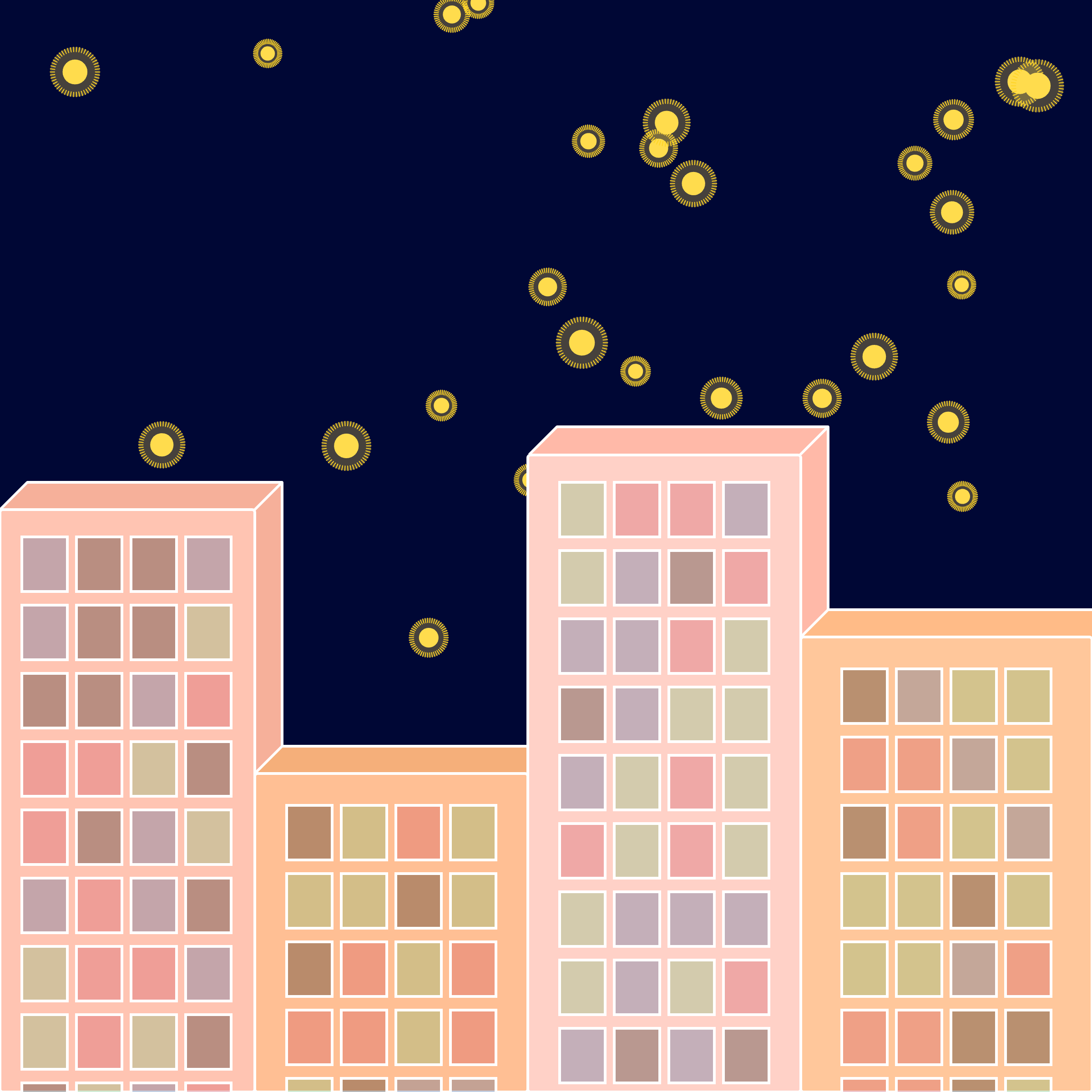
2) Another thing I’d like to mention is the fact that the details of the background aren’t quite clear because the radio size is too big. Of course I already went through a prior episode and so didn’t think it wise to change all the numbers relating to class: radio. Instead I opted to make the canvas bigger, originally it had been 800, 800. (prior episode==>) This too was an incredibly onerous process because every positioning detail relies on coordinates. So I had to go through each line of code to adjust the numbers, of course I’d like to believe that there is a much better solution but again, with my current knowledge on coding, this was the best I could come up with.

3) the requirement for this project was that a loop is required, a way to reset the experience. That was what my on/ off button was for. My plan was that when the on/off button was pressed when music was playing, music would pause. But if button was pressed when no music was playing, song would restart and automatically play. This for the life of me would not work. Somehow I got the last 2 buttons to work yet the first one was refusing to cooperate. If I tried to implement some code targeting the first button, then the interaction for the last button would not work. Of course I still have not been able to conquer this specific part of the code…

4) music backgrounds… This gave me such a headache I spent almost 5-6 hours trying to look for a solution but came up with zilch. When I tried to integrate the codes from e.g., sunset.js to sketch.js (my main sketch file), for some reason which to this day I still don’t know, the positioning, stroke weight and order of shapes went haywire. I really cannot think of a reason why since the backgrounds were created on a same-sized canvas. Because I couldn’t present a blank, half finished project, I had to compromise by uploading the png form of these javascript files, which didn’t look too bad. It just looked a bit dull since everything was static.

5) another thing relating to background, I felt like there was a big quality difference in bg#1 and bg#2 which still really irks me and leaves me feeling dubious about the quality of my project. For next time, I’d like to really delve into and experiment with the cool p5.js effects before contemplating a design because that’s how I discovered the noise function. Through serendipitous search!

6) finally along the way a part of my code ceased to work: click radio = radio change colour. There was too much to keep track of and if one thing worked, another didn’t, so I don’t even know at what point it stopped working. I ran out of time at the end and I am planning to go through to try and solve the issue.

Links and images to separate relating javascript files:


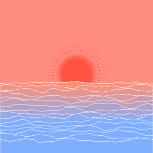
background#1 – “rises_the_moon”:
https://editor.p5js.org/jiho.choi/full/G8s6Rfgxn

background#2 “in_my_room”:
https://editor.p5js.org/jiho.choi/full/koRh51OvD


Week#5 Midterm Project

I wanted to make my midterm project really personal so as to motivate me to want to code and really push myself and the only topic that instantaneously came to mind was music. I am an avid music lover and have used music as a coping mechanism during times of (lowkey) depression and so I naturally garnered a really strong feeling about it. I decided to create my own version of the “coffee shop experience” which really struck a chord in me. My rendition of the “coffee shop”, as aforementioned, centers around music. A vintage radio with an on/off, skip and pause button, which necessitates user interaction, would play a sequence of 5(?) songs – more details listed below. Each song has their own uniquely specific background, each relating to a specific memory, and each background has an element of dynamicity. It’s important to note that the song title and artist name will be displayed on the radio for each song that plays.

Checklist:
1) create a radio using p5.js javascript.
(on/off button – when “on”, music plays, skip button, pause button)
(off button – sequence of songs randomizes + turns off music).
(make sure songs autoplay on loop)
2) (image and sound) – different songs(x5) have different backgrounds.
3) (list/arrays and on-screen text) – song title shows on display when song is playing.

Specific worries/ possible challenges:
1) keeping track of specific parts of codes:
it’s absolutely imperative that my code is well organised and commented, more so for me since I’m in the process of establishing somewhat of a foundation in coding. Keeping track of variable names, classes, functions are most imperative. One solution could be to work on separate sketch.js files for specific parts (for example., backgrounds) specifically for code sections that will be encompassed in classes. Once I’ve made sure it works, I can always copy and paste it onto the main sketch.js file. I’ll also need to copy and paste regularly my main file code onto googledocs/ word doc just so that it’s easier for me to keep track and stay more organised – I find that the p5.js window size limits readability.

2) localising “click” function to specific shapes:
throughout my assignments where interactivity is present, I’ve used “click” functions that result in a change, but it has never been localised to a specific area. It was general and random, which hence enabled flexibility. Because of this, I am naturally worried of the complexity of the code. And with this follows a subsequent building anxiety: the numerous conditions (if/for loops) that majorly depend on how the user decides to interact. To me, this particular segment appears as a big knotted, balled up thread which I have to individually unpick and so at the moment seems incredibly daunting… Of course though nothing is impossible with an internet search (in-depth if necessary). According to my memory, the topic of localising the “click” function to specific shapes has been touched upon in one of the coding train videos. The same can be applied to the if and for loops.  Furthermore there is always the “coffee shop experience” example I can use for guidance or as a source of reference. 

Week#5 – Reading Reflection

Golan Levin’s reading sheds light on computer vision and its role in interactive art and creative design. It’s intriguing how the seemingly contradictory worlds of computers and art come together to create interactive art that deeply engages people. This irony lies in the fact that digital technology often absorbs individuals, disconnecting them from the physical world. However, when art and computers combine, they captivate and transport individuals into alternate realms that encourage technological interaction. During this interaction, artists embed powerful meanings into their pieces, which become all the more memorable because people physically engage with them.

On a different note, one aspect that stands out is how computer vision has evolved beyond art and found applications in diverse fields, including healthcare, transportation, security, and entertainment. This evolution reflects the pivotal role of computer vision in our modern lives. However, its important to note that the reading also raises ethical and societal questions, particularly in the context of surveillance-themed artworks like “Sorting Daemon” and “Suicide Box.” These pieces challenge us to consider the implications of using computer vision for both artistic and surveillance purposes, which ultimately blurs the line between observation and intrusion.

In conclusion, computer vision has undergone a remarkable transformation, becoming a powerful tool for artists, designers, and creators across various fields. Its integration with cleverly designed physical environments showcases the interdisciplinary nature of interactive art and design, bridging the gap between the virtual and physical worlds. While offering incredible creative possibilities that often proffer a deep and meaningful message, it also prompts us to reflect on the ethical and societal implications of this technology.

Week#4 – Loading Data


For this particular assignment I wasn’t quite set on the concept. Again, I was more worried about the coding aspect of this assignment that I guess I didn’t have the luxury to be thinking about its aesthetics and data visualization. I do think that my specific way of visualising data was ineffective in the sense that its unable to tell us anything and its unclear what part of the data I’m visualising but nonetheless I used this assignment as a meek approach to solidifying my previous knowledge on object-oriented programming whilst incorporating a new knowledge of json!

Prior to this, I had seen a poster with lines being dispersed outwards similar to that of comics – as a means to depict emphasis. So, I tried to recreate this but ended up with a slightly altered result with a befitting meaning: fireworks. …Now that I’m reevaluating my process in determining an aesthetic by writing this post, I’m currently kicking myself because I just thought of a much better design that would probably make for a more solid conceptual idea which incidentally, would have been easier to code…

I used my previous assignment on object-oriented programming as a reference to creating the code for this piece since it incorporated the use of classes. I created and formatted my own json file data which included a few picks of my favourite songs, which more specifically outlined artist names, song titles and number of replays. I thought fireworks were a good embodiment of the explosion of emotions I felt when listening to music and the only way to cement this would be to link it to the number of replays a song has. The piece of code I’m most proud of is my use of map():

this.minLength = map(replays, 0, 250, 20, 100);
this.maxLength = map(replays, 0, 250, 40, 130);

I had the hardest time linking a specific range of replay numbers to min/max lengths so I ended up spending almost an hour looking for a solution using google, youtube and reddit. Ironically the solution was in my notes the whole time and so whilst it was a frustrating process, I was just glad that it was over and done with. Now comes the improvements…
One thing that I must criticise is the design choice. It isn’t my best work if not the worst.

1) Rather than randomising the position of each firework object, it would’ve been better to give it a static position so that each firework is given enough space for easy visualisation. With randomisation, every time the sketch is refreshed, it could be that the firework objects appear to be on top of each other, making size differentiation difficult. 2) To mimic actual fireworks, each firework object could appear and fade from their designated position. This would continue on as a loop. 3) Each firework object signifies a certain song within the json file, therefore to give it more distinction and meaning, each song could have had its own colour to signify the specific emotion I would feel when listening to the song.

Week#4 – reading reflection

I think this reading accentuates how finicky product design can be. There are so many different fields a product must fulfill e.g., ergonomics, optimization of function, aesthetics, interactivity/ user experience, whilst staying in keeping with budget constraints, for it to be considered optimal. It also highlights the difficulty of remaining in balance. It shows that we are always teetering towards one extreme, in this case, it may be logic with user functionality and aesthetics. I think NYUAD serves a primal typification of this struggle with remaining in balance. The long path winding down to D2 faces a “major” yet aesthetic obstruction: an elevated grass platform with chairs and tables and patio umbrellas(?) deliberately placed in the middle of an open path leading straight to the entrance of the dining hall. It’s what I can only describe as a deterrence. This debate has surfaced in NYUAD’s Room of Requirement whereby multiple people have criticised its hostile architecture. I feel as though this may also be applicable to the design of John Sexton’s Square, although this may be more of a subjective, personal critique.

Another thing the reading does profoundly is emphasise the importance of psychology in all aspects of design. Human centered design is centered around and relies largely on our concise understanding of human psychology and behaviour. Furthermore, such a study can be applied to increase commercial sales which also spotlights its importance in commercial businesses. This reminded me of deliberate aesthetic/ functionality designs of architecture as a means to maximise profit, for example: casinos. The windowless walls essentially inhibit one’s perception of time, and maze-like layouts ensure patrons serendipitously discover new games at every intersection. Overall, I think its fascinating how a singular area of design can encompass and call upon diverse disciplines e.g., maths, psychology, engineering, arts. In this sense, I think it perfectly encapsulates the intricacies that are necessary and play a paramount role in this specific field.

Week#3 – object-oriented programming

I think this assignment piece was a clear embodiment of all the things I learned whilst binge-watching ‘The Coding Train’ and making notes for every line of code that was introduced in the videos, for the past 5 days. Using all that I learned about functions, classes, if and for loops as well as boolean operations, I created a piece that’s more reliant on its meaning than its objective visuals. I used this assignment as a means of me dipping my foot into the water to test its current, hence it’s simplistic style.

I wanted to portray nostalgia/ melancholy of the past. Specific images I had in mind as reference were faded, warm-toned depictions of one’s memories in movies and hazy light circles. I utilised warm-toned colours to symbolise such melancholy and its movement and opacity to illustrate the idea that whilst the memory is fleeting and obscured, the emotions and ties related to it is prominent to the individual. Because of the piece’s mediocre, primitive(?) interactivity, that allows a gradual transition into blackness, I was also able to successfully depict the notion of “letting go”: letting go of the ties that bind us to the past in order for us to face the present and future.

Like the previous post, I was proud of all aspects of the code since I consider myself still relatively new to the p5.js javascript language. However, I must point out that I was especially proud of implementing and randomly assigning 3 different colours to the ‘blurs’ objects. This as well as attributing a boolean value to a variable to control an if condition and making sure ‘blurs’ objects remained contained within the canvas.

if (this.x < 0) {
      this.x = this.r; 
    } else if (this.x > width) {
      this.x = width - this.r; 
    }
if (this.y < 0) {
      this.y = this.r; 
    } else if (this.y > height) {
      this.y = height - this.r; 
    }
  }

(I think it’s hard to select specific code snippets relating to a single part because it’s sprinkled around the code i.e., some are in setup(), draw() or in class…) To make it easier to manage, I split the piece into different feasible parts: 1) creating randomly positioned/ sized ellipses, 2) randomly assigning 3 different colours to ellipses, 3) causing transparency to increase once mouse is pressed, 4) making sure ellipses don’t escape the canvas. Sometimes I would get confused with variable/ object names so there was a lot of trial and error in determining how to resolve relating errors. Some specific parts required research as I’m still ignorant to the vast amount of functions/ keywords that do specific things e.g., manually adding transparency to the ‘blurs’ objects:

let transparentColor = color(red(this.colour), green(this.colour), blue(this.colour), this.alpha);
fill(transparentColor);

Overall, despite its simplistic nature I am very satisfied. I feel that through this assignment I was able to solidify my knowledge to a greater degree. However, I do feel that this is fleeting so I’ll have to go through the entire javascript file and make notes on each code line function so that it doesn’t remain a surface-level knowledge. I’m very happy that I finally included some level of interactivity but for next time, I would like to use a type of interactivity that evokes a more complex sequence of events.
***I’m so sorry for the late submission. It might not be worth a grade but I still wanted to try it out for my sake. 


Week#3 – Reading Reflection

Chris Crawford’s approach to redefining interactivity challenged my previous understanding. Before reading his work, I had simplistically viewed “interaction” as any engagement that elicited a response. However, Crawford’s detailed criteria, emphasizing cyclically reciprocal actions like active listening, speaking, and thinking, expanded my perspective. It dawned on me that interactivity is not solely objective; it also involves subjective assessments of its degree. This revelation prompted me to reconsider instances I’d deemed interactive but didn’t align with Crawford’s definition. This reevaluation applies to the concept of participation as well. My initial interpretation had primarily focused on the term “interact,” which, as I realized, is distinct from “interactivity” and represents two surprisingly different notions.

To illustrate this point, consider social media platforms. We often think of them as interactive because users can like, comment on, and share posts. However, these platforms are primarily built around interfaces for content presentation and interaction with other users. The core design is about presenting information rather than fostering deep interactivity. Another example is YouTube. While viewers can like, comment, and subscribe, the core design revolves around presenting videos and ads. It offers interaction elements, but they don’t necessarily facilitate the deep, cyclically reciprocal engagement that Crawford’s definition of interactivity suggests. So, interactive design can indeed transcend traditional interface design, encompassing a wide range of digital experiences that may appear interactive on the surface but don’t fully align with the rich criteria Crawford outlines for true interactivity.

week#2 – reading reflection

It’s interesting how the juxtaposing binaries of order and chaos are so interrelated together and constitutes a vital component in visual arts. Casey Reas’ talk further enlightened me in this perspective. Randomness in art throughout history has been celebrated and such a chaos is what inspires the many variations of art we see in contemporary times. Yet it’s important to note that such a seemingly liberating practice involves delicate control, a notion that is reiteratively referenced throughout the video. Whilst this may be an implicitly obvious knowledge, it’s usually not something we consciously deliberate upon.

I didn’t know to the extent how closely interconnected the role of control was in chaos and vice versa. Following on from this, it’s intriguing how, even in our deliberate attempts to harness randomness, we are engaged in a kind of controlled chaos. It’s like we’re conducting an intricate symphony, guiding the elements of chance to produce results aligned with our intentions. This challenges the notion that randomness is synonymous with unpredictability; rather, it can be a tool for crafting intentional, yet pleasantly surprising, outcomes.

week#2 – “for” loop assignment

My aim for this assignment was to produce an Andy-Warhol(esque), visually abstract art with a pronounced focus on colour portrayal. This is because some of Andy Warhol’s more iconic features of pop art was his use of distinctive arrays of colour. Through this ever prominent display of colours, which was made especially overt by the black background, coupled with the illusion of depth that is added within each square, I was able to generate an unintended yet desirable end-result.

This assignment punctuated the fact that my brain is not hardwired for coding, especially p5.js – javascript coding, and to some extremes, it even made me reconsider my major (interactive media). Whilst I had ambitious ideas and concepts I wished to bloom into fruition, my abilities and understanding of coding severely restricted this. As a result, I am incredibly proud of every single code that I produced with the for() loop since it took me an unbelievable amount of time to perfect(?) it. Initially I had wanted some form of dynamic physical change of shapes e.g., squares transitioning into ellipses, circles alternating in size, but again, with my incredibly limited knowledge it was hard to replicate it.

let cols = 10; // Number of columns
  let rows = 10; // Number of rows
  let gap = 10; // Gap size between squares
  let squareSize = (width - (cols - 1) * gap) / cols; //calculating square size
  
  for (let r = 0; r < rows; r++) {
    for (let c = 0; c < cols; c++) {
      let x = c * (squareSize + gap); //x+y position of squares
      let y = r * (squareSize + gap); 
      
    //generating a random colour
    let randomColor = color(random(255), random(255), random(255));
      
      noFill(); 
      stroke(randomColor);
      rect(x, y, squareSize); // Draw the square
      
        //creating transition between square and ellipse
        for (let size = squareSize; size >= 20; size -= 2) {
          rect(x, y, size); // Draw a square
          ellipse(x + size / 2, y + size / 2, size - 10, size - 10); // Draw a circle in the middle of the square

Creating a spaced grid with randomly iterating colours was definitely doable although I can’t deny that it was a mind-twister but trying to create this transition from square to ellipse was almost impossible. I’m still not entirely sure how to adjust the coding to produce my desired result but, though not intended, this outcome was equally wonderful. I was very pleased with how it displayed on screen. For further improvements, as I have previously mentioned, I would love to first of all solidify my coding knowledge so that I can produce more dynamic and animated works. Perhaps an interesting idea could be that these squares randomly swap positions to occupy a new coordinate.

Week#1 – self-portrait

p5.js assignment#1 was an entirely jarring, anxiety-inducing experience. I severely struggled with understanding javascript code and hence this assignment felt like the biggest milestone. Whilst I still feel that to some extent I don’t entirely understand p5.js coding, I tried to adapt the best I could, within limited time constraints, by using a mixture of simple shapes and what I consider some high level codes to conjure a self-portrait.

I had the hardest time with determining the correct coordinates and so there were lots of trial and error in placing shapes and curves, specifically with the bezier() function. The double eyelids were the hardest to recreate and therefore took considerable time perfecting them. Once I had established a desirable curve I used the translate() function to transfer it to my right eye. Any features that required the bezier()/ beziervertex() function I was proud of:

//lips
fill(255,144,137);
beginShape();
vertex(380, 465);
bezierVertex(380, 465, 390, 450, 400, 465);
bezierVertex(400, 465, 410, 450, 420, 465);
bezierVertex(420, 465, 400, 490, 380, 465);
endShape();
//eyelids
noFill();
bezier(382, 393, 365, 375, 338, 385, 332, 393);
push();
translate(85, 0);
bezier(385, 393, 365, 375, 338, 385, 332, 393);
pop();

Through the fill()/ nostroke()/ translate() functions, I was able to discover and utilise the push() and pop() functions, which corrected many placement/ color errors that tended to occur. To compensate the lack of an interactive quality, I put substantial care into the aesthetics of the self-portrait. If I had a little more time, I would have loved to dabble in javascript coding for adding loops. Making the clouds move repeatedly would certainly make this assignment a more dynamic piece.