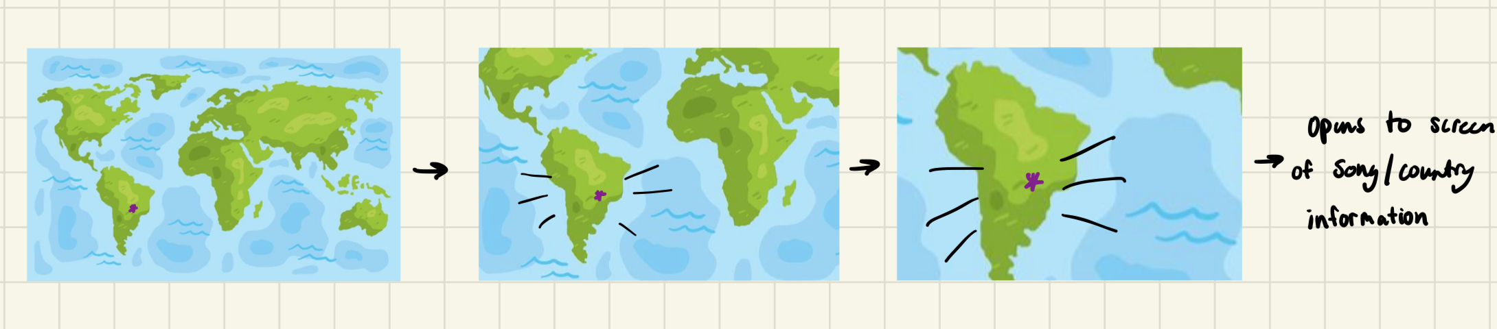
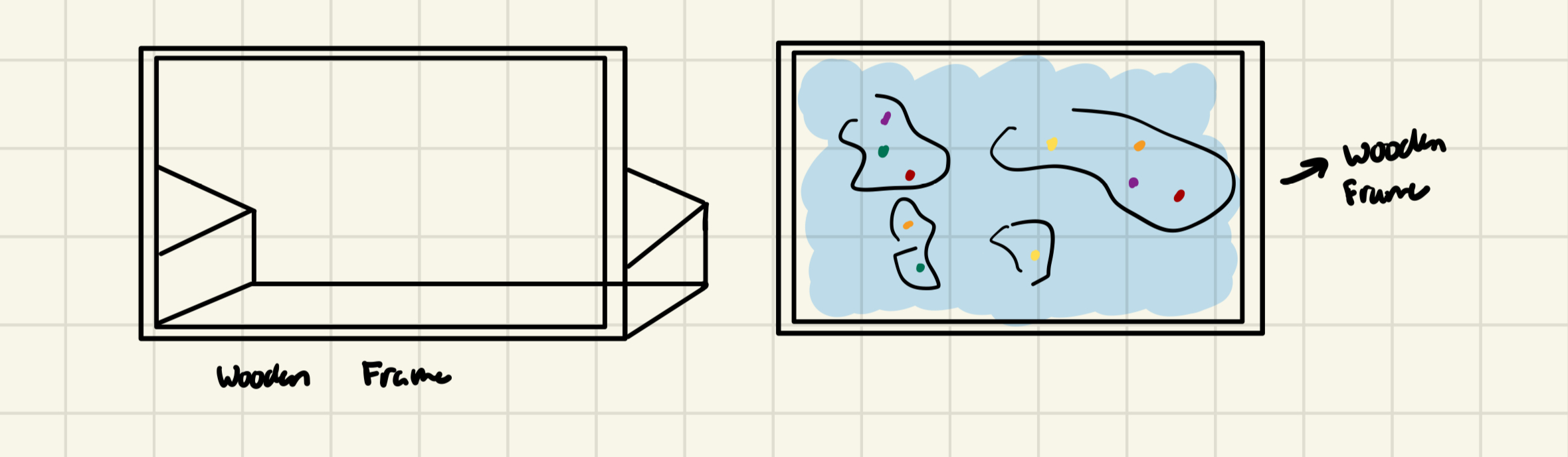
Concept
From the design to implementation phase I am rather satisfied with how close I was able to stay to my original concept. In the design phase I knew I wanted to create some type of map interaction with different countries and songs for users to dance too. When conceptualizing this project, my mind kept returning to the alphabet/poem rain installation we saw in the first half of the semester. I think it’s the best example we’ve seen of interactive art where there’s a message and a strong interactive component. Although, I was not able produce something of that quality, I am nevertheless pleased with way in which I combine meaning and interaction in my piece.
As a study away student being immersed in NYUAD’s vibrant culture has genuinely changed my perspective of the world. Growing up in New York City, and the US in general I’ve been taught a very specific definition of what diversity looks like and being a student here has completely redefined that for me. Thus, as the semester comes to a close, I thought this project would be a perfect way for me to share a glimpse of what I’ve come to appreciate so much.
Design
As I mentioned previously, throughout the design process I had a pretty clear idea of what I wanted to create. There were other features that I considered in order to strengthen the interactivity such as body tracking or a point system but I settled on a simpler design to ensure maximum functionality. Nevertheless I took a lot of inspiration from the video game Just Dance, and tried to consider that level of interaction throughout the design and implementation process.
Implementation
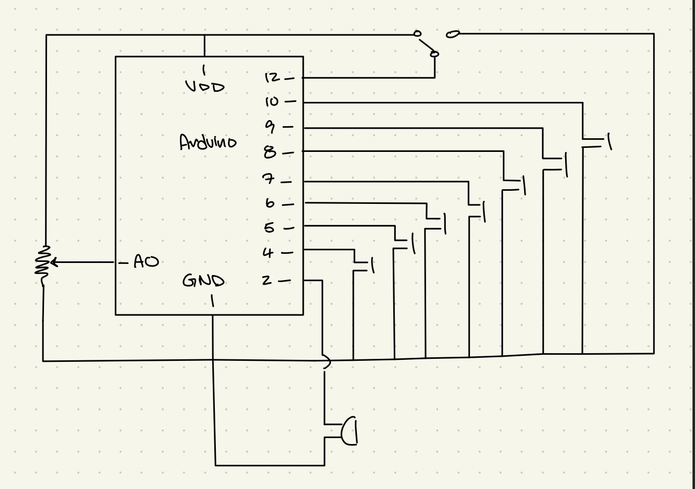
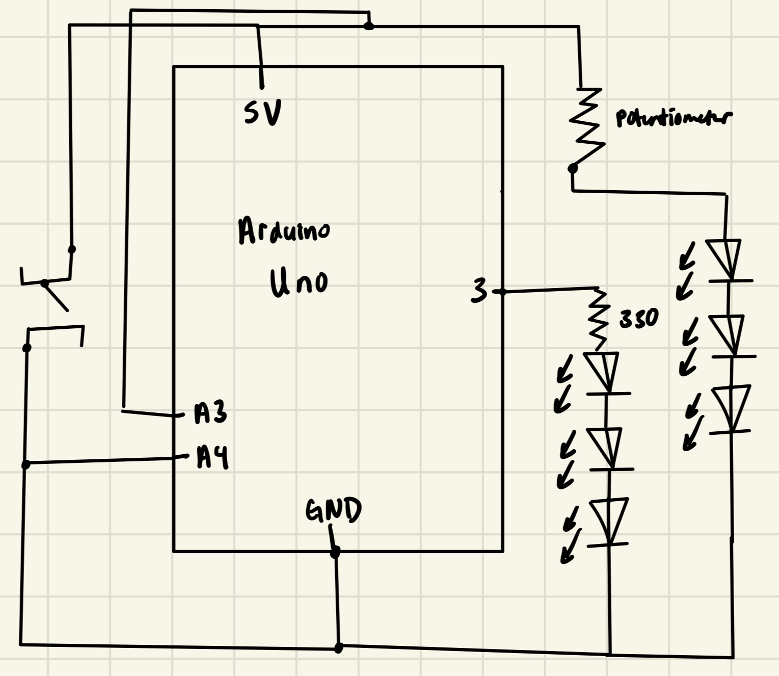
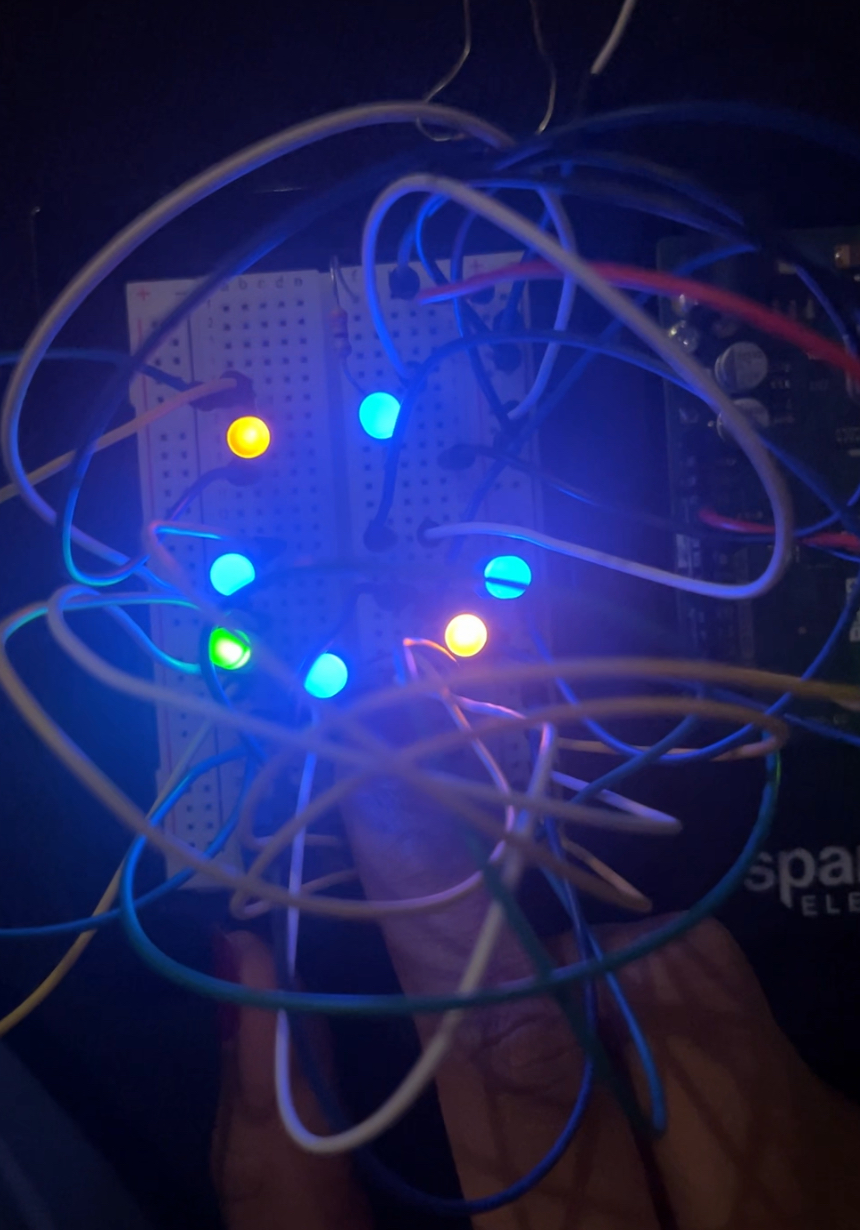
Once I began the ‘build’ process the difficult part was just in mainly getting started. Surprisingly enough, I also had a hard time figuring out what songs/countries would be represented. The hardware, although rather simple, tested a lot of skills in terms of soldering and using tools I’m not super familiar with so I’m glad I was able to use what we learned in class to my advantage. Furthermore, this is the first time I’m working with any kind of hardware components on top of software design so it took a bit of creativity to consider what materials I wanted to use to make my vision come alive.
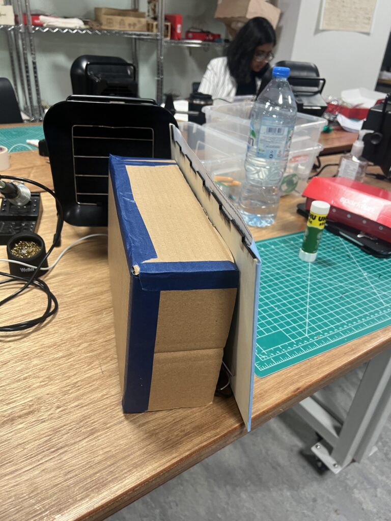
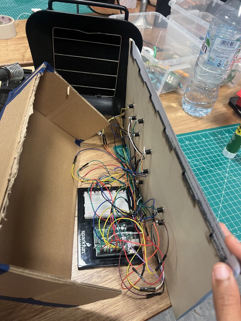
Caption: I originally had a ton of extra wires because I thought I wanted to extend the Arduino behind my computer but after assessing the material available, I shorted them and added this box to tuck them away. – Phase 2
My prototype consisted of just using the map itself and a few switches to test both the hardware and software. Once that was good to go, my main concern became ‘cleaning up the look’ so that I had a clear, finished project to present. This was rather easy, I just needed to identify areas of concern, and figure out how I could further simplify them.
Prototype video from user testing – no sound

In terms of software implementation, once I decided how I wanted to exchange information between P5 and Arduino, I was able to make significant progress in my code. Basically, when a button on the map is pressed, a flag corresponding to that country in Arduino is sent to P5 which then sets a series of commands off to play it’s respective video. However, a major road block that I hit was the 5 MB upload limit to video files in P5. My solution to this problem is fairly simple, but the route I took to get there was very long and complicated (as is most debugging). I eventually was able to implement an array based system to cycle through clips of each video so that they could all play as one.
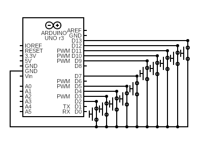
Schematic
Arduino Code
int colombiaButton = 13; // Button connected to pin 13
int indiaButton = 12;
int koreaButton = 11;
int chinaButton = 10;
int italyButton = 9; //black button with whie & blue wire
int prButton = 7; //yellow button with green and blue wire
int saButton = 5; //green button with white and yellow
int nigeriaButton = 2; //red button with orange and green
int kazakhButton = 3; //blue button with green wires
int fpButton = 4; //black button yellow and white wire

void setup() {
  // Start serial communication so we can send data
  Serial.begin(9600);

  // Configure the button pin as input with pullup
  pinMode(colombiaButton, INPUT_PULLUP);
  pinMode(indiaButton, INPUT_PULLUP);
  pinMode(koreaButton, INPUT_PULLUP);
  pinMode(chinaButton, INPUT_PULLUP);
  pinMode(italyButton, INPUT_PULLUP);
  pinMode(kazakhButton, INPUT_PULLUP);
  pinMode(prButton, INPUT_PULLUP);
  pinMode(saButton, INPUT_PULLUP);
  pinMode(nigeriaButton, INPUT_PULLUP);
  pinMode(fpButton, INPUT_PULLUP);
}

void loop() {
  // Check if button is pressed
  if (digitalRead(colombiaButton) == LOW) { // Button pressed (active low)
    Serial.println("colombia"); // Send "push"
  } else if (digitalRead(indiaButton) == LOW) {
    Serial.println("india"); // Send "push"
  } else if (digitalRead(koreaButton) == LOW) {
    Serial.println("korea"); // Send "push"
  } else if (digitalRead(chinaButton) == LOW) {
    Serial.println("china"); // Send "push"
  } else if (digitalRead(italyButton) == LOW){
    Serial.println("italy");
  } else if (digitalRead(prButton) == LOW){
    Serial.println("pr");
  } else if (digitalRead(saButton) == LOW){
    Serial.println("sa");
  } else if (digitalRead(nigeriaButton) == LOW){
    Serial.println("nigeria");
  } else if (digitalRead(fpButton) == LOW){
    Serial.println("fp");
  } else if (digitalRead(kazakhButton) == LOW){
    Serial.println("kazakh");
  } else {
    Serial.println(0);
  }
  delay(150); // Debounce delay
}
P5 Code
https://editor.p5js.org/jajones/sketches/SaANLV2D5
Aspect’s I’m Proud Of
Overall, I am pretty proud of my final product. What I struggled with the most in the midterm was designing realistic plans for my project which left feeling overwhelmed throughout the implementation process. Throughout this process, I gave myself enough space to design new ideas while staying focused on what my original plan was which I think really helped the overall process.
A more concrete component I am proud of this the solution to the file size upload issue I faced earlier. I did a lot of reading on StackOverflow and random P5 forums to help me solve the issue and so even though it isn’t perfect I am really happy with how it turned out.
Future Improvement
In terms of future improvement, I would love to incorporate more way to encourage people to physically react. Although in my user testing people were active and participating, I feel as though if I wasn’t standing there, watching, they wouldn’t necessarily feel as inclined to do so. To help alleviate this I did try to replicate a dance mirror effect when the videos play so users felt incentivized to dance, but I’m sure I could go even further to record them dancing and then have the program send it to them or add it to some dance database which they might enjoy being a part of.
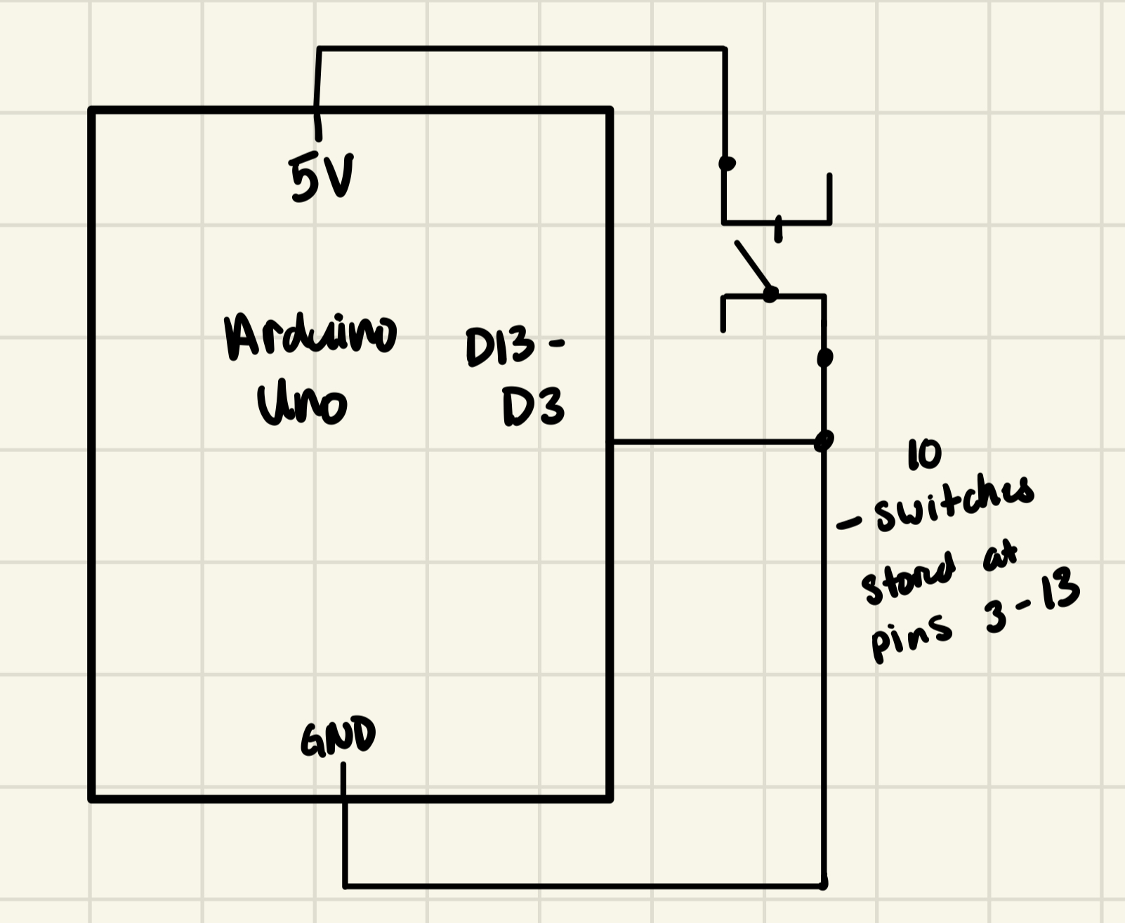 I did not include the LCD display in this schematic because I’m not sure how I’d balance those pins with what I need for the switches so I am temporarily pausing that idea. I will see if I can split half of the switched on analog and the other half on digital since LCD needs to be on digital pins.