Assignment 4 – Typography

Inspiration

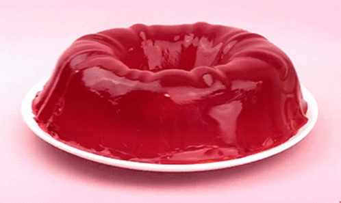
I wanted to make a typography that imitates the shaky nature of jello. I want the boundaries of the letters to move haphazardly while maintaining a their general features.

Jello GIFs | Tenor

Implementation

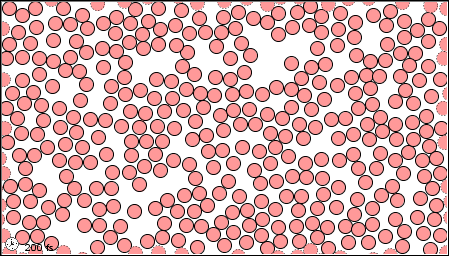
I preloaded a font called Aquino for to its thick,blocky appearance. This was so the word at least stays loosely legible even when it wobbles. The array of boundary objects is made using the textToPoints function in line 19 and 22. This is the basis of my topography. For the wobbly jello effect, I used the noise function in line 35 to make each point fluctuate.

The two texts have the same jello behavior, but differ in their points’ appearance. I like both designs, so I left them both on. They interact with the mouse position, by increasing pointer diameter when the mouse is close. When this happens the top text gets more bubbly, while the bottom text looks like a torch is being pointed at it. This is done using the using the dist() function.

Sometimes, the typography appears too disfigured, in which case please reload the page.

Conclusion

I leant a lot from this assignment, one of which being that one’s creativity is the only limit. My assignment, although farly simple, opened my eyes to countless other alterations I could implement in future assignments.

Assignment 3 – OOP Generative Art

Foundation

I set out to make an interactive design  based on  music bars, like those shown in the image below. OOP was a huge help, as this was the first assignment design I am satisfied with having created. I envisioned 2 sets of music bars sideways (from the right and left) widening and shortening depending on the position of the mouse. While at first I set out for a blocky design, my final product ended up being more smooth and wave-like.

sound bars animation Stock Footage Video (100% Royalty-free) 4096171 | Shutterstock

Implementation

After familiarising myself with the OOP syntax, I worked on a class to make a rectangle whose width increases when the mouse moves closer to it. The first problem I faced was trying to connect the mouse movement to the bar width. I overcame the obstacle by first calculating the distance between the base of the bar and mouse position by using the dist() function. I then used this to map the fluctuating value onto the bar width. This can be seen in the updateBar() function in the LeftBar class and RightBar class.

I spent the bulk of my time perfecting this so that when I do produce many bars using a ‘for’ loop, the bars widths would gradually increase and decrease in relation to mouse and eachother. The closer the mouse is to the base of a bar, the longer its width is.

I made the bar height a global variable on line 2 so that it is easy to adjust the smoothness of the curve. I chose to keep it small (1 pixel), so that the movements appear smooth and satisfying. This smoothness reminded me of lava lamps, so I went ahead and coded fluctuating colors that change based the same class variable, “distance”, that I used in the maping function.

So far all my code is object oriented. I didn’t want to leave the  middle of my design empy so I added some spinning squares that I feel gives the piece its hypnotic nature. I found it quicker and easier to just copy and paste the code I wrote for one square over and over with small adjustments rather than object orienting this simple part, so that’s what I did. This may be why my code is longer than it needs to be. I gave the larger squares a lower saturation and brighness value to give the piece some depth.

Conclusion

OOP made my code so much more readible and organised. Furthermore, I gained more control over my art piece and am more confident to code my vision onto the digital canvas.

assignment 2

To be frank, I found this assignment much harder than the face portrait. While I tweaked my code for hours only to be rewared with incremental improvements, I wasnt able to achieve the art piece I envisioned with my current level of expertise. I wanted to model the haphazard, random and continues movement of air particles trapped in a container but I could only get to the particle part. Something like the gif below.

11.1: A Molecular Comparison of Gases, Liquids, and Solids - Chemistry LibreTexts

But I unfortunately couldn’t figure out how to move my many “air particles” once they had spawned in at random locations. Even with adjusting the circleX and circleY components the particels did not move. I will continue practicing p5.js and search up more tutorials so I am better prepared for the next assignments.

Assignment 1 – Self Portrait – Ahsen Saaim

For this assignment I went for a clean, simplistic emoji-esc style for my portrait. I wanted my avatar to be outdoors, so I chose colors that I thought best complimented the light blue sky like white, maroon and yellow. I used different dimensions of ellipses for the sun, face, eyes, body and buttons, while the clouds are a cluster of overlapping ellipses. The nose is a triangle, while the mouth and hair are varying rectangles. Although I liked the aesthetic of my portrait it felt somewhat stiff, so I animated the cloud to move slowly across the sky by changing the x coordinates of the ellipse-cluster slightly with every repetition of the draw function.

This project was fun to work on but it was frustrating not being able to depict my vision onto the canvas. I tried to make my hair more true to life but didn’t suceed so I back peddaled to a simple rectangle. This shows I need a lot more experience to bring my  thoughts to life. In the future I hope to make more intricate projects with a larger arsenal of shapes and animations to work with.