Aisha Response – Computer Vision

In this reading, Golan Levin talks about the computer vision (the broad class of algorithmic so that allow computers to make intelligent assertions about digital images and video) for artists and designers in particular, through a survey of the new applicants in the arts, system design consideration, and contemporary tool. In 1966, Marvin Minksy decided to try to solve “the problem of computer vision”. Many years later, we still use this discipline to confront ideas such as pattern recognition and feature recognition. Between 1969 and 1975, Myron Krueger was working on the first interactive artwork, ‘Videoplace’, which displayed the user’s silhouette on screen as well as movements. Furthermore, it allowed users to paint lines with both their fingers and body. There have (obviously) been many interactive media designs that followed from the videoplace such as the suicide box. The suicide box was placed in front of the Golden Gate Bridge (a known suicide spot) and recorded the suicides through motion-detection. This was a very controversial project as it was morally and ethically wrong for obvious reasons.


There were numerous kinds of problems that vision algorithms have been developed to address. For example, a ‘Digital video is computationally “opaque” – it doesn’t contain any intrinsic semantic or symbolic information. Thus, a computer with no additional programming is unable to answer basic questions such as whether a video stream constrains a person or objects or whether it shows daytime or nighttime. There are three elementary techniques that can solve these problems. 1) frame differencing (attempts to locate features by detecting their movements). 2) background subtraction (locates visitor pixels according to their differences from a known background scene). 3) brightness thresholding (hoped-for-differences in luminosity between foreground people and their background environment). There are algorithms to help achieve this: detecting motion, detecting prescience, detection through brightness thresholding, simple object tracking, and basic interactions. However, we should solely rely on this as it can fail. We should also focus on computer vision in the physical world. These techniques include low light conditions, the use of retroflex time marking materials, and perhaps not intervening in the environment at all. To implement machine vision techniques directly from the first principles, all that is required is that It should provide direct read access to the array of video pixels obtained by the computer frame-grabber. To conclude, quality is determined by the specific algorithms which are used to analyze it. Furthermore, people new to computer vision should focus on the physical scenarios as well as the code.

Aisha – Floor is Lava Midterm project

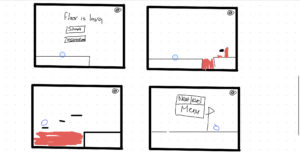
For my midterm project, I decided I wanted to make a floor is lava type of game where the player has to move from left to right without touching lava. There will be platforms in the game that can help the user as they can jump on it thus avoiding the lava. Once the user finishes a level they will have an option to go to the next level or back to the menu. At the beginning of the game, there will be the main menu where the start and instructions buttons are displayed. Furthermore, I might add background music or a sound effect when the user jumps (or both) to the game but there will be an option for the user to turn off the sound.

The user will move at a constant velocity from left to right. The user can press the up arrow button to allow the shape to jump. The background will be moving to the left to allow the image to scroll.


Inspirations:

I was inspired by games such as geometry dash and super Mario.

Geometry dash:

https://www.youtube.com/watch?v=HW41UNolUec

Super Mario:

Rising Tides of Lava - Super Mario Wiki, the Mario encyclopedia


Rough Sketch of the game:


This is all I have done so far:

let gravity = 0.5;

class Player {
  constructor() {
    this.x = 100;
    this.y = 320;
    this.d = 30;
    this.v = 0.05;
    //gravity
    this.xg = 0;
    this.yg = 0;
  }

  draw() {
    fill(15, 192, 252);
    stroke(0, 255, 255);
    ellipse(this.x, this.y, this.d);
  }

  update() {
    this.y += this.yg;

    if (this.y + this.d + this.yg <= height) {
      this.yg += gravity;
    } else {
      this.yg = 0;
    }

    // if (this.x < 400){
    //   this.x += this.xg;
    //   this.xg += this.v;
    // }
  }
}

class Platform {
  constructor(x,y) {
    this.x = x;
    this.y = y;
    this.w = 100;
    this.h = 20;
  }

  draw() {
    fill(0);
    rect(this.x, this.y, this.w, this.h);
  }
}

let player;
let platforms = [];

function setup() {
  createCanvas(800, 400);
  player = new Player();
  for (let i = 0; i < 100; i++) {
    platforms[i] = new Platform(i + 500, 300);
  }
}

function draw() {
  background(230, 143, 172);
  player.update();
  player.draw();
  for (let i = 0; i < 10; i++) {
    platforms[i].draw();
  }

  if (player.x < 400) {
    player.x += player.xg;
    player.xg += player.v;
    for (let i = 0; i < 10; i++) {
      platforms[i].x -= 5;
    }
  }

  // platform condition

  for (let i = 0; i < 10; i++) {
    if (
      player.y + player.d <= platforms[i].y &&
      player.y + player.d + player.yg >= platforms[i].y &&
      player.x + player.d >= platforms[i].x &&
      player.x <= platforms[i].x + platforms[i].w
    ) {
      player.yg = 0;
    }
  }
}

function keyPressed() {
  if (keyCode === UP_ARROW) {
    player.yg -= 10;
  }
}


There is obviously still much more I need to do however this was a quick test run I did to make sure I know what’s going on.

Things I need to add:

  • Change the look of the platforms
  • Add more platforms
  • Add a ground for the ball to be on
  • Add a better background
  • Add the lava
  • Add the title screen
  • Add the sound button
  • Add more levels

I’m looking forward to continuing to work on this project and hope that it ends up being similar to how I imagined it.

Aisha Response – Design Of Everyday Things

In this reading, Don Norman emphasizes the importance of a good design: discoverability and understandability. Is a design really good if users can’t comprehend it? Let’s imagine a swinging door; it has no signs to indicate whether users should push or pull and has big large handles. This creates frustration for the users as they have no idea whether they should push or pull them. Thus, they are not able to discover was actions should be used leading to a lack of understanding of what to do with the door. However, a good design would have a sign clearly indicating whether users should push or pull, helping them discover the action they should take, and leading to them understanding whether they should push or pull. This is also true for light switches. If a room has multiple complex light switches users could be confused and frustrated as to which switch corresponds to which light. Designers should focus on the psychological needs of humans when building something to decrease frustration and increase satisfaction. There are five psychological concepts: Affordances(cues that users can pick up), Signifiers (determine where the action will take place), Mapping (grouping and proximity), Feedback, and Constraints (Limitations). Conceptual Models are simplified explanations of how something works in users’ minds. We recall this information when interacting with different things. Overall, I agree with what Don Norman is stating in this text. Although a good design should look good it doesn’t only rely on that.  A good design means that users can comprehend it easily making life easier for them. I’d rather have a simple easy object than a complex-looking object with a lack of clarity

Aisha – OOP

Usually, when I physically paint, my go-to painting is the night sky. So I wanted to replicate that idea in this assignment. I created 4 classes: Rain, Moon, Sun, and Grass. The Rain class is the one I’m most proud of. With the help of the coding train, I displayed many drops falling from the sky using a fall function and a draw function at different x and y positions as well as different speeds. Here is the code:

class Rain {
  constructor(yspeed) {
    //random so drops dont fall in the same position/speed
    this.x = random(400);
    this.y = random(-500, -50);
    this.yspeed = random(5, 7); //how fast it falls
  }
  
  // function for raindrops
  fall() {
    this.y = this.y + this.yspeed;
    
    //ensures that rain is constantly falling
    if (this.y > height) {
      this.y = random(-200, -100);
      
    }
  }
  
  //shows raindrop
  draw() {
    stroke(255, 255, 255);
    line(this.x, this.y, this.x, this.y + 10);
  }
}

After this, I developed the moon and grass class. I then created a sun class that displays when the mouse is pressed. Furthermore, when the mouse is pressed it makes it turns from nighttime to daytime and stops the rain.  I also created two people to stand there and look at each other. I attempted to make a tree however after a few hours it still wasn’t working so I ended up just putting an image of a tree in the art to add more details.

This is my sketch:

Future Improvements:

  • I would like to build my own tree rather than upload an image from the internet.
  • I would like to animate the two people to make it seem like they are hugging/kissing
  • I’d also like to make the rain look more realistic (maybe have rain closer to the screen look bigger and rain in the back look smaller and splashes on the grass).

Aisha – Loop Art

Before working on my assignment I decided to keep practicing with loops to get myself comfortable with it. Once I did I began brainstorming some ideas and after doing research for inspiration I committed to an idea.

As a background, I  used a for loop to add a pattern of multiple small lines to give a sort of grainy feeling to this piece of work. After I accomplished this, I used Jeff Thompson’s video on youtube to help me with the animation of the squares. I placed the larger square in the center and had a global variable ‘angle’ that made the shape continuously rotate. After this, I created two rings of squares around the initial square. However, instead of keeping it in the center, I made it move around as well as rotate. I’m not going to lie this wasn’t intentional I was just experimenting and I ended up liking it. This is the piece of code I’m most proud of:

// ring of squares rotating
 for (let a=0; a<radians(360); a+=radians(30)) {
   push();
   translate(140,140);   
   rotate(a);   // rotate each by 30º
   translate(0, 80);  // puts it around the center square
   rotate(-angle);  // rotate the other way
   fill(random(0), random(255), random(255), random(255));
   rect(0,0, 25);
   pop();
 }

 for (let a=0; a<radians(360); a+=radians(30)) {
   push();
   translate(140,140);   
   rotate(a);               
   translate(0, 120);             
   rotate(-angle);                 
   fill(random(0), random(255), random(255), random(255));
   square(0,0, 20);
   pop();
 }

My sketch:


Improvements for next time:

– What I wanted to do but couldn’t achieve in this assignment was change the colors by mousePressed. So next time I’d really like to achieve this.

-I’d also think I should slow down the framerate a bit as the colors are changing too quickly and could cause a headache if you look at it for a long time.

Aisha – Self Portrait

Before starting this assignment, I tried to experiment with different shapes and colors to familiarize myself with p5 as I have never used it before and have little experience in coding. After I got the gist of it I attempted to produce a photo of me with a simple background of nature.  I thought it would be a fun idea to include the background as it enabled me to practice more coding and begin my coding artistic abilities.

I used the mouse and mousey to help me identify where I would have to put different features in my portrait. I used an ellipse to draw a simple head and eyes hijab adding details such as eyelashes by using the lines function. I used both the line and arc functions to sketch my mouth, nose, and hair. For the background, I used arc functions to sketch the ground and rectangles and ellipses to sketch a tree. Finally, I used ellipses to sketch a few clouds.

The most challenging part for me in this assignment was the majority of the arc shapes as well as figuring out the exact position to place different features of my sketch.

I think the feature that I’m most proud of is the mouth. Although it isn’t great, I liked how I included the upper lip and outlined the whole mouth as red rather than just leaving it as a white smile.  This is the code I used for it:

//Mouth
  
  fill(255,0,0);
  arc(200,232,50,8,radians(180),0);
  fill(255);
  stroke(255,0,0);
  arc(200, 230, 50, 50, radians(0),radians(180));
  stroke('#222222');
  line(200,231,200,255);
  line(185,231,185,250);
  line(215,231,215,248);
  line(178,241,222,241);


This is the final result:

As I mentioned earlier this was a fun task to get familiar with the program however there are some improvements I’d like to apply if I were to do this assignment again.

  1. As my code is too long I would like to use variables to simplify it a bit.
  2. Utilize different/new shapes such as a curvey line and a tilted ellipse to represent the leaves on the tree.
  3. I would also like to make my portrait more realistic. For example, I could go more into detail in terms of color and I could perhaps make it look 3D.
  4. Lastly, I could make my portrait more complex and challenging by adding an animation (such as birds flying).