WEEK 8: Unusual Soulmates

CONCEPT:

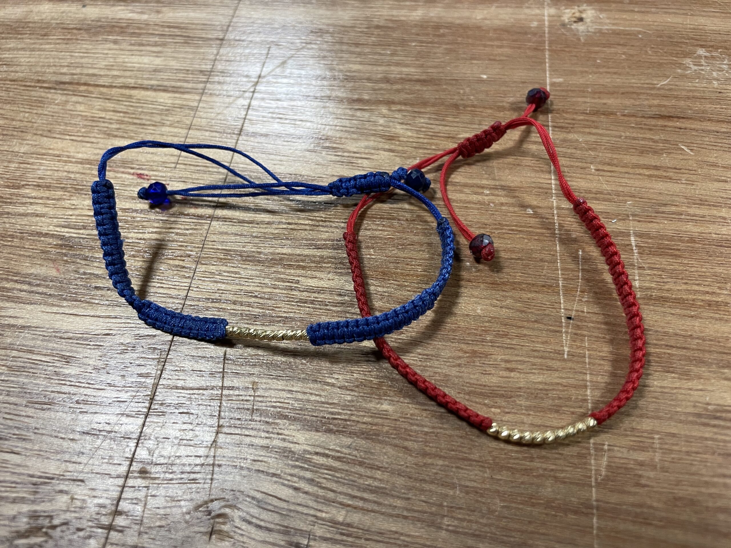
When two soulmates meet, both of their worlds light up. That’s exactly what’s happening in this assignment. I chose to use mine and my bestfriend’s matching bracelets to make the circuit complete and the LED light up. If the bracelets don’t touch, the LED won’t go on.

COMPONENTS:

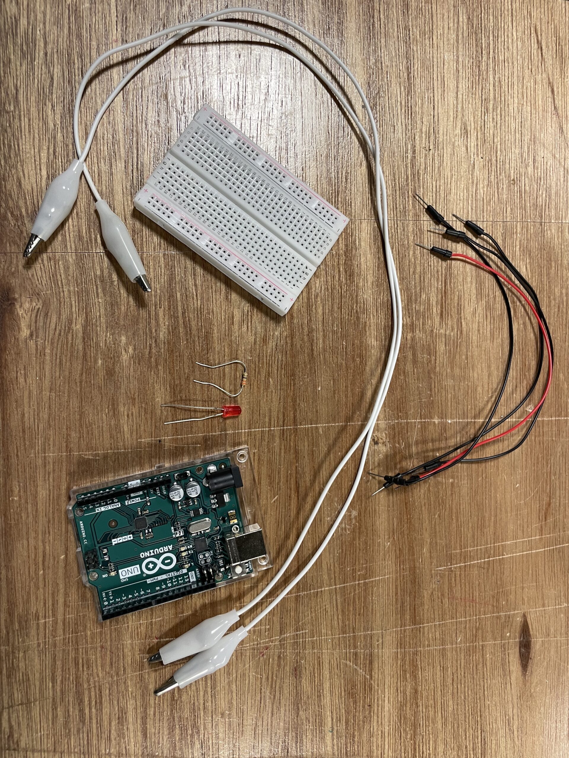
I used the following elements to make the circuit work:

-The matching bracelets (the conductive part is the gold rods)

-The following elements from the Sparkfun Kit:

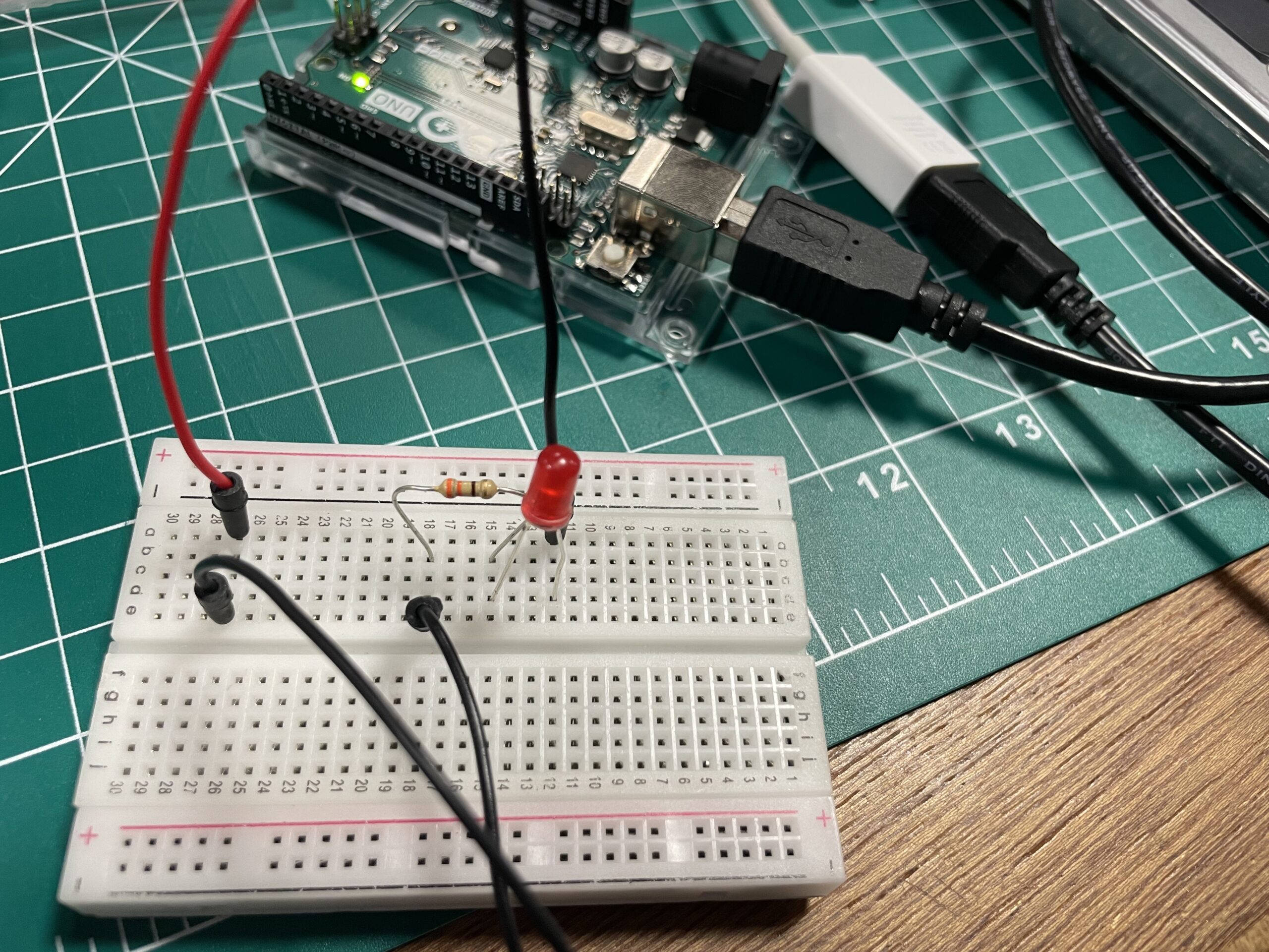
-The circuit:

VIDEO:

Here’s the video (click to download): IMG_7984

REFLECTION:

I had so much fun working on this assignment. The process was straightforward and I didn’t face any challenges because the idea is simple. If I do this assignment again, I would maybe try to make it more aesthetic. For now, I like how it turned out because it matches the requirements of the assignment efficiently.


Midterm project – Merhba, Alf Merhba

CONCEPT:

This midterm project was honed to be a simplistic learning experience, where users get to learn new words related to household, in the Moroccan dialect through sound and interactivity. It is a project that holds to my heart because it represents a part of my culture and my dialect. I can’t be happier to share it, now that it’s done!

The idea turned out exactly how it was imagined and planned which makes me very proud of the way I’ve come from the first assignments which were purely trial and error. After this assignment, I feel like I grasp more what should be done, how and when. From brainstorming to design to implementation, it went smoothly.

I present to you the outcome of my midterm: Merhba, Alf Merhba (Welcome a Thousand Welcome!):

Link to the full screen sketch : https://editor.p5js.org/aa8915/full/75GdtC-n2

HOW DOES IT WORK?

-Home Screen:  Click on audio graphic for the pronunciation of the title (this sentence is used to welcome people to your space). Click on PLAY to start the experience. -Instructions: You’ll be presented with a screen containing the idea of the experience, as well as how to proceed. Click on left arrow to go back to the home screen, or right arrow to proceed.
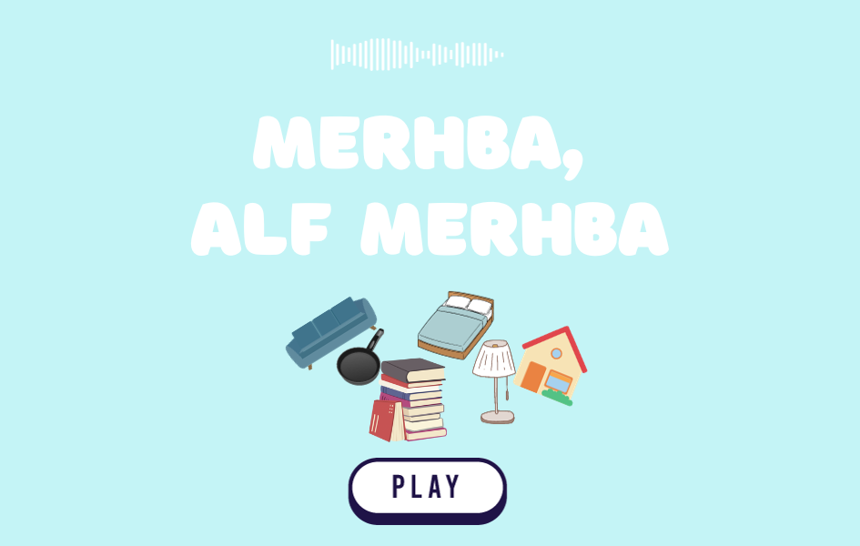
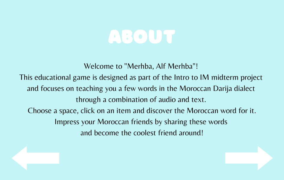
-Inside the house: Now you have six spaces to choose from (room 1, room 2, bathroom, kitchen, dining room and lounge). Click on any space to discover the pronunciation of Moroccan words for objects related to that space.
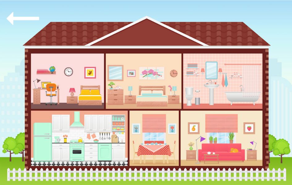
-In any space x: Click on any object and discover how it sounds in this dialect! Use the arrow (on top or in the bottom), to go back to the house.

PROCESS & DIFFICULTIES FACED:

  1. Brainstorming: I didn’t spend a lot of time in this step because as soon as I read “midterm … experience”, I knew I wanted to do something related to something I identify with, but at the same time fun and useful for users to spend few minutes of their time interacting with. It took a few days to choose this concept among three other interesting concepts.
  2. Design: I was slowed down a bit by this step because I had many ideas for my concept that I was struggling to imagine in a visual format. I knew from the beginning that I wanted the setting to be a house, but didn’t know if I should have a single space hand drawn with interactive elements or something else. Many thanks to my friend Nourhane for helping me decide on a vector based image with multiple spaces, to be made interactive. Then, I designed the home screen and instructions screen by myself to align with the color palette of the house.
  3. Sound Recordings: My favorite part! I had so much fun recording the pronunciation of the words. I had to re-do many of the recordings multiple times because they either sounded weird, mispronounced or noisy. This part took about half a day.
  4. Implementation: Implementing all the fun ideas was always my least fun part! Luckily enough this time, I enjoyed this part where I got to try different ways to make the project work. I was first confused with layering because I had 9 layers to include, but later on managed it by creating a SceneManager class.

The hardest part in the implementation of this project was the clickable object. Since my objects were a part of the image itself, I could not figure out any other way but using conditional statements for each and every object (about 60 objects). I measured the position of each object in order to make it clickable and add sound to it. The process to do this was not complicated, but very monotonous, but I’m glad it works. The only downside about this method is that only a specific part of each object is clickable. As a result, if a part of the sofa is hidden by a table, only the clear part is clickable. Depends on where the user decides to click, some parts may not work if clicked. Now that I think about it, I think it would have been a better idea to have vectors of the objects as separate images as well as a separate empty space. This way I could have created a Clicked Object class, have instances for each object image and make them clickable by using a conditional whenever  X object is selected.

HIGHLIGHT


There isn’t a part I’m specifically proud of this time, because I’m proud that the whole code worked without errors. I would say I appreciate all the efforts and time I put into measuring the position of each and every object.

if (sceneManager.onRoom2){
     //to go back to house
     if(mouseX>=0 && mouseX<=107){
       if (mouseY>=0 && mouseY<=49){
         clear();
    sceneManager.onWScreen = false;
    sceneManager.onHouse = true;
    sceneManager.onRoom = false;
    sceneManager.onRoom2 = false;
    sceneManager.onKitchen = false;
    sceneManager.onBathroom = false;
    sceneManager.onDiningRoom = false;
    sceneManager.onInstructions = false;
    sceneManager.onLounge = false;
    return;   
       }
     }
     //mirror object
     if (mouseX>=0 && mouseX<=206){
       if(mouseY>=61 && mouseY <= 274){
         mraya.play();
       }
     }
     //picture object
     if (mouseX>=259 && mouseX<= 368){
       if (mouseY>=128 && mouseY<=217){
         tswera.play();
       }
     }
     //painting object
     if (mouseX>=421 && mouseX<= 757){
     if (mouseY >= 87 && mouseY<= 251)
       {
         tablo.play();
       }
     }
     //bed object
     if(mouseX>=390 && mouseX<=795){
       if(mouseY>=341 && mouseY <= 500){
         namousiya.play();
       }
     }
     //desk object
     if(mouseX>=0 && mouseX<=205){
       if(mouseY>=390 && mouseY<=600){
         comoda.play();
       }
     }
     //lamp object
     if(mouseX>=273 && mouseX<=324){
       if(mouseY>=347 && mouseY<=465){
         bola.play();
       }
     }
     //lamp 2 object
     if(mouseX>=872 && mouseX<=921){
       if(mouseY>=345 && mouseY<=467){
         bola.play();
       }
     }
     //table object
     if(mouseX>=223 && mouseX<=377){
       if (mouseY >= 472 && mouseY <= 600){
         tabla.play();
       }
     }
     //table 2 object
     if(mouseX>=810 && mouseX<=945){
       if(mouseY>=493 && mouseY<=600){
         tabla.play();
       }
     }
     //plant object
     if (mouseX>=0 && mouseX<=86){
       if(mouseY>=287 && mouseY<=383){
         nebta.play();
       }
     }
     //vase object
     if(mouseX>=815 && mouseX<=861){
       if(mouseY>=336 && mouseY<=465){
         vase.play();
       }
     }
     //clock object
     if(mouseX>=833 && mouseX<=938){
       if(mouseY>=124 && mouseY<=224){
         magana.play();
       }
     }
   
   }
REFLECTION:

One element of the project that is missing is text. I could not figure out how to make the text for each object pop in an aesthetic way without creating a mess, so I decided to give up on it. However, I still want to improve the project even after turning it in, so I will work on finding an efficient and visually pleasing text to incorporate text.

Overall, I’m happy of the result of this project, I hope the users will also have a fun (and bug-free) experience with it!
Midterm Progress- Merhba, Alf Merhba

CONCEPT

Title translation: Welcome, a Thousand Welcome.

When I saw the coffee shop experience example, I was inspired to create an educational/cultural experience that has a fun aspect to it. The concept of this midterm project will be a dialect learning experience from which the user will be able to learn a few words in Darija the Moroccan dialect, in a fun way.

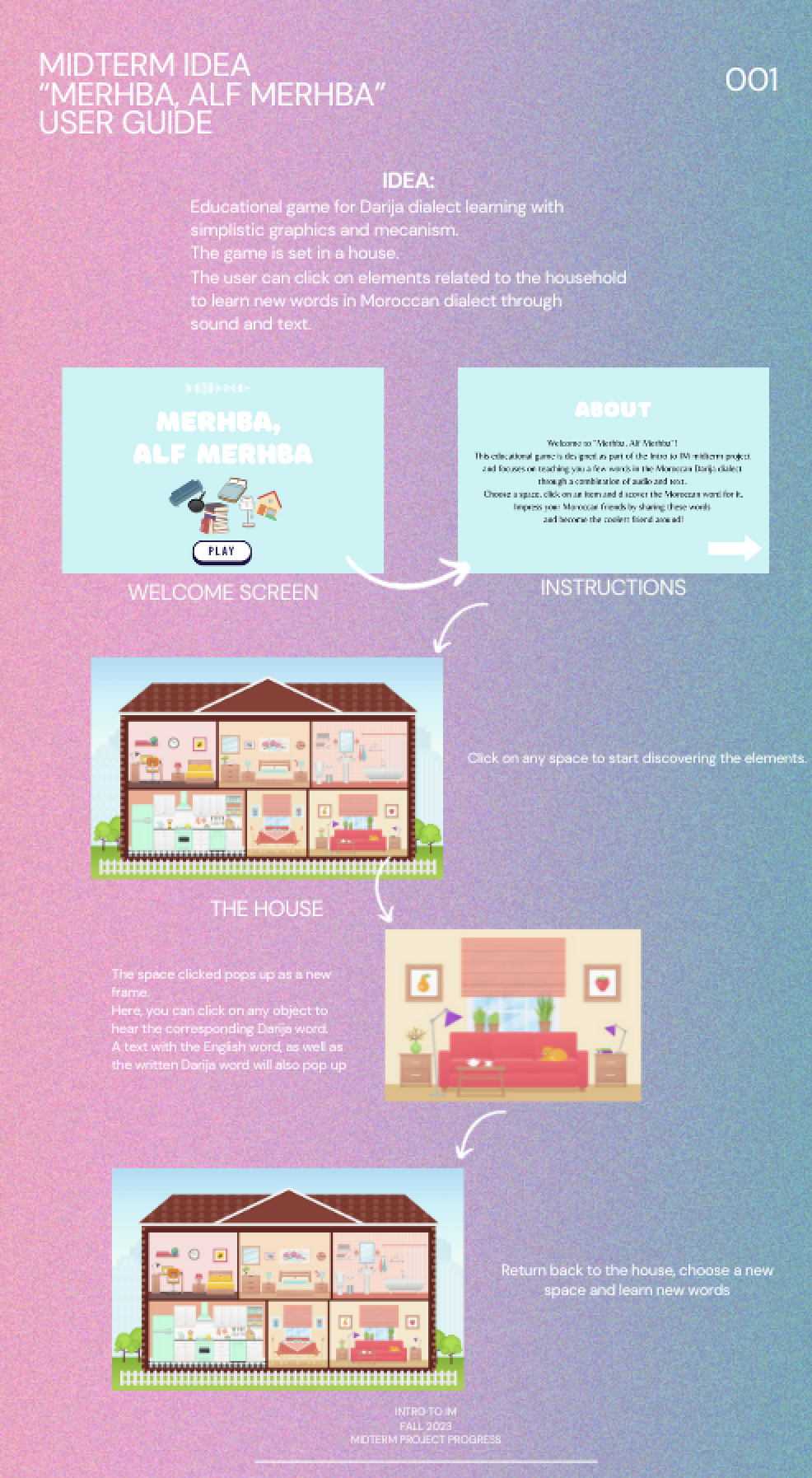
Here is a preliminary user guide for what I am referring to:

UI DESIGN:

Frame 1: WELCOME SCREEN

Press PLAY to start

Frame 2: INSTRUCTIONS SCREEN

Press arrow for next screen

FRAME 3: THE HOUSE

Hover the mouse and choose one of the six spaces

FRAME n: 1/6 space

Click on an object to hear the word for the object in Darija

Click on arrow to go back

LOOP

COMPLEX PARTS:

-SOUND RECORDINGS: I’ll be recording all the audio files for the objects. My goal is to at least have 10 recordings per space (6 spaces makes them 60 recordings in total). I’m anxious about managing all the files as well as how will I be able to incorporate all files into the project without making it too heavy and laggy. I’ll test it and in case it does not work, I’ll bring down the number to 4 recordings/space.

-SCENES MANAGEMENT: I have about 9 scenes in this project. The scene switching routine will be a lot of work. I started looking into libraries to help with this matter and found P5 Scene Manager  a library which may make my life much easier. Still looking into how it works.

-HOW TO INCLUDE TEXT: I want to include the English word of each object along with each object. I’m still brainstorming ways to make this possible.

Looking forward to see the result!

Assignment 4: quotify

CONCEPT

For this assignment, I decided to go with the generative text theme. I chose a random quote generator “quotify” as a concept. I love quotes and the idea came to me from a mobile app I have (Motivation) that generates a random quote daily on my lockscreen, which makes my day. I found the csv. file in Github (link in references). As for the aesthetics, they are pretty simple as I used an aura background and a typewriter effect (following this Github  example). The concept is basically a random quote from the csv. file pops up because of this line: typeWriter(random(quotes), 0, 50, 190, 50)with a typewriter effect. Each time you click you get a new random quote.

INSTRUCTIONS:
  • CLICK ON THE SCREEN FOR A NEW QUOTE.
  • CLICK ON KEY “W” (W FOR WIN!) TO SAVE A QUOTE YOU LIKE AS A PNG IMAGE 🙂
SKETCH:

CODE I LIKE:
function typeWriter(f, n, x, y, s) {
  if (n < f.length) {
    background(bg);
    textSize(25);
    text(f.substring(0, n + 1) + "_", x, y, 400, 250);
    n++;
    //delay the next character's appearance by s milliseconds
    setTimeout(function () {
      typeWriter(f, n, x, y, s);
    }, s);
  } else {
    printing = false;
  }

I like this part because it is new and I have never used effects for my text in any previous assignment. Since the assignment is about text, I needed a cool element to go with my text, which is this effect this case. I find it cool because it is similar to the typewriter machine used in the past: it types letter by letter.

IDEAS AND REFLECTIONS:

This assignment was pretty straightforward and enjoyable. I loved the brainstorming part where I got to search for the csv. file and finally use one to generate a piece. Though I find this piece lacking the “wow” or unexpected element/design, it is still a minimalistic piece with its own aesthetic. If I could do something different, I would have opted for a data visualization concept because my STEM self loves working with data, but I will save it for another time.

csv. file source


The Design of Everyday Things

This reading was great, pretty much because the author’s arguments were clear and direct to the point. In a nutshell, Norman delves into the concepts of usability and design in everyday objects (as the title indicates). 

He emphasizes the significance of design in everyday items and its impact on users’ experiences. One notable example was that of the poorly designed teapot with an unconventional spout and handle to illustrate how design flaws can lead to user frustration and usability issues.

One notable experience I am thinking of right now is this: 

Right-handed desks! I don’t know who designed this product, but I can definitely tell that they are right-handed. What about left-handed people? This product is a good example of how bad design can lead to user inconvenience. Back in high-school, we used to have this type of desks and it caused many issues for left-handed students. This design flaw made their learning experience more complicated.

Furthermore, Norman also introduces the concept of a “conceptual model,” which represents the mental image users have of how an object functions. He underscores that a good design should align with users’ mental models to minimize confusion and enhance usability.

Think of ATM machines for instance. Our mental model when it comes to using this machine is card > money > card. This model was enhanced so that users take their cards before money, in order not to forget it. Now imagine if a random ATM machine decided to randomly function by card > card > money. It will definitely be confusing and may cause many users to lose their cards.

Finally, the chapter underscores the importance of providing feedback to users and making the system’s state visible. Feedback allows users to understand the consequences of their actions and provides a sense of control, a critical aspect of user-centered design.

Art, Interactivity, Design

Whenever someone asks me: “what projects do you do as an IM major?”, I reply by saying: “I mean.. a big part of the projects is about that interaction between humans and what we develop. We develop cool interactive stuff?” Now I don’t know how much this description is consistent, but I actually sensed this description in Crawford’s arguments about Interactivity.

Basically, the chapter emphasizes the importance of interactivity in modern technology and entertainment. Crawford argues that interactivity is not a mere add-on but a core element of design, making it distinct from other forms of media. He highlights the unique ability of interactive media to engage users actively and elicit responses.

An important concept Crawford introduces is the concept of the “reactive mind”. He explains that interactivity relies on users’ ability to perceive and respond to changes in the system. He also discusses the role of user actions and system responses in creating a dynamic interactive experience.

It might be because of my Physics background, but just like Crawford, I’m too technical and direct with my definitions, which is why I agree with the points he talked about. One may think he is biased because he didn’t think of the internal interaction that occurs inside your brain when you open a fridge, but please? It’s hardly convincing to say that a fridge is interactive unless it has interactive elements in it (does the fridge open with a tactile button? does it answer when you say I want milk?). Same for a book, a cupboard, a rug, a static artwork.. You do not interact with what I just listed and it’s okay, it does not change their value. They are just not interactive. I feel like there is a very thin line that can be easily blurred between Interactive and Immersive. The first one concerns the actual interaction and the effect it elicits in the user, and the second one only concerns the engaged reaction of the user to anything, which doesn’t require the object or the work to be interactive.


HW3: I am Become Death

Concept:

A movie that I watched this summer and which stuck with me was “Oppenheimer”. Specifically this parallel:

Oppenheimer – 2023
In this assignment, I wanted to recreate (or actually just mimic as much as possible) the intense dynamic of the explosion scene from the movie. The idea of this generative art piece is simple: orangish shade particles that stem from the center of the canvas, creating a visually striking spiral pattern with a depth of view. The soundtrack in the background (press key enter to hear it), sets tense dynamics as well. You can loop the artwork by pressing the mouse.

SKETCH:

Instructions:

-Click on key Enter for sound.

-Click on mouse for loop.

Highlight of the code:

class Particle {
  constructor(x, y, col) {
    this.position = createVector(x, y);
    this.velocity = createVector(0, 0);
    this.acceleration = p5.Vector.random2D().mult(random(0.1, 0.5));
    this.color = col;
    this.alpha = 255;
  }

  //This method updates the particle's position based on its velocity and decreases the alpha value over time resulting in a fading effect.
  update() {
    this.velocity.add(this.acceleration);
    this.position.add(this.velocity);
    this.alpha -= 1;
  }

  //This method draws the particle as an ellipse with the specified color and position.
  display() {
    fill(this.color);
    ellipse(this.position.x, this.position.y, 8, 8);
  }

  //This method checks if the particle is finished which occurs when its alpha value becomes less than 0, indicating it has faded out.
  isFinished() {
    return this.alpha < 0;
  }
}

This part of the code was definitely the most challenging to figure out, thanks to OOP. This ‘Particle’ class, is basically the heart of the piece. Here I figured out the movement, appearance, fading effect and the behavior of each particle. First starting with the constructor, ‘this.position’ makes the position of the particle a 2D vector, ‘this.acceleration’ is a random 2d vector that makes the movement random. Then we have the method ‘update’ where I controlled the simulation of the motion through adding ‘this acceleration’ to ‘this velocity’, changed the particles’ positions by adding ‘this velocity’ to ‘this position’ and then reduced 1 in each frame in order for the particles to fade out gradually. The struggle in this part came from the fact that I didn’t know how to do good calculations in order for everything to work. I relied on trial and error until I figured out which number where and the properties. Again, I watched a lot of The Coding Train to figure out this part.

Reflections:

Casey Reas’ talk influenced a lot my perception of art. I started to find meanings and links to images, in abstract patterns with random elements. If someone told me two weeks ago that I’ll create a random spiral pattern and perceive it as a movie scene, I wouldn’t have believed it. While I still think symmetry beautiful, I also find chaos and noise aesthetic now.

Week 2: Reading Reflection

Navigating the debate over what qualifies as art and what falls short of that definition can be a tricky endeavor. In this context, I found great satisfaction Casey Reas’ counter-argument to embark on the arduous task of justifying the legitimacy of computer art. Instead, it confidently acknowledged computer art as a legitimate form of artistic expression from the outset, leaving no room for doubt. What truly captivated me were the captivating and thought-provoking concepts introduced, which prompted me to reevaluate not only my approach to creating art but also the underlying principles guiding my design choices. One particularly intriguing idea that emerged from the talk was the concept of imperfection within symmetry. This notion made me reflect on how I employ such subtle techniques unconsciously in my own work such as incorporating an element slightly off-grid, introducing a color outside the designated palette, or employing a different shape. Perfect symmetry, I realized, may yield expected satisfaction, but it often lacks the element of surprise that truly captures one’s attention. In the case that Casey Reas discussed, where receptors are wired in three slightly imprecise ways, it not only enhances intrigue but also unveils entirely new patterns of behavior.

After listening to Casey Reas’ talk, I’ve come to appreciate the significance of incorporating elements of randomness and noise in computer art. One of the most formidable hurdles I’m facing in my journey as an artist is the ingrained belief that symmetry is the sole path to achieving beauty and aesthetic appeal. However, Reas’ talk, along with the assignments in our class, has illuminated a profound revelation: there are no fixed or rigid formulas for attaining beauty in art. While there’s certainly beauty in structured order, it’s equally possible to discover aesthetic allure in the midst of chaos and randomness, just as Casey Reas eloquently demonstrates.

Yet, as I delved deeper into these ideas, questions surfaced regarding the decision-making process regarding the degree of randomness to include: how random can it be?

HW2: Shooting Stars

Concept:

There is one element in space that intrigued me a lot as a child: meteors (or shooting stars). Seeing a shooting star in the sky made me so happy, as I believed my wishes would come true as soon as I see one. Hence, this assignment was inspired by my dream as a kid to have a sky full of shooting stars!

The sketch tries to capture a bit the essence of a chaotic scene where the dark sky is filled with unending meteors. It’s a simple but effective, interactive (and hopefully immersive with audio!) project where I implemented a range of random sized and colored lines moving across a black background. The legendary Interstellar movie theme song starts as soon as the you press the key. A loop of the scenery also occurs if you press the key “space”.

Link to the version with sound: https://editor.p5js.org/aa8915/sketches/aU8fd7qtB

Highlight of the code:
//stars movement 
  update() {
   
    this.position.add(this.velocity);

    if (this.position.x < 0 || this.position.x > width) {
      this.velocity.x *= -1;
    }
    if (this.position.y < 0 || this.position.y > height) {
      this.velocity.y *= -1;
    }

    //fade out over time
    this.lifespan -= 2;
  }

I’m proud of many parts of this sketch. Yet, I struggled a bit with the bouncing effect (took a lot of research in tutorials and Google pages, The Coding Train videos saved me in this.). I had to ensure that the particles maintain a smooth appearance especially when they bounce off the boundaries. Along the process, I discovered the ‘update()’ function which was responsible of movement, boundary conditions and also fade out of particles.

Final thoughts:

Overall, the whole sketch took a lot of trial and error to be implemented. Unlike the first assignment, this second one took me immense time. I’m still not a 100% satisfied with the shape and appearance of the meteors. I wanted them to have gradient colors but couldn’t figure out this part.  However, I put a lot of efforts on the animation this time which is something I’m proud of. I also love the effect of the new element in this assignment which is sound.

References:

Coding Train playlist: https://www.youtube.com/watch?v=HerCR8bw_GE&list=PLRqwX-V7Uu6Zy51Q-x9tMWIv9cueOFTFA

Shooting Star: https://m.espacepourlavie.ca/en/what-shooting-star

Code art (for brainstorming): https://www.code-art.com/

HW1: Self Portrait “GoofAya”

Concept:

Quirky, aesthetic and simple but efficient with a light cartoonish aspect was everything I was looking for concerning this very first assignment. I tried as much as possible to utilize the functions and shapes we studied in our first class, to generate a self portrait that has at least one of my actual features. So here is Goof-aya, my goofy portrait with her round glasses, pink cheeks and moon-shaped pupils. I really wanted to have an interactive element in my portrait, so if you click and grab the mouth, it will widen up as if it is saying: “WOW!” (my favorite expression!). I feel like it adds an expressive touch to the portrait which is exactly what I intended.

Code Highlight: 
//widen the mouth
function mouseDragged() {
  mouthSize = constrain(dist(mouseX, mouseY, xPos, yPos), 20, 70);
}

It was very exciting to see something actually moving in my portrait. Hence, I love the mouth widening part of this code. I figured out a part of it watching a Youtube tutorial (here).

Reflection and Ideas:

Overall, I am satisfied with the outcome of my portrait given the limited coding knowledge that I started with. However, I definitely think that there are many areas to improve. Starting off with some parts of the portrait itself missing (neck and ears). Also, I find the pink background a bit dull. My initial idea was to actually have an interactive background that changes images based on the user’s input, but couldn’t figure out that part. Hence, I am excited to learn more in this class in order to incorporate such elements in upcoming assignments. For now, this first homework was definitely a fun task!

References:

P5JS references page: https://p5js.org/reference/

Mouse Interaction with Objects: https://youtu.be/TaN5At5RWH8?si=nZXGcyDdp9Hd6eOY