Week 8 reading reflection ( both in the same post )

Emotions & Attractive by Donald A.Norman

The reading about three teapots is incredibly inspiring and thought-provoking. It goes beyond a simple story about teapots and delves into the profound world of human emotions and how they influence the design and usability of everyday objects.

What’s truly inspiring is the notion that design is a delicate dance between beauty, functionality, and user satisfaction. The three teapots exemplify this concept, teaching us that an object can be beautifully designed, functional, and a source of pleasure simultaneously. It’s a reminder that design should not be limited to either aesthetics or usability; it’s about achieving a harmonious balance.

The concept of “affect” introduced in the reading is particularly eye-opening. It showcases how our emotional state can dramatically alter the way we approach tasks and interact with products. Negative affect narrows our focus, enhancing concentration, while positive affect encourages creativity but also increases distractibility. This revelation challenges our traditional understanding of how emotions influence our behavior.

The most striking and, indeed, inspirational revelation is the idea that attractive things work better. This contradicts the common belief that aesthetics are secondary to usability. It suggests that, in our pursuit of enhancing functionality, we should not neglect the importance of creating products that are visually appealing and emotionally engaging.

In a world where we often prioritize utilitarian aspects, this reading encourages us to look beyond the surface. It teaches us that true beauty in design encompasses both form and function. The lesson is clear: we should aim to create products that not only serve their purpose but also bring joy and delight to our lives. This reflection challenges us to think differently about the objects we use daily and to strive for a world where everything we interact with is not only usable but also a source of inspiration and pleasure.

Her Code Got Humans on the Moon

What’s really interesting in this reading is the incredible journey of Margaret Hamilton. She was a woman who, in the 1960s, went against the norm. Back then, women weren’t usually encouraged to do high-tech jobs. But Margaret, with her math degree, got a job as a programmer at MIT. Her original plan was to support her husband’s law studies for three years and then get her own math degree.

But things changed when the Apollo space program came into play. Instead of following her original plan, Margaret stayed at MIT and led a big engineering project. She was among the very few women in that era to do this kind of work. What’s striking is that she brought her 4-year-old daughter, Lauren, to the lab on weekends and evenings. While her daughter slept, Margaret was busy writing code that would be used in the Apollo mission.

People were surprised by her dedication. They’d ask her, “How can you leave your daughter to work?” But Margaret loved her unique job. She enjoyed the camaraderie and the challenges of it. She felt like “one of the guys.” What’s intriguing is that, at that time, nobody really knew what software was. It was like the “Wild West” of technology. There were no courses or training programs for it. But Margaret and her team were pioneering the field as they wrote the code for the world’s first portable computer used in the Apollo program.

What’s also fascinating is that when the Apollo project began, software wasn’t a big deal. It wasn’t even mentioned in the mission’s engineering requirements. But as the project progressed, it became clear that software was essential. Margaret became responsible for the onboard flight software on the Apollo computers. The pressure was intense. She even rushed back to the lab after a late-night party once to fix a piece of flawed code. She worried about making headlines for a mission failure.

In the mid-1960s, more than 400 people were working on Apollo’s software. Software became a key part of winning the race to the moon. But it did more than that. Thanks to Margaret and her team, they set the stage for the software industry we know today, worth billions of dollars.

The process of programming back then was completely different from what we have today. They punched holes in stacks of cards, and these cards were processed on a massive computer. Everything had to be simulated before the actual mission.

Apollo missions carried two special computers: one in the lunar module and another in the command module. These computers were unique. They were designed by MIT engineers and were among the first to use integrated circuits instead of transistors. The computer was responsible for many critical tasks, even though it had very limited memory and computation speed compared to today’s standards.

One particularly intense moment was during the Apollo 11 mission, just before landing on the moon. There was a “documentation error,” and the computer started giving error messages. But thanks to Margaret’s technical arguments, the computer focused on the most crucial task—landing safely on the moon.

Another intriguing detail is how Margaret’s daughter, Lauren, once caused an error during a simulation. This led to changes in the documentation to prevent similar errors. It shows that even in highly technical fields, human elements and foresight play a role.

In the end, what’s most captivating about this reading is Margaret Hamilton’s exceptional journey. She not only helped land humans on the moon but also played a crucial role in shaping the software industry. Her story is a reminder that one person’s determination and innovation can have a significant impact on history.

Reading Reflection – Week 8

Emotion & Design: Attractive things work better

I quite agree with this first reading, as I am a person who is greatly affected by the aesthetics of my surroundings. Norman wrote that there doesn’t have to be a scientific, cognitive explanation in place for us to like something better (as with the example of the color computer displays — there is no information advantage, yet we cannot go back to black & white displays). This brought two pieces of supporting evidence to mind. The first is YouTuber Molly Burke, who is blind and also very into fashion and makeup. I have watched her videos for a long time, and something that she often says is that, just because she can’t see the makeup or the colors of her cute outfit doesn’t mean she can’t enjoy it. This is a twist on what Norman wrote about the teapots: just because he can’t use them every day for brewing tea efficiently, doesn’t mean that they don’t give “satisfaction in their appearance”. While I agree with most of this text, I do think the author is biased, as a designer, when he says that “to be truly beautiful, wondrous, and pleasurable, the product has to fulfill a useful function, work well, and be usable and understandable”. I think true beauty can exist without usability, and might sometimes even exist because of the lack of usability.

Her Code Got Humans on the Moon—And Invented Software Itself

This reading was a fascinating glance into the beginnings of software, and I was both surprised and not surprised at how the tech industry hasn’t changed in terms of gender inequality. In fact, it may have even been less discriminatory back then, because it was the “Wild West” and nobody knew what they were doing. It is notable how Hamilton’s role as a mother and Lauren’s playing with the keyboard led to saving the Apollo 11 mission, because it shows how diverse life experiences in the workplace enhance overall outcomes.

Additionally, I think the inherently exclusionary “inside club” feel of programming persists to this day, because of the learning curve needed to understand and participate in discussions in the community. It’s comparable to jazz music, in the sense that there is a certain level of “work” you need to do to be a part of the culture.

I think this article shows that everything that we take for granted today was conceived and invented by people for the first time, some time ago. For example, I, with no previous knowledge about physical computing, am now able to use breadboards to create circuits that take digital input, but back in Hamilton’s time, a whole team of expert seamstresses was required to wire the 0s and 1s. This raises the question of how current technologies that are inaccessible to laypeople may, in the very near future, be simplified and commercialized enough for anyone to manipulate.

Week 8: Reading Response

I found the article “Her Code Got Humans on the Moon—And Invented Software Itself” to be very inspiring and thought-provoking. I am always amazed whenever I read about people who defy the norms of their times to do something extraordinary. Margaret Hamilton’s story is a shining example of resilience, determination, and innovation in the face of societal expectations.

In an era when women were not commonly encouraged to pursue careers in high-powered technical fields, Hamilton not only ventured into the world of software engineering but also became a trailblazer in the field. What struck me most is how Hamilton balanced her roles as a working mother and a programmer. The fact that she brought her daughter to the lab speaks to her unwavering commitment to her work.

In a world where gender inequality within the tech field still remains a challenge, I think Hamilton’s story provides a very promising avenue for doing the extraordinary.

The second reading “Emotion and Attractive” offers intriguing insights into the interplay of aesthetics, usability, and emotional response in design. I liked how the author used his teapot collection to illustrate the idea that design isn’t a one-size-fits-all concept; it depends a lot on the context, mood, and personal preference. The analogy of transitioning from black and white to color screens in the early days of personal computing is particularly fascinating. The author’s initial skepticism about the value of color screens, despite their popularity, speaks to the subjective nature of design preferences. While the cognitive perspective may suggest that color doesn’t add significant value to productivity, the emotional response to color cannot be discounted.

The concept of “affect” and its role in design has left me with some intriguing food for thought. It’s fascinating to consider how our emotional responses to design can have such a profound impact on our decision-making and behavior. Affect, in this context, acts as a sort of silent influencer, guiding our judgments, shaping our perceptions, and even affecting our reactions.

What’s particularly striking is how affect doesn’t just serve as an emotional compass but also as a practical tool. It can alert us to potential dangers, which is incredibly valuable, but it can also steer our creative problem-solving processes. This dual role of affect makes me ponder the delicate balance between emotional response and practicality in design.

Week 8 | Creative Reading Reflection: Her Code Got Humans on the Moon—And Invented Software Itself, Norman “Emotion & Design: Attractive things work better”

Creative Reading Reflection – Her Code Got Humans on the Moon -And Invented Software Itself:

The article talks about how back in the 1960s, when most tech jobs were filled by men, a woman named Margaret Hamilton made history. She was only 24 and worked at MIT as a programmer. Even though people didn’t expect much from women in tech back then, Margaret proved them wrong in a big way.  As a young programmer at MIT, she embarked on a journey that would mark her as one of the important figures behind the successful Apollo space missions.

She became a key person in the Apollo space program because she wrote a lot of the software that made the Apollo missions successful. There was a tense moment during the famous Apollo 11 mission when the computer started showing some unexpected errors. But, thanks to her hard work and her team, the mission was a success, and the astronauts landed safely. She thought ahead during the Apollo program, identifying issues and pushing for software changes that later became vital for the success and safety of future missions.

Margaret Hamilton made significant contributions to both software engineering and space exploration. Her dedication and leadership are remarkable. When we think about major space achievements, it’s essential to see Hamilton as an influential figure who greatly impacted technology and space missions. Her work shows how one person can change history.

Norman “Emotion & Design: Attractive things work better”

Don Norman’s essay, “Emotion and Attractive,” highlights a fundamental aspect of design that often goes unnoticed. He emphasizes that the aesthetics of a product go beyond its outer appearance. It includes usability, understandability, and ease of use, in addition to beauty. He explains that sometimes, in stressful situations, like emergencies, things should focus more on usability. They need to be easy to use so people can stay safe. But in everyday life, when things are less stressful, it’s nice to have things that look beautiful and make us happy.

Don Norman also introduces the idea of “affect,” which is how we feel when we use something. Affect can change the way we think and solve problems. When something looks nice and makes us feel good (positive affect), it can even help us be more creative and patient. When something is visually appealing, we tend to invest more mental effort in understanding its use. However, this preference for aesthetics can be influenced by our mood and circumstances.

Norman provides a concrete example with teapots. If you have the time and inclination, you might choose the most aesthetically pleasing teapot, even if it’s not the most user-friendly. But when you’re in a hurry, practicality takes precedence over aesthetics.

So, the key is to find a balance between usability and beauty in design. It’s not about choosing one over the other but making things that work well and make us happy. That way, our everyday things can be both useful and beautiful.


Week 8- Reading Reflection

“Emotion and Attractive” by Donald A. Norman and “Her Code Got Humans on the Moon- And Invented Software Itself” by Robert McMillan

We were assigned to read two different materials with varying ideas, but both were thought-provoking. 

I would like to start with the most influential article about the mother of software engineering- Margaret Hamilton. She is a living example of the phrase “everything is possible”. While reading the text, I immediately thought about the photo of her standing next to the tons of coded papers- Apollo code. The reading material tells more about the background of that photo, showing the first gigantic step toward software engineering. Her dedication to work and the result of her achievements impressed me the most. Imagine writing the code to the system, which gets the humans on the moon and back when no one even had an idea what the software engineering was. Her biography leaves me astonished every time I read it. 

Scene at MIT: Margaret Hamilton's Apollo code | MIT News | Massachusetts  Institute of TechnologyFig. 1. Scene at MIT: Margaret Hamilton’s Apollo code | MIT News | Massachusetts Institute of Technology. Source: margaret-hamilton-mit-apollo-code_0.jpg
Discussing the reading “Emotion and Attractive” by Norman, I would like to say that the reading told the basic things, which are usually overlooked by the designers. In other words, he mentioned such a foundational, yet significant aspect of the design that is neglected in the production of the goods and services. Making a connection with the previous reading “The Psychopathology of Everyday Things”, I would like to suggest that the complexity of the things is part of the “ugliness” of the goods. The point of view of the author is that the aesthetics of the product is more than its facade, including usability, understandability, and easiness along with beauty. However, I think that this focus on aesthetics may vary depending on the context because the things made for emergency situations need to be as simple and as understandable as it is possible, giving less attention to physical appearance, while the things for the occasional use in free time or for professional purposes can give the priority to the aesthetics. Furthermore, I would like to admit that his idea that the beauty of the product stimulates cognitive thinking better could convince me. We tend to put more mental effort into understanding the usage of the thing subconsciously if we find that appealing than non-attractive things. This might vary depending on the mood and the conditions. He gave a well-drawn example of that with the teapots. If you are in a mood and have free time, you would probably go with the most aesthetic teapot even if it’s not the most user-friendly, but if you are in a hurry, the most usable one, even if it’s not the most pleasurable one. Overall, it can be concluded that Norman emphasized the fundamental aspect of the design in clear terms and examples, which resonates with my perspective of the significance of the aesthetics of products.

Concept

Instead of developing a game for my midterm project I decided to create a space for an emotional experience. I believe that midterms often bring about stress, and it’s essential for individuals to be able to relax and prioritize their overall well-being. Consequently, I designed a meditation program that would help unwind people’s minds and partake in self-care activities.

Approach and Code highlight

For the development of this project, I planned to have three different exercises breathing, mantras, and journaling. I have shown the code for the breathing exercises in my midterm progress blog post, where I designed a program of a bouncing ball that would be helpful for people to find a certain rhythm in their breathing. For the mantras, I was planning to show participants different affirmative quotes that would allow participants of the meditation program to focus on their selves. I planned to use the method of a .substring(). I found a sketch that would help to display a portion of the string, based on the mouse position, here. For the journaling exercise, I decided to give some space for the participant where they can think about some questions and have a space to write down their responses. I used a csv. file to store all of the prompts for the journaling exercises. I created an array of strings to hold the entire file and preloaded the text from the file into an array. because I only had one row for all of the prompts, I did not need to loop through each row in the file. I created an index of the random prompt in the prompt array, a variable for a random prompt, and the code that would choose 1 of the prompts from an array. I created an input window and a button that when pressed would erase the input and leave a thankful note to the participant. As the basis for building this little program, I found a code for creating an input on the reference page, here.

Here is the code and sketch for this program, which I am very proud of.

let input, submitButton, prompt;
let strings = [];

function preload() {
  strings = loadStrings("quotes.csv");
}

function setup() {
  if (strings == null) {
    print("failed to load the file, stopping here");
  }
  print("strings array contains this many lines: " + strings.length);

  // create canvas
  createCanvas(710, 400);

  input = createInput();
  input.position(20, 100);
  input.size(400);

  submitButton = createButton("submit");
  submitButton.position(input.x + input.width, 100);
  submitButton.mousePressed(prompting);

  // all the prompts in an array

  let allThePrompts = split(strings[1], ",");

  print(allThePrompts); //it has 5 prompts and they are all split. nice!!!

  // X is the index of the random prompt in the promt array
  let X = int(random(allThePrompts.length));
  print(X);

  // variable for a random prompt
  let randomPrompt = allThePrompts[int(random(5))];

  print(randomPrompt);
  //choosing 1 of the prompts from an array
  prompt = createElement("h2", foo);

  prompt.position(20, 5);

  textAlign(CENTER);
  textSize(50);
}

function prompting() {
  input.hide();
  // ? not working: how to hide the button: button.hide();
  prompt.html(
    "Thank you for your response ! Hopefully it made your day a little better ^^ "
  );
  input.value("");
}


Another part of the program, which I am very proud of and which ended up working perfectly is the three buttons in the choosing menu. I was able to program buttons myself using an image and not using built-in buttons. For this, I used object-orientated programming. I created a class, where I specified how buttons should be displayed and function when a mouse is over and the mouse is clicked on these buttons. Then, in setup, I created the three similar buttons that are in the array, which would use the commands specified in the class. Here is a code highlight of the class:

class ChoosingButtons {
  constructor(inX, inY, inImg, inScenery) {
    // what does this mean?
    this.x = inX;
    this.y = inY;
    this.img = inImg;
    this.scenery = inScenery; // where to go if this button is clicked
  }

  display() {
    stroke(0);

    print("in button display; scenery = " + this.scenery);

    // tint the image on mouse hover
    if (this.mouseOverImage()) {
      print("mouse over image");
      tint(254, 220, 220, 255);

      // furthermore, if the mouse is clicked,
      // set the scene
      if (this.mouseClickedOnImage()) {
        print("mouse is clicked" + this.scenery);
        scene = this.scenery;
      }
    } else {
      noTint();
    }

    image(this.img, this.x, this.y);

    noTint();

    print(this.img.width, this.img.height);
  }

  // over automatically matches the width & height of the image read from the file
  // see this.img.width and this.img.height below
  mouseOverImage() {
    if (
      mouseX > this.x &&
      mouseX < this.x + this.img.width &&
      mouseY > this.y &&
      mouseY < this.y + this.img.height
    ) {
      return true;
    } else {
      return false;
    }
  }

  // over automatically matches the width & height of the image read from the file
  // see this.img.width and this.img.height below
  mouseClickedOnImage() {
    if (
      mouseIsPressed &&
      mouseX > this.x &&
      mouseX < this.x + this.img.width &&
      mouseY > this.y &&
      mouseY < this.y + this.img.height
    ) {
      return true;
    } else {
      return false;
    }
  }
}

The code for the three buttons:

// make the three choosing buttons
  buttonsChoosing.push(new ChoosingButtons(20, 150, choosingImage, BREATHING));
  buttonsChoosing.push(new ChoosingButtons(235, 150, choosingImage, MANTRAS));
  buttonsChoosing.push(new ChoosingButtons(450, 150, choosingImage, JOURNALING));

Future Thoughts and Reflection

I haven’t finished this project in three parameters: the switching back and forth between the pages, and the implementation of the sound and shape. I would have added the sound and the shape (btw, I know how to do it) if I finished the switch code. However, because I am very new to coding and have never designed such a complex program of switching between multiple cases, I did not fully realize my project. I decided to take the risk of creating multiple cases in the switch statement, however, the back buttons did not work perfectly well and I spent a lot of time trying to debug it and make it work. Even though it works in the sense that it changes cases, it didn’t change the case to the one I intended. Moreover, as I designed the code for journaling exercises in another shorter program, I was having issues implementing it in my main code. I tried multiple ways of breaking it down, however, it still didn’t work.

Nevertheless, I learned a lot during this project. I now know how to program a switch statement and create my own buttons from images. I learned how to create an input box and display text correctly. I recapped how to use a csv. file to load the information and I learned how to randomly present information from this file. I also learned patience and that it is best to debug a long program by diving it into smaller programs even though it may not work when you are trying to paste it back into the main program. I also was able to practice object-oriented programming on a new level by creating buttons with it. So, even though I didn’t get all of my program to work as was planned, I am nevertheless very happy with the experience and knowledge I gained in the process of creating it.


Midterm Project: Speedrunning Procrastination

CONCEPT

You know when you sit at your desk, open up your assignments on your laptop, and after thinking about what it is you have to do, you finally come to the conclusion: “Man, I could really go for a walk right now”? I know it all too well. I did the same with my midterm project, going on walks on and around campus, beyond the barriers across the welcome center (definitely not trespassing), above the highway behind campus, below the tunnel across the highway, but not starting my project. I’d listen to my playlist on Spotify while looking at the stars in the light-polluted Abu Dhabi sky, or at the stunning night skyline from the bridge on the highway (again don’t call the cops). Struggling to settle on an idea, I finally thought of making the exact thing that I was using to procrastinate on starting work in the first place – an interactive music library interface, just like Spotify. Now I could procrastinate while working, if that makes sense.

WORKFLOW

I had come up with an idea, sure, but I soon realized that to actually bring my idea to life, it was ME who would have to work, to write code endlessly, to face disappointment because of errors, to fix said errors, to do it all over again God knows how many times. Grappling with the truth, I started first with loading whatever I would need for my project: album cover art, that font Spotify uses, the actual songs I would have in the library (definitely not downloaded from a sketchy website that might as well have phished me). I picked the songs very intricately to kind of form a parallel with the stages of procrastination as experienced by me:


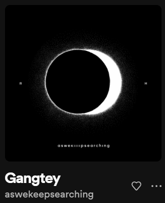
Gangtey- aswekeepsearching

This song by Indian band aswekeepsearching represents for me the stage where my assignment’s deadline is far away and not thinking about it poses no immediate threat. The repeated mystifying chants are melancholic, but calm.


Kalga – aswekeepsearching

By the same band, this one represents the shift from the calm to the storm. It starts off calm but is then interrupted by loud drums and vocals, representing the interruption of calm by dread when the realization of incoming deadlines hits.


Nahin Milta – Bayaan

Nahin Milta, by Pakistani bad Bayaan, is a song about acceptance following hopelessness. Which in the sense of procrastination is pretty self-explanatory…


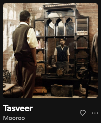
Tasveer – Mooroo

Another melancholic but calm song, this one you’d listen to while finally working on your assignment, maybe even singing along with it. Maybe don’t look too much into the lyrics though, because it can get sad. Tasveer means picture, and Mooroo sings about spent memories only living in pictures after they are lived.

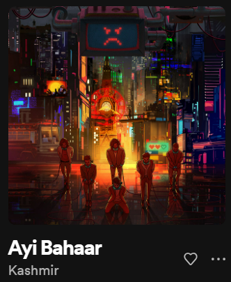
Ayi Bahaar – Kashmir

This upbeat song is about the coming of spring. You guessed it – you’ve finally finished your assignment, and things aren’t too bad after all. There is still good in the world.


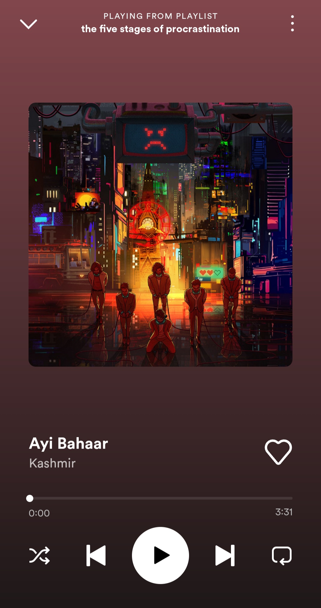
Here is the  playlist that I’ve used in my sketch:

After loading everything, I had to think of the logic behind different functions of a music player: play, pause, skip, go back, add to favorites, etc. At one point I was convinced that I would in no way be able to do all that because I could not for the life of me figure out how to implement  it. A few long walks later, I decided to start writing in the hopes that it would come to me itself; and come to me it did. I implemented the whole music player as  a class with methods for displaying relevant information like images, shapes, text, etc. It starts at a screen that introduces the concept and requires you to click to begin the experience. You can return to the screen from the music player by pressing any key on the keyboard. In the player, you can pause and play songs, skip to the next song, go back to the previous song, repeating the same 5 songs without going out of bounds. The code aspect can be understood using the comments on my sketch, the link to which I have provided below:

https://editor.p5js.org/haroonshafi/sketches/9mTUs7KrB

SKETCH

Here is how I wanted my sketch to look like:

Here is the sketch:

I am quite proud of finally figuring out the million conditions for implementing playback options. Embedded below are specific parts of the code: the first one that displays the details for a single song and the second skips the current song.

case 0:
        background("#484848"); // set background according to colour of album cover

        push(); // drop down icon
        strokeWeight(4);
        stroke("#373737");
        line(this.x, 0.7 * height, (width * 8) / 9, 0.7 * height);
        stroke(220);
        line(
          // duration slider constantly updating as time passes using the ratio of two methods as follows
          this.x,
          0.7 * height,
          (gangteyAudio.currentTime() / gangteyAudio.duration()) *
            (7 / 9) *
            width +
            (1 / 9) * width,
          0.7 * height
        );
        pop();

        textFont(gothamBlack);
        textSize(16);
        fill(240);
        text(songNames[songNum], this.x, this.y); // displaying name of song
        textFont(gothamThin);
        textSize(12);
        fill(220, 220, 220, 150);
        text(artistNames[songNum], this.x, this.y + 20); // displaying artist name

        textSize(10); // the following code displays the time of the song and its duration in minutes and instead of showing it in seconds by default by using modulus and integer division functions
        text(
          Math.floor(gangteyAudio.currentTime() / 60),
          this.x,
          0.7 * height + 15
        );
        text(":", this.x + 7, 0.7 * height + 15);
        if (Math.floor(gangteyAudio.currentTime() % 60) < 10) {
          text("0", this.x + 10, 0.7 * height + 15);
          text(
            Math.floor(gangteyAudio.currentTime() % 60),
            this.x + 17,
            0.7 * height + 15
          );
        } else {
          text(
            Math.floor(gangteyAudio.currentTime() % 60),
            this.x + 10,
            0.7 * height + 15
          );
        }
        text(
          Math.floor(gangteyAudio.duration() / 60),
          (8 / 9) * width - 15,
          0.7 * height + 15
        );
        text(":", (8 / 9) * width - 8, 0.7 * height + 15);
        text(
          Math.floor(gangteyAudio.duration() % 60),
          (8 / 9) * width - 5,
          0.7 * height + 15
        );

        if (gangteyAudio.isPlaying()) {
          // for alternating between the pause/play icon shape
          fill(220);
          noStroke();
          circle(width * 0.5, height * 0.85, 60);
          fill(0);
          rect(width * 0.5 - 8, height * 0.85 - 12, 4, 24);
          rect(width * 0.5 + 4, height * 0.85 - 12, 4, 24);
        } else {
          fill(220);
          noStroke();
          circle(width * 0.5, height * 0.85, 60);
          fill(0);
          triangle(
            width * 0.5 - 6,
            height * 0.85 + 10,
            width * 0.5 - 6,
            height * 0.85 - 10,
            width * 0.5 + 10,
            height * 0.85
          );
        }

        image(
          // displaying album cover
          gangteyImage,
          (1 / 9) * width,
          0.2 * width,
          (7 / 9) * width,
          (7 / 9) * width
        );
        break;
if (
      // if forward icon pressed
      mouseIsPressed &&
      mouseY > height * 0.85 - 12 &&
      mouseY < height * 0.85 + 12 &&
      mouseX > width * 0.7 - 10 &&
      mouseX < width * 0.7 + 12
    ) {
      greenFlag = 1; // reset heart flag to clear as song changes
      switch (
        songNum // stop song currently playing
      ) {
        case 0:
          if (gangteyAudio.isPlaying()) {
            gangteyAudio.stop();
          }
          break;
        case 1:
          if (kalgaAudio.isPlaying()) {
            kalgaAudio.stop();
          }
          break;
        case 2:
          if (nahinMiltaAudio.isPlaying()) {
            nahinMiltaAudio.stop();
          }
          break;
        case 3:
          if (tasveerAudio.isPlaying()) {
            tasveerAudio.stop();
          }
          break;
        case 4:
          if (ayiBahaarAudio.isPlaying()) {
            ayiBahaarAudio.stop();
          }
          break;
      }
      if (songNum == 4) {
        // update index to next index by incrementing
        songNum = 0;
      } else {
        songNum += 1;
      }
      switch (
        songNum // play song from next index
      ) {
        case 0:
          if (gangteyAudio.isPlaying() == false) {
            gangteyAudio.play();
          }
          break;
        case 1:
          if (kalgaAudio.isPlaying() == false) {
            kalgaAudio.play();
          }
          break;
        case 2:
          if (nahinMiltaAudio.isPlaying() == false) {
            nahinMiltaAudio.play();
          }
          break;
        case 3:
          if (tasveerAudio.isPlaying() == false) {
            tasveerAudio.play();
          }
          break;
        case 4:
          if (ayiBahaarAudio.isPlaying() == false) {
            ayiBahaarAudio.play();
          }
          break;
      }
    }

I think it is possible to enhance the functionality even more, for example by enabling shuffle, but this specific playlist is meant to be listened to in its exact order so maybe next time! Other than that, I am quite satisfied that even though I didn’t think it possible in the beginning, by revisiting the concepts and spending hours revising everything we’ve learnt so far and even checking out some other concepts, in the end I was able to bring my concept to life. Also, you guys should definitely put this playlist on while on a walk and maybe tell me what you thought about it! Hope you like the experience!

Midterm – Flappy Pokemon


For the midterm project, I decided to combine the common game flappy bird with my own obsession with Pokemon using one of my favorites as the main character.

Problems:

One of the main problems I ran into was figuring out how to restart the game without actually restarting the sketch. It took a lot of work to finally figure out how to do it because one of the arrays I was using wasn’t being reset with my resetSketch() function. So, after a lot of debugging, I figured out how to reset that array every time I reset the game.

This game is still very wonky and there are a lot of improvements that could be done for it to be an overall better experience. I am quite proud of my use of the flying animation and the continuous scrolling background.


Game:

Mid-Term Project

Concept 

For the Midterm Project, I initially started with a museum-like idea but as I focused more on the aesthetics and the picture I had in mind, it started looking like an old library room. I went with a friendly user interactivity experience, where a person experiences a calm and peaceful experience in a tiny underground library, where they could explore some books and have a few reads. I decided to encompass mostly positive quotes from historical figures from different backgrounds as well as Quranic verses. I also decided to include Greek temples and lanterns that hopefully align with parts of European culture and Arab Muslim culture as well.


Code Highlight 

The most part I struggled with is representing the quotes randomly as the user clicks on the bookshelf. I first placed an array inside the code itself but I kept getting multiple errors and unpleasant results, hence I decided to move the quotes in a CSV file and split the quotes at a semicolon, similar to how data visualization is implemented. I’m still facing one issue, the quote is being displayed twice, for the time being, I just left it there as a reflection but hopefully would figure out the mistake I made.

function room1_quotes() {
  fill(currentColor[0], currentColor[1], currentColor[2]);
  stroke(currentColor[0], currentColor[1], currentColor[2]);
  strokeWeight(10);
  rect(260, 260, 320, 220, 20);

  // Inside the book
  noStroke();
  fill(193, 154, 107);
  rect(270, 270, 300, 210);

  fill(0); // Set text color to black
  textSize(15); // Adjust text size as per your requirement
  textAlign(LEFT); // Change the text alignment to LEFT

  let textX = 270 + 10; // X-coordinate of the text
  let textY = 270 + 10; // Y-coordinate of the text
  let textWidth = 300 - 20; // Adjust the width to leave some margin
  let textHeight = 210 - 20; // Adjust the height to leave some margin

  // Loop through the quotes and display them as paragraphs

  for (let i = 0; i < selectedquotes.length; i++) {
    text(selectedquotes[i], textX, textY, textWidth, textHeight);
    textY += textHeight + 10;
  }
}
Reflection 

This assignment was definitely time consuming in my experience. It took me a while to figure out a lot of things, especially that I’m not very used to working with classes. I looked at random examples online that did not necessarily do anything I implemented but gave the solution to some of the problems I faced like presenting quotes randomly, and having images change but not rapidly. However, I learned a lot from coding this project, it compelled me to spend a good amount of time trying to understand how each code snippet affects the other and what might be causing glitches or any lags. It certainly made me more confident about my ability to implement something I envisioned, even though its not everything I wanted, but I’m pleased with what I have.

References


Midterm Project: I’m Not/Too Bored

Concept:

Boredom is a state of mind that craves some type of change. I ask myself sometimes when was the last time I have gotten bored. My answer would be is that I do not remember. While discussing other’s people state or level of boredom, I can see a glimpse of the different life each one of us has. As well as the pace humans like to take for themselves.

In my game I’m Not/Too Bored I wanted to create a dialogue between characters that experince different life pace than others. Each holds a unique lifestyle that changes how they decide to go on with their way of living. While engaging in a conversation with three people, I want to gain data, that shouldn’t be too seriously taken, to showcase the level of boredom the player might experince in life. I could also add a little input that could help them as I myself never get bored.

Process:

I started with the type of questions I wanted to ask, but I also didn’t want to make them way too deep; mostly because the results are not serious.

I started by coming up with NPC designs both in a small miniture version and the speaking version.

Drawing the background was fun as it was the first time drawing in pixels.


Code:

Coding could be said as the most diffecult and least enjoyable part. However I did manege to add my images, sound, and font to my likings.


In the code below is how I made my characters clickable so they could answer the questions.

    // Check if a character is clicked and handle interactions
    if (
      mouseX > 50 &&
      mouseX < 50 + hugo.width &&
      mouseY > 135 &&
      mouseY < 135 + hugo.height
    ) {
      // Handle interactions for Hugo character
      // Display questions for Hugo and handle answers
    } else if (
      mouseX > 280 &&
      mouseX < 280 + rene.width &&
      mouseY > 162 &&
      mouseY < 162 + rene.height
    ) {
      // Handle interactions for Rene character
      // Display questions for Rene and handle answers
    } else if (
      mouseX > 0 &&
      mouseX < fuLi.width &&
      mouseY > 0 &&
      mouseY < fuLi.height
    ) {
      // Handle interactions for Fuli character
      // Display questions for Fuli and handle answers
    }
  }
}

This is the class where the questions were saved:

class Questions {
  constructor() {
    this.characterQuestions = {
      hugo: [
        { question: "Is it easy for you to concentrate on your activities?", options: ["Yes", "No", "Maybe/Sometimes"] },
        { question: "Frequently when you're working do you find yourself worrying about other things?", options: ["Yes", "No", "Maybe/Sometimes"] },
        { question: "Does time always seem to be passing slowly?", options: ["Yes", "No", "Maybe/Sometimes"] },
      ],
      rene: [
        { question: "Do you often find yourself at 'loose ends,' not knowing what to do?", options: ["Yes", "No", "Maybe/Sometimes"] },
        { question: "Do you often get trapped in situations where you find yourself doing meaningless things?", options: ["Yes", "No", "Maybe/Sometimes"] },
        { question: "Does having to look at someone's home movies or travel pics bore you tremendously?", options: ["Yes", "No", "Maybe/Sometimes"] },
      ],
      fuli: [
        { question: "Do you find it easy to entertain yourself?", options: ["Yes", "No", "Maybe/Sometimes"] },
        { question: "In any situation, you can usually find something to do or see to keep yourself interested.", options: ["Yes", "No", "Maybe/Sometimes"] },
        { question: "Much of the time you just sit around doing nothing, and you are very good at being patient.", options: ["Yes", "No", "Maybe/Sometimes"] },
      ],
    };
  }

  getQuestion(character, questionIndex) {
    return this.characterQuestions[character][questionIndex];
  }

  calculateResults(answers) {
    const counts = { Yes: 0, No: 0, 'Maybe/Sometimes': 0 };

    answers.forEach(answer => {
      counts[answer]++;
    });

    const maxCount = Math.max(...Object.values(counts));
    const majorityAnswer = Object.keys(counts).find(key => counts[key] === maxCount);

    return majorityAnswer;
  }
}

// Export the Questions class for use in sketch.js
module.exports = Questions;

Possible Improvement:

I wish I could go around the local server issues when it comes to displaying my images.

I want only for certain keys to play the sound not all of them.

I wanted to showcase the results in a different way.


Edit: https://editor.p5js.org/mariamalkhoori/sketches/L-i2O01PV