Week 1: Self-Portrait

Concept:

For this assignment, my goal was to create an abstract and visually pleasing composition by utilizing various shapes and colors. I incorporated my favorite hues, such as baby pink and blue, into the portrait. The choice of having the portrait not look directly at the viewer but rather upside down symbolizes my personality, which tends to be optimistic and focused on finding the positives in life.

Highlight of Some Code I’m Proud Of:

// Text in Rotation

 let radius = 150; // Radius at which text rotates
 let textRotate = "Buka  Buka  Buka  Buka  Buka  ";
 let textArray = textRotate.split("");

 let angleStep = (2 * PI) / textArray.length;

 for (let i = 0; i < textArray.length; i++) {
   let x = w / 2 + radius * cos(-angle3 + i * angleStep);
   let y = h / 2 + radius * sin(-angle3 + i * angleStep);

   textSize(50);
   fill(232, 112, 133);
   noStroke();
   text(textArray[i], x, y);
 }

 angle3 += radians(1);

One aspect of the code that I take pride in is the rotation of text at the bottom right of the screen. This part turned out to be more challenging than I initially anticipated. While I had already created a rotating arch in the background, arranging individual letters to rotate around a circular path was a more complex task. Although I’m not entirely satisfied with the final result, I’m proud of how I managed to implement it.

Embedded sketch: 

Reflection and Ideas for Future Work or Improvements:

Despite my overall satisfaction with the portrait, I feel that it doesn’t fully capture my essence. In future projects, I would like to explore ways to infuse more personal elements into my works, creating a stronger connection between the piece and my identity. This could involve experimenting with different styles, techniques, or thematic elements to achieve a more accurate representation of myself.

Assignment 2 – Lava Lamp

Concept:
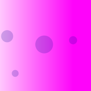
After learning in class about how the Perlin noise effect simulates more natural movement, I experimented with it using circles instead of lines. The way the circles moved reminded me of bubbles in a lava lamp, which is quite a nostalgic object from my childhood. I never actually owned one, but I would often be mesmerized by them whenever I saw them in classrooms or stores. To recreate the feel of a lava lamp with different size bubbles, I set 4 offset values and made them control different aspects of the circles. For example, for the first circle circle(n, n, 0.4 * n), the x-coordinate, y-coordinate, and diameter are all changing at the same time, while for the second circle circle(v - 10, 400, 0.4 * v) the y-coordinate is fixed. I did this so that the bubbles would have their own “territory” on the screen and not overlap that much.

offset = offset + 0.003;
  let n = noise(offset) * width;
  circle(n, n, 0.4 * n);

  offset2 = offset2 + 0.003;
  let v = noise(offset2) * 200;
  circle(v - 10, 400, 0.4 * v);

  offset3 = offset3 + 0.003;
  let k = noise(offset3) * width;
  circle(400, k, 0.2 * k);

  offset4 = offset4 + 0.003;
  let u = noise(offset4) * width;
  circle(40, u, 0.3 * k);

Highlight:
A part of the code I had many difficulties with was the forloop. My aim was to make the background color change slowly by altering the “g” value in my background function using a forloop. However, my p5.js kept crashing whenever I did anything, which was quite frustrating. I eventually found out that it was doing so because I had made an endless loop with g+1. Since  the value of g +1  is never reassigned to g, g stays at 0 forever. Therefore, g is always less than or equal to 255, so the forloop will run forever, causing p5 to crash.

function draw() {
  for loop does not work, why?
  for (let g = 50; g <= 255; g + 1) {
    background(255, g, 50);
  }

After I fixed this problem, the forloop was still not causing the background color to change, and I am still unsure of the reason why. I asked a NYU Shanghai IMA major for help, and she explained that I do not need a forloop to accomplish my aim, I could simply initialize a global variable g and then tell g to increase by 1 in the draw function.

let g = 50

function draw() {
  background(255, g, 200)
  g = g + 1
  
  drawBubbles();
}

This created the below effect:

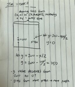
However, this project still lacked the use of a forloop, so my friend proposed that I could make a gradient by drawing vertical lines of varying colors from left to right. She showed me the code, but I did not want to simply copy and paste it without knowing how it worked, so I really tried to break down each part I did not understand. Writing it out on paper helped with that:

So, the final forloop code creating the changing background gradient was as follows:

let r = 50; // red
let b = 200; // blue

function draw() {
  //increase x by 1 every time the for loop runs
  for (let x = 0; x <= width; x = x + 1) {
    noFill();
    strokeWeight(1);
    let g = 200 - x / 2; // vary the "g" value according on the "x" value
    stroke(r, g, b);
    line(x, 0, x, height); //draw line from (x, 0) to (x, height) from left to right to create gradient
  }

  r = r + 1; // gradually increase r value by 1
  b = b + 1; // gradually increase r value by 1 

Embedded sketch:

Reflection and ideas for future work or improvements:
I’d like to figure out how to make the gradient change back the other way, so the background will keep changing forever once you run the program.

As a self reflection, I have never been very quick at understanding mathematical logic, so I always feel extremely lost when it comes to coding. Some functions of code seem like they should be simple, but I always need to walk through each step slowly in my head (or even better, on paper) to understand how it works. However, this may not be a bad thing, it just means I need more time for the information to marinate.

Resources:
Many thanks to the IM Discord and Pacey Wang for their help!

Week 2 – Reflection Assignment

The video explores the idea of randomness as a key component of computer programming and generative art. It uses a variety of illustrations to emphasize how randomness has the creative capacity to turn ordered systems into chaotic but visually appealing compositions. One of the standout demonstrations in the video is the progression from an ordered grid to increasing levels of deviation. This progression clearly shows how adding randomness can disrupt a well-defined pattern and eventually result in what appears to be chaos. This exploration raises questions about the delicate balance between order and chaos in artistic creation. It makes people stop and think about how controlled randomness can be used to create aesthetically appealing and unpredictable results. Additionally, the presentation highlights the significance of symmetry in understanding random patterns. By adding symmetry to a seemingly random grid of squares, the video reveals how our brains are wired to recognize familiar shapes and patterns even within randomness. This finding emphasizes how human perception and randomness interact deeply in art and design.

Regarding bias, it’s essential to note that the presentation seems to be focused on showcasing the creative potential of randomness rather than advocating for a particular viewpoint or agenda. The author appears to be impartial in their exploration of randomness as a creative force in generative art. As for changing beliefs, this presentation reinforces the idea that randomness can be a valuable tool for creativity, challenging the notion that art and computing must always follow rigid, predefined patterns. It prompts questions about the balance between structure and randomness in artistic expression and how these concepts can be leveraged in various creative processes. Personally, I think it’s fascinating how randomness can make art more interesting and exciting. It’s a reminder that not everything has to be perfectly planned, and sometimes, a little randomness can make things better.

Assignment 2 – Work of Art using Animation

Concept

This project is a creative expansion of my initial experience with p5.js, where I first ventured into the world of coding shapes and sketches. In our very first week of classes, we were encouraged to explore and create a house using p5.js. Now, for this assignment, I’ve revisited that initial sketch of a house, but with a twist. I aimed to breathe life into it by adding animation and interactivity, combining the fundamentals we learned previously with new elements. Additionally, winter is my favorite season, and I wanted to capture its essence in this project. To convey the beauty of winter, I decided to add falling snow in the background that accumulates on the ground as it descends. This not only adds movement and interactivity but also creates a serene winter landscape.

Highlight of the Code

One of the standout features of my code is the dynamic snowfall. Each snowflake is generated with a random position and speed, and they fall gracefully to the ground, accumulating over time. Here’s a snippet of the code responsible for this:

// Generate 300 random snowflakes with positions and speeds.
for (let i = 0; i < 300; i++) {
  snowflakes.push(createVector(random(width), random(height), random(minSpeed, maxSpeed)));
}

// Update and draw each snowflake.
for (const snowflake of snowflakes) {
  snowflake.y += snowflake.z; // Move the snowflake downwards.
  fill(255); // Set the snowflake color to white.
  rect(snowflake.x, snowflake.y, 1, 1); // Draw a small rectangle for each snowflake.

Moreover, I’ve added an interactive element where users can increase the snowfall by clicking on the canvas background. Additionally, pressing the mouse button while moving increases the snowfall, allowing users to control the intensity of the snowstorm dynamically.

Reflection/Improvements

While I’m pleased with the outcome, I recognize that there’s always room for improvement and further exploration. One possible avenue for improvement is to introduce a day-and-night cycle. By implementing this feature, the project could dynamically transition between day and night, altering the mood and atmosphere. This could involve changing the background color, adjusting the brightness of objects, and simulating the passage of time. Such a feature would not only add visual interest but also make the project more immersive and interactive. As I continue to explore creative coding, I look forward to experimenting with such dynamic elements in future projects, enriching the user experience and pushing the boundaries of what’s possible.

Edit Link

Week 1: Self-Portrait

The Concept:

For this project I wanted to try to code something that reflects in any form or sense who I am as a person. I kept racking my brain for ideas but I didn’t have any that I particularly liked so I just started drawing random things. I started with ellipses, a big one, a smaller one, an even smaller one. I created them non concentric because I don’t like everything to be perfectly aligned. Then I decided why not make it the background and just draw a simple face that resembles me on top. Then I started thinking about colors; I was too indecisive to choose one color so I settled on three!

The three colors I used for the background represent the sun, sea and grass because one thing about me is that I enjoy being by the beach and going to parks since nature has a very calming effect on me. 

By clicking the mouse, not only does the background change but also my facial expressions do too. I go from happy to surprised to pissed off. I wish I could say that the expressions relate to the background color or something cool like that, but it was really just an attempt at challenging myself to experiment further with p5.js. 

I added AirPods to the portrait because I am almost always listening to music. Music has been such a big part of my life for so long, I couldn’t draw a self-portrait without including any element of music into it. However, the AirPods are missing in the “pissed off” version of myself, because I can never get pissed off while listening to music.

As you move the mouse around the screen, the eyes follow the movement of the mouse because I wanted to add an element of interactivity in the portrait, but you could also say it reflects my curious nature.

A highlight I’m proud of:

Although it may seem very trivial, I had such a hard time getting the eyebrows to look the way I wanted them to. So I am proud of the final result I reached.

//eyebrows
fill(hair);

if(option == 1){ //straight brows
    bezier((width/2)-15, (height/2)-30, (width/2)-35, (height/2)-35, (width/2)-45, (height/2)-30, (width/2)-50, (height/2)-25);
    bezier((width/2)+15, (height/2)-30, (width/2)+35, (height/2)-35, (width/2)+45, (height/2)-30, (width/2)+50, (height/2)-25);    
}
else{if(option == 2){ //surprised brows
          bezier((width/2)-15, (height/2)-40, (width/2)-35, (height/2)-45, (width/2)-45, (height/2)-40, (width/2)-50, (height/2)-35);
          bezier((width/2)+15, (height/2)-40, (width/2)+35, (height/2)-45, (width/2)+45, (height/2)-40, (width/2)+50, (height/2)-35); 
      } 
     else{if(option == 3){ //pissed off brows
          bezier((width/2)-15, (height/2)-25, (width/2)-35, (height/2)-35, (width/2)-45, (height/2)-30, (width/2)-50, (height/2)-30);
       
          bezier((width/2)+15, (height/2)-25, (width/2)+35, (height/2)-35, (width/2)+45, (height/2)-30, (width/2)+50, (height/2)-30);
          }
     }
}

Another part I am particularly proud of is the way I had the background colors change with every mouse click.

if(option == 1){ 
    
    let blue0 = color(59, 197, 255);
    let blue1 = color(135, 219, 255);
    let blue2 = color(110, 212, 255);
    let blue3 = color(161, 227, 255);
    
    //non concentric circles in the background
    background(blue0);
    noStroke();
    fill(blue1);
    ellipse(150,150,500);
    fill(blue2);
    ellipse(200,150,350);
    fill(blue3);
    ellipse(150,150,200);
  
    // changes option to 2 so that the frame changes with next mouse click
    option = 2;
    // drawMe() function is called todraw the face over the desired background
    drawMe(); 
}

// second mouse click, changes background from blue to green (along with other changes further described in drawMe() function)
else{if(option == 2){
      
      let green0 = color(67, 166, 60);
      let green1 = color(0, 139, 0);
      let green2 = color(76, 187, 23);
      let green3 = color(97, 194, 86);

      background(green0);
      noStroke();
      fill(green1);
      ellipse(150,150,500);
      fill(green2);
      ellipse(200,150,350);
      fill(green3);
      ellipse(150,150,200);
  
      option = 3;
      drawMe();
    }
    else{if(option == 3){
      
          let yellow0 = color(255, 191, 79);
          let yellow1 = color(255, 172, 28);
          let yellow2 = color(255, 209, 130);
          let yellow3 = color(255, 228, 181);

          background(yellow0)
          fill(yellow1);
          ellipse(150,150,500);
          fill(yellow2);
          ellipse(200,150,350);
          fill(yellow3);
          ellipse(150,150,200);
      
          drawMe();
      
          //resets option to 1 so that backgrounds can loop
          option = 1;
          }  
      } 
  }


Reflection and ideas for future work or improvements:

Working on this assignment was very fun, I kept pushing myself to try new things and I stuck into this loop of constantly wanting to add more features without complicating it too much. It was hard for me to decide where to draw the finish line. For future work, I would like to work on having more interactivity and creativity within my code. I would also like to work on making my code more efficient by removing redundant repetition of code. 

Reading Reflection – Week 2

Randomness is an unexplored territory not only in the realms of mathematics and engineering but across all sectors. It’s often seen by humans as unsettling, something to be avoided, as it carries a hint of chaos. Yet, there’s a captivating dance between order and chaos that strikes a chord within us. Caser Reas’s concepts illuminate how elements of randomness and order can harmonize to create a piece that speaks to us in countless ways. Since randomness is an integral part of human existence, it finds its way into our lives no matter how meticulously we try to structure them. These subtleties find their reflection in artistic expression. It’s fascinating to see how we, as humans, translate these emotions and facets of our experiences into art, resulting in pieces that communicate on multiple levels.

What stands out to me about Casey’s showcased pieces is that regardless of how randomness is integrated into the art, they all give rise to distinct compositions teeming with points, lines, and more, each possessing its own character. Every piece imbued with randomness in its elements crafts a unique identity, capable of forging a profound connection with individuals who resonate most deeply with it. As I gazed at the various art pieces presented by Casey Reas, I couldn’t help but ponder: how does the infusion of random elements into these artworks alter our perception of reality and the future? On one hand, I felt that randomness is an inevitable force, and our best course of action is to embrace it and forge ahead, which is the sentiment these art pieces conveyed to me. However, on the flip side, could these unique art pieces, brimming with randomness, imply that randomness is an exponential force that may one day surpass our control, potentially leading to unforeseen consequences? I believe that while some art pieces effectively integrate randomness to create intriguing works, straying too far from the balance of order and chaos might convey a daunting and overwhelming impression of life. This could potentially become a psychological burden for some, as they grapple with the realization of their own insignificance in the face of nature. Thus, art’s impact can vary greatly depending on how randomness is employed.

assignment 1 – self portrait

Concept

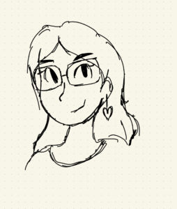
My main focus for this assignment was the aesthetics of it. Because I wanted to focus more on making something visually pleasing, I started off ambitious – I had made a cartoonish sketch of myself and was hoping to recreate it in Processing. It seemed possible if I broke down the drawing into small curves.

While it most certainly was possible, I underestimated the difficulty of doing so. However, as we discussed in class, even the way things fail can be inspirational in itself. As I was trying (and failing) to construct the initial sketch, I noticed that what I had looked very similar to minimalist line art. I realized a line art representation of myself was not only much more feasible but also more indicative of the features I see most representative of myself, like my glasses, my mole, and my often-worn heart-shaped earrings.

I also really love pastel color palettes, so I wanted to incorporate them into my portrait. I decided to make the background(s) of the portrait some of my favorite palettes. Every time the canvas is clicked, it changes the color palette. There are five in total.

Implementation

Like I said, because I focused mostly on the aesthetics of it the technical implementation isn’t the most out-of-this-world. I, however, like the idea of having different sized blobs in the background (which I believe makes the whole portrait visually appealing). The mathematics of implementing the blob I learnt from this article, which I then modified a bit to have animated.

  for (let k = 0; k < blobs.length; k++) { 
    let blobPoints = []
    push();
    noStroke();
    fill(blobs[k].colors[currentPalette])
    beginShape();
    translate(blobs[k].x, blobs[k].y); 
    for(let i = 0; i < res; i++) {
      //make sure circle isn'getting too big or too small
      rad += random(-20,20);
      rad = constrain(rad, blobs[k].minRad, blobs[k].maxRad); 
      let x = rad * cos(angle * i);
      let y = rad * sin(angle * i);
      blobPoints.push([x, y])
      curveVertex(x,y);
   }
    for (let j = 0; j < 3; j++) {
      curveVertex(blobPoints[j][0], blobPoints[j][1])
    }
    endShape();
    pop();
}

Reflections and Improvements

While I’m happy with the way my self-portrait turned out, I don’t like the way the curves were made. It was a lot drawing of lines with hard-coded coordinates, so it is not adjustable in anyway, so making the line art itself interactive in any capacity feels very difficult. For my next project, I want to focus more on using symmetry and geometry in the location of elements.


Week 1- Self-portrait

My concept: The movie “Barbie” was one of the most discussed films this summer, which raised many issues in society such as discrimination, existential crisis, the negative effect of patriarchy for all etc. I wanted to create my self-portrait in the Barbie style, keeping the pink vibe of the childhood Barbie cartoons and dolls in addition to the main message of girlhood. Girlhood is all about growing, finding yourself and the concept of ‘girl supporting girls’, giving a raise to feminism. Because of this, my self-portrait uses pastel colours with a focus on pink specifically and contains the popular phrase “GRL PWR” on the eyeglasses which is essentially a “Girl Power” and the phrase from “Barbie” movie as “kENOUGH”. Overall, my self-portrait was inspired by the childhood cartoon and the recent movie “Barbie”, promoting the idea of girlhood and feminism. 

From the technical aspect, the portrait has dynamic things such as bouncing hearts up and down, an increasing blue circle with the movement of the mouse and moving the word ‘kENOUGH’ from left to right. Moreover the word ‘click’ is moved with the mouse to show that the user has to click on the screen to see the change of the colour of eyeglasses and the phrase “GRL PWR” appears.  

A highlight of the code I am proud of is the code of the moving hearts because each heart was created with simple shapes such as circles and triangles. Secondly, each of these shapes was made to move up and down by bouncing. Initially, the bouncing part was hard for me because the hearts were moving indefinitely downwards and then I recalled the class about the importance of giving the limits to the movements of objects to make them bounce back from that limit. 

let y = 40;
let goDown = false;
function setup() {
  createCanvas(320, 400);
}

function draw() {
  background(226,201,221);

//moving hearts
  fill(227, 102, 152);
  circle(40, y, 10);
  circle(50, y, 10);
  triangle(35, y+1, 55, y+1, 45, y+15);
  
  if(goDown == false) {
  y=y+2
  }
  if(y<0) {
    goDown=false;
  }
  if(goDown == true) {
  y=y-2
  }
  if(y>400) {
    goDown = true;
  }

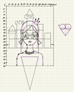
Moreover, I am proud of the overall process from the initial sketch on the iPad to the final project. As this was my very first coding experience, I had fun. To realize my idea, I drew the project’s coordinate system and raw sketch. Because of this, it was easier for me to find the coordinate points and draw the shapes. 

Pic 1. Initial Sketch on the coordinate system

Embedded sketch: CLICK on the screen; MOVE the mouse right and left.

Reflection and ideas for future work or improvements: I would make the movement of ‘kENOUGH’ continuously, not just going back and forth because I think that the space left at the beginning of the word train is not aesthetically pleasing. Additionally, I would try to make the castle more realistic and add some interactivity to it, such as making it flush, changing the color, etc. 

Assignment 2

Concept:

After learning about the different loops in P5.js, I wanted to create a simple yet soothing code. That’s when I remembered a game I used to play as a kid. When I moved the cursor around the screen, all the points scattered away from it. It was a basic game, just rolling a ball around a screen, but there was something oddly satisfying about seeing the points move away from me.

So, I decided to recreate that game in my code. I used a loop to keep generating points randomly, making sure they never stopped appearing. Then, I added a bit of trigonometry to make it look like the points changed direction when they got close to the cursor. This gave the illusion that they were all moving away from the cursor, following the ball’s lead. It was a fun way to bring back a childhood memory through code.

A highlight of some code that you’re particularly proud of:

let d = dist(random1, random2, mouseX, mouseY);
if(d < 50) 
{
let angle = atan2(random2 - mouseY, random1 -       mouseX);
random1 += cos(angle) * 2;
random2 += sin(angle) * 2;
point(random1,random2);

As I scoured the internet in search of a function that could calculate the distance between the cursor and the points, I stumbled upon the ‘dist’ function, and it was exactly what I needed. Delving into the p5 references, I delved into trigonometric equations, studying their inputs and outputs. Through a series of trials and errors, I played around with the code, hoping for it to be similar to that childhood game. I’m pleased to share that the outcome exceeded my expectations and turned out rather well.

Reflection and ideas for future work or improvements:

Discovering the potential of loops in programming has ignited my imagination for creating games and sketches, and it’s incredibly thrilling. Although the sketch is already promising, I see room for enhancement by incorporating a diverse palette of colors and trails that follow the ball’s movement. Additionally, I aim to optimize the program’s performance to reduce any glitches caused by its rapid execution. Looking ahead, I envision using both ‘for’ and ‘while’ loops to craft even more imaginative games, such as a maze, and bring forth fresh interactive experiences.

Assignment 1 – Self Portrait!

As I started working on this assignment, I wanted to explore colors and see how far I can go with basic shapes. Having a background in coding but little experience in creative pursuits, this was both exciting and challenging.

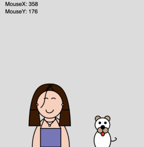
I began with a sketch on paper, a humble attempt to visualize the shapes I needed before trying it on p5.js. However, the transition from paper to screen was not as easy. The positioning of shapes was difficult so I displayed the X & Y coordinates using MouseX, MouseY and text. 

So here’s me! And a dog! Anyone who knows me, knows how much I love dogs and hence I decided to add a fur friend that can move and jump alongside me for the assignment. I thought I was content with what I had until I noticed the fairy lights in my dorm room and was curious to try adding a similar lively and vibrant vibe to the canvas. A nested list with RGB color codes, reduced frame count and ellipses filled with these colors resulted in the twinkling fairy lights – like effect. It took me quite a few tries until I was completely satisfied with the shapes and details of the girl I was trying to create.

This was the one I almost settled on, using basic rectangles, lines and ellipses but then I discovered the life saving functions! The bezier(), curve() and the beginShape() endShape() functions that I think were so much more efficient to create the self portrait. The final outcome:

There’s not much about the code or the idea that I’m particularly proud of but the things that I like about what I tried to make are,

  1. The motion of the dog – the dog moves with the mouse (as the X coordinates change) & jumps when mouse is pressed!
  2. My (the girl’s) smile slightly widens when the dog moves closer to her symbolizing how I feel every time I spot a puppy and run to play with it
  3. The fairy lights for the color pop and liveliness.

Here’s a snippet of the code that makes the dog jump! 

//dog jumping
if (isJumping) 
{dogY-=5;
  if (dogY <= height-100){isJumping=false;}
} 
else if(dogY < height/2+180)
{dogY+=5;} //anywhere above the ground, gravity when not jumping

// Prevent the dog from going below the ground
// if (dogY < 0){dogY = 0;} 
// else if(dogY > height/2 + 180){dogY = height/2 + 180;}
dogY = constrain(dogY, 0, height/2+180);
function mousePressed()
{
  if (!isJumping) {isJumping = true;} //if mouseclicked and dog not jumping already
}

I saw a few reference links and tried to understand the basic concept of a jump but then simplified it as much as I could since I felt I needed a very basic application of it to make the dog jump for this assignment. Initially I used if-else statements but then found the constrain() function to do the same.

References : Simple jump, Jump 

Reflections & Possible improvements

 I really enjoyed this assignment and actually found it addictive as I wanted to keep making changes and try new things. For scopes of improvement, I think I could try to make the girl look more realistic with shadows and movements and lesser hardcoding of coordinates. I also tried various colors for the background but then found out there are functions that I can use to create gradients – a feature I’d love to explore next time. Overall, I’m very grateful for the assignment, help and looking forward to more in the upcoming classes.