Week#3 – object-oriented programming

I think this assignment piece was a clear embodiment of all the things I learned whilst binge-watching ‘The Coding Train’ and making notes for every line of code that was introduced in the videos, for the past 5 days. Using all that I learned about functions, classes, if and for loops as well as boolean operations, I created a piece that’s more reliant on its meaning than its objective visuals. I used this assignment as a means of me dipping my foot into the water to test its current, hence it’s simplistic style.

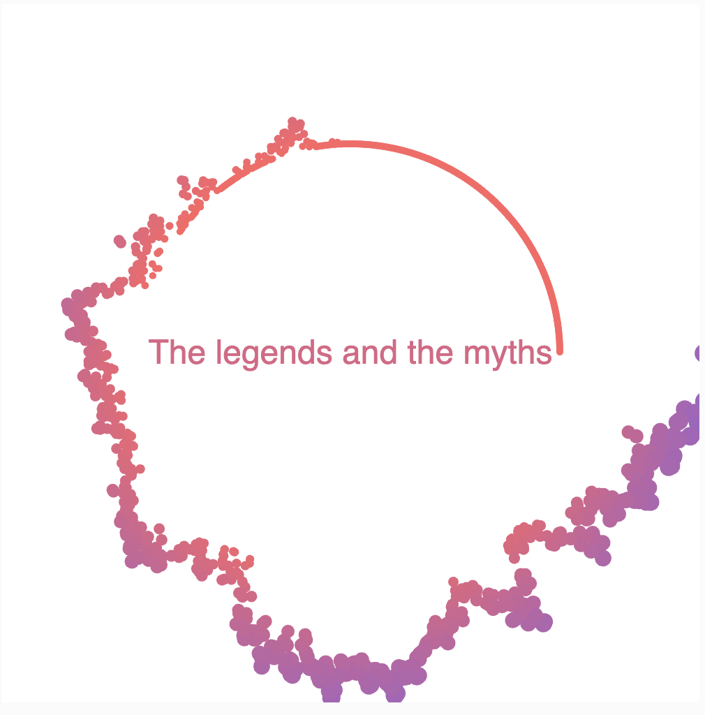
I wanted to portray nostalgia/ melancholy of the past. Specific images I had in mind as reference were faded, warm-toned depictions of one’s memories in movies and hazy light circles. I utilised warm-toned colours to symbolise such melancholy and its movement and opacity to illustrate the idea that whilst the memory is fleeting and obscured, the emotions and ties related to it is prominent to the individual. Because of the piece’s mediocre, primitive(?) interactivity, that allows a gradual transition into blackness, I was also able to successfully depict the notion of “letting go”: letting go of the ties that bind us to the past in order for us to face the present and future.

Like the previous post, I was proud of all aspects of the code since I consider myself still relatively new to the p5.js javascript language. However, I must point out that I was especially proud of implementing and randomly assigning 3 different colours to the ‘blurs’ objects. This as well as attributing a boolean value to a variable to control an if condition and making sure ‘blurs’ objects remained contained within the canvas.

if (this.x < 0) {
      this.x = this.r; 
    } else if (this.x > width) {
      this.x = width - this.r; 
    }
if (this.y < 0) {
      this.y = this.r; 
    } else if (this.y > height) {
      this.y = height - this.r; 
    }
  }

(I think it’s hard to select specific code snippets relating to a single part because it’s sprinkled around the code i.e., some are in setup(), draw() or in class…) To make it easier to manage, I split the piece into different feasible parts: 1) creating randomly positioned/ sized ellipses, 2) randomly assigning 3 different colours to ellipses, 3) causing transparency to increase once mouse is pressed, 4) making sure ellipses don’t escape the canvas. Sometimes I would get confused with variable/ object names so there was a lot of trial and error in determining how to resolve relating errors. Some specific parts required research as I’m still ignorant to the vast amount of functions/ keywords that do specific things e.g., manually adding transparency to the ‘blurs’ objects:

let transparentColor = color(red(this.colour), green(this.colour), blue(this.colour), this.alpha);
fill(transparentColor);

Overall, despite its simplistic nature I am very satisfied. I feel that through this assignment I was able to solidify my knowledge to a greater degree. However, I do feel that this is fleeting so I’ll have to go through the entire javascript file and make notes on each code line function so that it doesn’t remain a surface-level knowledge. I’m very happy that I finally included some level of interactivity but for next time, I would like to use a type of interactivity that evokes a more complex sequence of events.
***I’m so sorry for the late submission. It might not be worth a grade but I still wanted to try it out for my sake. 


Week 4 – Data Visualization

For this assignment, I visualized the “Cost of Living 2017” dataset in a circular diagram. I thought circular diagram would look much neater and allows to visualize much more countries than other diagrams. Also, it showcases the extremes very well, allowing us to compare the most expensive and most affordable places to live in a single glance.

In my circular design, each country from the dataset finds its place along the perimeter. The distance from the center of the circle to each country is determined by its cost of living. So, the more expensive a country, the farther out from the center it appears. To keep things visually appealing, I also added dots and text labels to each country.

One of the trickier parts of this project was making sure that the dots and text labels rotated in sync. I also had to figure out how to represent each country’s cost of living accurately by adjusting the length of the lines connecting them to the center. I’m particularly proud of successfully aligning the rotation of text and dots. I think achieving this synchronization made the diagram more intuitive and easy to understand.

// Calculate the rotation angle based on the length of the data
  const angleIncrement = 360 / (data.length - 2);

  // Define a scaling to make the diagram bigger
  const scaleFactor = 2;

  // Get the rotated text and dots based on the CSV data
  for (let i = 1; i < data.length; i++) {
    const rowData = data[i].split(",");
    const countries = rowData[0]; // coutries
    const cost = parseFloat(rowData[1]); // parse the cost as a floating-point number

    // Calculate the rotation angle based on the index
    const rotationAngle = radians(textRotation + i * angleIncrement);

    // Calculate the radius based on the cost and scaling 
    const radius = cost * scaleFactor;

    const x = centerX + radius * cos(rotationAngle);
    const y = centerY + radius * sin(rotationAngle);

    // Draw a line from the center to the dot
    stroke("#FF5733");
    line(centerX, centerY, x, y);

    // Display the dot with the same rotation angle
    push();
    translate(x, y);
    rotate(rotationAngle);
    noStroke();
    fill("#FF5733"); 
    ellipse(0, 0, 4, 4); 
    pop();

    // Display the rotated text of countries next to the dot
    push();
    translate(x, y);
    rotate(rotationAngle); // apply the same rotation to the countries
    noStroke();
    text(countries, 20, 0); // display the countries
    pop();

In the future works, I’d like to explore more creative ways to present data. I want to achieve a good balance between functionality and aesthetics, making the visualizations not only informative but also visually engaging and fun.

assignment 4: loading text

Initially, I wanted to make a nice data visualization, but by my standards, it would only be cool if the data was live. There’s little glamour in loading a CSV file — even Excel can do that. However, I really struggled to find a free API that lets you make bulk requests, and I couldn’t get around the request limit without paying for it. I settled for a project on loading/displaying text, and came up with my alphabet soup idea.

I tried creating a bowl of p5 alphabet soup, which lets you add new letters by typing on your keyboard. The alphabets all float randomly on the canvas, but they can bunch together if you haven’t pressed space. When they hit space, the bunch is ‘complete’, and the next time the user types, a new bunch is created. Under the hood, each bunch is just an array of “Letter” objects, each of which have their own position and speed. At the end of every array, there’s an invisible space, which I’m moving across the screen, and all the letters simply follow the next letter in the array. A little Perlin noise and rotation is used to simulate some turbulence in the liquid.

Additionally, the user can also use the mouse to scramble the letters on the screen. If the pointer is too close to a certain Letter, the Letter is separated from the bunch and it will go on moving independently. Whether the Letter was in the active bunch or an already completed bunch, it will be extracted from its array and added to a different one called floatingLetters. In this array, all the Letter objects are always moving around randomly. Letters in this array can also be scrambled — the user just has to hover the pointer near a Letter.

The logic to make the letters bunch together was a little tricky to pin down, and a bunch in this context wasn’t really like a boid. They have to (loosely) maintain a left to right order, and that depends on which direction they’re moving in. I eventually took the gradient (speed differential) of the last letter in the array, and made the rest of the letters arrange themselves accordingly. For example, if the next Letter is moving down and right, the current Letter will be drawn slightly to the left and up. If the next Letter is moving up and right, the current Letter will be drawn slightly to the left and below, and so on. There are four such cases.

calculateNewPosition(nextX, nextY, nextSpeedX, nextSpeedY) {
    this.rotation += noise(this.x * 0.01, this.y * 0.01) * 0.01;
    if (nextSpeedX > 0 && nextSpeedY > 0) {
      this.updatePosition(
        nextX - 30 + noise(xOff) * 20,
        nextY + noise(yOff) * 20
      );
    }
    if (nextSpeedX > 0 && nextSpeedY < 0) {
      this.updatePosition(
        nextX - 30 + noise(xOff) * 5,
        nextY + 30 + noise(yOff) * 5
      );
    }
    if (nextSpeedX < 0 && nextSpeedY < 0) {
      this.updatePosition(
        nextX + 30 + noise(xOff) * 5,
        nextY + 30 + noise(yOff) * 5
      );
    }
    if (nextSpeedX < 0 && nextSpeedY > 0) {
      this.updatePosition(
        nextX + 30 + noise(xOff) * 5,
        nextY - 30 + noise(yOff) * 5
      );
    }
  }

This is the final sketch:

I used a font that resembles the letters in alphabet soup, and each letter also has a shadow. In real soup, letters are always going above and below the surface of the liquid, which makes sometimes makes look smaller, fainter. I think I could make this more realistic if I added varying opacity to each letter. If the Letter objects randomly had a lower opacity, it would look like they were drowning a little.

reading reflection: week 4

Dan Norman takes a strictly humanistic stance in the opening of his book, which can be summed up nicely in this one line from the chapter: “It is the duty of machines and those who design them to understand people. It is not our duty to understand the arbitrary, meaningless dictates of machines.” His ideas are well informed and drawn from experience in both engineering and cognitive science, and I do in fact agree with him on the subject of the gap between designers’ faith in users who are willing to trial and error, and the very limited size of such a user base. Most people do really just want to get on with whatever they’re doing. However, the same people also want things to look nice. For example, almost all of us care about the aesthetic qualities of appliances we put in our homes. There’s people like the English couple mentioned in the book with the fancy washing machine, who don’t bother to learn about the machine’s functions but still keep the high-tech appliance around probably because it just looks nicer.

Another interesting case study would be SMEG, a home appliance company with a focus on design. They consistently get a bad rap for the poor quality of their products, which are simply not good investments. Yet, SMEG remains immensely popular, and consumer behavior shows that people are willing to pay much more for an appliance, be it of poorer quality, for something that just looks nice. Thus, I have this lingering question for Dan Norman: “so what?” Humans were born into an unbending, mystifying nature. But people still made it work, weaved clothes from flowers of cotton and learned to bake bread from grains. Now, is a washing machine with one too many functions really going to the nemesis to human development? Are we expected to be so lazy that reading a device manual becomes too much to ask? I’m really not talking about bad design — if I have to struggle to read text on a website in an avant-garde font, maybe that’s a design choice worth reevaluating. But some pretty doors that blend into a building’s facade, which can be swung open by pushing on either one of just two ends, shouldn’t really be that much of a headache to most people, considering once you’ve taken a minute to figure out which end to push, you can forever go on enjoying the nice design of a normally functioning door.

Week 4- Reading reflection The design of everyday things

When I find a door that doesn’t work or a machine acting strangely, I often joke with my mom that maybe the person who made it learned everything online. I really liked how this text talks about the hidden problems with everyday things, how we use machines, and why it’s important to make technology that works well with people, not the other way around.

In fact, this text got me thinking about making things we use every day easier for everyone. For example, let’s talk about SIRI. I get annoyed that I have to change my way of speaking just to make it understand me. I think it should understand English no matter how I speak it. And if I struggle with this, I can imagine how tough it must be for someone with a speech problem. SIRI is supposed to help us, but it doesn’t always do a good job.

When we make machines and stuff, it’s not just about how they look or how fancy they are. We learned this from what happened at Three Mile Island. At first, they blamed the people working there for the problems, saying it was their fault. But then, Don Norman and other experts looked into it more and found that it was also because the machines were hard to understand and use.

Personally, I find it interesting how Don Norman changed from being an engineer who cared mostly about technical stuff to someone who saw how important it is to understand how people think and act when designing things. His journey is really fascinating.

The World Deaths Rate in 2019

Concept

My initial idea was to see how COVID-19 had influenced the death rate of the whole world, however, I was not sure if this was an ethical thing to do. Therefore, I decided to visually represent what was the number of deaths in 2019 based on other illnesses. I found a great website that has public data and data visualizations available online. I thought it would be interesting to visualize the data available using circles. This way is more spontaneous and hence easier to understand. Each circle represented the cause of death. The bigger the circle the more deaths there were in 2019.

Approach and Code Highlights

To create this code, I was using a for loop in a setup function. I took a single row and split it into individual values that were separated by a comma.  I then assigned variables for each cause of death in a single row and I used ‘int’ to convert the value into an integer. I then calculated the sum of the deaths for every disease in a single row. And because all of this is in the for loop, this happened to every row in my data file, so I got the total number of deaths for every country in the world. After, I scaled the size of the circle according to the data. Specifically, in the data file the range of min and max values was from 0 to 500000, which would correspond to 1 to 10 size on the canvas, respectively. I placed the circle in the random x & y positions and I used the range of min and max for the radius.

After I was able to draw circles according to a country I needed to find a way to visually distinguish them. I am really proud that I was able to understand how to do it.

// Use unchar function to convert a
// single-character string to its corresponding
// integer representation
// We also use split because we have 3 letters in a
// country code and we need to extract only
// the first letter

let countryCode = unchar(split(singleRow[1], "")[0]);
print(countryCode);

// We know that the country code as represented by
// a number is going to be between 65 and 90 that
// corresponds to letters from A to Z
// We assign red values to the letters

let redValue = map(countryCode, 65, 90, 0, 255);

// Coloring the circle in a range for red value
// and fixed green,blue and alpha values

noStroke();
fill(redValue, 100, 100, 155);

I decided to use different colors to assign the colors according to some variables in the data file. In the data file, I had a country code represented as 3 letters. For instance, Kazakhstan is KAZ and Argentina is ARG. So, with the help of an unchar function, I used this country code and converted a single-character string to its corresponding integer representation. Specifically, for ease of things, I decided to split the 3 letter code into 3 values and use only the first one. To represent letters in a code I used the ASCII printable characters, where ‘A’ is 65 and ‘Z’ is 90. You can find the whole list of ASCII printable characters here. Then, I used a map function to re-map numbers from the ASCII range (65 to 90) to the color range (0 to 255). The last thing I did was to fill all the circles. I played with different Green, Blue, and Alpha values until I got visually appealing circles.

Future Thoughts and Reflections

I had several problems with the code, which did not allow me to see the circles. Firstly, I had some places where I forgot to put a curly brace or I put an extra one. This did not allow me to run the program and I understood how careful I should be in looking through a code. It is very helpful to write what is a curly brace for when closing it. Second, I had multiple times where I had to print the values and look if they were definer or undefined. This helped with debugging a lot. Moreover, the biggest problem was with assigning the const numbers for the radius of the circle. If the range is too big, for example from 1 to 100, what happens is that the program prints only 3 circles and the rest are not visible, probably because the smallest circles are just 1 pixel. Therefore, I had to change the range to be from 1 to 10, so that all the circles were visible. This assignment helped me to understand how to debug a problem step by step and it also taught me that the best way to do it sometimes is a trial and error method.


Reading reflection – Week #4

Norman’s book, “The Design of Everyday Things,” is a seminal work in the field of design. It provides core ideas that are applied in all design fields, UI and UX design being no exception as it relates more to our class. As I was reading I was reflecting on how Norman’s ideas could be applied to digital design, especially his thoughts about feedback, mapping, and emotional design.

Norman emphasizes the importance of providing clear and immediate feedback to users. In case of digital design, I believe that feedback is especially crucial. Unlike various everyday physical objects, computers appear like black boxes to many of the users and thus communication between the user and the interface is important. Thus, In UI/UX design, feedback is essential to inform users about the outcomes of their actions. Visual cues, animations, and messages should help users comprehend the cause-and-effect relationship of their interactions with the system.

Like anywhere, mapping in digital design is about creating a clear and intuitive connection between user interface elements (controls) and their corresponding actions or functions. This idea made me think how mapping is performed in the virtual space. Here consistency plays a huge role, for instance consistent iconography or color schemes for buttons that perform similar functions such as save, delete, submit. The physical or spatial arrangement of such controls also conforms to user’s expectations and mental models of applications or websites, and working together with feedback results in smooth operations.

Another key thought in the reading that I think is important in digital design is emotional design. Emotional design in UI/UX goes beyond aesthetics and usability; it is about creating interfaces that emotionally connect with users. One brand that comes to mind as a great example is Apple, who’s success can be attributed to its mastery of emotional design in UI/UX. Their products and interfaces go beyond mere functionality; they create products with sense of elegance and sophistication, evoking positive emotions such as admiration and desire. They consistently strive for user experience that focuses on simplicity and intuitiveness, making their users feel empowered and in control. The minimalist aesthetic, friendly interfaces and consistency along their different product define the brand’s identity. This quality generates a strong emotional connection with people, who frequently identify with Apple’s ideals and lifestyle.

Week 3 – OOP

For the week 3 assignment I decided to inspire myself with the magical concept of “sigils”, a type of symbol used to represent the signature of deities or manifestations. Each time the sketch is executed, a new one is generated with random circles and lines. The code was also based on one of the examples we saw in class.

Reading Response Week 5

Art has always been a way for people to connect deeply, and now, thanks to computers and digital media, this connection can happen from far away. The art pieces mentioned in the article use our movements, captured as pixels, to create special interactive experiences. This is a big step forward in how we express ourselves through art. These artworks often have important messages. One that really caught my attention is David Rokeby’s ‘Sorting Daemon’. It strongly shows how surveillance affects us by using real-life information in his art to send a strong message. When art and computer vision come together, something very powerful happens.

Even though interactive media art, like the examples in the article, is a clever way to share ideas and messages, and it can impact people from their own comfortable spaces, I still think there’s a bit of artificiality to it. When I say ‘fakeness’, I don’t mean it’s bad. It’s just that you can’t completely feel like you’re in that moment, even with virtual reality headsets. For example, I remember an art piece I saw with my class. There were lights hanging from the ceiling and a message playing in the background. That piece really touched us because we could touch the lights and feel the room around us, which is something you can’t do with VR headsets or other digital art.

I agree that computers are getting better and better at creating art that engages us. They’re getting really good at making it feel real. But they can never replace the special feeling of being physically present with a piece of art. There’s a unique connection that happens when all our senses are involved—our minds and our bodies. In the end, computer vision is improving every day, especially in creating interactive art that feels random yet beautiful to watch. This happens by using data we create, and by adjusting different parts of how the computer understands the images and videos. This leads to amazing art that really speaks to us. And there are new art pieces like this being made all the time.

Week 4 – Audio Visualizer!

For this week’s assignment, I decided to create an audio visualizer using p5.js, exploring both data visualization and generative text. I chose one of my all-time favorite songs for this assignment because it’s filled with diverse sound effects and beats, making it perfect for visualization. This visualizer represents the audio’s amplitude as dynamic circles. Louder beats create larger and more distant circles, and the lyrics sync with the audio, causing more circles when the lyrics begin. I learnt a lot of new functions and concepts in the process of making the following.

Concept
It uses Fast Fourier Transform (FFT) analysis to break down the audio signal into its frequency components. These components are then represented as circles on the canvas. The amplitude of each frequency band determines the size and color of the corresponding circle. The analyze() returns a spectrum array of amplitude values at each.  point.

Sketch

Click anywhere to begin!

 (The interlude that comes after the chorus is particularly interesting to observe, as the amplitude and beats vary significantly.)

Favorite parts of code

While the way this visualizer turned out makes me happy, my favorite part of this, (and my main struggle) was working with the text. I used a csv file I found online with timestamps for each line in the lyrics and then tried to display the lyrics accordingly by first converting the string to time, calculating the next Timestamp and adding color gradients to make it visually match. 

function displayLyric() {
  // check if there are lyrics data and if the current lyrics index is within the length of file
  if (lyricsData.length > 0 && currentLyricIndex < lyricsData.length) {
    // check if the song is playing and the current audio time exceeds the nextLyricTime
    if (song.isPlaying() && song.currentTime() >= nextLyricTime) {
      // display the lyric text for the current index with animation
      let lyricText = lyricsData[currentLyricIndex].split("]")[1];
      
      // calculating the lerp amount based on lyricTextOpacity for text animation
      let lerpAmount = lyricTextOpacity/255;

      let lerpedColor = lerpColor(color(255, 100, 100), color(100, 100, 255), lerpAmount);

    
      fill(lerpedColor);
      text(lyricText, width / 2, height / 2);
      lyricTextOpacity = 255;
      
      // move to the next lyric
      currentLyricIndex++;

      // updating nextLyricTime with the timestamp of the next lyric 
      if (currentLyricIndex < lyricsData.length) {
        let nextTimestamp = lyricsData[currentLyricIndex].split("]")[0].substring(1);
        nextLyricTime = convertTimestampToSeconds(nextTimestamp);
      }
    } else {
      // if the song is not at the next lyric yet, continue displaying the text
      if (lyricTextOpacity > 0) {
        let lyricText = lyricsData[currentLyricIndex - 1].split("]")[1];
        
        // decrease text opacity
        lyricTextOpacity -= 2;
        
        let lerpAmount = lyricTextOpacity / 255;
        let lerpedColor = lerpColor(color(255, 100, 100), color(100, 100, 255), lerpAmount);
        fill(lerpedColor);
        text(lyricText, width / 2, height / 2);
      }
    }
  }
}

It looked different earlier when I had the angle mode set to degrees but when I accidentally commented it out and tried to run it, it looked prettier and more effective. This is how it looked with the angled mode set to degrees.

Reflections and future Improvements

I learnt many new functions and found this assignment quite fun as I listened to the same song a million times. For future improvements, maybe I can make this interactive by adding multiple audios and having a click option where the users can choose the audio they want to be visualized. I can also try adding more animation to the text like creating a falling or a popout effect.

References

Tutorials: https://www.youtube.com/watch?v=uk96O7N1Yo0, https://www.youtube.com/watch?v=2O3nm0Nvbi4

Lyrics timestamps: https://www.megalobiz.com/lrc/maker/Something+just+like+this.54445587

Audio:https://www.youtube.com/watch?v=FM7MFYoylVs