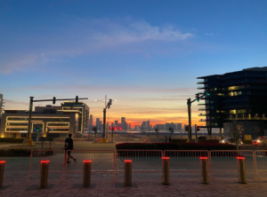
I took a very beautiful picture of the sunset a few days ago, and when looking for inspiration for this assignment I decided to make this the theme of my artwork. I planned to have two lines of text, one with the word “Sunshine”, and another with its definition. That way, I would get to explore with different styles and dynamics.
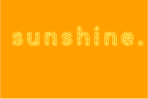
 Before writing any code, I decided to browse through the in-class examples a few more times. I really liked the circles example, and decided to do something similar with my main line of text. I struggled to understand its elements and, thus, had to watch a tutorial to fully grasp textToPoints. With this, I built my first draft. I included it as a picture given that it has no interactivity or other component to it. My next step was to figure out if I could include images and add my second line of text.
This is how it began to take shape:
After investigating, asking my friends, and Monday’s class, I figured out how to add an image and alter its transparency. I initially played arround with tint, and got the piece to a very beautiful aesthetic. Nevertheless, it made my computer very very slow and ruined the experience. I fixed this problem by adding the image and drawing a black rectangle in front of it, which I gave a low opacity, to increase the transparency of the image.
For the interactivity, since I was using a picture of a sunset, I thought it would be really cool to alter the size of the ellipses forming the letters only on the x-axis, as to create an arch-like path that would imitate the sun rising and setting. In the final piece, move the cursor from left to right and see how it resembles this natural movement.
I am very very happy with the overall look and feel of this piece. Working with text was very interesting to me, and I am very curious to see what else can be done with textToPoints. Furthermore, I would like to include object oriented programming to perhaps, give each ellipse its own identity. Could I get the ellipses shaping the word to make the shape of a sun upon a click?


Nice eye for design Juan. I think I would’ve liked to see a little more variation in what you did though. It’s exactly the same as what I gave for the example, just with a different color and text. Why circles? Why not rectangles? What about lines? What interesting things can you experiment around with and create?