Reading Reflection: Week 4

As a user of many machines, I agree with what the author said about the two most important characteristics of good design: discoverability and understanding. The example the author gave with opening doors was the one I found myself relating to. There were many doors that I encountered that gave me difficulties in figuring out what I should do in order to open the door. This touches upon discoverability that the author discussed. Some doors challenged me to try various actions (push, pull, slide) to sucessfully open the door. 

Something I noticed about modern designs is that they are drawn for aesthetics. While the designs manage to perform all the functions that they are supposed to, users often struggle to figure out how to use the design and question why they are built the way they are. Aesthetics is important, especially in the current age where people care about the looks of things. However, when it comes to creating problem in using the design, I feel like it may be better to put aside the aesthetics and focus on the functionality and accessiblity of the designs. 

To move on, the author talked about engineers being too logical in creating the designs. Because engineers who build the designs are being too logical, the machines they built are eventually also too logical for non-engineers to use. Hence this creates difficulties for the users and prevents them for using the inventions that the engineers spent time building. To fix this, I think engineers have to have the mindset of “we are building designs for people according to their ability” and not “we are creating designs for people who think like we do”. In this way, instead of having the users fit into the designs, designs will fit into humans and meet their needs. 

Overall, the reading made me rethink about designs around me and their purpose. While there are many great designs already out there in the world, I believe people can create better designs by understanding the abilities and logic of humans or the target customers. 

Assignment 4: Displaying Text

The concept of this assignment is emotions. There are numerous ways to express one type of feeling. As I saw from this website, there are 5 main emotions (enjoyment, sadness, fear, anger, disgust). I have selected 5 words from each category and generated a code that randomly selects and displays the words on the canvas. Ultimately, my goal for this assignment was to show the many emotions humans feel.

In this assignment, I used the pause code to make the artwork interactive. When the user clicks on the canvas, the randomly selected words pause and the canvas freezes. When the user clicks on the canvas again, the random generation resumes. The code below shows how I implemented it.

//when mouse is pressed, random display of words pause/resume
function mousePressed(){
  
  if(pause == false){
    noLoop();
    pause=true;
  }
  
  else {
    loop();
    pause=false;
  }

For improvement, I would like to add a reset button. I’ve tried adding the button but was unsuccessful at it. Adding the reset button would allow the users to have a more interactive experience and also get a view of the image before it gets covered with words.

click on the canvas to pause/resume the display of words


W4- Reading Reflection: The Psychology of Everyday Things

After reading the first chapter of Don Norman’s The Design of Everyday Things, I have come to realize that our thoughts on design align with one another. Throughout the chapter, Norman emphasizes the importance of understanding human behavior and psychology in order to create designs and even experiences that work successfully with one another. This is basically the backbone of my thinking process when creating or designing anything. Without proper thought being put into how users might think when it comes to using different prototypes or designs, then there is, in my opinion, no point in creating in the first place. Although this might seem extreme, my thinking process’ main idea is that we create things for users in order for them to use it. Thus, to be able to do so, we need to put ourselves in the position of the users. This, however, must be done without putting any expectations on the users’ behavior. Doing so will create unreasonable and unrealistic designs for humans to use. This will allow us to create and cater to the average user, ensuring that interactions between users, systems, and designers flow successfully. 

That being said, this reading raises the question of the importance of empathy in designing and creating. How important is it to consider others’ feelings, thoughts, and even past experiences when creating or designing anything? How can we empathize with others to successfully cater to their needs? These questions, I believe, help us navigate the complexities of human psychology, emotion, and interaction in relation to designing. I would go as far as to say that without considering one or the other, any effort for designing, especially one centered around human interactions, will not be able to go as smoothly. We saw it with the example Norman gave with the nuclear power plant, not designing for human behavior and psychology in mind can have adverse consequences. Thus, it is only by considering these things will, as I mentioned previously, allow us to create better designs that are sustainable for humanity, ensuring that these designs are safe and reliable for human use. 

New Interactivity factors. Week 3 Reading Reflection

There are only three factors that makes anything “interactive”. Are they more than three? Or two? One? Reading through the text and found out that the writer is biased in terms of reading a book, he mentions that the book isn’t interactive. But I personally think the opposite! When I open a book on my reading sofa, about a subject I love, e.g. Automotive industry, Immediately I will start to process images while sitting on the sofa. When reading a story or a book and this is only by using one factor of interactivity which is Thinking, I will immediately process an Image of what am I reading, and I draw what is happening by only using one factor. Even you professor Aya, while reading this and me inserting the question marks and the exclamation mark you may have processed and image of me and my expressions connecting them with the text, and it goes beyond processing an image of someone depending on the text. I have created factors of what makes a book interactive. 1. Interest 2. Knowing the writer 3. Storytelling. The first factor is the base for the other factors and without this factor the other will fail to achieve the interactivity, without an interest in the subject why do you read it? The 2nd factor is as I mentioned above, the voice of Masood is appearing in this text, why? Simply we met before, or I could have a video of me speaking on the internet or anything else that you could from it process an Image of me. The last factor is the Storytelling part, what is it? What is Storytelling as a term? Storytelling is the interactive art of using words and actions to reveal the elements and images of a story while encouraging the listener imagination. For example, On the cozy evening I dimmed the lights, played jazz music, sat on my reading sofa, grabbed a hot coffee in my favorite blue cup and started to revise this paper that you are reading now on your screen. 100% you have drawn everything on your mind from reading the sentence and I made an internal Interactivity with you dear reader. The Opposite point of views between the writer and me and the conflicts and the questions will generate fruitful answers.

Assignment 3

For this assignment, I used OOP and arrays to create an interactive Popcorn experience. On mouse Click, the user can see the popcorn bouncing from the popcorn machine straight to their popcorn box. The user can keep adding popcorn whenever they like.

<

The code that I am most proud of is allowing the user to add more popcorn at any time. I used the mousePressed function for that:

function mousePressed(){
  for(let i = 0; i < 10; i++){
    let x = i;
    let y = i*10;
    let xspeed = i*2;
    popcorns[i] = new Popcorn(x,y,xspeed,-1);

}

For improvements, I want to learn how to make the popcorn objects land on each other so that it shows that they are stacking. I also want to allow the user to enter a number which represents how much popcorn they would want to have.

Reading reflection: week 3

Chris Crawford starts by saying that none of us truly have an understanding on what interactivity is, and states that listening, thinking and speaking are the key elements of interactivity. Crawford also states that interactivity is not two-sided, and which is something that can be defined as low-interactivity and high-interactivity. The example of conversation between two persons (Fredegund and Gomer) made me understand the importance of interactivity namely its elements such as listening thinking and speaking in having an effective conversation.

Before reading the article, I simply thought that interactivity meant reacting or interacting with something. However, Chris Crawford’s insights shed light on the nuanced nature of interactivity, revealing that it has various levels, each with its own importance. Through his explanation, I came to understand that interactivity isn’t a one-size-fits-all concept; rather, it spans a spectrum with different degrees of engagement. This revelation deepened my appreciation for the multifaceted nature of interactive experiences and the significance of considering these levels in design and interaction.

Assignment 2 | Loops | Aadil

Concept 

While watching Casey Reas’s talk, I realized that using looping to create grids is one powerful way to create generative art. I started off by generating a grid of points using loops and thinking about what I could do with it. I remembered the dots and boxes game from childhood-
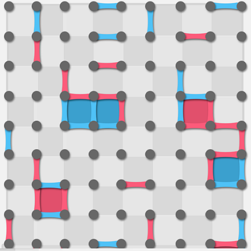
 

I remember making patterns on these grids alone by drawing lines in a random fashion , I wanted to see whether I could use a program to do something similar with different colors that would look appealing to the audience .

I started by programming what I call a “seeker” . The seeker joins the points in a path such that :

  1. No point is visited more than once
  2. the points that can be chosen are either horizontally or vertically adjacent points (diagonals can’t be drawn)
  3. The seeker stops when all the points around it are joined

However, I found that to create something visually appealing , I would need multiple seekers of different colors . So, I used loops to create teams of seekers . The interaction of these seekers over time fill the grid and give a visually appealing effect as these grid paths are drawn .

Because the seekers can draw over each other, I wanted to mix the colors where this happens . Thus I defined colors in RGBA format and defined alpha value to be 150 so that the colors can be mixed to some extent when one is drawn over the other

Sketch

The sketch is embedded below :

Running the sketch again gives a different output every time that is based on the random properties of the Seeker object  . (namely the random point at which the seeker starts from + the random selection of the path).

Code that I am proud of 

I am proud of the code for the seeker class and especially the code for the getAdjacentPoints(points) function in this class  :

getAdjacentPoints(point) { //gets adjacent points in 4 directions
  let adjacent = [];
  //the following 3 lines are to make sure the argument point is a point on       an extended form of the grid (if the grid is extended forever)
  let currentIndex = grid.indexOf(point);
  let x = currentIndex % cols; // cols is initialized in setup()
  let y = floor(currentIndex / cols); 

  // Define the four cardinal directions
  const directions = [
    { dx: 0, dy: -1 }, // Up
    { dx: 0, dy: 1 },  // Down
    { dx: -1, dy: 0 }, // Left
    { dx: 1, dy: 0 }   // Right
  ];

  // Check each direction for valid adjacent points
  for (let dir of directions) {
    let newX = x + dir.dx;
    let newY = y + dir.dy;
    if (newX >= 0 && newX < cols && newY >= 0 && newY < rows) { //Check if this is withing the bounds of the grid
      let index = newY * cols + newX; // finds index in the array grid
      let adjacentPoint = grid[index]; //keep in mind grid is an array of coordinates (array of vectors))
       
        adjacent.push(adjacentPoint);//pushes the adjacent point to                                                 adjacent

    }
  }

  return adjacent; //returns an arry of possible adjacent points
}

Although I thought this would be simple , I had problems implementing this class in the beginning (especially about looking at the edge cases such as a point on the edge ) .

I am also proud of the idea of thinking about the seeker objects as ‘teams’ and realizing that the array containing each seeker had to be shuffled to display colors in equal proportion .

Challenges

The order in which the seekers are initiated matters because they can draw over each other. Thus, if we create a team of yellow seekers for example, and all of the team is appended at the end of the seekers array, the output will have a grid dominated by the yellow seekers (since yellow is drawn on top) . To fix this, I have implemented a method to shuffle the array called shuffleArray (which is an algorithm called Fisher-Yates Algorithm). This is applied to the array to shuffle all the teams of ‘seekers’, so the final output has the colors uniformly distributed.

Reflection and Scope for Future improvements

Since we had already learnt about classes in p5 when I created this project, I decided to use classes to simplify the code. However, loops remain a big part of the code both in generating the grid and in describing how the lines are chosen.  I am happy with the overall result of what I got. There is some scope of improving it – especially in exploring how seekers that consider joining points diagonally too would look like (I tried doing it, but it looked very messy – maybe it’s possible to figure out a way to make it cleaner). In addition, in my drawing the points are arranged in a grid (rectangular). However, it would be interesting to exploring different kinds of grids such as a circular grid of points and modify the seeker accordingly.


Assignment#3 – Nested Orbital Motion

For this project we had to use arrays and classes to generate an artwork. My initial idea was inspired by planetary motion, I thought about creating the solar system with the planets rotating around the sun. Then, I thought about the moon and how it revolves around the earth, resulting in an orbit determined by two circular motions – the moon’s orbit around the earth and the earth’s orbit around the sun. This idea of nested circular motion intrigued me to the extent that I decided to solely focus on creating an artwork with dots revolving around dots in a circular pattern – with each following dot rotating around the previous one, in a long chain of dots.

I created the basic circular motion of a dot based on this video (https://www.youtube.com/watch?v=ib_o5g7V8pc), but it was only sufficient in case of a fixed center point for an orbit. Hence, I created the appropriate classes and function to achieve the desired nested circular motion effect, which I would say was the hardest part of the assignment. Next, I connected the dots together using lines in attempt to make the chaotic movements of the dots easier to follow. The dots and the lines have different colors, which, after combining with a fading effect, resulted in unique patterns. The following snippet is the main part of the draw function used to display and move the dots and lines accordingly.
dotarr[i].show();
dotarr[i].move();
dotarr[i].drawline();
dotarr[i].setxcent(dotarr[i-1].getxcoord());
dotarr[i].setycent(dotarr[i-1].getycoord());

Changing the number of dots instantiated and the speed of their revolution results in different patterns: if the “speedCoef” variable is a positive number, the change of the speed with each subsequent dot decreases, which creates an effect of the dots rising outward and gives the pattern an impression of a something like a worm coming to life. If the “speedCoef” is a negative number, the pattern gains more of an “inward” quality, like collapsing into itself, but inevitably untangling itself and looping back to where it started. Additionally, giving the connecting lines more thickness than the dots results in a smooth, wave-like pattern (see the image below). For the future, I would like to analyze the movements of the dots from a more mathematical perspective to figure out when exactly the pattern will return to where it started, or will it return at all. I would also like to play around with the different variables and observe the emerging patterns, possibly for an inspiration to extend the initial scope of the project.

Changing the line thickness results in a smoother pattern.


The following part shows how the speed and radius, as well as the specific positioning of the dots are used to create the needed dots.

dotarr[i] = new Dot(dotarr[i-1].x, dotarr[i-1].y, (50+(speedCoef*i)), dotarr[i-1].radius);

Week 3 Reading Response

I enjoyed “The Art of Interactive Design.” While doing the coding assignment for this week, I was questioning myself: What is interactivity, and why is it significant in art? This week’s reading perfectly aligned with that specific question. I liked how Crawford emphasized that interactivity is a form of art. And this also sheds light on understanding audiences’ needs and desires while creating any interactive experience, just as with any other form of art.  Although I had implemented a basic form of interaction in the last two weeks’ coding problem, I had not actually thought of it as an artistic expression and also did not consider my responsibility to present a coherent interactive experience. After reading Crawford’s thoughts, I went back and reevaluated this week’s coding assignment and tried to think about the audience’s perspectives. Crawford’s perspective on bringing objectivity into the subjective world of interactions was really thought-provoking. I hope to incorporate the three dimensions of interaction labelled in the reading into my future projects and optimize designs for all three dimensions. However, I am still a bit confused between the lines of low-level interaction and no interactivity.

Assignment 3

Concept

For this project, the goal was to apply the concepts learned in class, including loops, arrays, and Object-Oriented Programming (OOP), to create an interactive visual experience.  The initial goal was to create a dynamic piece where a single spiral would be generated with each mouse click. However, I wanted to enhance user engagement by adding a feature that allows spirals to change color when clicked inside. So, I decided to use mouseDragged function to generate spirals and mouseClicked for spirals to change colour. Therefore, the application now produces multiple spirals during a single drag action across the screen. Furthermore, if a spiral is clicked, it temporarily changes color before reverting to its original hue.

To make the application more visually appealing, I attempted to introduce a feature where waves are generated whenever two spirals collide. I added a trailing effect to these waves, aiming to create a mesmerizing interaction between the spirals and the waves produced. Additionally, I implemented a functionality to clear the screen by pressing the ‘c’ key, allowing users to reset the canvas and start anew.

Sample

Embedded Canvas

Drag your mouse and see the magic.

Code

let spirals = [];

function setup() {
  createCanvas(800, 800);
  background(0);
}

function draw() {
  background(0, 25); // Semi-transparent background for a trail effect
  for (let i = 0; i < spirals.length; i++) {
    spirals[i].update();
    spirals[i].display();
    // Check for collision with other spirals
    for (let j = i + 1; j < spirals.length; j++) {
      if (spirals[i].collidesWith(spirals[j])) {
        createWaveBetween(spirals[i], spirals[j]);
      }
    }
  }
}

function mouseDragged() {
  let newSpiral = new Spiral(mouseX, mouseY);
  spirals.push(newSpiral);
}

// Function to chnage colour of the spiral after mouse ci clicked inside the spiral
function mouseClicked() {
  for (let i = 0; i < spirals.length; i++) {
    if (dist(mouseX, mouseY, spirals[i].pos.x, spirals[i].pos.y) < spirals[i].radius) {
      spirals[i].transform();
     
    }
  }
}

class Spiral {
  constructor(x, y) {
    this.pos = createVector(x, y);
    this.radius = random(5, 20);
    this.angle = 60;
    this.color = color(random(255), random(255), random(255), 100);
    this.transformed = false;
  }
  
  update() {
    this.angle += 0.05;
    this.radius += 0.5;
  }
  
  display() {
// Itsaves the current drawing style settings and transformations applied to the canvas
    push();
//   moves the origin to the position of the spiral
    translate(this.pos.x, this.pos.y);
    stroke(this.color);
    noFill();
    beginShape();
    for (let i = 0; i < this.angle; i += 0.1) {
//  Calculate the x and y coordinates of each vertex of the spiral
      let x = this.radius * cos(i);
      let y = this.radius * sin(i);
//  This function adds a vertex to the shape of the spiral
      vertex(x, y);
    }
    endShape();
    pop();
  }

  transform() {
    this.transformed = true;
    this.color = color(random(255), random(255), random(255), 100);
  }

  collidesWith(other) {
    let d = dist(this.pos.x, this.pos.y, other.pos.x, other.pos.y);
    return d < this.radius + other.radius;
  }
}

function createWaveBetween(spiral1, spiral2) {
// Calculates the start and end points of the line connecting the centers of the two spirals
  let startX = spiral1.pos.x + spiral1.radius * cos(spiral1.angle);
  let startY = spiral1.pos.y + spiral1.radius * sin(spiral1.angle);
  let endX = spiral2.pos.x + spiral2.radius * cos(spiral2.angle);
  let endY = spiral2.pos.y + spiral2.radius * sin(spiral2.angle);
  
  let wave = new HorizontalWave(startX, startY, endX, endY);
  wave.display();
}

class HorizontalWave {
  constructor(x1, y1, x2, y2) {
    this.start = createVector(x1, y1);
    this.end = createVector(x2, y2);
    this.amplitude = 20;
    this.frequency = 0.1;
    this.color = color(255);
  }
  
  display() {
    push();
    stroke(this.color);
    noFill();
    beginShape();
    for (let x = this.start.x; x < this.end.x; x += 5) {
      let y = this.start.y + this.amplitude * sin(this.frequency * x);
      vertex(x, y);
    }
    endShape();
// This function restores the drawing state that was saved with the most recent 
    pop();
  }
}

Challenges & Reflections:

One of the significant challenges I encountered was the implementation of the wave generation when two spirals collide. The vision was to have the spirals transform into waves upon collision, with the spirals disappearing and the waves remaining on screen. However, I faced difficulties in realizing this feature due to my current level of understanding and technical limitations. This project has not only been a fun exploration of interactive graphics but also a valuable learning opportunity. I look forward to revisiting this project in the future, armed with more knowledge and experience, to incorporate the envisioned features and further enhance its interactivity and visual appeal.

References:

E. J. C. (2021, February 17). Excel – Adding and Graphing Sine Waves with Any Amplitude or Phase. YouTube. https://www.youtube.com/watch?v=2SdAtjoYEXo