Week 5 Reading | To the Moon and Back from Our Eyes.

Around fifty-five years ago, Apollo 11 reached the moon and back to Earth. Interestingly, the computers used to guide the spacecraft only required 4 kilobytes of memory. While it may seem small by today’s standards, it was a super machine that allowed precise and complex calculations for the journey.

“That’s one small step for man, one giant leap for mankind.” -Armstrong

Levin presented us with findings over thirty years later on the advancements humanity has made regarding computers. With more capacity, they are now able to track things in real-time and output images that are not just static but interactive. This reminds me of the breakthrough that Apple made with its Apple Vision and Vision Pro. The device is a major display (no pun intended) of what computer vision has become. While it may seem lesser compared to our phones (with its low battery capacity and weight!), it also made me reimagine the future when these devices are common occurrences in daily lives.

Remember when the first iPhone was introduced by Steve Jobs: people made fun of touchscreens. Today, it is indistinguishable from our daily lives. Indeed, today Apple Vision is mostly perceived as redundant to our smartphones.  But unless someone took up the mantle and challenged the default, no invention would ever be made.

References

To the Moon and Back on 4KB of Memory – Metro Weekly

The Four Computers That Flew Humans To The Moon (youtube.com)

Levin, G. “Computer Vision for Artists and Designers: Pedagogic Tools and Techniques for Novice
Programmers”. Journal of Artificial Intelligence and Society, Vol. 20.4. Springer Verlag, 2006.

Week 5 Assignment: Midterm Progress Report

Organ Defenders (WIP)

Concept

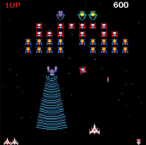
For this project, I was inspired mostly by Namco’s Galaga (image attached) and other games in the shoot ’em up genre. In the game, there are waves of enemies that you have to shoot down to score points. Being shot by the enemy or colliding into them makes you lose a life. Finally, there are some enemies that have special attacks that don’t kill you outright but make it harder for you to survive the wave.

A game of Galaga. The player controls a spaceship that is trying to dodge attacks from enemy spaceships. The boss spaceship has a tractor beam that spreads out in front of itself towards the player.

Galaga

As the Biology major of this class, I thought of combining the gameplay of Galaga with a concept based on our body’s immune system in order to make something new. Thus, Organ Defenders (would appreciate suggestions on the name) was born.

Design

This can be divided into three aspects, the game design, the code structure, and the visual design.

Game Design: I mostly went with the tried and true format of Galaga. The player has four lives and can control a white blood cell in the x-axis at the bottom of the screen. The player will be able to shoot bullets of enzymes at the enemies to bring them down and score points.

Waves of bacteria and viruses keep generating at the top and moving downwards (I might change this to right-to-left later). I may give some of the bacteria the ability to shoot toxins later, but for now, colliding with a bacterium makes the player lose a life. Viruses won’t directly kill the player but will disable the gun control, thereby not being able to earn any points.

As mentioned before, score is earned based off of how many bacteria/viruses have been killed. If I have the time, I might create a hard mode, where the higher the number of bacteria/viruses that are allowed to leave the bottom of the screen, the higher the number of new bacteria that are generated at the top. This will attempt to simulate infection.

Additionally, I plan to include three different kinds of timed powerups that can also help the player in challenging situations. Again, the hard mode might include some kind of cost to use the powerups more than once, to prevent spamming. The powerups I am currently planning for will be Antibody Rush (freezes the bacteria/viruses in place), Cytokine Boost (the player will be able to shoot more projectiles per shot), and Complement Bomb (basically nukes everything on the screen).

Code Structure: I plan to have 4 classes: the white blood cell, bacteria, virus, and the bullet. Here’s an example of how the classes will look, using my Bacteria class.

class Bacteria {
  constructor(
    initX,
    initY,
    radius,
    speed
  ) {
    this.x = initX;
    this.y = initY;
    this.r = radius
    this.moveY = speed;
  }
  
  display(){
    fill("green")
    ellipse(this.x, this.y, 2 * this.r);
  }
  
  move(){
    this.y += this.moveY
  }
  
  collide(other){
    return dist(this.x, this.y, other.x, other.y) <= this.r + other.r
  }
  
  wallCollide(){
    return (this.y > height)
  }
}

Visual Design: While it is a bit early to finalize the visual design before most of the gameplay is ready, I can still talk about it briefly. I plan to use Creative Commons-licensed sprites for the white blood cell, bacteria, and viruses. I might use spritesheets to show some animation, but I am not sure whether that will add to the game’s visual aspect as things might be going too fast anyway for a player to enjoy animations. At the most, I might include animations for when the white blood cell shoots a projectile.

Frightening Aspects / Challenges

There are quite a few aspects that seem daunting now:

  • Actually creating a desirable core gameplay loop, something that will encourage the player to keep playing
  • The powerups seem like a hassle to implement, especially the way I’m planning to implement them. Also, it will be challenging to show the timer of how much time is left before the next use of the projectile.
  • Timing of the animations will also need to be fine-tuned to avoid distracting the player and detracting from the game experience.
  • I also need to find a way to have the bacteria not clump together, which would unfairly make the player lose more lives. I tried for a bit to use while loops to keep regenerating random positions until there was a non-colliding one, but it didn’t seem to work properly.

Risk Prevention

  • I’ll have to work on extensive playtesting to resolve bugs. I also aim to have my roommates/friends playtest it to fine-tune the UI/UX.
  • Implementing the powerups will require me to learn some new skills.
  • I should have a core gameplay loop ready, along with visuals and SFX before I attempt to include the powerups, so that in the worst-case scenario, I still have a ready project.
  • Regarding the bacteria clumping together, I need to either find a way to unclump them or give the player i-frames (invincibility frames) upon losing a life. I might include the i-frames anyway, but will need to find a way to indicate that to the player (in fact, my prototype currently has half a second of i-frames, clearly not enough).
  • I should also make my code more responsive and check for any in-built functions I use that may respond unexpectedly on other systems.

Midterm Prototype

Finally, here’s the prototype. So far, only the player movements, the bacteria collisions, and the game over/game restart logic have been put in place.

Reading Response 5: Computer Vision for Artists and Designers

This article provided a fascinating exploration of the evolution of computer vision technology and its integration into the realm of artistic expression. Among the showcased artworks, “Standards and Double Standards” by Rafael Lozano-Hemmer particularly intrigued me due to its metaphorical approach to incorporating computer vision. What captivates me about this piece is its ability to evoke complex narratives and reflections on societal dynamics through a seemingly simple and tangible interaction. The choice of belts and their rotation adds a layer of symbolism, raising questions about control, authority, and the implications of automated surveillance. 

This artwork also reminded me of an immersive installation I experienced on Lulu Island in January, “Pulse Island” by the same artist. It featured stations with PPG pulse sensors that detected the participant’s heart rate, surrounded by an array of over 4,000 Edison lightbulbs. Consequently, the lightbulbs around that area glimmer to the rhythm of the heartbeat as the speakers echo the heartbeat. As people add a new recording of their heartbeat, the oldest recording in the group is replaced, creating a Memento Mori. By capturing and recording this physiological data, it felt like the artwork was engaging in a subtle form of surveillance of the participants’ vital signs.

It is also important to look at the ethical considerations surrounding the use of computer vision. I was recently invited to an event with industry experts where we discussed ethical considerations of AI and it prompted me to reflect on the following. One primary ethical concern highlighted is the potential misuse or unintended consequences of technology originally designed for creative and benign purposes. The shift from artistic experimentation to potential mass surveillance raises questions about the responsibility of creators and the broader ethical framework within which these technologies operate. Another controversial issue in computer vision is bias and fairness. Surveillance Algorithms can exhibit biases based on the data they are trained on. This bias can lead to discriminatory outcomes, influencing areas such as hiring, law enforcement, and financial services. Moreover, there are several privacy concerns associated with surveillance technologies. The integration of computer vision in art installations blurs the boundaries between observation and intrusion. For example, I wasn’t aware that our heart rates were being stored in a database for a while before I participated in the installation.

Midterm progress

The core idea of this project is to develop an interactive sound visualizer that not only generates music based on keyboard inputs but also visualizes this music with unique, noise-driven shapes on the screen. Each key press corresponds to a different note, and the shapes evolve in real-time to reflect the pitch, volume, and timbre of the sounds being produced. The project aims to blur the lines between music creation and visual art, offering users a multi-sensory experience of composing and visualizing music in real time.

Users interact with the application primarily through the keyboard, where each key triggers a distinct musical note or sound. The visual component consists of evolving shapes whose characteristics (e.g., size, color, noise level) change in response to the music. The proposed enhancement involves integrating hand detection technology, potentially through a webcam and machine learning models, to allow users to manipulate sound characteristics (like volume and pitch) and visual aspects (like shape complexity) with hand movements and gestures.

The main component is the visual class:

class ShapeVisualizer {
  constructor(x, y) {
    this.x = x;
    this.y = y;
  }

  draw(size, alpha, weight) {
    strokeWeight(weight);
    push();
    translate(this.x, this.y);
    beginShape();
    for (let a = 0; a < TWO_PI; a += 0.02) {
      let xoff = map(cos(a), -1, 1, 0, 5) + angle;
      let yoff = map(sin(a), -1, 1, 0, 5) + angle;
      let r = map(noise(xoff, yoff), 0, 1, size * 0.5, size);
      let x = r * cos(a);
      let y = r * sin(a);
      let hue = (angle * 50) % 360;
      stroke(hue, 100, 100, alpha);
      vertex(x, y);
    }
    endShape(CLOSE);
    pop();
  }
}


Hopefully, for future I want to make this more of an interactive synthesizer, hopefully, as I said, using hand motion

Week 5 – Reading Response: Vision for All (From Art to Security)

I found the reading really interesting, especially because it made me think and do research about real world applications, as well as examples in which we can use computer vision technology. Moreover, the democratization of computer vision technology has indeed paved the way for innovative applications across different sectors, not only arts. For instance, in the field of healthcare, computer vision algorithms are being used to assist radiologists in analyzing medical images such as X-rays and MRIs. By automating the process of identifying anomalies or patterns indicative of diseases, these algorithms not only enhance diagnostic accuracy but also expedite patient care, especially in regions with limited access to healthcare professionals.

Furthermore, the integration of computer vision techniques into home automation systems presents another compelling example of its democratization. Home security systems equipped with computer vision capabilities can analyze live video feeds to detect suspicious activities or unauthorized entries, alerting homeowners and authorities in real-time. Moreover, these systems can be programmed to differentiate between pets, family members, and intruders, thereby minimizing false alarms and optimizing security measures. By harnessing computer vision in this context, even individuals without extensive technical expertise can create sophisticated home security solutions, underscoring the democratizing impact of accessible tools and resources in transforming everyday environments.

Assignment 5 – Midterm Progress: Real (Rio) Angry Birds

Concept:

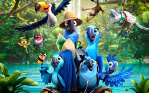
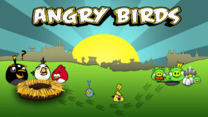
For the midterm project, I plan to create the classic Angry Birds game. In addition, I got inspiration from the movie Rio, so I plan to join both universes and incorporate elements from the movie such as characters, settings, and storyline. In this game, players will use a slingshot mechanism to launch birds towards targets (e.g., enemy characters or objects) to progress through levels.

Code design:

When it comes to the code design, I will define functions for launching birds, detecting collisions, scoring points, and advancing through levels. I will also use classes for birds, targets, obstacles, and any other interactive elements I plan to implement in the game. Then, the user input mechanisms will be added for controlling the slingshot, aiming, and launching birds against the enemies.

Example of a class structure from my code:

class Bird {
  constructor(x, y) {
    this.position = createVector(x, y);
    this.velocity = createVector();
    this.acceleration = createVector();
    this.r = 20;
    this.released = false;
  }

  display() {
    fill(255, 255, 0);
    ellipse(this.position.x, this.position.y, this.r * 2);
  }
  
  update() {
    if (this.released) {
      this.velocity.add(this.acceleration);
      this.position.add(this.velocity);
      this.acceleration.mult(0); // Reset acceleration
      this.velocity.mult(0.99); // Air resistance
    }
  }

Challenges:

One of the most challenging aspects of my project would be implementing realistic physics for bird movement and collision detection. To minimize this risk, I will start by writing code to simulate basic projectile motion and collision detection. I also plan to use existing libraries or frameworks for physics simulations, which can help for the structure of the game.

Conclusion:

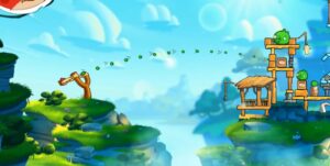
In conclusion, there are several additional elements that I plan to incorporate to improve the overall gameplay experience. Beyond the existing mechanics of slingshot aiming and bird launching, future iterations of the game will feature dynamic sound effects to accompany actions such as bird launches and target destruction. Furthermore, I aim to enhance the visual elements of the game by incorporating more detailed character sprites, vibrant backgrounds, and visually appealing animations. The current sketch provides a foundational framework for the game, and that’s how it looks like so far:


Assignment 5 – Midterm Progress

Concept 

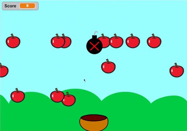
I am creating an interactive game that revolves around collecting rotten apples in a trash can. What inspired me to do this is that most games always make you collect the “good” items and leave the “bad” items out of the box. So, I flipped this norm that we always see in kids games and I am now collecting rotten apples (bad item) and leaving the good apples (normal items). There is no specific game that inspired the apple catching game but I just thought about using an apple since apples fall from trees so it makes sense that they are falling from the sky and can be collected.

Design

There are normal apples falling from the sky and rotten apples. The purpose of this game is to try to collect as much rotten apples into the trash can as possible. The trash can is in the bottom of the canvas and can move horizontally to catch the falling rotten apples. There is a score that is being incremented by 10 every time a rotten apple is collected in the trash can. For the design of the trash can and the apples, I uploaded pictures of a trash can and pictures of apples to make the aesthetics of this game better. I still did not design the “start” page yet but I will also be uploading pictures to make it look aesthetically pleasing. In terms of sound, I am aiming to add background music just like kids games and also a sound for every time an apple is caught in the trash can. Since the game is still in progress I did not add it to this post.

Improvements

I think what will make this project interesting is adding timer to the game so that the player has limited time to collect the apples. Also I think being able to ask for a players name in the beginning and then add it to an array that holds their name and score can make this a more competitive game so when the game ends the player can see what position he has compared to his friends. I also need to add a function that allows the player to start over the whole game and go back to the home page or only start over the game without having to go to the home page. I also thought power ups can make this game more interesting but I do not know if I can achieve that yet. Lastly, I need to make the screen be as big as possible (take as much of the screen as  possible).

Limitations 

The images that are uploading have a white background, so, if the background is any other color than white, the frame of the image will show and it is not aesthetically pleasing. Also the apple randomizer might make the game unfair because you never know how many rotten apples you will get in the span of your turn. Another player might get more rotten apples in the screen, thus, a better chance to get a higher score. Another limitation is that the apple images might be confusing because they are small and some players might get confused between the rotten and good apple. I obviously will be working to reduce these limitations and make this game as good as possible.

Assignment 5: Midterm Progress

For my Midterm Project, I wanted to create a simple yet fun and interactive game that you could play on the go. I decided to create “Catch It!”, a catch game where elements fall from the top and the player needs to move the basket to avoid bombs and collect enough elements before the time ends to move onto the next level.


(Reference)

My game would consist of elements falling from the top of the screen randomly at different positions. There would be a basket present at the bottom which is controlled by left and right keys. Every element that is caught by the basket gives points to the user. However, if a bomb is falling, the user should move to another position and try to avoid it. There will be a time limit for every level. If the user gains enough points within the time limit, they move on to the next level. The difficulty increases with each level. The speed of falling elements will increase, the frequency of bombs will increase, and the time given will decrease. Furthermore, once in a while, a special power-up element will fall, which if you are able to catch will make you immune to 1 bomb. For each level, the player gets to choose a theme.

I implemented a prototype just to test the falling and collision detection, the most crucial parts of the game. The screen is divided into rows and columns forming tiles. The element would fall tile by tile down the screen from a random column and will either be caught by the basket or miss the basket and go out of the screen. Once the element goes off-screen, it respawns at the top.

Here is what my sketch looks like so far:

Assignment 5 – Reading Reflection

It is quite thought-provoking to examine how technology is dual in nature in both art and surveillance. The books explore the philosophical and ethical implications of technology’s development, emphasizing how inventions that were first created for beneficial and creative uses might later be transformed into instruments for widespread control and surveillance. This contradiction is best illustrated by the way that facial recognition has evolved from a scientific marvel to a possible tool for privacy invasion. This should cause readers to consider the wider effects of technology progress. Furthermore, a rich field for discussion on the nature of observation and the hazy boundaries between watcher and watched is provided by the irony in works of art that criticize surveillance by using surveillance techniques themselves. This dichotomy challenges readers to consider the social values that influence technology advancement as well as the motivations behind it.

These thoughts resonate with my own experiences and opinions on technology on a personal level. Just as I was astounded when I was a child and could talk to distant relatives via video chats, I have always been in awe of the advances made possible by digital innovation. However, this nostalgia is now flavored with a cautionary tale about the invisible eyes that could be hiding behind any gadget. I’ve been forced by the reading to reevaluate how I use technology and to acknowledge the fine line that separates convenience from invasion. It speaks to my growing knowledge of privacy issues and the covert, frequently undetectable methods that I could be monitored. The aforementioned artworks function as a reminder of the ubiquitous nature of monitoring and the necessity of maintaining awareness of the trade-offs between the advantages of technology and individual privacy. My grasp of the societal effects of technology has grown as a result of this thinking, which has also motivated me to handle my digital imprint more carefully.

Assignment #5 – Code – ☆Midterm Progress☆

Concept and Inspiration

For my midterm, I want to create some sort of audio-reactive (?) artwork. I am unsure about the audio-reactive part because I don’t think I want it to actually live react to audio; rather, I want the artwork to depend on the preloaded sounds.

Essentially, I created a playlist of 12 songs. I want to upload these songs and their matching cover images as well as the title and the artist. The idea is that the user can switch between songs with the left and right arrows keys, and the visuals in the background will change depending on which song is playing.

Here are the songs I picked:

  1. Heart-Shaped Box – Nirvana
  2. Cool Colorado – La Femme
  3. Weak For Your Love – Thee Sacred Souls
  4. Spooky – Dusty Springfield
  5. Karma Police – Radiohead
  6. Buddy’s Rendezvous – Lana Del Rey
  7. Althea – Grateful Dead
  8. Naive – The Kooks
  9. Drink Before The War – Sinead O’Connor
  10. Right Down The Line – Sam Evian
  11. She – The Blaze
  12. Belong In The Sun – ¿Téo?

My inspiration comes from the feelings I get when I listen to music. Sometimes, I just lay in bed and close my eyes and I start visualizing the energy of the music. So I simply wanted to create an artwork that matches visuals to music.

Back to my first uncertainty, I think I want the visuals to depend on the characteristics of the song itself. In other words, I would like to extract the amplitudes and frequencies of each songs and load them in the functions of the visuals in order for them to control what the visuals will look like.

For the visuals, I want to have some sort of melting effect. That is what will be controlled by the characteristics of the music. I am also thinking, for the color, whether to also have it controlled by one of the music’s characteristics or whether it should be based on the colors of the cover image (by extracting the pixels).

Risks and Problems
  1. I tried loading the songs as mp3 files and most of them didn’t work. The only two that worked I had compressed through a website as they were over 5mb. The other ones wouldn’t load for some reason, so I need to figure that out.
  2. I tried playing with the visuals a bit, but I am not satisfied. As I am still exploring how to make them, I think it will take some time for me to achieve something close to what I want to get. Basically, I tried to create lines that have a melting effect by using Perlin noise, in order to make it dynamic
  3. I think the hardest part will be having the amplitude/frequency of the music control the visuals. I will be working on that next!
Sketch Progress

Anyway, here is what my sketch looks like so far (I hate!!!! the way the background looks like currently):

You can use the left arrow and right arrow keys to switch between songs, though no music will play :/

What’s Left to Add and Change
    • At least one sound (12, technically)
    • A screen giving instructions and wait for user input (button / key / mouse / etc.) before starting
    • A way to start a new session (without restarting the sketch), though I’m not sure what exactly this would entail
    • The shape, perhaps, and to have it controlled by the music
    • The colors, and to have them controlled either by the music or by the cover image – then the text will be more readable hehe