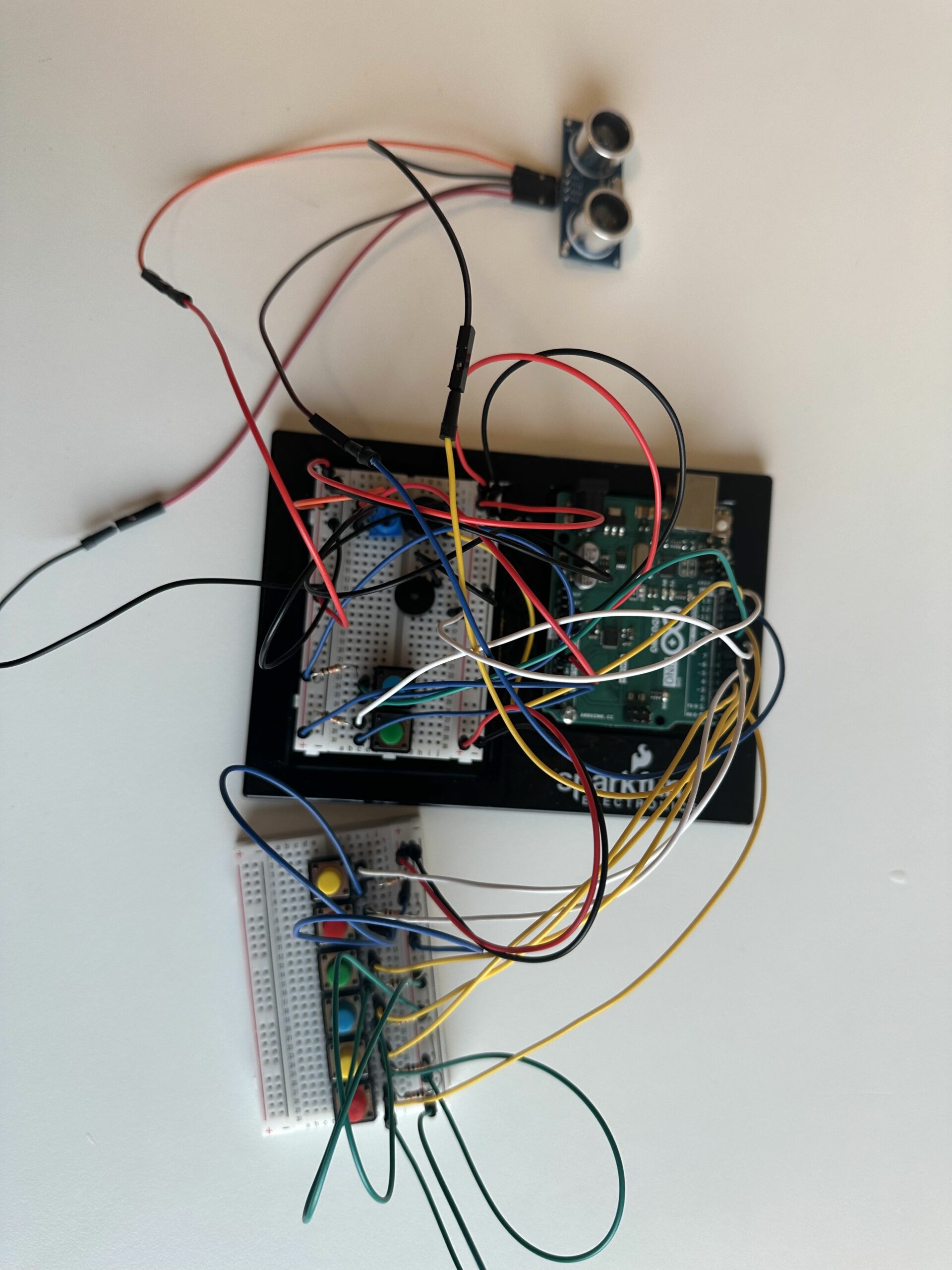
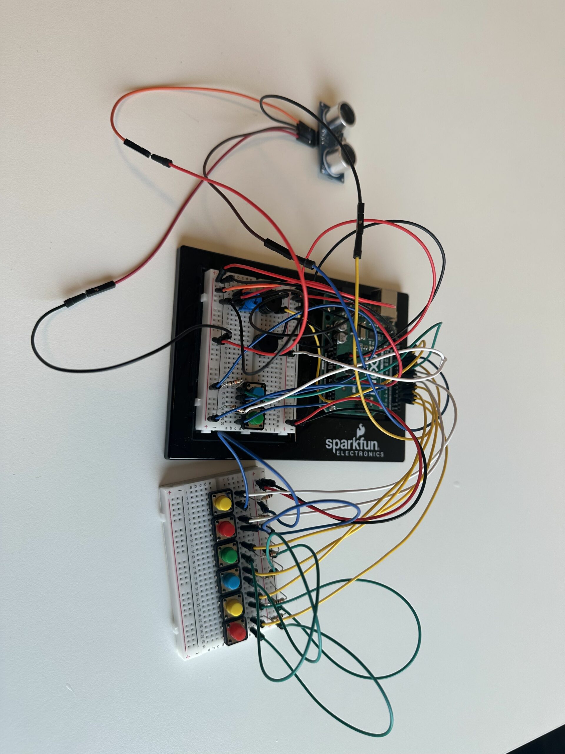
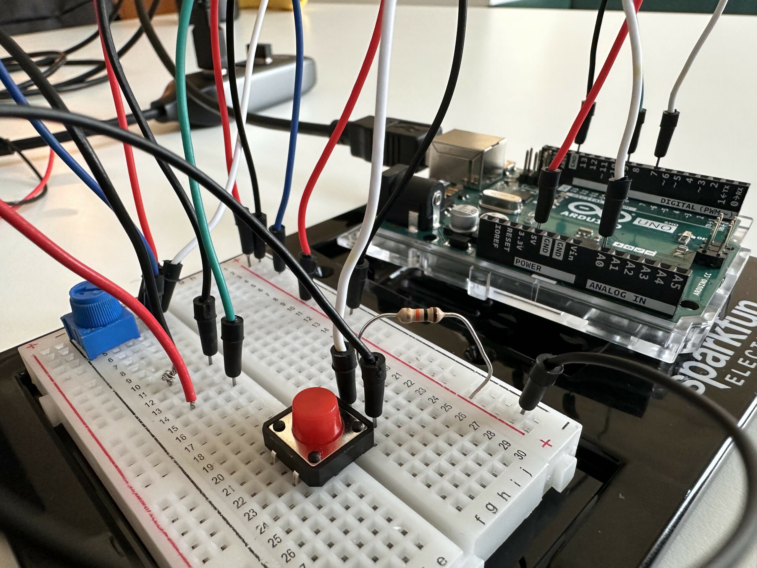
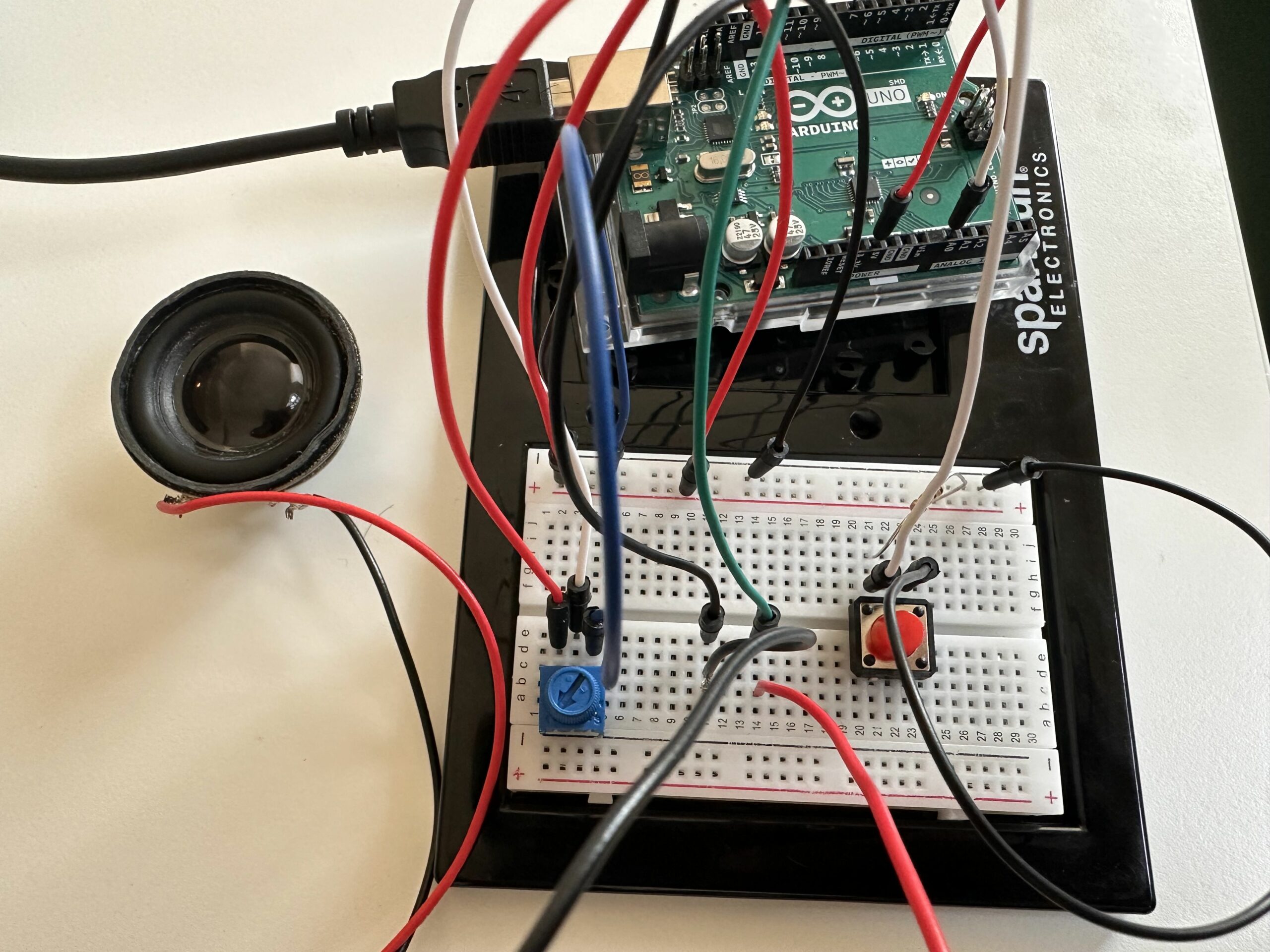
The Digital Piano with Distance-Sensing Percussions is an innovative musical instrument that blends traditional piano elements with modern sensor technology to create a unique and interactive musical experience. This project utilizes an array of digital push buttons connected to an Arduino board to simulate a piano keyboard, where each button triggers a distinct musical note. In addition to the conventional keyboard setup, the instrument incorporates an ultrasonic distance sensor, which introduces a dynamic layer of percussion sounds. These sounds vary depending on the distance of the player’s hand. Furthermore, a potentiometer is integrated to alter the pitch of the notes dynamically, offering musicians the ability to manipulate the sound palette expressively.
Images
Components Used
Arduino Uno
Breadboard (x2)
Jumper Wires
Piezo Buzzer (x2)
Push Buttons (x8)
Potentiometer
10k ohm resistors (x8)
Ultrasonic Sensor
Circuit Setup
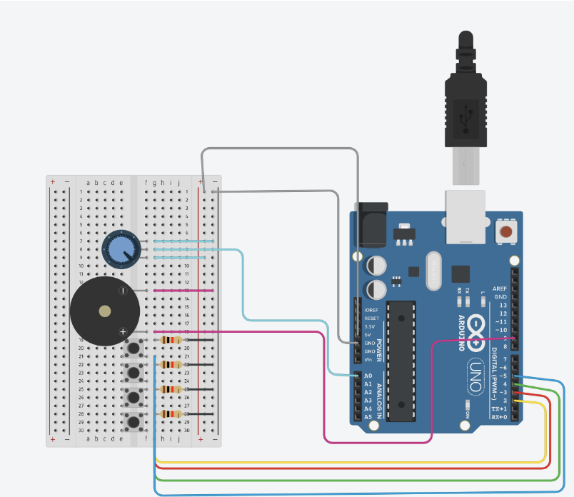
Power Connections
Arduino 5V to Breadboard positive rail
Arduino GND to Breadboard negative rail
Piezo Buzzers
Piezo Buzzer 1:
Positive connection to Arduino digital pin 12
Negative connection to Breadboard negative rail
Piezo Buzzer 2:
Positive connection to Arduino digital pin 13
Negative connection to Breadboard negative rail
Push Buttons
One side of each button connected to the Breadboard positive rail
The other side of each button is connected through a 10k ohm resistor to the Breadboard negative rail and also connected to Arduino digital pins 2 through 9.
Potentiometer
One outer pin is connected to the Breadboard positive rail.
Another outer pin is connected to the Breadboard negative rail.
Middle pin connected to Arduino analog pin A0.
Ultrasonic Sensor
VCC pin is connected to the Breadboard positive rail.
GND pin is connected to the Breadboard negative rail.
TRIG pin is connected to Arduino digital pin 10.
ECHO pin is connected to Arduino digital pin 11.
Video
Code
int buzzerPin = 12;
int buzzer2 = 13;
int potPin = A0;
int keys[] = {2, 3, 4, 5, 6, 7, 8, 9};
// Frequencies for notes (C4 to C5)
int notes[] = {262, 294, 330, 349, 392, 440, 494, 523};
int trigPin = 10;
int echoPin = 11;
int bassDrum = 200;
int snare = 250;
int hiHat = 300;


void setup() {
  pinMode(buzzerPin, OUTPUT);
  pinMode(buzzer2,OUTPUT);
  pinMode(2,INPUT);
  pinMode(3,INPUT);
  pinMode(4,INPUT);
  pinMode(5,INPUT);
  pinMode(6,INPUT);
  pinMode(7,INPUT);
  pinMode(8,INPUT);
  pinMode(9,INPUT);
  pinMode(trigPin, OUTPUT);
  pinMode(echoPin, INPUT);
  Serial.begin(9600);
}

void loop() {
  int potValue = analogRead(potPin);
  int volume = map(potValue, 0, 1023, 0, 255); // Map the potentiometer value to a volume range

  // Measure distance using the ultrasonic sensor
  digitalWrite(trigPin, LOW);
  delayMicroseconds(2);
  digitalWrite(trigPin, HIGH);
  delayMicroseconds(10);
  digitalWrite(trigPin, LOW);
  long duration = pulseIn(echoPin, HIGH);
  int distance = duration * 0.034 / 2; // Calculate the distance

  Serial.print(distance);
  Serial.println(" cm");


  bool isAnyButtonPressed = false;
  for (int i = 0; i < 8; i++) {
    int modifiedNote = map(potValue, 0, 1023, notes[i] / 2, notes[i] * 2);
      if (digitalRead(keys[i]) == HIGH) {
          tone(buzzerPin, modifiedNote, 100);
          isAnyButtonPressed = true;
          break; // Stop the loop once a button is found pressed
      }
  }

  if (!isAnyButtonPressed) {
    noTone(buzzerPin);
  }
  if (distance < 10) {
    tone(buzzer2, bassDrum, 100);
  } else if (distance >= 10 && distance < 20) {
    tone(buzzer2, snare, 100);
  } else if (distance >= 20 && distance < 30) {
    tone(buzzer2, hiHat, 100);
  } else {
    noTone(buzzer2);
  }
    delay(100);
}
In the loop, the program first reads the potentiometer value and uses it to modify the frequency of the piano notes. Depending on the button pressed, it plays a modified note frequency. If no buttons are pressed, it stops any ongoing tone. Depending on the distance detected, it chooses a percussion sound to play, simulating a drum kit with different sounds for different ranges.
Music possesses a remarkable capacity to bridge cultural and linguistic divides and unite individuals from diverse backgrounds. Motivated by the notion of promoting interactive experiences and democratizing music creation, we set out to build a one-of-a-kind musical instrument out of buttons and Arduino. Our intention was to enable people to use sound as a creative medium for self-expression, irrespective of their experience with music. We chose the piano as our main inspiration because we could recreate the chords using buttons.
💡 Process:
Using Arduino Uno we wired up buttons to serve as interactive triggers for different musical notes. Each button was assigned a specific pitch or sound, allowing users to create melodies by pressing combinations of buttons. We leveraged our programming skills to code the logic behind the instrument, ensuring seamless functionality and an intuitive user interface.
🚀 Difficulties:
Although our journey was exciting and innovative, there were certain difficulties. A major challenge we encountered was guaranteeing the reliability and consistency of button pushes. We have to use precise calibration and filtering techniques to get beyond problems like noise interference and debounce.
There were additional difficulties in creating an intuitive user interface. To ensure that users could simply grasp how to interact with the instrument while still having the freedom to explore and experiment with various musical compositions, we had to find a balance between simplicity and utility.
const int speakerPin = 9;  // Speaker connected to pin 9
int buttonPins[] = {2, 3, 4, 5};  // Button pins for C, D, E, F
int notes[] = {262, 294, 330, 349};  // Frequencies for C4, D4, E4, F4

void setup() {
  // Set up each button pin as an input with pull-up resistors
  for (int i = 0; i < 4; i++) {
    pinMode(buttonPins[i], INPUT_PULLUP);
  }
  // Set the speaker pin as an output
  pinMode(speakerPin, OUTPUT);
}

void loop() {
  // Check each button and play the corresponding note
  for (int i = 0; i < 4; i++) {
    if (digitalRead(buttonPins[i]) == LOW) {  // Check if button is pressed
      tone(speakerPin, notes[i]);  // Play the corresponding note
      delay(200);  // A short delay to help debounce the button
      while (digitalRead(buttonPins[i]) == LOW);  // Wait for the button to be released
      noTone(speakerPin);  // Stop playing the note
    }
  }
}
This week’s reading advocates for a more holistic approach to interaction design, one that fully engages human capabilities. The author criticizes current interfaces (i.e., touchscreens) for ignoring the full range of human hand functions—particularly our ability to feel textures and manipulate objects. Victor’s criticism of using just one finger made me wonder: if we could accomplish so much with just one finger, how many more opportunities might arise if we used our entire body? However, this also makes me that there is some level of bias because the author formerly worked in interaction design, I wonder if their strong opinions are a result of this experience.
Although I agree with the author’s perception that we can accomplish more with the use of our hands, what about the people who aren’t able to use them? “Picture under glass” is far more accessible than previous interactive designs since it makes use of touch and drag, which is perhaps one of the simplest human movements.
Furthermore, although more natural behaviors like grabbing and throwing are being incorporated into virtual reality systems, these systems are still mostly dependent on visual inputs and are unable to provide true haptic feedback due to limitations in existing technology. This makes me wonder what are innovative ways that technology can simulate these experiences without reverting to traditional physical forms?
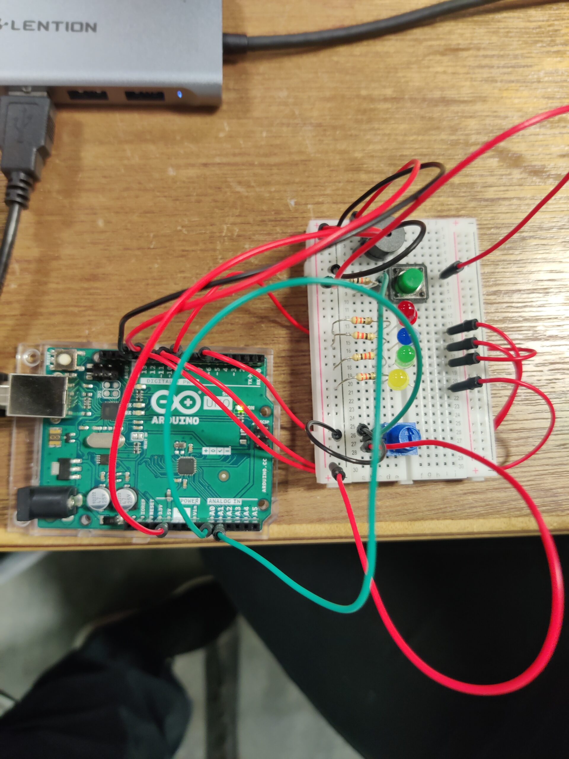
For this week’s assignment, we made a simple musical instrument using the Arduino. It is more similar to DJ equipment than a traditional musical instrument – slowing down the music or speeding it up, switching between different speed quickly to add dynamics to the music, and, of course, flashy lights, which will make or break the party. As part of the assignment, we used the button switch as the digital input and the potentiometer as the analog input. The Arduino plays a melody through a buzzer, and 4 LEDs light up in correspondence with the melody. By pressing the button, you can play the melody. The potentiometer allows you to control the length or duration of the melody.
The map() function is a hidden gem in this code. It’s a versatile function that remaps a range of values from one scale to another. In our case, the potentiometer reading (analog input) ranges from 0 to 1023. We use map() to translate these values to a range of speeds between 1.3 and 6.0. This allows the potentiometer to control the tempo of the melody playback.
The loop() function continuously checks the button state. If the button is pressed (digitalRead(DIGITAL_PIN) == LOW), the isPlaying flag is set to false, effectively stopping the melody. Additionally, the LED lighting is turned off (digitalWrite(RED_PIN, LOW), etc.). When the button is not pressed (digitalRead(DIGITAL_PIN) == HIGH), the isPlaying flag is set to true, and the playMelodyWithLEDs() function runs.
As we were integrating the LEDs with the melody, we struggled a bit. Initially, the LED light-up function was different, and it had a separate delay() for the individual LED to match with the melody. It did not work as expected. We realized after playing a note if we move to the separate LED function and delay there, the melody becomes very slow due to using 2 separate delays. So, we removed the LED function and used the same delay() for both the notes and LEDs.
In the textA Brief Rant on the Future of Interaction Design, the author argues for a thoughtful approach to tool design, emphasizing that a tool’s primary function should be to serve human needs and enhance our innate abilities. The essence of his argument is that tools should not be valued merely for their aesthetics, but for their ability to improve our efficiency and effectiveness. He expresses a certain dissatisfaction with current technology, particularly critiquing devices he describes as “Pictures Under Glass.” He suggests that such technologies diminish the sensory richness and the interactive potential of our hands, more specifically our fingertips. He’s worried that focusing too much on making interfaces look good might make us forget how important it is to actually touch and interact with things around us.The author urges us to think about all the ways we can interact with tools, suggesting we use interfaces that involve more of our senses and movements. He believes that just using one finger on a touchscreen doesn’t make full use of our ability to move and feel.
In conclusion, the author calls for a future where technology development is inspired by the full range of human abilities. Instead of adapting to the constraints of existing technology, he challenges designers to envision tools that integrate seamlessly with human capacity for manipulation and sensory experience, fostering a more intuitive and enriching interaction with our tools.
As for his follow-up article, the author has replied to some critiques about his previous article on the future of interaction design, where he ranted about current tech not being up to par. He clarifies he wasn’t out to offer a solution but to spark deeper research into better solutions that really fit human capabilities. He’s not against current tech like iPhones or iPads, but he’s worried if we don’t push for more, we’ll get stuck with something that’s only a bit better than what we have. He’s not keen on just adding physical keyboards or styluses to our devices because that doesn’t really tap into the full experience of interacting with the world around us. And when it comes to voice commands, he thinks they’re fine for simple questions or tasks, but for more complex stuff like exploring ideas or creating art, they fall short.The author isn’t thrilled with tech that’s all about swiping on screens either. It might be easy, but it’s not making the most of what our bodies can do, and it could even hold back kids’ development because it’s not challenging them enough. He thinks we’re meant to interact with our world in more dynamic ways, and our future tech should reflect that.
Victor urges designers to defy convention and rethink how we engage with technology through his criticism.
Victor’s initial outburst functions as a wake-up call, stressing how crucial quick feedback loops and user-friendly interfaces are to creating meaningful user experiences. He highlights how technology can empower people and foster creativity, and he pushes for a move towards direct manipulation and user-centric design.
There is a wide range of viewpoints from the design world in the replies to Victor’s questions. While some share his views and support his vision for the direction of interface design, others present opposing arguments and voice legitimate doubts about the viability and practicality of his suggestions.
In my opinion, Victor makes strong arguments. I really like how he emphasises user empowerment and the transformative power of interactive technologies. His appeal for creativity is in line with my own conviction that technology has the ability to improve human experiences and encourage meaningful interaction.
I do, however, recognize the difficulties of turning creative concepts into workable solutions. Victor makes some insightful and thought-provoking suggestions, but putting them into practice in real-world settings necessitates giving considerable thought to user requirements, technology limitations, and wider societal ramifications.
Music possesses a remarkable capacity to bridge cultural and linguistic divides and unite individuals from diverse backgrounds. Motivated by the notion of promoting interactive experiences and democratizing music creation, we set out to build a one-of-a-kind musical instrument out of buttons and Arduino. Our intention was to enable people to use sound as a creative medium for self-expression, irrespective of their experience with music. We chose the piano as our main inspiration because we could recreate the chords using buttons.
💡 Process:
Using Arduino Uno we wired up buttons to serve as interactive triggers for different musical notes. Each button was assigned a specific pitch or sound, allowing users to create melodies by pressing combinations of buttons. We leveraged our programming skills to code the logic behind the instrument, ensuring seamless functionality and an intuitive user interface.
🚀 Difficulties:
Although our journey was exciting and innovative, there were certain difficulties. A major challenge we encountered was guaranteeing the reliability and consistency of button pushes. We have to use precise calibration and filtering techniques to get beyond problems like noise interference and debounce.
There were additional difficulties in creating an intuitive user interface. To ensure that users could simply grasp how to interact with the instrument while still having the freedom to explore and experiment with various musical compositions, we had to find a balance between simplicity and utility.
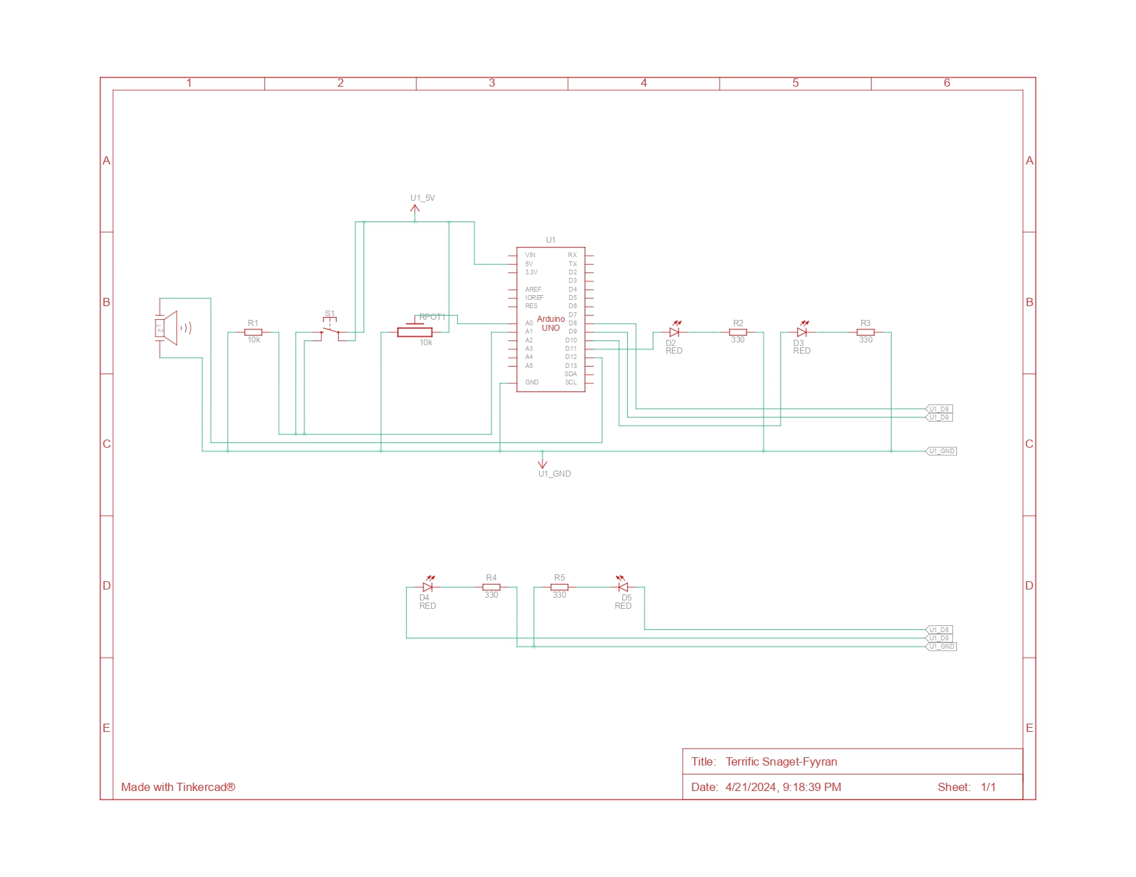
Our arduino illustration:
The code:
onst int speakerPin = 9;  // Speaker connected to pin 9
int buttonPins[] = {2, 3, 4, 5};  // Button pins for C, D, E, F
int notes[] = {262, 294, 330, 349};  // Frequencies for C4, D4, E4, F4

void setup() {
  // Set up each button pin as an input with pull-up resistors
  for (int i = 0; i < 4; i++) {
    pinMode(buttonPins[i], INPUT_PULLUP);
  }
  // Set the speaker pin as an output
  pinMode(speakerPin, OUTPUT);
}

void loop() {
  // Check each button and play the corresponding note
  for (int i = 0; i < 4; i++) {
    if (digitalRead(buttonPins[i]) == LOW) {  // Check if button is pressed
      tone(speakerPin, notes[i]);  // Play the corresponding note
      delay(200);  // A short delay to help debounce the button
      while (digitalRead(buttonPins[i]) == LOW);  // Wait for the button to be released
      noTone(speakerPin);  // Stop playing the note
    }
  }
}
Music possesses a remarkable capacity to bridge cultural and linguistic divides and unite individuals from diverse backgrounds. Motivated by the notion of promoting interactive experiences and democratizing music creation, we set out to build a one-of-a-kind musical instrument out of buttons and Arduino. Our intention was to enable people to use sound as a creative medium for self-expression, irrespective of their experience with music. We chose the piano as our main inspiration because we could recreate the chords using buttons.
💡 Process:
Using Arduino Uno we wired up buttons to serve as interactive triggers for different musical notes. Each button was assigned a specific pitch or sound, allowing users to create melodies by pressing combinations of buttons. We leveraged our programming skills to code the logic behind the instrument, ensuring seamless functionality and an intuitive user interface.
🚀 Difficulties:
Although our journey was exciting and innovative, there were certain difficulties. A major challenge we encountered was guaranteeing the reliability and consistency of button pushes. We have to use precise calibration and filtering techniques to get beyond problems like noise interference and debounce.
There were additional difficulties in creating an intuitive user interface. To ensure that users could simply grasp how to interact with the instrument while still having the freedom to explore and experiment with various musical compositions, we had to find a balance between simplicity and utility.
Arduino illustration:
The code:
const int speakerPin = 9;  // Speaker connected to pin 9
int buttonPins[] = {2, 3, 4, 5};  // Button pins for C, D, E, F
int notes[] = {262, 294, 330, 349};  // Frequencies for C4, D4, E4, F4
int potPin = A0;  // Potentiometer connected to A0
int volume;
int melody[] = {262, 262, 349, 349, 330, 330, 294};  // Melody for Twinkle Twinkle
int noteDurations[] = {500, 500, 500, 500, 500, 500, 500};  // Duration of each note


void setup() {
 for (int i = 0; i < 4; i++) {
   pinMode(buttonPins[i], INPUT_PULLUP);
 }
 pinMode(speakerPin, OUTPUT);
}


void loop() {
 volume = analogRead(potPin) / 4;  // Read volume level from potentiometer


 if (digitalRead(buttonPins[0]) == LOW) {  // Check if the first button is pressed
   playSong();
 }
 for (int i = 0; i < 4; i++) {
   if (digitalRead(buttonPins[i]) == LOW) {  // Check if any button is pressed
     tone(speakerPin, notes[i], volume);  // Play note with dynamic volume
     delay(200);  // A short delay to help debounce the button
     while (digitalRead(buttonPins[i]) == LOW);  // Wait for button release
     noTone(speakerPin);  // Stop the note
   }
 }
}


void playSong() {
 for (int thisNote = 0; thisNote < 7; thisNote++) {
   int noteDuration = 1000 / noteDurations[thisNote];
   tone(speakerPin, melody[thisNote], noteDuration);
   int pauseBetweenNotes = noteDuration * 1.30;
   delay(pauseBetweenNotes);
   noTone(speakerPin);
 }
Concept : This project is a creative exploration into the realm of music and interactivity. Inspired by the dynamic role of a DJ, we have created a turntable that allows users to listen two globally popular songs: “Despacito” by Luis Fonsi and Daddy Yankee, and the “Mario Theme Song” by Koji Kondo for Nintendo. The project aims to provide a simple yet enjoyable experience, blending Western and Eastern musical influences.
Objective: The primary objective is to design an interactive turntable that allows the user to play and switch between two distinct songs using a digital switch and an analog potentiometer, emulating the experience of a DJ.
Components we used:
Arduino UNO
Potentiometer (Analog Sensor)
Push Button (Digital Sensor)
Miniature Speaker
10k Ohms Resistor
Implemented Code with comments:
#include "pitches.h"

#define BUZZER_PIN 9
#define POTENTIOMETER_PIN A0
#define BUTTON_PIN 7

// Melody for the first song
int melody1[] = {
  NOTE_D4, NOTE_CS4, NOTE_B3, NOTE_FS3, NOTE_FS3, NOTE_FS3, NOTE_FS3, NOTE_FS3,
  NOTE_FS3, NOTE_B3, NOTE_B3, NOTE_B3, NOTE_A3, NOTE_B3, NOTE_G3, NOTE_G3, NOTE_G3, NOTE_G3, NOTE_G3,
  NOTE_G3, NOTE_B3, NOTE_B3, NOTE_B3, NOTE_B3, NOTE_CS4, NOTE_D4, NOTE_A3, NOTE_A3, NOTE_A3, NOTE_A3, NOTE_A3,
  NOTE_A3, NOTE_D4, NOTE_D4, NOTE_D4, NOTE_D4, NOTE_E4, NOTE_E4, NOTE_CS4
};

// Note durations for the first song
int noteDurations1[] = {
  4,4,8,8,16,16,16,16,
  16,16,16,8,16,8,16/3,16,16,16,16,
  16,16,16,16,8,16,8,16/3,16,16,16,16,
  16,16,16,16,8,16,8,16/3
};

// Melody for the second song
int melody2[] = {
  NOTE_E4, NOTE_E4, NOTE_E4, NOTE_C4, NOTE_E4, NOTE_G4, NOTE_G3, NOTE_C4, NOTE_G3, NOTE_E3, NOTE_A3, NOTE_B3, NOTE_AS3, NOTE_A3,NOTE_G3,NOTE_E4,NOTE_G4,NOTE_A4,NOTE_F4,NOTE_G4,NOTE_E4,NOTE_C4,NOTE_D4,NOTE_B3,NOTE_C4
};

// Note durations for the second song
int noteDurations2[] = {
  16,8,8,16,8,4,4,16/3,16/3,16/3,8,8,16,8,32/3,32/3,32/3,8,16,8,8,16,16,16/3,8
};

// Flag to indicate if a song is currently playing
bool songPlaying = false;
// Variable to store the previous state of the button
bool lastButtonState = false;

// Setup function to initialize the pins
void setup() {
  // Set the buzzer pin as output
  pinMode(BUZZER_PIN, OUTPUT);
  // Set the button pin as input with internal pull-up resistor enabled
  pinMode(BUTTON_PIN, INPUT_PULLUP);
}

// Loop function to continuously check for button presses and play melodies
void loop() {
  // Read the current state of the button
  bool buttonState = digitalRead(BUTTON_PIN);

  // Check if the button is pressed and it was not pressed in the previous loop iteration
  if (buttonState == LOW && lastButtonState == HIGH) {
    // Toggle the song playing state
    songPlaying = !songPlaying;

    // Start or stop playing the selected song
    if (songPlaying) {
      // If the potentiometer value is less than 512, play the first melody; otherwise, play the second melody
      if (analogRead(POTENTIOMETER_PIN) < 512) {
        playMelody(melody1, noteDurations1, sizeof(melody1) / sizeof(int));
      } else {
        playMelody(melody2, noteDurations2, sizeof(melody2) / sizeof(int));
      }
    } else {
      // If the song was playing, stop playing it
      noTone(BUZZER_PIN);
    }
  }

  // Update the last button state for the next iteration
  lastButtonState = buttonState;
}

// Function to play a melody
void playMelody(int melody[], int noteDurations[], int size) {
  // Iterate over each note in the melody
  for (int thisNote = 0; thisNote < size; thisNote++) {
    // Calculate the duration of the current note
    int noteDuration = 1000 / noteDurations[thisNote];
    // Play the current note on the buzzer pin
    tone(BUZZER_PIN, melody[thisNote], noteDuration);
    // Wait for the duration of the note
    delay(noteDuration * 2);
    // Stop playing the note
    noTone(BUZZER_PIN);
    // Add a short pause between notes
    delay(noteDuration * 0.1);
  }
}
Code Logic:
The code begins by defining the pin numbers for the buzzer, potentiometer, and button. The buzzer pin is where the speaker is connected, the potentiometer pin is where the potentiometer (for selecting songs) is connected, and the button pin is where the push button (for controlling song playback) is connected.
In the setup() function, the buzzer pin is set as an output, and the button pin is set as an input with an internal pull-up resistor enabled. This configuration ensures that the button pin reads HIGH when the button is not pressed and LOW when it is pressed. Moreover two melodies are defined (melody1 and melody2), each represented as an array of note frequencies. Corresponding to each melody, two arrays (noteDurations1 and noteDurations2) define the duration of each note in the melodies.
In the loop() function, the code continuously checks the state of the button. When the button transitions from HIGH to LOW (indicating a button press), the code toggles the songPlaying variable to start or stop playing the selected song. If songPlaying is true, the code reads the potentiometer value to determine which melody to play. If the potentiometer value is less than 512, it plays melody1; otherwise, it plays melody2. If songPlaying is false, it stops playing the melody by calling noTone() on the buzzer pin.
The playMelody() function is responsible for playing a melody. It takes as input the melody array, note duration array, and the size of the melody. Inside the function, it iterates over each note in the melody, calculates the duration of the note, plays the note using tone(), adds a short delay between notes, and then stops playing the note using noTone().
Video Demonstration:
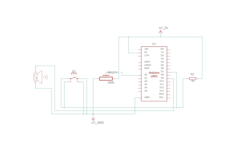
Images of the circuit:
Schematics Sketch:
Circuit connections from above Schematics diagram.
1) Potentiometer Connections: The potentiometer is crucial for song selection and control. It has three pins: two for power and one for the signal. The outer pins are connected to the 5V and GND (ground) terminals on the Arduino to provide it with power. The middle pin, which is the wiper, is connected to the analog input A0 on the Arduino. As the user turns the knob of the potentiometer, the resistance changes, and the Arduino reads this as an analog value, allowing the user to blend between the two songs.
2) Button Connections: A push button is used to start or stop the song playback. One side of the button is connected to the digital pin 2 on the Arduino. The other side is connected to the GND terminal on the breadboard. A pull-up resistor is not necessary as the Arduino’s internal pull-up resistor is used in the code to avoid floating values when the button is not pressed.
3) Speaker Connections: The speaker, which outputs the sound, has two wires. The positive wire is connected to digital pin 8 on the Arduino. This pin is set up in the code to deliver a pulse-width modulation (PWM) signal that creates the audio tones for the songs. The negative wire from the speaker is connected directly to the GND terminal on the breadboard to complete the circuit.
4) Power Connections: The breadboard’s power rail is used to distribute the 5V and GND connections to the potentiometer and the button. Wires run from the 5V and GND pins on the Arduino to the power rail on the breadboard.
With this setup, the user interacts with the button and potentiometer to control the playback of “Despacito” and the “Mario Theme Song”. The code on the Arduino processes the input signals and triggers the speaker to play the appropriate song based on the state of the button and the value from the potentiometer.
What does the Analog and Digital Sensor do in this circuit? – Schematics:
The code and circuit are structured to respond to the interactions with the potentiometer and the push button:
1) Button Press: Initiates the playback of “Despacito” or stops the current song.
2) Potentiometer Rotation: Facilitates the blending from “Despacito” to the “Mario Theme Song.” and vice versa.
The user must press the button to start playing “Despacito.” They can then rotate the potentiometer to initiate the “Mario Theme Song” by pressing the button again. This interaction can be repeated to switch between the two songs.
Challenges & Reflections:
1) Connecting the buzzer, potentiometer, and push button to the Arduino board together proved to be trickier than anticipated. We encountered issues with loose connections, incorrect wiring, and misplacing the digital pin assignments. Later then, we carefully reviewed the circuit diagram and schematics to double-checked each wiring connection, additionally we also referenced the Arduino documentation and class slides to ensure we understood the purpose and functionality of each sensor working nature.
2) When testing the circuit, we noticed inconsistencies in melody playback. Some notes were not playing correctly, and there were unexpected pauses between notes and some notes are repeating itself. To troubleshoot this issue, we reviewed the code related to melody playback and examined the arrays containing note pitches and durations. We adjusted the timing parameters and experimented with different delay values to ensure smooth transitions between notes.
Future Improvements:
1) To create a vibrant atmosphere that mimics a mini club, we aim to incorporate LEDs that flash in sync with the music notes.
2) To provide a more DJ-like experience, we intend to program more songs and add a crossfade effect, allowing one song to ease into the other as the potentiometer is turned, instead of multiple switches.
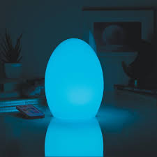
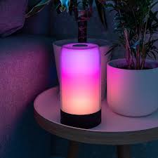
My idea for the final project is the Interactive Mood Lamp, a user-responsive system that combines hardware interaction through Arduino and software interfacing via P5.js to create an emotionally adaptive environment. This system utilizes a webcam to capture the user’s facial expressions, which are then processed through P5.js to analyze and interpret emotions. Following this analysis, the detected emotions are communicated to an Arduino-controlled RGB LED lamp, which changes its colors accordingly. The primary goal of this project is to provide visual feedback based on the user’s emotional state.
Sensing: The project begins with the webcam capturing live video of the user’s face. This video feed is processed by a P5.js application running on a connected computer. The application utilizes a facial recognition algorithm, potentially enhanced by machine learning libraries
Processing: Upon identifying an emotion, the P5.js application assigns a specific color to represent each mood: blue might indicate sadness, green happiness, red anger, and yellow surprise. This color mapping will be based on common psychological associations between colors and emotions
Responding: After processing the emotional data, the P5.js application sends the corresponding color command to the Arduino via a serial communication link. The Arduino then adjusts the RGB LED’s color to match the detected emotional state.