Introduction
This is the “Overengineered Guitar” by Pi Ko and Darko Skulikj.
We massacred an acoustic guitar with a single string into an automated musical device that can be played akin to a theremin.
Concept – A Cringy Skit
Darko does not know how to play the Pirates of the Caribbean theme song on guitar, so he decided to turn to Arduino for help.
Demonstration and Media
The video demo of the instrument is shown below.
The sound sucks 😡. Moral of the story : Pi should play the guitar instead of the machine 🫵😠🎸.
Concept
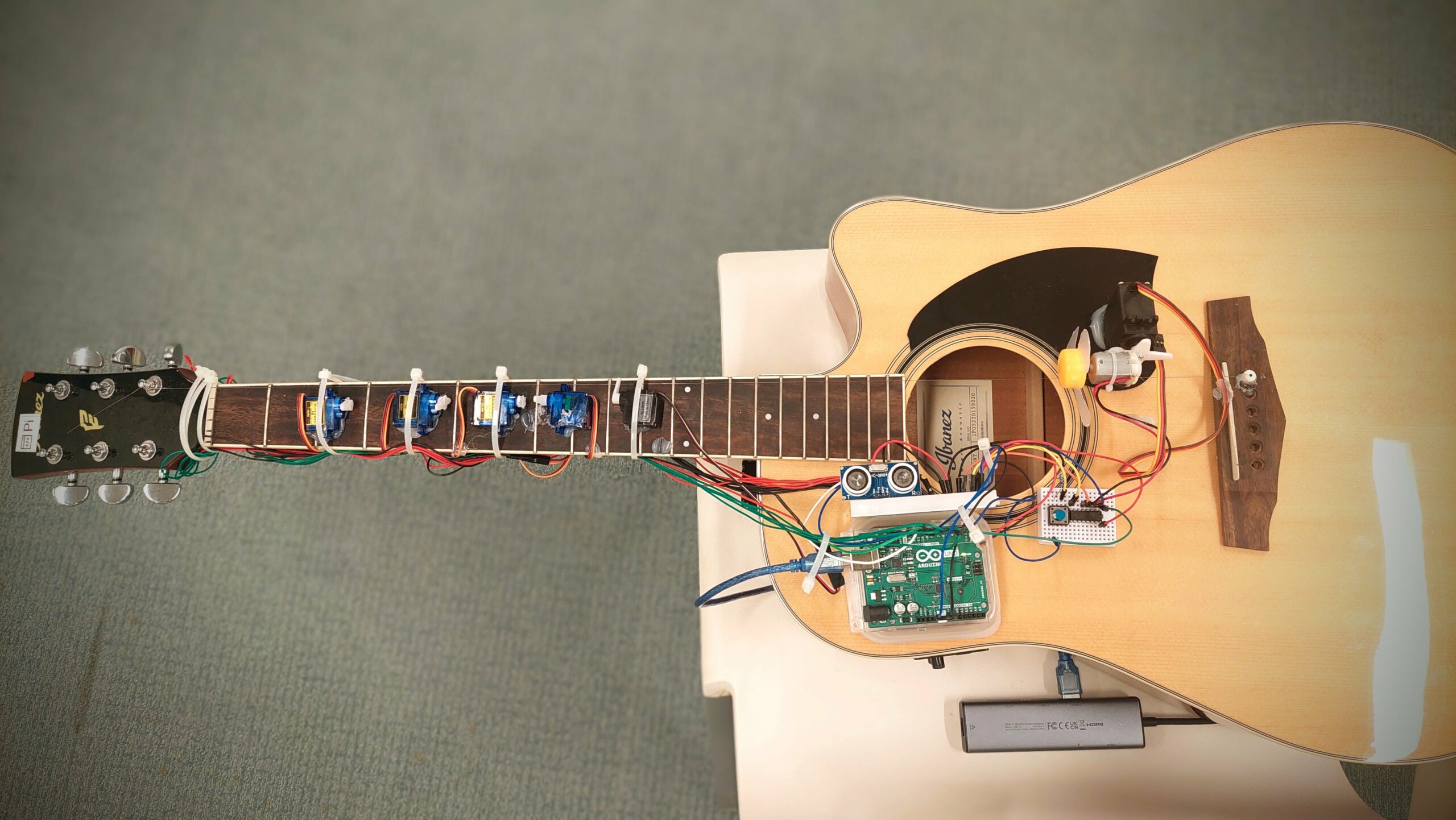
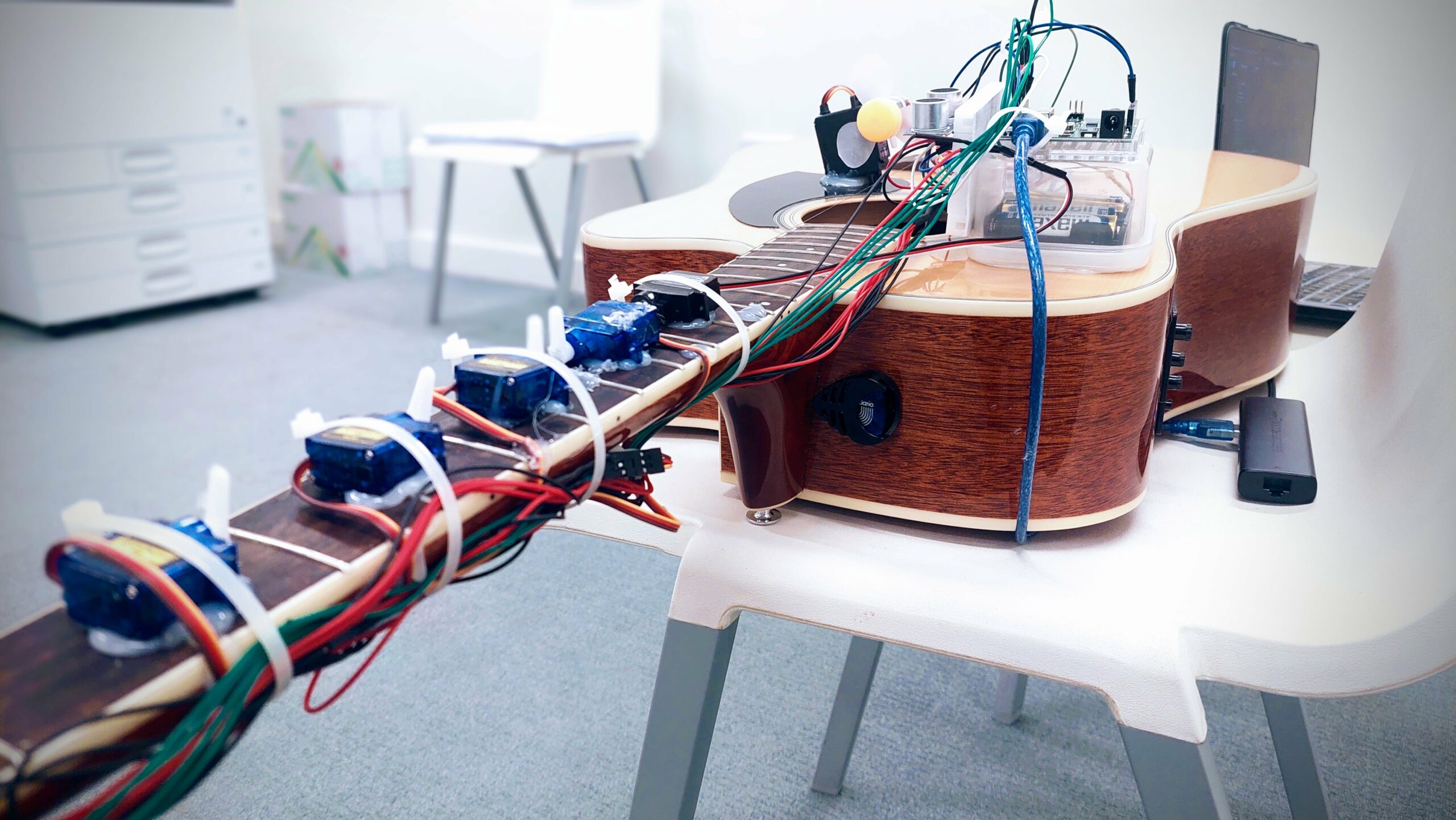
In principle, the “Overengineered Guitar” is a one-stringed setup acoustic guitar for playing by using an array of sensors and servo motors. It has a push button digital sensor and an analog ultrasonic sensor. The main idea is to control the musical notes by hand over the ultrasonic sensor. Then a propeller does the mechanical plucking, controlled through a push button.
This provides the user the opportunity to play the predefined sequence from “He’s a Pirate” from Pirates of the Caribbean over and over again.
Components
- Arduino Uno: Serves as the main controlling box for all the sensors and actuators used.
- Servo Motors (5x): Five servo motors are being attached all across the fretboard, pressing their respective frets according to the desired note.
- Ultrasonic Sensor: Used to toggle the press on the fretboard by the motors.
- Digital pushbutton: It is pressed down to start up the propeller, which plucks the string.
- Propeller motor and DC Motor: It gives the mechanical pluck on the guitar string.
- L293D motor driver IC: Takes care of the high current requirement for the propeller.
- External Power Supply: This ensures that the system power is being properly distributed among the various components without having to necessarily overpower the Arduino.
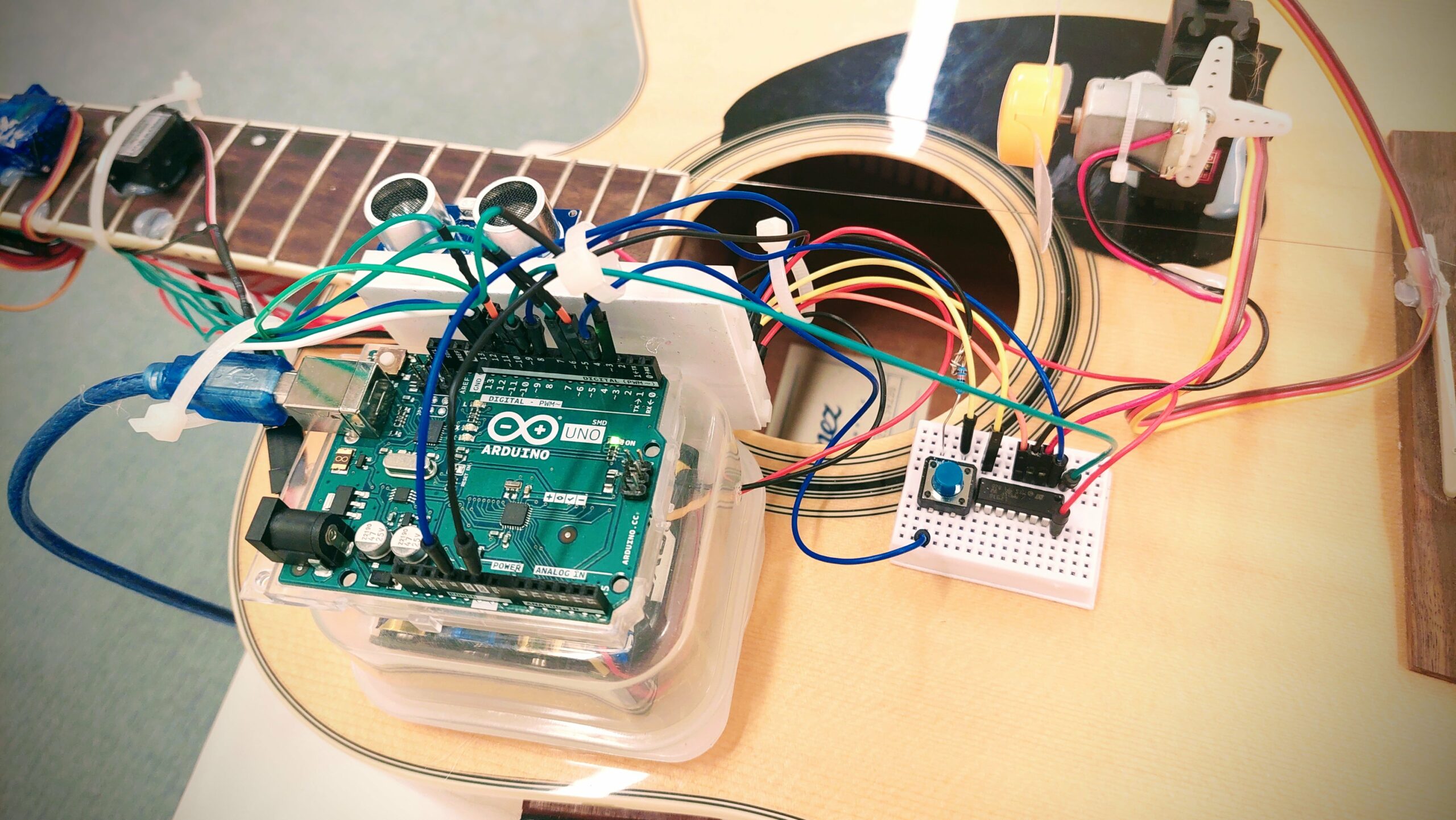 (Arduino, ultrasonic sensor, switch and L293D IC)
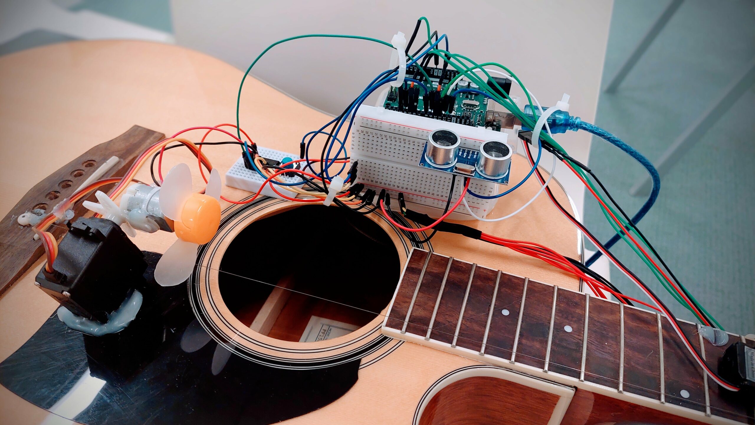
(Propellor on DC Motor)
The motors are attached to the arduino as below.
| Arduino Pin | Motor/Music Note ID | Open Servo Angle | Press Servo Angle |
|---|---|---|---|
| 11 | 5 | 180 | 0 |
| 10 | 4 | 0 | 180 |
| 6 | 3 | 180 | 0 |
| 5 | 2 | 180 | 0 |
| 3 | 1 | 180 | 0 |
| N/A | 0 (open string) | N/A (no servo) | N/A (no servo) |
Challenges
Our main challenge involved managing power to ensure that each component the required current. Also, the wiring was a challenge since there were a lot of wires.
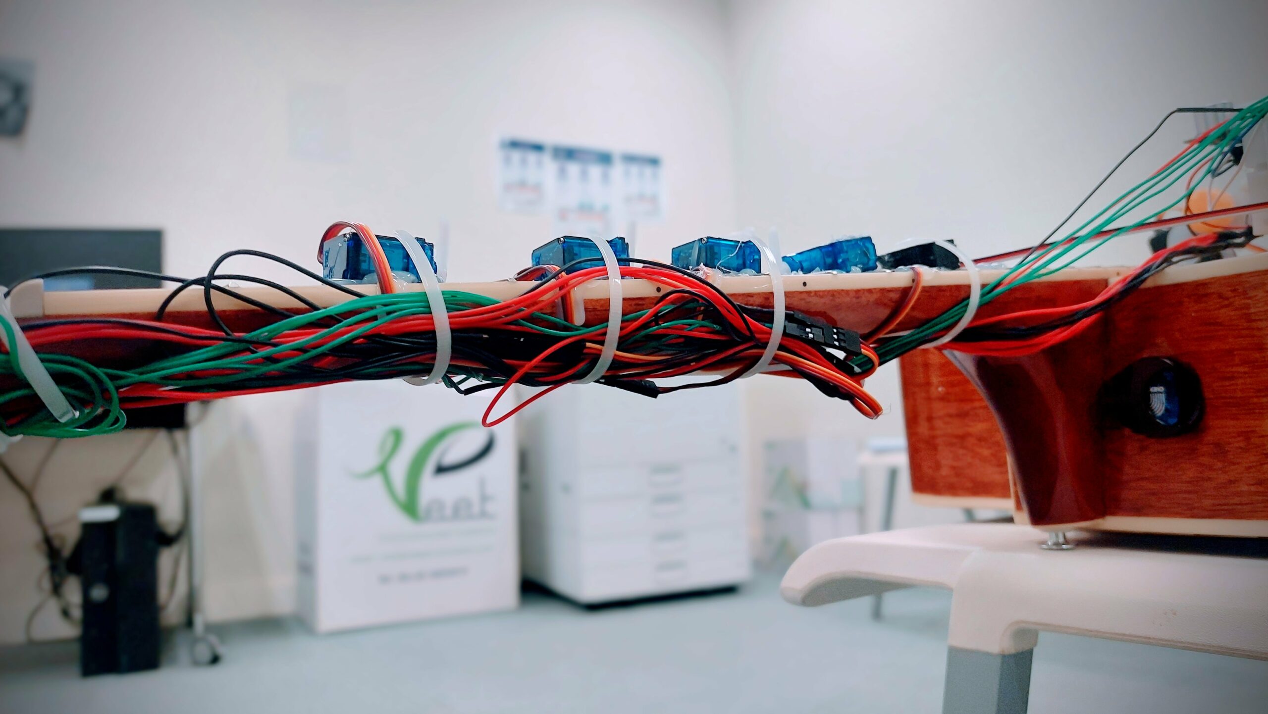
(Wire management 😎)
Task Allocation
Darko took care of the wiring and code for the ultrasonic sensor and the switch using non-blocking code. The rest is filled by Pi.
Code
The code is below. It has debouncing to guarantee reliable operation of the switch.
#include <Servo.h>

// Define a struct to hold servo data
struct ServoData {
  int pin;
  int openAngle;
  int pressAngle;
  Servo servo;
};

// Create an array of servos for each note
ServoData servos[] = {
  {3, 180, 0}, // Note 1
  {5, 180, 0}, // Note 2
  {6, 180, 0}, // Note 3
  {10, 0, 180}, // Note 4
  {11, 180, 0} // Note 5
};
const int numServos = sizeof(servos) / sizeof(ServoData);

// Note durations in milliseconds
int noteDurations[] = {500, 500, 2000, 500, 2000, 500, 1000, 500, 500, 1000};
int noteSequence[] = {0, 1, 2, 3, 4, 5, 3, 2, 1, 2};
const int numNotes = sizeof(noteSequence) / sizeof(int);

unsigned long previousMillis = 0;  // Stores last update time
int currentNoteIndex = 0;          // Index of the current note being played

// Push Button and Propeller control
const int buttonPin = 4; // Pushbutton pin
const int ledPin = 13; // LED pin (for debugging)
int enA = 9; // Enable pin for motor
int in1 = 8; // Motor control pin
int buttonState = 0; // Current button state
// Define the pins for the ultrasonic sensor
const int trigPin = 13;
const int echoPin = 12;

// Define variables for the duration and the distance
long duration;
int distance;


void setup() {
  // Setup for servos
  for (int i = 0; i < numServos; i++) {
    servos[i].servo.attach(servos[i].pin);
    servos[i].servo.write(servos[i].openAngle);
  }

 // Define pin modes for ultrasonic
  pinMode(trigPin, OUTPUT); // Sets the trigPin as an Output
  pinMode(echoPin, INPUT); // Sets the echoPin as an Input
  // Setup for button and propeller
  pinMode(ledPin, OUTPUT);
  pinMode(buttonPin, INPUT);
  pinMode(enA, OUTPUT);
  pinMode(in1, OUTPUT);
  analogWrite(enA, 255); // Set propeller speed
  digitalWrite(in1, LOW); // Initially disable propeller
}

void loop() {
  unsigned long currentMillis = millis();
  // Darko - Switch
  // Improved button reading with debouncing
  int readButton = digitalRead(buttonPin);
  if (readButton != buttonState) {
    delay(50); // Debounce delay
    readButton = digitalRead(buttonPin);
    if (readButton == HIGH) {
      digitalWrite(ledPin, HIGH);
      digitalWrite(in1, HIGH); // Enable propeller
    } else {
      digitalWrite(ledPin, LOW);
      digitalWrite(in1, LOW); // Disable propeller
    }
    buttonState = readButton;
  }

  // Darko - Ultrasonic
  // Clear the trigPin condition
  digitalWrite(trigPin, LOW);
  delayMicroseconds(2);
  // Sets the trigPin HIGH (ACTIVE) for 10 microseconds
  digitalWrite(trigPin, HIGH);
  delayMicroseconds(10);
  digitalWrite(trigPin, LOW);

  // Reads the echoPin, returns the sound wave travel time in microseconds
  duration = pulseIn(echoPin, HIGH);

  // Calculating the distance
  distance = duration * 0.034 / 2; // Speed of sound wave divided by 2 (go and back)


  if(distance<=12){

  // Handling servo movements based on timing
  if (currentMillis - previousMillis >= noteDurations[currentNoteIndex]) {
    // Move to the next note
    if (noteSequence[currentNoteIndex] != 0) {
      // Release the previous servo, if any
      int prevNote = (currentNoteIndex == 0) ? -1 : noteSequence[currentNoteIndex - 1];
      if (prevNote != -1 && prevNote != 0) {
        servos[prevNote - 1].servo.write(servos[prevNote - 1].openAngle);
      }
      // Press the current servo
      int currentNote = noteSequence[currentNoteIndex];
      if (currentNote != 0) {
        servos[currentNote - 1].servo.write(servos[currentNote - 1].pressAngle);
      }
    } else {
      // Release all servos for open string
      for (int i = 0; i < numServos; i++) {
        servos[i].servo.write(servos[i].openAngle);
      }
    }

    previousMillis = currentMillis; // Update the last actuated time
    currentNoteIndex++;
    if (currentNoteIndex >= numNotes) {
      currentNoteIndex = 0; // Restart the sequence
    }
  }
  }
}