Week 2: Loop Flowers

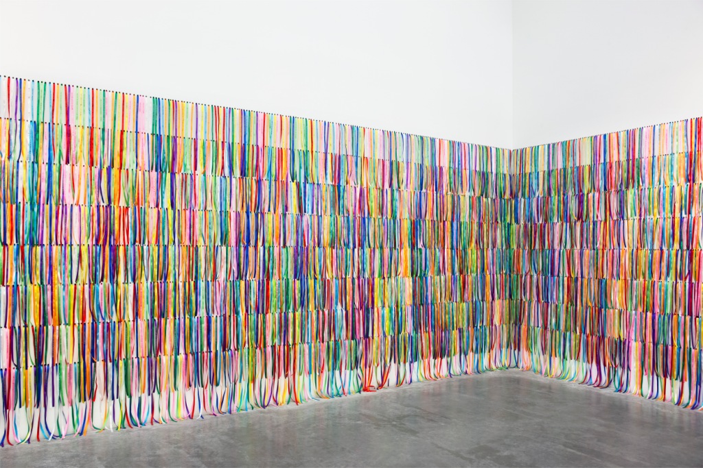
For inspiration, I found some online references with patterns created by combining similar shapes. Most of these combinations resulted in forms that resembled flowers.

Flower Pattern

I drew a connection between using a shape multiple times to draw a pattern and using loop in p5js. My idea is using the same shape, with elements of randomness to create a different flower every time the user interacts with the canvas.

Challenge

When creating this piece, what I found particularly challenging was using the rotate() function to position the petals around the center (the mouse cursor). However, the rotate() function in p5.js only allows rotation around the origin (0,0), so I had to use translate() to change the origin to the mouse cursor’s position. This quick fix created a problem later when I wanted the flowers to remain permanently on the canvas instead of disappearing every time the mouse was released.

For drawing the flowers, I created two functions: one to draw flowers with squares and one with ellipses. They are similar in essence except for the change in shapes used to draw.

function squareFlower(x,y,size,fcolor){
  //repeat drawing the square with the rotation of angle until the 360 degree is full
  for(let i =0; i<(360/angle); i++){
    rotate(angle);
    stroke(fcolor[0], fcolor[1],fcolor[2]);
    fill(fcolor[0], fcolor[1],fcolor[2],fcolor[3]);
    rect(x,y,size);
  }
}

Finally, I included random attributes like shape, petal size, and angle of rotation to create different flowers. I also adjusted the opacity of the shapes to create a more interesting composition. To make it look more like flowers, I implemented an increase in shape size over time when the mouse is pressed, creating a blooming effect.

Final Sketch

Reflection

After finishing the sketch, I tried to make the flower appear permanently on the screen instead of disappearing, but I couldn’t because the flowers are drawn based on their rotation around the origin (which changes for each flower). When I revisit this in the future, I want to change the drawing of the flowers from using the built-in rotate() function to using math to calculate the new coordinates. This will allow the flowers to be drawn independently of the origin’s location. Another issue is that some shapes in the flowers are overlapping, which I think stems from the calculation of the rotation angle. I will also try to improve this calculation in future sketches.

Assignment 1 Self Portrait

Concept: 

For my self portrait I wanted to do something slightly unconventional. Joan Miro is an artist that I really like and I thus decided to do my self portrait in his unorthodox surrealist style. I wanted to have fun background elements commonly seen in his artwork such as the crescent moon and a star.

Something I’m proud of:

Something I’m proud of for this assignment are the random curves across the whole portrait, and especially drawing the crescent moon. These aspects took me the longest time to figure out and are thus the ones I am most proud of.

function details() {
  
  fill(255,255,0);//drawing a crescent moon shape by drawing two intersecting circles and having one of them be the color of the background
  //this effect makes it so that the second circle cuts the first one to make the moon shape
  noStroke();
  ellipse(150,630,100,100);
  fill(240, 248, 255);
  ellipse(170,630,100,100);

  //drawing the diagonal lines for the eyebrows
  stroke(0);
  strokeWeight(4);
  line(300, 300, 450, 400);
  line(500, 400, 650, 300);

  //drawing the yellow curve around the mouth
  noFill();
  stroke(255, 215, 0);
  strokeWeight(8);
  beginShape();
  vertex(250, 550);
  bezierVertex(350, 500, 450, 700, 550, 550);
  endShape();
}

Final Product:

Reflections:

I enjoyed working on this assignment quite a lot, it was a fun experience juggling between taking inspiration from Miro and then also trying to add my own personality into the portrait so I could make something I could be truly proud of. An aspect that I would like to work on in the future is adding some sort of interactivity maybe with eye movement or some background features morphing into others to further portray the dreamlike essence of Joan Miro.

Weekly Reflection(Creative Reading): Week 2

Reflection:

Casey Reas’ video shows how structure and randomness blend together in digital art. He explains that with the use of software, artists can combine strict rules with random elements to create pieces that are both unique and unpredictable. This approach challenges the traditional view of art, where the artist had full control over every detail. Now, algorithms can introduce unexpected outcomes, making the process less about direct control and more about exploring the balance between order and chance. This new way of creating art mirrors life itself, where both structure and unpredictability constantly interact.

Watching this video made me reflect on how creativity is evolving. Reas shows that creativity is no longer just about human control or intention; it can also come from the interaction between the artist and the machine. This got me thinking about whether using randomness and algorithms might make the art less personal or if it actually enhances the creative process by introducing new possibilities that an artist might not think of alone. I’m curious to discuss these ideas with others and hear different perspectives on whether this shift in the role of the artist adds value to art or takes away from it. The questions Reas raises make me wonder how much of creativity comes from us and how much can come from machines, and I believe exploring this could change the way we understand the art of the future.

Self Portrait: Assignment_01

Concept: The concept comes from my favourite childhood cartoon Masha and Bear. I always loved how the bear’s room looked so cozy and peaceful in the cartoon. As I grew older, I noticed my younger brothers acting mischievously, much like Masha. In response, I found myself playing a protective role similar to the Bear’s in the series. So, I choose the bear as my concept for this assignment and tried to create a stylized portrait of the bear using basic 2D shapes in P5.js. While the result may not be an exact replica of the Bear, I tried to capture the essence of his character as seen in cartoon.

Highlight Code: One part of the code that I’m particularly proud of is the drawing of the bookshelf. It’s my first time working with Java and doing a full sketch on P5.js, so I had to go through quite a few tutorials from this channel to understand basics of the drawings. I tried to code the bookself using loops technique from this video. I calculated the positions of the shelves and books using variables and loops. This method allowed me to place multiple shelves and books at regular interval but I had to go through a lot of trials and errors so took me quite some time to figure out how to work with the perspective drawing in P5.js. On my first try, I tried to make a 2D bookshelf, but that didn’t look satisfactory so I added some depth in the drawing using beginShape(), vertex(), and endShape() functions to add some thickness on the sides and changed the fill() to create a contrast on the shadow and lighting. To express what I meant to portray I added one line of quote about books, I achieved this by using textStyle()and textAlign() functions.

Code:

function setup() {
  createCanvas(600, 500);
  setGradient(0, 0, width, height, color(255, 182, 193), color(255, 228, 225)); // Gradient background
  drawHelloKitty(); //function that I am using to draw the main character 
  drawBookshelf();
}

function drawHelloKitty() {
  noLoop();
  noStroke();

  // Draw face
  stroke(0);
  strokeWeight(0.2);
  fill("rgb(252,245,225)");   
  ellipse(200, 200, 180, 180); 

  // Draw ears
  fill('rgb(244,230,215)');
  ellipse(120, 130, 70, 70); // Left ear
  ellipse(280, 130, 70, 70); // Right ear

  //inner ear color

  fill(160, 82, 45); // Medium brown
  ellipse(120, 130, 50, 50); // Left inner ear
  ellipse(280, 130, 50, 50); // Right inner ear

  // eyes
  fill(0); 
  ellipse(170, 200, 22, 22); // Left eye
  ellipse(230, 200, 22, 22); // Right eye

  // Draw nose
  fill(160, 82, 45); // Medium brown
  ellipse(200, 230, 22, 18); // Nose

  // Draw mouth
  
  stroke(0);
  strokeWeight(2);
  noFill();
  arc(200, 245, 50, 25, 0, PI); // Mouth

  // Draw whiskers
  
  stroke(0);
  strokeWeight(2);
  line(100, 200, 50, 190); // Left whisker 1
  line(100, 210, 50, 210); //2
  line(100, 220, 50, 230);  //3

  line(300, 200, 350, 190); // Right whisker 1
  line(300, 210, 350, 210); //2
  line(300, 220, 350, 230); //3

  
  // Drawing body
  fill(255, 0, 0);
  stroke(0);
  strokeWeight(2);
 
  fill(160, 82, 45);
  ellipse(200, 480, 260, 400);
  stroke(0);
  strokeWeight(2);
  fill("rgb(250,204,109)")
  rect(155, 270, 90, 100);


  // hand details
  fill('rgb(252,245,225)'); 
  ellipse(140, 300, 70, 40); // Left hand
  ellipse(260, 300, 70, 40); // Right hand 
  
stroke(0); 
  
strokeWeight(2); 

  // lines for left hand
line(140, 295, 170, 290); // First finger
line(140, 305, 173, 305); 
line(140, 315, 165, 315); 
  
// lines for right hand
line(228, 295, 265, 297); // First finger
line(225, 305, 265, 305); 
line(240, 315, 266, 315); 
}

function drawBookshelf() {
  // Adjusted position of the bookshelf
  const shelfX = 400;
  const shelfY = 150; 
  const shelfWidth = 160;
  const shelfHeight = 360;
  const shelfThickness = 19;
  
  // Draw the bookshelf
  fill(150, 75, 0); // Wood color
  rect(shelfX, shelfY, shelfWidth, shelfHeight); // Main body of the bookshelf
  
  // Draw the shelves
  fill(120, 60, 0); // Slightly darker wood color
  for (let i = 1; i <= 5; i++) { // Adjusted to have more shelves
    rect(shelfX, shelfY + i * 60, shelfWidth, shelfThickness); // Horizontal shelves
  }
  
  // Draw the sides for depth
  fill(100, 50, 0); // Darker wood color for sides
  beginShape();
  vertex(shelfX, shelfY); // Top left corner
  vertex(shelfX + 10, shelfY - 10); // Slightly to the right and up
  vertex(shelfX + 10, shelfY + shelfHeight - 10); // Down to the bottom
  vertex(shelfX, shelfY + shelfHeight); // Back to the bottom left corner
  endShape(CLOSE);
  
  beginShape();
  vertex(shelfX + shelfWidth, shelfY); // Top right corner
  vertex(shelfX + shelfWidth + 10, shelfY - 10); // Slightly to the right and up
  vertex(shelfX + shelfWidth + 10, shelfY + shelfHeight - 10); // Down to the bottom
  vertex(shelfX + shelfWidth, shelfY + shelfHeight); // Back to the bottom right corner
  endShape(CLOSE);

  // Draw the books
  fill(200, 0, 0); // first row
  drawBook(shelfX + 10, shelfY + 60, 40, 80);
  drawBook(shelfX + 60, shelfY + 60, 40, 80);
  drawBook(shelfX + 110, shelfY + 60, 40, 80);
  
  fill(0, 200, 0); // second row
  drawBook(shelfX + 10, shelfY + 130, 40, 80);
  drawBook(shelfX + 60, shelfY + 130, 40, 80);
  drawBook(shelfX + 110, shelfY + 130, 40, 80);


  // a quote below the bookshelf
  fill(0); 
  textSize(18);
  stroke(0);
  strokeWeight(0);
  textFont('Arial');
  textStyle(NORMAL);
  textAlign(CENTER);
  
 // Text lines
let line1 = "Read,";
let line2 = "Masha!";

// position of the quote
text(line1, width / 3, 320); 
text(line2, width / 3, 340); 
  
}

function drawBook(x, y, w, h) {
  fill(255);
  rect(x, y, w, h); 
  fill(0); 
  rect(x + 10, y, 20, h); //the book spine

}

function setGradient(x, y, w, h, c1, c2) {
  noFill();
  for (let i = y; i <= y + h; i++) {
    let inter = map(i, y, y + h, 0, 1);
    let c = lerpColor(c1, c2, inter);
    stroke(c);
    line(x, i, x + w, i);
  }
}

P5.js Sketch:

Reflection and ideas for future work or improvements:

I felt as a beginner I learnt a lot while doing this basic shape based portrait. From brainstorming to implementing, I changed some ideas, colors and techniques but at the end, I am pretty happy with this little drawing. However, there are areas for improvement and future exploration.

The bear doesn’t look or match with the bear color from the cartoon, so it can be enhanced by using different color pallets from rgb colors. The face shape of the bear can be refined a bit more with some curves to give a bear like feature.  Interactivity can be added into this portrait to make it more appealing and fun. The color combination makes the brown color heavy on eyesight, it can be changed as well.

Week 1- Self Portrait: MANG-F2024

Concept

For this self-portrait, I wanted to create something that shows who I am but also adds some fun, interactive elements. I focused on making my hair, face, and upper body look as close to real as I could. I also added cool features like changing the background color when you click the mouse and making the eyes follow the cursor. Plus, there is a custom wand that moves with your mouse, adding a playful touch to the whole thing.

Code

The code begins by setting up a canvas that is 400×400 pixels in size and gives it a light blue background. The default mouse cursor is hidden to make the custom wand cursor more prominent.

The draw() function runs continuously, which allows the portrait to update in real-time. The background color changes to a random color when the mouse is pressed and resets to the original blue when released.

The main features of the face—head, eyes, nose, mouth, ears, and hair—are drawn using basic shapes like ellipses, rectangles, and triangles. The pupils are interactive and follow the mouse cursor, giving the eyes a dynamic effect. The shoulders and chest area are represented with curves and rectangles to add more detail to the portrait.

Finally, a custom wand cursor is drawn at the mouse position, with a black handle and a yellow tip, adding a playful touch to the sketch.

Highlight

One part of my code that I’m really happy with is the way the pupils of the eyes move. I made it so that the pupils follow the mouse as you move it around. This makes the eyes look like they’re actually looking at the cursor, which brings the portrait to life. Here’s the code that does this:


// Interactive Pupils Movement
fill(0);  // Sets the fill color to black for the pupils
let leftPupilX = map(mouseX, 0, width, 165, 175);  // Maps mouseX to move the left pupil within the eye
let rightPupilX = map(mouseX, 0, width, 225, 235);  // Maps mouseX to move the right pupil within the eye
ellipse(leftPupilX, 180, 10, 10);  // Left pupil
ellipse(rightPupilX, 180, 10, 10);  // Right pupil

This part of the code lets the pupils move depending on where the mouse is. It’s a small detail, but it makes the portrait feel more interactive and real.


Embedded Sketch

.


Reflection and Ideas for Future Work

Looking back, I’m happy with how the interactive features turned out, especially the moving pupils and the changing background color. These parts make the portrait more fun to play with. But, I think I could improve the details of the hair and the face to make them look better. In the future, I would like to work on shading and maybe add more interactive features, like changing facial expressions. I also want to get the proportions of the head and face just right to make the portrait even more realistic.


Week 1: A Self Portrait

Concept

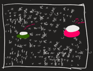
For my self-portrait, I wanted to create something that represents who I am on the surface and who I sometimes become inside. Growing up, I was a huge fan of Dragon Ball Z, so for this project, I decided to make a portrait of myself that can transform into a ‘Super Saiyan.’ For this assignment, we were required to use p5.js to create the self-portrait using the shapes and lines we learned in our first week. Before getting started, I drew the following images to guide my code; let’s call this the R&D part of the process:

This is the normal portrait concept of myself before the transformation.
This image represents the transformation during the R&D process.


The Process

The process for this project was quite enjoyable. I had a lot of fun experimenting with different colors, shapes, and lines while creating the portrait. I started from scratch, using an ellipse to resemble the face, and other shapes as the building blocks for the body’s anatomy. Once the basic human figure was drawn in JavaScript, the hair surprisingly became the most time-consuming aspect. I had to use triangles to accurately represent how my hair looks to closely match my image. I used online resources like ‘Google Color Picker’ to find the unique color codes that created my desired effect. A simple if-else statement was also used to enable the switch from normal to Super Saiyan. Be sure to stick around to find out about my favorite part of the code that sells the entire effect.

if(keyIsPressed === true) // he turns 'Super Sayain' { background(174, 224, 235);


Code that I am Proud of:

The code that I’m particularly proud of is the one where I used a ‘for loop’. I started coding last fall, and during that time, I learned the basics, all the way up to classes and object-oriented programming. With this knowledge in mind, I wanted to experiment with how loops would function (no pun intended) in this self-portrait. The best way to integrate this was by using a for loop. It’s one thing to see your code run in a terminal, but it’s another glorious moment to see the visuals your code can produce. That’s exactly how I felt when I saw my code turn into something visually intriguing. The following code creates the energy around my transformed character to maximize the intended effect:

// The following loop is for the energy around our 'Sayain'
    for (let i = 0; i < 20; i++) 
    {
      let x1 = random(width);
      let y1 = random(height);
      let x2 = x1 + random(-30, 30); // Randomizing the length and direction of the lines
      let y2 = y1 + random(-30, 30);
      line(x1, y1, x2, y2);
    }

The final Outcome:

The moment you’ve all been waiting for! To turn Super Saiyan, press any key on your keyboard (for simplicity, try pressing the spacebar 😉)

Reflection:

I thoroughly enjoyed every part of creating this self-portrait, and it taught me how to visualize my code and think creatively while coding. Although I faced some challenges in aligning each shape with others, overall, this assignment helped me strengthen both my creative and coding skills. For future improvements, I’d like to implement more conditionals, variables, loops, and classes in this portrait and in my future projects. I’d also like to explore how these elements can be integrated with 3D models in p5.js to create something so interactive that people would become truly captivated by my work.

Week 1 – Self Portrait

Concept
My concept centres around the idea that a cat represents an important aspect of my identity, being my favourite animal and symbolising certain personal traits like independence, curiosity, and playfulness. In this project, I wanted to create an interactive experience where a simple click could reveal the transition between a cat and my self-portrait. The idea was to make this transformation not just about visuals but also about the connection between the two images—how the cat symbolises me in a more abstract way and how that symbolism morphs into a more literal self-portrait. The goal was to capture a sense of play and surprise, inviting the viewer to engage with the piece and reflect on how we often associate certain animals with our personalities or characteristics.

function draw() {
  if (showCat) {
    drawCat();
  } else {
    drawPerson();
  }
}


This function is simple yet crucial for the interactive element of my project. It efficiently toggles between two distinct visual representations based on user interaction. The conditional logic is straightforward but powerful, allowing for a seamless transition between the cat and the self-portrait. What I find particularly satisfying about this piece of code is how it encapsulates the entire concept in just a few lines. It’s a perfect example of how simplicity in code can lead to a more engaging and fluid user experience. This function effectively bridges the gap between concept and execution, making the interaction feel natural and intuitive.

Reflection and Future Improvements
Reflecting on the project, I’m pleased with how the interactive element turned out, but I see a lot of potential for further refinement. One area I would like to focus on in the future is adding more realism to the visuals, particularly through the use of shadows and shading techniques. Currently, the transition between the cat and the self-portrait is clean and simple, but adding shadows could give the images more depth and make the transformation feel more lifelike. I also want to explore more advanced rendering techniques to enhance the texture and detail of both the cat and the self-portrait. Additionally, experimenting with subtle animations during the transition could add another layer of sophistication, making the experience even more engaging. This project has been a great learning experience, and I’m excited to see how I can push it further to create a more polished and immersive piece.

Week 1 – Self Portrait

Welcome to my first IM project!

Concept: I was surprised that I can include emojis in coding so I wanted to play around with it. I went with a simple but cute design since this is my first time coding. I used the emojis to make eyes as well as a waving hand that is tracked by the mouse. I also used my two favorite colors, blue and purple, to make a little smile.

Code: I was a bit worried on how to implement the hijab in the sketch because I did not want to use two circles. I ended up using the stroke of the ellipse to make the hijab and it turned out great!

//face and hijab
fill('rgb(218,173,130)')
stroke('rgb(112,11,11)')
strokeWeight(30)
ellipse(200,200,250,300)


Reflection and improvements: Overall I had fun exploring the different variables and testing things out! I didn’t really know what I was getting myself into when I chose to enroll in this class but I’m glad I did. Interactive media seems like the perfect blend between computer science and art, two things I’ve always wanted to try out. Coming back to the sketch, in the future, I would try making a curved line for the smile because I couldn’t figure out how to do that.

Week 1: Self – Portrait

Concept
For this project, I decided to create a more abstract, cartoonish self-portrait. The simplified shapes give the drawing a cute and playful look, which fits well with the style I am aiming for. The strawberry-shaped hat I featured in the portrait is an item I gave to my little sister for her birthday, which adds a personal touch to the project. (She made me wear this hat for days) The background is inspired by Astana, which has the most beautiful sky I’ve seen, which makes this project even more meaningful to me.

Code snippet
A piece of code that I’m particularly proud of is the implementation of eye blinking on the character. The eyes alternately open and close, creating a simple but effective animation. Here’s the relevant code snippet:

if (millis() - lastBlink > interval) {
  push()
  fill(0);
  stroke(0);
  strokeWeight(3);
  line(295, 400, 335, 400);
  line(355, 400, 405, 400);
  pop()

  if(millis() - lastBlink > interval + blinkDuration) {
    lastBlink = millis();
  }
  
} else {
    fill(0);
    circle(315, 400, 25)
    circle(385, 400, 25)
}

This block of code is responsible for the blinking logic, checking the elapsed time and switching between drawing closed eyes (lines) and open eyes (circles).

Sketch

Reflection and ideas for future improvements
Creating this project helped me get more familiar with p5.js, especially in terms of working with different forms and layers. The biggest challenge was figuring out how to draw curves correctly and how to handle time intervals in p5js. However, this project gave me the confidence to experiment further with p5.js and possibly add more complex animations or interactive elements in the future.

In the future I would like to add interactivity to the sketch, such as making the eyes follow the cursor, or adding background changes depending on the time of day. I also plan to refine the background, adding more details that more accurately convey the atmosphere of Astana.

Week 1 – Self Portrait

Short Description

For the first assignment of my intro to IM class, we had to design a self-portrait of yourself. I have been wanting to take an IM/ IMA class for the past two years at NYU, so I was really excited to get started and work on this project. I wanted my portrait to portray some of my favorite characteristics of who I am as a person. As such, portrait is a small reflection of the character that I am.

Character Design Concept

For my character, I took inspiration from the appearance of Duolingo character. Now before you judge, I often feel the need to add contrast and extensive detail to a design, so I have trouble simplifying my ideal design into primary shapes and colors. Therefore, specifically referencing Violet (my favorite) from Duolingo, I was able to simplify how the human anatomy is suppose to look and add details accordingly to my needs.

The Outfit

My next I asked myself, “what did I want my character to wear?” And so, I decided to dress her up in one of my to-go outfits in a black tank top, green cargo pants, and pair of off-white sneakers.  In addition, I have a cartilage piercing and two lobe piercing on one of my ears, so I added silver jewelry that I typically wear on my character’s ear. I could have added my other ear, but I thought my character looked good as it was. I also can’t forget my pair of silver/blue glasses, so my character can look even more like me.

The Background

After I had completed my character design, I moved onto the background and added some little detail of things I liked. At first, I wanted a cool animated background, but then I realized I wasn’t that comfort/ knowledge on p5 and decided on a plain background of my favorite color – burgundy red. Then, in the corner of the screen is my pet cat (Mio), who I love very much. Lastly, I added “Hello!” to the background to greet anyone that may come across my character.

The Coding Process

Given this was my first time working in p5, I am really happy with the outcome of my design. I had some issue with simplicity and wanting to do more than I was currently able to do. However, after experimenting and testing the p5 reference functions, I was able to work a lot more comfortably.

The Hardships 

THE HAIR. I believe the thing I work on the longest out of everything on my character was the hair. I could not find a shape that fit exactly what I wanted, and the math functions for the shapes were initially all so confusing to me. Eventually I searched up ‘character designs in p5’ on Google to see if hair was just supposed to look bad with the simple shapes, but I came across a post by Erika Noma who used the bezier() function and life was good again. I wouldn’t say my hair is how I imagined it to look, but it works. Although understanding the parameters was a little confusing to me, I do recommend anyone wanting to do a simple curvy/ waving shape to use this function because you’re able to insert 4 different points.

// hair front (on face)

fill('#927242');
bezier(200, 85, 245, 80, 280, 143, 257, 160) // left hair
bezier(200, 85, 135, 80, 120, 140, 135, 160) // right hair

The Brightside/ Greatest Achievement

After working through several shapes and functions to find the perfect hair shape, I felt like I became an expert on the math components of p5. For some functions such as arc() and rotate(), I didn’t realize at first the angles were measured radians, not degrees. You can imagine my confusion when errors were blowing up on the console and the shapes started flying across my screen. Through this project, the unit circle became my best friend and biggest support :’).

As such, through this experience, I was able to encode a simple waving action to my character. With the help of ChatGBT to understand the push(), pop(), and translate() functions that were outside of the p5 reference page, I was able to tweak my project to move based on the x-position of the mouse. The code below is the function for the waving action of my character. I am super proud I was able to make my character come to life and turn my difficulties into something positive.

/* right arm
  -- translate the center to where the arm would pivot 
  -- push() & pop() so it doesn't affect the rest of the drawing 
  -- let angle which the arm will wave based on the x-position of the mouse 
*/

fill("rgb(242,222,203)") // filled at the top for the arms 
push()
translate(245, 230)
let angle = map(mouseX, 0, width, PI/ 10 , PI / 4) 
rotate(angle)
ellipse(0, -40, 15, 100)   // right arm 
fill('rgb(233,200,170)')
circle(0, -113, 20) // right tiny circle hand :3 
pop()

My Final Self-Portrait Reflection

Overall, I am pretty satisfied with the outcome of my final design. I was able to incorporate different aspects of myself onto my character and show who I am as a person. Given I was hesitant and unsure if I could implement something that moves in my project, I feel I have learned a lot through my experience with p5 and overcoming technical difficulties. Going forward, I hope to learn more about the potentials of p5 (frames, rendering, input/output, etc) and continue to design fun projects.  I advise anyone starting out with p5 to not give up and continue to learn through trial and error!