Week 1: Self Portrait – Multiple Perspectives

# Jump To:


# Introduction & Conception

Welcome everyone! 👋

This is my first blog post on the IIM website!

I was wondering about what to create, since I wanted it to both be impressive, and interactive. I had several ideas:

1.

Initially, I thought about an intro sequence where a little square is formed out a material in a factory/assembly line like style, and then it falls into the right spot below, completing a picture (my stylised portrait). This sequence would only last maybe 5-10 seconds. Then, either a flying spaceship or TRON lightcycle would come breaking through the 2D picture, and then you could control it on a 3D grid (with the elevation generated with perlin noise). After the set time runs out, it would fade to a screen with the player model standing alongside the spaceship/lightcycle, and the path traced out by the player would be the emblem/symbol on the player’s shirt and also be animated below.

While this is a pretty cool idea, it didn’t exactly fit in. Not to mention, it seems wayy higher effort than even sensible for a first post (but that wasn’t my primary concern). Had I joined the course from the beginning, I might’ve done that, but with a 2 week late start, it wasn’t feasible.


2.

A sand game (like sandspiel / powder toy game), where my portrait is formed by the sand and similar particles falling from above. Then, you could control/play with it, adding and removing the sand, adding water, blowing the sand around, lighting fire, etc.

Sandspiel
Sandspiel (it’s awesome!)

This was actually a pretty good idea, and I had even gone through a few different resources (Coding Train’s falling sand, jason.today’s blogs, etc). I could even put the rest of the action from the point above after this, if time permitted. Ultimately, idk why, but I wanted to do something in 3D, especially as I realised I wouldn’t have enough time to do the sequence I imagined in the first idea.


3.

So, a 3D sand game! This idea seemed perfect. My portrait could form like in the 2nd idea, and it would be incredibly interactive! I liked it a lot, and also saw many things on this (such as toad pond saga’s videos on it, and more), in fact, going into a deep dive on other voxel games. Unfortunately, what I also went into a deep dive on was performance, and I realised that I was going to need to manually code some major portions of it (like the rendering), if I wanted good performance, as p5.js’s built-in methods wouldn’t suffice (eg. I would need to dynamically build a single static mesh, cull faces using a binary greedy mesher or just a simple direction check if the camera was orthographic, GPU instancing, etc, etc, etc). In the end, despite how cool, and simply interactive it was, I had to give it up due to the amount of time it would take to optimise performance.


4.

Then (skipping a few over), this brings me to my current idea, the one I ultimately ended up going with. The dual perspective illusion. I wanted something that could represent a bit more meaning, and I found the “illusion” perfect for representing 2 different perspectives, while looking at the same object. There were 2 ways to do this, one using a classic object that many of you have probably seen before, and another, using a 3D model. I choose the latter.

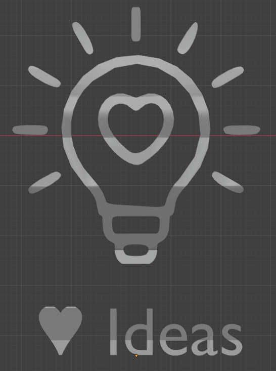
Since I had to create a portrait, one of the sides had to be a portrait. The other one however was free for me to choose from. I initially thought about the text/logo of Intro to IM, and a few other things, but in the end settled on a lightbulb-heart combo, representing my love of innovation and creativity.


# Implementation

## Finding and Modifying Images

One way to create such a 3D model, is to take 2 flat surfaces (eg. images, flat models, text, etc), extrude them (add thickness), and then use a boolean intersection operation (this creates a shape only where the previous 2 intersected). There were 2 ways I could go about doing this. I could try and do them entirely using p5, but that would take a lot longer, since it wasn’t really built for this work. Or alternatively, I could use standard tools like a vector editor (in my case, I choose Inkscape) & a 3D editor (eg. Blender) to get it done much faster. Due to the aforementioned time constraints, I choose the later, but only since I knew that I could recreate this entirely in p5.js if I needed to, so I wasn’t “cheating”.

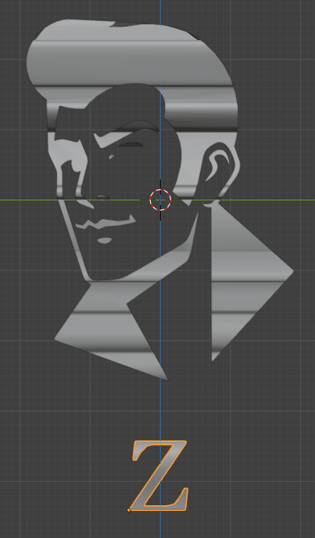
Now, the first thing I needed was a portrait, and a lightbulb-heart thingy. I thought about making them myself, but after browsing around for a while, I found a few images that were close to what I wanted.

A stock image of a face.
Face (from alamy.com)
A lightbulb with a heart
Lightbulb-heart (from iconfinder.com)


I converted the face into a vector format, and then edited it to suit my liking more. For example, I cropped it, removed the holes, cleaned it up, and I obviously didn’t like that he had a cigarette, so I tried manually editing the vertices, which to be honest makes his mouth look a bit wonky 😅, but it’s workable.


I also did a similar thing with the lightbulb-heart thingy (gosh, I have to stop calling it that), and got this:


## Creating the 3D Model

After this, I imported them into Blender, and oh, boy oh boy, this took up most of my time. For some reason, it was pretty hard to get the SVGs into the right format. When you import an SVG in Blender, it (in recent versions) gets converted into a Grease Pencil object (a type of 2D animation), but the format we need it in is a mesh (a 3D object). Unfortunately, there’s no direct route.

Blender, showing the options to convert the Grease Pencil object
Why no mesh?!

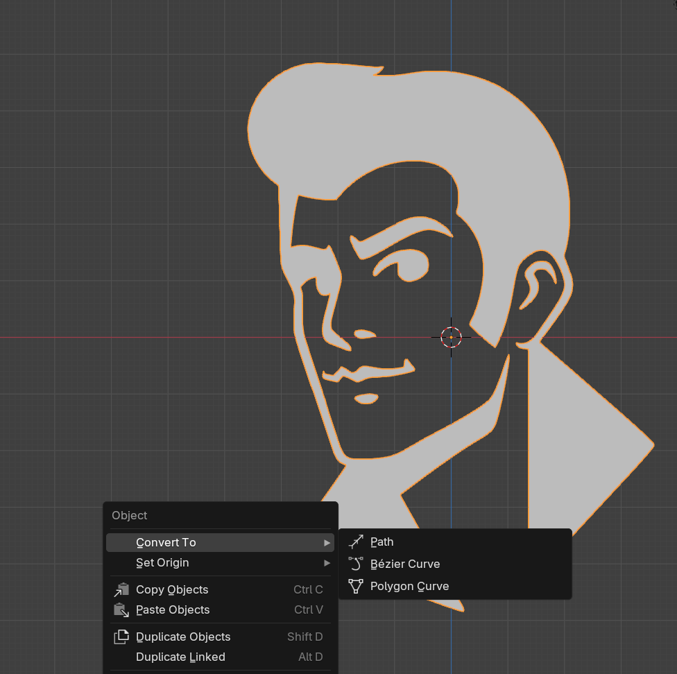
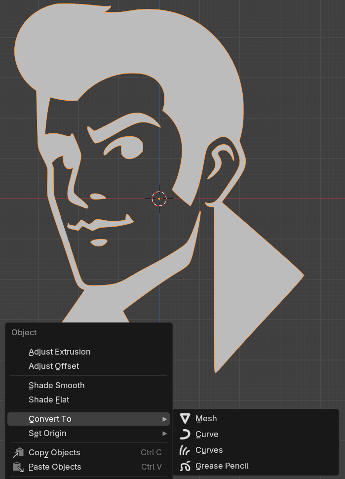
Luckily, I found out that you could first convert it into a curve, and then into a mesh. Simple enough. The issue is, is that it didn’t work for me. I spent a long time struggling with this, until I realised that after I had converted it, I still had the original Grease Pencil object selected, as Blender had created a new curve object, instead of converting the existing one 🤦‍♂️. After I selected the right one though, it was finally there!

Blender, showing the mesh option
Finally!!

I won’t get into the specifics, but basically I cleaned it up again (to remove some vertices, as the lower the number, the smaller the filesize and loading time, something we’ll get back to) and extruded it (solidify). Then, I did a similar thing with the lightbulb-heart thingy (gosh), but this time made multiple copies, since I had to “poke holes” for the center floating heart to come through.

Blender screenshot showing issue
An anchor issue

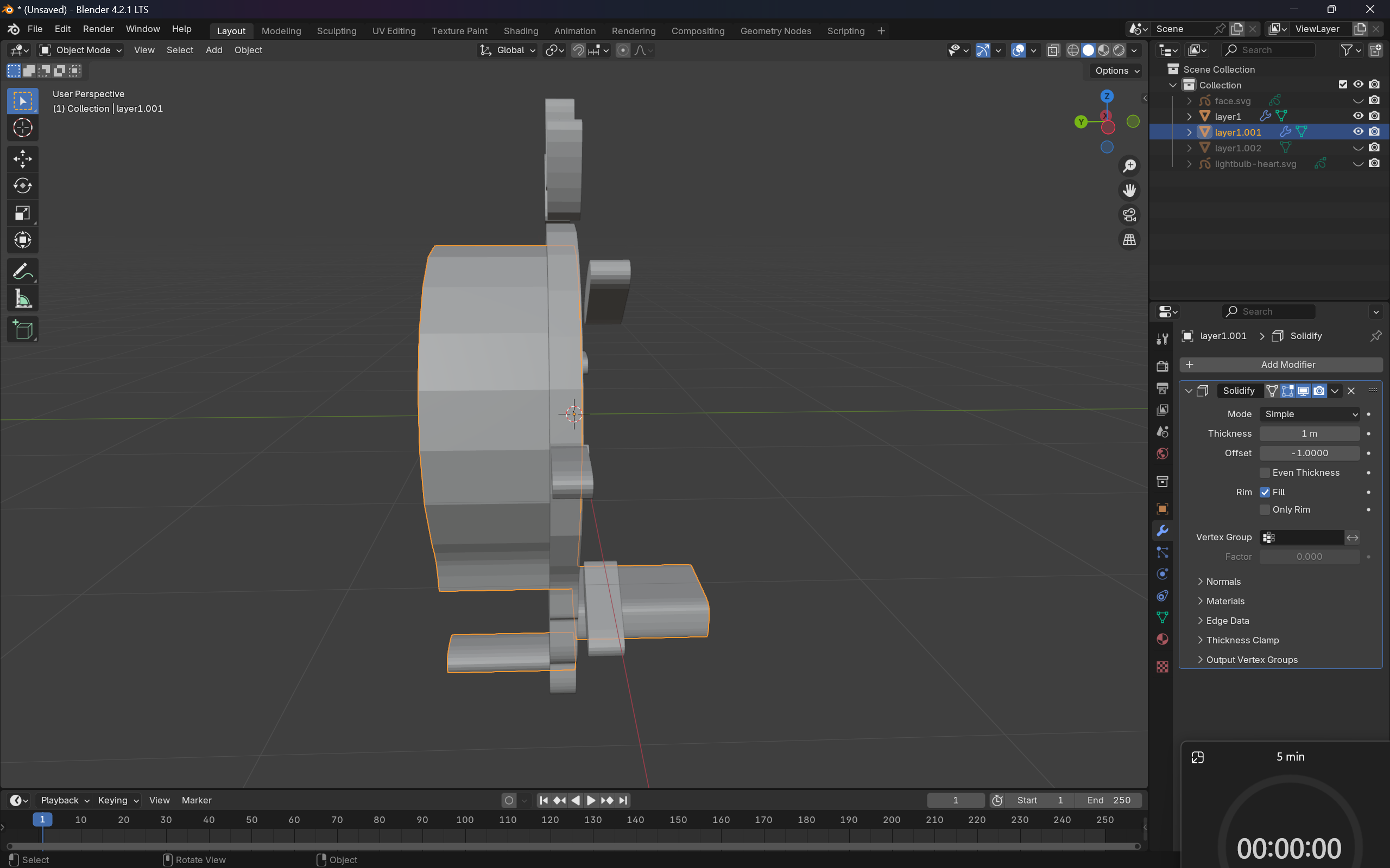
There were a few more issues I had to fix, such some missing vertices for the hair, some of the elements being extruded to the wrong side (as seen above, probably due to the orientation of vertices (clockwise vs anticlockwise) or something), an incredibly annoying one about the face’s vertices not connecting (since I edited them, even though I definitely felt like I connected them), etc.

After resolving all that, I ended with proper model!

Blender screenshot
The model from an angle
Blender image of face after operations
The model (from straight, “head on” :D) Though an eye is nearly gone…
Blender screenshot
The model from another straight side

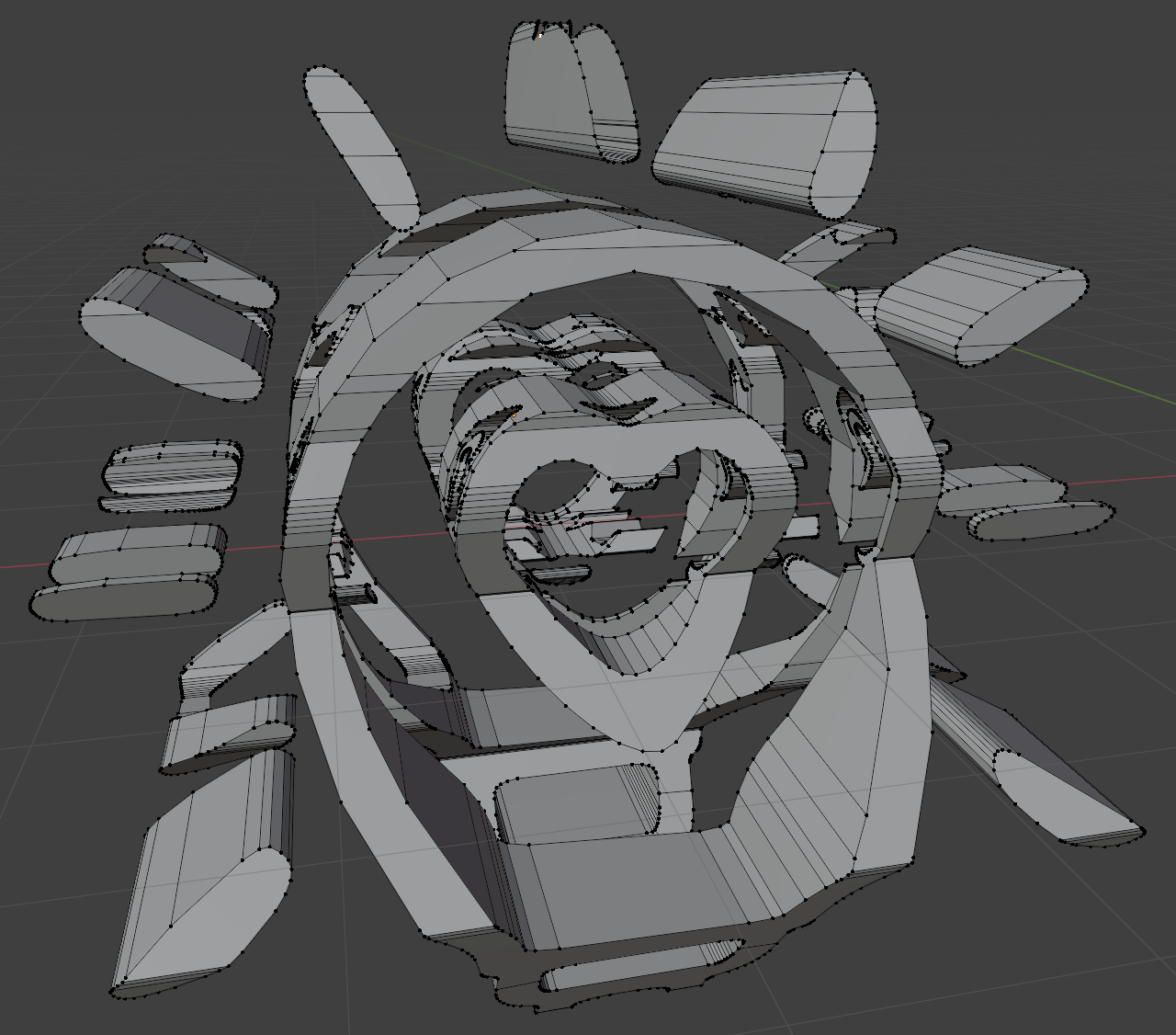
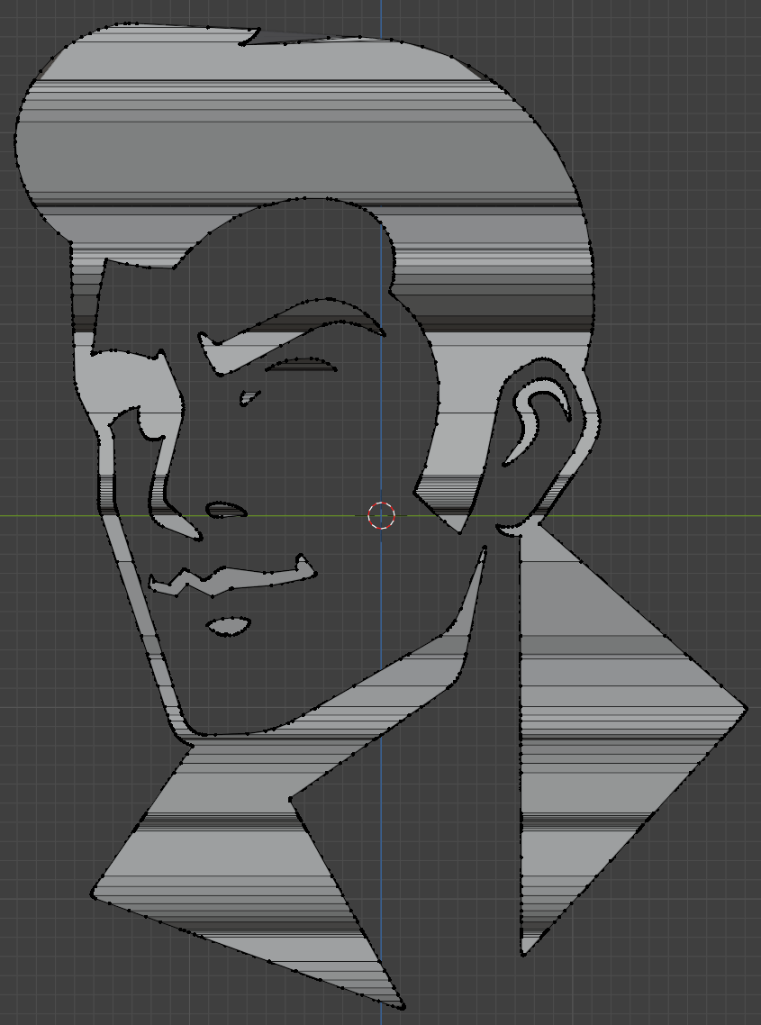
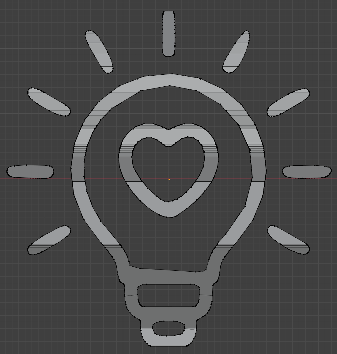
The model appears garbled from other angles, but clearly forms a face or lightbulb from a particular angle. Isn’t that so cool?!

I then thought about adding a caption, which is also double sided, and followed this tutorial (which showed the same steps), resulting in:

Blender screenshot
The model, face side
Blender screenshot
The model, lightbulb-heart side

I wanted to portray the double sided meaning, by expanding or peering into the mind of the person. I wish I could’ve chosen something much more creative, but since I lack anything close to representing an artistic ability, I settled with “Z ♥ Ideas” (since innovation or creativity felt too long to fit in there).


## Creating the Sketch

This brings me to the next challenge of trying to bring it into p5.js. Boy oh boy. *deep inhalation & exhalation*. The first, unexpected, challenge was trying to import it into p5.js. I didn’t expect this to become a challenge, but for some reason, I just could not upload anything to the website. In fact, the entire menu wasn’t functional! (yes, I tried rebooting, relogging, etc, multiple times across multiple days)

p5.js menu
What are you for?? Decoration?!

The menu that did work, was the Sketch one, but that only allowed creating files and folders.

p5.js menu
Well, at least this works…

No issue then, I thought I’ll just create a file named model.obj or something, and copy paste the entire contents of the file into it (since obj is a text based format).

p5.js file naming restrictions
p5.js’s file naming restrictions

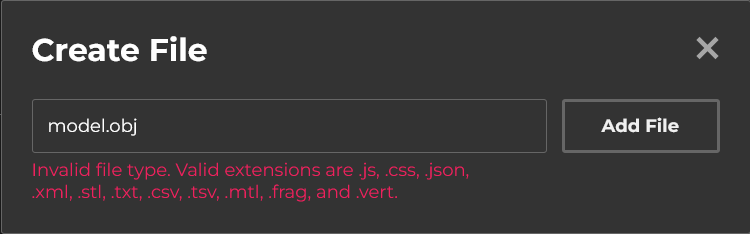
*Sigh*. p5.js only allows us to create a file with a limited set of extensions. Fortunately, we can rename files and change the name (and extension) to anything, so yay!

I also tried hosting the files locally using a webserver and fetching them from the website (which somehow worked, code below), but alas, I didn’t find a way to save the files directly, so my option was to copy and paste from the console, which didn’t provide any benefit.

function setup() {
  
  let models = [
    "test 3.stl",
    "test 0.obj",
    "test 0.stl",
    "test 1.obj",
    "test 2.obj",
    "test 3 (ASCII).stl",
    "test 3.obj"
   ]
  
  // Fetch the models from my computer and print them in the console
  for (let modelName of models) {
    fetch(`http://localhost:5500/models/${modelName}`)
      .then(res => res.text())
      .then(txt => print(`\n\nModel: ${modelName}\n`, txt))

      // Then I would manually "Copy Object" of a response (eg. test 0.obj), create the file "test 0.obj.txt" (since only a few file extensions are allowed, and for some reason obj isn't on that list), then paste the contents, then rename the file to remove the ".txt".
  }
}

(the code above also hints at multiple models, something I’ll revisit)


In fact, I actually gave up and continued on my local machine (using VS Code, with the p5.vscode extension, and npm http-server package, since I didn’t want the page constantly refreshing due to the model taking time to load), but I did later on manage to get the model on the website. After writing some quick code, I can see that… woops. The model isn’t the correct way around.

vscode and p5.js sketch, with model upside down
It’s upside down!

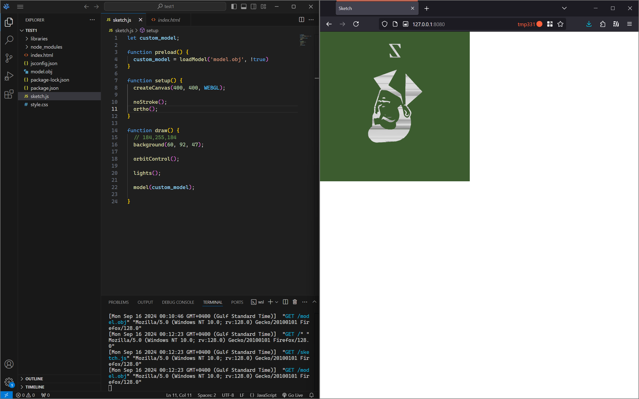
I was sort of expecting this, due to having a (very, very ) limited amount of experience with similar stuff. However, I did not expect how difficult it would be to get it the right way around!

I nearly went mad, trying out over 36 different combinations of exporting the model. In short, none of them worked, so I ended up switching tactics, just sticking with one orientation, and modifying the model directly in Blender (you might be wondering why I didn’t just rotate it in p5.js, and while that certainly is an option (and in hindsight, maybe the smarter one due to saving time), that might have caused issues later on down the line, and didn’t feel as “correct” or “clean”). I tried many more times, and skipping over all that, I, FINALLY, got it working correctly.

model
FINALLY!

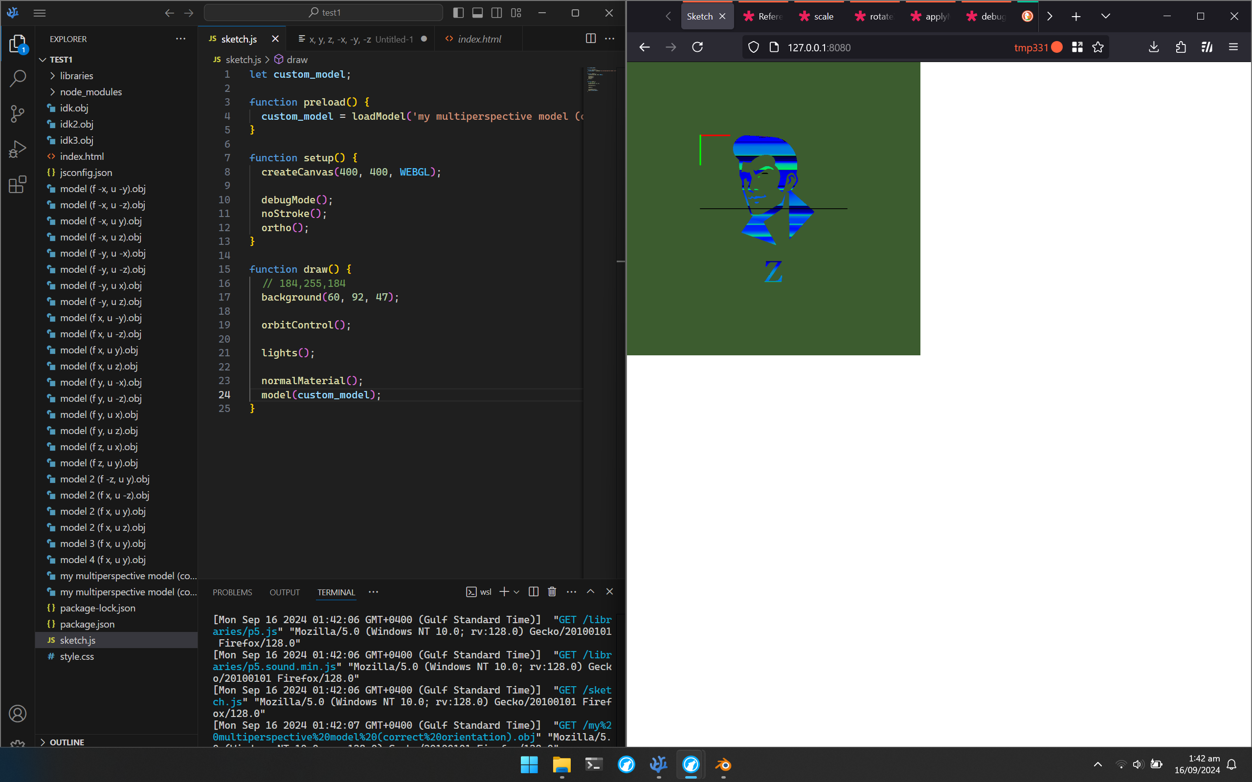
(the normal material was just to help with the orientation, though I don’t know if it actually did, or just made me more confused 😅. debugMode() was to provide the grid and axis indicator. Also, you can see some of the insanity in the small number of models shown here)

However, the model in Blender is now misaligned😅. Anyways, I got that done. Yay -_-.

### Testing performance

Now, I noticed that loading the model took a pretty long time, so I wanted to reduce the size of the model, in order to make the sketch load faster. I assumed it would, but I also wanted to test it (for some reason 🤷‍♂️).

To do so, I added the line:

let startTime = new Date();

And then added this as the first thing in setup() (since I loaded my model in preload(), which runs before setup()).

print(`Finished loading model in ${(new Date() - startTime)/1000} s`)

And these are the results I got:

Model Time 1 (s) Time 2 (s) Time 3 (s) Time 4 (s) Time 5 (s) Avg Time (s) Avg Time, excluding extremes (s)
Original 10.167 6.850 17.533 28.484 1.783 12.963 6.910
Optimised 1 10.850 5.366 4.933 4.683 0.767 5.320 2.996
Optimised 2 2.533 4.133 16.083 0.850 0.750 4.870 1.503
Optimised 3 9.566 5.400 3.300 23.067 0.400 8.347 3.653

Basically, the more optimised it was, the lower the number of vertices it had, and the lower the file size. You would logically expect the most optimised one to load the quickest, but surprisingly, that wasn’t exactly the case. While it did have the shortest time, overall, the times are scattered all over the place, and wildly inconsistent (probably due to caching, traffic/load and server availability, etc), so a much, much larger number of samples are needed to determine anything with statistical significance. Regardless, I went with the most optimised one, just out of theory and kindness too (why put extra burden sending unnecessary bits), but it does unfortunately look the worst (due to having a lower resolution, but I hope the difference isn’t much).

### Brief Explanation of Some Code

Now, a brief explanation of some of the code.

I loaded the model using loadModel() (passing true as the second argument, normalises the model)

customModel = loadModel('perspective model.obj', true)


Then I initialised the first camera by doing the following

// Initialise camera, and point to the 1st side (face)
  faceCam = createCamera();
  faceCam.ortho();
  faceCam.setPosition(0, 0, 800);
  faceCam.lookAt(0, 1, 0)

.ortho() sets the camera to be orthographic, and .setPosition & .lookAt are self-explanatory, but they position the camera to point to the face. I set up the 2nd camera similarly, and then have a main camera.


I’m able to resize the canvas to the maximum size (while maintaining a square aspect ratio) by:

let windowSize = windowWidth > windowHeight ? windowHeight : windowWidth
resizeCanvas(windowSize, windowSize)

… which corresponds to:

if (windowWidth > windowHeight) {
  resizeCanvas(windowHeight, windowHeight)
} else {
  resizeCanvas(windowWidth, windowWidth)
}


Now, I’ve also added a cool little entry animation, which causes the model to bounc-ily(?) grow and rotate till its final size, by doing the following

if (frameCount < enterAnimationFrames) {
  rotateY(lerp(0, TWO_PI*2, easeInOutElastic(frameCount/enterAnimationFrames)));
  scale(lerp(0, 1, easeInOutElastic(frameCount/enterAnimationFrames)));
}

In the code above, I interpret the scale from 0 to 1, and Y rotation from 0 to 4Π, according to the elastic ease in and out, which I found from easings.net


Similar to lerp (which stands for linear interpolation), there’s also slerp (a special spherical version), which I use in a similar manner to smoothly transition the camera to the first and second sides when the user presses ‘1’ and ‘2’ respectively.


Lastly, I just draw the model

// Draw custom model
fill(64, 112, 112);
model(customModel);


That’s mostly it. Anyways, without further ado, I present, the final sketch!


# The Final Sketch

Controls:

  • Mouse drag: Orbit camera
  • Mouse scroll: Zoom
  • 1: Face the face 😀
  • 2: Face the light bulb


# Additional Thoughts

I had planned to also some nice rustling orange leaves and ambient music, alongside an option with the model on a 3D background, but that unfortunately had to be cut due to time (alongside a huge portion of what I wanted to tell on his blog).

Additionally, I would like to implement the orbital controls myself, so that I can properly restrain the camera from going too far or crossing (flipping) over, improving the user experience, as well as add buttons to switch to the 2 views (in addition to the current key shortcuts).

Also, I would’ve liked to actually move parts of the model, so that it could transition between different states.


I know you’re really enjoying reading such a long post, but fortunately or unfortunately, that’s all the time I’ve got, so we’ll have to end it here. Until next time!

That's all Folks!
That’s all Folks! (from Wikipedia)

Week 4 – Reading Response

The Psychopathology of Everyday Things by Dan Norman was an interesting read as it caused me to deeply analyze the very mundane interactions I have with everyday objects in my life. The “Norman Door” phenomenon highlighted an interesting problem that I found to clearly illustrate the importance of addressing usability in what we design. It is a very common (and embarrassing) experience to walk into a glass door or continuously pull an unmarked push door. But if that is the case, if this issue is so prevalent, why aren’t we doing more to fix it? Two hours ago, I might’ve said because that’s just life, and walking into a very clean glass door is sometimes exactly what we need to stay humble. However, after reading Norman’s critique of these confusing designs, I’ve realized it doesn’t necessarily have to be our life.

After doing a bit of googling and further diving into this Norman door concept, I was reminded of the most frustrating design feature I’ve ever come across. If anyone lives in a NYC apartment, or any urban apartment building, they may be able to relate. Most of the time, these building are designed with a lock on the front door to your building and then another lock to your apartment. Many of these apartments will often have one key (for both locks) where one side of it opens building and the other opens your apartment. A common user error is to insert the wrong side of the key into one lock when it should be the other. (I know this sounds a bit confusing, try to imagine something simple, I’m overcomplicating it a bit) After 8 years of living in the same apartment I still sometimes insert the key the wrong way and believe there has to be a better way while still having to only use one key for both doors.

My proposal is that there is some kind of tactile imprinted indicator on each side of the key that tells you which side to use. My key personally is different colors on each side so in theory it should be very straightforward on which side to use but somehow I still couldn’t tell you which one is right (it also doesn’t help that the colors are not uniform for all copies of the key, so you have to memorize multiple combinations). If there was a small “F” for front door, and an “A” for the apartment door, I think even that would help. This may be too simple of a signifier but I think even a raised dot on the front door side and nothing on the apartment door side would help (so you could feel for it in your pocket as your approach the door instead of fumbling around at the front door.

I believe all of Norman’s principles of design are applicable in interactive media because they enhance the interactive experience between the designer and user. Not only does his focus on discoverability clearly correlate to a seamless experience for our user’s, but it reminds us as designers that we can only view our product with the end in mind, while the user’s are the opposite. I conceptualized this a bit more with what it’s like to put together a pen. If you’ve just taken it apart, you remember where every piece goes, and exactly how the pen should function; but if you’ve just been given a bunch of part and told it should make a pen it might be a bit more difficult to assemble.

This also leads me to discuss Norman’s conceptual modeling idea. I think an effective way to gauge your usability is to test this model with someone else. For every project we’ve done so far I usually send it off to my friend’s or my mom with a set of instructions on what they should do in order to generate activity. However, in the future I might just try and show them without any guidance and see what they are able to discover. This works an indicator for me as to what mapping makes sense and what does not. Although implementing all of these ideas is far easier said then done, this reading, in conjunction with the ideas from the previous week about what interactivity truly means has me excited to create a well rounded product that hopefully incorporates most of these standards.

Week 4 – Generative Text; Shakespeare

Week 4 – Generative Text

CONCEPT:

I recently re-read one of my favorite Shakespearean plays, The Merchant of Venice. When it came time to start my assignment, I knew I wanted to create something related to Shakespeare. I began by searching for “Shakespeare datasets” online and clicked on the first link I found on Kraggle.  The vast amount of data available was overwhelming, and I realized I could approach the project in many ways. After experimenting with different methods for generating text, I ultimately decided to focus on extracting character lines. A user selects a play, a character from that specific play, and then a line at random is generated.

CODING:

I did find this assignment challenging, as working with APIs is something I am not familiar with. Funnily enough, I spent time focusing over a silly mistake, wondering why my code was not working – it was because I had forgotten to upload the actual file into p5.js. 

I was unsure on how to get started, therefore I took to p5.js – Table for aid. From there, I learnt how to upload my data.However, I faced several issues in terms of uploading the file because it was colossally over the file size limit, so I had to spend a lot of time cutting 3 to 4 plays out of the file in order for it to be of a decent file size.

However, during my coding, I came across an issue. The character lists were not showing up on my dropdown list. After several attempts of testing and Youtube videos, I took to ChatGPT to give me help. It then told me although I was populating the ‘play’ dropdown in the setup() function,  I wasn’t updating the character dropdown when a play is selected. To fix this, I needed to add an event listener to the playSelect dropdown that will update the characterSelect dropdown whenever a new play is chosen. I asked it to explain the logic of the task at hand and I was finally able to understand. I created a new function called updatecharacterselect() — which basically  dynamically updates the character dropdown menu.


function generateRandomLine() {
  selectedCharacter = characterSelect.value();
  if (selectedPlayName && selectedCharacter && characterDialogues[selectedPlayName][selectedCharacter]) {
    let lines = characterDialogues[selectedPlayName][selectedCharacter];
    randomLine = random(lines);
  }
}

REFLECTION.

Perhaps, if I were able to expand on this, then I would add further levels of interactivity and make it a bit more aesthetically pleasing.

Reading Reflection – Week 4

I really liked the reading, especially how the author structured the idea and the definition of good design. The funny stories, facts, and pictures (Coffeepot for Masochists by Jacques Carelman actually made me laugh for a moment), in my opinion, positively impact any type of written work, and this is just something I wanted to point out. With these elements, even a long reading can become interesting and fun to read.

This chapter includes a lot of good points, many of which I highlighted while reading, but there are so many that it would not be possible to fit them into 2 paragraphs, so I will talk about what ideas came to my mind as a reflection of what I read. First of all, I really liked the statement that if the design is so confusing that you need to check the manual, and after that, you still struggle to figure out how the thing works, then the whole purpose of the design is lost. I completely agree as I experienced similar situations so many times in my life. One of the most recent happened when I was staying in a hotel in Uzbekistan for a couple of days. It is worth mentioning that it was a top-level hotel with a widely recognized brand name, so maybe that is why they had a very, very sophisticated AC system. I came to the hotel extremely tired after the flight and the car trip, so I just wanted to turn on TV, relax, and maybe even sleep a little. It was quite hot, and I decided to turn on AC, but there were so many buttons on the panel as well as so many indicators on the screen that I simply could not figure out what to do. Manual was not in the room, and I was too lazy to call the reception (besides, who am I not to handle the AC myself and call for help), so I spent quite a lot of time figuring out the brand and the batch number of the AC to find the manual on the Internet, and then figure out how to set the proper mode and temperature. As a result, I put so much effort into it that I did not want to sleep anymore and was very annoyed by it, so I decided to go out and eat… Uzbekistan is a pretty hot country, especially in the summer, so I appreciate the efforts of hotel management to provide their customers with the best ACs, but I think it is worth leaving the printed copy of a manual in the room. And as for AC manufacturers, they should definitely read this book…

Another thing that I liked from today’s reading is the idea about the paradox of technology. We have invented so many sophisticated devices and objects and not less sophisticated software for them that sometimes it can be too much. Regarding that, I also want to highlight the importance of understanding how the brain of young people is used to all those technologically advanced things. For me, figuring out how to set up the settings on the newly bought smartphone would not make any problem. Not because it is so easy, but because I am facing technology every day by using electronic devices to read, work, study, rest, and many other things. However, if you take my grandma or even mum, it will be a challenge for them to figure out what works, with what purpose, and how exactly should it be set up and used.

Lastly, with regard to my future projects in Interactive Media, I will definitely do my best to make my projects as transparent as possible to the users. Transparent does not mean they will be simple and silly, but rather they will be well-designed. They will be discoverable and understandable, and to achieve that, I will try to think from the perspective of a person who just came across my work instead of assuming that if it seems simple to me then it should seem simple to everybody. This class as well as others teach us how to understand technology, but our goal if we create something for other people is to understand them. If we achieve that goal, interaction with our work will be a pleasurable experience even for those who do not anything about the technology.

Assignment 4 – The World Airports

Since my early childhood, I have loved to fly. It was always an exciting moment for me to board the plane as it promised me the upcoming trip. In anticipation of adventures, I always wondered how often I would travel when I became an adult.

Now, I still love to fly, and I do it much more compared to my younger self. Nevertheless, my feelings are still the same whenever I enter the airport. These moments are quite fascinating to experience, so to remind myself of them, I decided to dedicate this small assignment to the airports.

Data Search and Code Implementation

Finding the data about the airports was not as challenging as I expected. Although I could not find it at first, and the websites that I tried to download it from were blocked for some reason, I immediately decided to look for the data on GitHub, and I found it relatively quickly. Thankfully, it was already pretty organized, so I did not need to edit the file in any sort of way. Just to familiarize myself with how data upload in p5.js works, I watched the videos of TheCodingTrain from this playlist.

As my favorite time to catch a flight is night, I decided to make the background black and the ellipses representing the airports yellow. I used the wonderful function map() in my previous assignment, so it was fairly easy for me to implement it here to adjust the longitude and latitude to the dimensions of the canvas (to x (width), and to y (height) respectively).

The part of the code that I am proud of the most is the design part. To make some add-ons, I decided to add the ability for users to look for the airports in the specific country by inputting the 2-letter country code (my CSV file had the column dedicated to it). For that, I decided to add the input window, format it in a way to correspond to the colors of my sketch and make the ellipses change color and grow in size if the airports are stated under the country code name in the file. I also decided to implement the console text output by adding the button. When the user types in the country code and clicks the button, all the names of the airports inside that country are displayed in the console. The button is also very well designed thanks to the functions mouseOver() and mouseOut().

    // if user input the existing country code, highlight the airports in this country with green
    if (country_code === input_country_code) {
      fill('rgb(0,255,0)');  // Green for matching airports
      noStroke();
      ellipse(x, y, 2, 2);
    } else { // by default all yellow - nice color reminding of the night flights
        fill('rgb(255,255,95)');
        noStroke();
        ellipse(x, y, 1, 1);
    }
    
    /* if (dist(mouseX, mouseY, x, y) < 5) {
      console.log(one_airport_name) 
    } */ // idea of displaying airport names when pointing at them on the canvas
  }
}

function show_airports() { 
  
  console.log('Airports in this country:');

  // If user not only input the country code but also pressed the button, display the names of airports in this country in the console
  for (let j = 0; j < airportsCSV.getRowCount(); j++) {
    let iterating_country_code = airportsCSV.getString(j, 'country_code');
    let iterating_airport = airportsCSV.getString(j, 'airport');
    
    if (iterating_country_code === input_country_code) {
      console.log(iterating_airport);
    }
  }
}

function highlight_button() { // changing style of the button when mouse is over it
  button.style('background', 'rgb(255,255,95)')
  button.style('color', 'black')
  button.style('border', ' 0.1px solid rgb(0,255,0)')
}

function default_button() { // default style, whenever the mouse is not pointing at the button
  button.style('background', 'black')
  button.style('color', 'rgb(255,255,95)')
  button.style('border', ' 0.1px solid rgb(255,255,95)')
}

Conclusion

Honestly speaking, I did not enjoy this assignment as much as I did the previous ones. This assignment was quite straightforward in some sense, and, in my opinion, visualizing data is not as cool unless you know the advanced-level programming that can help you make art out of the letters and numbers. Nevertheless, I liked working on my sketch, it gave me a nice perspective on how to combine working with data and coding in p5.js. I also learned how to work with text input and output, so I am happy with the result I have.

To further improve my work, I was thinking of displaying the name of the airport whenever a user points with the mouse at it. I even started coding it, as you can notice if you look at my code (I used // for some lines, but you can remove // to see how it works), but for the sake of time, I decided to leave this idea for the future. I also had some ideas in my mind, for example, adding the zoom-in/zoom-out options, or maybe even adding some animations of planes flying from one airport to another. I also thought about visualizing the busyness of the airport by making the busier airport look different, but I decided that it would be too much as I wanted to stay minimalistic.

Overall, it was a nice assignment, maybe not as creative as the previous ones, but also very useful! Can’t wait to start working on my midterm project!

Week 4 – Reading Response

Don Norman’s “The Psychopathology of Everyday Things” presents compelling principles for effective design, emphasizing the importance of discoverability, understanding, and human-centered approaches. As I reflect on these concepts, I’m struck by how often I encounter poorly designed objects in my daily life.One item that particularly frustrates me is the standard TV remote control. Despite being a common household device, many remotes are poorly designed and frustrating to use. They often have far too many buttons, many of which are rarely used. Frequently used buttons like volume and channel controls are often not prominently placed. Using a remote in low light is challenging due to lack of illumination, and many buttons have cryptic labels or icons. Applying Norman’s principles, this device could be vastly improved by reducing the number of buttons, prioritizing essential functions, adding backlit buttons, and using clear, intuitive labeling. These changes would enhance both discoverability and understanding, ultimately improving the user experience.

When considering how Norman’s principles can be applied to interactive media, several key areas come to mind. Visibility and feedback are crucial in digital interfaces, where users need clear indications of what actions are possible and immediate responses to their inputs. For example, in a mobile app, important functions should be easily discoverable through prominent placement or intuitive icons. Feedback could be provided through animations or haptic responses, confirming user actions. The principle of constraints is particularly relevant in interactive media, where guiding users through complex processes is often necessary. This could be implemented through progressive disclosure of features or contextual help systems. Additionally, maintaining consistency across different sections of a digital product and adhering to established design patterns can significantly enhance usability. By focusing on these human-centered design principles, interactive media can become more intuitive, efficient, and enjoyable to use, ultimately leading to better user experiences and increased engagement.

Week 4: Who or What is Perlin?

Concept
I have always been fascinated by ASCII art and how simple characters can create complex images. But I wanted to take it a step further. What if we could make ASCII art that moves and changes color? That is where Perlin noise comes in. By using noise to determine both the characters and their colors, we create a living, breathing ASCII landscape that is very satisfying  to watch. The idea is simple: we divide the canvas into a grid of cells. For each cell, we use Perlin noise to choose an ASCII character and a color. As time passes, the noise changes, making our ASCII world shift and flow like a colorful river of text.

Code snippet
The heart of this project is how we map noise values to both ASCII characters and colors. Here is the snippet I’m most proud of:

const noiseVal = noise(x * 0.01, y * 0.01, frameCount * 0.01);
const charIndex = floor(map(noiseVal, 0, 1, 0, density.length));
const asciiChar = density.charAt(charIndex);
const hue = map(noiseVal, 0, 1, 0, 360);
fill(hue, 100, 100);

This bit of code is doing double duty. It’s using the same noise value to pick an ASCII character and determine its color. I was able to achieve a perfect harmony/balance between the texture of the characters and their hues.

Sketch

Reflection and ideas for future improvements
I’m pretty happy with how this turned out, but there’s always room for improvement. The main issue I’m facing is performance. If I try to add more features or increase the resolution, things start to get laggy real quick.

Looking ahead, I’ve got a few ideas how I can improve this sketch:
First, I want to optimize the code. Maybe I could use a buffer to draw the ASCII characters once and then just update the colors each frame. This would cut down on the text rendering overhead. I’m also thinking about making the cell size dynamic. Imagine if the cells got smaller when you moved your mouse closer, and smaller if mouse far away. That will add more interactivity and will help to make this sketch even more dynamic. Lastly, I’d love to experiment with different noise algorithms. Perlin noise is great, but there are so many other types of noise out there. Each one could give a unique character to the ASCII landscape.

Reading Reflection – Week 4

That light switch placement in the dorm bathroom really gets on my nerves! Every time I go in there, I end up smacking the mirror instead of hitting the lights. It’s such a small thing, but it makes a big difference in how frustrating it is to use the bathroom. The switch is so close to the mirror already – why not just move it a tiny bit closer so it’s the first thing your hand hits? This seems like a perfect example of Norman’s point about the importance of mapping and natural positioning of controls. A little more thought about the user’s actions could have made this design so much more intuitive and less annoying.

The shades in the NYU New York dorms are another headache. These shades consist of multiple connected panels and have a seemingly simple string mechanism for opening and closing. However, the actual operation is far from intuitive or user-friendly. You have to pull the string sideways and then up or down, but it doesn’t always work right. Sometimes you end up doing a little dance just to open or close them. What’s more, if you try to open or close the shades too quickly, the individual panels start rotating as crazy instead of moving up or down. Why make it so complicated?

Norman’s principles could definitely be applied to interactive media design. In my other class, we’re struggling with how to show users which objects on the screen are clickable. Should we add a glow effect? An outline? Following Norman’s ideas about signifiers, we need clear visual cues to indicate interactivity. But we also don’t want to clutter up the artwork. It’s a tricky balance.

I like how Norman emphasizes the importance of feedback. With digital interfaces, it’s crucial to give users immediate confirmation that their action worked. Even a slight delay can be confusing. In our comics, we’re trying to add subtle animations or sound effects when objects are clicked. The trick is making the feedback noticeable but not distracting from the story.

Overall, the reading made me more aware of design choices all around me. I’m noticing signifiers and affordances everywhere now! It’s a good reminder that even small details can have a big impact on usability. As we create digital experiences, we need to really think through how users will interact and understand the interface. Good design isn’t just about looks – it’s about creating an intuitive experience.

Week 4 – The Design of Everyday Things : Chapter One

This reading made me realize just how imperative the ‘human’ aspect of things comes into play when it comes to interactive design. As I reflected on the chapter, I found myself connecting the concepts to my own experiences with technology and design.

The author’s emphasis on discoverability and understanding resonated with me deeply. I’ve often purchased products and I couldn’t figure out what to actually do or how it’s done without reading the instructions manual first. It made me appreciate the importance of intuitive design that communicates its functionality without requiring extensive instructions or manuals.

I found the writer’s descriptions of engineers and their thought process during production to be quite intriguing, as I had not thought of things that way before. The chapter delves into the failings of machines due to the way certain engineers think – logically. In terms of failings, I am referring to the I learned that they often assume that the audience of their product or project will think like them or read the instruction manual. This is where they fall short. I came to understand that they struggle to grasp the idea that we all think so uniquely, and therefore, designs need to be adapted into a language that can be universal yet enjoyable enough to use. Which made me understand that this failing bleeds into the actual production of the gadgets, hence why it is not received the way they hand in mind.

As I came to learn of these concepts, I found myself looking at the designed world around me with new eyes. I started noticing how certain designs naturally suggest their use, while others require explicit instructions. This awareness has changed how I interact with and evaluate the design of everyday objects and digital interfaces. For example, the doors in D2 are just abysmal. Although they have a sensor, where if you wave at it then it opens the doors – it doesn’t always work, and I actually have to manually open the door like a jester. Although I am unsure if this fault is due to some technical thing, or a lapse in judgment, it is a problem that has existed since freshman year.

This new perspective isn’t just changing how I look at things; it’s changing how I create them too. Whether I’m putting together a presentation or organizing my workspace, I’m now thinking about how to make things clear and intuitive for others. It’s like I’ve been given a new set of glasses to see the world of design through.

Reading Reflection – Week 4

Don Norman’s arguments on affordance, discoverability, and communication offer a compelling and analytical perspective on how interactive objects should be designed. Unlike readings such as “The Art of Interactive Design,” which tend to focus more on the finished product, Norman delves into the intricacies of poorly designed objects, analyzing the root causes and suggesting improvements. His credibility as an engineer strengthens his arguments, as he understands both the technical and human aspects of design. This raises an interesting question: if a professional fictional writer presented the same solutions, would they carry the same weight? This reflects the importance of practical experience in validating design solutions. I relate to Norman’s critique of poorly designed objects; for example, VR/AR goggles often suffer from an imbalance that makes them front-heavy. Redesigning them to be lighter would significantly enhance the immersive experience. This demonstrates how affordance and ergonomics directly impact the user experience.

In discussing the “Paradox of Technology,” Norman argues that as technology becomes more functional, it becomes harder to learn. I agree but question the extent to which this should be solely a designer’s responsibility. While Norman emphasizes that engineers should approach design from a non-logical, human perspective, this principle should also apply to the Paradox of Technology. Designers face limitations in simplifying complex functionality, suggesting that the solution lies in ensuring engineers design with the average human in mind, not just other engineers. This point is particularly relevant when considering advanced technologies like Artificial Super Intelligence (ASI). While intended to serve humanity, ASI must be designed to accommodate the everyday user, not just the logical thinker, ensuring it remains accessible and understandable.

Feedback, another of Norman’s key points, is essential in design, as humans are naturally impatient with technology. However, the expectation of rapid feedback, especially in digital interactions, can have unintended psychological consequences, such as increased anxiety and impatience in the extreme usage of  cellphones among young people. While Norman rightly argues that feedback should be provided correctly and appropriately, I contend that excessively fast responses can condition users to expect instant gratification, potentially harming mental well-being. Designers and engineers must be mindful of balancing efficiency with psychological impact, aligning with the principles of Human-Centered Design (HCD).  Norman’s insights on affordance, feedback, and human-centered design are not just applicable but essential in shaping interactive media. Especially in contexts like end-of-semester showcases, where media installations encounter a diverse audience, applying Norman’s principles ensures intuitive and meaningful human-machine interactions.