Week 9 – Reading

Physical Computing’s Greatest Hits (and misses)

This reading was insightful as it helped me to demystify some of my own misconceptions regarding making works that have already been done before. He tells us that it is okay to make something which has already been made before, as long as we apply our own ideas into it – add that unique touch. For example, he discusses a work made in the theme of music instruments. . The examples he shared with us, tells us that while recreating existing projects is a common starting point, it’s crucial for designers to innovate by incorporating their unique perspectives. Key elements for creating meaningful interactions include considering the context and purpose of the interaction, designing physical structures that complement intended use, and developing natural gestures that feel significant to users. Analyzing both successful and unsuccessful projects reveals important lessons: simplicity can be powerful, user experience is paramount, and innovation often arises through iteration. By understanding these principles, creators can develop more impactful physical computing projects, pushing the boundaries of interactive technology while learning from the successes and failures of their predecessors.


Making Interactive Art: Set the Stage, Then Shut Up and Listen

When I read this, I came to understand that an interactive project is a performance. When it comes to the works I make, especially the ones I have made for this class. I often find myself explaining a lot before the person gets to interact with it. But now I came to understand why that can be harmful for the user. Our work itself should be intuitive to the extent where we don’t have to explain anything — if a button is supposed to be pressed, make it approachable. Essentially, the essence of interactive art lies in its ability to engage users without extensive explanation. Just as a well-designed stage set can convey the mood and context of a play before a single word is spoken, an interactive piece should invite engagement through its visual cues, layout, and interface design By minimizing verbal instructions and allowing users to approach the work with fresh eyes, we empower them to become active participants rather than passive observers. This approach not only enhances the sense of discovery and exploration but also opens the door to unexpected and delightful interactions. The joy of interactive art often resides in the process of figuring out how to engage with it, much like solving a puzzle or exploring a new environment. As artists, our role shifts from being explainers to becoming facilitators of experiences. We set the stage, carefully crafting the environment to encourage exploration and interaction. Then, we step back, observe, and listen. This process of watching users interact with our work without intervention provides valuable insights for refining and improving the intuitive aspects of our designs.

Week 9: Reading Response

Articles:

  • Physical Computing’s Greatest hits and misses
  • Making Interactive Art: Set the Stage, Then Shut Up and Listen


In Tigoe’s two articles, he explores the ways in which artists can find inspiration from the work of others, offering both insights and reassurance about the process of building on existing ideas. A particularly compelling aspect of these articles is how Tigoe illustrates the concept of ‘copying’ among artists—not as mere replication but as transformation. He shows that while artists may draw from each other’s work, they often create something entirely new and unique, reshaping the borrowed elements into original expressions. This idea aligns with the well-known notion that artists often remix various sources, juxtaposing them to create fresh, unique works. In interactive art, this approach can ease the burden of starting from scratch, which can be overwhelming and anxiety-inducing. Without inspiration from existing works, artists may struggle to bring their ideas to life fully—unless they are among the rare few who don’t rely on external inspiration at all.

Tigoe discusses various interactive pieces that appear to share certain traits but yield vastly different experiences for the audience, such as ‘Video Mirrors’ and ‘Body and Hand Cursors’. One of my favorite examples is the gloves that produce music when tapped on a surface. This design is not only interactive but fun and highly engaging, embodying the playful spirit of interactive art.

One critical reflection I have is about Tigoe’s reference to the “Scooby Doo painting” example, where he highlights a common mistake among designers: confusing presence with attention. He states, “Presence is easy to sense… but it’s harder to tell whether someone’s paying attention.” I think that in cases where artwork detects a person’s presence and responds by moving, it naturally draws the viewer’s attention, fostering interaction. For instance, in a crowded space, artwork that moves autonomously could spark collective interest, showing how even unintended effects can enhance user experience.

This concept connects with Tigoe’s advice in the second article about avoiding interference with a finished product while users engage with it. I wholeheartedly agree with this perspective, and I believe it’s an essential practice to adopt in designing interactive experiences. Even if I don’t incorporate this approach all the time, it’s a valuable insight I’ll certainly keep in mind.

Week 9: Reading Responses

Physical Computing’s Greatest hits and misses

Here the article describes the various projects seen from interactive media design ranging from instruments design with gloves or pads to reactive art with various sensors or computer vision. Although the author describes these project as common themes amongst physical computing courses, they do not disregard or look down upon the repetitive theme because to them each project brings with a unique idea and innovated process. For me, reading his opinion on this issue brings me comfort because I have been trying to brainstorm ideas for the final project for IM and with each idea, I fear it isn’t original or creative enough. Of course, I would not copy another’s work, however I feel the art I have seen and interacted with has shaped my ideas and influenced my creative thinking process. I believe everyone is shaped by the world around them, so I think it is cool to see how people can reimagine a concept and build upon past works.

Making Interactive Art: Set the Stage, Then Shut Up and Listen

The following articles writes about how interactive artist should design their works a degree of intention that allows the users to explore their art, but also leaving room for the user to decide on the art’s interpretation. The author mentions how interactive artist should avoid bluntly telling the user what to do and how to interpret their art. Although I do see the point the author is trying to make, I think there are exceptions where the artist should have the freedom to express themselves the way they want the user to appreciate and experience their art. For example, in activist artworks, oftentimes they shed light to forgotten/ overlooked history, and I believe in these cases, it is critical for the user to understand the concept behind the art to fully be immersed with the artwork. I don’t think the idea of simply setting up the stage and observing user is enough and there needs to be balance of artist intervenes and user appreciation. As such, I feel it okay if an artist feels the need to describe their works. I rather much learn the passion behind the work, than be completely open to interpretation.

Reading Response 6: Norman and Hamilton

Norman:
When I first opened the article titled “attractive things work better”, I was completely unaware that I would leave with such profound insights.
Norman’s premise—“attractive things work better”—initially appears straightforward, but as he dives deeper, it’s clear that he challenges the pure function-over-form mindset often seen in technology and design. Reading his analysis, I found myself reflecting on my own relationship with technology and my understanding of utility, aesthetics, and the human experience in design.

One example Norman uses to illustrate the power of emotional design is color screens on computers. He recalls initially perceiving color screens as unnecessary, a view that aligns with a utilitarian perspective focused on measurable, practical outcomes. However, he soon realized that, despite offering no overt advantage, color screens created a more engaging experience. I can see this reflected in my choice of smartphones, where choosing a sleeker more aesthetically pleasing model is a priority even if the it performs identically to a model that is cheaper but less aesthetically appealing. Though a basic model could perform many of the same tasks, I choose a high-end model because it simply feels right. While utilitarianism would label this decision inefficient, Norman’s work suggests that emotion has its own kind of utility.

An interesting case where Normal emphasizes utility over looks is his example of emergency doors, where design has to be immediately intuitive, especially in emergencies. It’s an example where utilitarianism, focused on maximum efficiency, clearly benefits the user. However, in low-stress situations, attractive designs with aesthetic details enhance the user’s experience. This reflects John Stuart Mill’s “higher pleasures” in qualitative utilitarian philosophy, which suggests that intellectual and emotional satisfaction are inseparable from true utility. Norman’s view implicitly critiques a rigid, form-over-function approach by suggesting that design must incorporate both utility and aesthetics to meet the full spectrum of human needs.

As a student, I see Norman’s work inspiring me to think differently about the intersection of technology, utility, and emotion.  Rather than dismissing emotional design as indulgent, Norman helps us see that “attractive things work better” not because of a superficial appeal to aesthetics but because they engage our emotions in ways that functionality alone cannot.

Hamilton:
Margaret Hamilton’s contributions to the Apollo Program and software engineering are monumental feats accomplished against all odds. Her ability to work under high pressure, to predict and plan for critical failures and her creative thinking made the moon landing a resounding success. At the same time it saddens me how little I had heard of Margaret before this article, everyone always talks about Neil Armstrong or Buzz Aldrin, and famous lines they said while diminishing the ever important work of a brilliant woman.

Hamilton built in a priority task scheduling system and robust error handling which came in handy when multiple alarms threatened to abort the Apollo 11 mission. She also coined the term software engineering, providing more legitimacy to a field which now permeates through every major and minor world avenue. As a woman leading a crucial team in a male dominated field, she broke significant barriers and paved the way for more gender diversity within STEM.
Her legacy extended beyond the Apollo Guidance System, she continued working on error prevention and development of UML  showcasing a lifelong devotion to her field and love for computers.
I am truly inspired by the immense impact that Hamilton has had on the field, contributing to one of humanity’s greatest feats while also shaping how we think of software development today. Her story is a powerful reminder to push boundaries, think creatively and to plan rigorously for every outcome even in the face of insurmountable challenges.


Assignment 6 Unusual Switch

Concept: 

While thinking of unusual switches, the first thing that came to mind was how suitcase locks work. How setting some sort of combination and pressing a button would make that into a ‘password’ that you could repeatedly use to open the suitcase. Inspired and fascinated by the workings of such a simple concept I came up with the idea of mimicking a combination lock but instead using buttons on a breadboard. Although using our hands wasn’t technically a part of the assignment, I do believe that being able to set a combination using the code, and having the circuit only work when the correct combination is entered is a creative switch.
Code Highlight:

Approaching this problem I had to think very creatively about how the Arduino code would work with multiple switches. In the end the best solution I arrived at was setting a lock using the pins each switch was connected to and then checking if each switch pressed in order was one corresponding to its index in the combination array.

const int buttonPins[] = {2, 3, 4, 5}; // Digital pins connected to the buttons
const int ledPin = 13; // Digital pin connected to the LED
int combo[] = {0, 1, 2, 3}; // The correct sequence of button presses (in order)
int input[4]; // Array to store the user's button press sequense
int index = 0; // Keeps track of how many correct buttons have been pressed
bool isUnlocked = false; // Flag to indicate if the correct combination has been entered

void setup() {
  // Set up each button pin as an input
  for (int i = 0; i < 4; i++) {
    pinMode(buttonPins[i], INPUT);
  }
  // Set up the LED pin as an output
  pinMode(ledPin, OUTPUT);
}

void loop() {
  if (!isUnlocked) { // Only check for button presses if the lock is not yet unlocked
    for (int i = 0; i < 4; i++) { // Iterate over each button
      if (digitalRead(buttonPins[i]) == HIGH) { // Check if the current button is pressed
       delay(50) //Small delay to ensure one press is not registered multiple times
        if (digitalRead(buttonPins[i]) == HIGH) { // Confirm the button is still pressed
          if (i == combo[index]) { // Check if this button is the next in the correct sequence
            input[index] = i; // Record the correct press in the input array
            index++; // Move to the next position in the sequence
            delay(500); // Delay to avoid multiple readings from a single press
          } else {
            index = 0; // Reset if a wrong button is pressed
            break; // Exit the loop to start checking from scratch
          }
        }
      }
    }

    if (index == 4) { // If all buttons have been pressed in the correct order
      digitalWrite(ledPin, HIGH); // Turn on the LED to indicate success
      isUnlocked = true; // Set flag to indicate that the lock has been unlocked
    }
  }
}

Demonstration:

The led only lights up when the correct combination is pressed
In this case the correct combination is yellow, red, green, blue for clarity of demonstration.

Week 8 Reading Response

Her Code Took Us to the Moon

Reading about Margaret Hamilton’s work on the Apollo mission taught me a lot about how careful and exact programming needed to be. The mission depended on software, so even a small mistake could lead to failure. This reading reminds me that when working on physical programming projects, I need to pay close attention to every detail. As we move into the hands-on part of the course, I’ll focus on testing my projects carefully, just like the Apollo team used simulations to catch problems early and make sure everything worked as it should.

Norman’s “Emotion & Design: Why Good Looks Matter”

In Norman’s reading, I found it interesting how he connects emotions and looks with how well things work. He says that when something is nice to look at, it makes people feel good, and that makes it easier to use. This idea makes me want to design things that aren’t just useful but also make people curious and excited to try them. Moving forward, I’ll try to add features that make people want to explore, while keeping things simple to use. Norman’s ideas showed me that good looks can improve the whole experience, helping people enjoy and connect with what they’re using.


Week 8: Reading Reflection of McMillian’s “Her Code Got Humans on the Moon…”

Hi there! 👋

Today, I also wanna reflect on McMillan’s article, “Her Code Got Humans on the Moon — And Invented Software Itself” (on WIRED), which was an interesting article, talking primarily about the history and nature of Margaret Hamilton’s work with NASA on the Apollo missions.

However, one thing I didn’t really like about the article was that it hypes her up a lot, often unjustly and by greatly exaggerating. Make no mistake, I’m not going after her. The work she did was invaluable, and the fact that she worked in a time when women often didn’t get these roles is noteworthy, and I applaud her for that. It’s the article I have an issue with.

For example, the title literally says “Her Code … And Invented Software Itself”, which to anyone familiar with the history of computing would know, is a huge stretch, to say the least. Ada Lovelace is widely believed to have written the very first computer program (software), and hence is the first computer programmer (though some believe Charles Babbage should have this title, as he had some writings written earlier that could be considered programs). So anyways, the title rests between them, not Hamilton, who came over a hundred years later (no knock on her, it’s simply the facts).

Ok, you might be thinking “So what, a news outlet used a clickbaity and incorrect headline, what’s new?” However, it also mentions “Software engineering, a concept Hamilton pioneered” in the article itself, which is also a bit of a stretch, as neither was she the first, nor did she invent the term, which was already in use by her time (although for some credit, maybe not very widely).

Also, while I get that the article focuses on her, it makes it seem like she was single-handedly responsible for saving the mission and some other important aspects, which leaves out the huge collaborative effort and teamwork that went into those missions, as well as a space to call out the other brilliant experts who worked on it as well.

In the end, the article offers an engaging look at Margaret Hamilton’s vital contributions to the Apollo missions (with some feel-good vibes), and while it definitely might’ve overstated her accomplishments, she is highly accomplished regardless, and her, along with the rest of the entire team’s achievements, are something we can all be inspired by and appreciate.

Week 8 Assignment

Ultrasonic Distance-Based LED Switch

Concept: This project uses an HC-SR04 ultrasonic sensor and an Arduino to activate an LED when an object is within 10 cm. This distance-based switch can serve as a touchless light control.

Materials
– Arduino Uno
– HC-SR04 Ultrasonic Sensor
– LED
– 220Ω Resistor
– Breadboard and Jumper Wires

Process:
1. Setup: The ultrasonic sensor’s Trig and Echo pins connect to Digital Pins 12 and 13 on the Arduino, while the LED is connected to Digital Pin 2 with a resistor.
2. Code: The Arduino reads the distance from the sensor. If within 10 cm, it lights the LED; otherwise, it turns off.
3. Testing: The LED successfully turns on when an object is close, providing feedback on proximity.

CODE: 

const int echo = 13;     // Echo pin of the ultrasonic sensor
const int trig = 12;     // Trigger pin of the ultrasonic sensor
int LED = 2;             // LED pin

int duration = 0;        // Variable to store pulse duration
int distance = 0;        // Variable to store calculated distance

void setup() {
  pinMode(trig, OUTPUT);    // Set trig pin as output
  pinMode(echo, INPUT);     // Set echo pin as input
  pinMode(LED, OUTPUT);     // Set LED pin as output
  Serial.begin(9600);       // Initialize serial monitor for debugging
}

void loop() {
  // Send out a 10 microsecond pulse on the trig pin
  digitalWrite(trig, LOW);
  delayMicroseconds(2);
  digitalWrite(trig, HIGH);
  delayMicroseconds(10);
  digitalWrite(trig, LOW);

  // Read the echo pin and calculate distance
  duration = pulseIn(echo, HIGH);
  distance = (duration / 2) / 29.1;  // Convert duration to distance in cm

  // Turn on the LED if the distance is less than 10 cm
  if (distance < 10 && distance > 0) {  // Check distance within range
    digitalWrite(LED, HIGH);  // Turn on LED
  } else {
    digitalWrite(LED, LOW);   // Turn off LED
  }

  // Print distance to the serial monitor for debugging
  Serial.print("Distance: ");
  Serial.print(distance);
  Serial.println(" cm");

  delay(500);  // Delay for stability
}

VIDEO DEMONSTRATION


Reflection: This project demonstrates basic sensor integration and is adaptable for touchless applications in home automation.

Week 8: Reading Reflection of Norman’s “Emotion & Design: Attractive things work better”

Hey there! 👋

Today, I wanna reflect upon Noman’s essay, “Emotion & Design: Attractive things work better”.

It was a pretty nice and interesting read, that spoke about how design, behaviour, and (a new term for me,) affect, interact. I feel like it takes pieces which we individually can easily accept as true, and ties them together to create more interesting ideas. Overall, he says that how an object is perceived is also dependent on the emotion of the user, as well as the beauty/design (obviously including its workings, but not sorely dependent on it). For example, happy, relaxed users interacting with a beautifully designed product are much more likely to forgiving and overlook some of the faults and issues, compared to focused users in stressful situtations. He ends the main text with title text “Attractive things work better” (an arguably controversial but true statement).

However, while reading this, I couldn’t help but think of some of my previous research (for a different course), where a similar thing could be said for people. Now obviously, this is much more controversial and offensive, but bare with me, research has shown that the “Pretty Privilege” or “Attractiveness Advantage”, where people who are more conventionally attractive have a noticeable advantage in many aspects of life, is unfortunately, very real.

For example, people are slightly more forgiving to those conventionally attractive, not too dissimilar to how people were more forgiving of issues in beautifully designed objects. Also, the halo effect (where a someone associates other positive traits after seeing just a few / one) comes into play too, and since one of the first thing people see when they meet someone, is how they look, that often ends up being the basis (or initial positive trait) for the halo effect, and so those people are usually also considered smart, trustworthy, and kind (among other things).

However, the opposite is also true, and something people who are more conventionally attractive are also considered to be rude, snobbish, arrogant, and undeserving of their success (sometimes for good reason, but not always, and certainly not everyone). Similarly (going back to objects), I think that people also hold more beautiful products to higher standards, and although they might end up being more forgiving sometimes, they could also easily become upset due to expecting it to support their desired functionality (and quite well too), as simply the appearance of a better looking product often leads people to believe it is also better made.

In conclusion, I found this essay to be an insightful reading about how design, affect, and behaviour interact, and how the experience of someone using a product could differ not only on how it works, and not also only about its design, but also the emotional and mental state the user is in, and how the design needs to take that into account. I then compared and contrasted this with how people interact with others (specifically those considered more conventionally attractive), and while drawing similarities between people and objects may seem inhumane, I think it could help us further understand and research these effects, as there’s now another situation that exhibits the same properties, allowing us to look at this problem from another angle.

Week 8: Creative Switch – Course

# Jump To:


# Introduction & Conception

Hey everyone, welcome back from your break! 👋
(I know, I know, I wish it was longer too… but hope you had a relaxing and wonderful break!)

This week’s practical assignment was to create a creative/unusual switch. I immediately got a few ideas in my head, but the one I ended up going with, was a “looking at” detector! (or rather, a very crude head rotation detector 😅). I wanted to activate something something just by looking at / facing it.

So I built a simple circuit with 3 LEDs, that could indicate the rotation of my head (where I was facing). I now remember that initially, I also wanted to extend this concept by having a multiple screen setup, and then automatically closing or blacking out the screens I wasn’t facing towards, saving energy. I also had one where it would automatically dispense food or something when I turned my head, building the ultimate “automated-eating-while-working-solution” (which would probably result in a montage of hilarious fails too) 😂. However, I somehow totally forgot about these, and only remembered while writing this blog post right now (and it’s too late to implement them now, probably for the better 😅). But argh man, those would have made for a much more interesting blog :/… oh well.


# Implementation

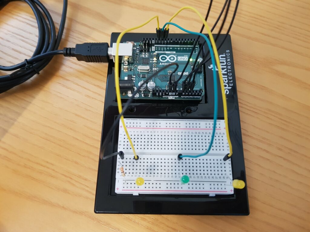
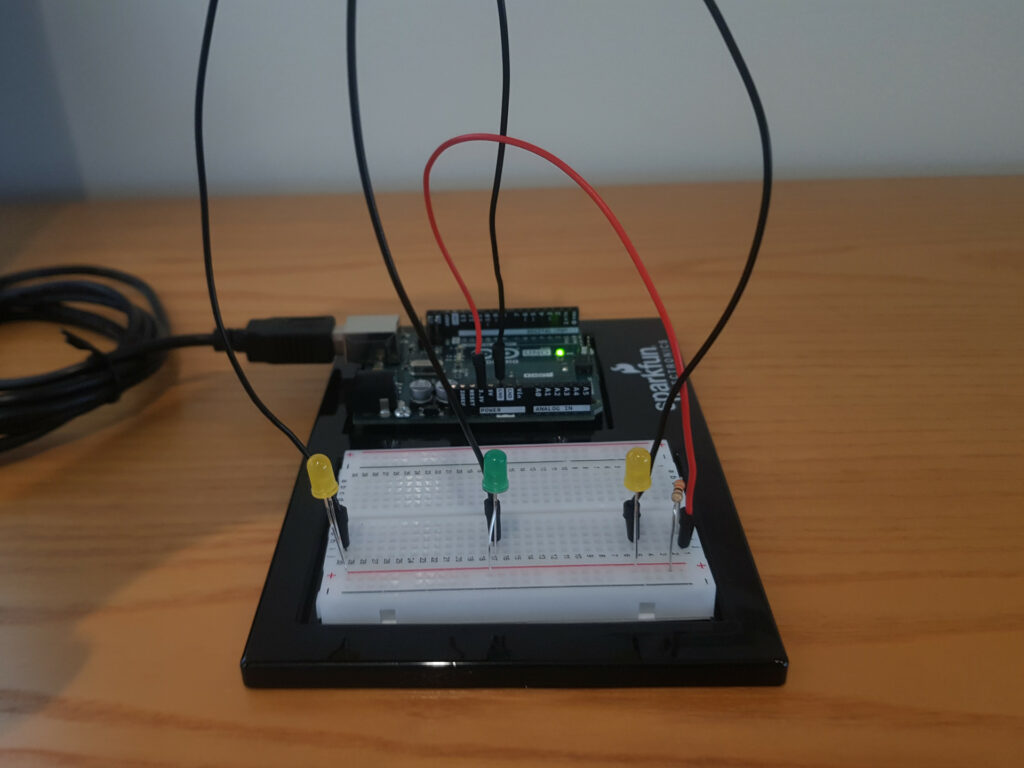
I first started by connecting 3 LEDs on a breadboard, to 3 resistors which connect to the Arduino’s 3.3V. Then I realised that I could use just 1 resistor, and so wired 3.3V to the resistor, and the resistor to the positive rail of the breadboard. Then I had a wire for each LED’s cathode (the shorter pin, the one that connects to ground), and could now activate any individual LED by connecting the Arduino’s ground wire to the LED’s ground wire! All that was left now was the simply connect ground to a hat (with some tape and foil) and a flag sticking out, and have a foil flag/square for each LED, and success!


This circuit is so simple in fact, that it doesn’t even need the Arduino! Literally the only thing the Arduino is doing here is providing power, which can easily be replaced with a battery. However, when I looked at the requirements again, it says we have to use digitalRead :/… Ah man, ok I’ll need to integrate it.

At first I really wanted to keep the simplicity as much as I could, and basically just try the Arduino pins as ground, so there would be almost no difference in the circuit, but we could detect which LED is being lit up. Unfortunately, I read that this is quite a bad idea as the Arduino isn’t well suited for that, so I had to double the number of wires, to separate the switch part from the lighting part. The circuit now still works in a very similar way, it’s just that when I try now connect 2 wires (meaning my head has turned to a certain position), the Arduino detects the switch is activated, and then powers the corresponding LED. Same functionality, but with including the Arduino and its digitalRead and digitalWrite functions. Oh also, I used “INPUT_PULLUP” instead of “INPUT” for the pinMode, as I didn’t want to add another 3 resistors 😅 (so the readings are flipped (as there’s no “INPUT_PULLDOWN” on most of the Arduino boards), 1 for inactive and 0 for active, but this isn’t an issue).

Code:
 

const int rightLED = 10;
const int centerLED = 11;
const int leftLED = 12;

const int rightSwitch = A0;
const int centerSwitch = A1;
const int leftSwitch = A2;

void setup() {
  // Initialize serial communication at 9600 bits per second:
  Serial.begin(9600);
  
  // Inputs (set to INPUT_PULLUP instead of INPUT so that it automatically pulls up the value, saving me from adding 3 resistors 😅)
  pinMode(rightSwitch, INPUT_PULLUP);
  pinMode(centerSwitch, INPUT_PULLUP);
  pinMode(leftSwitch, INPUT_PULLUP);

  // Outputs
  pinMode(rightLED, OUTPUT);
  pinMode(centerLED, OUTPUT);
  pinMode(leftLED, OUTPUT);
}

void loop() {
  // Read the input pins
  int rightState = digitalRead(rightSwitch);
  int centerState = digitalRead(centerSwitch);
  int leftState = digitalRead(leftSwitch);

  // Power the correct LED
  digitalWrite(rightLED, rightState == 0 ? HIGH : LOW)
  digitalWrite(centerLED, centerState == 0 ? HIGH : LOW)
  digitalWrite(leftLED, leftState == 0 ? HIGH : LOW)


  // Print out the states
  Serial.print(rightState);
  Serial.print(',');
  Serial.print(centerState);
  Serial.print(',');
  Serial.println(leftState);

  delay(1);  // Short delay between reads for stability
}


# Final Result


# Additional Thoughts & Room for Improvement

I initially wanted to use a potentiometer, to be able to get a much greater resolution and more accurately determine where the head was facing (and hence, have more fine grained control over what activates), while also eliminating a few wires and the need to have the foil flags. While I opted out of that idea as this assignments requires we use digitalRead, it would be a great improvement.

Well, unfortunately that’s it for today (yea, this was a very short blog), so until next time!