Week 3 – OOP Graphic Art

Concept: Errors

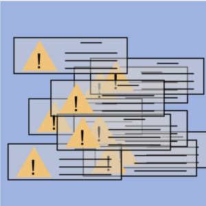
My idea of this work comes from the situation we probably all have run into, when our computer gives many errors, or even worse when the entire system crushed down. I remember facing this kind of situations a lot back to my childhood when the computer first became popular. The system was not looking good and not stable at all. It can easily crush or be attacked. Therefore, I used to see these errors very often. Now, the computer system has improved so much that I personally rarely face similar situations of so many errors now. My work thus aims at giving a retrospect to the early days of computers and technology. But now, you can simply click to take all the warnings down!

Highlight of the code

The main body of the code is the triangle warning sign class. The other elements of each warning window is anchored to these triangles, as seen in the code:

class TriWarning {
  constructor(xPos, yPos, triHeight) {
    this.xPos = xPos;
    this.yPos = yPos;
    this.height = triHeight;
    this.side = triHeight / sqrt(3); // all the triagnles are equilateral
  }

  // this method draws the entire triangle warning signs and windows
  drawTriWarning() {
    fill("rgba(210,206,206,0.48)");
    rect(this.xPos - 50, this.yPos - 5, 220, 70);
    strokeWeight(2);
    line(this.xPos + 80, this.yPos + 5, this.xPos + 120, this.yPos + 5);
    line(this.xPos + 50, this.yPos + 25, this.xPos + 150, this.yPos + 25);
    line(this.xPos + 50, this.yPos + 40, this.xPos + 150, this.yPos + 40);
    line(this.xPos + 50, this.yPos + 55, this.xPos + 150, this.yPos + 55);
    noFill();
    fill("rgb(239,195,122)");
    noStroke();
    triangle(
      this.xPos,
      this.yPos,
      this.xPos - this.side,
      this.yPos + this.height,
      this.xPos + this.side,
      this.yPos + this.height
    );
    fill(0);
    textSize(40);
    text("!", this.xPos - 7, this.yPos + 55);
    stroke(0);
  }
}

I use mouseClicked() function to start the loop of draw() function as the draw() function mainly affects the falling down of the generated warning windows and I don’t want them to start falling if the user doesn’t click on the canvas.

function mouseClicked() { // this will trigger the falling of the warning windows
  loop();
}

The falling down is realized by adding the y-position of each warning window by a certain speed each time draw() runs. It stops when the windows touch the base of the canvas.

function draw() {
  for (let i = 0; i < 10; i++) {
    if (!(triArray[i].yPos > 335)) {
      background("rgba(158,179,224,0.93)");
      triArray[i].yPos += speed;
    }
  } // triangles in the array will 'fall down' to the bottom of the canvas
  for (let i = 0; i < 10; i++) {
    triArray[i].drawTriWarning();
  }
  print(triArray);
}

Reflections and improvements

Another way to do this is to make the warning windows constantly move within the canvas. But I think this does not contribute to the main idea of my work, which is reimagining the time where computers usually ran into all kinds of warnings. However, I do think that the falling of the warning windows could be more dramatic and dynamic than the current one, but I am not sure what could work best.


Week 3 – Response: Interactive Design

What is interactivity? What are some essential qualifiers to be interactive? This is the essential question the author starts with. The answer he gives is a combination of three metaphorical steps: listening, thinking, and speaking. He also argues that interactivity might not be a dichotomy; instead, it could be described with degrees. I agree with most of the author’s points that in order for something to be interactive, it must proactively give responses to another’s actions or inputs. However, as the author also mentions, the degree of interactivity among things that are interactive could vary, and therefore, I am thinking about the value of interactivity.

Referring the author’s example of having conversations with another person, the thinking part plays an important role. For human beings, it’s easy to imagine how the lack of thinking of either party of the conversation could destroy the entire meaning of the conversation. But what about machines and computers? Nowadays, most of the human-computer interactions rely on the same codes that run over and over again whenever the computer receives an input from the human. This is surely interactive, but is the computer in this case a good thinker as in the conversation? Instead of active thinking, the computer merely processes the input in a preset procedure and gives out its output. But it works perfectly, just as we expect it to do so. Then does interactivity matters? One example would be Siri. Surely it is cool to speak to this “virtual personal assistant” and it will help you settle things down. But do you remember how many times they can fail you? At least for me, sometimes I feel that it seems to be more convenient just to go back to traditional way of clicking. By definition, Siri might be of a higher degree of interactivity. but its actual value of being this interactive is not so definite. Therefore, I think that computers for now are still just preprogrammed machines that complete some tasks, and that its interactivity is indeed significant but a substantial improvement in its interactivity and its resulting efficiency still need more and more technological innovations.

And at this point, I think the author makes a good point in the collaboration of interaction designers and interface designers. Interaction design is definitely a new area, instead of an extension of traditional interface design, and requires new skill sets. And to achieve new technological innovations that can lead to a higher level of efficient interaction, the collaboration and exchange of ideas between these two area are crucial and necessary.

Week 3 Reflection

I have always thought of ‘interactive design’ or ‘interactivity design’ as just a  necessary component of the UI design role. In general, I also realized upon going through this reading that the word ‘interactive’ had in a sense lost its meaning to me. It was refreshing to actually think of the concept and its importance in a systematic way as the reading puts us up to do.

An idea that the author introduces, and I love, is how interactivity isn’t a Boolean value but should rather be seen as a scale. This allows us to still call low level interactions such as those between a person and a TV remote interactive but on a lower level – while still maintaining our initial definition that involves thoughtful communication/conversation between two agents.

Circling back, the section of the discussion most relevant for me here is the one on ‘interactivity design’ which pertains to human-computer interaction. The author here mentions a key difference between User Interface design and interactivity design:

UI  designers never presume to address the ‘thinking’ part of the software. While interface designers also take into account the ‘thinking’ part or the function of the software alongside the other dimensions when coming up with a solution.

This comparison makes me draw from my own limited experience in UI design in a Software Engineering class and an internship at a startup. I had always felt that the UI design approach was too restrictive and shallow – that there needed to be more work done to actually take the now functional design and actually integrate it in a way that it flows naturally with the actual ‘function’ of the software.

Lastly, on a more philosophical note, the discussion on new paradigms leading to rapid progress is one I have interacted with frequently in the context of rapidly developing AI. However, I had always assumed for some reason that the paradigm for software and computer design had already been established (similar to how microbiology had the paradigm of cell theory strongly established for example). Interacting more with the field of creative computing through this course, and doing this reading have led me to the realization of how wrong this intuition may have been.

Assignment 3 – Light

Concept:
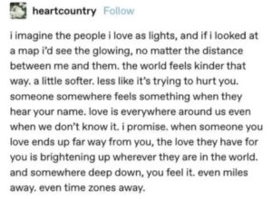
I recently saw a post (below) about love that touched me very much, and I thought that I would be able to represent this idea visually using what I currently know about objects and arrays.

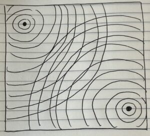
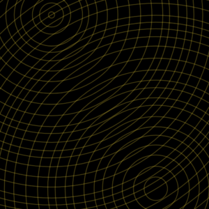
This was my initial idea, where the circles represent the waves of light radiating out from each of us and intersecting with other people’s lights:

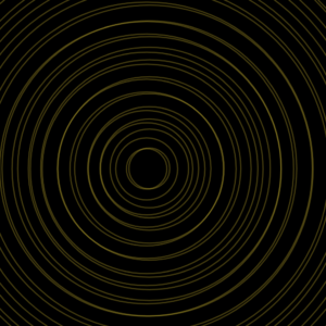
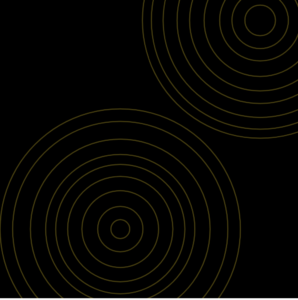
And here is the final sketch, where each time you run the code, the circles start at random places, and the increments between the circles also vary. You can click the mouse to make the circles appear:

A bonus of the random starting locations of the circles is that each outcome made me think of different types of relationships. For example:

A mother and her child:

Long distance best friends:

Future lovers who are just about to meet for the first time:

I started out the assignment only meaning to depict the “long distance” visual, but the randomness sparked many more possibilities, which I was not expecting!

Highlight:
I am proud of this part of my code, because the forloop + objects + arrays integration was something that I struggled a bit to understand, but after watching several Coding Train videos and following his examples, I was able to apply the same principles to my own code.

let circles = [];

function setup() {
  createCanvas(500, 500);
  background(0);

  for (let i = 0; i < 2; i++) {
    let x = random(width);
    let y = random(height);
    let r = random(1, 50);
    circles[i] = new Circle(x, y, r);
  }
}

function draw() {
  if (mouseIsPressed){
      for (let i = 0; i < circles.length; i++) {
      circles[i].show();
      circles[i].increaseRadius();
      }
  }
}

Reflection and ideas for future work or improvements:
I would like to assign colors to the light waves, for example making the smaller circles brighter/more saturated and having the color fade out as the circles get bigger. It would also be cool to apply some kind of blur feature so that the circles look more like actual light.

Resources: 


Week 2: Reading Reflection

Navigating the debate over what qualifies as art and what falls short of that definition can be a tricky endeavor. In this context, I found great satisfaction Casey Reas’ counter-argument to embark on the arduous task of justifying the legitimacy of computer art. Instead, it confidently acknowledged computer art as a legitimate form of artistic expression from the outset, leaving no room for doubt. What truly captivated me were the captivating and thought-provoking concepts introduced, which prompted me to reevaluate not only my approach to creating art but also the underlying principles guiding my design choices. One particularly intriguing idea that emerged from the talk was the concept of imperfection within symmetry. This notion made me reflect on how I employ such subtle techniques unconsciously in my own work such as incorporating an element slightly off-grid, introducing a color outside the designated palette, or employing a different shape. Perfect symmetry, I realized, may yield expected satisfaction, but it often lacks the element of surprise that truly captures one’s attention. In the case that Casey Reas discussed, where receptors are wired in three slightly imprecise ways, it not only enhances intrigue but also unveils entirely new patterns of behavior.

After listening to Casey Reas’ talk, I’ve come to appreciate the significance of incorporating elements of randomness and noise in computer art. One of the most formidable hurdles I’m facing in my journey as an artist is the ingrained belief that symmetry is the sole path to achieving beauty and aesthetic appeal. However, Reas’ talk, along with the assignments in our class, has illuminated a profound revelation: there are no fixed or rigid formulas for attaining beauty in art. While there’s certainly beauty in structured order, it’s equally possible to discover aesthetic allure in the midst of chaos and randomness, just as Casey Reas eloquently demonstrates.

Yet, as I delved deeper into these ideas, questions surfaced regarding the decision-making process regarding the degree of randomness to include: how random can it be?

HW2: Shooting Stars

Concept:

There is one element in space that intrigued me a lot as a child: meteors (or shooting stars). Seeing a shooting star in the sky made me so happy, as I believed my wishes would come true as soon as I see one. Hence, this assignment was inspired by my dream as a kid to have a sky full of shooting stars!

The sketch tries to capture a bit the essence of a chaotic scene where the dark sky is filled with unending meteors. It’s a simple but effective, interactive (and hopefully immersive with audio!) project where I implemented a range of random sized and colored lines moving across a black background. The legendary Interstellar movie theme song starts as soon as the you press the key. A loop of the scenery also occurs if you press the key “space”.

Link to the version with sound: https://editor.p5js.org/aa8915/sketches/aU8fd7qtB

Highlight of the code:
//stars movement 
  update() {
   
    this.position.add(this.velocity);

    if (this.position.x < 0 || this.position.x > width) {
      this.velocity.x *= -1;
    }
    if (this.position.y < 0 || this.position.y > height) {
      this.velocity.y *= -1;
    }

    //fade out over time
    this.lifespan -= 2;
  }

I’m proud of many parts of this sketch. Yet, I struggled a bit with the bouncing effect (took a lot of research in tutorials and Google pages, The Coding Train videos saved me in this.). I had to ensure that the particles maintain a smooth appearance especially when they bounce off the boundaries. Along the process, I discovered the ‘update()’ function which was responsible of movement, boundary conditions and also fade out of particles.

Final thoughts:

Overall, the whole sketch took a lot of trial and error to be implemented. Unlike the first assignment, this second one took me immense time. I’m still not a 100% satisfied with the shape and appearance of the meteors. I wanted them to have gradient colors but couldn’t figure out this part.  However, I put a lot of efforts on the animation this time which is something I’m proud of. I also love the effect of the new element in this assignment which is sound.

References:

Coding Train playlist: https://www.youtube.com/watch?v=HerCR8bw_GE&list=PLRqwX-V7Uu6Zy51Q-x9tMWIv9cueOFTFA

Shooting Star: https://m.espacepourlavie.ca/en/what-shooting-star

Code art (for brainstorming): https://www.code-art.com/

Response post – Casey Reas

Prior to watching Casey Reas’ eyeo2012 presentation, the interplay between structure and randomness in art hadn’t been a central focus for me when working on a new piece. However, his ideas really intrigued me and have reshaped my perspective on design. As someone with a knack for creative design, I’ve often contemplated the idea of subtly infusing randomness into my work, though it had largely remained an unexplored concept until now. Upon reflection, I’ve come to realize that I’ve instinctively incorporated elements of randomness into my creative process on numerous occasions, often without conscious intent.

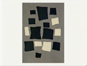
Reas’ ideas really illuminated the potential power of putting together structure and randomness as tools for artistic expression. They have pushed me to think about how “controlled chaos” could enhance the richness of artistic pieces. One of my favorite visual examples is this untitled piece by Jean Arp:

This juxtaposition of ordered geometric shapes against what seems to be a more chaotic composition is what really captured my interest. I think the piece does a very good job at illustrating the idea of controlled chaos and finding the right balance between chaos and structure.

My main takeaway from Reas’ presentation revolves around the idea of incorporating subtleties of randomness within my work and finding the right balance between this randomness and intentionality within each piece which I believe, ultimately leads to more dynamic outcomes.


Reading Reflection – Week 2

After watching Casey Reas’ talk at the 2012 Eyeo festival, I was left questioning certain beliefs I held. In my mind, the distinction between digital and organic systems was like night and day. For example, Casey Reas’ earlier work is what I would have associated with computer graphics. Before watching this video, we had to make some computer graphics ourselves, and all of the ideas that came to my mind had one thing in common: order.

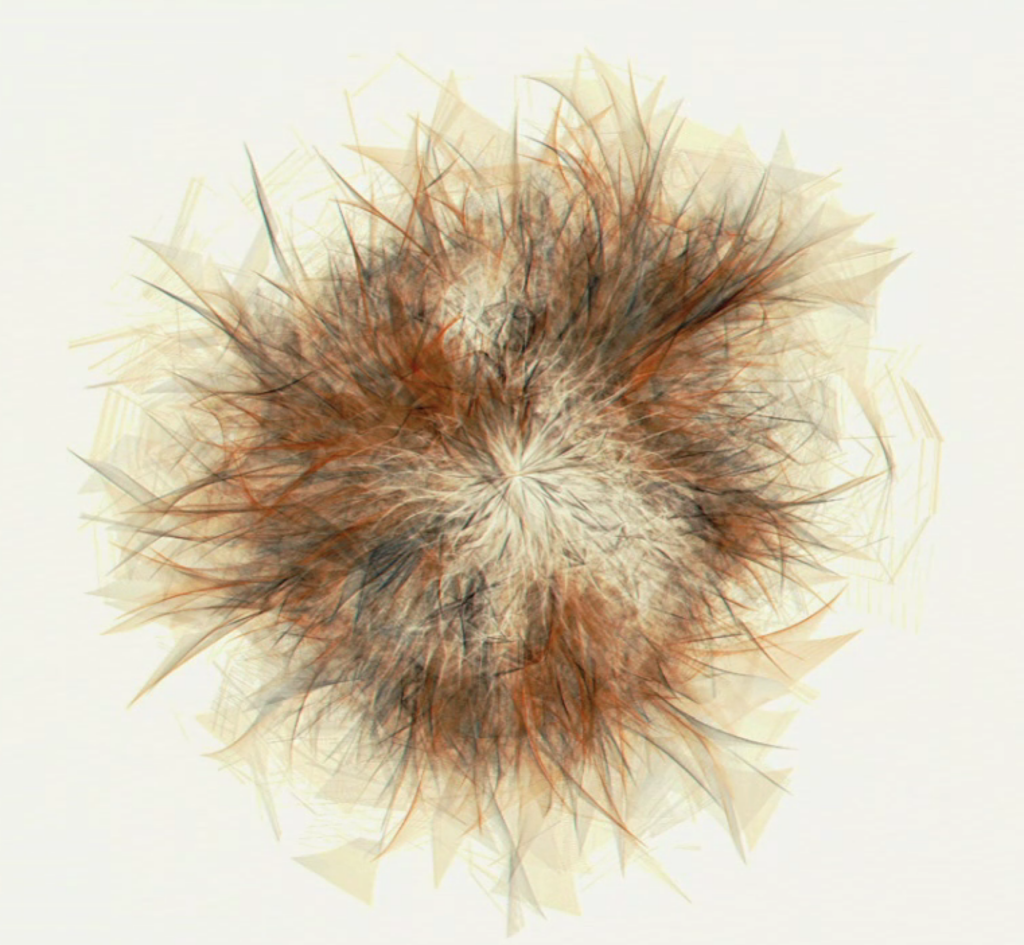
Casey Reas’ Early Work

While trying to work on the second assignment, all I kept thinking about was how to recreate using code the vision I had in my mind. Not thinking of generating something I had no control over makes me realize that I was limiting myself to the idea that computer graphics had to have order.

Casey Reas’ Early Organic Work

Secondly, after watching Reas’ talk, I’m questioning what exactly it means to be alive. When he shows the grid of randomly generated pixels and adds symmetry to the randomness, suddenly faces and things I associate with living beings start to emerge. I do feel an urge to resist this association. Maybe it’s because my definition of life is tied with organic matter. I don’t have the answer to that yet.

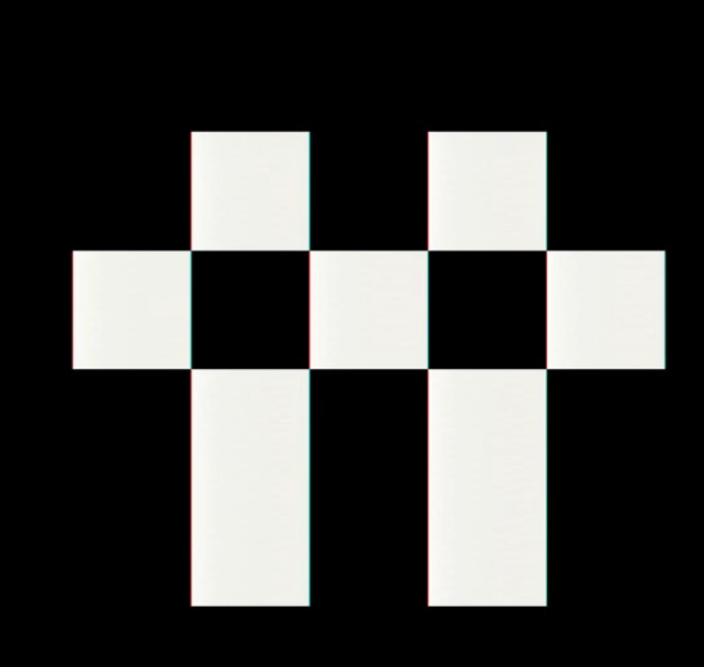
Symmetry – Casey Reas

However, when he shows the paths of vehicles and mentions that these would be perfectly similar to one another if not for the error, it made me think: is that not what life is? Living things fail and some win. Sometimes through sheer luck. Without random mutations changing us, we could have been single-celled organisms floating across the oceans. However, all the complexity that we see today was given rise to through that little bit of randomness causing some helpful instability.

With this in mind, I think I’ll let some randomness into my upcoming work. I’ve been trying to mold it to fit my vision so far, so it will be a fun change to incorporate an element of uncertainty into it.

Sources

Casey Reas – Eyeo 2012

Connecting the Dots in my Memory

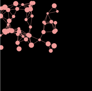
Concept: My artwork depicts dots that may be interpreted as brain cells or fragments of a scattered memory. The lines that link these dots essentially show how I feel our brains attempt to connect the dots or connect the storyline of a memory. It’s an interactive simple project where the user can use the mouse to click to pause and see how much memory was recalled. One could also say that these dots are parts of different memories and they are causing internal chaos trying to link a specific experience, where some parts are distancing and some are getting mixed up. 


Code: The code I’m proud of is the nested loop that allowed me to connect the lines from the dots. I was struggling at first because I had to consider that “cells” is an array and I had to adjust the code accordingly to make it work.

function connectCells(cells) {
  let maxConnections = 10; // Maximum number of connections per cell

  // Loop through each cell as the source cell
  for (let i = 0; i < cells.length; i++) {
    let connectedCount = 0; // Counter for the number of connections made by the source cell

    // Loop through all cells again to consider them as potential target cells
    for (let j = 0; j < cells.length; j++) {
      // Ensure that the source cell is not the same as the target cell
      if (i !== j) {
        // Calculate the distance between the centers of the source and target cells
        let d = dist(cells[i].x, cells[i].y, cells[j].x, cells[j].y);

        // Check if the cells are close enough to be connected, and if the source cell
        // has not reached its maximum allowed connections
        if (d < 50 && connectedCount < maxConnections) {
          stroke(255, 150, 150); // Set the line color
          line(cells[i].x, cells[i].y, cells[j].x, cells[j].y); // Draw a line between the cells
          connectedCount++; // Increment the connection count for the source cell
        }
      }
    }
  }
}

Reflection: For this task, my initial brainstorming revolved around the concept of producing a blurred image to symbolize a hazy memory. However, I felt that executing this idea might be somewhat challenging at this stage. Nevertheless, I am content with my final piece, although I believe it could benefit from additional refinements to achieve a greater level of abstraction and realism in my eyes.

Reference:

https://stackoverflow.com/questions/41719843/connected-balls-not-working-p5-js


Week-2.Assignment – lines;

When I first began brainstorming an idea for this assignment, I was overwhelmed looking through all the other elaborate projects my classmates and other students were able to come up with. I felt as though I was lost and didn’t know enough to create something that I actually liked. I started my exploration by playing around with generating lines using a for() loop and allowing the background and stroke to change color according to the cursor position. This was my first attempt at this assignment:

I found the project to be very simplistic, yet the patterns created by the overlapping lines create a beautiful sense of symmetry, and the gently changing colors create stark contrast and desaturation at times.

Nevertheless, as I kept browsing through other projects, I felt as though I hadn’t done enough.

I spent a while playing around with variables and the loops, randomly. I think it’s only fair to say that trying things randomly leads to unexpected and random results, however, those results can be just what you want.

I began by using a similar loop structure, but now generating lines to create a pyramid in the center of the canvas. The main concept I wanted to convey was my feelings of being lost and confused. I felt as though those who knew more than I did found it much simpler and knew how to keep everything fair and organized. I transformed this concept into my assignment. As the cursor moves, representing ‘knowning less’ – the lines represent chaos and fear that many of us experience. Similarly, if the mouse is pressed, an organized array of circles turns to chaos.

Ultimately, the part I struggled with most was adjusting the loops so they don’t cause P5 to crash once I add them to the draw function. Here is a part of my code I am proud of:

function chaos(s) {
  if (status === 0) {
    for (let y = 0; y < height; y = y + 40) {
      for (let x = 0; x < width; x = x + 40) {
        offset = offset + 0.1;
        line(0 + mouseX, x + noise(offset) * (s/2), y + noise(offset) * (s/2), height);
      }
    }
  } else {
    for (y = 0; y < height; y = y + 20) {
      for (x = 0; x < width; x = x + 20) {
        offset = offset + 0.1;
        noFill()
        circle(y + noise(offset) * (s/20), x + noise(offset) * (s/20), mouseY/5);
      }
    }
  }
}

I created a separate function called chaos, which also had an argument input (s), which I determined to be mouseY representing the height of the cursor.

Here is my final project:

Looking forward, I am planning to learn how to better optimize my code, especially loops, and I am excited to see what I will be able to do with the functions now that I have a basic understanding of how useful they can be.

Sources:

Coding Train Videos – 5.1, 5.2, …

P5JS – Reference Page