The Design of Everyday Things, The Psychopathology of Everyday Things.
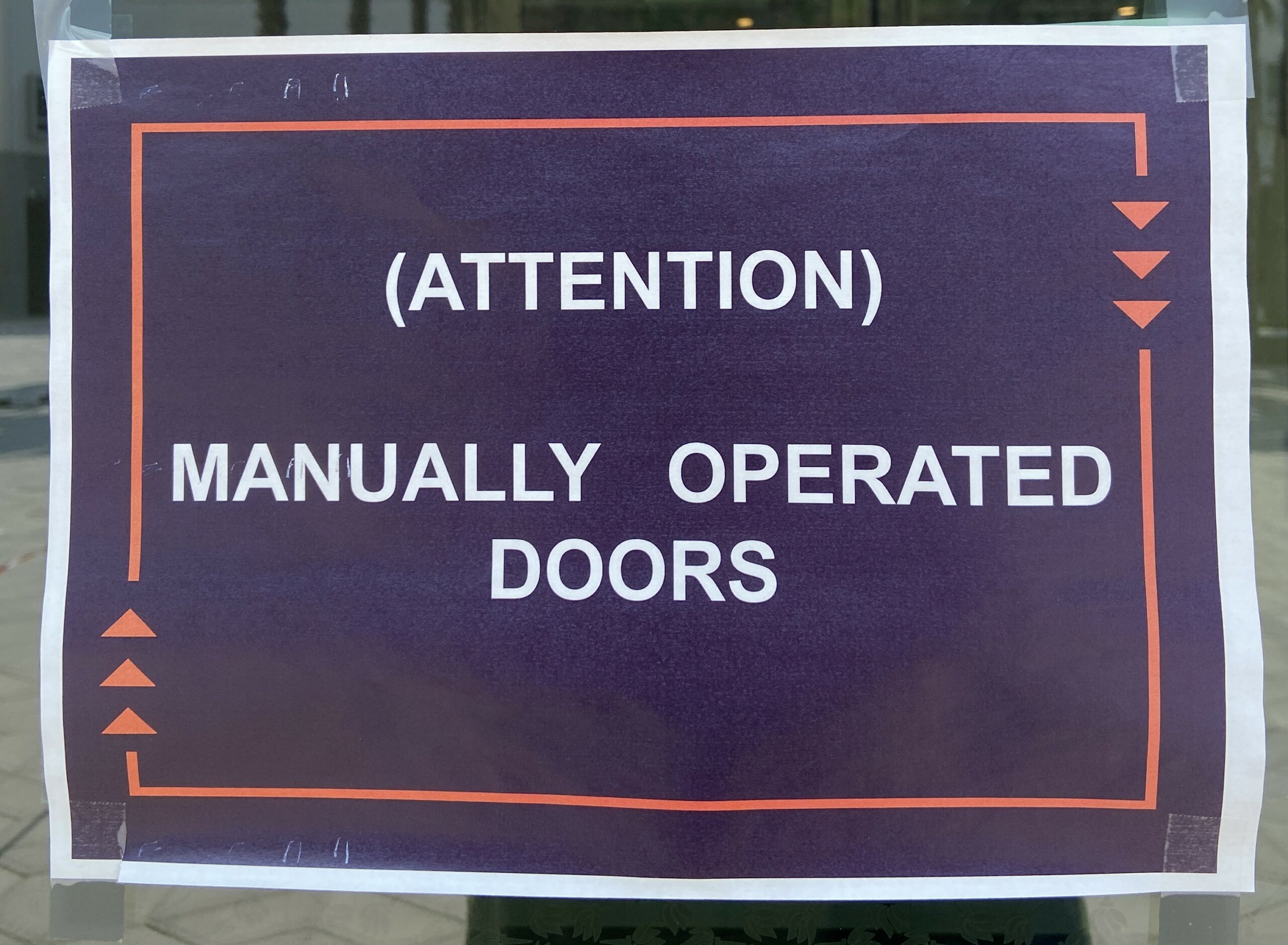
From this reading, I found the principles of affordances and signifiers most interesting. Norman writes, “Affordances determine what actions are possible. Signifiers communicate where the action should take place” (14). The authors frustration with doors not having signifiers that appropriately and intuitively demonstrated their affordances reminded me of my frustration with mobile apps, specifically the apps used to order takeout, when I first moved to China to attend NYU Shanghai. The apps are often overcrowded with symbols, words, and pop-ups, akin to the complex instruction manuals for machines that the author mentions. The affordances of these apps were not clear at all if you could not read Chinese fluently. Apps, like doors and refrigerators, could be designed to have simpler, more visible affordances.
However, this made me wonder if all perceptions of affordances are created equal. For example, when I encounter the “Settings” app on any phone (even in Chinese), I can find my way around because the layout is the same (or similar) across all operating systems (usually “General” settings is at the top, then there are some sections for wallpaper, brightness, sounds, notifications, etc). In contrast, my mom or my grandparents have a harder time finding setting controls that are second nature for me to find.
It is also interesting to consider how there exists a need to specify a design field as “human centered design”. Does this suggest that, if we do not consciously remind ourselves to design for the ease of use by humans, that the design of products will inevitably be pushed towards “profit centered design” or “efficiency centered design”? Seems rather depressing, because aren’t humans designing for ourselves?
Another thought the reading brought up for me is our tendency to value logic above emotion. The text stated that engineers are trained to think logically, and I think that we as a society have been trained to think that logical thinking is better, even though emotion colors every decision and experience we have.