After the data visualization lecture, I had a lot of ideas about what data I would like to project on the map. I thought about oil dwellers in the GCC region, corn fields in Europe, and so on. But it turned out that finding a CSV file with data can be harder than writing the actual code for data visualization. After hours of searching, I decided to find something more obvious and chose to project the world’s airports on the map.
SKETCH
The sketch illustrates where the airports are located in the world. Through observations, we can see which parts of the world are more developed and which are not. This data can later be used in scientific research.
CODE
function draw() {
  for (let csvRowNumber = 1; csvRowNumber < strings.length; csvRowNumber++) {
    let singleRow = split(strings[csvRowNumber], ",");
    let longitude = float(singleRow[6]);
    let latitude = float(singleRow[7]);

    // Making sure that longitude and latitude coordinates exist

    if (!isNaN(longitude) && !isNaN(latitude)) {
      //Map function is used for calculating the coodinates x and y

      let x = map(longitude, minLong, maxLong, width, 0);

      // Invert y-axis to match typical map orientation

      let y = map(latitude, minLat, maxLat, height, 0);

      stroke(0);
      point(x, y);
    }
  }
A lot of used functions were covered during the lecture, but while writing a code for a sketch, I was facing different problems. For example, some .csv files with numeric values didn’t work with the float function. And this project helped me a lot with building confidence around doing data visualization code.
REFLECTIONS
Personally, this project was more technical for me than creative because the scope of my work was limited to the data I was able to find on the Internet. But I believe that technical skills are no less important than doing creative work; therefore, I’m glad I had an opportunity to get familiar with the new functions and opportunities P5 has, which I will use in my future works and projects.
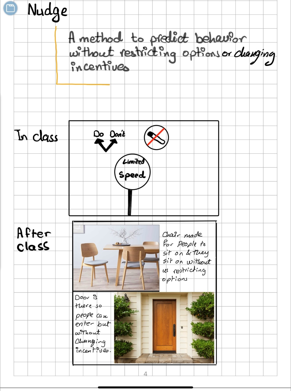
Chapter 1 of The Design of Everyday Things by Don Norman poses interesting and crucial observations about the design of our everyday objects, machines, and other utensils. When Norman described the example of bad design with the story about his friend being trapped between doors, I remembered of a similar experience I once faced. After moving to central Europe from Ukraine, I did yet realize that the design of doors in this area of Europe was significantly different than that in Ukraine. Here, doors had handles only on the inside and a dysfunctional knob on the outside. When I an apartment building in Slovakia, I was confused why do all the doors have useless knobs if they don’t even turn. I later learned that this design choice was mainly for ‘safety purposes.’ Still didn’t stop me from accidentally locking myself out of the apartment, even with the door unlocked.
I believe that the points Norman makes in the first chapter are precisely how poor design choice leads to many failures and mistakes. Even recently, I had bought swimming goggles, and accidentally ruined them by rubbing the inside surface. I later read the instructions where it said not to do so. I believe the design of everyday things can be so much better, exactly like Norman proposes, and that it is perhaps our human nature to assume other think like us to design things in a way that we might understand, but others might find challenging. Just like Norman’s example with how engineers think about the things they create, they assume things logically, which is not the case for all people, and thus poor design choices are made. They might not necessarily be poor in functionality, but it is often difficult for people to understand the exact functions if the design is unclear. Overall I believe Norman makes valid arguments as to why the design of everyday things could be so much better.
Initially I intended to choose the generative text project, but due to a lack of ideas/direction I switched over to the data project. I personally have a strong background with data, so it was a surprise to me when I couldn’t come up with a direction with this either. Data visualizations should effectively communicate the data they are trying to visualize, however I couldn’t think of a way to cohesively do this, while applying the lessons I had learned with my projects in the past weeks.
At this point, I first attempted to find a dataset to visualize. I wanted to visualize air-pollution in New Delhi, the capital of India (where I spent a chunk of my childhood), but an appropriately formatted dataset was hard to find. So, I ended up settling on a weather dataset of the city that had hourly weather data for a period of ~50 years from the 1960s to 2010s. This dataset contained several fields, but I narrowed them down to ‘wind speed’, ‘wind direction’, and temperature.
To visualize the wind, I decided to use a simplified version of the particle generators from my previous assignment. My word would be simple enough if I could vary the color based on temperature, and vary the particle’s movements and orientations based on the wind speed and direction. However, this proved to be a bit more challenging. Removing the noise from the simulation, made it look extremely bland.
Following this, I had to strategically add noise to not disturb the visualization but still add interesting movement. But even this didn’t seem enough. Since I was borrowing ideas from my previous assignment, I felt I needed to do more. This led me to add the elements of interactivity to the project. First, clicking on the mouse, lets you move forward a day in the visualization (you only move forward an hour every 2-3 seconds otherwise). Additionally, you can navigate to any date you want using the input menu.
Lastly, I also added a visualization of the important cities in India as the starting screen. A continuation of this project could be finding and adding similar data for the other cities in the visualization.
Highlights:
My highlight for this project was certainly adding the elements of interactivity to the code. Creating the input box, and attempting to match the date by matching the string formatting was a bit challenging, even given my background. Moreover, generating the final effect was also fun it itself!
Additionally, I enjoyed the process of finding relevant data, and actually thinking of ways I could enhance the visualization.
function jumpToDate() {
let inputDate = dateInput.value();
let dateParts = inputDate.split('-');
let formattedInputDate = dateParts[2] + dateParts[1] + dateParts[0];

for (let i = 0; i < table.getRowCount(); i++) {
let rowDate = table.getString(i, 'datetime_utc').split("-")[0]; // Extract just the date part
if (rowDate === formattedInputDate) {
index = i; // Set the index to the found row
break;
}
}
}
Reflections and Future Work:
This project can still have several improvements. First of all, I would love to be able to increase the scale and include other cities/states/countries into the visualization. It would also be really cool if one could toggle between this mode, and a more ‘bird’s eye view’ to see changes both across time and geographies.
Regarding the aesthetics themselves, I believe there are several more optimizations needed especially with some of the direction-based motion. For example, the switches in direction when the next row of the dataset is accessed can be made smoother.
Lastly, as stated earlier, an obvious continuation would be to increase the scope of the visualization by adding data for other cities.
After our lecture, where we learned about how to visualize large amounts of data within p5, I remembered one popular image regarding the subject. This was the visualization of all McDonald’s locations in the USA. The map was nearly full of points representing the large amounts of fast-food chain restaurants, however, I realized that I had never seen a similar map for Europe. This inspired me to search for a file containing the locations of all McDonald’s restaurants in Europe, and consequently, visualize the data to see what the map of Europe will look like through McDonalds locations. I was able to find a .csv file with exactly what I was looking for published by a user on GitHub.
Implementation / Code
Since the project I am working on is very similar to the data visualization example we looked at in class, a lot of my code is very similar, including checking if the file loaded, checking if there are errors within the file, and so on. I also realized that it is unnecessary to run through the file again in order to plot the points onto the canvas. Or perhaps it might be… As I was trying to create the data visualization, I frequently used the example in the lecture notes as a template. However, even though the code seemed good, the mapping of the points did not resemble a map to me. The minimum and maximum Lat and Long coordinates were all correct and accurate after I checked them on Google Maps, however, the visualization itself did not resemble the map of Europe. This set me back, and I took a few hours off to come back later and think what might be causing this issue.
Something that was initially confusing to me, was determining the minmaxLatLong coordinates. The method of adding 10 and subtracting 10 from the variables “latitude” and “longitude” themselves seemed odd to me. I decided to try and instead use an extreme value for the initialization of the variables minLat, maxLat, minLong, and maxLong. To my surprise, this actually produced a visualization that seemed way more accurate, however, it was not scaled properly to the canvas. After playing around with the values, I was able to get a good scale on the canvas. I am yet to figure out why this worked out the way it did.
function getMinMaxLatLong() {
  let singleRow = [];
  for (let mcdRowNumber = 0; mcdRowNumber < strings.length; mcdRowNumber++) {
    singleRow = split(strings[mcdRowNumber], ",");
    let latitude = float(singleRow[0]); // first is latitude
    let longitude = float(singleRow[1]); // second is longitude

    if (isNaN(longitude) || isNaN(latitude)) {
      // make sure they are numbers
      print("Conversion to float failed; Skipping row " + mcdRowNumber);
    } else {
      if (mcdRowNumber == 0) {
        // very interesting observation, by changing the initial values of min and max of the lat and long, the entire visualization shifts, why?
        minLat = -20;
        maxLat = 30;
        minLong = 20;
        maxLong = 70;
      }
      minLat = min(minLat, latitude);
      maxLat = max(maxLat, latitude);
      minLong = min(minLong, longitude);
      maxLong = max(maxLong, longitude);
    }
    let xpos = map(longitude, minLong, maxLong, 0, width);
    let ypos = map(latitude, minLat, maxLat, height, 0);
    stroke(3);
    point(xpos, ypos);
  } // end of for loop

  //inaccurate with the extreme values
  //print("Latitude (min, max) = (" + minLat + "," + maxLat + ") ");
  //print("Longitude (min, max) = (" + minLong + "," + maxLong + ")");

  print("Finished.");
} // end of findMinMaxLatLong
Final Product
Above is the final data visualization. The black points represent the McDonalds fast food restaurants in most of Europe.
Reflection
Even though the coding was mostly understandable, I am still questioning why the initial methods of determining the minimum and maximum Latitude and Longitude did not work out. I will be looking into this more thoroughly in the future, and I enjoyed working on this project.
After reading this text, I started to think and investigate about discoverability. In my opinion, the concept of how easily users can understand, find, identify, and access a design product’s features, functions, or content is a vital pillar in UX design.
I especially agree with the author’s idea of good design. The washer-dryer machine example was a scene that I felt really close to home. I remember multiple designs that even though they provided high levels of personalization to the user, they did not allow an intuitive learning of its use. Discoverability ensures that users can navigate and operate an interface with minimal effort with minimal guidance or instructions, which in my personal experience, is what makes a great design.
The idea the author provides that “machines have no leeway or common sense” is interesting, because it shows one of the fatal flaws of bad design. Failing to follow the exact process of the machine leads to problems, frustration, and misunderstandings. If the machine cannot provide an experience that is forgiving to user mistakes, then it is a bad design. Even if the design itself does not lead to the correct functioning, then it is a bad design. So, what can we do to improve this?
Every design should not be ruthless. The idea of having no mercy in terms of how many errors can the user make goes completely against the whole concept of user experience and interactivity. In special, when designing, it is crucial that we are able to lead the user toward the main user flow. Therefore, we allow the washing/drying machine to have many options and different customizable settings: however, users should be directed with colors, arrows, sizes, and lights to the main features, washing and drying clothes.
For this week, I focused on creating a project on data visualization. The idea here was to provide a map of every single airport in the world, no matter the size or the location. To provide some interactivity in the project, I decided to add the function of moving the mouse and slowly revealing the map.
I was inspired while checking the passport map and ranking available at https://www.passportindex.org/. In here, we can see a map that is divided by countries and shows the ranking of each passport in terms of visa-less travel.
Having obtained the altitude, longitude and latitude of each airport, I presented a map that would plot all three coordinates. Hovering the mouse will show the airports around that area and pressing will reveal the map.
Implementation:
For this project, I browsed different APIs and datasets that I could plot and represent in the sketch. I ended up finding this dataset in Kaggle.
Initially, I implemented different types of datasets for the airports. However, the biggest problem was regarding the size. Due to the fact that removing items from the list would go against the purpose of the project itself, I decided to search for a CSV file that would be within the limits of P5JS.
function draw(){
  background(0);
  for(let i = 0;i<airportsX.length;i++){
    //if it is close to the mouse and we are not pressing the mouse.
    if(abs(mouseX-airportsX[i]) < 100&&abs(mouseY-airportsY[i]) < 100 && !mouseIsPressed){
      stroke(255);
      strokeWeight(airportsAlt[i]/400)
      point(airportsX[i],airportsY[i]);
    }
    //show whole map if we pressing.
     else if (mouseIsPressed){
       stroke(255);
       strokeWeight(airportsAlt[i]/400);
       point(airportsX[i],airportsY[i]);
     }
  }
}
Challenges and Improvements:
I would have liked to improve the interactivity and the amount of data provided. For example, I already have the names of each airport and their altitude. With this, I would have liked to show the name of each airport, but I was not able to solve the problem with the size of the dots. In order to show every dot properly, I could not change the size too much, because it relies on the altitude.
Interestingly, the map ended up showing a very pretty plot, which resembles logically the altitude of different areas around the world. We will see that the north-western side of South America has a lot of big circles, which symbolize the amount of high airports there are around Bolivia and countries around the area.
I used the geolocation data of power plants around the world combined with the data for the production capacity for each plant. I used the geolocation to put them on the canvas, and then at each point a bar extends from the canvas vertically upward to account for the capacity of the plant.
I think something to make this more visually appealing would be to add some interactivity. I think it could be that as the user clicks on a point, they can get more information about that power plant, like the country, capacity, type of plant, etc. A pop-up text box could display such information.
Donald Norman’s exploration of the intersection between technology and psychology in the context of design strikes a chord with anyone who has ever interacted with modern products. In a world where technological advancements abound, Norman’s central argument, that design should encompass more than just functionality, resonates deeply. It’s a view that goes beyond the realm of theory and feels undeniably pertinent to our daily lives.
Engineers often excel at creating products that function flawlessly, yet they may falter when it comes to the user experience. A personal experience that illustrates this disconnect is the time I ordered a make at home clock on amazon that came with a complete user manual. On the surface, assembling the clock seemed like a straightforward process. However, despite the presence of a user manual, I found myself grappling with the intricacies of the clock’s operation.I think this experience underscores Norman’s assertion that effective design should prioritize the user’s experience, making products not only functional but also intuitive and accessible. The clock’s design may have been functionally sound from an engineering perspective, ensuring that it kept accurate time. Still, it failed in terms of user-friendliness.
Morever, Norman’s discussion on “discoverability” also resonates with my own experiences. He emphasizes the importance of understanding the connection between cognition and emotion in design. When interacting with products, users must effortlessly perceive how they work and what operations are possible based on the design cues and characteristics (affordances) of the product.
I think Norman’s insights challenge the conventional engineering-centric approach, advocating for designs that seamlessly cater to the average user’s perspective and understanding. I think Human centered design, as proposed by Norman, has the potential to bridge the gap between technological functionality and intuitive user experiences.
For this assignment, I decided to recreate a popular game called “Cards against humanity.” In this game, each participant is presented with a black card containing a humorous or absurd prompt. The objective is for players to select from a set of white cards, each bearing a comical response, aiming to match the prompt with the funniest, most unexpected, or outrageous answer.
Sketch
Code highlight
function generateCards() {
  let randomIndex = floor(random(blackCardTexts.length));
  blackCardText = blackCardTexts[randomIndex];

  whiteCardOptions = [];
  while (whiteCardOptions.length < 3) {
    randomIndex = floor(random(whiteCardTexts.length));
    let selectedCard = whiteCardTexts[randomIndex];
    if (selectedCard.trim() !== "" && !whiteCardOptions.includes(selectedCard)) {
      whiteCardOptions.push(selectedCard);
    }
  }

  cardsGenerated = true;
  displayInitialText = false; // Update the variable to switch to displaying cards
}
The function generateCards() is responsible for displaying the cards with random prompts from the csv files. First, I generate a random index to pick a prompt at random from the blackCardsTexts array which holds all the possible prompts in my game. Next, I initialize an empty array whiteCardOptions to store the white card responses to display on the 3 white cards. To ensure they are all distinct responses, I use a while loop which continues until whiteCardOptions array has 3 distinct responses. I did this by:
1. generating a another random index (randomIndex) from the whiteCardTexts array.
2. extracting the white card response at this random index and storing it in a variable called selectedCard.
3. checking if selectedCard is not empty (i.e., it contains text) and if it’s not already included in the whiteCardOptions array. This is the step that ensures I only add valid and unique responses to the white cards.
Reflection
I had the most fun working on this assignment so far because I tried to recreate a game that I love playing with my friends. While I’m quite happy with the outcome and how the core mechanics of the game function, I think there is definitely room for improvement, particularly in terms of the aesthetics of the sketch. For this project, my primary focus was recreating the fundamental concept and gameplay of the game rather than emphasizing the visual design.
Nonetheless, I’m still pretty satisfied with what I’ve been able to create. Reading some of these responses made me chuckle as well (even though I wrote them myself), and that’s ultimately what this game is all about—laughter and amusement.
The reading offered a general idea of good design and what components it should have. The author talked about the demands new technology expects from design, why engineers fail to make the design of things more affordable and accessible, the importance of human-centered design, fundamental principles of designs, the image users have from reading and searching about a product versus the designers and the paradox of technology. I honestly could not agree more with the author’s approach to good design. This reading reminded me of some books I read about design like “The Universal Principles of Design”, where the author simply explains different design principles. Attached below is his definition of affordance.
I agree that signifiers are more important than affordance, but I also believe that a well-designed object does not need a lot of signifiers. If its affordance is good enough. I also think that a good understanding of the psychology of humans helps in making good designs. One important concept I believe when understood would affect a design. These are abidance to authority by Milgram, confirmative bias by Asch, and situation of power by Zimbardo. Abidance to authority was briefly based on psychological experiments that discovered that humans would obey instructions even if these instructions harm other people because they ‘had orders to do them’. Asch in the Confirmative bias experiment discovered that humans by their mere nature tend to follow the group even if the group is wrong just to fit in. Finally, Zimbardo, in his Stanford prison experiment, puts forth that if someone is given power, they gradually become bad. He argues that people will conform to their assigned roles and take advantage of stereotypes and power.