Midterm Progress

Sketch link: https://editor.p5js.org/ff2185/sketches/J9qU9jniU

After tinkering around with different ideas, I decided on the concept of my midterm project: The Interactive Bar.

Here, I will feature different parts of a bar that will allow the user to have 3 actions that intend to simulate a bar experience:
– Make your own drink.
– Play the piano.
– Sit down and enjoy a performance.

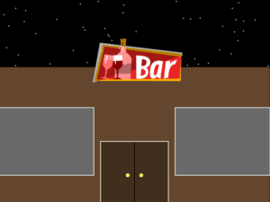
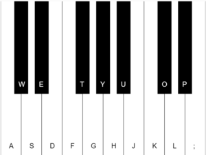
For this midterm progress, I have managed to do the front view of the bar and the piano, which was one of the most intimidating experiences.
The inspiration for the bar front was taken from “Moe’s Bar”, an iconic spot in the popular TV show “The Simpsons”

In addition to this, the piano is made using sounds generated directly from the oscillator function in P5js, which creates a signal that oscillates between -1.0 and 1.0. Using this, we can replicate the piano notes, at least the most basic ones.

for (var j = 0; j < 17; j++) {
    envo.push(new p5.Env()); //p5.Envelope,  controls the output volume of oscillator.
    envo[j].setADSR(0.01, 0.05, 1, 0.1);
    envo[j].setRange(1, 0);
    osc.push(new p5.Oscillator());
    osc[j].amp(envo[j]);
  }

  for (var i = 0; i < 10; i++) {
    rSide.push(new rSideKey(i, space, rKee[i]));
    black.push(new BlackKey(i + 0.667, space, blKee[i]));
    mid.push(new MidKey(i, space, midKee[i]));
    lSide.push(new lSideKey(i, space, lKee[i]));
  }

Potential challenges and next steps:

Starting from here, the most challenging parts of the project will be designing the interior of the bar. In order to make this functional, we have to allow the user to click in a certain object to start the experience. In addition to this, the project needs to include navigation options. By this I mean that every new screen should allow the user also to go back.
For this, I included a state management system to organize every screen and make navigation easier.

Reading Response— Computer Vision for Artists and Designers

Reading afterthoughts:

In “Computer Vision for Artists and Designers”, there are multiple interesting concepts and projects presented that piqued my interest heavily.

For starters, one term that caught my attention instantly was “computer vision techniques”. I did not expect the text to dive into this topic because my expectations when I dived into this was that the concept mentioned would be more related to the uses and applications of computer vision rather than proper explanation of how it works. As a Computer Science major, I was immediately shocked to discover that “there is no widely agreed-upon standard for representing the content of video”. Having worked with video myself, it never crossed my mind that there are multiple standards for handling the information of videos, which for many cases might be as bad as having no standard at all. Why? The problem relies on the level of understanding computers have. They have no knowledge on the content itself, but rather, they only know how to show it. In better ways, blurred, black and white, or whatever way you want, but they are not able to know if a person or a dog is there.

Instead of diving into AI and model training, I wanted to mention how interesting it is that older projects were able to work with computer vision even when there was no concept of artificial intelligence. It is not needed to teach the computer how to understand it, but we can start working by simply telling it how to recognize it. The simplest idea is detecting motion. By doing something as trivial as checking whether the frames changed, we can properly detect motion and movement. Even better, we can check how the pixels changed: if there was pixel A in position X, and that same pixel and neighbor pixels are found in position Y, then we can confidently guess that what pixel A and its neighbors portrayed moved from X to Y.

Overall, this reading was very enjoyable from the point of view of someone who loves coding and working with computer vision. It was interesting to see concepts that I could recognize, but at the same time exciting because I could learn new information about these exact topics.

week5.reading – Computer Vision for Artists and Designers

In his article Computer Vision for Artists and Designers, Golan Levin writes about the progression of computer vision and how it has played a crucial role in shaping what we perceive to be interactive tech, art or not. It is interesting to acknowledge that prior to people experimenting with using computer vision for artistic endeavors, the “application development for computer vision technologies, perhaps constrained by conventional structures for research funding, has generally been limited to military and law-enforcement purposes” (Levin). Nevertheless, in our fast-paced and exponentially growing society, it is bizarre to note that with each decade, our computer vision capabilities expand vastly.

In his article, Levin demonstrates multiple examples of where computer vision met artistic and interactive ideas, all ranging in creation times spanning the past few decades. Levin also focused on the different techniques that are used to allow the computing of visual files, mainly by pixel analysis, and this led me to reflect on how, throughout my childhood, we took these technologies for granted. When I was 10, like any other young aspiring boy who liked to play video games, I dreamt of creating the perfect set-up to record myself playing my favorite games. Green screens were extremely popular during that time amongst various creators, and they allowed them to capture and project only the subject of the video onto a different layer. This effect was ultimately used to achieve a better immersive experience for the viewers; however, it is only now that I realize how these applications function and what algorithms and processes are involved to create the seamless effect of being able to change your background. And with each month, we see more implementations of these techniques; for instance, Zoom allows people to change their backgrounds, even without a proper green screen.

In conclusion, I believe that it is a fascinating topic for many to explore, and understanding the complexities behind all the computer vision algorithms is substantially brought into a simpler context in Levin’s article.

Midterm Progress

Midterm – Pride Dragon Generator

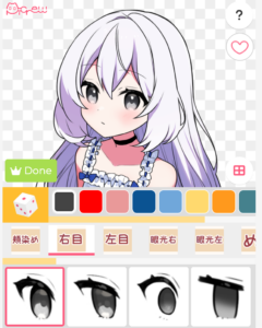
Inspired by the simple yet compelling cartoons of @dinosaurcouch, and the fun and customizability of avatar designing websites such as Picrew, I set out to make a “Pride Dragon Generator” in which users can select a LGBTQ+ identity and receive a dragon with spike colors of the corresponding pride flag. I wanted to incorporate an educational element as well, and what came to mind was using the generator to teach people LGBTQ+ terms in Chinese. When the user hovers their mouse over each of the buttons, an audio will play pronouncing the Chinese term. When they click on a button, they will get a picture of a dragon with, for example, lesbian flag spike colors. They can then save this image to their device.

Dinosaurcouch comic, featuring dinosaurs with lesbian and bi flag color spikes

One of the many customizable avatars in Picrew image maker

Most Frightening Part & Risk Reduction

The most frightening parts of this midterm are 1) the underlying logic of the “hover over button” interactions how users will go forward and go back to the homepage, 2) the sound playing and image saving functionalities, and 3) the complexities of drawing a dragon.

To address risk #1, I first tried to make interactive buttons on my own, and then went to IM Lab hours. With help from Coding Train and Zion, the IM lab assistant, I now have the basic logic of my program, and buttons that enlarge when you hover over them. The next steps are adding the sound and customization options.

To address risk #3, I went to this website to try to better understand bezierVertex, and played around with it a bit to get the hang of which numbers control which aspects of the shape.

week5.assignment – Midterm Project Progress

Concept Design

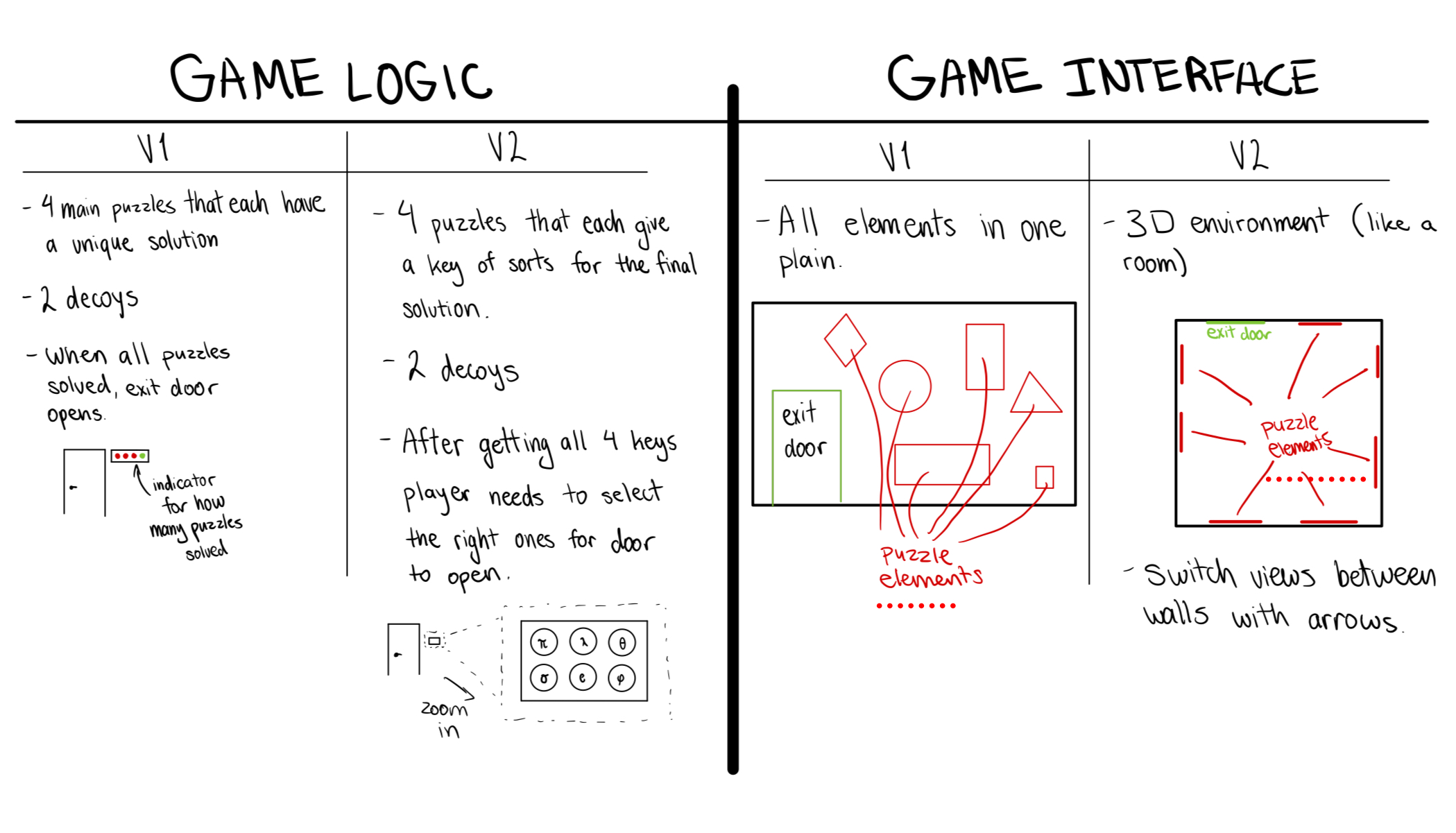
As we were looking at previous Midterm projects in class, one of them reminded me of a type of game I used to highly enjoy. The project that reminded me of this was the Coffee shop experience. A few years back, I really enjoyed playing mobile 2D puzzle / escape room games, which had a very similar structure to how the Coffee shop experience functioned. You would be able to zoom into certain parts of the walls, where the objects were placed, and solve interactive puzzles, which would eventually lead to you figuring out some final code to opening the door and passing the game. Thus, I decided that I would attempt and create a virtual 2D escape room game of my own. I am still debating on whether I should create the images myself or find references online. I began by sketching out two versions of how I would want the game to function.


I am still not fully decided on the overall theme of the experience/puzzle game; however, I will shortly begin sketching possible ideas for the visuals and take it from there.

Code Design

In order to piece all of the walls and “zoom-in puzzles” together, I am sure that I will need to come up with some sort of layers and switch them according to some indicators.

As of now, I think the best approach for this would be to create a class that would help differentiate between the different scenes. Additionally, I need to consider where I will include each of these elements:

  1. At least one shape – Perhaps the door, maybe create shapes as objects underlying the images for them to detect if they are being selected
  2. At least one image – Images for puzzles, keys, characters, background, etc.
  3. At least one sound – Some theme song playing in the background.
  4. At least one on-screen text – One of the puzzles will be a riddle which will include on-screen text.
  5. Object-Oriented Programming – I will create a “Layer Manager” class which will help me switch to different layers, such as the overall wall view, zoom into a specific puzzle, etc.
Frightening Concepts

Since I have not yet tried creating objects that are clickable, I believe that this aspect, along with switching views, will be the most challenging for me. In order to overcome this, I will try to research methods of how I can implement this. I have a few ideas about how I can create clickable objects, and I will create a tester p5 sketch, where I will try to implement all of these concepts, which are complex to me. After I am able to make sure that they work well, I can then confidently add them to my midterm project.

Midterm Project Progress

Concept and Design

For the midterm project, I’d like to design a Peking Opera experience. In this experience, the user will be able to have a look at the traditional setting of a Peking Opera theater, listen to a clip of a famous Peking Opera, and interact with some of the objects within the scene. This idea comes from the cafe experience the professor showed us in class, and I decided to make some similar experience which is practical but also related to my own culture.

The general style is cartoonish and the general interaction will be: 1. On the start page, the user will click somewhere on the canvas and will enter the theater; 2. within the theater, the user will be able to click on several objects and the object clicked on will zoom in and the user can have a closer look at it.

The most frightening part

I think the most frightening part for this project is sketching the entire setting. I was worried how I could build out the desired setting for a traditional Peking Opera theater and characters. And technically, I was concerned of using transformation function of p5js.

To tackle the setting of the theater, I first looked up some pictures online to decide the color and design of a Peking Opera theater. And I found something like this:

Peking opera stage hi-res stock photography and images - Alamy

In this picture, I identified some theme colors, including Chinese red, yellow, and brown, and some patterns such as Chinese dragon and phoenix. Therefore, I decided to make a simplified version of this using these colors and patterns, with a character downloaded online that has similar appearances.

For the technical difficulty, I look at some online tutorials on how transformation, specifically scale(), works and started trying with some simple images and shapes to understand this function. With the scale(), I am able to make the character turn around when she’s moving backward.

Next steps

The next steps will be adding the start page, instructions for the suer, and the function of returning to the previou scene as well as refining the entire setting.

Midterm Progress

Concept

Initially, I had planned on making a project with gravity manipulation as a core mechanic. However, I did not particularly like the ideas that I came up with. One particular idea was to create a voxel-based game where players could create objects that would fall to the ground. Upon impact, the land would be destroyed based on the momentum of impact. However, this proved to be difficult. I might attempt this for a future project, but the idea I settled on took its roots in this idea of a voxel-based landscape, where a voxel is a 3-dimensional pixel.

My idea was to implement a landscape constructed with voxels, and the player could play around with. Additionally, I wanted to give players the ability to change the view from 3D to 2D and vice versa. What I have so far is the project below:

I really enjoy pixel art, which is why I wanted my landscape to be pixel-based instead of being a continuous plane. Some of my previous projects have had the same style, so I wanted to stick to something that I knew design-wise.

I particularly like the way I transition from the 2-D view to the 3-D view. The 2-D plane rotating as it grows and morphs into a 3-D landscape gives a sleek look to the experience.


Nourhane Sekkat’s Reading response week #5

Golan Levin’s “Computer Vision for Artists and Designers” addresses a pivotal intersection in the contemporary world: the confluence of technology and art. By targeting novice programmers, particularly those with roots in the arts, Levin emphasizes the transformative potential of computer vision. This isn’t merely about enhancing artistic endeavors with technology; it’s about a fundamental shift in the capabilities and representations of art in the digital realm. One significant aspect of Levin’s work, inferred from the search results, is the “demystification” of computer vision. This underscores two primary challenges: the intrinsic complexity of the discipline and potential reservations artists might feel towards such a technical domain. By striving for accessibility, Levin advocates for a broader, more inclusive landscape where technology is not a barrier but an enabler.

The exploration of new applications of computer vision in the arts suggests a forward-thinking and innovative approach. This showcases not only the diverse ways artists are leveraging technology but also presents technology as an active collaborator in the artistic process. Such insights could serve as an inspiration, illuminating the expansive possibilities when art and technology seamlessly intertwine. While the search results don’t explicitly indicate Levin’s biases, his emphasis on interdisciplinary collaboration suggests a strong belief in the synergy of art and technology, potentially challenging traditional notions of their separateness.

Reflecting on this raises intriguing questions like: How might computer vision redefine traditional artistic mediums? As tech becomes an intrinsic part of art, how does the role of the artist evolve? Are there ethical ramifications, especially concerning surveillance and privacy, when integrating computer vision into art? Which highlight the evolving dynamics of art in the age of rapid technological advancements and the imperative to navigate this landscape thoughtfully.

Nourhane Sekkat’s Reading Response week #4

“The Psychopathology of Everyday Things” from “The Design of Everyday Things” by Don Norman delves into the intricacies of design in everyday objects. Reflecting upon the reading, one can undoubtedly identify with Norman’s perspective, especially when considering our daily interactions with objects around us. For instance, modern technology and gadgets, despite their advances, can often be counterintuitive in their designs. I’ve personally faced challenges with certain digital interfaces, which, instead of simplifying processes, make them more convoluted, aligning with Norman’s argument about poor design leading to user errors.

However, one might argue that as technologies and needs evolve, there’s a learning curve associated with new designs, making it imperative for users to adapt. This suggests that not all design ‘errors’ are solely the fault of the designer. In terms of bias, Norman does seem to lean towards placing the onus on the design rather than the user. While his points are valid, it’s essential to consider that user education and adaptation play roles in how effectively one interacts with a design.

This reading has indeed made me more observant and critical of the designs I encounter daily. Instead of solely blaming myself for misusing an object, I now consider whether its design might be contributing to the confusion. Which leads to the following questions, how can modern designers better incorporate user feedback? To what extent should designs cater to established user habits versus introducing new paradigms?

Reading Reflection – Week #5

The reading for this week was especially interesting. I have never seen the first works in interactive media that were using the concept of computer vision. I do not think that I came to like every work, however, one work was extremely fascinating – Suicide Box by the Bureau of Inverse Technology. It raises complex ethical concerns. While it offers a thought-provoking commentary on surveillance, privacy, and technology’s impact, its name and intent may be distressing. Ethical issues include potential harm to vulnerable individuals and the responsibility of artists to consider the emotional impact of their work. Even though this work triggered negative emotions in me, I believe it is one of those works that changed the world.

Although I liked how the author of this article was trying to present evolutionary artworks and thus provide a guide for new programmers about computer vision, I believe the lack of technological advances that use computer vision was obvious. Today, for instance, in healthcare, computer vision aids in medical image analysis, diagnosing diseases like cancer, and monitoring patient vital signs. In criminal investigation, it’s used for facial recognition, fingerprint matching, and analyzing surveillance footage to identify suspects and solve crimes swiftly, enhancing both medical diagnosis and law enforcement efficiency. These are just several examples of how people use computer vision not just for the sake of art, but also for something that is truly significant. I feel that the author could’ve mentioned these implications and shown how art can be incorporated into our everyday lives.