Week 9 | Analog_Digital_I/O

The concept
For this assignment, I wanted to make use of one of the sensors to automate a process. The first sensor I thought of was Grove Light Sensor, which is a module that is used to measure light intensity. The idea is simply controlling the speed of LED blinking based on the ambient brightness of the room. The system monitors brightness through the light sensor and intensifies the LED blinking speed in low-light or dark conditions, serving as a visual cue for urgent notifications.

Process
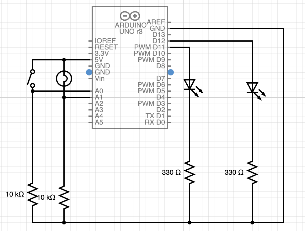
I started the assignment by creating a schematic diagram for my circuit, illustrated in Figure 1. The pivotal components include a light sensor, responsible for monitoring the ambient brightness of the room, and dynamically adjusting the blinking speed of the LEDs accordingly. Additionally, a toggle switch has been integrated into the circuit, allowing users to seamlessly switch between the two LEDs based on their preferences.
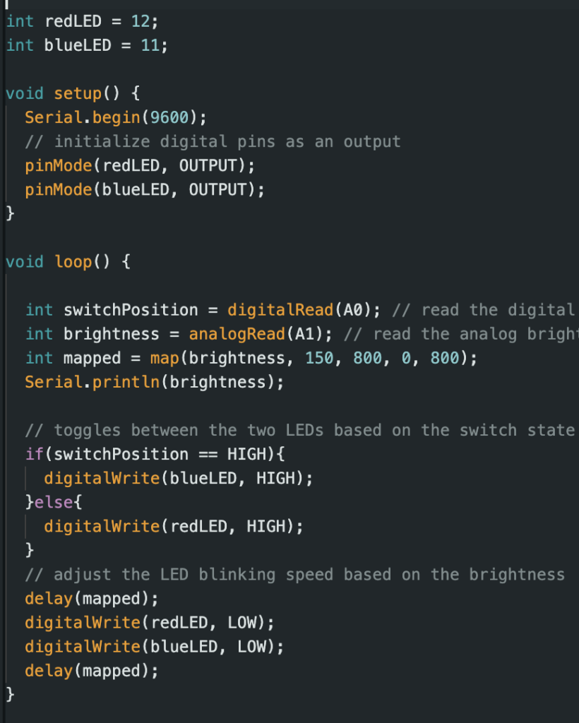
Figure 2 delves into the software aspect of the assignment. The software reads the digital input generated by the switch, ensuring a smooth and controlled transition between the two LEDs.

Figure 1
Figure 2

Video of implementation

Reflections
In this task, it was really interesting that I got to combine physical parts like circuits with software to create interactive and automated product. However, I faced some issues while designing the circuit. It was a bit confusing at the beginning to add these different components together, but I eventually figured it out by going step by step from using just a simple led to using a sensor for controlling other components.

Week 9 | Reading Reflection

Physical Computing’s Greatest hits and misses

The first article “Physical Computing’s Greatest Hits (and misses)” provides a fascinating insight into the world of interactive design, showcasing recurring themes and popular ideas in the realm of physical computing. As I read through the diverse range of projects and ideas, I could reflect on the ingenuity and creativity that arises from the fusion of technology and human interaction.
Different types of projects, like making instruments that work like theremins or devices for sending remote hugs, show how flexible and adaptable physical computing can be. Each project has its own special appeal and room for creative ideas. It highlights how important it is to think about the person using the technology when designing interactive systems. Instead of just focusing on what the machine does, these projects make sure that technology improves and reacts to what people do, making the interaction more meaningful.
Additionally, I liked how the article mentioned projects that mix different ideas. It shows that new and creative things often come from combining unrelated concepts. For example, the flight simulator, which combines a tilty controller with a big glove, demonstrates how unexpected combinations can be both surprising and enjoyable.

Making Interactive Art: Set the Stage, Then Shut Up and Listen

In this article, the author advises artists creating interactive art not to interpret their own work explicitly. Instead of providing detailed explanations and pre-scripting the participant’s experience, the focus should be on designing an environment or device that initiates a conversation with the audience. I totally agree with the writer’s perspective on creating interactive art without explicit interpretation. The idea that artists should let their audience engage with the work independently resonates deeply with my own experiences as a user not a designer.
Reflecting on my visits to art museums, I can recall instances where the lack of clear interpretation hindered my appreciation of certain works. Some pieces seemed inaccessible, their beauty obscured by ambiguity. I often found myself yearning for a more interactive and participatory experience, one that allowed me to unravel the layers of meaning at my own pace.
Overall, the article confirmed my belief in the power of interactive art, where the beauty lies not only in the creation but also in the ongoing conversation it sparks between the artist and the audience.

Week 9 – Reading Reflection

I would like to start with “Making Interactive Art: Set the Stage, Then Shut Up and Listen” because it points out an idea I was not very comfortable with. Yesterday we had a presentation of our sound project for another IM class. Before giving the presentation, I raised the question of what would be better: first, give a chance for an audience to listen to the song and then give a presentation of what the project is actually about, or, vice versa. One of the senior IM students in my group said that it is much better to give them the freedom to interpret, and have their idea of the project rather than forcing our interpretation to them. The idea was the same as it was conveyed in the text because the interactive media project is not a research work with a clear thesis and arguments, it is a more exploratory object that needs to be interacted with. I liked the idea that the project created is “just the beginning of a conversation with the people who experience your work”. We have our idea about the project and we can make a short remark about what the project is about but nothing more because the audience should explore and understand its meaning themselves. Coming back to our sound project, I was worried that the audience wouldn’t understand the point of the project and what exactly we wanted to convey with that. This happened. Some of the audience didn’t get the point of our sound project, but because of the text, I understood that it is fine because not all conversations make sense either. 

“Physical Computing’s Greatest Hits” felt like a selective collection of the simple, yet interesting physical computing project ideas. Starting from the musical instruments, and ending up with the interaction with the body, the article provides many ideas to get inspired from. Particularly, I loved the idea of floor pads as a space for dancing. As a child, I loved that kind of game in the gaming rooms of huge malls. It would be very interesting and exciting to create that by myself and give my little sisters to play with. I am not sure whether they would be as excited as I was with so much technological development nowadays. Although the article gives the basic idea about how each project is created, there are still many grey areas. It would be better if the author provided more technical elaboration on that.

Week 9: Reading Response

From these articles by Tom Igoe, it’s clear that physical computing offers immense creativity and excitement. The examples shared in the first article, “Physical Computing’s Greatest Hits (and misses,” introduced various creative possibilities that sensors and technologies offer in creating interactive projects. It was fascinating to see how simple touch, thermal, light, and sound sensors could be integrated into creative projects that evoke emotional responses in users. The concept of the “remote hugs” project was particularly intriguing. Although Igoe explained that the user didn’t quite feel hugged, this project succeeded in radiating positivity and satisfaction, aiming to engage users on an emotional level. I particularly appreciate the idea he raised that not everything has to be entirely original, but it can be improved upon and reimagined, which is inspiring. Therefore, I am more encouraged to explore projects that can bring positivity and emotion to users in innovative ways, even if they build on existing concepts.

The second article, “Making Interactive Art: Set the Stage, Then Shut Up and Listen,” explains interactive art’s interactivity and how it should be approached. In interactive art, the core message is to create a meaningful dialogue between the artist and the user. Allowing the user to explore and interpret the artwork without explicit guidance can lead to more satisfying experiences. I think this element of surprise and discovery is crucial in interactive art, enhancing user satisfaction. I also realized that open-ended interactive pieces are particularly suited to this approach, as users can uncover the artist’s intentions by exploring various features or come up with their interpretations. Also, one thing about interactive art is that the user feels engaged in creating something by interacting with the work, which makes the project much more fun and meaningful to the user. The article also touches upon user experience design (that we have learned from previous readings by Norman), such as providing interactivity hints. It is valuable advice as it ensures that users intuitively understand how to interact with the artwork.

Week 8 – Response

Maragret Hamilton’s Story

I think it’s really empowering to see historical figures (that not much of the public knows about) having made impact that, again, we sometimes don’t know well about or take for granted in some way.

I think as a person studying computer science, the question of what fields will rise and fall, and what impact I will be able to make in different fields is always daunting as much as it is exciting. It might be because I am still a student, but the decision to go into a field that’s not perferred or considered prospective would not have been easy. I think the burden would have also come from the fact that once such big projects go wrong, they may lose both a lot of money and individuals. Becoming pioneers under these pressure, and leading future generations follow the way is definitely ( in my opinion) something all future programmers dream of.

Emotions & Design

I’m very excited that this topic has been raised again. I remember that in one of the readings from the first half of the course, there was a question of how designs need to consider both the funcitons and the attractiveness.

I remember this as the discussion I had with my group in class was really interesting. It is without doubt that finding the right balance between function and design is important. However, it also becomes a question whether this applies to all cases.

For instance, maybe if it’s something that’s not that frequently used. Maybe in that case, it’s more important for the product to merge into the design of its environment and not be considered as a hideous object.

Or, in other cases, it might be that something is for such private use that there is no need for it to be attractive. Maybe people don’t care about how something looks, if they are just going to use it at homes, on their own.

I think it really shows that yes, it’s important to find a balance, but this question is even harder as ‘the right balance’ differs by every situation.

Switches

Concept

When I thought about a LED lighting up, I wondered what connotations or messages it could give. The red and blue lights are commonly used to let people know if something’s good to go or not. With this, I thought about simple ways to connect LED lights and safety.


Approach

I found a safety vest that had velcros on them. When one wears the vest, they need to close the velcros, which means the two sides will meet. This is the exact concept of switches, so I decided to use this action.

When you wear the safety vest, the blue light will turn on, signalling that you’re good to go outside and have fun! (or work, to be realistic)

Expansion

I only used blue light to show that things are good to go. I think a good feature to add is the red light, that shows that the vest is not worn properly. This action would be eliminating contact, so I would need to think about how I would use this action as a switch (as it’ll be different from the blue light’s logic).

Week 8 – Reading Reflections

Norman,“Emotion & Design: Attractive things work better”

I agree with the author’s ideas on balancing design and practicability when designing objects. From my personal experience, I know how frustrating it is when I am in a hurry and something doesn’t work. I was doing a group assignment and the final step was to finalize everything and put our final elements together and format them. However, the formatting software was extremely difficult to use. It wasn’t until I almost finished everything that it told me I needed to use paid methods to finish the export. I was so stressed that I did what they wanted and paid a subscription because the deadline was getting near. In the end, the task was finished. But it was after that I realized I didn’t use the paid method at all. It was only advising me to pay the subscription because it thought I might need the method. That is how I realized that in stressful situations, certain designs can serve different purposes and lead the user to do certain stuff they might not have done without the pressure. If there had been no pressure when I was exporting the project, I would have read what it said more carefully and thought about whether I needed the subscription. Therefore from my perspective, I agree with the author’s idea that emotions affect design, and for a design to be easy to use in stressful situations, all functions should have clear implications on how they should be used.

Her Code Got Humans on the Moon

After reading the article, I have great respect for Margaret Hamilton. At a time when men dominated the tech industry, Mrs Hamilton, as a working mother, achieved much that other men could have never thought of. Also, at the crime, coding was much harder than it is today. These days coding can be done with languages that have syntax pretty close to human language that’s easy for people to understand. However, at that time, coding was “punching holes in punchcards”. The difficulty and the stress of being responsible for developing a manned spacecraft are insane and unthinkable. Her achievements were outstanding enough, and the environments in which she got those achievements added to the greatness of her work. I have nothing but respect and awe for this woman.

Creative Switch

Concept

The main concept is to create a switch that isn’t necessarily a physical switch but a gate that returns true when a requirement is fulfilled. I created a switch that can provide an alert based on the water level of a specific environment. The circuit looks like this:

The two switches at the bottom part of the board indicate the water levels. Whatever the water level is, the rightmost LED always shines. If the water level is above a threshold, the second LED shines too. If another threshold is met, the third LED shines. This serves as an alert system for the water level of a specific environment. The actual functional circuit is shown below:This is what happens when there is no water in the cup.This is what happens when the water in the cup only reaches the first thresholdThis is what happens when the water level reaches the maximum value.This is what happens when I disconnect the second LED, because the power the red LED needs is more than the yellow one needs, so it might not be obvious that the red one is shining. This image is to show that the red one is shining when the water level is high.

Week 8: Reading response

Her Code Got Humans on the Moon—And Invented Software Itself:

I have heard about Margaret Hamilton several times before, but I have never actually read her story until now. I find it so inspiring how she managed to defeat all the stereotypes and the stigmas around her working in the field and managed to not only create a successful code that would allow people to go to the moon but she was also able to detect an error no one else had found and when she was told that it would never happen, she still didn’t give up on it and found a short term solution, telling astronauts not to choose P01, and a long term solution, the actual solution that saved the Apollo 8 when the astronaut chose P01. I believe that more people should take a page from her book and be persistent and consistent with their software projects and not brush off minor mistakes. Up until this reading most readings were focused on design and creativity, but I like that this reading invites us to think about the technical aspect of coding and interactive media, Additionally it highlights the fact that minor errors should be taken care of or else they might turn into major catastrophes.


Emotion & Design: Attractive things work better:

I have always underestimated the process of design, I have always thought of it as something very easy to master, but once again I have been proven wrong. I did not realize how complex design actually is. Having to understand how the human mind works so that you can design a product that would make the person feel better about themselves in positive situations and not induce extra stress and anxiety in extreme situations is a skill that unfortunately not all designers possess. At several points throughout the reading, I found myself nodding and agreeing with the author, i found myself thinking back to scenarios where an object that is poorly designed would annoy me more than i am already annoyed and ruin my whole day just because it wouldn’t function the way i want it to, or when I’m having a good day and everything just seems to make sense and work perfectly fine. I realize now that it is not a coincidence but rather a thing that designers take into account when designing everyday things to ensure that humans are satisfied with the product. The author described the concept of affect in such a way that makes it so clear and easy to understand without over complicating it. The example of walking, dancing and jumping on a plank got me wondering how our gut feeling and intuition have such a strong influence on our thoughts and our decisions which makes it even harder for designers to predict our feelings at a certain point and tailor their products accordingly.

Week 8: Reading reflection

As someone new to physical computing, finding inspiration in the idea that reusing existing concepts is a valuable part of the learning process is truly motivating. Throughout the works given, the work that inspired me the most is Scooby-doo paintings. The use of distance sensors and advanced camera technology in interactive art installations is captivating due to its ability to transform the viewer’s passive observation into an active and personalized experience. It blurs the lines between traditional artwork and audience participation, immersing viewers in the art’s narrative. As the artwork responds to the viewer’s presence or gaze, it becomes dynamic and engaging, fostering a deeper connection and sparking curiosity. Each interaction with the artwork is unique, creating a different emotional journey for every individual. This fusion of art and technology not only showcases creative expression but also represents a harmonious blend of the traditional and the contemporary, making it an innovative and intriguing form of artistic engagement.

In the blog “Making Interactive Art” by  TIGOE, he clearly mentions the task of a designer. I completely agree with that sentiment. During a recent exhibition, I attempted to engage with one of the games, but the artist overwhelmed me with a multitude of instructions that were challenging to grasp all at once. Instead of approaching or presenting an idea in this way, as TIGOE mentioned, when designing an interactive artwork, our primary objective is to provide the audience with essential context and then allow them to engage with the piece autonomously. Create the space, place objects for interaction, and hint at a sequence of events through their arrangement. Make interactive elements accessible by providing clear cues and handles. Ensure that objects meant to be untouched are not within reach. If you want the audience to uncover hidden elements, drop hints, but eliminate any unnecessary distractions or clutter from the environment to keep the focus on the intended experience. The audience plays a crucial role in completing the work through their actions. Guide them on how to engage, discover, and interpret the piece emotionally.