Reading Reflection

In this video, Casey Reas explains how to establish a set of rules that govern how shapes, colors, and patterns are generated, while also introducing an element of randomness or chance into the process. He believes that the tension between control and chaos can produce visually captivating compositions. His artwork series creates generative art using custom software that blends strict rules with randomness. It starts with clear guidelines for shapes, colors, and patterns but adds unpredictability through algorithms. Reas essentially acts as both an artist and a programmer, setting the stage for a unique creative process. What makes this series particularly intriguing is Reas’s intentional introduction of randomness and chance operations through algorithms. This deliberate juxtaposition of control and chaos allows for a dynamic interplay that results in a captivating array of visual outcomes.

After I watched this video, I could think of “No. 5, 1948”, an iconic abstract expressionist painting by American artist Jackson Pollock. Even this painting is pretty old and not painted by AI or software program, this painting could be one of the original paintings that explores the interplay between control and chaos, order and randomness. In this painting, it seems very messy and has no orders. However, his control over his movements and the flow of paint from his brushes or cans is evident in the deliberate calculated way he approached his paintings. His unique “drip painting” technique, in which he poured or dripped paint onto a canvas placed on the ground, allows gravity and chance to play a significant role in the creation of his artworks. I believe that this old artwork can inspire modern artworks using software programs.

Assignment 2: Simple Art Work

Concept

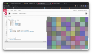
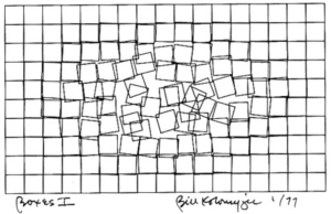
This assignment focused on creating a simple computer art piece using loops, basic shapes, and the fundamental concepts we’ve learned in the course. I quickly reviewed the attached documents for inspiration, and one illustration from Computer Graphics and Art immediately caught my attention.

The concept depicted in the image appeared straightforward to execute, but I had an idea to add interactivity to the art. I thought it would be enjoyable to allow users to move the tiles on the screen using their mouse. So, I set out to do just that. My tasks included generating tiles on the screen, keeping track of their coordinates, and finding a way to displace them based on mouse coordinates. I discovered that the most effective approach was to create a class for tile objects, allowing them to manage their attributes and methods. I designed the Tile class with a constructor that required x and y coordinates based on the screen’s dimensions and the desired tile size. The class also featured update and draw methods, responsible for tile displacement by the cursor and rendering to the screen, respectively. The draw method used the rect function to draw rectangles on the screen, while the update method checked if the mouse cursor was within a tile and adjusted the tile’s position accordingly.

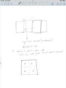
After successfully drawing the tiles using a nested for loop, I developed a straightforward algorithm for moving them. Here’s how it appeared in the planning stage:


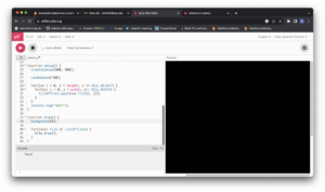
During the coding process, I encountered a couple of logic errors. The first issue I faced resulted in a completely black screen when I expected to see a colorful canvas.

To troubleshoot, I added console messages to verify whether the code block for drawing the tiles was executing.

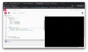
I eventually traced the problem to how I was using the ALPHA option in the fill function. Initially, I had used a low alpha value, which resulted in everything appearing black. After removing the alpha option, I obtained this result:

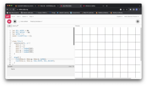
I adjusted the alpha value correctly, leading to this result:

Highlight of Code

I take particular pride in how I handled tile displacement. I applied an animation concept from class to achieve smoother displacement instead of snapping to fixed positions. I included logic to determine whether the mouse cursor was inside a tile and added a constant variable to its coordinates. I experimented with different code versions to manipulate tile size, reset tile properties, adjust speed, and control whether to draw the tiles without strokes.

Snippet of condition checking

update() {
    // checking if cursor is within tile
    if(mouseX > this.x  && mouseX < (this.x + this.breadth) && mouseY > this.y && mouseY < (this.y + this.length)) {
      // adjusting the position of the tile based on which quarter the cursor is in
      if (mouseX > this.x + (this.breadth /2)) {
        this.x -= displacementSpeed;
      }
      
      if (mouseX < this.x + (this.breadth /2)) {
        this.x += displacementSpeed;
      }
      
      if (mouseY > this.y + (this.length /2)) {
        this.y -= displacementSpeed;
      }
      
      if (mouseY < this.y + (this.length /2)) {
        this.y += displacementSpeed;
      }
    }
    
    // resetting the tiles to their original positions
    else {
      if(this.x > this.xBeforeDisplacement) {
        this.x -= resetSpeed;
      }
      
      if(this.x < this.xBeforeDisplacement) {
        this.x += resetSpeed;
      }
      
      if(this.y > this.yBeforeDisplacement) {
        this.y -= resetSpeed;
      }
      
      if(this.y < this.yBeforeDisplacement) {
        this.y += resetSpeed;
      }
    }
  }

Variations of the main sketch:

Reflection and Ideas for Future Work

While I successfully completed the task I set out to accomplish, there remains a glitch when the mouse cursor is positioned on a tile or group of tiles. I tried various approaches to address it but only managed to reduce the issue slightly. Hopefully, I can debug the code and completely resolve this problem. For future work, I plan to explore other shapes, possibly more complex ones, to unleash my creativity. Additionally, I aim to incorporate input from different devices beyond just the mouse and keyboard.


Week 2 – Reflection Assignment

The video explores the idea of randomness as a key component of computer programming and generative art. It uses a variety of illustrations to emphasize how randomness has the creative capacity to turn ordered systems into chaotic but visually appealing compositions. One of the standout demonstrations in the video is the progression from an ordered grid to increasing levels of deviation. This progression clearly shows how adding randomness can disrupt a well-defined pattern and eventually result in what appears to be chaos. This exploration raises questions about the delicate balance between order and chaos in artistic creation. It makes people stop and think about how controlled randomness can be used to create aesthetically appealing and unpredictable results. Additionally, the presentation highlights the significance of symmetry in understanding random patterns. By adding symmetry to a seemingly random grid of squares, the video reveals how our brains are wired to recognize familiar shapes and patterns even within randomness. This finding emphasizes how human perception and randomness interact deeply in art and design.

Regarding bias, it’s essential to note that the presentation seems to be focused on showcasing the creative potential of randomness rather than advocating for a particular viewpoint or agenda. The author appears to be impartial in their exploration of randomness as a creative force in generative art. As for changing beliefs, this presentation reinforces the idea that randomness can be a valuable tool for creativity, challenging the notion that art and computing must always follow rigid, predefined patterns. It prompts questions about the balance between structure and randomness in artistic expression and how these concepts can be leveraged in various creative processes. Personally, I think it’s fascinating how randomness can make art more interesting and exciting. It’s a reminder that not everything has to be perfectly planned, and sometimes, a little randomness can make things better.

Assignment 2 – Work of Art using Animation

Concept

This project is a creative expansion of my initial experience with p5.js, where I first ventured into the world of coding shapes and sketches. In our very first week of classes, we were encouraged to explore and create a house using p5.js. Now, for this assignment, I’ve revisited that initial sketch of a house, but with a twist. I aimed to breathe life into it by adding animation and interactivity, combining the fundamentals we learned previously with new elements. Additionally, winter is my favorite season, and I wanted to capture its essence in this project. To convey the beauty of winter, I decided to add falling snow in the background that accumulates on the ground as it descends. This not only adds movement and interactivity but also creates a serene winter landscape.

Highlight of the Code

One of the standout features of my code is the dynamic snowfall. Each snowflake is generated with a random position and speed, and they fall gracefully to the ground, accumulating over time. Here’s a snippet of the code responsible for this:

// Generate 300 random snowflakes with positions and speeds.
for (let i = 0; i < 300; i++) {
  snowflakes.push(createVector(random(width), random(height), random(minSpeed, maxSpeed)));
}

// Update and draw each snowflake.
for (const snowflake of snowflakes) {
  snowflake.y += snowflake.z; // Move the snowflake downwards.
  fill(255); // Set the snowflake color to white.
  rect(snowflake.x, snowflake.y, 1, 1); // Draw a small rectangle for each snowflake.

Moreover, I’ve added an interactive element where users can increase the snowfall by clicking on the canvas background. Additionally, pressing the mouse button while moving increases the snowfall, allowing users to control the intensity of the snowstorm dynamically.

Reflection/Improvements

While I’m pleased with the outcome, I recognize that there’s always room for improvement and further exploration. One possible avenue for improvement is to introduce a day-and-night cycle. By implementing this feature, the project could dynamically transition between day and night, altering the mood and atmosphere. This could involve changing the background color, adjusting the brightness of objects, and simulating the passage of time. Such a feature would not only add visual interest but also make the project more immersive and interactive. As I continue to explore creative coding, I look forward to experimenting with such dynamic elements in future projects, enriching the user experience and pushing the boundaries of what’s possible.

Edit Link

Reading Reflection – Week 2

Randomness is an unexplored territory not only in the realms of mathematics and engineering but across all sectors. It’s often seen by humans as unsettling, something to be avoided, as it carries a hint of chaos. Yet, there’s a captivating dance between order and chaos that strikes a chord within us. Caser Reas’s concepts illuminate how elements of randomness and order can harmonize to create a piece that speaks to us in countless ways. Since randomness is an integral part of human existence, it finds its way into our lives no matter how meticulously we try to structure them. These subtleties find their reflection in artistic expression. It’s fascinating to see how we, as humans, translate these emotions and facets of our experiences into art, resulting in pieces that communicate on multiple levels.

What stands out to me about Casey’s showcased pieces is that regardless of how randomness is integrated into the art, they all give rise to distinct compositions teeming with points, lines, and more, each possessing its own character. Every piece imbued with randomness in its elements crafts a unique identity, capable of forging a profound connection with individuals who resonate most deeply with it. As I gazed at the various art pieces presented by Casey Reas, I couldn’t help but ponder: how does the infusion of random elements into these artworks alter our perception of reality and the future? On one hand, I felt that randomness is an inevitable force, and our best course of action is to embrace it and forge ahead, which is the sentiment these art pieces conveyed to me. However, on the flip side, could these unique art pieces, brimming with randomness, imply that randomness is an exponential force that may one day surpass our control, potentially leading to unforeseen consequences? I believe that while some art pieces effectively integrate randomness to create intriguing works, straying too far from the balance of order and chaos might convey a daunting and overwhelming impression of life. This could potentially become a psychological burden for some, as they grapple with the realization of their own insignificance in the face of nature. Thus, art’s impact can vary greatly depending on how randomness is employed.

Assignment 2

Concept:

After learning about the different loops in P5.js, I wanted to create a simple yet soothing code. That’s when I remembered a game I used to play as a kid. When I moved the cursor around the screen, all the points scattered away from it. It was a basic game, just rolling a ball around a screen, but there was something oddly satisfying about seeing the points move away from me.

So, I decided to recreate that game in my code. I used a loop to keep generating points randomly, making sure they never stopped appearing. Then, I added a bit of trigonometry to make it look like the points changed direction when they got close to the cursor. This gave the illusion that they were all moving away from the cursor, following the ball’s lead. It was a fun way to bring back a childhood memory through code.

A highlight of some code that you’re particularly proud of:

let d = dist(random1, random2, mouseX, mouseY);
if(d < 50) 
{
let angle = atan2(random2 - mouseY, random1 -       mouseX);
random1 += cos(angle) * 2;
random2 += sin(angle) * 2;
point(random1,random2);

As I scoured the internet in search of a function that could calculate the distance between the cursor and the points, I stumbled upon the ‘dist’ function, and it was exactly what I needed. Delving into the p5 references, I delved into trigonometric equations, studying their inputs and outputs. Through a series of trials and errors, I played around with the code, hoping for it to be similar to that childhood game. I’m pleased to share that the outcome exceeded my expectations and turned out rather well.

Reflection and ideas for future work or improvements:

Discovering the potential of loops in programming has ignited my imagination for creating games and sketches, and it’s incredibly thrilling. Although the sketch is already promising, I see room for enhancement by incorporating a diverse palette of colors and trails that follow the ball’s movement. Additionally, I aim to optimize the program’s performance to reduce any glitches caused by its rapid execution. Looking ahead, I envision using both ‘for’ and ‘while’ loops to craft even more imaginative games, such as a maze, and bring forth fresh interactive experiences.

Assignment 1: Self Portrait

Concept:

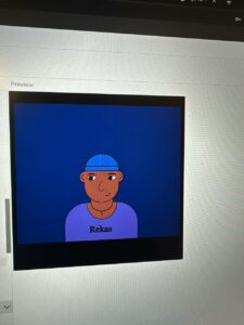
In this sketch I mostly wanted to have as much fun as I wanted to with it. From getting the face structure the way I wanted to adding neutral toned colours that could be eye pleasing. Adding the change of colours was the final step of the whole process, which I thought was the most fun part.

//clothes
fill(mouseY,193,117,135);
rect(202,306,129,24);
fill(mouseX,205,202,184);
rect(163,282,10,23);
rect(240,282,10,23);
quad(158,292,245,293,265,319,138,319);

//earring
fill(mouseY,225,125,186);
circle(156,228,5);
circle(246,228,5);

//bow
fill(mouseX,227,34,80);
circle(173,190,10);
triangle(175,190,186,180,186,196);
triangle(170,189,159,180,159,196);

A highlight of code that I’m particularly proud of:

I’m quite proud of how I put together the face and hair. I enjoy drawing and learing anatomy, so trying a different way to practice certain positions was a little challenging. However, I managed to place the shapes in the positions and areas I felt was right.

Embedded Sketch:


Reflection and ideas for future work or improvements:

Hopefully I would get to practice more on the rest of the body. Maybe work harder on trying to animate or move my sketches smoother. I also wished I worked on the size of the canvas and adjust it before starting.

Assignment 1 – self portrait

This is my version of a “smiley face”, I used the elements we’ve learnt last class to implement the variables in the background and experiment with them, as you move the mouse they make an x while changing colors.

Reflection

The skills that i hope to achieve, is to maybe make a more polished portrait, and to fully understand how to create more shapes that will allow me to produce better results. I would say it is personally for me a bit difficult as i have little knowledge about coding in general, but i managed to create this portrait after practicing a couple of times, i would say i got the hang of it, nonetheless, it is fun and interesting with experimenting different types of syntax and changing the variables as i continue to code.

function setup() {
  createCanvas(800, 800);
 background(0)
;
}

function draw() {
  //background
  fill(mouseX, mouseY,50) // to fade the colors

 
  circle(mouseY,400,300,) //to move the circle with the pointer
circle(400,mouseY,300) //to move the circle with the pointer

  //face
  fill(255,255,)
  circle(400,400,600)

  //eyes
  circle(280,330,90)
  circle(490,330,90)

  //pupils
fill(0)
  circle(280,330,50)
  circle(490,330,50)
  noStroke()
  
  //mouth
   strokeWeight(20);
  stroke('#f28865');
  arc(400, 550, 150, 200, .1, PI-.1);
  noStroke();
  
  //eyebrows
  stroke('#333');
  strokeWeight(9);
  noFill();
  arc(280, 310, 80, 80, PI+.9, -.9);
  arc(490, 310, 80, 80, PI+.9, -.9);
 

  //nose
   stroke('#333');
  strokeWeight(9);
  noFill();
  arc(400, 480, 50, 80, PI+.9, -.9);


}

 
editable link: https://editor.p5js.org/mka413/sketches/dnJhX_ugh

Assignment 1: Self Portrait


Concept:

I’m basically using this self portrait to experiment with what I’ve learned so far (which is obviously not a lot) because let’s be honest – I’m not very artistic. I did however try to compensate for the lack of artistic accuracy by making some other aspects of the portrait interactive.

A highlight of code that I’m particularly proud of:

I thought about what it was that I could make interactive, and I settled on making my (or my sketch’s) eyes follow the mouse pointer. In the process, I  stumbled upon some other people’s sketches, and also found inspiration in Maryam’s sketch, particularly how her expression changes as you hover the mouse pointer over her face (apologies if there are multiple Maryams in our class). Without looking at the code behind it, I tried, with much initial disappointment, to do something similar, and thus finished with two interactive features: the eyes, and the facial expressions.

//interactive eyeballs
  if (mouseX<=350 && mouseY<=250) {
  fill(255)
  ellipse((320-(255-mouseX)/120),(200+mouseY/120),6,6)
  ellipse((380-(255-mouseX)/120),(200+mouseY/120),6,6)
}
  if (mouseX>350 && mouseY<=250) {
  fill(255)
  ellipse((320-(255-mouseX)/120),(200+mouseY/120),6,6)
  ellipse((380-(255-mouseX)/120),(200+mouseY/120),6,6)
}
  if (mouseX>350 && mouseY>250) {
  fill(255)
  ellipse((320-(255-mouseX)/120),(200+mouseY/120),6,6)
  ellipse((380-(255-mouseX)/120),(200+mouseY/120),6,6)
}  
  if (mouseX<=350 && mouseY>250) {
  fill(255)
  ellipse((320-(255-mouseX)/120),(200+mouseY/120),6,6)
  ellipse((380-(255-mouseX)/120),(200+mouseY/120),6,6)
}
  
  //interactive mouth + eyebrows
  if(mouseX<310 || mouseX>390) {
  fill('rgb(253,91,91)')
  stroke('#B0764A')
  strokeWeight(2)
  curve(300, 0, 310, 290, 390, 280, 300, 0);
  fill('#C7A184')
  strokeWeight(4)
  curve(310,220,305,181,330,178,328,220)
  curve(370,220,365,181,390,178,388,220)
  }
  if (mouseY<285 || mouseY>320) {
  fill('rgb(253,91,91)')
  stroke('#B0764A')
  strokeWeight(2)
  curve(300, 0, 310, 290, 390, 280, 300, 0);
  fill('#C7A184')
  strokeWeight(4)
  curve(310,220,305,181,330,178,328,220)
  curve(370,220,365,181,390,178,388,220)
  }
  if(mouseX>=310 && mouseX<=390 && mouseY>=285 && mouseY<=320) {
  stroke('#B0764A')
  strokeWeight(4)
  line(320,300,390,280)
  line(310,175,330,180)
  line(365,180,385,175)
  }

The sketch:


Reflection and ideas for future work or improvements:

I was limited by my familiarity with JavaScript and could use only some of the various functions it is capable of executing, so I would like to revisit this assignment – just to see how far I’ve come – at the end of this course and do more stuff (or just improve on this existing stuff).

Assignment 1: Me

Concept:

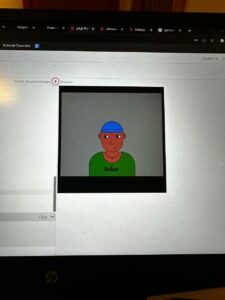
As this is the beginning of our course my Art is simple and cool. I made a portrait of how I might look in two weeks. I love stars so I decided to add it to my art.

Highlight:

Creating the dynamic stars was hard for me as this was my first time using JavaScript. I wish I could do better though so I hope to be able to use my future knowledge to improve my work.

for(let i=0;i<50;i++){
  noStroke();
  circle(random(400),random(400),2);
}

Drawing the body was fun.

Reflection/Improvement:

I hope to be more creative next time. Hope you love my work. Cheers!