Assignment 3: The Art of Interactive Design Reflection

Crawford thinks of interactivity the same way I measure consciousness. I believe rocks are conscious–just less conscious than we are. I describe consciousness as “witnessing.” Everything is witnessing each other. A rock is witnessing you just as you are witnessing it. And the more complex your way of “witnessing” is, the more conscious you are. Similarly, Crawford measures the interactivity of an exchange based on how complex it is. He says you achieve the highest level of interactivity whenever you have a good conversation. And I agree.

There have been people I tried over and over again to have good conversations with. And it never worked. Some of the best conversations of my life were with strangers on the street. I’ve thought hard and often about what makes a conversation good. And I’ve settled on the idea that it’s a mutual acknowledgment that you’re speaking from the same spiritual mycelium. A look in your eyes that says, “You feel as I feel. You speak from the same hiding place I speak.” And you can see in their eyes that they know how rare this is too. That they’re acknowledging what a relief it is to find that, having trudged for miles, they’ve finally stumbled across another fisherman at the bank of the same river. They’ve found you. One of my favorite Fitzgerald quotes goes: “Let your convictions be, not caves in which you hide, but hills upon which you stand.” And during a good conversation, you feel yourself dancing on that impossible hill.

All of this got me questioning, thinking about interactivity in Crawford’s terms, can media actually be interactive? As interactive as a good conversation? How can you interact with installations, with mere objects, as intricately and intimately as you do with your closest friends? But the thing is, I have been moved by interactive installations as profoundly as I have been moved by special conversations. And I concluded it’s because the artists of those particular installations poured themselves into what they had created. As if their art was a placeholder for them themselves. Some incarnation. By interacting with what they had made, I was touching their head, their thoughts, their visions, their dreams. That’s why we love the musicians we love. When we hear a particularly moving song, whether it’s by Kanye or Bob Dylan, it’s a strange kind of magic that happens when we realize that they know us down to the bone. We ask, “How do you know me when you have never met me?” And when we’re interacting with what someone has created, in a very important way, we’re interacting with them. Crawford said that opening a refrigerator door is an exchange with extremely low interactivity. But for the child who obsesses over opening and closing the refrigerator door over and over again, I believe, in their case, it is a highly interactive experience because they truly believe the refrigerator is alive.

Crawford goes into the differences between regular designers and interactive designers. Bruno Munari is one of the greatest designers of all time. I love a quote by him that goes: “There is no such thing as a personal style in a designer’s work.” Of course, no designer in the world can achieve this. But they try pretty damn hard. I believe the principle difference between regular designers and interactive designers is that the former’s objective is to put as little of themselves into their designs as possible. Interactive designers aim for the absolute, complete opposite. They demand: “See me.” And if what they made was good enough, you can acknowledge that you did.

But songs do this. Movies do this. And those weren’t interactive enough for Crawford. Maybe it’s only when installations seem to say: “Let me try to see you” that they meet the picture in his head. I got the sense that Crawford was relegating a lot of his understanding of the medium to the certainty of the future. I understand him very much in this aspect. I am never able to say what I am trying to say until the future says it for me. I’m no prophet.

Reading Reflection – Week#3

In the first chapter of The Art of Interactive Design, Crawford attempts to define the word interactivity, which he feels is misunderstood due to its popularity. Instead of defining it in technical terms such as ‘input, process and output’, Crawford sees the more human side of interactivity: listening, thinking, speaking. For him, interactivity comes from reciprocal action between two actors, an action that, in his words, has blood in its veins, or one that imitates life. He draws a distinction between the degrees of interactivity, claiming that it is more like an ever-changing variable than a boolean property; there are high interactivities and low interactivities. For it to be classified as high interactivity, it should perform all three steps, namely listen, think and speak. If it fails in any one of these steps, it falls short and falls under the category of low interactivity. Crawford also differentiates between interactivity and reaction, arguing that mere reaction to forms of media such as books and films fall short of the true definition of interactivity since they do not carry out all of the three steps.

Crawford points out the different approaches to solving a problem by ‘user interface people’ and ‘interactive design people’, mentioning how the ‘user interface people’ seem to be concerned more with the objective side to the solution while the ‘interactive design people’ bring to the table an artistic way of solving the problem. Crawford attempts to unite the two peoples by suggesting that good interactivity design integrates form with functionality, and that they are far from being mutually exclusive.

Crawford is self-aware of how his definition might not resonate with everyone and acknowledges that he cannot claim to provide a definition that truly encompasses everything interactivity is about. His ideas prompted a reconsideration of what I define interactivity as. However, I do think that the degree of interactivity does not matter as much as the thought behind it – which, essentially, is an unspoken understanding between the artist and the beholder, a conversation that might never have been had if not for the interactive art. After all, why, as long as it listens, thinks and speaks, should one compartmentalize the degree of art at all?

Week 3 – Reading Reflection

Chris Crawford’s reading on what defines interactivity was both frustrating and informative. Personally, I wasn’t a big fan of the pre-internet sense of humor presented in the reading. It often felt like Crawford was overlooking levels of subjectivity and nuances regarding interactivity in mediums such as books and movies. These aspects could have been explored more thoroughly instead of being briefly touched upon. However, the reading provided valuable insights into how interactivity became part of the collective technology lexicon, how it was distorted by various products, and the potential it still holds for the future.

I agree with the idea of interactivity being just a feature of a piece of art or a product, it does not inherently imply merit, which Crawford seems to propose as well. I thought the gradient of interactivity from zero, low to high seemed fruitful, however Crawford’s inisistence on an objective understanding of interactivity was honestly frustrating, but atleast he played into the fact that i cant argue with him through the book.

I found the distinction between a user experience designer and an interactivity designer fascinating. The idea that graphic designers who primarily focus on form and then implement function are not considered interactive designers makes sense. Interactivity requires an equal level of emphasis on both form and function from the beginning in order to provide a “good” interactive experience.

Overall, I found the reading to be thought-provoking. It made me reflect on the importance of interactivity in technology and helped me define my own understanding of interactivity, whether it is “two actors that listen, think, and speak to each other,” or something different.

Assignment 3- Fireworks!

Concept:

The concept behind my code is a joyful celebration brought to life through a fireworks simulation. It all started with a personal inspiration – something that never fails to make me happy. I wanted to capture that happiness and express it through code, turning it into a dynamic and interactive fireworks display.

At first, my code was a simple attempt at creating a fireworks animation. It lacked the functionality to launch fireworks interactively. It looked like this:

However, during my programming class, I learned how to incorporate user interaction. Now, when the mouse is pressed, the fireworks are generated. So, my code has evolved to include this interactive feature.


Highlight of Code:

The update() method in the provided code is a central part of the fireworks simulation. It controls the behavior of a firework object based on whether it has exploded or is still ascending in the sky.

update() {
    if (this.exploded) {     // Update particles if the firework has exploded
      for (let i = 0; i < this.particleCount; i++) {
        this.particles[i].update();
      }
      if (this.particleCount === this.particleEnded) {
        this.alive = false;
      }
    } else {                 // Accelerate, move, and draw the firework until it explodes
      this.accelerate();
      this.move();
      this.draw();
      if (this.vy >= 0) {
        this.explode();
      }
    }
  }

if (this.exploded) { … }: This condition checks whether the firework object has already exploded. The code within this block is executed if the firework has exploded..

Inside this block, there’s a for loop that iterates through all the particles of the firework’s explosion, which are stored in the particles array. It calls the update() method for each particle. This is responsible for updating the position, velocity, and appearance of each particle as they move away from the explosion point.

After updating the particles, there’s another check to see if the number of particles that have ended (burned out) is equal to the total particle count (this.particleCount). If this condition is met, it sets the alive property of the firework to false. This means that all the particles have completed their animation, and the firework is considered no longer active.

else { … }: This section of the code is executed when the firework is still ascending in the sky and has not yet exploded. It corresponds to the earlier phase of the firework’s motion.

this.accelerate();: This method is called to apply an acceleration to the firework. Typically, this acceleration represents the effect of gravity, causing the firework to fall faster as it ascends.

this.move();: This method updates the position of the firework, simulating its movement upward in the sky.

this.draw();: This method is responsible for drawing the firework on the canvas, typically as a line representing its trail as it rises.

if (this.vy >= 0) { … }: This condition checks whether the vertical velocity (vy) of the firework has become non-negative, indicating that the firework has reached its peak height and is about to explode. If the condition is met, it calls the explode() method to initiate the explosion phase.

Reflection:

The code successfully achieves the initial concept of creating an interactive and visually appealing fireworks display, effectively simulating the behavior of fireworks with a personal touch through mouse interaction. While the code does a decent job at creating realistic fireworks, there’s room for improvement in enhancing visual effects, such as diverse particle shapes, a broader range of colors, and smoother transitions, to make the display even more captivating.

For future work and improvements, several exciting possibilities exist. These include experimenting with enhanced particle effects, introducing a wider variety of colors and color transitions, adding sound effects to complement the visuals, allowing for the simultaneous launch of multiple fireworks, implementing user-configurable parameters for customization, enhancing the visual background for a more immersive environment, optimizing performance for better handling of a large number of particles

Assignment 3 – “welcome to fish school!”

Concept

So, my concept was primarily inspired by Coding Train’s video on the starfield. Initially, it was just a practice video for me to learn how to create a starfield. As I worked on it, I came across other starfield videos, such as the one by Barney Codes, which helped me understand the intricacies and complex techniques involved in creating a starfield. These techniques included pushing and popping elements from arrays, using velocity increments, and adjusting background opacity to achieve the famous trail effect.

To add a unique twist to the concept, I decided to make the movement more angular and dependent on the mouse, introducing interactivity. This led to the idea of creating a generative art piece resembling a school of fish, where the movement of the mouse also influences the way the fish move.

Fish School

The code that I am most proud of is the way I added angular movement to the “fish trail”. Despite not having done math in a while, I refreshed my knowledge of trigonometry before experimenting with the arctan function and mouse coordinates (mouseX/Y) to create dynamic angles between the origin, previous position, and current position. This resulted in a fish-like movement that works well when moving the mouse around.

// for more dynamic angular movement of fish i.e velx vely and the inverse tan function with mouseX and mouseY values
    this.velx = map(mouseX,0, width, 0,5)
    this.vely = map(mouseY,0,height,-3,5)
    
    this.vel = createVector(this.velx, this.vely);
    
    this.ang = atan2(y - (mouseY/2), x - (mouseX/2) );


Reflection:

I feel more confident in using mathematical functions and coding with p5.js in general. I’ve realized that it’s not always necessary to start from scratch when writing code. Instead, I can be inspired by existing functions, adapt them for my own use case, and come up with new concepts. Even the more challenging math aspects can be intimidating at first, but once I figure out an equation, it becomes enjoyable to tweak and play with the values. Sometimes, I don’t even know where the project will end up, which adds to the fun. As for the project itself, I plan to find a way to give the initial screen a fish-like quality from the beginning, rather than it only appearing once mouse movement starts. Currently, it looks like a regular starfield until then, which can be jarring.

Week 3 – Reflection Assignment

Based on the content from “The Art of Interactive Design” by Chris Crawford, the author examines the concept of interactivity and its definition. He argues that interactivity should be characterized as a conversation between two actors who alternately listen, think, and talk. He emphasizes the significance of all three components (hearing, thinking, and speaking) in the interactive process, implying that excellent interactivity requires each person to perform these processes effectively. The author also distinguishes between interactivity and reaction, emphasizing that true interactivity requires two actors to engage in a cyclic process.

Reflecting on the reading, I find the author’s definition of interaction to be both interesting and useful. His emphasis on the three fundamental components of interactivity – hearing, thinking, and speaking – aligns with the notion that effective communication requires engagement from all parties involved. This perspective aligns with what I believe that meaningful interactions, whether in human-to-human or human-computer interfaces, require a reciprocal exchange of information and ideas. The author’s difference between interactivity and reactivity raises concerns about the depth and quality of interactions in various circumstances, leading me to investigate how genuine interactivity may be achieved.

In terms of bias, the author does not appear to be biased in this work. He expresses his concepts and ideas clearly and uses examples to back up his point. The reading did not greatly alter my opinions, but it did emphasize the significance of addressing all aspects of interaction, especially in design and communication. It makes me think about the function of interactivity in many technical and communication contexts, as well as how it may be enhanced for better user experiences. The reading also raised concerns regarding the practical application of interactivity and the difficulties that come with building truly interactive systems.

Reading Response- Interactivity

Chris Crawford really gets it right when he talks about interactivity. He explains it in a clear and organized way, especially when he connects it to our senses. Making this connection between interaction and our senses is a big deal. I think interactivity gets super powerful when it tugs at our feelings and expressions.

Imagine interactive games or events that use special sounds, words, colors, and lights. They make a whole new experience for the person taking it all in. It’s like diving into the art itself. Regular movies might not have a lot of interactivity but think about formats like 4DX. They change the game. You’re not just watching; you’re feeling things like air blowing, water splashing, and chairs moving. It’s like the movie comes to life, playing with your senses. As Crawford points out, a vital part of interactivity is making you think, feel, and express yourself. When art really hits you deeply, it makes you stop and feel. This feeling is what kicks off the real interaction with the artwork, creating a strong bond between you and what you’re seeing.

In my view, interactivity goes even further. It’s about connecting with individuals on a deeper level, creating an experience that really resonates with them. This, in turn, leads to the kind of reaction Crawford talks about – a reaction that truly does justice to the interactive nature of the encounter. It’s like a dance between the viewer and the medium, each responding and influencing the other in a meaningful way. This, to me, is the true essence of interactivity.

Assignment 3

The Infinite Canvas

Concept

This project came about by chance. Initially, my goal was to design two color-changing balls. While I was exploring ways to enhance the project, I stumbled upon the idea of removing the background function. This allowed the ball from the previous frame to remain on the screen. I eliminated the stroke and implemented a color gradient transition, which produced a visually pleasing effect. To expand on this concept, I decided to create multiple duplicates of both balls, aligning them with the “mother” ball. Then, I began experimenting with adjusting the hardcoded bounce variables. Each time I increased the value by 0.1, it resulted in a distinct pattern, sometimes even yielding unique “art pieces” that had an appealing element of randomness.

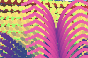
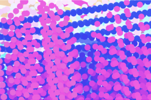
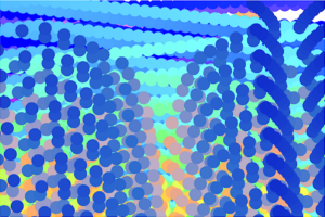
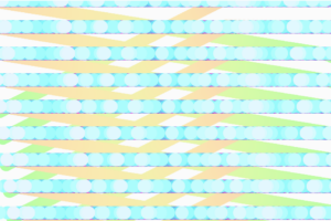
The “random” Art pieces


Furthermore, I developed different versions of this project. The first version functions as a standard screensaver-like visual effect. By tweaking the bounce function variables, users can generate their own one-of-a-kind art pieces. In the second version, I introduced user interaction. Initially, the screen displays two beams, and when a user clicks on it, an additional beam appears, leaving a trace on the screen. The beam stops when the user releases the mouse button. This change opens up endless possibilities for creating an unlimited number of distinctive patterns.

Version ONE

Version two

Code that i’m proud of

//Ball colors
var r = map(sin(frameCount), -1, 1, 50, 255);
var g = map(cos(frameCount / 2), -1, 1, 50, 255);
var b = map(sin(frameCount / 9), -1, 1, 50, 255);
fill(r, g, b);

//creating ball/ ellipse
ellipse(this.x, this.y, 24, 24);

//adding second beam on click
let count = 0;
if(mouseIsPressed)
{
count += 24
}
for (let i = 0; i < 12 + count; i += 24) {
ellipse(this.x + i/4 , this.y + i * 2, 24, 24);
}
}

Reflection and IMPROVEments

In the future I would love to add a feature that enables the user to pause the moving beams and save the sketch.


ASSIGNMENT 3 REFLECTION


The first chapter in Chris Crawford’s book “The Art of Interactive Design” identifies some of the essential traits of great design and addresses common misconceptions about interactive design. 

He begins the chapter by analyzing the increasing popularity of “interactivity” over the years, as well as the numerous ways that “interactive design” has been mischaracterized as a result of its unexpected popularity. He specifically mentions the overuse of the term “interactivity” in marketing campaigns for products ranging from children’s toys to shampoo and even cereal. 

Before getting into the fundamentals of great design, he attempts to describe interactivity through metaphor, stating that interactivity must allow for hearing, speaking, and thinking. Crawford acknowledges that there are degrees to interactivity but emphasizes that without these qualities, true interactivity cannot be achieved or done so to the greatest extent. He also provides numerous instances of non-interactive items, such as books, movies (not yet), and paintings, since these items fail to meet all three elements of interactivity. 

Later on, Crawford touches on the differences between user interface design and interactive design, stating that UI design focused on “…optimizing communication between people and electronic devices”, while interactive design “…addressed the entire communication between the user and computer.”.  

Crawford’s concept for great design as “speaking, listening, and thinking” was very intriguing to me in this chapter. Each of these activities has an enormous effect on the individual, allowing for full-body engagement with whatever they are observing. For me, this will always be what I find most astonishing about the work being done in the IM field. Interactive media/design transcends passive observation and evokes emotion, showcasing the most beautiful parts of life.

The Art of Interactive Design

The way the author explains interactivity is quite interesting. What caught my attention was when the author talked about a falling tree branch in the woods, and how what happens next is a reaction, not a true interaction. The author was able to present a well-structured step-by-step approach to defining interactivity. He started by discussing communication and the roles of different actors, then went on to propose the idea of categorizing interactivity into two levels: low and high, and explained how to tell them apart.

Chris’s viewpoint on interactivity is really unique and got me thinking that we might need a new word to describe what He’s talking about, especially since the term “interactivity” has been used incorrectly so often. This also brings up the question of how we decide if a digital artwork or project is interactive or not. On the flip side, it seems like he is mostly focused on human interaction (communication) as the main type, comparing computer limitations to human communication and interactions which might be insufficient to create a strong argument. This might mean they’re missing out on considering other forms of interactivity that don’t involve humans.

Furthermore, the author gave good examples to differentiate between an interaction and a reaction. For instance, he spoke about a reader reading a book where they only react to what they read rather than “interact” with it. Even though I believe these examples are prevalent, they were essential in explaining the difference between both terms. However, if we refer back to the initial examples presented in the beginning of the paper, such as the image of a child playing on an “interactable” rug, it could indeed be considered a form of interaction if it provides distinct feedback to the child based on the specific actions they take.

In general, the author has made a compelling case and touched upon a subject that could be relevant to various contemporary buzzwords we employ nowadays. Take, for instance, the phrase “Immersive experience.” Lately, numerous businesses have adopted this term to describe their offerings as immersive, even when they fall far short of delivering a high-quality, enjoyable experience for the user.