Week 4 – Reflection

Norman provides several illustrations of what works and why, how even seemingly straightforward and uninteresting objects contain complex ideas about all potential outcomes, and how products develop. I was interisted by how effortlessly we use items thanks to product design and how rapidly we pick up new features as a result of technological advancements. I hardly ever claim that something has altered my perspective on the world, but ever since I became aware of the importance of thoughtful product praise, I have a tendency to view all designs through this lens.

The value of design in our day-to-day existence and how it affects our experiences. Underlines how important it is to create products and systems using user-centered design principles in order to lessen annoyance and increase usability.

Assingment 4: Sw(eeeeee)irl

Concpet:

I got inspired by one of the given examples that we got the chance of looking through. My idea was very simply just let the letters “W” and “E” have a little fun swirling around the canvas.


inspo:https://www.lyceelecorbusier.eu/p5js/?p=2653#more-2653

Highlight of Code: 

As shown in the set of codes below, I was able to control how the letters appeared on screen depending on its position. As well as the distance between each letter and their angle. You can smoothly draw around the canvus as it displays the letters. After displaying them all the code repeats.

function draw() {
  if (mouseIsPressed) {
    // Calculate the distance between current and previous mouse positions
    let d = dist(x, y, mouseX, mouseY); 
    textFont('impact'); 
    textSize(fontSizeMin + d / 2); // Set text size based on the distance
    let newLetter = letters.charAt(counter); // Get the next letter from the letters string
    stepSize = textWidth(newLetter); // Calculate the step size based on text width

    if (d > stepSize) {
      let angle = atan2(mouseY - y, mouseX - x); // Calculate the angle between current and previous mouse positions

      push(); 
      translate(x, y); // Translate the origin to the previous mouse position
      rotate(angle + random(angleDistortion)); // Rotate the text randomly
      text(newLetter, 0, 0); // Draw the text at the translated and rotated position
      pop(); // Restore the previous transformation state

      counter++; // Move to the next letter
      if (counter > letters.length - 1) {
        counter = 0; // Reset the counter when all letters have been used
        clearCanvas(); // Clear the canvas when the cycle is complete
      }
//moving according to coordinates
      x = x + cos(angle) * stepSize; 
      y = y + sin(angle) * stepSize; 
    }
  }
}

Reflection and Ideas for Future Work:

I wanted to take more inspotations and combine them in order to come up with an idea that refelcts my own work rather than someone else.

Edit: https://editor.p5js.org/mariamalkhoori/sketches/SpcDmSs92

Week 4: Reflection


Chapter 1 of “The Design of Everyday Things” by Don Norman, analyzes the importance of design in our daily interactions in a way that will make you stop and think. I was compelled to reflect on my interactions with everyday processes and objects while reading this chapter. The fundamental idea that design is essential in determining how we experience and interact with ordinary objects is introduced in this chapter, which also serves as the book’s introduction.

The idea that good design is essential for reducing frustration and improving usability is one of the main issues covered in this chapter. Several instances of badly designed products that aggravate users are provided by Norman, including doors with ambiguous push-and-pull instructions, phone systems with complicated user interfaces, and stovetops with perplexing burner controls. These examples speak to me since I’ve experienced frustrations like these in my own life. Amazingly, seemingly basic items can become annoyances if their design needs to be better considered.

Another principle Norman mentions is the idea of “natural mapping,” which relates to the notion that the link between controls and their functions should be intuitive and conform to the user’s mental model. In the context of user-centered design, this idea is extremely crucial. This idea appealed to me greatly because I frequently come across gadgets or user interfaces with controls that need to be organized or labeled sensibly.

“affordances” is a major concept covered in this chapter. According to Norman, an object’s perceived and actual qualities affect how it can be used. To demonstrate this idea, he used the illustration of a door. He contends that a well-designed door should have distinct affordances that make it obvious whether it should be pulled or pushed. This idea of affordances opened my eyes. It made me aware of how frequently I come across doors, faucets, or buttons without signs of their intended usage, resulting in unpleasant and confusing situations.

The notion that when users experience problems, it is the fault of the design they are having rather than the user is particularly thought-provoking in this chapter. This viewpoint is a welcome change from the usual tendency to criticize customers for not comprehending or using a product properly. It emphasizes how designers must make things that are simple to use and intuitive.

In conclusion, Chapter 1 of Don Norman’s book “The Design of Everyday Things” addresses the importance of design in our daily lives and its influence on our experiences. It emphasizes the significance of developing goods and systems with user-centered design concepts to reduce frustration and improve usability. After reading this chapter, I became more aware of how the design of commonplace items affects how we interact with the environment. It emphasized that excellent design is crucial for enhancing the caliber of our daily experiences, not just a nice-to-have.


Week 4: Assignment


This weeks assignment asked us to either do a data visualization or generative text, i thought data visualization was interesting and i wanted to see what i could create using the vast amount of data sets available.

I first found a data set on kaggle called spotify charts, i completed all of the codes necessary but for some reason the bar chart that i created kept giving me an error and its size did not change according to the data took from the spotify csv file. therefore, i searched for more data sets and i came upon a data set that shows Cats and Dogs household dataset which kind of worked but still was not flawless as it did not display the data that i chose.

Finally, as i was running out of time , i made a very simple chart on excel, which worked perfectly, which had name ,age , and how tall the seven people are.  I would still rather use the other data sets mentioned above, as it will give me better visuals and maybe change the course and look of the charts i create.


My code:

I wouldn’t say im proud of some parts of the code, as i wish i had done a better one with more complexity and creativeness, until next time.

let table;

function preload() { //it makes sure that everythings checks out before the other functions execute
  
  table = loadTable('information.csv', 'csv', 'header');
 
}

function setup() {
  createCanvas(400, 400);
  noLoop();
}

function draw() {
  background(255,200,204);
  
  //this makes sure there is content in the data
  if (table) {

    //get the amount of rows in the CSV
    let numRows = table.getRowCount();

    //get the column titled age and how_tall
    let age = table.getColumn('age');
    let how_tall = table.getColumn("how_tall");
     
    
    //iterate over the number of rows
    for (let i = 0; i < numRows; i++) {
      noStroke()
      let x = 100;
      let y = 100+(i*25); //i*25 will increment by 20 each time the loop runs
      let w = age[i]*5;  //age by itself was small, so * to get bigger 
      let h = 10;
       
         if (name[i] =='dana'){
           
           h=5;
         }   
      rect(x,y,w,h);


    }
  }
}

Editable link :

https://editor.p5js.org/mka413/sketches/qaidZGOFj

Assignment 4 – F1 2021 WDC Points Tally Data Visualization

Concept

I just recently got back into F1. I have a sporadic relationship with it, sometimes not watching at all, and then for 3-4 races straight, I’ll be checking out all the different reports about the new Ferrari engine or whatnot. But basically, my data visualization came out of wanting to show a graphic representation of the points table at the end of the 2021 F1 Season which what got me into it as the final race also happened in Abu Dhabi.

I decided to create a bar table that shows the points tally for Formula 1, while incorporating elements that represent the essence of the sport. I obtained the data for the drivers, teams, and points tally from a Wikipedia table, which I extracted into a CSV file using a free online web tool. I cleaned up the data as necessary. Additionally, I wanted to include the team colors and the cars used by the 10 teams in the 2021 season. To add a dynamic element, I incorporated a smoke effect, giving the impression that the cars are revving.


Highlight

Besides loading the images next to the tally bar, the highlight of my code was definitely the smoke effect which was relatively easy using a Smoke class and put the instances of the object through an array to display them as they widdle out and get removed.

// smoke class!
class Smoke {
  
    //Constructor will take 2 parameters: x and y position
    constructor (x ,y ) {
        this.x = x;
        this.y = y;
      
        //Smoke radius
        this.r = 3;
      
        //Smoke velocity (for some motion)
        this.vx = random(-3,-2); 
        this.vy = -1; //Up
        this.color = 190;
        this.alpha = 235;
    }
    show() {
        noStroke(); //No borders on smoke
        fill(this.color, this.alpha); //Fill Ellipses
        ellipse(this.x, this.y, this.r); //Create Ellipses
    }
    update() {
        //Move smokes
        this.x += this.vx;
        this.y += this.vy;
      
        //Make smoke disappear slowly
        this.alpha -= 15; 
      
        //Make smokes bigger
        if (this.r != 5) {
          this.r += 1;
        }
    }
    delete() {
        return (this.alpha <= 0); //If smoke disappears, return true and remove it from smokes array.
    }
}


Reflection

This project was enjoyable for me, as it involved analyzing fascinating data and reflecting on Ferrari’s unfortunate performance this season, which is disheartening as I am a supporter. However, it was still an exciting season overall, especially since the championship title was decided in the final race.

As an additional feature, I would like to include an initial loading screen where the cars start moving from the driver name area and stop at specific x distances corresponding to the driver’s points.

Week 4 response:

Don Norman’s first chapter has been an eye-opening experience. It’s astonishing to realize how much thought and intentionality should go into the design of even the simplest objects we encounter daily. Norman’s concept of “the psychopathology of everyday things” resonates deeply with me because I’ve often found myself frustrated by poorly designed objects like confusing interfaces or counterintuitive controls. His emphasis on Human-Centered Design is particularly relevant in today’s world, where technology is pervasive, and products should cater to a wide range of users. What struck me the most was the reminder that good design should make our lives simpler, not more complicated. This chapter has made me appreciate the importance of clear communication between designers and users and has left me with a newfound awareness of the impact of design on our daily experiences. It’s a lesson I’ll carry with me as I continue to learn and explore the world of design.

Assignment 4: Smlie :)

Concept:

Creating this Assignment I was feeling sad so I decided to create an auto text generator that tells whoever interacts with the screen what I think about them. Tap on the screen to see what you are 🙂

Highlight:

I decided to use everything we learned in class besides data analyses to create this artwork. I was inspired by the bouncing ball example used in class so I decided to replace the ball with a word and with that, I just utilized loops and if-else statements to create a generator that can will print random words in an array of words.

The parts of the code I found challenging were; The choosing of the words as random numbers to generate numbers in double casting and also because I didn’t pay attention to when you were talking about how to cast numbers. But after asking Powers I was able to solve this situation.

The main problem that I wasn’t able to also solve was fitting the words on the canvas. I tried to use “addition and subtraction” means to do so but this didn’t solve the problem but rather created another one.

bounce() {
  if (this.x > width-120 || this.x < 0) {
    this.xspeed = this.xspeed * -1;
    this.colorChange();
  }

  if (this.y > height-5 || this.y < 20) {
    this.yspeed = this.yspeed * -1;
    this.colorChange();
  }
}

Because I added and subtracted, if an object was created in the space I excluded the object bugged.

I solved this with the use of the return function but it is not exactly how I want it to be. The objects still go out of the canvas and sometimes they bounce when they haven’t hit the edges.

if(this.x>width-120||this.y<20||this.y>height-5){
      return;
    }

For the addition of objects and deletion I used the “function KeyPressed()” and “function mouseClicked()” as well as return loops and dynamic memory allocation. I am proud that I made sure to not cause memory leak as I applied what I have learnt even though it didn’t cause any error.

Finally, I used the opacity in the fill function as well as some randomness to cause this kind of flashy look in the end and I don’t know if this work made you smile but it made be happy after I was done.

Final Work:

Reflection and Ideas for Future works:

I really hated the fact that the letters kept going out of scope so maybe in future I would correct this error, if not in this project, in another similar one.

Assignment 4 – Waves After Waves

Concept

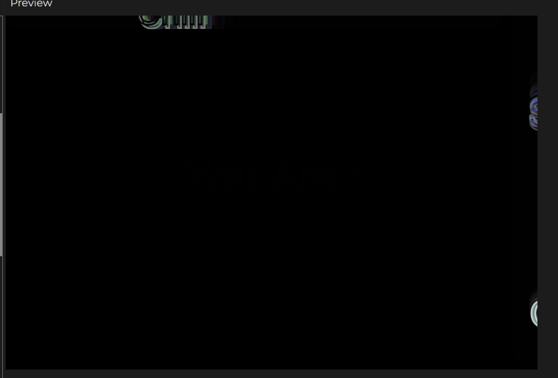
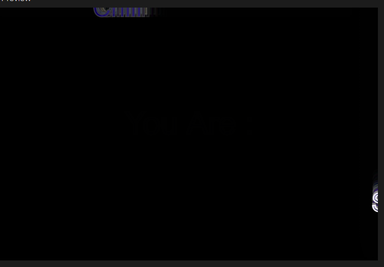
I was inspired by my love for the beach and how it resonates peace and calmness within me. So, I decided to create a digital representation of a tranquil beach scene at night. The idea was to capture the essence of the ocean waves, a crescent moon, and embed generative text that represents the soothing and rhythmic nature of the waves. For the generative text, I chose lyrics from the song ‘Waves’ by Mr. Probz, as it perfectly encapsulates the feeling of being by the ocean, and it’s a song that holds personal significance to me.

Highlight of the Code

One particular aspect of the code that I’m particularly proud of is how I created the wave-like motion for the generative text. Specifically, the following block of code:

let waveOffset = sin(frameCount * waveSpeed) * waveAmplitude;
  xPosition += direction * 1; // here we can adjust the speed (horizontally)

  // Reverse direction when text goes off-canvas
  if (
    xPosition > width + textWidth(myString) ||
    xPosition < -textWidth(myString)
  ) {
    direction *= -1;
  }

  // Draw the characters of myString with wave motion
  for (let i = 0; i < myString.length; i++) {
    let myChar = myString.charAt(i);
    
    // Calculate the horizontal position for each character
    let x = xPosition + textWidth(myChar) * i;
    
    // Display each character of myString with vertical wave-like motion
    text(myChar, x, yPosition + waveOffset);

This code combines the use of “sin()” to create a smooth wave effect and dynamic movement of the generative text as it moves horizontally across the canvas. It seamlessly simulates the rise and fall of ocean waves, adding a captivating visual element to the scene.

Reflection/Improvements

Creating this beach scene with generative text has been an engaging journey where I combined my passion for art and coding to express a personal connection with nature and music. For future improvements, I envision extending the project by incorporating interactive elements, different times of day, realistic sound with the song ‘Waves’ playing, and user customization of lyrics. These improvements would create a more immersive and user-friendly experience, making the artwork more fascinating and interactive for viewers.

Edit Link

Update: 2 October 2023

I wanted to share an update on this assignment! As mentioned in my class presentation, I was initially working on creating a digital representation of a tranquil beach scene with generative text that captures the soothing essence of ocean waves. However, due to time constraints, I was unable to achieve the exact wave-like motion I had envisioned for the generative text before the submission deadline.

But, I didn’t give up on my assignment. I continued to work on it, digging deeper into the code and experimenting with different techniques. After some additional research and coding, I finally figured out how to make the generative text move in a wavelike motion, just as I had initially planned.

Initially, the text was moving as a straight sentence going up and down in motion. However, with the new update, I have successfully implemented the wave-like motion, simulating the rise and fall of ocean waves. I’m incredibly proud of how it looks now, and I believe it truly captures the essence of the beach scene I aimed to create.

here is a snippet of the edited code:

// Draw the characters of myString with wave motion
for (let i = 0; i < myString.length; i++) {
  let myChar = myString.charAt(i);
  
  // Calculate the horizontal position for each character
  let x = xPosition + textWidth(myChar) * i;
  
  // Calculate the vertical position with wave-like motion
  let y = sin(frameCount* waveSpeed + i * waveAmplitude + waveOffset) * 5; 
  
  // Display each character with vertical wave-like motion
  text(myChar, x, yPosition + y * 3);
  
  // Display each character of myString with vertical wave-like motion
}

Here is the final result:

Week 4 – Reflection Assignment

Don Norman’s first chapter, “The Design of Everyday Things,” sheds light on the complicated world of design and its tremendous impact on our daily lives. As I reflect on the reading, several key points and questions come to mind.

The importance of user-centered design is emphasized by Norman. He contends that excellent design should prioritize the wants and expectations of users, which makes perfect sense. However, this raises a question: How often do designers genuinely consider the end users when creating products? This might be a huge difficulty in a world where firms may prioritize money or aesthetics over usability.

The example of the refrigerator’s temperature controls struck a chord with me. It made me think about how frequently I’ve faced similar problems with common things, leaving me upset due to a lack of clear design. This experience has made me more appreciative of well-designed products and less forgiving of those who prioritize aesthetics over usability.

Norman’s idea of conceptual models and their misalignment with the system image is compelling. Users clearly form mental models of how things work based on their interactions and experiences. However, usability challenges arise when these models clash with the actual workings of a product. This approach has made me realize how important it is for designers and users to communicate clearly and consistently.

In terms of bias, while Norman appears to advocate for user-centered design, it does not appear to be inherently biased. Instead, it appears as a call for a more balanced and thoughtful approach to design.

Assignment 4: 676 Wonder Hues

676 Wonder Hues

For this project, I needed to use data visualization, but instead of portraying it in a graph or a static image, I was striving to make it look dynamic while also giving agency to people to have a personalized experience. To start with, I began looking for different sets of data, but none of them were as customizable to each person as much as their names. However, there are millions of names, and it would not be possible to link all those names in a CSV file. Hence, there was an alternative way, getting a smaller sample of names and counting the number of names associated with each alphabet. To begin, I was able to get 7000 different male and female names, then using Excel I counted the number of names that starts with each alphabet. Next, I imported the Excel to my project in p5. After hours of brainstorming , I was able to modify a previous code of mine to give different visual illusions. By using only the initial of each name, I am only limited to 26 different combinations. However, by using the person’s first and last name initials, I am able to bump it to 676 different visual illustrations and hence the project name “676 wonder hues”.

Below are a few patterns to different initials.

Initials: “PM”

Initials: “DS”

Part of the code

function setup() {
  createCanvas(600, 600);

  let alphabet = names.getColumn("alphabet");
  let frequency = names.getColumn("freq");

  sampleName = "P,M";

  let splitString = split(sampleName, ",");

  alpha1 = splitString[0];
  alpha2 = splitString[1];

}
function getValue(targetAlphabet) {
  let alphabet = names.getColumn("alphabet");
  let frequency = names.getColumn("freq");
  let rowNum = names.getRowCount();

  for (let i = 0; i < rowNum; i++) {
    if (alphabet[i] === targetAlphabet) {
      return frequency[i];
    }
  }
}

Reflections and improvement

In the future I want to add a section on the screen for the user to input their initials.I also look forward to add more color combinations to increase the customizability of the visual illustration.