Midterm Progress 2 – Street Crash

What’s New!

Enhanced Menu Section

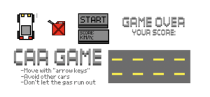
Since the first draft, I’ve implemented several exciting features to enhance the gameplay. The first notable change is in the game’s menu section. In the initial version, the game started with a simple spacebar press. Now, when you launch the game, you’re greeted with a pixelated title, instructions, and a sleek “Start” clickable button. All the text elements were crafted using a pixel font, giving the game a retro aesthetic.

Enhanced Car Controls

Once you’re in the game, you’ll notice significant improvements in the player’s car control. Your car can now move in various angles when turning left or right, offering a more immersive driving experience. You also have the freedom to move forward and backward, giving you complete control of your vehicle.

Here’s a code snippet showcasing how the player’s car rotates as you turn left and right:

// Function to handle player movement based on keyboard input.
this.move = function() {
  // LEFT
  if (keyIsDown(LEFT_ARROW)) {
    this.pos.x -= this.vel;
    if (this.a > -0.3) {
      this.a -= 0.05; // Adjust rotation speed here.
    }
  } else
  // RIGHT
  if (keyIsDown(RIGHT_ARROW)) {
    this.pos.x += this.vel;
    if (this.a < 0.3) {
      this.a += 0.05; // Adjust rotation speed here.
    }
  } else {
    // If the player isn't turning left or right, set the angle to 0.
    this.a = 0;
  }
}

Redesigned Bot Cars

I decided to revamp the bot cars and made slight design changes, all achieved using a pixel art style created with the help of the “Scratch” platform. These unique car designs add character to the game and create a visually appealing racing environment.

Fuel Management

One of the exciting new features I’ve introduced is fuel management. As you play, you must keep an eye on your fuel level. Collecting randomly placed fuel pickups in the game replenishes your fuel. If you neglect to refuel your car, the game ends. This adds an extra layer of challenge and strategy to the gameplay.

Improved Game Over Options

When you want your racing adventure to end, you now have two options to start over. Clicking the “Menu” button takes you back to the main menu, eliminating the need to crash into another car to restart the game. However, if you prefer the classic way, colliding with another car still ends the game, displaying your score and a “Game Over” message right after it.

Unique Self-Crafted Pixel Art

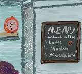
I’ve infused a touch of creativity into every detail of my game, meticulously crafting all the visuals using the Scratch platform. From the charming car designs to the captivating game titles, I’ve poured my artistic flair into each element. These pixel art creations add a unique and nostalgic appeal to the game, promising players an engaging and visually delightful experience. Below, you’ll find a selection of these original designs that contribute to the game’s distinct charm.
Edit Link

Midterm Project Progress 1: I’m Not/Too Bored

Concept:

Boredom is a state of mind that craves some type of change. I ask myself sometimes when was the last time I have gotten bored. My answer would be is that I do not remember. While discussing other’s people state or level of boredom, I can see a glimpse of the different life each one of us has. As well as the pace humans like to take for themselves.

In my game I’m Not/Too Bored I wanted to create a dialogue between characters that experince different life pace than others. Each holds a unique lifestyle that changes how they decide to go on with their way of living. While engaging in a conversation with three people, I want to gain data, that shouldn’t be too seriously taken, to showcase the level of boredom the player might experince in life. I could also add a little input that could help them as I myself never get bored.

Code & Functions:
function draw() {
  background(255);
  //main menu 
  if (instructionsVisible) {
    tint(160);
    image(startupImage, 0, 0, width, height);
    noTint();
    fill(0);
    textFont(myFont);
    textSize(20);
    fill(225);
    textSize(55);
    
    //title
    text("I'm Not/Too Bored", width / 2, height / 5);
    textSize(20);
    
    //instructions
    text("Use WASD keys to move around.", width / 2, height / 2 - 20);
    text(
      "Engage in conversations with all the characters",
      width / 2,
      height / 2 + 20
    );
    text("to get a somewhat boring result!", width / 2, height / 2 + 60);
  } else {
    
    // Display character images only after Start button is clicked
    
    image(backgroundImage, 0, 0, width, height);
    //NPC locations
    image(hugo, 50, 135);
    image(fuLi, 0, 0);
    image(rene, 280, 162);
  }
}
// Hide the start button after it has been clicked
function showInstructions() {
  instructionsVisible = false;
  startButton.hide(); 
}
Challenges Faced:

-Controlling the appearnce time of different elements took some time to organise.

-Having my images uplaod without an external server required me to rewrite my code multiple times.

So far…:

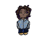
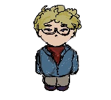
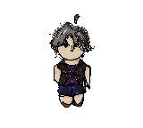
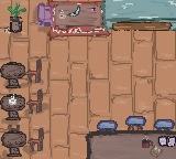
As shown below all I have right now is the main menu and my NPC just there.

I have been able to create an acceptable looking background and characters.

https://editor.p5js.org/mariamalkhoori/full/L-i2O01PV

Next Steps:

-My next step is to add the player and allow them to move around. I want the character to run around in certain areas ans bump into objects they can’t pass by (like a wall or table).

-Enable my characters to only engage with the NPCs if they are near them.

-Figure out a set of codes that allows the player to save the choices made after talking to each character and get the results.


Midterm Project:

Project Idea:

So as I was in class I remembered the funny guy Daniel’s joy as he tried to mimic the movement of the buzzing bee formed from Perlin noise in his tutorial video and I thought to myself, why not make a game that immerses the user into the game in a similar way.

Design:

So far I am just trying to create classes to form a kind of falling blocks where the user has to prevent themselves from hitting the blocks that are falling to gain points. The most challenging part of this project will probably be the collision aspect as I don’t know how to track this but hopefully, I figure it out. For now, I am done with the falling blocks and I am doing some research on how to deal with the collisions.

Progress:

Iron Knock-Midterm Assignment Progress Report 1

Concept:

The Steelpan is an integral part of Trinidad and Tobago’s cultural identity, serving as our national instrument and an emblem of our unique spirit. It transcends being a mere musical instrument; it’s a symbol of the heart and soul of our vibrant Caribbean culture. The Steelpan’s roots trace back to the early 20th century when resourceful Trinidadians ingeniously transformed discarded oil drums into melodic instruments. This innovation birthed a distinctive musical tradition that has not only captured the essence of our culture but has also resonated globally. And so, my project is a heartfelt celebration of this rich cultural heritage. I have decided to craft an engaging digital Steelpan experience that invites users to play the instrument through interacting with the mouse. (This might be changed to the keys).

Classes and Functions:

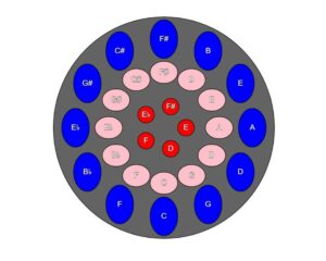
Steelpan Class: At the core of my project lies the steelpan class, an embodiment of the instrument itself within the digital realm. It comprises three rows – the outer, middle, and core – each adorned with circles representing the musical notes. The steelpan class is responsible for the visual representation of the steelpan and labelling each note seen on the pan that would be a direct instruction as to which note the user should play or click, to trigger the actual sound for this note.

I have already created numerous functions that perform major functions like operating the start and end buttons and the draw function that brings everything together.

Below is a snippet of the steelpan class.

draw() {
    // Draw the outer body of the steel pan
    fill(100, 100, 100);
    stroke(10);
    ellipse(width / 2, height / 2, 400, 400);

    // Draw the circles for the outer row with labels and hover effect
    for (let i = 0; i < this.outerCount; i++) {
      let angleOuter = i * this.angleIncrementOuter;
      let x = width / 2 + cos(angleOuter) * this.outerRadius;
      let y = height / 2 + sin(angleOuter) * this.outerRadius;
      let circleSize = 50;

      // Check if the mouse is inside the circle
      if (dist(mouseX, mouseY, x, y) < circleSize / 2) {
        fill('darkblue'); // Change to a darker color when hovering
      } else {
        fill('blue'); // Default color
      }

      ellipse(x, y, circleSize, 70);
      fill(255);
      textSize(14);
      textAlign(CENTER, CENTER);
      text(this.outerLabels[i], x, y); // Display the label for the circle
    }

    // Draw the circles for the middle row with labels and hover effect
    for (let i = 0; i < this.middleCount; i++) {
      let angleMiddle = i * this.angleIncrementMiddle;
      let x = width / 2 + cos(angleMiddle) * this.middleRadius;
      let y = height / 2 + sin(angleMiddle) * this.middleRadius;
      let circleSize = 50;

      // Check if the mouse is inside the circle
      if (dist(mouseX, mouseY, x, y) < circleSize / 2) {
        fill('darkpink'); // Change to a darker color when hovering
      } else {
        fill('pink'); // Default color
      }

      ellipse(x, y, circleSize, 40);
      fill(255);
      textSize(14);
      textAlign(CENTER, CENTER);
      text(this.middleLabels[i], x, y); // Display the label for the circle
    }

    // Draw the circles for the core row with labels and hover effect
    for (let i = 0; i < this.coreCount; i++) {
      let angleCore = i * this.angleIncrementCore;
      let x = width / 2 + cos(angleCore) * this.coreRadius;
      let y = height / 2 + sin(angleCore) * this.coreRadius;
      let circleSize = 30;

      // Check if the mouse is inside the circle
      if (dist(mouseX, mouseY, x, y) < circleSize / 2) {
        fill('darkred'); // Change to a darker color when hovering
      } else {
        fill(255, 0, 0); // Default color
      }

      ellipse(x, y, circleSize, circleSize);
      fill(255);
      textSize(14);
      textAlign(CENTER, CENTER);
      text(this.coreLabels[i], x, y); // Display the label for the circle
    }
  }
}


Challenges Faced:

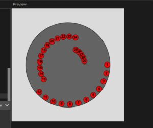
Already I encountered many challenges but a particularly difficult one, was the assignment of notes to each circle within the Steelpan, and the position of these notes. The notes at the beginning formed half of a circle instead of a full circle, and to fix this I had to play with angle increment and ensure that it was suited to each row of circles and not the entire pan. So, I had to break each row into different for loops and then I was able to get the look I was initially going for.

Before:


After:


Another challenge I foresee for the future is then using arrays to assign a specific sound for each note on the pan. After watching a few videos on how to assign sound to more than one object when the mouse is pressed, I realized that I would have to use an array to store the sounds for each row, and then allocate these sounds to the individual circles with each respective row. I want to reduce the risk of misalignment, so I have to be especially careful when assigning the sound to each note.

Next Steps:

Nevertheless, this is just the beginning. My focus in the next phase of this project is to source the audio for each note, from (WEBSITE) and save them accordingly. After this I would be solely working on ensuring that the sound and the notes align correctly as this is the only way the users would have an opportunity to delve deeper into the rich culture of Trinidad and Tobago.

Below is an embedded sketch of my work:

Assignment 5: Midterm Progress

Can you remember the last time your mother held you? How it felt so good, you didn’t want it to stop? The sea really is your Great Mother. She can rock you for forever, for as long as you need, even if you need it until you die. I’ve been thinking of the sea a lot these days. At night, it stretches out so dark. The horizon–it’s so dark. It’s black. I see it a lot these days.

I’d seen a project before that resembled the picture in my head, starting with morphing mandalas. I watched Youtube videos making these linked here. The ebb and flow reminded me of the ocean. I want to capture the trance effect. The black horizon, you can’t take your eyes off it. See below:

I also wanted to incorporate elements of interactivity by taking inspiration from this video. Maybe the sea starts out in day time. And then when you click, it’s the sea at night. And lastly, I wanted to incorporate an element of generative text. This poem by Naomi Shihab Nye has also been on my mind a lot these days. (She’ll be at the university for a writers summit on October 31 by the way.) And I want the poem to play throughout the piece like subtitles for a movie. I also want to load in sounds of the ocean that get softer and louder, corresponding with the visuals. All in all, the concept is still coming together and it’s the coding part that will be difficult but. We move.

Midterm progress

 Lucid Dream  –  a world of illusions

In recent weeks, I’ve been completely engrossed in the realm of illustrations and visual designs. I couldn’t resist delving deeper into this world of boundless possibilities. I embarked on a creative streak, aiming to produce as many distinct visual effects as I could. With each creation, I learnt something new. My goal is to establish a platform that showcases these diverse illustrations in a unique and aesthetic way. The journey has been quite lengthy, so allow me to share it with you.

To kick things off, I took more time studying the patterns I could generate, particularly by integrating sine and cosine functions to craft these visual effects. Below, you’ll find a selection of the artistic pieces I’ve crafted. Please note that these are experimental representations of different potential patterns and not the final designs.


Yeah and this one too (EXTRA COLORS!)…
(you can see the version as the title of each artwork) 😉

Then i started to look at different approaches to create the background of the main page. I wanted it to look something close to the night sky with stars, so this is one of my draft ideas.

But…. This isn’t doing justice to the other art piece, it may look simple which might compliment the “complexity” of the other pieces, But thats not what I’m looking for. I started to look at different functions in p5, until is stumbled upon orbitControl. ummm… this is too interesting to be left alone. I started looking at the different possibilities with it, i started watching videos explaining how to create a 3D object using x,y, and z axis, along with sin, cos, phi, and theta. It was time to Create a new fresh file, and put all the stuff i learnt from the previous projects as well as video tutorials.

and this is how it went..


Initially, the 3D design was static, requiring user agency to click and interact with it ( go ahead and try 😛 ). However, I aimed to make it dynamic, allowing it to move and rotate like my other projects. The challenge lay in achieving a linear movement for every point, and I didn’t have a clear solution for that at the time. Instead, I devised an alternative approach: I manipulated the “camera” using rotateX and rotateY to create the illusion of a linear visual rotation.

But…. I still haven’t figured out the initial star background. but this design has the potential to look like a night sky.

lets do this..

and here we GO!

Reflection and future plans

These were my initial concepts for the upcoming project, but I have numerous additional features in the pipeline. These include the ability to download the final static art piece, granting users more agency and a personalized experience. Additionally, there will be a main page that will serve as the home for all these art pieces.


Week 5 – Midterm progress

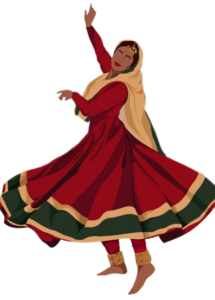
For the midterm project, I wanted to implement all the concepts learned so far and at the same time create something that represented my experiences. So I arrived at the idea of creating an interactive artwork that depicts the Indian classical dance form of Kathak. I intend to bring a unique perspective to this project, drawing from my six years of learning the dance form of Kathak.

My vision for the project is to create an experience that allows the user to explore different movements and hand gestures of the dance form. Another idea that I hope to explore is the use of the string of syllables that compose a piece as a dataset which results in the corresponding footwork for the syllable, hopefully producing a depiction of the dance.

The application of sound would be integrated in the form of the sound produced by the footbells worn by the dancer. I am also thinking of exploring the concept of a sprite sheet discussed in class which I believe would produce a more realistic effect.

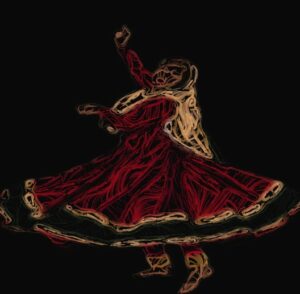
To begin the project, I started exploring a unique way of presenting the dancer. I came across an interesting tutorial on using Perlin noise to manipulate the pixels of an image. I tried implementing this but found the code a little complex, and I would like to work on simplifying it.

https://editor.p5js.org/rujulm/full/kl43KRCHP

Going forward, the challenges I perceive are the implementation of the ideas that I have into code. I have experienced challenges in coding in the past that required me to change my expectations of the final result. I hope to put in the effort to explore concepts that would help my work seem realistic.

Week 5 – Reading Reflection

“Computer Vision for Artists and Designers: Pedagogic Tools and Techniques for Novice Programmers” talks about the increasingly used concept of computer vision, which refers to the ability of a computer to interpret visuals such as data, images, and videos. The article focuses on the applications of computer vision in interactive art by describing particular examples that have stood out in this field. I found Myron Krueger’s Videoplace to be a remarkable artwork that involves various aspects of vision and interaction. It gave me the impression of optical illusions, making it seem intriguing. I also thought of the concept of LimboTime to be very impressive. Involving a relatively simple idea, the project includes exciting interactivity through computer vision.

I felt the article provided a concise yet thorough understanding of the concept of computer vision. It was informative and interesting to read about the different techniques that enable the computer to infer visual data namely, ‘frame differencing’ to detect movements, ‘background subtraction’ to detect the presence of people and objects, and ‘brightness thresholding’ that compares and classifies the pixel brightness.

The discussion of computer vision in the physical world reminded me of a very common application of computer vision. The reverse camera used in cars processes visual data to such precision which enables it to produce an accurate estimate of the guide lines that assist the driver in parking the car. However, as mentioned in the article such applications are only possible if the physical conditions are designed to be compatible with the program.

Overall, the article was an engaging read. I felt it has sparked new ideas that I hope to explore in projects and further work to understand the working of the various techniques involved in computer vision.

Midterm Progress 1 – Street Crash

Concept and User Interaction

Concept: The inspiration for my current project stems from a previous experience in an “Introduction to Computer Science” course, where I was tasked with creating a game using the Processing library in Python. This immersive experience not only kindled my passion for game development but also became the driving force behind my current endeavor. Inspired by this journey, I set out to create an entertaining 2D car racing game called “Street Crash”. The core idea is quite straightforward: players take the wheel of a virtual car and must deftly navigate it along a bustling road while skillfully avoiding collisions with other cars. The final goal is to achieve the greatest possible score while retaining control and avoiding accidents.

User Interaction: I’ve given considerable thought to the user experience in my game. I created an intuitive interaction approach to ensure that players find the game accessible and entertaining. This is how it works:

  • Player Control: Players can easily steer their car using the arrow keys. The left arrow key initiates a left turn, while the right arrow key guides the car to the right.
  • Game Start: A simple and universally recognized action ‘pressing the spacebar’ kickstarts the game. This design choice makes it easy for players to begin their adventure.
  • Game Restart: After a game over, players can swiftly get back into the action by pressing the spacebar again.

Classes and Functions

  • Player Class (player): This class takes care of everything related to the player’s car, including its position and movement. Here’s a snippet of the code:
function player() {
  // Define properties and methods for the player's car
  this.pos = createVector(width / 2, height - 100);
  this.r = createVector(40, 60);

  // Render the player's car
  this.render = function () {
    // Drawing code for the player's car
    // ...
  };

  // Update the player's car position
  this.update = function () {
    // Logic for updating player's car position
    // ...
  };
}
  • Street Class (street): This class represents the road that the player’s car travels on, including its movement.
  • Cars Class (cars): This class manages the spawning, movement, and collision detection of other cars on the road.
  • Keys Function: The keys function responds to arrow key input for controlling the player’s car.

Embedded Sketch

Tackling Complexity: Collision Detection

The collision detection system is without a doubt one of the most complex aspects of this project. It is critical to the game’s fairness and enjoyment that collisions are detected and handled reliably. To reduce the risk associated with this complexity, I’ve carefully implemented the collision detection algorithm. This method determines if the player’s car and other cars cross on both the X and Y axes, taking into account the cars’ size. In the event of a collision, the game ends, and the player is given the option to restart.

Edit Link