A brief rant on the future of interaction design…

A brief rant on the future of interaction design…

Victor expands on this idea by arguing that the future of interaction design should move beyond just screens and graphical user interfaces. He contends that our current reliance on touchscreens and GUIs is limiting, and that we need to explore more natural and intuitive ways for humans to interact with technology.

Victor argues that interaction design should leverage our innate abilities to manipulate physical objects and navigate three-dimensional space. He suggests that future interfaces should allow users to interact with information and digital content as if they were tangible objects, rather than abstract representations on a flat screen.

The article emphasizes the importance of incorporating more natural hand and body movements into interface design. Victor contends that touchscreens and mice are poor substitutes for the rich expressiveness and dexterity of human hands. He envisions interfaces that can interpret subtle gestures, manipulations, and movements to control digital systems more intuitively. I agree with Victor’s core argument that interaction design needs to evolve beyond just screens and GUIs to create more natural and intuitive interfaces.

However, I would add that while moving beyond touchscreens and traditional GUIs is important for pushing interaction design forward, we shouldn’t completely discard these technologies which call for the use of a single finger. This simple design he is ranting about is especially handy for users with certain disabilities or limitations.

For example, touchscreen interfaces with large, easy-to-tap buttons can be very beneficial for users with motor control issues or limited dexterity. The simplicity of tapping a screen with one finger opens up digital experiences to many who might struggle with more complex gestural interfaces. 

Music Box; Penguin edition

Tinh and I going into this were slightly stuck on the creative idea first. However, during a brainstorm session, we came across a video of a ballerina music box – inspiring us to create something similar to this whilst sticking to the ‘instrument’ concept of the assignments. As we did not have a mini ballerina, I had a mini figurine nonetheless – a small penguin rubber (Basil Jr). Now that we had a figurine, we had to figure out how to implement the ‘instrument’ concept into this, as we did not want to make it into a passive music box.

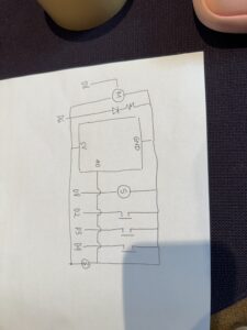
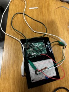
Therefore, we decided we wanted to control the movement of the penguin with the instrument. We ended up deciding that buttons could be used as the method to control movement — we decided that each button would correspond to a note, and each note has a specific rotation. Originally, we wanted to use 8 buttons to correspond to the 8 notes, however, due to the limited space on our breadboard, we chose to stick with three – C,D,E.

This is our code:

#include <Servo.h>
#include "pitches.h"


const int photoPin = A0;        // Photoresistor analog pin
const int ledPin = 6;           // LED pin
const int buttonPins[] = {2, 3, 4};  // Button pins for sound triggers
const int photoThreshold = 100; // Threshold for photoresistor reading
const int speakerPin = 8;

Servo penguinServo;             // Create servo object
const int servoPin = 9;         // Servo pin

void setup() {
    // Initialize the photoresistor, LED, and buttons
    pinMode(ledPin, OUTPUT);
    for (int i = 0; i < 3; i++) {
        pinMode(buttonPins[i], INPUT_PULLUP);  // Using internal pull-up resistor
    }

    // Attach servo to pin
    penguinServo.attach(servoPin);

    Serial.begin(9600);  // For debugging if needed
}

void loop() {
    // Read the photoresistor value
    int photoValue = analogRead(photoPin);
    Serial.println(photoValue);

    // Control the LED based on photoresistor value
    if (photoValue < photoThreshold) {
        digitalWrite(ledPin, HIGH);  // Turn on LED if it's dark
    } else {
        digitalWrite(ledPin, LOW);   // Turn off LED otherwise
    }

    // Check each button 
    for (int i = 0; i < 3; i++) {
        if (digitalRead(buttonPins[i]) == LOW) { // Button pressed
            playPitch(i);
            movePenguin(i);  // Move penguin based on button pressed
        }
    }
}

// Function to move the penguin based on the button pressed
void movePenguin(int buttonIndex) {
    switch (buttonIndex) {
        case 0:
            penguinServo.write(0);   // Move penguin in one direction
            break;
        case 1:
            penguinServo.write(90);  // Move penguin to center
            break;
        case 2:
            penguinServo.write(180); // Move penguin in the other direction
            break;
    }
    delay(1000);  // Hold position for 1 second
    penguinServo.write(90);  // Return to center
}


void playPitch(int buttonIndex) {
    switch (buttonIndex) {
        case 0:
            tone(speakerPin, NOTE_C4, 300); // Play note C4
            break;
        case 1:
            tone(speakerPin, NOTE_D4, 300); // Play note D4
            break;
        case 2:
            tone(speakerPin, NOTE_E4, 300); // Play note E4
            break;
    }
    delay(300);
    noTone(speakerPin);
}


Week 9 – Assignment

Concept:

For this assignment, I decided to create a gender reveal project. I used a red LED and a button to represent “girl,” and a blue LED and button to represent “boy.”

Implementation:

When the red button is pressed, the red LED (representing “girl”) lights up. Similarly, when the blue button is pressed, the blue LED (representing “boy”) turns on.

int yellowLED = 13; // yellow LED
int blueLED = 9;    //  blue LED
int yellowButton = A0; // yellow button 
int blueButton = A2;   // blue button 
void setup() {  
  pinMode(yellowLED, OUTPUT);    
  pinMode(blueLED, OUTPUT);        
  pinMode(yellowButton, INPUT_PULLUP); 
  pinMode(blueButton, INPUT_PULLUP);   
}

void loop() {
  int switchPositionYellow = digitalRead(yellowButton);  
  int switchPositionBlue = digitalRead(blueButton);     

  // Check if both buttons are pressed at the same time
  if (switchPositionYellow == LOW && switchPositionBlue == LOW) {
    digitalWrite(yellowLED, LOW);  
    digitalWrite(blueLED, LOW);     
    delay(500);               

    digitalWrite(yellowLED, HIGH);  
    delay(500);
    digitalWrite(yellowLED, LOW);

    digitalWrite(blueLED, HIGH);    
    delay(500);
    digitalWrite(blueLED, LOW);
  }
  
  // If only the yellow button is pressed
  else if (switchPositionYellow == LOW) { 
    digitalWrite(yellowLED, HIGH);   // Turn ON yellow LED
    digitalWrite(blueLED, LOW);      // Turn OFF blue LED
  }

  // If only the blue button is pressed
  else if (switchPositionBlue == LOW) { 
    digitalWrite(yellowLED, LOW);    // Turn OFF yellow LED
    digitalWrite(blueLED, HIGH);     // Turn ON blue LED
  }

  // If neither button is pressed
  else {
    digitalWrite(yellowLED, LOW);    // Turn OFF both
    digitalWrite(blueLED, LOW);
  }
}

IMG_8148

Week 9 – Reading

Physical Computing’s Greatest Hits (and misses)

This reading was insightful as it helped me to demystify some of my own misconceptions regarding making works that have already been done before. He tells us that it is okay to make something which has already been made before, as long as we apply our own ideas into it – add that unique touch. For example, he discusses a work made in the theme of music instruments. . The examples he shared with us, tells us that while recreating existing projects is a common starting point, it’s crucial for designers to innovate by incorporating their unique perspectives. Key elements for creating meaningful interactions include considering the context and purpose of the interaction, designing physical structures that complement intended use, and developing natural gestures that feel significant to users. Analyzing both successful and unsuccessful projects reveals important lessons: simplicity can be powerful, user experience is paramount, and innovation often arises through iteration. By understanding these principles, creators can develop more impactful physical computing projects, pushing the boundaries of interactive technology while learning from the successes and failures of their predecessors.


Making Interactive Art: Set the Stage, Then Shut Up and Listen

When I read this, I came to understand that an interactive project is a performance. When it comes to the works I make, especially the ones I have made for this class. I often find myself explaining a lot before the person gets to interact with it. But now I came to understand why that can be harmful for the user. Our work itself should be intuitive to the extent where we don’t have to explain anything — if a button is supposed to be pressed, make it approachable. Essentially, the essence of interactive art lies in its ability to engage users without extensive explanation. Just as a well-designed stage set can convey the mood and context of a play before a single word is spoken, an interactive piece should invite engagement through its visual cues, layout, and interface design By minimizing verbal instructions and allowing users to approach the work with fresh eyes, we empower them to become active participants rather than passive observers. This approach not only enhances the sense of discovery and exploration but also opens the door to unexpected and delightful interactions. The joy of interactive art often resides in the process of figuring out how to engage with it, much like solving a puzzle or exploring a new environment. As artists, our role shifts from being explainers to becoming facilitators of experiences. We set the stage, carefully crafting the environment to encourage exploration and interaction. Then, we step back, observe, and listen. This process of watching users interact with our work without intervention provides valuable insights for refining and improving the intuitive aspects of our designs.

Week 8 – Reading

Attractive things work better

I found this reading particularly intriguing because it introduced a concept I hadn’t considered before: the significance of “mindspace” in our interactions with objects. As the text points out, when users are in a relaxed state, they are more likely to successfully complete tasks, such as unlocking a door.

Additionally, the reading thoughtfully explores the idea that an object’s beauty extends beyond mere aesthetics; its functionality plays a crucial role as well. This connection between emotion and design is fascinating—attractive objects not only draw us in but also enhance our overall experience and effectiveness in using them.

Week 8 – Readings

Her Code Got People on the Moon

Hamilton has made imperative and remarkable contributions to the field of space. As the director of the Software Engineering Division at MIT’s Instrumentation Laboratory, Hamilton led the team that developed the on-board flight software for NASA’s Apollo missions, including the historic Apollo 11 moon landing. 

Margaret Hamilton’s contributions to the Apollo program and computer science have been widely recognized and celebrated. She coined the term “software engineering” to elevate the field and give it the respect it deserved alongside other engineering disciplines. Hamilton’s story not only highlights the crucial importance of software development in the success of the Apollo missions but also sheds light on the often-overlooked contributions of women in the early days of computer science and space exploration. Her pioneering work and leadership helped pave the way for future generations of software engineers and computer scientists.


Week 8 – Unusual Switch

PROJECT: UNUSUAL SWITCH

For this unusual switch project, I conceptualized a system where clicking or snapping my fingers would activate an LED light. This idea explores novel ways of interacting with electronic devices using natural gestures.

Components Used:

Arduino board: Used to control the circuit and process inputs

LED: The light source activated by the finger snap

Resistor (330 ohm): To limit current flow and protect the LED

Jumper wires: For making connections between components

Copper tape: Used as a sensor to detect the finger snap without a traditional button

REFLECTION: 

  • Importance of resistors: I initially forgot to add a resistor, which resulted in the LED burning out. This made me understand the critical role of resistors in protecting sensitive components.

IMG_7912

Midterm – Welcome to Macbeth

CONCEPT

This midterm project explores the theme of illusion in Shakespeare’s “Macbeth,” focusing on the play’s intricate examination of hallucinations and the blurred line between reality and fiction. Inspired by a recent rereading of the tragedy, I was particularly drawn to Macbeth’s psychological descent and how it manifests through vivid hallucinations. The project aims to translate these literary elements into an interactive digital experience, allowing users to engage directly with Macbeth’s internal struggles.

Dagger Scene:

Central to the project is Macbeth’s first and perhaps most iconic hallucination: the floating dagger. This vision, occurring as Macbeth grapples with the moral implications of regicide, serves as a powerful metaphor for his ethical dilemma. The famous line, “I have thee not, and yet I see thee still,” encapsulates the frustration and confusion Macbeth experiences as he attempts to grasp the illusory weapon. This moment became the cornerstone of my project.

To recreate this sense of futility and frustration, I designed a scene where users must attempt to catch a floating, elusive dagger. Initially, I incorporated a probability variable to make the dagger challenging to catch, mirroring Macbeth’s inability to clutch the hallucination. However, after discussing with my professor, I realized this approach inadvertently removed an essential aspect of user agency and responsibility.

Therefore, instead of relying on probability, a ‘jittery’ random movement for the dagger seemed the best approach. This approach maintains the essence of Macbeth’s struggle while allowing users to feel fully responsible for their actions and failures. The erratic movement of the dagger not only represents the unstable nature of hallucinations but also challenges users to question their perceptions and reflexes, much like Macbeth questioning his sanity.

function moveDagger() {
  daggerX += speedX;
  daggerY += speedY;
  if (daggerX <= 0 || daggerX >= windowWidth - 200) {
    speedX *= -0.5;
    speedX += random(-2, 7);
  }
  
  if (daggerY <= 0 || daggerY >= windowHeight - 200) {
    speedY *= -0.5;
    speedY += random(-2, 7);
  }
  
    // jittery movement

  
  speedX += random(-0.5, 0.5);
  speedY += random(-0.5, 0.5);
  speedX = constrain(speedX, -5, 7);
  speedY = constrain(speedY, -5, 7);
}


BLOODY SPOT:

Once the user manages to catch the dagger, they have essentially helped Macbeth kill the king. Then we move onto the next scene, known as the ‘bloody spot scene’, which takes place in the context of after the murder, shifts focus to Lady Macbeth and her psychological unraveling due to guilt. This level/scene aims to immerse players in her descent into madness, mirroring her frantic attempts to cleanse herself of the metaphorical blood that stains her soul.

The gameplay mechanics are designed to reflect Lady Macbeth’s futile struggle against her guilt. Players will interact with various blood spots that appear on the screen, attempting to “wash” them away using a sponge cursor. However, just as Lady Macbeth’s efforts are in vain, more spots will appear even after being washed, illustrating the persistent nature of guilt and the psychological effects of their actions. I wanted to mirror her feelings into this, so I decided to create this cyclical gameplay.

To enhance this experience, the level also features a timer that counts down from 30 seconds. This time constraint adds urgency to the gameplay while emphasizing the fleeting nature of sanity as Lady Macbeth spirals deeper into madness. Unlike traditional games that have clear winning conditions, this level does not allow players to achieve a definitive victory; instead, it reflects Lady Macbeth’s tragic fate. When the timer reaches zero, players will be confronted with a poignant message about her inability to escape her guilt, culminating in a “Game Over” screen that reinforces the themes of ambition and remorse present in Shakespeare’s tragedy.

MENU

The menu design for this Macbeth-inspired game aims to create an immersive, gothic atmosphere that sets the tone for the entire experience. Drawing inspiration from the dark themes and supernatural elements of Shakespeare’s play, the design incorporates visual and auditory elements to engage the user from the moment they enter the game.

The background is set to black, immediately establishing a somber and mysterious mood. This dark canvas serves as the perfect backdrop for the text elements, allowing them to stand out and capture the user’s attention. 

The welcome message, “Welcome To Macbeth,” is displayed using a medieval font (UnifrakturMaguntia) in a blood-red color. This font choice evokes the historical setting of the play, while the red color symbolizes the bloodshed and violence central to the story. The welcome message appears word by word with a fade-in effect, creating a sense of anticipation and drawing the user into the world of the play.

Following the welcome message, a series of paragraphs introduce the story and set up the game’s premise. These paragraphs use a more readable serif font (DM Serif Display) in white, contrasting with the black background for clarity. The text appears gradually, line by line, allowing the user to absorb the information at a measured pace. This pacing mimics the gradual unfolding of the play’s plot and builds suspense. The final line, “If you are brave enough, click D,” serves as a call to action, challenging the user to engage with the game.

SOUND: 

Throughout all levels of my Macbeth-inspired game, sound plays a crucial role in enhancing the user’s interactive experience. I carefully selected and implemented audio elements to create an immersive atmosphere that aligns with the psychological journey of the characters.

Menu Level:

To set an eerie tone from the start, I incorporated audio from an actual performance of Macbeth’s first encounter with the prophecy that catalyzes his downfall. This choice immediately immerses players in the ominous atmosphere of Shakespeare’s tragedy.

Dagger Level:

In this pivotal scene, I layered the gameplay with a recorded performance of Macbeth’s famous dagger monologue. As players attempt to grasp the elusive dagger, they simultaneously hear Macbeth grappling with his moral dilemma. This audio-visual synergy deepens the player’s connection to Macbeth’s psychological state. Upon successfully catching the dagger, symbolizing Macbeth’s decision to commit murder, a sharp ‘slash’ sound effect punctuates the moment, aurally representing the finality and violence of his choice. In addition, I also added a fading effect – from white to black, to symbolize Macbeth’s descent.

Bloody Spot Level:

For Lady Macbeth’s scene, I opted for a more subtle approach with a general background soundscape. This audio backdrop sonically communicates Lady Macbeth’s internal turmoil and growing madness, enhancing the player’s understanding of her psychological plight without overpowering the gameplay.

Challenges:

I encountered a significant challenge with sound between scene transitions. Initially, audio from previous scenes would continue playing in subsequent levels, creating a chaotic and unintended soundscape. To resolve this, I implemented a sound management system where I call the .stop() method on all active audio elements at the beginning of each new scene. This ensures a clean audio slate for each level, maintaining the intended atmosphere and preventing audio overlap.

However, the most PROMINENT issue that I had (I spent two days trying to figure this out) was the sound — my sound in Menu (the prophecy audio) would play automatically when I run it in p5, like it should. However, when I go the full screen mode, the audio (the prophecy)  would not play, only when I would click ‘R’ to restart . I originally assumed that there was some conflict in my restartMenu() function. However, after tearing my code apart trying to figure out why the sound would not specifically play from full screen but would play in the preview/regular screen, I decided to turn to ChatGPT to see if it was able to recognise the problem. It immediately told me that it was due to my browser (I’m just happy there were no logical fallacies in my code) and how it handles audio autoplay. It told me that many browsers restrict automatic playback of sounds without user interaction, especially on initial load. Therefore, it just told me to use a built-in function from p5 called userStartAudio() — it explained to me that I should code a specific user interaction that can trigger the sound.

Thus this I coded:

function setupMenu() {

  background('black');

  medievalFont = 'UnifrakturMaguntia';

  paraFont = 'DM Serif Display';


  // to play audio

  userStartAudio();


  if (prophecy.onended ) {

      prophecyPlay = false;  

  }

}


function mousePressed() {

  if (!prophecy.isPlaying()) {

    prophecy.play();

    prophecyPlay = true;

  }


}

And my code now functions as expected when I go full screen!

This project has been the most insightful to teach me to be open to feedback, as well as really understanding the elements of  what it takes to make something interactive and functional.

This is the link:

WELCOME_TO_MACBETH


Week 5 reading

This reading was instrumental in my understanding of how computer vision techniques can be harnessed in the realm of interactive art and design.

One of the most enlightening aspects of the article was its clear explanation of the fundamental differences between computer and human vision. Understanding these distinctions helped me grasp why certain approaches are necessary when implementing computer vision in artistic contexts. The emphasis on the limitations of computer vision systems, such as their struggle with environmental variability, underscored the importance of thoughtful design in both the physical and digital realms.

The article’s discussion of various techniques to optimize computer vision for artistic applications was particularly valuable. Levin’s explanations of methods like controlled lighting, and algorithms provided me with a toolkit of practical approaches. This knowledge feels empowering, as it opens up new possibilities for creating interactive artworks that can reliably detect and respond to elements in a scene.

The ethical considerations raised in the article regarding tracking and surveillance capabilities of computer vision were thought-provoking. Levin’s examples of artists like David Rokeby and the Bureau of Inverse Technology, who have used these technologies to comment on surveillance culture and social issues, inspired me to think about how I might incorporate similar critical perspectives in my own work.

Furthermore, the range of artistic applications presented in the article, from full-body interactions to facial expression analysis, expanded my understanding of what’s possible with computer vision in art. These examples serve as a springboard for imagining new interactive experiences and installations.

In conclusion, this reading has significantly enhanced my understanding of computer vision in the context of interactive art. It has equipped me with technical knowledge, practical approaches, and critical perspectives that I’m eager to apply in my own creative practice.

Week 5 – Midterm Progress Report

CONCEPT:

Reading, as typical as it sounds, really and truly does fuel my creativity. I have always been keen on Shakespeare, particularly his tragedies. For this project, I want to explore how to toy with the human eye. In Shakespearean tragedies, the protagonists experience some sort of downfall that is indicated through the beginning of experiencing hallucinations. It is typically catalyzed due to paranoia and guilt – or a general feeling of loss of control over a situation. Macbeth is one of those characters. The Tragedy of Macbeth stands out because it is a lesson on arrogance and ambition – and how quickly the human spirit can be broken from guilt and ambition. Macbeth and his wife, Lady Macbeth, experience a series of hallucinations as they attempt to wrap their minds around the notion of regicide. Therefore, this project will have the user attempt to help them through these hallucinations.

EXPLAIN:

There are three hallucinations in Macbeth: A Dagger that Macbeth sees floating in the air that he cannot seem to catch; Banquo’s ghost (Macbeth’s friend he murdered), and blood on Lady Macbeth’s hands. These hallucinations are a manifestation of their guilt. For this project, I have chosen to leave out the hallucination of Banquo, as I would like to do a more stable approach of focusing and detailing and balancing the hallucinations between the husband and wife, the Macbeths. The Dagger Scene, and the Bloody Spot Scene are going to be divided into two levels or scenes.

SCENES:

The dagger level will have a floating hand (Macbeth) attempt to catch a floating dagger, but it will always seem to evade his hand, essentially driving him mad. This is inspired by the monologue he has, “Is this a dagger which I see before me?/The handle toward my hand?/ Come, let me clutch the/  I have thee not, and yet/ I see thee still.”. Here, he is basically saying that he sees this dagger, but as he tries to capture it in his hand, he cannot. I would add a speed variable – so that at moments the dagger will slow down, giving the user the opportunity to catch it. The purpose of this game overall  is not to win, but to simply understand Macbeth and the play a little better. 

For Lady Macbeth’s hallucination — the Bloody Spot level — the user will engage in a different type of interaction that reflects her overwhelming guilt. In this scene, the user will control Lady Macbeth’s hands as they attempt to wash away the bloodstains that symbolize her remorse. The gameplay will involve blood spots appearing randomly on the screen, and the user will need to “wash” these spots by moving Lady Macbeth’s hands over them. As the user succeeds in removing one spot, new ones will emerge, creating an endless cycle that mirrors her inability to escape her guilt. This mechanic emphasizes the futility of her actions and the psychological torment she experiences.

The purpose of the user interaction is to highlight the internal struggles and frailty of the characters. 

IMPLEMENTATION:

To effectively implement these ideas in code, I plan to create several classes: Dagger, Hand, and BloodSpot. Each class will encapsulate properties such as position, speed, and visibility. The functions will include moveDagger(), which updates the dagger’s position and speed; checkCollision(), which detects proximity between the hand and dagger; generateBloodSpots(), which creates new blood spots on the screen; and washBloodSpot(), which reduces the opacity of blood spots when interacted with. 

However, I anticipate several challenges throughout this process. The dagger’s movement algorithm must be realistic yet unpredictable enough to convey Macbeth’s frustration. 

Creating a sense of futility in gameplay will also be essential. Balancing difficulty is key; while users should feel challenged, they must also understand that catching the dagger is ultimately impossible. Gradually increasing difficulty or ensuring that new blood spots continuously appear will reinforce this theme. Lastly, integrating atmospheric sounds or character voices using the p5.sound library could enhance immersion and emotional impact.

To minimize risks associated with these challenges, I plan to implement the dagger movement algorithm first and test various approaches to ensure it feels engaging yet frustrating. Creating a prototype for the blood spot washing mechanic will help determine its intuitiveness early on. 

CODE:

In terms of my current code, I also decided to add two menus – one at the start and one at the end. The one at the start introduces the user to Macbeth. I wanted to make this extremely engaging. Although the final interface and design for the menu is not done yet, I wanted to implement sound almost immediately. The first speakers – the female voices — are actually from Macbeth. It is a prominent dialogue in which they, the witches, converse with Macbeth and let him know of a prophecy – that he will be king. However, there is already a king. So for Macbeth to be king, that means he would have to kill him. I wanted to create an eerie and uncomfortable experience — the whole time, I want users to be on their toes. 


However, I am most proud of figuring out how to navigate through different levels. It seemed like a no-brainer, but it took me time to figure it out.

function mouseClicked() {
  if (currentScene == 'menu'){
    currentScene = 'dagger';
  }
  else if (currentScene === 'dagger') {
    currentScene = 'bloodySpot';
  } 
  else if (currentScene == 'bloodySpot') {
    currentScene = 'closing'
  }
}

I have a lot left to accomplish, but overall I am looking forward to doing something unique.