
Concept
My concept is a semi-thriller game that features two key sensors — the joystick, and the pulse sensor. It was inspired by my siblinghood. Growing up, I would often eat my sister’s snacks, of course, without her permission. This would give me a thrill that was akin to what someone would feel playing hide-and-seek with a murderer (I’m exaggerating here; I actually really love my sister haha). I settle on making it “slime-themed” since I wanted it to be more fun and gender-neutral to be inclusive to all players (possibly people that had older brothers, cousins, etc.). I mean certainly a slime character is non-specific enough I think.
How it works
Well, when you first start the game, you will be greeted with an eery background music and screen image with two options: “how to play” and “start game”. If you press on “how to play” with the joystick, you’ll be shown a very comprehensive manual on how to play the game. Then, if you press start, it’ll take you to the game dialog, and you can click through the dialog through the joystick clicks. After that, the game begins! When it starts, on the top right of the screen there is a icon of slime chips with a number on top, these are the number of chips you need to eat without getting caught and losing all your hearts. The number of hearts you have is on the top left. When the sister turns around and you’re eating your chips (i.e. your hands are touching; you can move the right hand with the chips left and right with the joystick), she gets mad and you lose a heart. Here are the game p5.js visuals:
(startscreen) (how to play)
 (dialog screen)
 (game started and sister turned around)
 (game started and sister caught you!!)
 (you won!!)

Implementation
1. Interaction Design:
I wanted it to have a flex sensor initially as the pseudo “joystick” but I realized that that wouldn’t really be intuitive or even enjoyable for the average user likely due to its foreign nature in games like these. So I decided to borrow a joystick from the IM lab, alongside a pulse sensor. I wanted to make the game take real-time input from the user and imitate the scenario of my heart racing as a kid when stealing my sister’s food. So, every 1.5 to 2.5 seconds, the game checks if the user’s heartbeat ‘jumps’ by more than 70 (imitating nervousness). If so, or with a 25% random chance, the sister turns around. I did this to simulate the tension of being caught, as the player’s nervousness (heartbeat jump) makes the slime sibling more likely to notice you with a bit of randomness. I added chip-eating sound effects among some other sounds to reflect what is happening on the screen.
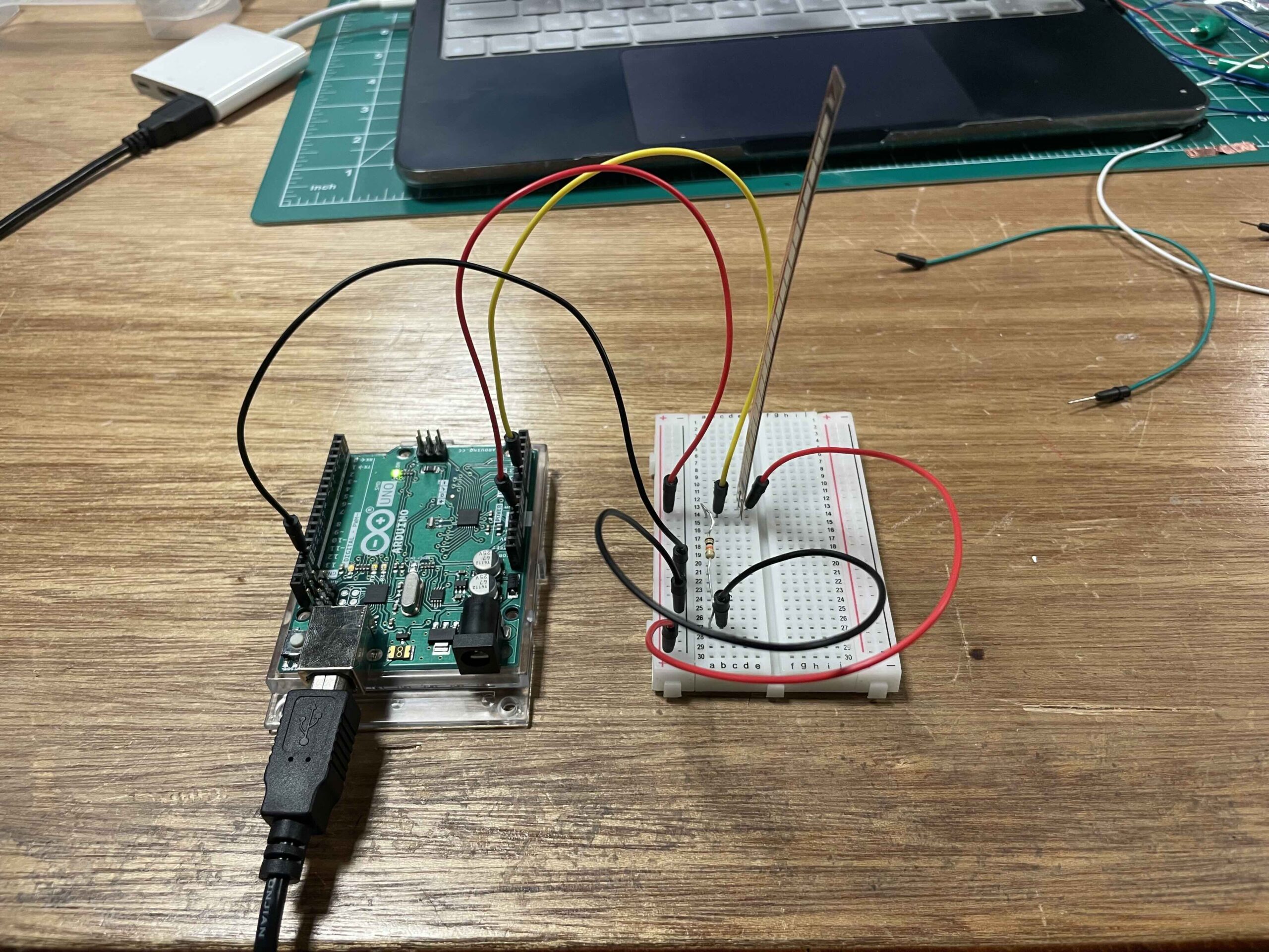
2. Arduino Code:
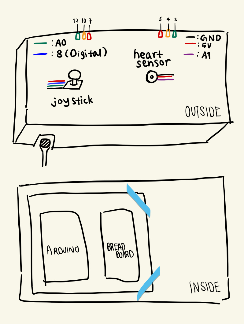
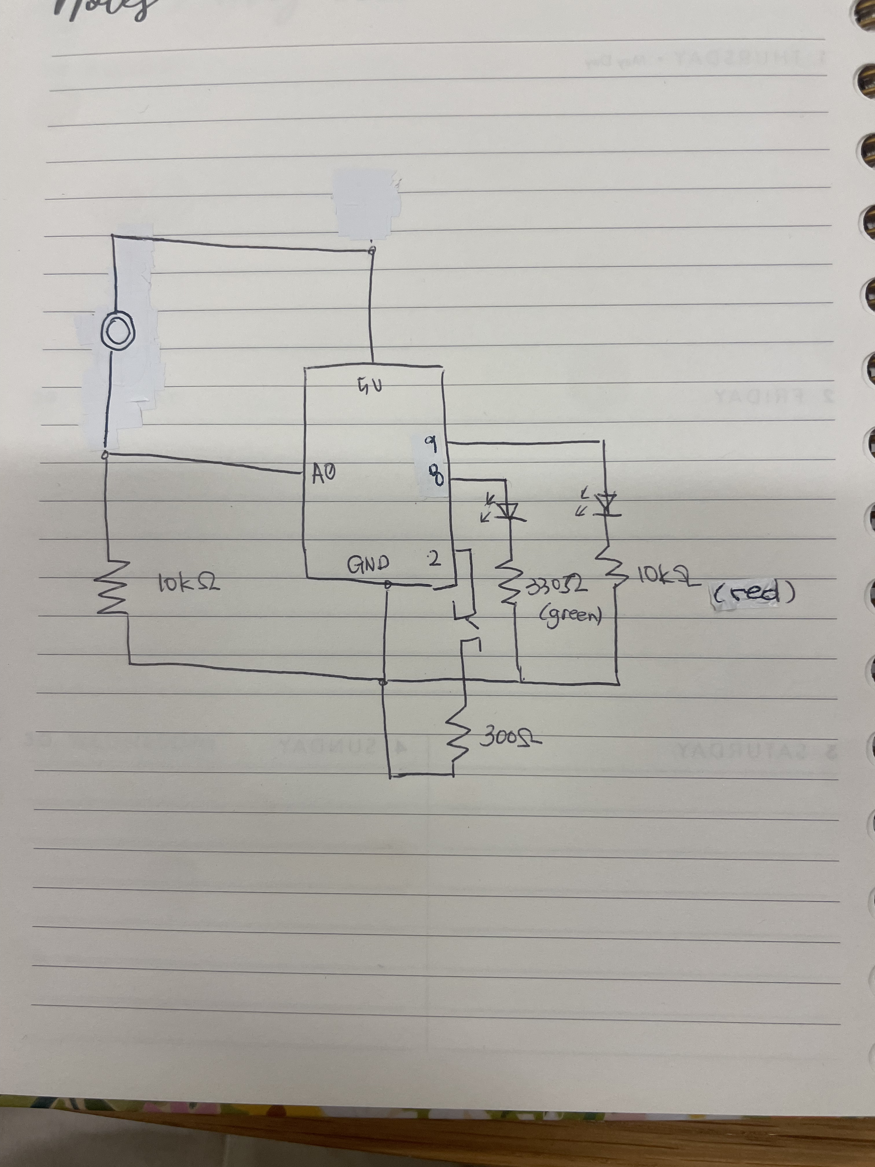
My Arduino code controls three pairs of colored LEDs (red, yellow, green) based on commands received from a computer (via Serial). It also reads a joystick’s X-axis, a pulse sensor, and a joystick button (I put print statements for their values for debugging and monitoring). Only one color is lit at a time, and the code ignores repeated color commands, to make sure a state is reflected clearly for the player. I also added some helper functions to keep all LEDs off at the beginning and another one so that the same color LED is on at both sides of the box. Here is the code:
const int joyXPin   = A0;    // joystick a-axis
const int pulsePin  = A1;    // pulse sensor
const int selPin    = 8;     // joystick “select” button (digital)
const int baudRate  = 9600;

// LED pins
const int RED_L  = 7,  RED_R  = 5;
const int YEL_L  = 10, YEL_R  = 4;
const int GRN_L  = 12, GRN_R  = 2;

const int threshold = 50;    // dead-zone around center (512)

// remembering last LED state
String currentCmd = "";

void setup() {
  Serial.begin(baudRate);
  pinMode(selPin, INPUT_PULLUP);

  // LED pins
  pinMode(RED_L, OUTPUT);
  pinMode(RED_R, OUTPUT);
  pinMode(YEL_L, OUTPUT);
  pinMode(YEL_R, OUTPUT);
  pinMode(GRN_L, OUTPUT);
  pinMode(GRN_R, OUTPUT);

  // start with all off
  clearAllLeds();
}

void loop() {
  // checking for new command from p5.js
  if (Serial.available()) {
    String cmd = Serial.readStringUntil('\n');
    cmd.trim();

    // only accept valid colors
    if (cmd == "RED" || cmd == "YELLOW" || cmd == "GREEN") {
      // if different than last, update
      if (cmd != currentCmd) {
        currentCmd = cmd;
        applyLeds(currentCmd);
      }
    }
    // echo back for debugging
    Serial.print("Received: ");
    Serial.println(cmd);
  }

  // existing joystick/pulse prints
  int xRaw    = analogRead(joyXPin);
  int pulseRaw = analogRead(pulsePin);
  bool selPressed = (digitalRead(selPin) == LOW);

  int dirX;
  if (xRaw < 512 - threshold)      dirX = 0;
  else if (xRaw > 512 + threshold) dirX = 1;
  else                              dirX = -1;

  Serial.print("DIRX:");   Serial.print(dirX);
  Serial.print("  PULSE:");Serial.print(pulseRaw);
  Serial.print("  SEL:");  Serial.println(selPressed ? 1 : 0);
}

// helper to turn all LEDs off
void clearAllLeds() {
  digitalWrite(RED_L, LOW); digitalWrite(RED_R, LOW);
  digitalWrite(YEL_L, LOW); digitalWrite(YEL_R, LOW);
  digitalWrite(GRN_L, LOW); digitalWrite(GRN_R, LOW);
}

// helper to set exactly one color on both sides
void applyLeds(const String &cmd) {
  clearAllLeds();
  if (cmd == "RED") {
    digitalWrite(RED_L, HIGH);
    digitalWrite(RED_R, HIGH);
  }
  else if (cmd == "YELLOW") {
    digitalWrite(YEL_L, HIGH);
    digitalWrite(YEL_R, HIGH);
  }
  else if (cmd == "GREEN") {
    digitalWrite(GRN_L, HIGH);
    digitalWrite(GRN_R, HIGH);
  }
}
3. Schematic of Project:
4. p5.js Code:
The game features multiple states (start menu, gameplay, how-to-play screen) managed through a state machine architecture. When playing, users control a hand to grab chips while avoiding detection from the sister character who randomly turns around. The sister’s turning behavior is influenced by both randomness and the player’s actual heartbeat measured through a pulse sensor.
Key features in the p5.js include:
- Dialog system for narrative progression
- Character animation with multiple emotional states
- Collision detection between hands
- Health and scoring systems (hearts and chip counter)
- Two endings (happy and bad) based on gameplay outcomeThis is the code:
let gameState = 'start'; // 'start', 'game', or 'howToPlay'
let startImg;
let bgImg;
let howToPlayImg;
let bgMusic;
let angry;

// serial communication variables
let rightX = 0;
let pulseValue = 0;
let connectButton; // button to initiate serial connection

// hoystick control variables for menu navigation
let currentSelection = 0; // 0 = start game, 1 = how to play
let selPressed = false;
let prevSelPressed = false; // to detect rising edge
let backButtonSelected = false; // tracking if back button is selected in how to play screen

// hand objects
let leftHand = {
  img: null,
  x: 0,
  y: 0,
  width: 150,
  height: 150,
  visible: false
};

let rightHand = {
  img: null,
  x: 0,
  y: 0,
  width: 150,
  height: 150,
  visible: false,
  currentImg: 1, // tracking current hand image (1, 2, or 3)
  animationStarted: false, // tracking if animation has started
  animationTimer: 0, // timer for animation
  lastLedState: "",
  sisterTurned: false, // tracking if sister is turned around
  sisterTurnStart: 0,      // ← when she last flipped to “turned”
  maxTurnDuration: 1700,   // ← max ms she can remain turned (1.7 s)
  lastTurnCheck: 0, // timer for checking sister's state
  heartDeducted: false, // flag to track if heart was deducted in current overlap
  lastSisterState: false, // tracking previous sister state to detect changes
  sisterAngry: false, // flag to track if sister is angry
  lastPulseValue: 0 // tracking last pulse value for heartbeat detection
};

let chipCounter = {
  img: null,
  x: 0,
  y: 0,
  width: 80,
  height: 80,
  count: 10
};

let hearts = {
  img: null,
  count: 5,
  width: 30,
  height: 30,
  spacing: 10,
  x: 20,
  y: 20
};

let gameOver = false;
let gameEndingType = ''; // 'good' or 'bad' to track which ending to show

let dialogSounds = {};

let startButton = {
  x: 0,
  y: 0,
  width: 150,
  height: 30,
  text: 'start game',
  isHovered: false
};

let howToPlayButton = {
  x: 0,
  y: 0,
  width: 180,
  height: 30,
  text: 'how to play',
  isHovered: false
};

let backButton = {
  x: 0,
  y: 0,
  width: 100,
  height: 40,
  text: 'Back',
  isHovered: false
};

let instrumentSerifFont;
let currentDialog = null;

let characters = {};

function preload() {
  startImg = loadImage('Images/start.png');
  bgImg = loadImage('Images/bg.png');
  howToPlayImg = loadImage('Images/howtoplay.png');
  instrumentSerifFont = loadFont('InstrumentSerif-Regular.ttf');
  bgMusic = loadSound('Audios/bg.mp3');
  leftHand.img = loadImage('Images/left_hand.png');
  rightHand.img = loadImage('Images/right_hand1.png');
  rightHand.img2 = loadImage('Images/right_hand2.png');
  rightHand.img3 = loadImage('Images/right_hand3.png');
  chipCounter.img = loadImage('Images/slimechips.png');
  hearts.img = loadImage('Images/heart.png');
  happyEndingImg = loadImage('Images/happy_ending.png');
  badEndingImg = loadImage('Images/bad_ending.png');

  dialogSounds['chipbag.mp3'] = loadSound('Audios/chipbag.mp3');
  dialogSounds['chip_crunch.mp3'] = loadSound('Audios/chip_crunch.mp3');
  dialogSounds['angry.mp3'] = loadSound('Audios/angry.mp3');

  characters['sister_normal'] = new Character('sister_normal', 'Sister', 'Images/sister_normal.png');
  characters['sister_speaking'] = new Character('sister_speaking', 'Sister', 'Images/sister_speaking.png');
  characters['sister_turned'] = new Character('sister_turned', 'Sister', 'Images/sister_turned.png');
  characters['sister_upset'] = new Character('sister_upset', 'Sister', 'Images/sister_upset.png');
  characters['sister_angry'] = new Character('sister_angry', 'Sister', 'Images/sister_angry.png');
  characters['slime'] = new Character('slime', 'me', 'Images/slime.png');
  characters['slime_speaking'] = new Character('slime_speaking', 'me', 'Images/slime_speaking.png');
  for (let key in characters) {
    characters[key].preload();
  }
}

async function setUpSerialWithErrorHandling() { // handling errors with serial
  try {
    await setUpSerial();
  } catch (error) {
    console.log("Serial connection failed: " + error.message);
  }
}

function setup() {
  createCanvas(627, 447);
  noCursor();

  // playing background music
  bgMusic.setVolume(0.5);
  bgMusic.loop();

  textFont(instrumentSerifFont);

  connectButton = createButton('connect serial');
  connectButton.position(25, 25);
  connectButton.style('font-size', '18px');
  connectButton.style('font-weight', 'bold');
  connectButton.style('color', '#000');
  connectButton.style('background-color', '#fff');
  connectButton.style('border', '2px solid #000');
  connectButton.style('border-radius', '8px');
  connectButton.style('padding', '8px 16px');
  connectButton.style('cursor', 'pointer');

    connectButton.mouseOver(() => {
      connectButton.style('background-color', '#000');
      connectButton.style('color', '#fff');
    });
    connectButton.mouseOut(() => {
      connectButton.style('background-color', '#fff');
      connectButton.style('color', '#000');
    });

  connectButton.mousePressed(setUpSerialWithErrorHandling); // using setUpSerial from p5.web-serial.js


  positionStartScreenButtons();

  positionBackButton();

  rightHand.x = width - 10;
  rightHand.y = height/2 - rightHand.height/2;

  chipCounter.x = width - chipCounter.width - 20;
  chipCounter.y = 20;

  const sampleDialog = [
    { speaker: 'sister_speaking', line: "Hey! Have you seen my chips?" },
    { speaker: 'slime', line: "Nope, I haven't seen them." , sound: "chipbag.mp3"},
    { speaker: 'sister_upset', line: "Hmmm... are you sure?" },
    { speaker: 'slime_speaking', line: "Yep...! Haven't seen them! I'll let you know if I see them!" },
    { speaker: 'sister_speaking', line: "Grrr! If I catch you with them..I'm going to kill you!" }
  ];
  currentDialog = new Dialog(sampleDialog); // passing the new structure to the Dialog constructor
}

function readSerial(data) {
  let val = trim(data);
  if (!val) return;

  let parts = val.split(" ");

  // parsing DIRX for both game movement and menu navigation
  let dirPart = parts.find(p => p.startsWith("DIRX:"));
  if (dirPart) {
    let dir = int(dirPart.split(":")[1]);

    // setting rightX for in-game hand movement
    if (dir === 0) {
      rightX = width * 0.25;  // move left

      // for menu navigation, select the left button (start game)
      if (gameState === 'start') {
        currentSelection = 0; // selecting start game button
      }
      // for how to play screen, select the back button when moving left
      else if (gameState === 'howToPlay') {
        backButtonSelected = true;
      }
    } else if (dir === 1) {
      rightX = width * 0.75;  // move right

      // for menu navigation, select the right button (how to play)
      if (gameState === 'start') {
        currentSelection = 1; // selecting how to play button
      }
      // for how to play screen, deselect the back button when moving right
      else if (gameState === 'howToPlay') {
        backButtonSelected = false;
      }
    } else if (dir === -1) {
      rightX = width / 2;     // center (neutral)
    }

    console.log("Joystick Direction:", dir);
  }

  // parsing SEL for button selection
  let selPart = parts.find(p => p.startsWith("SEL:"));
  if (selPart) {
    let sel = int(selPart.split(":")[1]);
    prevSelPressed = selPressed;
    selPressed = (sel === 1);

    // if SEL button was just pressed (rising edge detection)
    if (selPressed && !prevSelPressed) {
      // handling button selection based on current screen
      if (gameState === 'start') {
        if (currentSelection === 0) {
          startGame();
        } else if (currentSelection === 1) {
          showHowToPlay();
        }
      } else if (gameState === 'howToPlay') {
        // only going back if the back button is selected
        if (backButtonSelected) {
          goBackToStart();
        }
      } else if (gameState === 'game' && currentDialog && !currentDialog.isComplete) {
        currentDialog.advanceDialog();
      }
    }
  }

  // parsing PULSE
  let pulsePart = parts.find(p => p.startsWith("PULSE:"));
  if (pulsePart) {
    pulseValue = int(pulsePart.split(":")[1]);
    console.log("Pulse Reading:", pulseValue);
  }
}


// helper that mirrors mouseClicked() logic but uses joystick coords
function joystickClick(x,y){
  if(gameState==='start'){
    // is it on the “start” button?
    if(x > startButton.x && x < startButton.x+startButton.width &&
       y > startButton.y && y < startButton.y+startButton.height){
      startGame();
    }
    // how-to-play button?
    else if(x > howToPlayButton.x && x < howToPlayButton.x+howToPlayButton.width &&
            y > howToPlayButton.y && y < howToPlayButton.y+howToPlayButton.height){
      showHowToPlay();
    }
  }
}


function draw() {
  background(255);

  switch (gameState) {
    case 'start':
      drawStartScreen();
      updateButtonHover(startButton);
      updateButtonHover(howToPlayButton);
      break;
    case 'game':
      drawGameScreen();
      updateButtonHover(backButton);
      break;
    case 'howToPlay':
      drawHowToPlayScreen();
      updateButtonHover(backButton);
      break;
  }

  if (!gameOver) {
    noCursor();
  }
}

function drawStartScreen() {
  image(startImg, 0, 0, width, height);

  // updating button hover state based on joystick selection instead of mouse
  if (gameState === 'start') {
    // hilighting the currently selected button based on joystick input
    startButton.isHovered = (currentSelection === 0);
    howToPlayButton.isHovered = (currentSelection === 1);
  }

  drawButton(startButton);
  drawButton(howToPlayButton);

  // hiding back button on start screen
  backButton.x = -backButton.width; // positioning off-screen
}

function drawGameScreen() {
  image(bgImg, 0, 0, width, height);

  // drawing dialog if it exists and isn’t complete
  if (currentDialog && !currentDialog.isComplete) {
    currentDialog.display();
    return;
  }

  // if dialog is complete but gameover, show ending
  if (gameOver) {
    drawGameOverScreen();
    return;
  }

  // --- sister character ---
  let sisterWidth  = 180;
  let sisterHeight = 200;
  let sisterX = width/2 - sisterWidth/2;
  let sisterY = height/2 - sisterHeight/2 - 30;

  let sisterImg = characters['sister_turned'].img;
  if (rightHand.sisterAngry)        sisterImg = characters['sister_angry'].img;
  else if (rightHand.sisterTurned)  sisterImg = characters['sister_upset'].img;

  // possibly flip her based on time+random+heartbeat
  if (!rightHand.lastTurnCheck
      || millis() - rightHand.lastTurnCheck > random(1500, 2500)) {

    rightHand.lastTurnCheck = millis();
    let heartbeatTrigger = (rightHand.lastPulseValue
      && Math.abs(pulseValue - rightHand.lastPulseValue) > 70);
    rightHand.lastPulseValue = pulseValue;

    if (random() < 0.25 || heartbeatTrigger) {
      rightHand.sisterTurned = !rightHand.sisterTurned;
      if (rightHand.sisterTurned) {
        rightHand.sisterTurnStart = millis();
      }
      rightHand.sisterAngry   = false;
      rightHand.heartDeducted = false;
    }
  }

  image(sisterImg, sisterX, sisterY, sisterWidth, sisterHeight);

  // enforcing max “turned” time
  if (rightHand.sisterTurned
      && millis() - rightHand.sisterTurnStart > rightHand.maxTurnDuration) {
    rightHand.sisterTurned   = false;
    rightHand.sisterAngry    = false;
    rightHand.heartDeducted  = false;
  }

  // --- Collision ---
  leftHand.x = width/2 - leftHand.width - 50;
  leftHand.y = height/2 + leftHand.height/2;

  // compute & smooth right hand
  let targetX = constrain(rightX, width*0.1, width*0.9);
  rightHand.x += (targetX - rightHand.x)*0.2;
  rightHand.y  = height/2 + rightHand.height/2;

  let handsOverlap = checkHandCollision(leftHand, rightHand);
  let ledState = "";
  if (handsOverlap && rightHand.sisterTurned && !rightHand.heartDeducted) {
    // CAUGHT → angry → RED
    hearts.count--;
    rightHand.heartDeducted = true;
    rightHand.sisterAngry   = true;
    ledState = "RED";
    dialogSounds['angry.mp3'].play();

    if (hearts.count <= 0) {
      gameOver = true;
      gameEndingType = 'bad';
    }
  }

  else if (handsOverlap && rightHand.sisterTurned && rightHand.heartDeducted) {
    ledState = "RED";
  }
  else if (!rightHand.sisterTurned) { // sister is not turned
    // SAFE while she’s turned → GREEN
    ledState = "GREEN";
  }
  else if (rightHand.sisterTurned && !handsOverlap) { // sister is turned but hands are not overlapping
    // NORMAL (not turned) → YELLOW
    ledState = "YELLOW";
  }

  if (ledState && ledState !== rightHand.lastLedState) {
    writeSerial(ledState + "\n");
    rightHand.lastLedState = ledState;
  }

  // --- Eating Animation & Chips ---
  if (handsOverlap && !rightHand.animationStarted) {
    rightHand.animationStarted = true;
    rightHand.animationTimer   = millis();
    if (rightHand.currentImg === 3 && chipCounter.count > 0) {
      chipCounter.count--;
      if (chipCounter.count <= 0) {
        gameOver = true;
        gameEndingType = 'good';
      }
    }
    rightHand.currentImg = 1;
    dialogSounds['chip_crunch.mp3'].play();
  }
  else if (handsOverlap && rightHand.animationStarted) {
    let t = millis() - rightHand.animationTimer;
    if (rightHand.currentImg === 1 && t > 300) rightHand.currentImg = 2;
    if (rightHand.currentImg === 2 && t > 500) rightHand.currentImg = 3;
    if (rightHand.currentImg === 3 && t > 800) {
      rightHand.animationTimer = millis();
      rightHand.currentImg = 1;
      if (chipCounter.count > 0) {
        chipCounter.count--;
        if (chipCounter.count <= 0) {
          gameOver = true;
          gameEndingType = 'good';
        }
      }
      dialogSounds['chip_crunch.mp3'].play();
    }
  }
  else if (!handsOverlap && rightHand.animationStarted) {
    rightHand.animationStarted = false;
    dialogSounds['chip_crunch.mp3'].stop();
  }

  // drawing hands
  let handImg = rightHand.currentImg===1 ? rightHand.img
              : rightHand.currentImg===2 ? rightHand.img2
              : rightHand.img3;
  image(handImg, rightHand.x, rightHand.y, rightHand.width, rightHand.height);
  image(leftHand.img, leftHand.x, leftHand.y, leftHand.width, leftHand.height);

  image(chipCounter.img, chipCounter.x, chipCounter.y, chipCounter.width, chipCounter.height);
  push();
    fill(255); stroke(0); strokeWeight(2);
    textSize(24); textAlign(CENTER, CENTER);
    text(chipCounter.count, chipCounter.x+chipCounter.width/2, chipCounter.y+chipCounter.height/2);
  pop();
  for (let i=0; i<hearts.count; i++) {
    image(hearts.img, hearts.x+(hearts.width+hearts.spacing)*i, hearts.y, hearts.width, hearts.height);
  }
}

// function to check collision between hand objects
function checkHandCollision(hand1, hand2) {
  // rectangular collision detection
  return (
    hand1.x + 10 < hand2.x + hand2.width &&
    hand1.x + hand1.width > hand2.x &&
    hand1.y < hand2.y + hand2.height &&
    hand1.y + hand1.height > hand2.y
  );
}

function drawHowToPlayScreen() {
    background(50);
    let imgWidth = width * 0.9; // Use 90% of screen width
    let imgHeight = height * 0.7; // Use 70% of screen height
    image(howToPlayImg, width/2 - imgWidth/2, height/2 - imgHeight/2 + 30, imgWidth, imgHeight);

    fill(255);

    textSize(35);
    textAlign(CENTER, CENTER);
    text("How to Play", width/2, height/2 - imgHeight/2 - 15);

    backButton.isHovered = backButtonSelected;

    drawButton(backButton);

    startButton.x = -startButton.width; // Position off-screen
    howToPlayButton.x = -howToPlayButton.width; // Position off-screen
}


function startGame() {
  gameState = 'game';
  console.log("Game Started!");

  if (bgMusic.isPlaying()) {
    bgMusic.stop();
  }

  if (currentDialog) {
      currentDialog.currentLineIndex = 0;
      currentDialog.isComplete = false;
  }

  positionBackButton();
}

function showHowToPlay() {
  gameState = 'howToPlay';
  console.log("Showing How to Play");
   positionBackButton();
}

function goBackToStart() {
    gameState = 'start';
    console.log("Going back to Start Screen");
    positionStartScreenButtons();
}


// helper function to position buttons on the start screen
function positionStartScreenButtons() {
    textSize(20);
    startButton.width = textWidth(startButton.text) + 40;
    howToPlayButton.width = textWidth(howToPlayButton.text) + 40;
    startButton.height = 40;
    howToPlayButton.height = 40;


    let buttonY = height * 0.65; // Moved buttons higher (was 0.75)

    let buttonSpacing = 20;
    let totalButtonWidth = startButton.width + howToPlayButton.width + buttonSpacing;
    let leftShift = 15;
    startButton.x = width / 2 - totalButtonWidth / 2 - leftShift;
    howToPlayButton.x = startButton.x + startButton.width + buttonSpacing;

    startButton.y = buttonY;
    howToPlayButton.y = buttonY;
}

function positionBackButton() {
    textSize(20);
    backButton.width = textWidth(backButton.text) + 40;
    backButton.height = 40;
    backButton.x = 20;
    backButton.y = 20;
}


// function to draw a button
function drawButton(button) {
     if (button.x + button.width > 0 && button.x < width) {
         push(); // Save current drawing settings

        if (button.isHovered) {
            fill(255, 0, 0);
        } else {
            fill(0);
        }

        rect(button.x, button.y, button.width, button.height, 10); // 10 is corner radius

        fill(255);
        textSize(22);
        textAlign(CENTER, CENTER);

        text(button.text, button.x + button.width / 2, button.y + button.height / 2 - 5);

        pop(); // restoring drawing settings
     }
}

// helper function to update button hover state
function updateButtonHover(button) {
    // inly update hover if the button is likely visible on screen
    if (button.x + button.width > 0 && button.x < width) {
        if (mouseX > button.x && mouseX < button.x + button.width &&
            mouseY > button.y && mouseY < button.y + button.height) {
            button.isHovered = true;
            cursor(HAND); // Change cursor on hover
        } else {
            button.isHovered = false;
            // only set cursor back to ARROW if NO button is hovered
             let anyButtonHovered = false;
             if (gameState === 'start') {
                 if (startButton.isHovered || howToPlayButton.isHovered) anyButtonHovered = true;
             } else if (gameState === 'howToPlay' || gameState === 'game') {
                 if (backButton.isHovered) anyButtonHovered = true;
             }
             if (!anyButtonHovered) {
                 cursor(ARROW);
             }
        }
    }
}

// helper function to update button hover state with joystick
function updateButtonHoverWithJoystick(button, joyX, joyY) {
  if (button.x + button.width > 0 && button.x < width) {
    if (joyX > button.x && joyX < button.x + button.width &&
        joyY > button.y && joyY < button.y + button.height) {
      button.isHovered = true;
    } else {
      button.isHovered = false;
    }
  }
}

function mouseClicked() {
  switch (gameState) {
    case 'start':
      // Check for button clicks on the start screen
      if (mouseX > startButton.x && mouseX < startButton.x + startButton.width &&
          mouseY > startButton.y && mouseY < startButton.y + startButton.height) {
        startGame();
      } else if (mouseX > howToPlayButton.x && mouseX < howToPlayButton.x + howToPlayButton.width &&
                 mouseY > howToPlayButton.y && mouseY < howToPlayButton.y + howToPlayButton.height) {
        showHowToPlay();
      }
      break;
    case 'game':
      // handling dialog clicks in the game screen
      if (currentDialog && !currentDialog.isComplete) {
        if (mouseX > currentDialog.boxX && mouseX < currentDialog.boxX + currentDialog.boxWidth &&
            mouseY > currentDialog.boxY && mouseY < currentDialog.boxY + currentDialog.boxHeight) {
          currentDialog.advanceDialog();
        } else if (mouseX > backButton.x && mouseX < backButton.x + backButton.width &&
                   mouseY > backButton.y && mouseY < backButton.y + backButton.height) {
            goBackToStart(); // Go back if back button is clicked
        }
      } else {
           if (mouseX > backButton.x && mouseX < backButton.x + backButton.width &&
                   mouseY > backButton.y && mouseY < backButton.y + backButton.height) {
            goBackToStart(); // Go back if back button is clicked
           }
      }
      break;
    case 'howToPlay':
        if (mouseX > backButton.x && mouseX < backButton.x + backButton.width &&
            mouseY > backButton.y && mouseY < backButton.y + backButton.height) {
            goBackToStart(); // Go back to start screen
        }
        break;
  }
}


class Character {
  constructor(key, displayName, imagePath) {
    this.key = key;
    this.displayName = displayName;
    this.imagePath = imagePath;
    this.img = null;
  }
  preload() {
    this.img = loadImage(this.imagePath);
  }
}

class Dialog {
  constructor(dialogLines) {
    // dialogLines: array of strings like 'sister_normal: "Hey!"' or just dialog text
    this.lines = dialogLines.map(lineObj => {
      if (typeof lineObj === 'string') {
        let match = lineObj.match(/^(\w+):\s*"([\s\S]*)"$/);
        if (match) {
          return { speaker: match[1], line: match[2] };
        } else {
          return { speaker: 'sister_normal', line: lineObj };
        }
      } else if (typeof lineObj === 'object') {
        return {
          speaker: lineObj.speaker || 'sister_normal',
          line: lineObj.line || '',
          sound: lineObj.sound || null
        };
      }
    });
    this.currentLineIndex = 0;
    this.isComplete = false;
    this.boxWidth = width * 0.8;
    this.boxHeight = 100;
    this.boxX = (width - this.boxWidth) / 2;
    this.boxY = height - this.boxHeight - 20;
    this.textSize = 18;
    this.textMargin = 15;
    this.lineHeight = this.textSize * 1.2;
  }

  display() {
    if (this.isComplete) {
      return;
    }
    fill(0, 0, 0, 200);
    rect(this.boxX, this.boxY, this.boxWidth, this.boxHeight, 10);

    let currentLineObj = this.lines[this.currentLineIndex];
    let charKey = currentLineObj.speaker || 'sister_normal';

    let displayedCharKey = charKey; // Either 'me' or one of the sister variants

    let charObj = characters[displayedCharKey] || characters['sister_normal'];

    let charImgSize = (displayedCharKey === 'me') ? 150 : 220;

    if (charObj && charObj.img) {
      let centerX = width / 2 - charImgSize / 2;

      let centerY = (displayedCharKey === 'me')
        ? height / 2 - charImgSize / 2 - 20
        : height / 2 - charImgSize / 2 - 45;

      image(charObj.img, centerX, centerY, charImgSize, charImgSize);

      fill(255);
      textSize(18);
      textAlign(CENTER, TOP);
      text(charObj.displayName, width / 2, centerY + charImgSize + 5);
    }

    fill(255);
    textSize(this.textSize);
    textAlign(LEFT, TOP);
    let textY = this.boxY + this.textMargin;
    text(currentLineObj.line, this.boxX + this.textMargin, textY, this.boxWidth - this.textMargin * 2);

    if (this.currentLineIndex < this.lines.length - 1) {
      fill(255, 150);
      textSize(14);
      textAlign(RIGHT, BOTTOM);
      text("Click to continue...", this.boxX + this.boxWidth - this.textMargin, this.boxY + this.boxHeight - 5);
    }
  }

  advanceDialog() {
    if (this.isComplete) {
      return;
    }

    this.currentLineIndex++;

    if (this.currentLineIndex >= this.lines.length) {
      this.isComplete = true;
      console.log("Dialog complete!");
      return;
    }

    let currentLineObj = this.lines[this.currentLineIndex];
    if (currentLineObj.sound && dialogSounds[currentLineObj.sound]) {
      dialogSounds[currentLineObj.sound].play();
    }
  }
}

function drawGameOverScreen() {
  push();
  fill(0, 0, 0, 180); // dark overlay with 70% opacity
  rect(0, 0, width, height);

  let endingImg;
  if (gameEndingType === 'good') {
    endingImg = happyEndingImg;
  } else {
    endingImg = badEndingImg;
  }

  let imgWidth = 300;
  let imgHeight = 200;
  image(endingImg, width/2 - imgWidth/2, height/2 - 150, imgWidth, imgHeight);

  fill(255);
  textSize(40);
  textAlign(CENTER, CENTER);
  if (gameEndingType === 'good') {
    text("YOU WON!", width/2, height/2 - 30);
  }
  else {
    text("YOU LOST!", width/2, height/2 - 30);
  }
  textSize(24);
  text("Press R to restart", width/2, height/2 + 80);
  pop();
}

function keyPressed() {
  // Check if 'R' key is pressed to restart the game when game over
  if (key === 'r' || key === 'R') {
    if (gameState === 'game' && gameOver) {
      resetGame();
    }
  }
}

function resetGame() {
  hearts.count = 5;
  chipCounter.count = 10;
  gameOver = false;

  handsOverlap = false;
  rightHand.sisterTurned = false;
  rightHand.animationStarted = false;
  rightHand.currentImg = 1;
  rightHand.heartDeducted = false;
}
5. Communication between Arduino and p5.js:
The Arduino and the p5.js sketch exchange data over a 9600 baud serial link, as we did in the sample homework 2 weeks back. On each loop, the Arduino reads the joystick X‐axis (A0), the pulse sensor (A1) and the select button (pin 8), then emits a line of the form “DIRX:<–1|0|1> PULSE:<0–1023> SEL:<0|1>
” (these were the specific format that I chose as it helped me debug as well). The p5.js sketch listens for these lines, parses out the numeric values for direction, heart rate, and button state, and uses them to drive menu selection, character motion, and game logic. When the sketch determines that the physical LED indicators should change color (based on the game state), it sends right back a single‐word command: “RED\n”, “YELLOW\n” or “GREEN\n” via writeSerial(), and the Arduino responds by calling applyLeds() to set the appropriate digital outputs. I’m glad that I was able to implement a bidirectional serial communication where not only the Arduino sends information to the p5 sketch but also vice versa.
Reflection
I was really proud of how seamlessly the physical box integrated into the game environment; it didn’t feel tacked on, but like a natural extension of the game world I created . I’m also proud that I soldered the LEDs to the wires because I was really afraid of soldering in the beginning. However, after a couple of tries on a sample, I was able to solder all 12 legs . In the future, I’d look to add a custom cursor that follows the joystick movements and actually wire up the Y-axis input so users can move that cursor freely around the screen. During playtesting, at least two people instinctively pushed the stick up and down—and, of course, nothing happened (since I hadn’t implemented Y at all)—which led to a couple of awkward pauses. Enabling full two-axis control would make the interaction more intuitive and keep the game flow smooth.


THANK YOU PROFESSOR & EVERYONE FOR AN AMAZING CLASS FOR MY LAST SEMESTER!


