Yerkebulan Imanbayev – Home Work 3

Glitch in the System

Concept

For this assignment, I wanted to focus on the concepts of chaos and order that we talked about in the previous class.

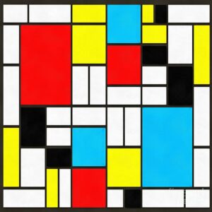
I was really inspired by the work of Edward Fielding, specifically “Modern Art Square”.

This piece is very clean and organized – what we think of when we think of order. My inspiration manifested itself in the idea of opposing that and creating and artwork that draws superficial elements of the piece – squares – and turns them into complete chaos.

The code

In my artwork, I was able to code a certain number of squares using arrays and classes. This algorithm create a variety of squares, in random positions, shapes, colors, and with different borders. These appear in a glitch like manner, and due to the randomness of the algorithm, evokes a feeling of chaos. When the user presses the mouse on the canvas, the aforementioned characteristics change completely, once again creating the sensation of a glitch.

A prominent piece of code

display(){
strokeWeight(this.strokeThickness);
stroke(this.strokeR,this.strokeG,this.strokeB)
fill(this.colorR,this.colorG,this.colorB);
rect(this.rectX,this.rectY,this.rectWidth,this.rectHeight);
} //drawing the rectangles themselves

changeArtWork(){
this.rectX = random(350);
this.rectY = random(350);
this.rectWidth = random(50);
this.rectHeight = random(50);
this.strokeThickness = random(3);
this.colorR = random(255);
this.colorG = random(255);
this.colorB = random(255);
} //the function for changing the position, the parameters,the colors, the thickness of the borders, and the colors of the borders of the rectangles

This piece of code is symbolic to me of the concept of the artwork, because it’s very structured in nature but has the opposite outcome. In this code, every single numerical parameter that could have been used for a function is replaced with a variable, yet these variables are the outputted in a sequence of very chaotic rectangles.

Future

Going forward, I want to improve my work in terms of adding an element of movement to the codes that include arrays and classes. This would allow the user to explore the piece more extensively and spend more time on it.

Artwork


HW2 – Yerkebulan Imanbayev

Concept:

With this art piece, I tried to explore the idea of excitement. The color palette chosen for the piece was meant to represent a “dormant” state. The excitement is then catalyzed by the clicking of a mouse, which makes the colors brighter and makes the square turn in a different direction.

Coding process:

While thinking of the idea of excitement and how I could visually represent that, I know I wanted to use the concept of rotation and the change of direction to represent some sort of change. The colored lines, which were coded using the “for()” loop were meant to remain static. However, due to a “happy accident”, I put the “strokeWeight” in my “if” loop that was supposed to change the direction of rotation of the square when the mouse was clicked. When I did that, the strokes for the lines became thicker too, creating the visual sensation of lighting up. Accidentally, the result of my mistake perfectly tied back to the idea that I wanted to convey.

The piece of code I’m particularly proud of is
if (mouseX < 235 && mouseX > 165 && mouseY < 235 && mouseY > 165 && mouseIsPressed) {
stroke(166, 245, 237);
strokeWeight(4); //increasing the thickness of the borders of the square and the lights when the mouse is clicked
angle = angle – 1;
rotate(angle);
rect(0,0,70,70);
}
//rotating the square in the anti-clockwise direction when the mouse is clicked

Not only was I able to solve the issue I was facing with my previous assignments where I make the mouse click within certain bounds trigger something, but I was also able to code it in a way that allowed me to change the direction of rotation of the square. On top of that, this was the piece of code that let me somewhat visually represent the concept of excitement.

The code:


HW 1 – Self portrait – Yerkebulan Imanbayev

This was the first sketch I have ever created using coding, and my main focus was exploring shapes and colors. The arc is the most prominent shape used in this sketch, as it is also something I had difficulty using. In general, the coordinate system turned out to be some sort of guessing game for me because I had very little awareness as to where my shapes would end up. However, after a bit of practice, I gained more understanding of the coordinate system used in p5.js. My main issue with the project was the conception of the sketch, as I made the mistake of starting out with the code, as opposed to the idea. This is something I hope to work on in the future because I want to have a more clear picture in my head of what I’m creating before delving into the coding.

I am particularly proud of this bit of code:

fill(239, 182, 242);
arc(240, 420, 130, 200, QUARTER_PI + HALF_PI, QUARTER_PI, OPEN);

It took me some time to figure out how the arc works because of its start and stop angles; however, eventually I was able to create a symmetrical open arc that would represent the clothes I am wearing in the portrait.