Week 8 – Reading Response

I think the first and the second reading is both contradictory and complementary to each other in talking about the relationship between functionality and aesthetics.

The first reading centers around the question “Do attractive objects work better”. The author argues that it is okay for things to be aesthetically appealing even when the appearance is not necessarily related to its functionality. But he also points out that for objects people use when they are under stress and need a series of actions, the functionality outweighs aesthetics. I think his argument is true and important to keep in mind when designing everyday objects, such as the teapot example in the article. With things like teapots, even if they are not functional at all, people can just enjoy it looking at it and have a bit of fun. And in many real life cases, such as phones and furnitures, appealing things actually work better with us; people more tend to buy and use objects that look better than just function well.

However, the second reading points out the case where the argument of the first author does not hold. In the case of Apollo and related softwares, full attention to functions and details is what matters. Aesthetics is not important at all, as any error in functionality could result in irreparable harm. In this case, what works well is more significant than what looks good.

Taken together, both readings shed light on a central principle in HCD, which is the balance between aesthetics and functionality. And I think what’s more important here is the balance should be based on the essential purpose of the design, which should be the driving force of all kinds of designs.

Midterm Project – Peking Opera Village

Concept:

Link to the sketch: https://editor.p5js.org/Yupuuu/full/p-mvwnETP

This project takes its inspiration from the coffee shop example given by Professor Shiloh in class. My idea is to integrate some cultural elements into such an experience, Therefore, I decided to create an experience of a Peking Opera Village, in which users can listen to and learn about Peking Opera and hopefully can eventually appreciate it. The overall idea for this project is that the user enters the village through an arch and arrives at a traditional Peking Opera theater. Here, the users are able to see the main stage, some paintings on the wall, tables, tea and teapots, the opera information, and even play a little trivial game.

Design and Implementation:

The most significant design of the experience is the main stage. For this part, I wanted to create something like this:

Peking opera stage hi-res stock photography and images - Alamy

Recognizing the complexities of such a sophisticated design, I decided to make a simplified version of it. The simplified version consists of the use of both online images and primitive shapes of p5js. The essential elements that constitute a Chinese style stage remain, such as the yellow dragon and phoenix  patterns, the little fences, and the color of Chinese dark red. Combing these elements, I have created this stage for my project:

Particularly, I am proud of the lanterns swinging animation. This adds a bit fun to this static display of the stage. This is realized by the following code:

lantern.resize(55, 0);
 // the left lantern
 push();
 translate(690, 0);
 rotate(angle);
 image(lantern, -25, 0);
 pop();

 // the right lantern
 push();
 translate(780, 0);
 rotate(angle);
 image(lantern, -25, 0);
 pop();

 // the swing effect of the lantern
 angle += lan_speed;
 if (angle >= 10) {
   lan_speed = -lan_speed;
 } else if (angle <= -10) {
   lan_speed = -lan_speed;
 }

Moreover, whenever the user hovers their mouse onto an interactive object, the cursor will become a hand, indicating the interactivity. This explicitly navigates the user’s interaction in the scene without disturbing the holistic aesthetics of the setting. This is realized by the following code:

if (mouseX >= 28 && mouseX <= 48) {
      // back button
      if (mouseY >= 320 && mouseY <= 348) {
        cursor(HAND);
      }
    } else if (mouseX >= 200 && mouseX <= 838) {
      if (mouseY >= 0 && mouseY <= 418) {
        // stage
        cursor(HAND);
      }
      if (mouseX >= 755 && mouseX <= 805) {
        //paper on table
        if (mouseY >= 493 && mouseY <= 545) {
          cursor(HAND);
        }
      }
    } else if (mouseX >= 45 && mouseX <= 170) {
      //painting on the left
      if (mouseY >= 0 && mouseY <= 158) {
        cursor(HAND);
      }
    } else if (mouseX >= 900 && mouseX <= 1050) {
      // opera today
      if (mouseY >= 10 && mouseY <= 105) {
        cursor(HAND);
      }
    } else {
      cursor(ARROW);
    }

Another interesting part of my project is the little trivia challenge for the user. They can click on the paper on one of the table in the main scene, and it will show them the challenge. To complete the challenge, the user will have to read the Opera Today on the wall to get some information about the opera clip I chose. Then, the user will be asked three questions about the information of the opera. Currently, there is not scoring or reward system with this challenge. This just adds some interactivity to the experience.

Reflections:

For this project, I think the overall output is satisfactory. However, it is clear that to truly replicate an experience in a Peking Opera theater need a lot work than this. Due to the limit of time, I wasn’t able to duplicate all the details. If time allows, for example, I would add some audience, waiters, ect, to make the environment more lively and realistic. Moreover, I could add more sounds, like crowd sounds, to make the soundscape of the experience more realistic. Lastly, I could improve the challenge to make it record score and have a reward system. But this indeed need a lot more efforts and time.

One problem I ran into and was not completely solved is the lagging of the character when moving. As the program progresses, the opera singer on stage’s motion will become more and more lagging. I suspect that the problem is due to the huge memory the program is taking when running for a long time. I tried remove(), but this didn’t work as expected. Then I used clear() whenever the scene changes; this works a bit, but not perfectly. So far, I am not sure how I can solve this problem.

Midterm Project Progress

Concept and Design

For the midterm project, I’d like to design a Peking Opera experience. In this experience, the user will be able to have a look at the traditional setting of a Peking Opera theater, listen to a clip of a famous Peking Opera, and interact with some of the objects within the scene. This idea comes from the cafe experience the professor showed us in class, and I decided to make some similar experience which is practical but also related to my own culture.

The general style is cartoonish and the general interaction will be: 1. On the start page, the user will click somewhere on the canvas and will enter the theater; 2. within the theater, the user will be able to click on several objects and the object clicked on will zoom in and the user can have a closer look at it.

The most frightening part

I think the most frightening part for this project is sketching the entire setting. I was worried how I could build out the desired setting for a traditional Peking Opera theater and characters. And technically, I was concerned of using transformation function of p5js.

To tackle the setting of the theater, I first looked up some pictures online to decide the color and design of a Peking Opera theater. And I found something like this:

Peking opera stage hi-res stock photography and images - Alamy

In this picture, I identified some theme colors, including Chinese red, yellow, and brown, and some patterns such as Chinese dragon and phoenix. Therefore, I decided to make a simplified version of this using these colors and patterns, with a character downloaded online that has similar appearances.

For the technical difficulty, I look at some online tutorials on how transformation, specifically scale(), works and started trying with some simple images and shapes to understand this function. With the scale(), I am able to make the character turn around when she’s moving backward.

Next steps

The next steps will be adding the start page, instructions for the suer, and the function of returning to the previou scene as well as refining the entire setting.

Week 5 – Reading Response

The readings gives an overview on the development and application of the computer vision technology. While it is specifically about the computer vision technology, I think it also exemplifies the general trend of technological development: from the highly specialized sector to a novice and amateur sector. And in this development, artists play a pioneer role in populating the technology.

It is surprising to see how early the computer vision technology was utilized by artists and intertwined with virtual reality technology. This is a very good example of the co-evolution of different technologies and how artists are making attempts to explore the connections between different technologies. On the other hand, however, it can also be seen from this example of computer vision technology that the technology development is never linear. It might take many years for one technology to be fully advanced and adopted by people outside the field of techniques.

It is also meaningful to see that how we can improve the efficiency of technology by changing the physical environments. It is a great case where the physical world and digital world collaborates to achieve our goals. It is important to keep it in mind that the deficiencies in technology could be fixed by changing the physical environments the technology is situated in and that the environment can also be augmented by technology. This truly provides me with another perspective on the relationship between the physical and digital world.

Week 4 – Reading Response

In this reading, the author discusses the psychopathology of everyday objects. Essentially, the author argues that there are several factors determining the user experience about everyday objects, and that the design for everyday objects is hard and complex because it also involves many parties, such as designers, users, and manufacturers. With these factors, the author introduces the concept of Human-Centered Design (HCD).

One prominent feature of HCD is that it focuses on both the human psychology and the functionality of the object. Therefore, the design for everyday objects should also comply with these two principles. However, to add to the HCD, especially in modern times, I think it is also important to point out the constant evolving of our psychopathology of everyday objects. Our perceptions about affordances, signifier, and so on are constantly challenged and changing with the emergence of new designs and new design regimes. For example, the recent transformation to flat design in almost every field of digital design might indicate our less desire or need for digital designs to completely represent the daily objects in their most realistic form. On the contrary, we realized that we were able to understand the minimalistic flat design and found it aesthetically appealing. Maybe, one day, the example of the unworkable pot the author presented at the beginning would become the mainstream of design when people find it interesting, appealing, or even practical.

In a nutshell, in the digital era, everything is evolving at a rapid pace, so is our psychology for design. Except for the challenges the HCD faces as the author presented, designers must also realize or even foresee the future of our psychopathology of everyday objects and make movements towards our needs not only in the moment, but also in the foreseeable future.

Week 4 – Data Visualization

Concept: Simulating Brownian Motion

In this project of data visualization, I chose the data set about the wind directions at Hong Kong International Airport (HKIA) from 1997-2023. It is interesting from two aspects. Firstly, the airport and wind directions have a close relationship. The wind directions impact the operation of the airport. Secondly, the wind directions are random to some extent. It is a natural and random phenomenon even though it could be observed or predicted. This leads to another concept called Brownian Motion, describing the random motions of particles in fluids. This makes me think what it looks like if the winds are particles moving in the air. Therefore, I decided to simulate the Brownian Motion with the data.

Highlight of the code

Firstly, I extracted the wind direction data from the CSV file and store them in the array call angles[]

for (let rowNum = 0; rowNum < strings.length; rowNum++) {
    let angle = split(strings[rowNum], ",")[3];
    if (angle != "***") { // This skips the unavailable data in the file
      angles.push(angle);
    }
  }

Then, each point is a vector, and it adds with another vector which has the angle from the angles array. This simulates the movement of particles, which in this case following the wind directions

if (
    // if the point reaches the boundaries, it will start from a random place within 
    // the canavas
    startPoint.x >= width ||
    startPoint.y >= height ||
    startPoint.x < 0 ||
    startPoint.y < 0
  ) {
    startPoint = createVector(random(20, width), random(20, height));
  } else {
    startPoint.add(createVector(sin(angles[i]), cos(angles[i]))); // this makes the 
    // point turn according to the angles in the file
  }

Note that because at one location the overall direction of winds is consistent, the points will move out of the canvas if not constrained. Therefore, I wrote in the code that if the point went beyond the boundaries, it should move to a random place within the canvas and continue drawing.

Reflections and future improvements

For this data visulaztion project, I tried other ideas like particle fields or mapping, but eventually I think that stimulating the Brownian Motion with the wind direction data is much more interesting. It explores the relations between randomness, nature, and art making while visualizing the data. Therefore, I am satisfied with this project. However, some improvements or alternations could be made, such as smoother movements, better color selections, etc.

Week 3 – OOP Graphic Art

Concept: Errors

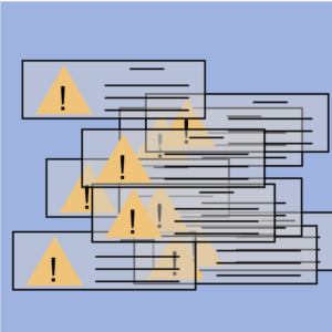
My idea of this work comes from the situation we probably all have run into, when our computer gives many errors, or even worse when the entire system crushed down. I remember facing this kind of situations a lot back to my childhood when the computer first became popular. The system was not looking good and not stable at all. It can easily crush or be attacked. Therefore, I used to see these errors very often. Now, the computer system has improved so much that I personally rarely face similar situations of so many errors now. My work thus aims at giving a retrospect to the early days of computers and technology. But now, you can simply click to take all the warnings down!

Highlight of the code

The main body of the code is the triangle warning sign class. The other elements of each warning window is anchored to these triangles, as seen in the code:

class TriWarning {
  constructor(xPos, yPos, triHeight) {
    this.xPos = xPos;
    this.yPos = yPos;
    this.height = triHeight;
    this.side = triHeight / sqrt(3); // all the triagnles are equilateral
  }

  // this method draws the entire triangle warning signs and windows
  drawTriWarning() {
    fill("rgba(210,206,206,0.48)");
    rect(this.xPos - 50, this.yPos - 5, 220, 70);
    strokeWeight(2);
    line(this.xPos + 80, this.yPos + 5, this.xPos + 120, this.yPos + 5);
    line(this.xPos + 50, this.yPos + 25, this.xPos + 150, this.yPos + 25);
    line(this.xPos + 50, this.yPos + 40, this.xPos + 150, this.yPos + 40);
    line(this.xPos + 50, this.yPos + 55, this.xPos + 150, this.yPos + 55);
    noFill();
    fill("rgb(239,195,122)");
    noStroke();
    triangle(
      this.xPos,
      this.yPos,
      this.xPos - this.side,
      this.yPos + this.height,
      this.xPos + this.side,
      this.yPos + this.height
    );
    fill(0);
    textSize(40);
    text("!", this.xPos - 7, this.yPos + 55);
    stroke(0);
  }
}

I use mouseClicked() function to start the loop of draw() function as the draw() function mainly affects the falling down of the generated warning windows and I don’t want them to start falling if the user doesn’t click on the canvas.

function mouseClicked() { // this will trigger the falling of the warning windows
  loop();
}

The falling down is realized by adding the y-position of each warning window by a certain speed each time draw() runs. It stops when the windows touch the base of the canvas.

function draw() {
  for (let i = 0; i < 10; i++) {
    if (!(triArray[i].yPos > 335)) {
      background("rgba(158,179,224,0.93)");
      triArray[i].yPos += speed;
    }
  } // triangles in the array will 'fall down' to the bottom of the canvas
  for (let i = 0; i < 10; i++) {
    triArray[i].drawTriWarning();
  }
  print(triArray);
}

Reflections and improvements

Another way to do this is to make the warning windows constantly move within the canvas. But I think this does not contribute to the main idea of my work, which is reimagining the time where computers usually ran into all kinds of warnings. However, I do think that the falling of the warning windows could be more dramatic and dynamic than the current one, but I am not sure what could work best.


Week 3 – Response: Interactive Design

What is interactivity? What are some essential qualifiers to be interactive? This is the essential question the author starts with. The answer he gives is a combination of three metaphorical steps: listening, thinking, and speaking. He also argues that interactivity might not be a dichotomy; instead, it could be described with degrees. I agree with most of the author’s points that in order for something to be interactive, it must proactively give responses to another’s actions or inputs. However, as the author also mentions, the degree of interactivity among things that are interactive could vary, and therefore, I am thinking about the value of interactivity.

Referring the author’s example of having conversations with another person, the thinking part plays an important role. For human beings, it’s easy to imagine how the lack of thinking of either party of the conversation could destroy the entire meaning of the conversation. But what about machines and computers? Nowadays, most of the human-computer interactions rely on the same codes that run over and over again whenever the computer receives an input from the human. This is surely interactive, but is the computer in this case a good thinker as in the conversation? Instead of active thinking, the computer merely processes the input in a preset procedure and gives out its output. But it works perfectly, just as we expect it to do so. Then does interactivity matters? One example would be Siri. Surely it is cool to speak to this “virtual personal assistant” and it will help you settle things down. But do you remember how many times they can fail you? At least for me, sometimes I feel that it seems to be more convenient just to go back to traditional way of clicking. By definition, Siri might be of a higher degree of interactivity. but its actual value of being this interactive is not so definite. Therefore, I think that computers for now are still just preprogrammed machines that complete some tasks, and that its interactivity is indeed significant but a substantial improvement in its interactivity and its resulting efficiency still need more and more technological innovations.

And at this point, I think the author makes a good point in the collaboration of interaction designers and interface designers. Interaction design is definitely a new area, instead of an extension of traditional interface design, and requires new skill sets. And to achieve new technological innovations that can lead to a higher level of efficient interaction, the collaboration and exchange of ideas between these two area are crucial and necessary.

Week 2 – Graphic Art

Concept: Order and Chaos

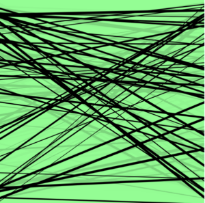
I get the inspiration from this week’s reading (watching) assignment, which is a talk by Casey. He talks about chaos and order in computer generated arts, and I think it is interesting to explore myself how computers can generate arts of order and chaos. My idea is to use simple lines to generate different shapes. I have experimented mostly with random() function, and discovered that even the randomly generated lines can actually follow certain patterns to form different shapes! In the meanwhile, the user can manipulate these lines to form different patterns and shapes so that they can personally feel the change from complete chaos to some order. Hope you enjoy!


Highlight of the code

The code is relatively short and simple. I mainly started with generating completely random lines with random sizes:

for (let i = 0; i < 50; i ++){
  let xPos1;
  let xPos2;
  let yPos1;
  let yPos2;
  let thickness = random(1, 5);
  strokeWeight(thickness);
  xPos1 = random(mouseX, 400);
  yPos1 = random(mouseY, 400);
  xPos2 = random(mouseX, 400);
  yPos2 = random(mouseY, 400);
  
  line(xPos1, yPos1, xPos2, yPos2);
}

Then for the user to manipulate the lines, I created a circle that follows the mouse so that the user can see clearly where the mouse is and better control the lines. Moreover, I modified the last line of the previous code to achieve user’s manipulation of the lines:

line(xPos1 - mouseX, yPos1 - mouseY, xPos2, yPos2);

I tried to use Perlin noise to make the lines move more naturally as we learnt in class. However, I feel the natural movement here undermines the sense of chaos, which is not intended here. Therefore, I decided not to use it and keep how these lines move as now.

Reflections and improvements

The execution is relatively easy, but it took me some time to finally come up with this idea. I tried several other ideas, but they all failed because my coding ability did not allow me to realize them. And this is why I ended up with this relatively simple code, but its effectiveness in exploring chaos and order is still strong.

And for future considerations, I am interested in knowing probably what other elements, such as other shapes, colors, movements, etc, could be added to the work to further explore the idea of chaos and order in computer generated arts. To me it is a very interesting concept even in other fields. Therefore, I’d like to explore more possibilities to discuss and apply this concept!

Sources:

Casey’s talk: https://vimeo.com/45851523

P5.js reference page: https://p5js.org/reference/

Week 2 – Response

Casey’s talk on chance operations perfectly shows the use of technology in arts. The most significant and profound argument I think he is making is that people are using computers, which are ordered, rational machines, to create randomized, chaos art. As he develops his argument, he starts from the nature, religion, and science to show the relations among order, chance, and chaos, and how these could to apply to art works after artists started to generate art using software and chance operations.

I personally agrees with Casey’s argument, and believe that machines are very good experimental place to test the relations between chance and order. By looking at the examples Casey gives during his talk, it is clear that developing from chance and order in art to chance in code, chance and order seem to find a balance in code, or in other words in machines. The last example, 10 PRINT, he shows sheds light on it.  Even though it uses random operations, the final art work generated is still somehow in a certain order. The patterns are still detectable if analyzed closely. Does it mean that even the chaos is still confined in a ordered system, in this case computers? Does chaos follow a certain pattern to be chaotic? This reminds of an installation art I visited in Iceland. The work was titled “The only certain thing is uncertainty”, and used random mechanical motions to explore this theme. Even though the results of these motions were unpredictable, the mechanical systems were always the same, such as a metal piece plucking a thing, hanging bent mental wire. Therefore, I find Casey’s argument and examples reading interesting and inspiring.