Reading Reflection – Week 8

Donald A. Norman’s “Emotion & Design: Attractive Things Work Better” was a pleasant read about the importance of the balance between beauty and usability. When it comes to products, especially digital ones, one of the most important characteristics to me is beauty, or, in other words, how aesthetically pleasing a design is. This necessity makes sense considering that beauty increases the satisfaction of the user when using a product, as explained by the author. Now, of course, there is a whole scientific explanation behind this idea, but honestly, I am not that interested in that, since this is such an intuitive concept to me.

For instance, the author gives the example that although colored monitors offer no advantage over black and white ones when it comes to displaying data, everyone strongly prefers them. The fact that colors offer more intrinsic pleasure to the users is incredibly obvious to me. Humans are not robots that just perform tasks over and over again thinking only about usability; we also care about aesthetics and entertainment, and that is precisely why products that look better will always be more successful, even if their performance is a bit inferior.

Moreover, attraction is so important that aesthetics are an actual driving force when it comes to your work style. Some people are essentially driven by the beauties of life, just as much as others are motivated by knowledge or power, for example. Even eating a sandwich cut in half somehow makes it taste better than just eating it plainly for me; that is how much we can be influenced by looks.

The other text, “Her Code Got Humans on the Moon—And Invented Software Itself” was also quite interesting. It is fascinating to me to see the great things that people can accomplish when they are so driven and focused on their objectives. The passage where Hamilton mentioned when she would think about the headlines was especially compelling.

Week 5 – Midterm

Concept

“Remy the Rat” is a dark visual novel about a comical and relatable experience related to pets. It tells the story of a teenager that forgets to feed his brother’s rat, and his attempt in solving the issue.

Elements

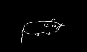
All of the background drawings were made by me on Paint. They are extremely minimalistic, almost like they could have been made by a five year old, but truthly that was the aesthetic that I was trying to achieve. This rough look is also enhanced by the doodled dialogue boxes of the library p5.scribble. The background music was also done by me, being the recording of boiling meat tweaked on Audacity.

Below are some pictures:


Future Improvements

Unfortunately, I was not able to add some of the game mechanics that I wanted to, such as controlling the sprites of a character, or choosing your own paths, which could have improved the concept and the replayability of the game. Nonetheless, I am satisfied with the final product, and I believe that taking a more minimalistic approach was more effective.

Week 5 – Midterm Progress

Concept

Something that I have always been interested in but never had the opportunity to make is visual novels. Having the option to influence and experience a story with your own choices is a concept that has always fascinated me in video games, and I believe that P5.js would be great for that. Through this form of interactive fiction, I would be able to tell a story that would not only be engaging but also intriguing, creating something that would look aesthetically pleasing while also invoking several emotions.

In regards to the story, my intention is to depict a weird and disturbing yet comical narrative, focused on making the user uncomfortable. Topics will most likely be related to dark themes, but in subtle and fun ways in order to not cheaply shock the user.

Design

My initial inspiration for the visual novel came from the game “Phucker in the Woods”, due to its bizarre storyline and visuals. What captures my attention is the uncanny design of the characters, something that I want to replicate although in a minimalistic way. The ambient and sounds will be dark, using mostly black and white colors and eerie ambient music and sound effects. The storyline will be short and simple, but with different choices that the player can make, altering the endings. Each screen will have drawn characters and objects along with dialogues.

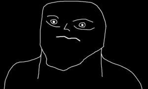
Below is an example of the character which the player will follow:

Additionally, I would like to implement different game mechanics as opposed to just using the point-and-click aspect of a visual novel. Two of these mechanics could be scenes in which the player can control the character and walk around the screen by using sprites and the “keyIsDown” function, and a maze scene in which the player controls a cursor.

Frightening / Challenging Aspects

  • Coding the logic of screen transitions after each choice
  • Implementing an engaging story within a reasonable amount of resources and lines of code
  • Applying different game mechanics under one project

Risk Prevention

  • Utilize boolean variables to update the screen after each choice
  • Write a concise story with a limited amount of choices and refactoring the code as much as possible
  • Only focus on the point and click aspect or make the scenes with different mechanics as simple as possible

Week 4 – Data

For the week 4 assignment I decided to give a visual representation of the five most successful A24 movies in 2023, by using a bar chart and a csv file containing the 200 most successful movies of 2023. The chart displays the rank of the movie, the total gross, and the title. For the concept I took inspiration from Jacob Rivkin on his video of working with basic data on YouTube.

Reading Reflection – Week 5

Computer Vision for Artists and Designers was a fascinating read about the topic of Computer Vision, a concept that is constantly gaining more traction in our world, but that is not understood as much as it should be. Personally, I was already aware of the concept, but not deeply enough as the reading presented, especially when it comes to its history and evolution throughout the years. The examples provided were also amusing, especially the ones that were more focused on people, such as the “Suicide Box” by the Bureau of Inverse Technology and “Cheese” from Christian Möller. What is interesting to me is that computer vision can be used both for purely artistic reasons and for social reasons. For instance, Suicide Box creates several discussions about the ethics of utilizing suicide as an experiment, such as the implications of recording people taking their own lives while doing nothing to prevent it. Or with “Cheese”, an installation that tracks people’s smiles, and plays an alarm when the display of happiness falls below a certain threshold. To some, this could be just a silly experiment, but when you think about it, corporations could absolutely enforce some sort of similar system to their employees, displaying the powers that such a technology can offer in our society.

Additionally, it was also interesting to read about the technological advancements of computer vision in physical optimizations and in multimedia authoring tools. With the examples provided, such as the technique of retroreflective marking materials used for safety uniforms and the “Limbotime” game, it made it much easier to comprehend the practical uses of these methods, which motivated me to know more about them.

Week 3 – OOP

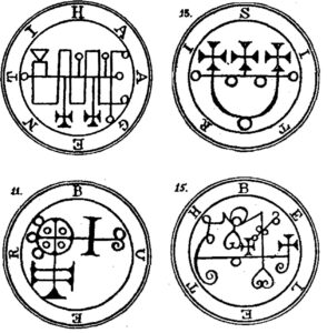
For the week 3 assignment I decided to inspire myself with the magical concept of “sigils”, a type of symbol used to represent the signature of deities or manifestations. Each time the sketch is executed, a new one is generated with random circles and lines. The code was also based on one of the examples we saw in class.

Reading Reflection – Week 4

The Psychopathology of Everyday Things was quite a fun and informative chapter to read. The author’s descriptions of his experiences with products that have ineffective designs were pretty relatable, which helped me to understand the importance of good design in my mind. The topic of how engineers build products that are overly logical while expecting unrealistic outcomes was also amusing. I have heard so many developers complaining about users because they cannot grasp their interfaces, but they have never stopped to think that not everyone has the same knowledge that they do, or that they have a completely social lack of communication. Worse yet is when some products are so annoying that it feels like the designers behind them did it on purpose. I have seen washing machines that had the most excruciating beeping sounds that had no indication of how to make them stop, and that is precisely what the author talks about when he mentions the problem of too much feedback.

Moreover, I do not think the reading changed any of my beliefs, although it definitely made the importance of psychology and communication in technology more clear to me. However, the concept of mapping could have been more explored in my opinion. For instance, I would have liked to see more examples of good and bad mapping in digital technology, and how we could take into consideration factors such as cultural differences in order to improve mapping.

Reading Reflection – Week 3

The Art of Interactive Design offered me deep insights into the world of interactivity. Before reading this text, I had never stopped to think about the definition of interactivity or the steps necessary to consider something interactive, even though it is a core idea of computing. Nonetheless, I have found that the text managed to put into words almost all of my beliefs on the topic, and even the aspects that I do not agree with ended up intriguing me. For instance, the author argues that movies are not interactive because they fail to utilize two principles of interactivity: thinking and listening. He goes even further by saying that we should “appreciate them for what they are good at instead of press-ganging them into something they’re terrible at”. I found this passage to be interesting because nowadays we do have interactive movies, one example is “Black Mirror: Bandersnatch”, which gives the option for the viewer to change the story depending on their choices. To me, it is amusing to come across an example of an outdated perspective and compare it with the forms of media that we have nowadays. Moreover, even though interactive movies did not exist back when the book was written, I still found his previously mentioned statement to be quite harsh. For someone who argues so much in favor of innovation, I did not expect him to reject the possibility of interactive movies in the future so easily. Sure, interactive movies are not that popular, but they are still appreciated for how entertaining and creative they are.

On a different note, I completely agree with his definition of interactivity, and I found his idea of a degree to be extremely useful. As he argued, the definition of interactivity is quite subjective. The lights of a refrigerator that turn on and off when a door is opened and closed are not interactive with adults, but they could be with children. In that case, how would we define whether refrigerators are interactive or not? With the interactivity scale, we can argue that they are indeed interactive, although lowly, because they barely interact with the user. Following that notion and the three principles of interactivity given by him (listening, thinking, speaking), I would like to give my own damn definition of interactivity. To me, one definition of interactivity could be: “A form of medium that connects two or more agents through active listening, thinking, and speaking”. The same idea, but written more clearly to me. Still, I deeply admire and respect the author’s arguments on such a modern concept.

Reading Reflection – Week 2

Casey Reas’ presentation gave me several insights about the role of chaos in computing visual art. I never stopped to think about these concepts, but the more examples I saw, the more I understood their importance. As Reas was showing some of his work throughout the presentation, I quickly realized how superior the works he was not in “control” were in comparison to his highly fixed ones, which were just simple shapes as opposed to aesthetically pleasing and complex pieces generated by chaotic code. This dynamic interaction between human intent and machine generated randomness not only can produce captivating art but it can also deepen our understanding of mathematics. The generated outputs were so interesting that Reas even ended up using them in clothing, showing the power of computing when it comes to art. The examples from other authors also gave me inspiration for the loops assignment.

Additionally, something that caught my attention was the process behind coming up with these codes. Reas mentioned that one of his projects took a year of planning before he actually started to code, he also mentioned at some point how he went through hundreds of different generated outputs for the same project, which makes me wonder how long on average it takes to come up with these designs, and how much of it is simple trial and error or hours and hours of analyzing and writing algorithms to come up with something idealized. Perhaps it is a mix of both, as mentioned in the quote: “It’s never a blind chance, it’s a chance that is always planned, but also always surprising”

In short, although I am more interested in the presented visual aspects as opposed to mathematical ones, these are still beautiful concepts to take a look at and appreciate the hard work and complexity that goes behind the scenes.