Reading Reflection #7

A Brief Rant on the Future of Interactive Design

I believe that the author’s frustrations with the current trends/future of interactive design are completely justified. It is undeniable that many developers now seek to make things digital just for the sake of being digital, subjugating everything behind a glass panel for no substantive reason. In this pursuit of digitalization, we often forget that humans are in fact very dependent on tactility to interact with the world around us; to reduce everything to swipes on a flat, glassy screen is to gradually reduce our cognitive abilities to respond to different forms of input from our senses.

Of course, this is not to say that touch screens are devil’s spawn and must be retired, but to suggest that perhaps efforts in technological advancement are too focused on applications of touch screens and it would be much more worthwhile to explore how other human needs can be aided by other forms of interactive design.

Follow-up

It’s quite surprising how many of the responses to the rant seemed to misunderstand the author’s point. It’s unreasonable to expect the author to singlehandedly provide a solution to the problem, which seems to be what many readers expected him to do. The point of the rant was to point out a problem and hopefully direct future research to solve that problem.

I think analogy in the last section of the article sums up the author’s argument perfectly: “A child can’t understand Hamlet, but can understand Cat In The Hat. Yet, it’s Shakespeare, not Dr. Seuss, who is the centerpiece of our culture’s literature…A tool for adults should take full advantage of the adult capabilities of both mind and body. Tools that are dumbed down for children’s minds or children’s bodies are called ‘toys’.” Ultimately, it is important to keep in mind that useful, well-designed tools make things easier while helping us develop our existing skills instead of simply dumbing things down and impose homogeneity to every activity in the name of digitalization.

Week 10: Musical Instrument (with Elizabeth and Linus)

Concept

For this assignment, we were inspired by the toy pianos that we’ve all played with at least a few times as children. These toys were often quite limited, as they only had enough space to accommodate the keys for a single octave. We decided to create a miniature piano that could play the notes from C to A, with a knob that can be turned to change octaves.

Mini 8-Key Electronic Piano Toy for Children Early Musical Education, Yellow : Amazon.ae: Toys

Setup and Code

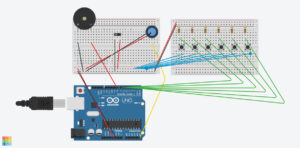
We set up a row of buttons that play a note when pressed, a potentiometer that changes the octave, and a switch that switches the notes to their respective sharp notes.

We created arrays that store the frequencies of the natural notes across seven octaves, doing the same for the sharp notes. The range of the potentiometer is mapped to a range of 0-6 and determines which octave the notes will be played in. When the switch is low, natural notes are played, and vice versa.

To prevent the notes from continuously playing, the noTone() function stops the buzzer playing any sound when no button is pressed.

Full code on Github

if (buttonState7 == LOW && buttonState6 == LOW && buttonState5 == LOW && 
    buttonState4 == LOW && buttonState3 == LOW && buttonState2 == LOW) {
  noTone(8);  // Stop any tone on pin 8
}

Demo

Reflection

Overall, this group project was a success as we managed to recreate our inspiration using Arduino. We were really satisfied with how we made sure to implement the natural notes as well as sharp notes in our project. A few struggles we faced was that the wires and resistors were really crowded on our small breadboards, making it a little difficult to reach the buttons. Ideally, we would want to get bigger breadboards in the future so that there would be more room for interacting with the product. Additionally, the bread board was just a little too small for us to add the 7th natural note, so we could only fit 6, as we’re missing a B note. 

In the future, we would like to add two different colored led lights that switch on and off along with the natural or sharp notes. This way, it would help users know if they are currently playing natural or sharp notes, as not everyone is familiar with musical notes in that sense.


Week 9: Unusual Guitar Switch 2.0

Concept

Expanding upon the unusual guitar switch I made for last week’s assignment, I decided to introduce a new feature that will detect the distance between the guitar and the edge of the table. I got the idea for this feature from my own carelessness, as I often knock my guitar into my desk on accident. Using input from the ultrasonic sensor in our arduino kit, a red LED light will light up as a warning whenever the body of the guitar gets too close to the edge of the desk.

Setup and Code

Like my previous assignment, I covered my guitar pick with aluminum foil to make it conductive and then taped it to a wire; another wire was attached to a larger sheet of aluminum foil and then the sheet was taped to the bridge of the guitar, allowing the yellow LED to light up when the pick makes contact with any of the guitar strings. On the other half of the breadboard, I installed the red LED bulb and the ultrasonic sensor on the edge facing outward so that it can be positioned on the edge of the desk.

I learned how to make the LED light turn on and off according to ultrasonic sensor input from these posts on the Arduino Forum:

  • https://forum.arduino.cc/t/ultrasonic-sensor-with-led-how-can-i-do-this/920861
  • https://forum.arduino.cc/t/hc-sr04-always-returns-zero/206641

While trying to get the red LED to work properly, I struggled for a good amount of time as the ultrasonic sensor kept retrieving 0 and only 0 as values on the serial monitor. I eventually realized that I, being my careless self, put the wrong number for the sensor’s echo pin in the definition at the start of the code.

Github code link

Demo

Reflection

The biggest challenge for this assignment was learning how to use the ultrasonic sensor, since we did not get to practice with it in class, but thankfully there were a lot of tutorials on the internet. And while it wasn’t particularly complicated, I’m proud of managing to get it working (despite the minor hiccup with the code as a result of my carelessness).

Reading Reflection #6

Physical Computing’s Greatest Hits (and misses)

This article was really fun and reassuring  to read. While listing recurring elements in physical computing projects,  the author stresses that old ideas can always be altered in creative ways and there is no need to actively steer clear of techniques that have been explored before. This was a wake-up call for me, as I have always struggled while trying to come up with ideas that didn’t overlap with those of Intro to IM students in previous semesters. We’re constantly taught and pressured to be different, to make something completely new, but we often forget that innovation isn’t just for the sake of “being different” but also to take existing concepts and technologies and improving upon them to suit new contexts and ideas.

I think the key is to remember that there is a creative side of physical computing that is arguably just as important as important as the technical side; it’s about how you incorporate the same elements into new narratives and fashion them for new purposes. From this point onwards, I will try not to shy away from looking at previous student works for inspiration.

Making Interactive Art: Set the Stage, Then Shut Up and Listen

Sometimes, artists have the tendency to over-explain their work, feeling the need to defend their work and themselves for validation. However, this mindset can be counterproductive when dealing with interactive art. Interactive pieces are meant to be experienced directly by the audience instead of having your audience be passive onlookers. Instead, you are creating a piece that performs and also lets the audience perform on it; you can guide your audience, but the ultimate goal is to let your audience explore what is possible with your design.

Week 8: Unusual Guitar Switch

Concept

It came to me while I was playing on my guitar as a way to destress after hours of failing to think of ideas for an usual switch: why not use the guitar as a switch? The strings of the guitar are made of steel and can therefore act as conductors. All I had to do was to find a way to incorporate it into a circuit so that an LED light switches on with every strum of the guitar.

In retrospect, I realize that I was, in fact, using my hands despite the assignment instruction being to create an unusual switch that does not require the use of one’s hands. I was too preoccupied with trying to make my switch as unconventional as possible and accidentally neglected this instruction. Still, I am proud of coming up with the idea to incorporate my interest in guitars into my assignment.

I took the same circuit from our class exercise for digital input and removed the button, replacing it with the guitar and the guitar pick. I covered my guitar pick with aluminum foil to make it conductive and then taped it to a wire. As for the guitar itself, my initial idea was to tape a wire to the bottom E string; however, it proved to be not ideal as this meant that the LED will only light up if I strum this one specific string and not for the other five. I ended up taping the wire to a larger sheet of aluminum foil and then taping the sheet to the bridge of the guitar, which is a metal part that acts as a saddle for all six strings.

The code is also fundamentally the same as our in-class exercise, but instead of switching off when the circuit is complete, the LED light switches on.

void loop() {
  int buttonState = digitalRead(A2);

  if (buttonState == HIGH){
    digitalWrite(13, HIGH);
  } else {
    digitalWrite(13, LOW);
  }

}

Setup:

Github link


Demonstration


Reflection

There are many elements in this assignment that I would like to improve upon if I had more time. For example, the aluminum foil I wrapped around my guitar pick kept shifting despite the tape, the parts around the tip wore off and exposed the plastic pick after some strumming; using metal guitar picks would easily solve the problem, but I unfortunately do not have one. Another option would be to fashion a guitar pick out of multiple layers of aluminum foil.

It would also be interesting to expand on the functions of this device to help guitar players be on tempo. Since the LED lights up with every strum, adding a small speaker to the circuit that acts as a metronome; guitar players can listen to the tempo and look at the LED light to make sure it is also blinking on tempo, in case it is difficult for them to hear the subtle differences.

Reading Reflection #5

Her Code Got Humans on the Moon

Reading about Margaret Hamilton’s incredible life and career was eye-opening; I was not aware that a woman played such a central role in the United State’s Space Race efforts, not was I aware that “software engineering” was already a thing back then in the 1960s (albeit in its early stages). I feel like there are no words that can begin to describe just how impressive it was for her to juggle motherhood and her career in an era with layers of glass ceilings for a woman to break through (especially in engineering), all while setting the foundations of a discipline that is so integral to modern life. The unfathomable amount of responsibility assigned to Hamilton and her ability to set up all those crucial programs and troubleshoot while under immense pressure really put things into perspective for me. Whatever struggles I have with the more technical aspects of this course are nothing compared to hers, and her story gives me more drive and inspiration to take on my fears in coding and physical computing.

Emotion and Design: Attractive Things Work Better

Donald A. Norman makes a compelling argument about the balance between practicality and visual aesthetics that I absolutely agree with. Just the right amount of consideration for each is dependent on the context and purpose of the design; tools that are to be used in serious, concentrated efforts should of course be straightforward in design, but there are great benefits to be gained from adding style to the tools and activities we engage with in everyday life. We are naturally enticed by attractive things, and when using things that look good our “behavior seems to go along more smoothly, more easily, and better” (Norman). We derive joy from using aesthetically pleasing tools, but only if usability has not been compromised for visual style. Video game interfaces very well exemplify the need for this balance: visually, they must be appealing and in line with the style of the game, but they must also be easy to navigate as to not hinder gameplay and turn players away. I think the UI design of the Persona series (attached below) are the prime examples of good visual and interactive design:

Let's talk about Persona 5's menus - Eurogamer : r/JRPG

The UI and UX of Persona 5. You don't gotta say it over text too! | by Ridwan | Ridwan Khan

Persona 3 Reload's amazing UI might have the best menus in the history of JRPG menus, and shows the value of keeping devs around long-term | GamesRadar+

Midterm Project: SAVE BRAN STARK

Concept

HBO’s Game of Thrones has countless iconic scenes that have been forever ingrained in the memory of 21st century pop culture, but arguably one of the most iconic and significant is the fall that crippled Bran Stark and set off the ripple of scandals that made the series’s plot as complicated as it is. While I obviously do not condone acts of violence against minors, I found the scene quite funny because of how absurd everything was: a 10 year old child who somehow managed to climb up the exterior of a tower accidentally witnesses an incestuous affair and then gets thrown out of a window.

I figured that I would eternalize this scene in a more lighthearted way by creating a simple game in which multiple Brans will fall and the player, with their mouse, has to catch the boy by moving a pile of hay as a cushion for him to fall on. At the same time, players will also have to avoid catching the severed head of Bran’s father Ned Stark. Each game lasts 45 seconds; for every Bran saved, the score increases by one, and for every Ned head caught, the score decreases by one.

Highlights:

I illustrated most of the visual assets for the game in Procreate on iPad, employing a more cartoonish art style that I felt was fitting for the simplicity of the game despite the gritty aesthetic of Game of Thrones.

– Background: I tried to keep the whole image simple and not too crowded with details as to not affect the visibility of the falling Brans and Ned heads.
– Bran Stark

– Hay cushion

  • Ned Stark’s severed head

In terms of gameplay, Ned’s falling heads were not part of the initial concept. However, after a few play-throughs it became apparent that having saving bran as the sole objective proved to be quite dull, so I decided to introduce obstacles in the form of Ned’s heads. While the mechanisms for Ned’s heads were almost identical to the falling Brans’, I think it’s an important addition as it adds to the stakes and makes the gameplay a bit more interesting.

As for the code, there wasn’t anything particularly challenging, but I am proud of having incorporated a countdown timer that resets with every new game; I used this video by flanniganable as a reference for the timer and added additional parameters to have it reset automatically.

let startTime; //track when the game starts
let timeLimit = 45; //countdown timer duration
let countdown;
let gameState = "start";

function drawGame() {
  //start 45 second countdown
  let currentTime = int((millis() - startTime) / 1000);
  countdown = timeLimit - currentTime;
  
  //end game after time is up 
  if (countdown < 0) {
    gameState = "end";
  }

  //display score and countdown in real time
  fill(0);
  textFont("times new roman");
  text("Score:" + score, 500, 60);
  text("Time:" + countdown, 500, 80);
}

function restartGame() {
  //reset countdown and Brans and Neds
  score = 0;
  startTime = millis();
  timeLimit = 45;
  countdown = timeLimit;
  gameState = "start";
}

function keyPressed() {
  if (gameState == "start") {
    // Start the game
    startTime = millis();
    gameState = "playing";
  } else if (gameState == "end") {
    restartGame();
  }
  // preventing the key press from being counted again
  return false;
}

Finished Game:

Areas for Improvement:

  • The gameplay becomes repetitive and there is very little replay value as of now; expanding on the game with increasingly difficult levels and power-ups as incentives would greatly add to the replay value.
  • I was not able to add fullscreen display for the game, as I had already illustrated the background image before we learned about fullscreen in class. Enabling fullscreen would allow players to see the falling Brans more clearly.

Midterm Progress: Save Bran Stark!

Concept:

HBO’s Game of Thrones has countless iconic scenes that have been forever ingrained in the memory of 21st century pop culture, but arguably one of the most iconic and significant is the fall that crippled Bran Stark and set off the ripple of scandals that made the series’s plot as complicated as it is. While I obviously do not condone acts of violence against minors, I found the scene quite funny because of how absurd everything was: a 10 year old child who somehow managed to climb up the exterior of a tower accidentally witnesses an incestuous affair and then gets thrown out of a window. I figured that I would eternalize this scene in a more lighthearted way by creating a simple game in which multiple Brans will fall and the player, with their mouse, has to catch the boy by moving a pile of hay as a cushion for him to fall on. Each game will last 60 seconds, and players must save as many Brans as they can — and prevent the chaos that is about to spread throughout Westeros.

A rough sketch of what the game will look like.

Project Components:

  • OOP: Bran Stark will be a class. Bran’s sprite and the parameters for his falling movement will be set in this class.
  • Image: Using Procreate, I will illustrate a simple background image that depicts the tower from which Bran fell + grassy ground + pebbles. The sprite for Bran will also be illustrated by yours truly (in a desperate attempt to make up for amateur coding with good artistic direction).
  • Sound: I plan to have the show’s opening theme, composed by Ramin Djawadi, play as soon as the game loads; it will stop when the timer runs out and restart along with the game.
  • Text: The starting screen will show the game’s title in the same font as the show’s title card. The countdown and score will also be displayed.
  • Shape: I will draw simple shapes to serve as buttons for starting/restarting the game.

Code Progress:

  • So far, I have a rough sketch of red ellipses (placeholder for Bran) that fall at varying speeds and a yellow rectangle (placeholder for hay cushion) with a fixed y position that moves horizontally with the player’s mouse. Both of these are classes of their own.
  • The Game of Thrones main title theme starts playing when the game loads.
  • The checkCollision() function checks if a Bran has came into contact with the hay cushion; if so, the score increases by 1 and that specific Bran is removed while a new Bran spawns at the top.
  • let brans = [];
    let hay;
    let numberOfBran = 3; //number of Brans to be on screen at the same time
    let score = 0;
    let music;
    
    function preload() {
      music = loadSound("GOT Main Title.mp3");
    }
    function setup() {
      createCanvas(600, 400);
      for (let i = 0; i < numberOfBran; i++) {
        brans[i] = new Bran();
      }
      hay = new Hay();
      music.play();
    }
    
    function draw() {
      background("rgb(180,226,218)");
      //display Bran and hay cushion
      hay.display();
      for (let i = 0; i < brans.length; i++) {
        brans[i].display();
        brans[i].move();
        
        //increase score and reset Bran after collision
        if (checkCollision(brans[i], hay)) {
          score += 1;
          brans[i].reset();
        }
      }
      fill(0);
      text("Score:" + score, 500, 80);
    }
    
    //check for collision between Bran and hay cushion
    function checkCollision(bran, hay) {
      let d = dist(bran.x, bran.y, mouseX + 35, hay.y + 15); 
      return d < bran.diameter / 2;
    }
    
    class Bran {
      constructor() {
        this.x = random(50, 550);
        this.y = 0;
        this.speed = 3 + random(0, 7);
        this.diameter = 50;
      }
    
      display() {
        fill("rgb(216,78,78)");
        ellipse(this.x, this.y, this.diameter);
      }
    
      move() {
        this.y += this.speed;
        //re-generate Brans at top of screen when Brans fall off screen at the bottom
        if (this.y - this.diameter / 2 > canvas.height) {
          this.reset();
        }
      }
    
      reset() {
        this.x = random(50, 550);
        this.y = 0;
      }
    }
    
    class Hay {
      constructor() {
        this.x = mouseX;
        this.y = 330;
      }
    
      display() {
        fill("#FCD179");
        rect(mouseX, this.y, 70, 30);
      }
    }
  • Challenges:
  • Setting a countdown for the game would be a challenge for me, as I have never tried incorporating one into my projects prior to this one.
  • I will also need to figure out an algorithm that prevents the randomly generated positions of the falling Brans from overlapping.


Reading Reflection #4: Computer Vision for Artists

As much as we may try, computer vision has yet to be able to emulate the human vision; what a computer “sees” are “critically dependent on certain unique assumptions about the real-world video scene it is expected to analyze” (Levin). And as we work towards optimizing computer vision — especially in terms of enhancing facial recognition and such — I do believe that regulations do need to be put in place so that these technologies are not appropriated by the wrong hands, with issues such as surveillance and the potential invasion of privacy being so widely debated. The Suicide Box referenced in the text feels especially macabre and ethically questionable, since the project relies on tracking the movement of unsuspecting, suicidal people who are at their most vulnerable moment. Conversations about the ethics of computer vision being implemented in such manners are difficult but necessary in this rapidly evolving technological landscape.

In terms of interactive media arts, however, I do believe that computer vision and tracking can greatly enhance immersive experiences. Once again speaking in terms of video games (because I really do love games), the eye-tracking mechanism of Skybound Games’s Before Your Eyes is an example of great computer vision implementation that came to my mind. The game is centered around the story of a boy who revisits memories of his life while preparing for the afterlife (this is a very rough synopsis, as to not spoil the game). The gameplay tracks the player’s eyes, and players blink to interact with in-game elements and advance the plot. The game’s lengthy but crucial cutscenes prove to be challenging for players to watch without blinking and accidentally skipping to the next scene. While this may seem like an unwise choice of gameplay on the developer’s part, I eventually realized how creative it was for a game dealing with themes of grief to utilize eye-tracking to capture the bittersweet feelings of wanting to hold on to fleeting moments in life but feeling yourself unintentionally letting them slip away. Before Your Eyes is proof that computer vision, when implemented creatively, also has the potential to enhance the emotional value of a project.

Assignment #4: Magic NYUAD 8 Ball

Concept:

  • Time management and planning are two of the most important skills a college student should have. However, I often find myself torn between needing to finish my assignments and wanting to take a step back and just relax. It is during these moments when I desperately wish for someone/something else to decide for me my plans for the day. Therefore, I decided to make a magic 8 ball that decides for what you should do, who you should do it with, where you should do it, and until when should you do it at the click of the mouse. The program will be based on the generative text exercise we did in class.

Highlight:

  • While I didn’t do anything too innovative for this project, I am proud of having incorporated elements that I’ve incorporated in my past projects. For example, I utilized the dist() function within the mousePressed() function to determine if the user clicked on the 8 ball, just as I did to determine whether players clicked on the orbs for last week’s assignment.
//click 8 ball for new day plan
function mousePressed() {
  if (dist(mouseX, mouseY, width / 2, 320) < 40) {
    loop();
  }
}

Sketch:

Click on the magic 8 ball!

Future Improvements:

  • In the future, it would be interesting to expand the list of words to be randomized in the generative sentence so that there is more variation. I would also like to explore more efficient ways to split the words, perhaps with a loop.