Week 5: Midterm Progress

Going into the midterm project I originally had the idea to make a two player game of Russian roulette, but eventually I changed my mind. I have now decided to make a two player, Mexican standoff game. Where there is a countdown and whoever presses the shoot button first wins. Player 1 will have a button on the left hand side of the keyboard like the letter ‘S’ and player 2 will have a button on the right hand side of the keyboard like the letter ‘L’ for example.

I spent most of my time working on the scene management. By that I mean the functionality around being able to switch to and from scenes. For example, going from the main menu to the tutorial screen or to the credits or game screen and back. I also decided for this project I would use visual studio code to program the code. It has worked perfectly up to this point where I have to now upload the code onto the website so that I can share it here. For some reason, as of writing this I am having the problem where whenever I run the code in the website editor the website decides to turn white. I thought this was a problem with chrome and maybe one of my extensions so I tried switching to Safari but had the same problem. Here is the sketch below. I managed to fix the issue and I explain the

I was having the issue of the website editor going blank, because one of my functions returns a console.error(). At the time when I had made the function return such a value I didn’t think it would be an issue in the first place because it would never happen, and it never did, but because a function could return such a value it crashed the editor. Note to self: don’t try to be fancy with the values you return

At the moment the program is very bare bones. In the future I plan to have the main title an image, and maybe the main menu background will be an animated one. Then for the game each player will be a pixelated version of a cowboy or something along those lines, and there will be some kind of background. I may also make the mexican standoff game a best of 5.

Lastly, thank you Pi for telling me about scene management, and thank you professor for helping with uploading the code from Visual Studio Code to the website editor.

Week 5 Reading Response – Saeed Lootah

I found the article to be very interesting, before reading I had a very primitive idea as to how a computer can recognize objects in a video or anything else to do with a computer processing a video. But, as I was reading I was reminded of examples of “computer vision” as the author put it. On the way to the Intro to IM class there is a screen and camera, and displayed on the screen is whatever is in front of the camera but the brightness of (nearly) every pixel is represented as a character. The end result is a black and white image but with characters to represent the brightness of most of the pixels. I was also reminded of a time where during the thunderstorm which had happened recently I met someone as I was walking to D2 who was having trouble photographing a lightning strike. In my head I thought that he could have benefited from some kind of program which could do all the work for him. I thought about it, and the idea I came up with was if the camera was recording all the time but deleting footage older than 30 seconds (to save space) then if the camera detects a spike in brightness it saves the last 30 seconds plus some footage after the lightning strike (this could be done by delaying the time between detecting the spike and saving the footage). Of course I don’t really know how to implement it but in theory it could work… I think.

I also learned a lot from the article. There were techniques mentioned, most of which which I would never be able to come up with myself. “Frame differencing,” “background subtraction,” and “brightness thresholding.” While I do not have a great idea of how to implement these techniques I think the most valuable thing I took away from the article were the names as I could always search them up and learn more afterwards. Fortunately they also linked some processing programs at the bottom that I could use to learn more.

Lastly, I noticed that the article was somewhat outdated. It was released in 2006. I felt it was worth mentioning because at the time machine learning was no where near as advanced as it is today so I would have liked to have learned more about how machine learning could be used to improve “computer vision.”


Week 4 Reading Response – Saeed Lootah

I personally have not always thought much about the appliances or objects we always interact with even though I sometimes get annoyed by them so when going through the chapter I began to think more about the things I use on a day-to-day basis. Moreover, the beginning of the chapter outlines a philosophy which I have started hearing more of today: Human Centered Design. In my last semester I believe it came up in one of my classes, I am personally surprised that it didn’t exist until recently because I always imagined that designers (anyone that designed anything to be specific) always had the person at the center but what’s new is that designers are accounting for the worst possible mistakes or misunderstandings to best “foolproof” their work.

By the end of the chapter I began to think about two things. How have designers or the discipline of design in general changed since this book has been published. I ask this because as I’m reading it sometimes feel obvious and maybe thats because it has become more ingrained into the culture or perhaps it’s obvious when its spelled out. Then my second thought was about a recent product. The Apple vision pro, which I’m sure almost everyone has heard of by this point, uses the senses in a way which comes naturally to people whereas before with other virtual reality headsets people would have to be taught or spend more effort learning. It made me consider how sometimes a designer might approach a problem from the perspective of how can we make it with the tools we have already or some designers might approach a problem with the perspective of what tools do we have to make the product we should. Maybe I didn’t explain myself very well but thats what came to mind.


Assignment 4 – Saeed Lootah

Going into this project I originally had no idea what I was going to do. With the previous projects it was easy to come up with ideas but when it came to typography I didn’t know how I was going to make it aesthetic. I could have done data visualization but I couldn’t think of any data or statistics that mattered to me. In any case, the first idea that came to mind was to first try and make a bouncing ball which goes across the screen, then to make it about typography I would have said ball go to a certain point on the screen to spell out a word. It was a simple idea but as you will see down the line I added a few small details to make it more appealing.

I began first with creating the bouncing circle as you can see below


For some reason it has decided to fall through the bottom of the screen, but I promise when I first made it it worked fine :). In doing this simple animation I learned a lot. I had taken a lot of inspiration from my previous assignment where I wanted to make circles that went around. In that previous assignment I wanted to use vectors originally but didn’t know how to. However, after showcasing it in class my professor as well as Pi explained to me how to use the vector to add a new position. It was done by adding the vectors x or y value to the x or y value of the circle. You can see this in more detail in the code below.

update() {
    
    angleMode(DEGREES);
    
    this.posX = this.posX + this.v0.x;
    this.posY = this.posY + this.v0.y;
    
   // theres a problem where when it hits the corner it decides to go in a straight line into the next corner. Not sure why this happens, I think its to do with the if statements, but its rare enough where debugging isn't worth it (at least by my standards).
    
    // overarching if statement, if false then it goes into other if statements to see which part is false
    
    if(!(this.posY < height && this.posY > 0 && this.posX > 0 && this.posX < width)) {
      
        if(this.posX > 0 && this.posX < width) {
        // top and bottom
        if(this.posY < 0) {
          // top reflect
          print("reflect top");
          this.v0 = p5.Vector.reflect(this.v0, this.upVector);
        }

        if(this.posY > height) {
          //bottom reflect
          print("reflect bot");
          this.v0 = p5.Vector.reflect(this.v0, this.downVector);
        }
      } else {
        // left and right
        if(this.posX <= 0) {
          // left reflect
          print("reflect left");
          this.v0 = p5.Vector.reflect(this.v0, this.leftVector);
        }

        if(this.posX >= width) {
          // right reflect
          print("reflect right");
          this.v0 = p5.Vector.reflect(this.v0, this.rightVector);
        }
      }
    
    }
    
    // noise for the heading
    
    
  }

The specific line where I do the adding of the vectors x and y component is at the top. Afterwards I made a lot of if statements and created some other vectors from which the object could reflect off. The reason I did this with vectors again was because there was a method that already existed which I could use instead of doing math. By the time I had gotten all of this to work I was very happy with how it turned out. You’ll see with the bottom comment that I at one point was going to add noise to make the direction slightly random, but it didn’t work out unfortunately. I may work on this for the next assignment just as I worked on vectors for this assignment.

Then after that, I made another sketch. The plan for this other sketch was to just make the points surrounding text. Up to this point I had only ever done it once in class and that wasn’t enough for me to really understand how it works.


Its a very basic sketch, and that was kind of the point. It took me a while to make it and that was mainly because I was trying to center it. The way I did it was by subtracting half of the width of the text to the x position of the text since by default it’s drawn from the bottom left of the text (as far as I know, it may be top left but it doesn’t matter for centering). The problem was getting the width, for some reason textWidth() wasn’t working so I had to use the textBounds() function which is part of the font class which already comes with p5js. After all that I was finally ready to make the final project.

Also I should mention, my original plan was to make the text in arabic but I saw a stack-overflow post which said p5js isn’t great at doing right to left text and so I decided not to in order to save time.

By this point, my plan was that I would have all of these bouncing circles, one for each point in the text and then when the user holds down a button each button would return to it’s appropriate point on the text. Because I had done a lot of work before this working on separate features I was struggling with I could bring it all together and in theory it would mean that I wouldn’t have to spend as much time. I put the text sketch into a function, and since I had made the bouncing circle in a class I copied that too. In hindsight, I could have made the bouncing circle its own class to see how that would work and to learn a bit more but I, again, my try to do that for the next assignment.

Below is the finished product (press left click)

The text can be changed

Week 3 Reading Response – Saeed Lootah

When first going through the article I enjoyed the authors’ style of writing. Even though his style may not have to do with interactivity I found it interesting how he it seemed he was at times angry or fed-up with the current state of things surrounding the word interactivity. This may show that he is biased in that he starts off by feeling annoyed rather than objectively considering how the word interactivity is being used already as he only starts by mentioning advertisements, then throughout the text mentions more real-world scenarios (like reading, or dancing) but I wish I could have seen more mention of how interactivity is used in academia as words are often loosely used/defined in normal conversation.

In any case he makes a compelling alternative to how the word interactivity should be used. For example interactivity should be more than just being true or false but should consider how interactive something is. Then also mentioning what qualities are needed for something to be highly interactive. Listening, thinking, and speaking. The only problem I see is that I believe how interactive something is, is subjective, but whether or not something is interactive is objective. The author believes that if one of the qualities are missing then it cannot be considered highly interactive but people can play games against someone else who is reacting to their moves (which makes it interactive) but not speak at all for example and still find it highly interactive since it is based on emotions rather than logic alone. One of the interesting things I found towards the end is that a good interactive designer should have a good understanding of both the backend and the frontend of a product. Backend in this case meaning the algorithms, and frontend the general appearance.

Assignment 3 – Saeed Lootah

When starting this assignment I set the goal of creating classes which behaved differently to each other. In my previous assignment I had a similar goal but wasn’t able to achieve it so I thought I would try again. When it came to the code I took inspiration from the car sketch, where the location of each car was stored as posX and posY. I also wanted to make something similar to what some of my other classmates were making without looking at their code and spending as much time figuring it out myself. I tried to replicate Snehil’s design with the use of what looked like snakes but I wanted a different color scheme. I found Darko’s color scheme more appealing. Then lastly, I wanted to make a class which I could easily repurpose or re-use if I wanted to make shapes which could move around almost randomly.

class snake {
  
  constructor(posX, posY, radius, magnitude, coefficient) {
    
    this.posX = posX;               // x-position of the shape
    this.posY = posY;               // y-position of the shape
    this.radius = radius;           // radius of the circle, could be changed if the shape is different
    this.magnitude = magnitude;     // magnitude refers to the amount the shape moves every frame
    this.coefficient = coefficient; // coefficient is the number that multiplies the frameCount in the noise function, I prefer it when it is the same for all snakes but it is a variable that can be changed regardless
    
  }
  
  // This class sets a new posX and posY based on a randomly generated heading
  update() {
    // update random heading
    
    let noiseRandom = noise(this.coefficient * frameCount);
    
    angleMode(RADIANS);
    
    let randomHeading = map(noiseRandom, 0, 1, -2*PI, 2*PI); //random heading
    
    // setting new posX, and posY based on the magnitude
    
    this.posX = this.posX + cos(randomHeading) * this.magnitude;
    this.posY = this.posY + sin(randomHeading) * this.magnitude;
    
    // The reason I used sin and cos is because setting the new values is similar to a right angle triangle: The magnitude can be represented as the hypotenuse, and the random heading an angle, then the adjacent value is the change in x, the opposite value is the change in y, then add said changes to the posX and posY respectively. Of course to calculate the new aformentioned values the formula sin(randomHeading) = x / magnitude has to be rearranged, and the same for cosine. 

  }
  
  // this class just draws the shape, it could really be anything, it could even be modified to be a rectangle or an ellipse or anything else you can think of.
  drawShape() {
    
    circle(this.posX,this.posY,this.radius);
    
  }
  
}

Above is the entire class which I named snake. I only used 2 functions not including the constructor which was update and drawShape. the update function’s purpose was to create a new heading, and update the posX and posY variables based on the heading and the magnitude inputed when creating the class. I tried to explain how it’s done but I feel the long comment does not do it justice. Before I explain, originally I tried to use vectors and the translate method. What I realized was that the translate function could also move other shapes on the screen, and instead of trial and error-ing my way around, I decided to use posX and posY like what I remembered from the car-sketch.

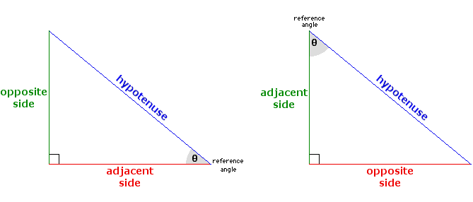
To do this I thought of a right angled triangle and using the trigonometric equations to find what the new coordinates for the shape would be.

While the math isn’t very complicated I felt it was worth explaining and documenting regardless. The hypotenuse is in this case the magnitude, the adjacent side (see left triangle) is the change in x, and the opposite side (left triangle) is the change in y, and theta is the randomHeading variable I generated in the update function. I knew the equations sin and cosine could be used as they had all the variables I needed and so by rearranging for x and y respectively, then adding the new values I got to the pre-existing posX and posY variables I could get the new posX and posY variables. This was the main problem I had, and it was what took me the most time to figure out since at the beginning I chose not to look directly into the code of others and to use what I knew already or what I remembered from class.

Below is the finished product:

Click to reset the circles.

Assignment 2: Ellipses

Loops… I wasn’t really sure how I could use a for, or while loop when the draw() function is itself a loop anyways. My previous experience with programming (which isn’t much) has taught me using for, or while loops in sorting algorithms but I didn’t know where to use loops when drawing an image in p5js. In any case, I looked through the magazines to see if there was anything I felt I could do.


When I saw the image above, I immediately began to think about how I could create it in p5js. I knew I could use ellipses to create what, in the image, looks rings around a tube. I also knew  that by making the background black, making the outline of the ellipses white, and removing the fill of the ellipses it could look almost exactly like the image. The only problem was that I didn’t really know how to make the shape without hardcoding all the values. So, instead of hardcoding all the x-coordinate, y-coordinate, width, and height values of all the ellipses I realized I could use a for loop.

When first testing out the idea I made a class and an array and made variables of that class which I put in the array and was just testing to see what worked and what didn’t since I wasn’t familiar with the syntax. In hindsight, I didn’t need to use a class or an array but it was good practice nonetheless. In any case, I ended up with the code below:

for (let i = 0; i < ellipseArray.length; i++) {
    
    
    let something = map(i, 0, ellipseArray.length, -1, 1);

    w = map(tan(frameCount * something * 0.025), -1, 1, 0, 100);

    y = map(i, 0, ellipseArray.length, 10, height);

    ellipseArray[i].make(width / 2 - 100, y, w, 20);

    ellipseArray[i].make(width / 2 + 100, y, w, 20);
    
    
  }

The method of the class which drew the ellipse was called make. Looking at it again I could have just had ellipse() in the place of ellipseArray[i].make … it would be easier to look at but I’ll just call it good practice. Despite that, I am happy with the code I wrote above. I was especially happy with my use of the map() function. At first I wasn’t sure how to use it, I also felt that the p5js references didn’t explain it very well but with a bit of trial and error it became obvious. I was also happy with how I used the frameCount variable to make the image move. I think it might be slightly obvious that I didn’t really know what I was doing throughout all of this as I named one of my variables something, I’m still not sure what to call it but the idea was that depending on where the ellipse was in the array it would have a different value from the tan() function.

At the end, I made the background slightly transparent so that it would leave a shadow of the previous ellipses, which I think makes a similar effect as the slightly fuzzy lines that can be seen in the image I took inspiration from.


Reflection

I mentioned this a few times before and it is that I should just use the ellipse() function alone rather than use a class and array to make the code more readable, and maybe even more efficient. I also think I could have added more comments to explain what each line or section did, I left most of it uncommented because I myself wasn’t sure what I was doing and was making changes fairly quickly. I feel with more practice and if I lay out my thought process with comments I can be more efficient when writing my code.

Future Ideas

For the future if I ever choose to come back to this style I could have a design where it uses a trigonometric function as I used it for this assignment but the ellipses are made around the cursor then it would look cool as you move the cursor. Also, I only varied the width of the ellipse, I could also vary both the height and width in the future.

Assignment 1 – Self portrait | Saeed Lootah

Concept
I intended for this self-portrait to have a portrait which is fairly accurate but cartoonish, and I also wanted to experiment with many of the commands in the p5js and I chose to do this by making my portrait dynamic. My main focus was the eyes.


Highlight

  translate(x, y); //makes the center of the canvas the point from which everything rotates. otherwise it would have been rotating around (0,0)
  // -18 because that is

  // dont ask me to explain this, I got help from the reference of atan2()
  let mx = mouseX - x;
  let my = mouseY - y;

  let a = atan2(my, mx); // atan2 is weird, its atan2(y,x) rather than x,y :/

  let v = createVector(x, y);

  let d = dist(mouseX, mouseY, x, y);

  let d0 = d * constant;

  // the maximum of 18 has to be found manually, so i added the mouseIsPressed if statement below to help

  if (d0 > max) {
    d0 = max;
  }

  v.setMag(d0);
  v.setHeading(a);

  // for debugging magnitude of the vector
  //   if( mouseIsPressed == true) {

  //     print(d0);

  //   }

  translate(v);

First to explain what the code is doing it helps to also use the embedded sketch whilst reading this. The code above is the logic behind the movement of the eyes. The pupils follow the cursor of the user but move further out or further into the pupil based on how far the cursor is from the  center of the eye. I did this to make the eyes more realistic but also to make the overall sketch more interesting and more fun to interact with.  I did this by calculating the angle from the center of the pupil to the cursor (with a bit of help from the p5js reference), then I created a vector who’s origin point is the pupil and I set it’s angle to be the angle from the center of the pupil to the cursor and it’s magnitude to be based on how far the cursor is from the center of the eye but I limited the magnitude. Once the vector was made I had the eyes translate using the vector using the translate() method. To make things a little more neat I put all of it into a function. I did this because I worked on the eyes feature on a separate sketch but with only one eye and then just placed it into a function so that I could easily create two eyes for this sketch.


Sketch


Reflection

In hindsight there are a lot of things I would have done differently. Firstly, it was only towards the end that I started using functions more diligently and I hardcoded a lot of my values which meant that I no longer had the luxury of changing the canvas size without having to painstakingly go through every shape. Also, I felt I spent a lot of time trying to do the eyes mechanic all by myself, I feel I would have both enjoyed and benefited greatly by working on it with someone else since for a while I was stuck on what to do. In summary, I would make my code more neat in the future and soft-code more of my variables where I can, and lastly, I should try to get help/ideas from others rather than stick only to myself.