Week 8 Reading Response

On Norman and the Importance of Attractive Design:

In this follow-up reading we had to Norman’s previous work – Norman feels the need to clarify that when he didn’t mention aesthetics in his previous writing “The Design of Everyday Things” he didn’t put functionality above aesthetics, but rather on the same level. I never got the impression this was the case, but nonetheless, it’s a welcome clarification.

Throughout the reading, Norman stresses the synergy of affect and cognition – not only are emotions driven by cognition,  cognition is also influenced by affect. I particularly love the rigorous way in which Norman points out how aesthetics can make things more ‘functional’ by themselves. Moreover, going into this reading, I did not expect to read an analysis of how mental/emotional states affect our mental processing – Norman’s discussion of depth first processing etc. – a pleasant surprise as this is a topic I have read about before!

On a more practical level, working to make your designs pleasant and relaxing for the user (or in general being conscious of the emotional state we want the user to be in when experiencing our work) seems extremely important. I have personally experienced this when even though my website designs were often technically better than my peers, I would myself prefer theirs because they looked pretty. Moreover, (though not recommended) even implementation flaws can be hidden by an aesthetic design – but are glaring when your designs are not aesthetic. From the perspective of psychology, perceptual sets, and first impressions of an aesthetic design deciding the overall experience more than the technical details seems obvious too!

I want to end this reflection with this beautiful quote by Norman: “True beauty in a product has to be more than skin deep, more than a facade. To be truly beautiful, wondrous, and pleasurable, the product has to fulfill a useful function, work well, and be usable and understandable”


On Hamilton’s Contributions to the Space Mission:

Margaret Hamilton’s narrative with the Apollo program is not just a testament to her pioneering efforts but a remarkable moment in the history of software. On a personal level, it echoes some sentiments I’ve personally experienced in my coding journey.  For example, the evolution of software from an afterthought to a critical component during the Apollo moon landings parallels many projects I’ve encountered, where the true importance of effective software design only shows up later.

Moving on, this deep-dive into Hamilton’s contributions also reveals an essential trait in software design: predictive error handling. I can recall several instances in my own projects where I had neglected potential edge cases. When a user unexpectedly entered data in a manner I hadn’t anticipated, causing the software to crash. While this is an important concept drilled into students who learn coding today – I imagine the roots of how it came to be thought of as a fundamental concept can be traced back to Hamilton. Additionally Hamilton’s championing of asynchronous processing in the Apollo computer also sounds way ahead of the time they were operating in and is incredibly impressive.

In sum, Margaret Hamilton’s journey with the Apollo program, filled with foresight, innovation, and resilience, is not just historical but a beacon for every coder. Her story doesn’t just echo the challenges and triumphs in the software domain but resonates with the intricacies of my personal coding experiences. It’s a reminder that in the realm of coding, challenges are but stepping stones to innovation.



Midterm: A Dreamlike Reflection on Intro To IM

Overall Concept:

Through this project, I take a chance to reflect on my work and progress during the first half of the semester. In broad terms, it is a compilation of my work in this class, designed as a mini-game where the user themselves has to jump over obstacles I faced. The idea for this concept came to me when I realized how happy I was with my evolution in terms of artistic expression as the class went on, and I wanted everyone to get a glimpse of this evolution.

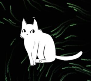
The game itself is simple enough and can be thought of as a simplified version of the Google Chrome Dinosaur game – with only ground obstacles. (it is deceptively hard!). However, the design is more complex. For example, since I want my viewers to wait and watch the artworks unfold – I made it such that no new obstacles spawn when the cat is stationary. Lastly, I went for a dreamy – after image trail- look for aesthetic purposes.

Working and Strengths:

As I stated earlier, the game itself can be thought of as a simplified version of the Chrome Dinosaur game. Your journey starts the moment you step into the cat’s paws. The left and right arrow keys move the cat, and the spacebar allows it to jump. Additionally, pressing 1 lets you click a screenshot and save it to your device. Whereas, pressing 2 lets you restart the game. You also have the option to toggle the audio on/off.

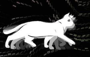
The progression of the game happens at the user’s own pace. Obstacles only spawn as the cat keeps moving, and they are randomized in size – being one of three variants: “Error”, “Deadline” and “Breakdown”. The cat’s movements include a sitting animation cycle and a walking animation cycle. Aesthetically, I went for a simple color pallet making my main character – a cat white, and the background black, that complimented my color usage in previous projects. The font style I chose resembles handwritten text – a decision made to further highlight the personal tone of the work. I also went for a generally upbeat theme to add to the work!


My cat sprites in motion!


On a technical level, the collision detection and mechanics were surprisingly hard to implement due to the length of the cat. Even when I got the implementation right, it was nigh impossible to play the game as intended (as it would lead to a continuous triggering of the collision mechanism). I needed to find a way to make this mechanism work without increasing the cat’s speed and worsening the overall experience.

Ultimately, I realized I could also increase the speed on the X axis while jumping, that made the game a lot smoother.

function jump() {
  if (catY >= groundHeight - catHeight / 2) {
    velocity += jumpForce;
    speed = boostSpeed; // boost the speed during the jump
  }
}    //jump function

function checkCollision(obs) {
  return (
    camX + width / 2 + (catWidth / 2) * 0.6 -50 > obs.x &&
    camX + width / 2 - (catWidth / 2) * 0.6 +40< obs.x + obs.width &&
    catY + (catHeight) * 0.6+30 > obs.y &&
    catY - (catHeight) * 0.6 -30< obs.y + obs.height
  );
}

Another area whose technicality I am proud of is the cat animations. I only had a sprite sheet for a right walk cycle. In code, I used this to also work for a left walk cycle (by flipping). But more importantly, I managed to find a way to connect my sitting cycle with my walk cycle. The cat now sits down when you are not moving, and then gets back up (in reverse the sit cycle) when you start again!

/ Check direction of camera movement to adjust cat's direction
    if (camX > lastCamX) {
      direction = -1;
    } else if (camX < lastCamX) {
      direction = 1;
    }

    // If camera is not moving and the cat was walking previously
    if (camX == lastCamX && wasMoving) {
      wasMoving = false;
      isWalking = false;
      isSitting = true;
      sitFrames.reverse();
      currentFrame = 0;
    }
// If camera starts moving and the cat was sitting previously
    if (camX != lastCamX && !wasMoving) {
      wasMoving = true;
      isSitting = false;
      isWalking = true;
      sitFrames.reverse();
      currentFrame = 0;
    }

// Draw the cat
    let frameToDraw;
    if (isWalking) {
      frameToDraw = walkFrames[currentFrame % 12];
      if (frameCount % 2 == 0)
        //making the animation slower
        currentFrame = (currentFrame + 1) % 12;
    } else if (isSitting) {
      frameToDraw = sitFrames[currentFrame];
      if (frameCount % 2 == 0 && currentFrame < 6) {
        currentFrame++;
      }
    }

On a more fun note, while working on the project I realized a peculiarity of the code – if you try to run away from the obstacles – they start bunching up and appear together more frequently – a fact we all know to be true from experience.

Reflections and Future Work:

Throughout this project, I ran into several problems – a couple of which I already highlighted in the above section. In general, staging the whole game was quite the task (as it involved basically a moving background created by a camera movement (that we simulate by a constant translation based on arrow keys)). This could only be resolved with meticulous testing.

Moving on, I’ve identified two crucial components of my project that might require some improvement: the way it appears and the way it functions. I believe I can further improve the project’s aesthetics and visual appeal. To make it more appealing, the background and cat’s appearance can be improved. Additionally, I want to make the text on the obstacles more legible. On a functional level – the hitboxes of the collision functions aren’t yet perfectly set – I’d like to explore using an elliptical hitbox than a rectangular one.

Finally, I would love to include my expectations and plans for the second half of the semester, as well as any abstract ideas or goals I may have as the ending scene – something that I didn’t have time to implement.


References:

Music:

Voxel Revolution – Kevin Macleod

Digital Lemonade – Kevin Macleod

Midterm Progress Report

Concept:

In my concept, I attempt to take the viewer through an interactive journey of my development and learning through this course. We play a cat, who we can move with the arrow keys. and as we proceed the background reflects the projects from my initial weeks in the class. At the end of the journey, after week 4, lies a final interactive demonstration of what lies ahead for me in the second half of this course.

I decided on doing this project, over a more mainstream idea such as a game, due to its nature of tying together my previous development. I feel this will be a rather poetic tribute, since I am proud of my previous works and what i have learnt!


Design:

Designing the code has been a more complex challenge than I imagined. A lot of the issues stem from implementational difficulties such as bad organization of my prior code which results in cluttered and unusable code when I attempt to combine elements. Nonetheless, I seem to have made headway into the same.

Other important design elements for me include a dependence on vibrant colors on a black background. My previous projects followed this aesthetic and I believe it is the most aesthetically pleasing to continue doing the same. I have also chosen relevant copyright-free music that shows a sense of ‘adventure’ as the user moves through the adventure.


Frightening Aspects:

The most frightening, volatile, and uncertain aspect of this project for me is the final ‘interactive stage’. This seems rather obvious, since I should have the code for the building blocks of the initial stages. However, the issue is deeper than being that of just a technical implementation.

Conceptually, it has been tough to find a way to showcase the ‘future possibilities’ of this course. Technically, a couple ideas I had included features such as minigames where a robot attempts to attack you – which seem far too intricate to design. Finally, I have decided to settle on an interactive ‘task board’, tasks on which would be clickable and would show pictures of robots/AI/ other things related to our future topics of discussion, play music, etc.

Reducing the Risk:

An attempt I have made to reduce the risk is rigorously try out different possibilities that I have brainstormed – in a manner which leaves no doubt as to whether a method is viable.


Moreover, I am attempting to see if libraries can simplify my work and code organization beyond what it is now.


Week 5 Reflection

Having conducted research in computer vision, and considering it as one of my areas of specialization, I believe this reading wasn’t specifically targeted towards me. Nonetheless, it was a fun reading and exploratory review of how computer vision can be used for the purpose of interactive medium. But in another way, it has always seemed to me as if those who are closest to a work often fail to recognize it beyond the framework they use it for. In this way, I feel like it may be that the exploration of computer vision and AI in interactive media which is explored in this reading (and that we will explore further in class) may perhaps be the most enlightening for me.

For this reason however, in this reading response, I would like to go a bit beyond the reading. One of the first things that surprised me here was the date of the publication of this article. From what I know, most modern computer vision techniques evolved in the 2010s – thus it was surprising for me to see such creative use of relatively primitive technology going back to the previous century. This also shows that the far more advanced technology available now can probably help us to even more boundary-crossing media pieces.

At this point, I also want to go on an aside about the usage of AI in art. The topic of the ethics of generative art has been in contention over the past year (and rightly so). But if we can somehow have such technology ethically created -then this adds several new dimensions to what art can do and show. Let’s take for example – a technology like ChatGPT. Even though this class rightly discourages its use for generating code, there is still something to be said of its power in being a tool to learn, and how it makes computer art more accessible even to those who have less of a background in coding.


Assignment 4: A Data Story of Wind and Temperature

Approach and Concept:

Initially I intended to choose the generative text project, but due to a lack of ideas/direction I switched over to the data project. I personally have a strong background with data, so it was a surprise to me when I couldn’t come up with a direction with this either. Data visualizations should effectively communicate the data they are trying to visualize, however I couldn’t think of a way to cohesively do this, while applying the lessons I had learned with my projects in the past weeks.

At this point, I first attempted to find a dataset to visualize. I wanted to visualize air-pollution in New Delhi, the capital of India (where I spent a chunk of my childhood), but an appropriately formatted dataset was hard to find. So, I ended up settling on a weather dataset of the city that had hourly weather data for a period of ~50 years from the 1960s to 2010s. This dataset contained several fields, but I narrowed them down to ‘wind speed’, ‘wind direction’, and temperature.

To visualize the wind, I decided to use a simplified version of the particle generators from my previous assignment. My word would be simple enough if I could vary the color based on temperature, and vary the particle’s movements and orientations based on the wind speed and direction. However, this proved to be a bit more challenging. Removing the noise from the simulation, made it look extremely bland.

Following this, I had to strategically add noise to not disturb the visualization but still add interesting movement. But even this didn’t seem enough. Since I was borrowing ideas from my previous assignment, I felt I needed to do more. This led me to add the elements of interactivity to the project. First, clicking on the mouse, lets you move forward a day in the visualization (you only move forward an hour every 2-3 seconds otherwise). Additionally, you can navigate to any date you want using the input menu.

Lastly, I also added a visualization of the important cities in India as the starting screen. A continuation of this project could be finding and adding similar data for the other cities in the visualization.


Highlights:

My highlight for this project was certainly adding the elements of interactivity to the code. Creating the input box, and attempting to match the date by matching the string formatting was a bit challenging, even given my background. Moreover, generating the final effect was also fun it itself!

Additionally, I enjoyed the process of finding relevant data, and actually thinking of ways I could enhance the visualization.

function jumpToDate() {
let inputDate = dateInput.value();
let dateParts = inputDate.split('-');
let formattedInputDate = dateParts[2] + dateParts[1] + dateParts[0];

for (let i = 0; i < table.getRowCount(); i++) {
let rowDate = table.getString(i, 'datetime_utc').split("-")[0]; // Extract just the date part
if (rowDate === formattedInputDate) {
index = i; // Set the index to the found row
break;
}
}
}

Reflections and Future Work:

This project can still have several improvements. First of all, I would love to be able to increase the scale and include other cities/states/countries into the visualization. It would also be really cool if one could toggle between this mode, and a more ‘bird’s eye view’ to see changes both across time and geographies.

Regarding the aesthetics themselves, I believe there are several more optimizations needed especially with some of the direction-based motion. For example, the switches in direction when the next row of the dataset is accessed can be made smoother.

Lastly, as stated earlier, an obvious continuation would be to increase the scope of the visualization by adding data for other cities.

Resources:

Using Data:


Input Text:

From last week:

I realized at a later stage that this video does what I attempt to do, and took reference towards the last part of my coding:
https://youtu.be/BjoM9oKOAKY?si=tIbnzH-ndMvgCB2R

Another resource I used to understand the concept of vectors in p5.js:

https://www.youtube.com/watch?v=bKEaK7WNLzM&pp=ygUUY29kaW5nIHRyYWluIHZlY3RvcnM%3D

(Also, some other videos in the playlist)

Week 4: Reflections

This week’s reading continued the trend these readings have had of furthering my ideas, thoughts, and beliefs about facets of art and design. In a lot of ways, the reading takes me back to our previous reading on interactivity, and our class discussions regarding the same. The author quips in an initial section of the reading, about how engineers who believe that being logical is enough may say that it is the fault of a device’s user for not understanding how to use it properly. Having an engineering background, I feel that this statement may as well have been personally directed to a version of me from a few years back. Even if my code (for say an app) was intricate, complex and highly functional – this would never actually end up being used because of bad design choices that made it harder to navigate for a user -leading me to say things the author says an engineer would say.

The following sections of the reading discusses affordances and signifiers amongst other attributes of human-centered design. This made me immediately think of direct relations to technology-based experiences. A simple example of this would be images in a website. Often people wouldn’t click on them, so it wouldn’t make sense to make them hyperlinks. There would be the need for some other signifier if we indeed wanted to do so (and had reason to do so). The author goes on to discuss a similar example of an app later.

Finally, the author’s ending notes on the paradox of technology is one I have actually thought of several times previously. The technology sector seems to have a fascination with smaller and smaller form factors to squeeze better and more complex technology into. The primary reason for this seems obvious: increased portability. But as the author states, the more complex the technology gets (presumably to improve our lives if used adequately), also complicates life. We have even seen technological juggernauts fail to take this into account – and fail hard as a consequence. The ‘Google Glass’ seems like a great example for this, and the Meta’s ‘Metaverse’ may be moving in a similar direction. Nonetheless, as the author claims, if all disciplines work together, and more attention is paid to design in a human-centric sense, it should be possible to have technology which is both better and more functional. Like the author, I too believe that this dream is possible.

Week 3: A ‘Drift’-ing Gradient

Approach and Concept:

Starting off this project, I realized I could potentially look to screensavers of different kinds for motivating my generative art piece. Upon googling, I was instantly reminded of the iconic Mac screensaver – ‘Drift’.

Attempting to recreate the piece proved incredibly hard as it seems to use some sort of fluid-based physics simulation rather than simple noise. Additionally, the particles itself were 3D and detailed with shadows, depth etc. I gave up on the idea for a bit and decided to create a cool ‘background’ first. I did this with an idea I got during my previous project -using Perlin noise on each pixel to evolve the color based on the x,y, and time axes to make an evolving gradient.

However, this gave me a new idea – what if every pixel was a particle that moved on a trail decided by noise? That could certainly simulate the effect I wanted to an extent! With some code changes, and a lot more tinkering with variables – I finally came up with my final design:

Bonus: Click to see the animation speed change, and hover to see how the particles interact with the mouse!!

Highlights:

My highlight for this project is modeling the interplay between the noise evolution of every particle’s size,angle, and color. Moreover, I added some user interaction elements by adding an effect when we hover a mouse over the animation: the particles get repelled!

I had to bake in some considerations here so I only made this effect available away from the edges of the screen – so that the user can see the art without the mouse effect easily. I was also worried about the effect strength since the result wasn’t smooth and didn’t go with the aesthetics of my vision originally, but the normalize function came into the rescue here!


update() {
        let r = noise(this.pos.x * noiseScale, this.pos.y * noiseScale, timeC) * 255;
        let g = noise(this.pos.x * noiseScale + 100, this.pos.y * noiseScale + 100, timeC) * 255;
        let b = noise(this.pos.x * noiseScale + 200, this.pos.y * noiseScale + 200, timeC) * 255;
        let alpha = noise(this.pos.x * noiseScale + 300, this.pos.y * noiseScale + 300, timeC) * 150 + 105;
        this.color = color(r, g, b, alpha);

        this.angle = noise(this.pos.x * 0.01, this.pos.y * 0.01, timeMove) * TWO_PI;

        let move = p5.Vector.fromAngle(this.angle);
        move.mult(currSpeed);   //changes the speed based on mouse click
        this.pos.add(move);
        let sizeNoise = noise(this.pos.x * noiseScale, this.pos.y * noiseScale, timeMove*2);
        this.size = sizeNoise*20;  // Change these values to adjust the range of size based on noise
    }

    show() {
        push();
        translate(this.pos.x, this.pos.y);
        rotate(this.angle);
        fill(this.color);
        rect(0, 0, this.size, this.size * 0.3); // making the rectangle elongated like a bristle
        pop();
    }
  
   repulse(point) {
        let dir = p5.Vector.sub(this.pos, point);
        let dist = dir.mag();
        
        if (dist < 100) {  // Only push away if within 100 pixels
            dir.normalize();
            dir.mult(3);  // Adjust for stronger or weaker repulsion
            this.pos.add(dir);
        }
    }


Reflections and Future Work:

My initial goal was to make the particles 3-dimensional. When I actually attempted to do so, and mess with movement in the Z dimension, I ran into several issues both on the aesthetical and technical front. For example, using 3D graphics benefits immensely from the use of shaders – which are very different from the 2D objects we use to both learn and implement. Moreover, it required more geometrical calculations that seemed beyond the scope of the project.

If I had more time I would also try to see what variations I can get with using differently shaped particles, different types of noises etc.

Resources:

I realized at a later stage that this video does what I attempt to do, and took reference towards the last part of my coding:
https://youtu.be/BjoM9oKOAKY?si=tIbnzH-ndMvgCB2R

Another resource I used to understand the concept of vectors in p5.js:

https://www.youtube.com/watch?v=bKEaK7WNLzM&pp=ygUUY29kaW5nIHRyYWluIHZlY3RvcnM%3D

(Also, some other videos in the playlist)

Week 3 Reflection

I have always thought of ‘interactive design’ or ‘interactivity design’ as just a  necessary component of the UI design role. In general, I also realized upon going through this reading that the word ‘interactive’ had in a sense lost its meaning to me. It was refreshing to actually think of the concept and its importance in a systematic way as the reading puts us up to do.

An idea that the author introduces, and I love, is how interactivity isn’t a Boolean value but should rather be seen as a scale. This allows us to still call low level interactions such as those between a person and a TV remote interactive but on a lower level – while still maintaining our initial definition that involves thoughtful communication/conversation between two agents.

Circling back, the section of the discussion most relevant for me here is the one on ‘interactivity design’ which pertains to human-computer interaction. The author here mentions a key difference between User Interface design and interactivity design:

UI  designers never presume to address the ‘thinking’ part of the software. While interface designers also take into account the ‘thinking’ part or the function of the software alongside the other dimensions when coming up with a solution.

This comparison makes me draw from my own limited experience in UI design in a Software Engineering class and an internship at a startup. I had always felt that the UI design approach was too restrictive and shallow – that there needed to be more work done to actually take the now functional design and actually integrate it in a way that it flows naturally with the actual ‘function’ of the software.

Lastly, on a more philosophical note, the discussion on new paradigms leading to rapid progress is one I have interacted with frequently in the context of rapidly developing AI. However, I had always assumed for some reason that the paradigm for software and computer design had already been established (similar to how microbiology had the paradigm of cell theory strongly established for example). Interacting more with the field of creative computing through this course, and doing this reading have led me to the realization of how wrong this intuition may have been.

Week 2 – Reading Reflection

The lecture by Casey Reas on Chance Operations was a fascinating look at randomness, and the dynamics between chaos and order. Being a Computer Science major, most code I write is defined by rigid precision. Even areas such as web development which allow some artistic precision, allow this only within set boundaries. The first two weeks of this course have already opened me up to the idea of using code for artistic expression – this video only added to this.

My favorite sections of the videos were the demonstrations where persistent chaos would give way to some sort of symmetry and order. The best example of this would be the “Fractal Invaders” example where, random pixels and some duplication can lead our imagination to see characters and objects.

Having explored principles of Taoism through some of my Philosophy coursework, I have read about how concepts such as order and chaos don’t have to conflict, but can rather enhance each other. I can see this principle floating through the talk, and I hope to integrate this in my later projects through this course.

Moving on, Reas states in the video how “the idea of using a rational machine to do something unexpected at the time was a subversive one”. Here, by “at the time”, Reas refers to the period where computers were still severely limited in what they could do and were just starting to be widely used. However, I believe that this statement may be true even today. Most people choose to use their computers for tasks that are constrained and rigid. Tasks such as playing games, that are intended for recreational purposes, also don’t allow artistic expression which has even become a lot more accessible to everyone using the systems today. As such, I feel it is an avenue for self-exploration, discover, and fun that is overlooked by most people today. I would be highly interested in making a web tool that could enable people to play around with randomness and its accompanying mechanics without needing knowledge of code, but I assume this may be difficult due to the nature of art.

The last point I wanted to touch in this discussion is an emerging technology – and its relation to both art and randomness : Generate AI – specifically diffusion models. Having been interested in the technology powering the space – I know the role randomness plays in it. Having a different ‘seed'(a measure of randomness) with the same ‘prompt'(the input given to the AI) can result in artworks extremely different from one-another. Researchers and enthusiasts have been working constantly to traverse this randomness in an effective way to get the best possible results. But perhaps, there is beauty in this randomness too that has yet to be explored. (The discussion of the ethics of using such technologies is also equally important)

Week 2: Chaotic Spirals of Randomness

Concept and Approach:

I have always been fascinated by spirals. I remember books on ‘mental illusions’ that would often consist of spirals that looked procedurally generated, but could seemingly trick you into believing anything. My work for this week is inspired by such spirals – but I wanted to go beyond the procedurally generated symmetries and explore combining movement, elements of randomness, and interactivity with such spirals.

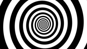
A mental illusion eliciting spiral.
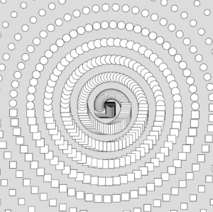
My initial static spiral made of circles and squares

The code design and the movement itself were pretty simple. Early on, I decided to have my spirals be made of circles and squares that would move. Later, I would randomly vary whether the next generated shape was a circle or square, and the size/color of each circle/square. I used Perlin Noise for colors so they would change relatively smoothly. Later, I also added spirals to the four corners of my canvas and made their colors change based on mouse clicks.

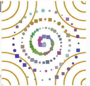
Still, after all this, perhaps one of the best decisions I took was making sure I kept my editable parameters as global variables which could be changed easily. Once I had my spiral effect in place, I started tweaking the ‘distance’ and ‘increment’ variables that tweaked the shape of my spiral – and chanced upon an artwork which I found even more satisfying than my initial vision!

Before tweaking the parameters.

Highlights:

My favorite part of the code has to be the actual calculation for having the shapes move in a spiral. It’s actually based on simple math. To be precise, when covering an angle from 0 to  theta across a circle. The new coordinates will be center_x+radius*cos(theta), center_y-radius*sin(theta). Moreover, since it’s a spiral we also increase the radius constantly.

for (let i = 0; i < shapes.length; i++) {
    let shape = shapes[i];
    offset+=0.1
    let x = shape.r * cos(shape.theta);
    let y = shape.r * sin(shape.theta);
    fill(shape.redval,shape.greenval,shape.blueval)
    if (shape.isCircle) {
      ellipse(x, y, shape.size);
    } else {
      rect(x, y, shape.size, shape.size);
    }

    // Update position
    shape.theta += increment;
    shape.r += distance;
    shape.r+=noise(offset)*0.1;
  }

Reflections and Future Work:

I think this project has a lot of scope for improvement. Firstly, the actual code is just the same loops duplicated multiple times. The code thus lacks any sort of modularization. This can be improved relatively simply and will enhance the readability and editability of the code by several times.

Second, there are several other interactive elements that can be added to the project. For example, the loop may get tough to look at for a longer period of time – so, a mouse click may be used to stop all the motion.

Lastly, even though my theme for this week’s assignment was ‘chaos’ I believe I can still improve this project’s aesthetics significantly, if I spend more time with it!